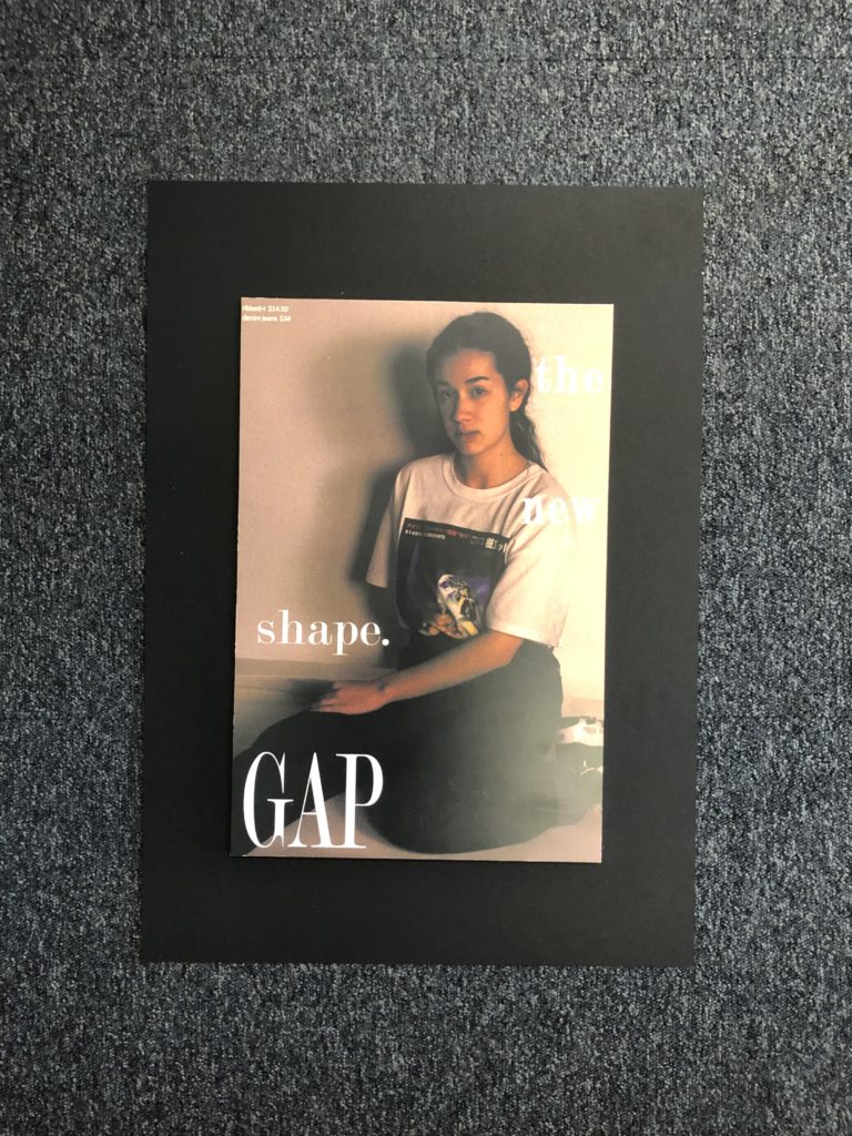
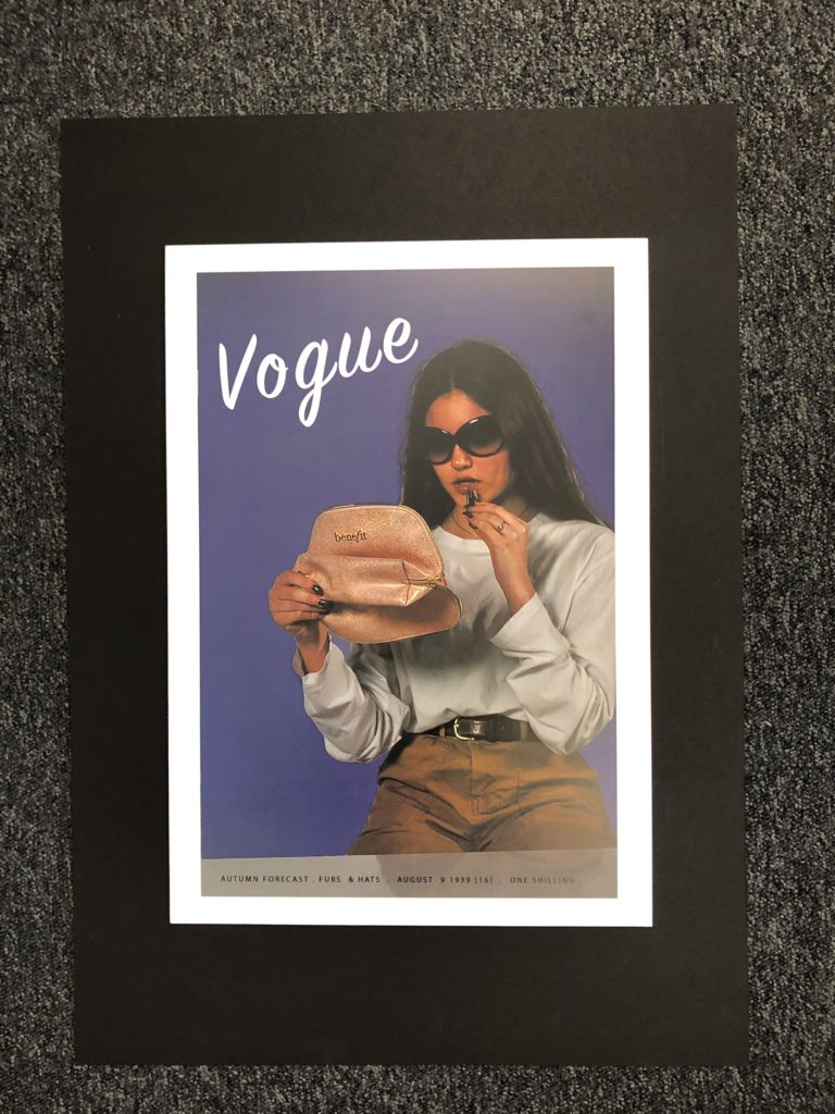
Below shows how my final outcomes turned out ones printed and displayed, I chose to display them on foam board and then onto black mount board as I feel this is what worked best with the photographs and it made them stand out off the page which I feel was effective in displaying the types of photographs that they are.
I am happy with the way that my final displays had turned out and the actual photographs themselves. I feel that putting them on foam board rather than a window mount helped to make a difference and stand out for the types of photographs they are in the style of adverts and what they are presenting.
All of my final photographs have stemmed from inspiration and ideas from people such as Kourtney Roy and Cindy Sherman and the message that they also try to send across to people and the style and way that they portray those ideas I feel is effective and stand out which is one of the reasons as to why I placed my pieces on mount board. I feel that adding the writing and actual advert elements helped to make a better impact and I feel was more effective than just leaving the images as they were.

1983 
2016 
1994 
1943 
1939 
1993 
All Final Outcomes Together
Below shows a created image of a virtual gallery to suggest what my work could look like in a gallery and all displayed properly together. This helps to give a sense of all of the photographs being grouped together and how I may show them if I was to have a real gallery space to put them in and I feel helps to give it a different perspective.

Gallery Suggestion
