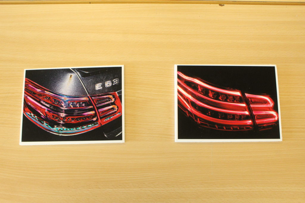
My overall direction of ‘journeys and pathways’ was too illustrate the path taken by my mind over these past few years. Each work depicts a stage in my life which had a great impact on my being in some way.


My overall direction of ‘journeys and pathways’ was too illustrate the path taken by my mind over these past few years. Each work depicts a stage in my life which had a great impact on my being in some way.




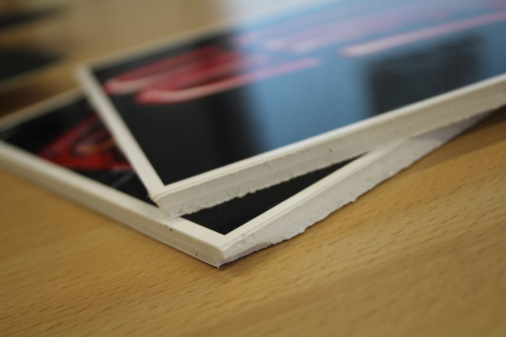
What I did in the exam went mostly to plan. Doing the collage, I had no problem, however when doing the Polaroid piece I had a few problems. For starters I had used different Polaroid templates and had not realised they were different sizes. I had to separate the landscape Polaroids and put them as separate images because they wouldn’t fit right on the board and were different sizes to the normal Polaroids and to make them the same size I would have had to cut the image. I made them individual photos and looked up the time and place I took them and wrote that on them. If I had more time or did the exam again I would trim the Polaroids more carefully and maybe have space out my collage more.

Other than those small blips the exam went really well. I really love how all my images came out in the printer. The Polaroids had the discoloured, sometimes over exposed and scratchy look I wanted. When displaying them I took advantage of the really bright ones with dominant colours like red and orange and spaced them out so the eye is attracted to more places on the piece than one. I also spaced out the ones with less colour to highlight their lack of colour. I then wrote things on them because that’s what people do with Polaroids. They normally describe what is happening and date them so they are like youthful memories.
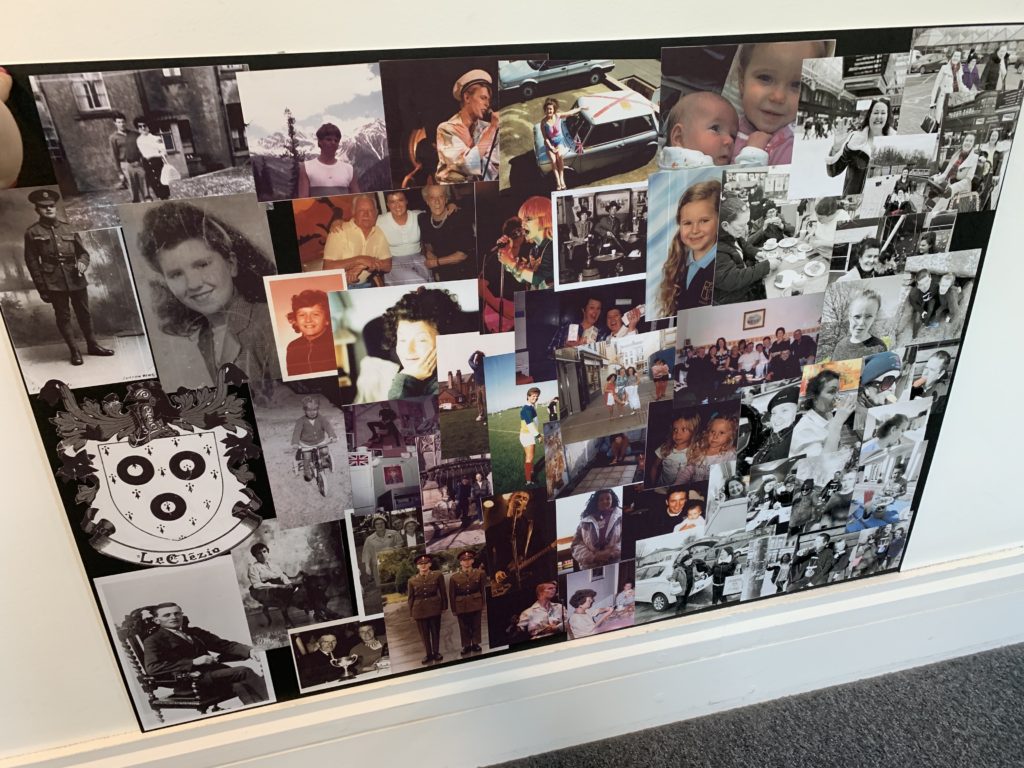
When displaying the collage I cut up lots of images displaying my family and individual member’s youth like my mum’s and dad’s (that I’d photocopied from originals), which included thing like seeing David Bowie in concert, joining the army and playing cards. I also included really old images of grandparents and great grandparents at my age. I didn’t want to do a neat lined up display for this one because the images were all different sizes and I wanted the fact that I layered them to represent how when moments of the journey of time are put together they flow into each other.
I drew most of my inspiration for these pieces from Carinthia West and Kristen Lewis. Kristen Lewis documents the life or journey of a family through a day so in my collage piece I documented my family’s journey through multiple lifetimes, using photos from my parents and taking my own modern day ones. Carinthia West was my inspiring artist for my Polaroid piece and a bit for my collage piece. I found with her images she took were vernacular and documented the journey of youth and fun events that happened around her. My Polaroids document the journey of youth in different ways. They are all about having fun but also show how the youth of my time are very different from the youth of West’s time in the way that there are iphones in my images. I displayed my images as Polaroid because my generation has brought back the Polaroid camera. Lots of teenagers my age have instant cameras, and because they are taken at an instant, a moment of time recorded instantly like memories which I liked the idea of. West’s themes were also used in my collage piece in the way that I used a lot of images of my parents’ youth that was during the 70’s and 80’s which is when West took her images.
The exam question way journeys and pathways. My Polaroid piece relates to the exam question in the way that it documents the journey of youth and generational journey. The journey of youth is documented in the images in the way that it shows young people having fun, getting ready to go out and playing, which is what being young is all about. The theme of a generational journey comes in with how I’ve displayed them as Polaroids and edited them to look discoloured as if they were from an older generation like the 80’s, including the folded and dirty looking polaroid templates I’ve used. My collage piece documents the journey of life, my family, youth and my journey, everything that led up to me. It also shows the different pathways of my family. Despite the fact that it’s the Le Clezio family crest at the start of it there is a lot of images of my Scottish family as well. There’s pictures of cousins, great aunts, great cousins which are like the different veins of my family like pathways of the blood.
I’ve really explored different types of journeys and pathways in my project. I started off documenting physical journey buy travelling to Scotland and taking pictures. I then decided I wanted to look at the exam question in a different way. I wanted to look at people as a journey which led to what I did for my exam. I think overall it’s all gone really well. My final images came out better than I expected as did my pieces. If I were to do the project again I’d maybe look at a physiological journey and surrealism. What I like most about my project is that it has a lot of meaning to it and that I’ve thought very deeply about it looking at all the ways I can use myself, my life to document a journey. I’ve thought about story boards and timelines and have slowly developed on those original ideas to get my final pieces.
For this project, I went on a journey with my mum to the St Saviours abandoned hospital to show the state that it is was in. As I turned up to it, it was shocking to see it all boarded up and see warning posts all over the walls. I took photos of people on the way there.


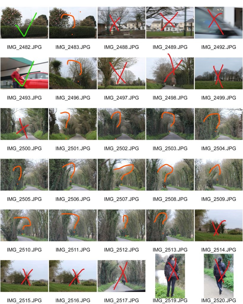


Even though some of the photos I took were good, they just weren’t what I was looking for and didn’t really link in with the theme I was doing.
When think about how to layout my images I thought that setting them as a window mount but there were some possible problems with it, firstly that the frames might distract from the images and that some are in portrait.

In the end the layout for the images that I decided upon is a grid with the layout being from light at the top to dark at the bottom. The two images that were lost would have gone at the bottom. The reason that I put the images on black card is because they are black and white images and the deep matte black and the glossy black and white on the images.
This presentation is made to twin with the negative slides and the light box as it is the same set of images and the negatives.
This is how they ended up and how I displayed them.



Analysis of images
First 3 – these images are inspired by Katies joy crawford and her use of double exposure. the images give a sense of confusion and uncertainty and show the distress someone goes through while dealing with anxiety and depression. the images are lacking colour but not black and white so it gives a sense of dullness and emotionlessness. i the lighting is dim but still bright enough to be able to capture any visible facial expression. the mounting bring in rule of thirds with the leadings lines in the top image brining your eyeline down the piece. i used soft lighting to enhance the lack colour. These link to journeys and pathways as it is my experience of my journeys through various mental health struggles. I found it a good way to express my feelings. Rather than a physical journey, it is a mental journey of struggle.
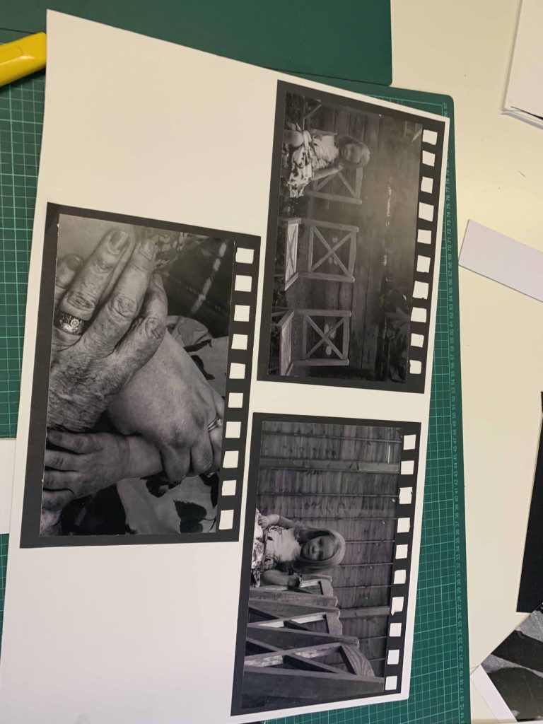
Second 3 – the images are inspired by Bill Volia’s still image of his film ‘birth life death. the framing is to resemble old film to bring in that resemblance to the video. the images are in black and white to give a moody look and to also bring out the shadows of the lines in the hands to distinguish between the others. and also give a dated look. i keep everything in focus but keep my subject in the centre. the textures of the hand accentuates the age which is what these series of images is focused. natural lighting. kept depth of field of the hands small so it seems dreamy. It links to journeys and pathways as the hands shows different generations and the different stages of life, starting with a young child, and progressing to adult/parent, then to elderly/grandparent. The child is alone in these images as it is meant to be she is the only one in her family left with other members sadly passing on. I wanted to keep the chairs empty and keep them in view to capture this emptiness. This is rather an existential view on the journey through life, and again, rather than being a physical journey, it is a metaphorical one.
Third 2 – these images are also inspired by katie joy crawford, mainly her birdcage photo which i modelled the ‘box head’ and ‘clouded head’ directly after. i placed the clouded one at the top so its like head in the clouds which is what is feels like to deal with depression; a sense of disconnection. i used a black background to contrast the whites in the photograph. the textured cloud against the smooth background also shows the disjointed feeling depression gives you.the box is to represent how trapped you can feel inside your own mind dealing with these issues. i used harsh studio lighting to resemble the harshness of these thoughts. Again, this is represent my view on a journey through mental health and links to journeys and pathways through the idea of mental health journeys.
Final 2 – links to journeys and pathways as it is also embodying the ideas of mental health journey as well as a physical journey (walking along a path). She is stepping between the cracks as it links with the obsessive nature of OCD and also the childish superstition that stepping on cracks is bad luck. The blue boxes I edited in enhances the space she is stepping between and shows how he mind when in this place of mental state actually views this simple pathway.
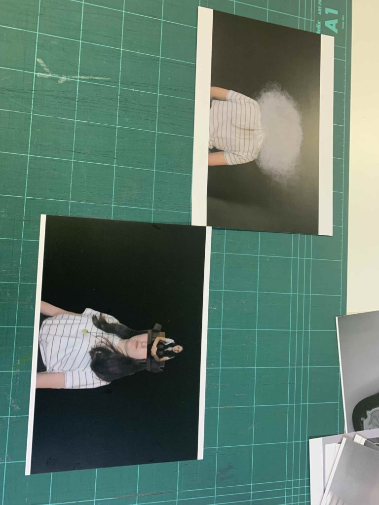


I first placed out my images to see if my ideas I had out on paper would work. some of them, I realised wouldn’t, and others I ended up having better ideas once I played around with placing them. In the end I ended up using foam board to create different levels and I used black paper to create the look of old film slides. laying out the placement of photos and grouping them together really helped see what was effective and what wasn’t. I had so many more better ideas once I had the prints in front of me and was able to use my images more effectively.
For my first final piece, I cut out the outline of my grandma with a stanley knife. I then got a piece of plain white A4 paper, spray glued it and then added the gold glitter dust to it. I then spray glued the back of the photo and then layered it on top of the glitter paper. I then used red thread and sewed an outline of my grandma. I then layered the photo on a piece of black paper and made a border for the image.


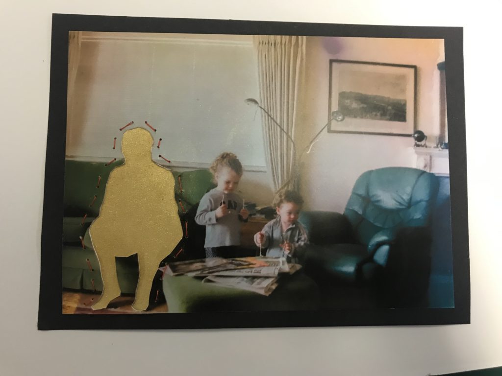
For these images of my dad, I used a stanley knife to cut out the outline of my dad. I then spray glued him onto the original image, and then sewed a clock and an outline around the smaller image of my dad. I then spray glued the image on top of a piece of black paper

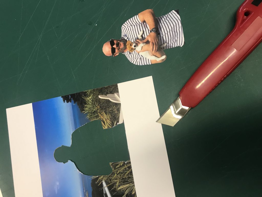

For my final image I used a stanley knife to cut around the outline of the original image. I then spray glued the original image into the reworked image, and then sewed around the children in the reworked image.
I then spray glued the image on top of a piece of black paper


I am pleased with my final piece, I have produced a scrapbook/photo album of holiday photos of my chosen destinations of Jersey and Thailand. My concept is of the journey of these two places in the world of tourism and economic incline. I focused on how Thailand has taken a pathway of in the short-term a success as after the tsunami they managed to get back on the horse and rebuild their lives, but in the long term their argent need to return to normal life has destroyed their once bespoke and isolated scenery, now all it is a tourism feeding ground, the sustainability of their pathway ceases to exist. Whereas Jersey’s plan, although we are running out for houses to provide for people we are thinking of our landscape on the coast and the importance of it’s preservation. My concept hasn’t always been clear, at the start I was steering towards the idea of time, then I thought about the concept of travelling, with led me to my final concept. Overall the theme of ‘journeys and pathways’ is a reasonably broad area and I found it could be easily linked landscapes, which is ideal for Jersey, so I went on my fourth photo shoot to my favorite beach and the most popular tourist destination, St Brelades Bay. Even before knowing the theme I wanted to explore landscape, as I hadn’t done any to my best standard throughout the duration of the coursework as it was focused on abstract and portrait. I took my first inspiration from Mark Powers when it came to my Jersey photos as I wanted the focus to be on the sea and how powerful it is in its looks and movement, but then as I progressed I veered away from Power’s ideas of how dependent people are on the ‘shipping forecast’ and more into how the people of Jersey are dependent on it’s beaches and weather because it’s our islands main marketing point for tourism, which is a huge sector in our economy. When taking my photos in Thailand I took inspiration from my case study photographer, Andrew Quilty and how he took photos in artificial lighting rather than the sun and I wanted to do this as a contrasting point to my Jersey photos which are in completely natural lighting from the sun. As well as that I wanted to highlight like Quilty the culture in the country I was photographing and how it’s completely different to ours. For instance how night life for locals is so important, it’s the time when you get the most customers, as it is when it’s cool enough to actually be away for air conditioning. Night markets in particular are very popular, where fakes, food and merchandise are sold, to locals these stalls may be their only source of income, which supports my concept that Thailand is overwhelmingly reliant on tourism. My editing process could have been made more complex if I were to have done it again but I feel that overall the simplicity of it worked well with my final display as it looked like genuine holiday photos a person would print off. I did go through problems when editing my photos as it was pointed out to me that although the photos were clear on my computer, they won’t be as bright when printed off, so I had to rethink my selection process and also consider the images with reasonable amounts of light in order to have the best outcome when in print form. This meant that I had to experiment a lot with exposure and brightness and I found it challenging to be able to keep the quality of the photo as well as increasing exposure, but I worked around it to create 12 final outcomes for my Thailand night photo shoot. If I were to have more time I maybe would have looked more in depth into Thailand and how it affected the people who leaved their and their personal accounts of what they had to go through to get back on their feet. In conclusion, I am happy with my final outcome and the concept I have based it on and in my opinion the theme the exam board set was very ideal for me and I found it enjoyable to come up with a concept and execute it.
The following are photos of my prints after I have framed them.
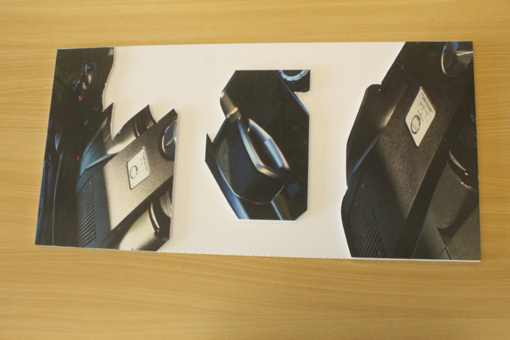
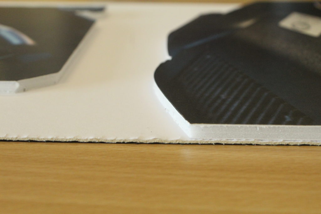
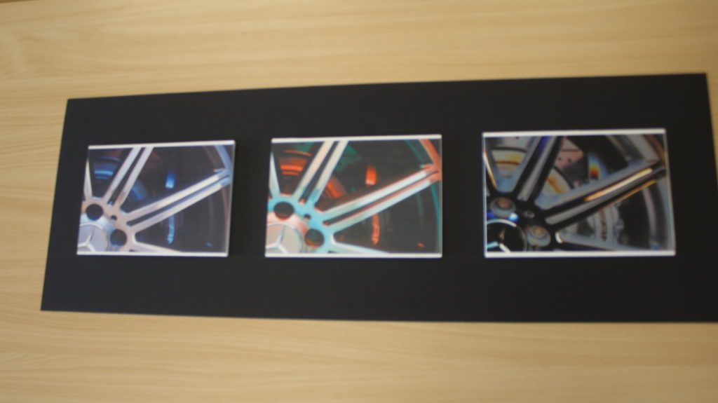
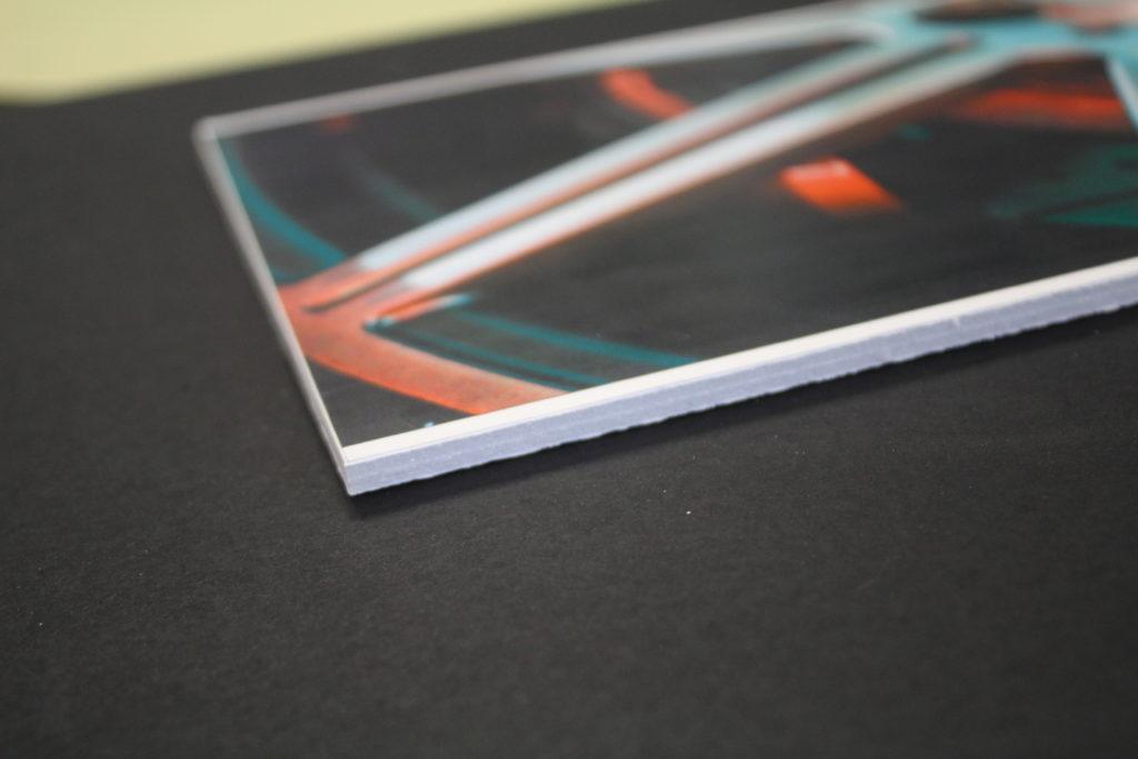
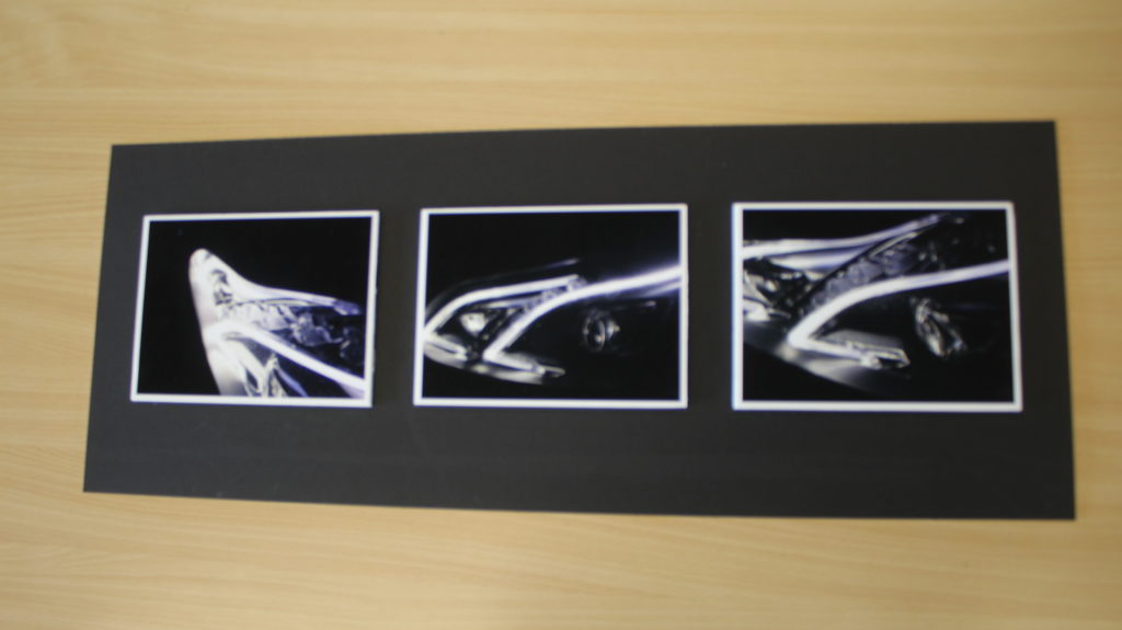
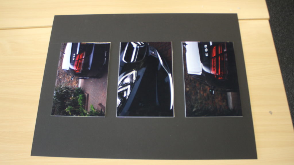
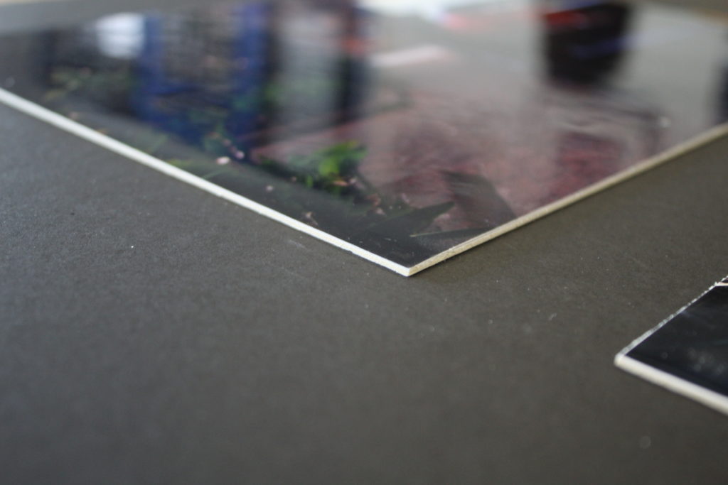
The following 2 images are of two more images which I have just stuck onto foam board due to running short of time, they are also printed with a gloss finish.
