Technical;
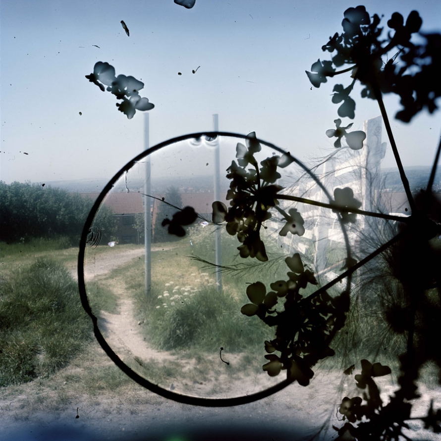
When first looking at this image it is clear that there is an initial contrast of light and dark presented straight away. Firstly the background image, the photograph is represented as a image taken in daylight, from a high up location due to the smaller buildings that can be seen in the background, this give the image a good view point when looking at the image itself. To me this adds more depth which is essential for a decent image to be produced. With an evident use of high over exposure to ensure the clear contrast between the background image and the much darker shapes placed on top. On the other hand the use of the over whelming white blurs seeping through from behind the heavy black print in front is a consistent technique used through out Stephan Gills other work. The temperature of this photograph provides us with a much colder feeling due to the use of paler shade used and the idea of the color emerging from the image, the over exposure almost leads to all the main colors to become extremely pale. However this help emphasis the much darker shapes on top which is clearly a critical point to be bought across from the image.
Visual;
As previously mentioned the main color presented in the image are much paler than what would be presented in real life, this would be due to the over exposure used from the camera to give a much colder and harsher effect and lead to a much further evident contract between the background image and the dark shapes presented in front of the photograph. These black images presented in front of the photograph give the image depth and texture which yet again adds more detail enabling different view and perspective from the viewer to be interpreted. The texture of the photograph to me is still represented in a flat smooth way rather than a ’lumpy’ texture, although there is a clear texture that must be presented due to the over lays on the images. The black images in front to me give an almost stain like feel this can be seen through the circle which could be translated to a coffee mug stain. On the other hand the other patterns are more of a floral type or a plant pattern that have been possibly imposed on the image by using chiffon giving the overall feel to the images and the essential contrast. As mentioned the texture of the images isn’t necessarily rough or uneven but the photograph for sure gives a strong 3D effect. The organisation of the image to be proves to be unorganized and almost random display of the gloomier images, with the placement of the plants and circular ring being placed out of center and unsymmetrical, although I believe this to add the end product and feeling of the image.
Contextual;
For the creation of these images Gill in Brighton and Hove during 2010 added features of objects and creatures that he had found and picked up from the his local surrounding, use his natural environment to help produce his most famous work, and the introduced that into the body of the camera to give this new effect. Gill hoped through this particular approach it would encourage the spirit of the place to clamber aboard the images and be encapsulated in the film emulsion, like objects embedded in amber. The aim was to evoke the feeling of the area at the same time as describing its appearance. Gill said that this particular technique gave him less control, and provided a considerable an element of surprise, as how the image ended up was not always a plan and was for sure at times not what was expected. Some results included some highly detailed macro recordings amongst and within the landscape of the portraits. Gill said ‘ like to think of these photographs as in-camera photo-grams in which conflict or harmony has been randomly formed in the final image depending on where the objects landed.’ Some of Gills technique to get these particular effects on the image were, by using a magnifying glass to concentrate the sunlight onto some of the negatives in order to etch markings directly onto the image or sometimes Gill would even dip his negatives into the sea.
Conceptual;
The types of images Stephan Gill produced left a wide option for different interpretations and different ideas to be produced from the viewers of the images, this was due to the different types of backgrounds hat were over exposed and the dark shapes over laid on top of the original image. That’s one of the best things about Stephan Gills work there is so much opportunity for personal explanations of what the images means and represents.
