Final Outcomes & Display

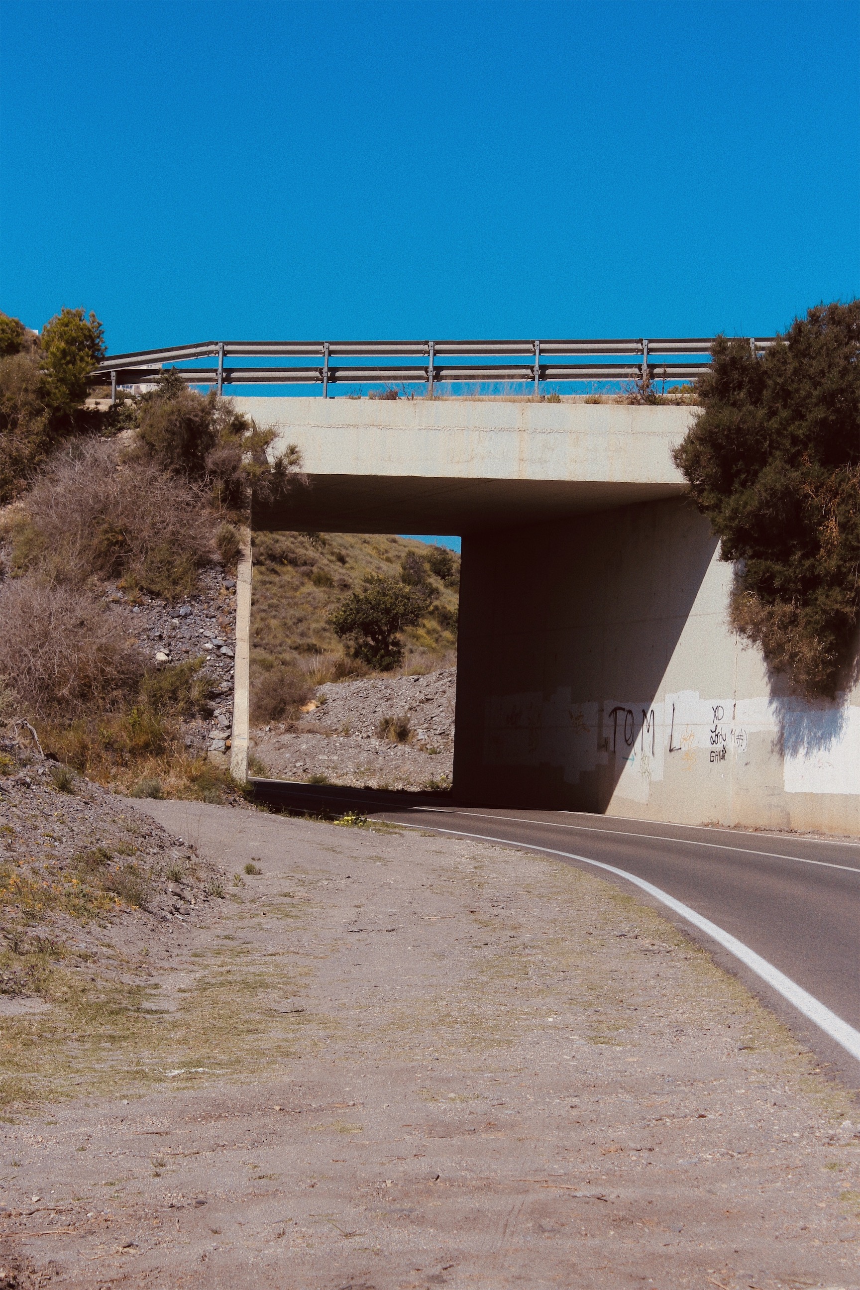
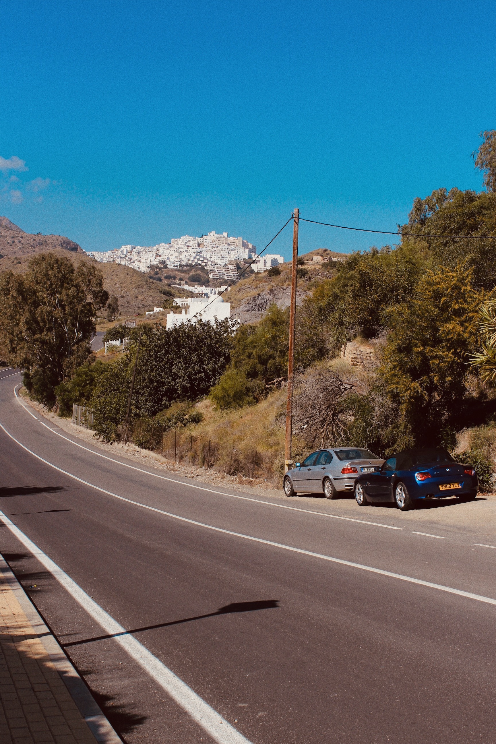
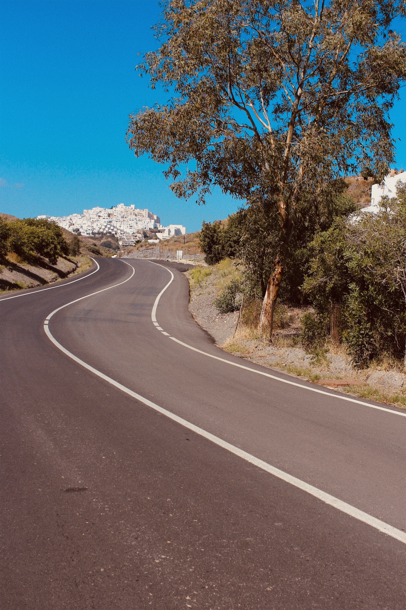
I chose these two images to be paired for one of my final outcomes because they respond to The New Topographic, which I have been focusing on through the ‘journeys and pathways’ project. The New Topographic relates to the project because it is showing man altered landscapes, often connected by roads and urban developments.

These two images present the same subject from two different viewpoints. The building appears as a substantial part of each scene emphasising the dominance of urban structures over the natural features. Cables form an integral part of the urban landscape dominating the skyline, competing with the natural beauty of the palm trees.

For my first pair of A4 images, I will be displaying them onto white card because of the clean and simple look it creates. The white card will match the white building that can be seen on both images.
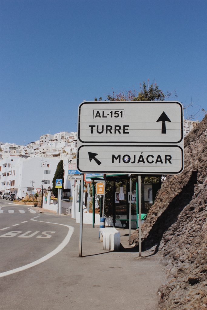
This pair of images also respond to The New Topographic but are from a different photo shoot. The image on the left depicts a sign showing the direction into Mojacar town. Road signs are often seen in photography work labelled The New Topographic because they appear as intrusions in the landscape being both bold and obnoxious. The image on the right depicts a close up view of the white washed houses that can be seen from a distance on the left hand image. The houses appear cluttered and demonstrate the impact people have on the landscape and how urban development is increasingly taking over.

For my second pair of A4 images, I will be displaying them onto white card. The white card is colour coordinated with the road sign and the moorish houses. I didn’t select black because it would create contrast and fail to produce the simplistic look that I’m after. Additionally black would clash with my images.

A4

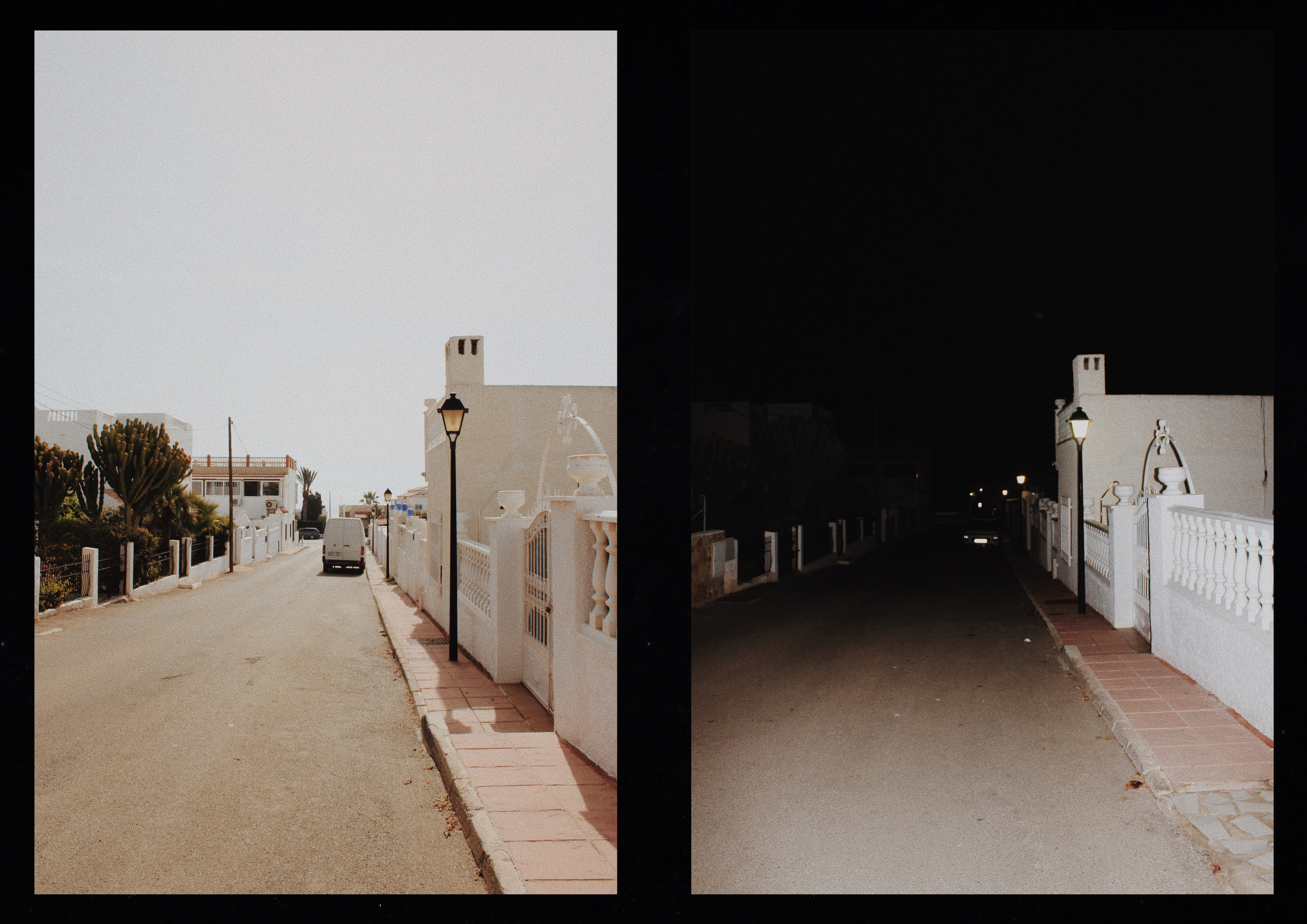
I wanted one of my final outcomes to show my response to Luke Fowler who creates two frame films which are juxtaposed yet linked to each other in pairs. This pair is different when it comes to the lighting but the same in composition and subject.

For my third pair of A4 images, I will also have a window frame to reveal the images. I decided to use black card to replicate Luke Fowlers style of two frame film. The black card will frame these two images together and replicate the photographers style.

A5

I have experimented in the project ‘journeys and pathways’ by taking pictures throughout the day every hour. Taking pictures of the tide every hour was one of my strongest outcomes because it shows the journey of the tide from high to low. The composition in each photo is the same and the viewer can see the gradual progression of change.

For my last set of images I decided to mount them onto white card to keep it simplistic and so the viewer can focus on the movement of the tides. Before mounting them onto the card I will stick each individual photo onto foam board so the images appear raised to capture the viewers attention.

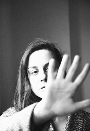
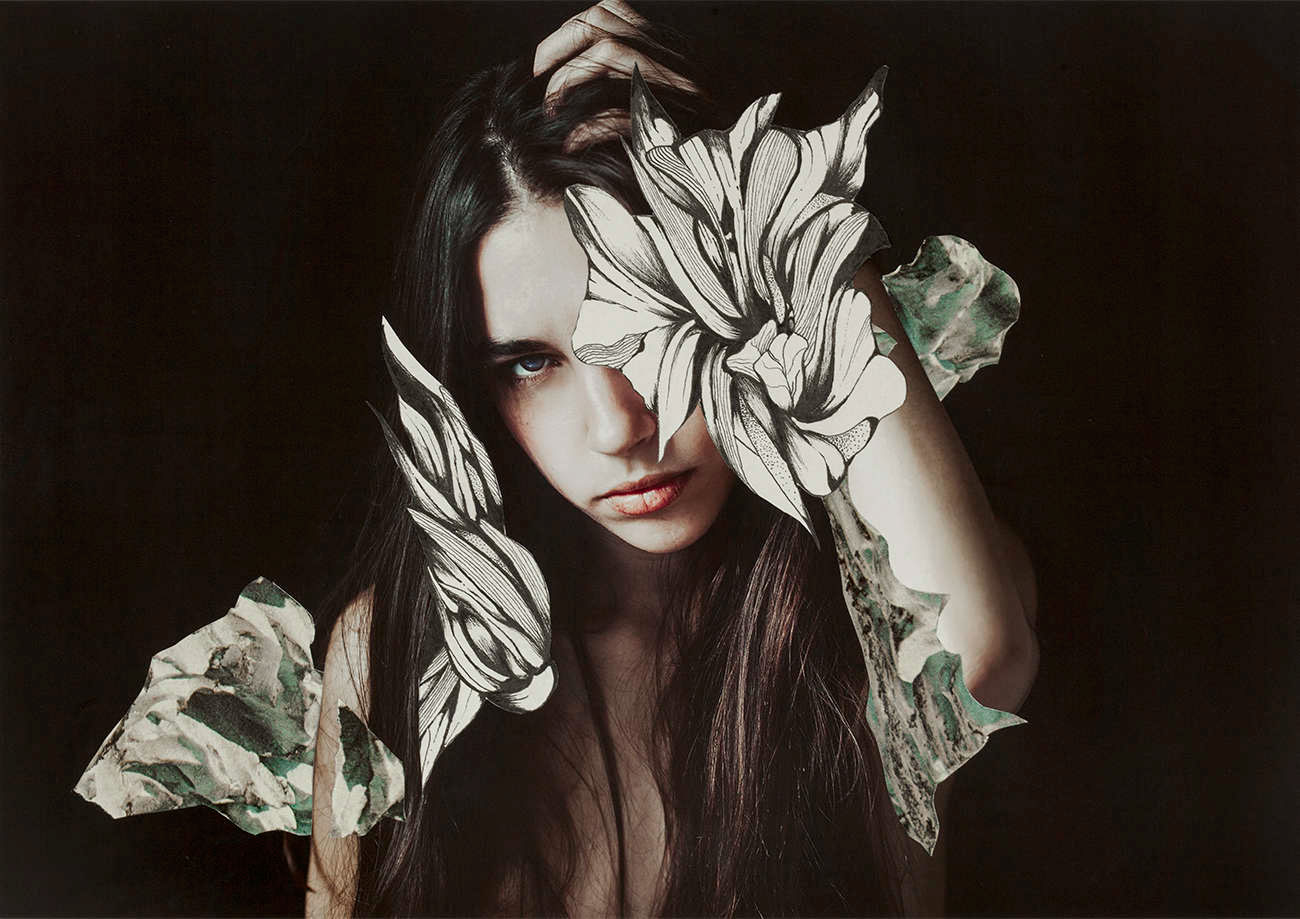
Rocio Montoya

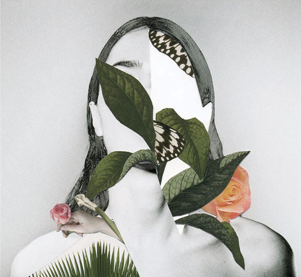
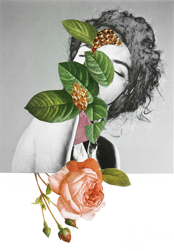
“Rocio Montoya (Madrid, 1983) is a photographer, graphic / web designer and editor based in Madrid, Spain. Her specialty is the experimental photography, land on which has moved from its creative inception. Also passionate for the editorial design, in 2010 she founded DOZE Magazine, which has co-directed and designed until its closure in June 2014.
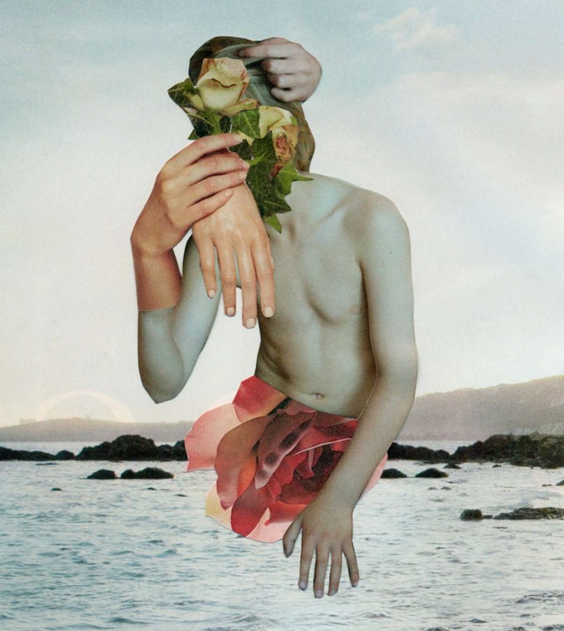
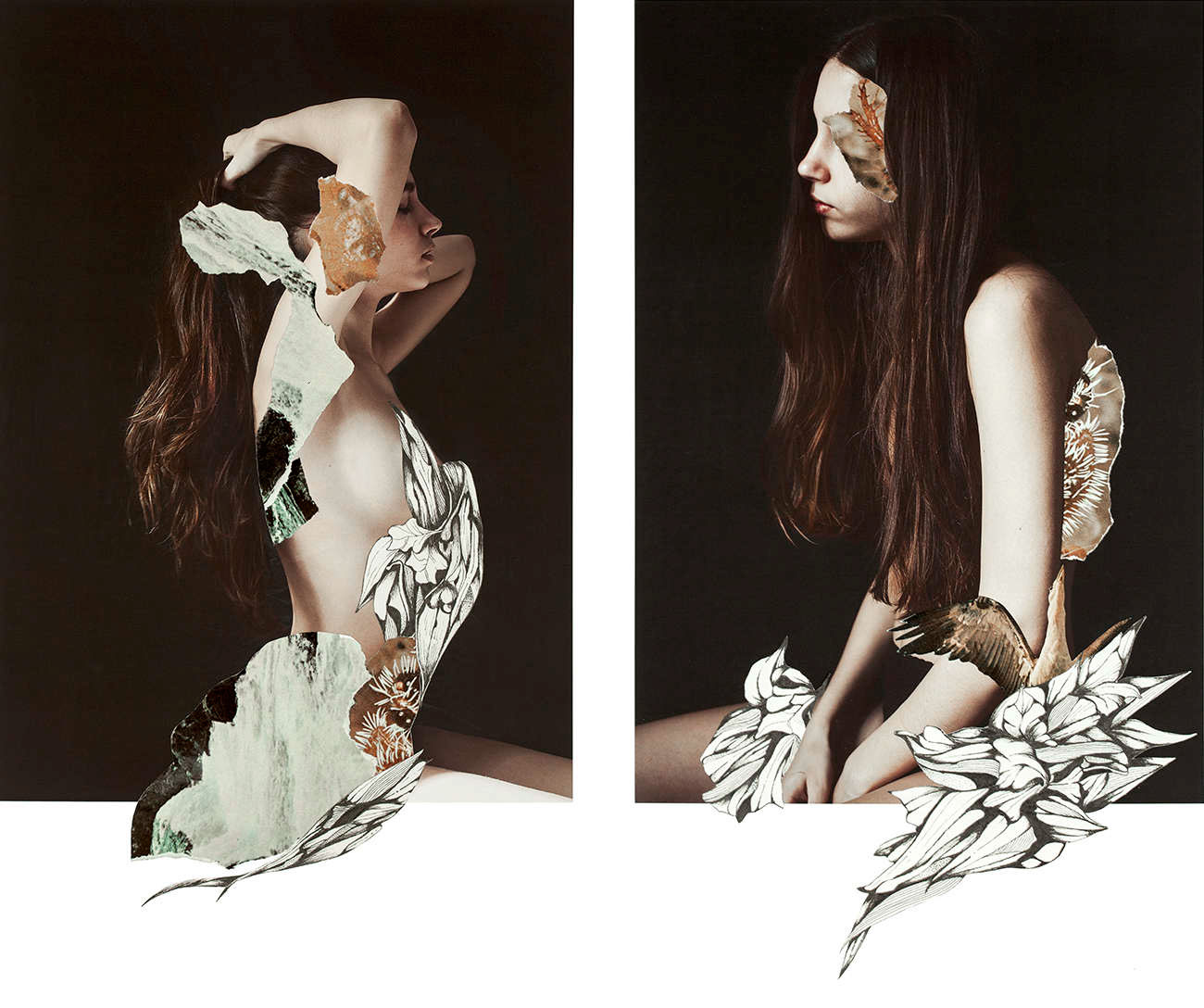
Her interest is particularly focused on the portrait, approached through different plastic techniques and always with photography as the essential basis of each final artwork . Throughout her career as an artist she make a personal exploration of behaviors and emotional states of the human being, transforming reality by manipulating the image to convey their perception of the environment through aesthetic experiences.

She immersed herself in the field of visual arts by curiosity to express her concerns and the need to seek beauty as a means of escape and personal enjoyment. Her admiration for painting and surrealism is evident in addressing their creations, which you can see a clear trend to recreate atmospheres and distant situations to pure documentary reality, characterized by a delicate, haunting and poetic graphic style.

The human body in synergy with nature, the female figure and the loss of identity are the conceptual basis of her work.

One of her most recent interests is illustration, a field in which she began to submerge more conscientiously in 2018. With techniques such as watercolor, graphite and gouache Rocio has tackles new creations with a powerful chromatic charge and with women again as protagonists.

In addition to her personal work, Rocio Montoya has done numerous fashion editorials and has worked as a newspaper photojournalist.”
https://rociomontoya.com/bio/

Examples of Her Work:

Rocio Montoya

Rocio Montoya

Rocio Montoya

Rocio Montoya

Rocio Montoya

My Response:

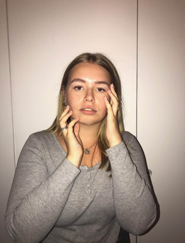
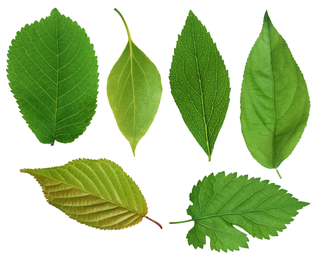
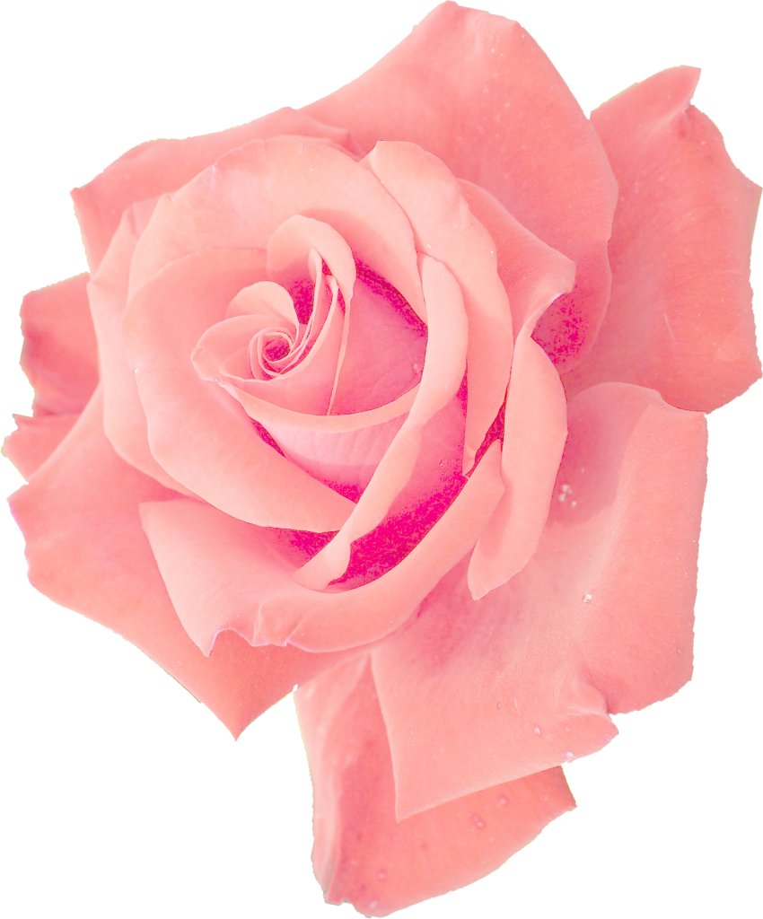
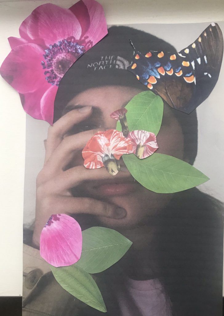
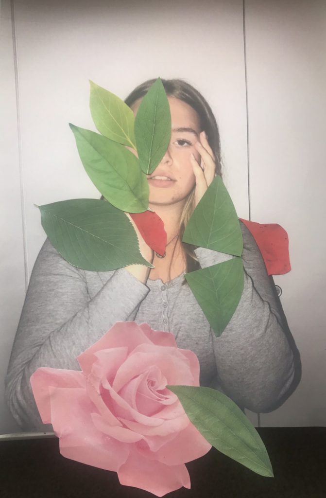
For my response, I will be printing out the photos and sticking photos of plants and vines onto the photo of the models. I will be linking it to the journey of life, the flowers and vines coming out of the models represents life itself.

Photos I Will Be Using:


https://www.onlygfx.com/6-pink-rose-png-transparent/

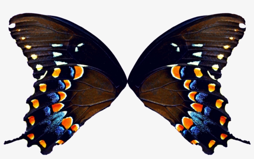
https://www.pngkit.com/view/u2w7a9t4w7w7q8e6_butterfly-wings-png-butterfly-wings/

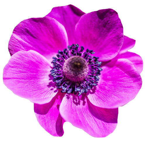
http://www.pngpix.com/download/flower-png-transparent-image-3

Final Outcomes:

Overall, I am really happy with how these photos came out. I think they capture Montoya’s style very well. I think if I had done them on the computer they would’ve looked a bit better, but I still like how they look on paper.

Day & Night

For my second response to Luke Fowler, I decided to take pictures in Mojacar during the day as well as the night. When two images are exposed in one frame, the viewer is able to see the relationship between the juxtaposed photographs.

I captured images during the day under natural light and used flash photography for some of the night time shots when there wasn’t enough light source to capture the image. When returning to the same location during the night, I had to make sure that I was in the same postition to get the exact composition as the day time image.

On Photoshop I included a black frame that surrounds the pair of images to replicate Luke Fowler’s two-frame films. I edited the images on VSCO to create a film effect to replicate his photography style.

Evaluation

Overall, I think the side by side comparison of the two images in day and night was successful because you get to see the same location under different lighting. The black frame helps to link the two images together while the comparative images using different levels of lighting creates contrast to emphasise the juxtaposition.

In order to improve upon my technique, I would change the order of my photoshoot and capture the nocturnal images first of all. A number of my night time images weren’t clear due to inadequate lighting, blurring and the limited range of the flash. After capturing clear images at night it would be much easier to replicate the same composition during the daytime. Additionally I would ensure that I had a tripod available to maintain camera stability and reduce movement that made some of my photos blurry.

New Topographics: Photoshoot 4

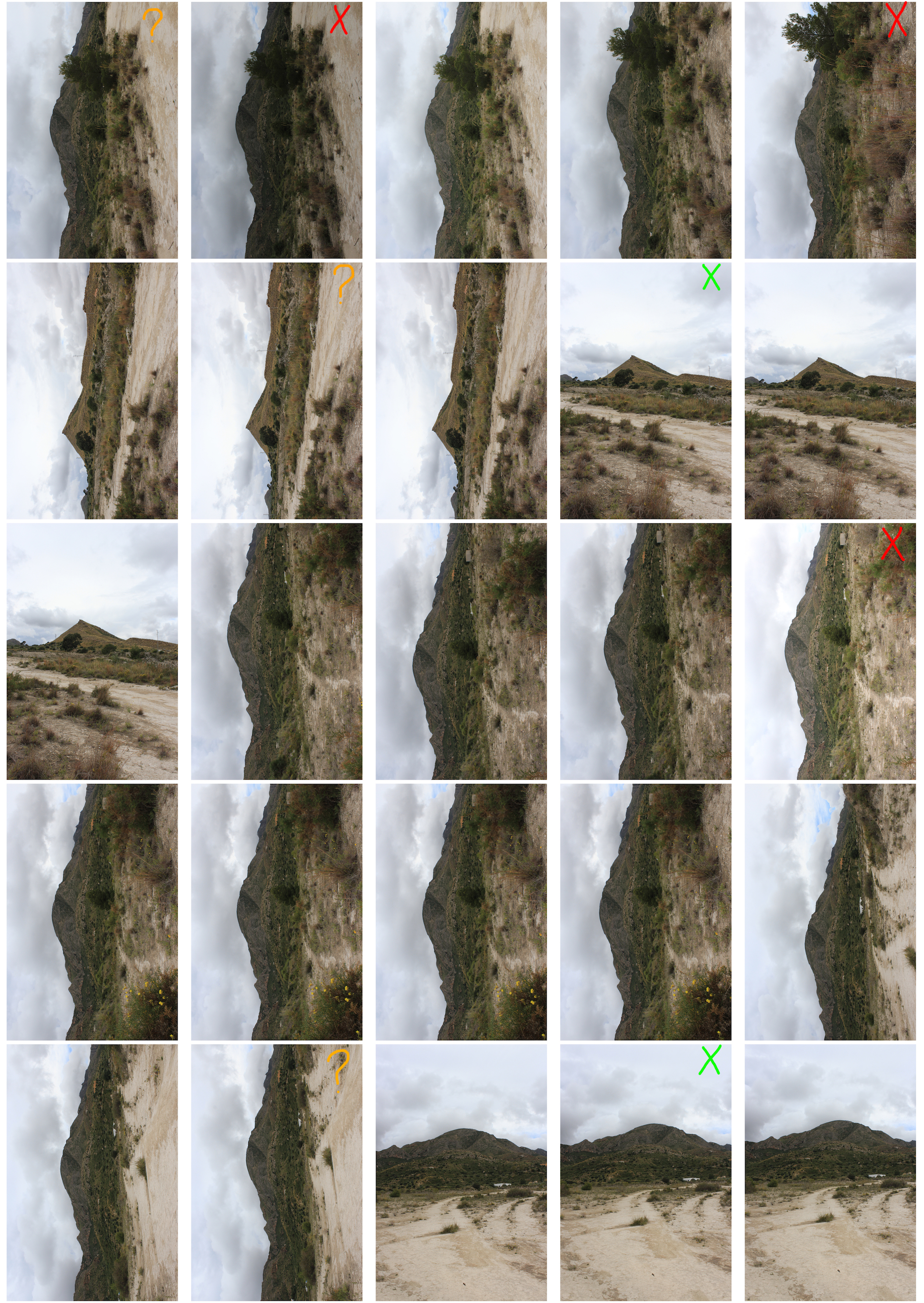
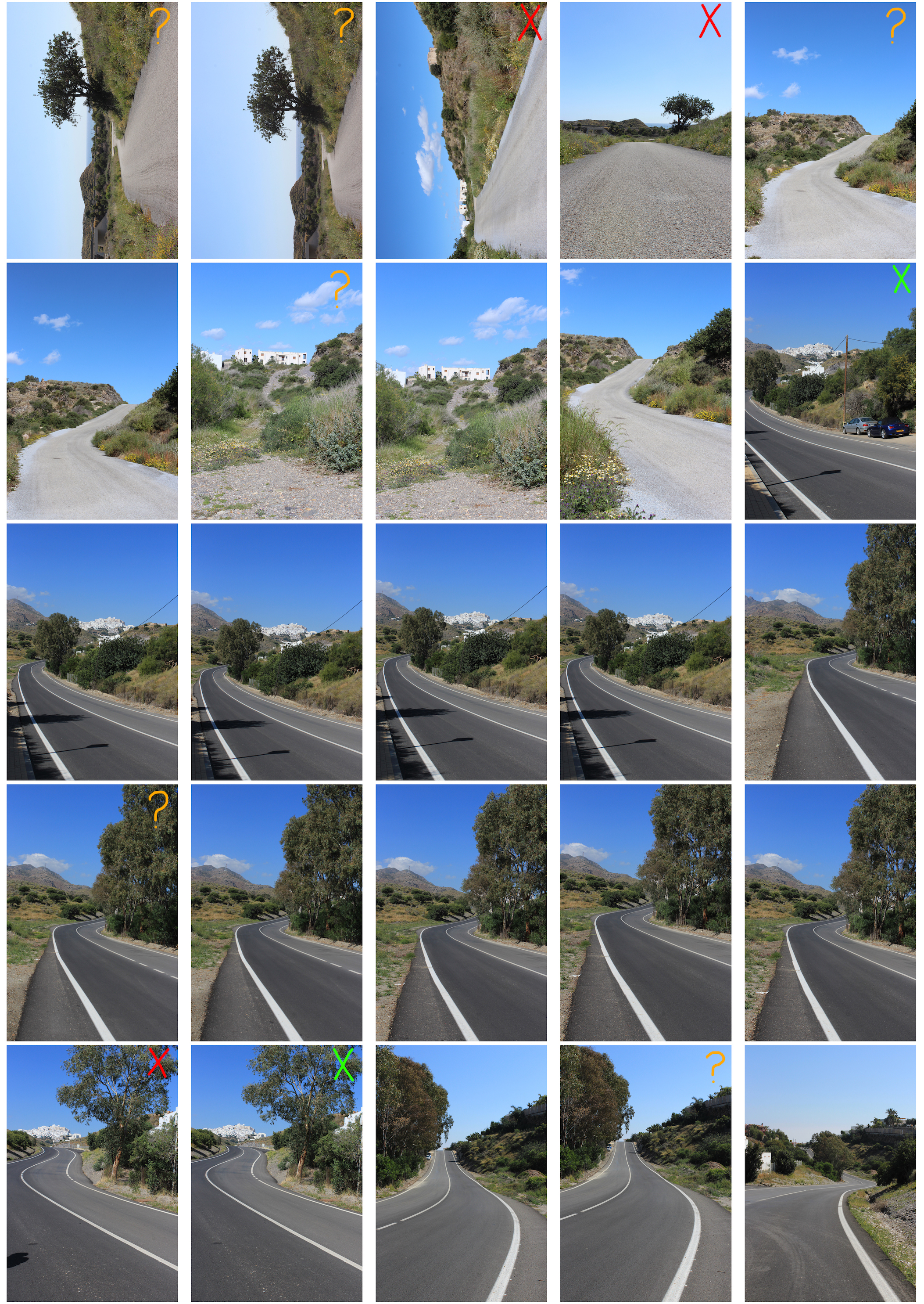
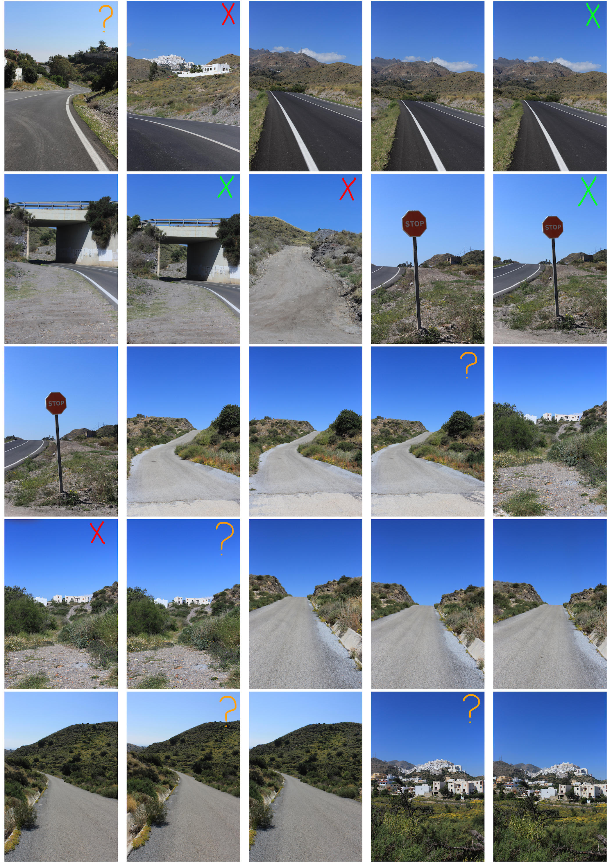
For my last photo shoot, in response to The New Topographic, I captured images of the mountainous landscape in Mojacar. However, in many images you can see how vehicles have destroyed the surface vegetation creating dry, compacted patches of dirt. Although the mountains and shrubs create a beautiful landscape, they have been partly destroyed by human actions. The destruction of the natural landscape links to The New Topographic because nature has been steadily degraded by mankind.

Like all the previous photoshoots in response to The New Topographic, the images have been edited on VSCO with filter and grain.

Contact Sheet
My Response

New Topographics: Photoshoot 3

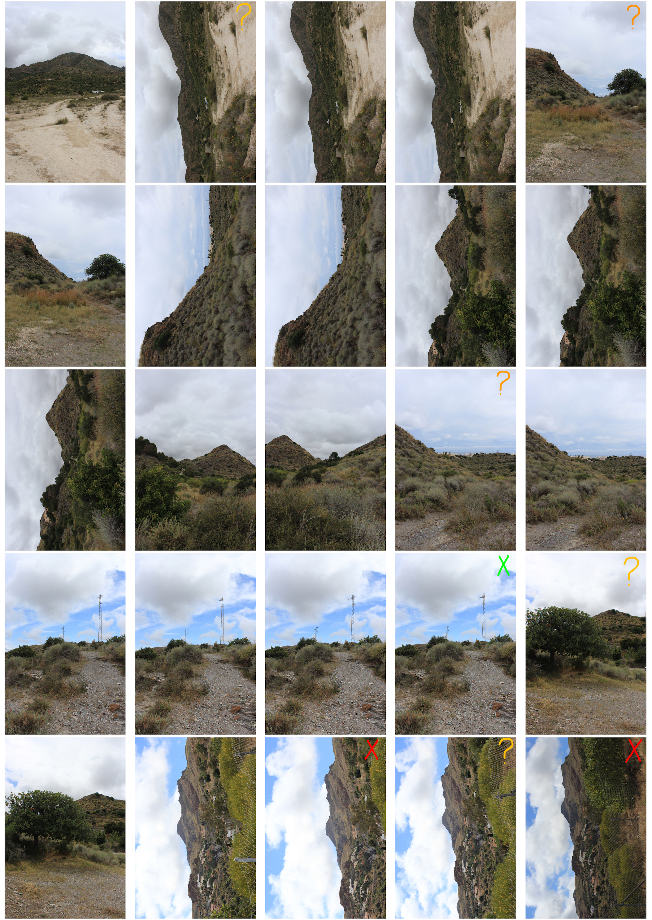
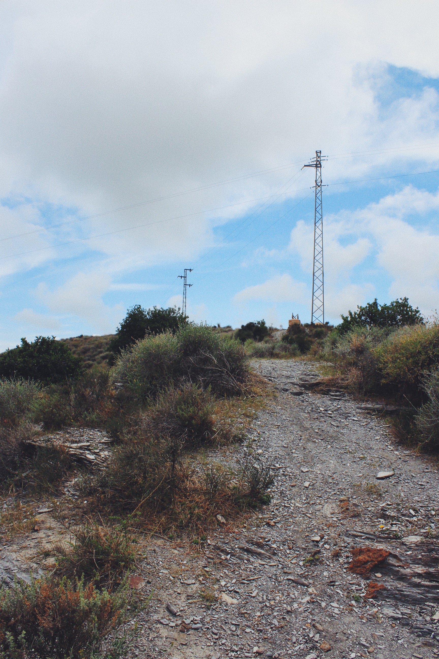
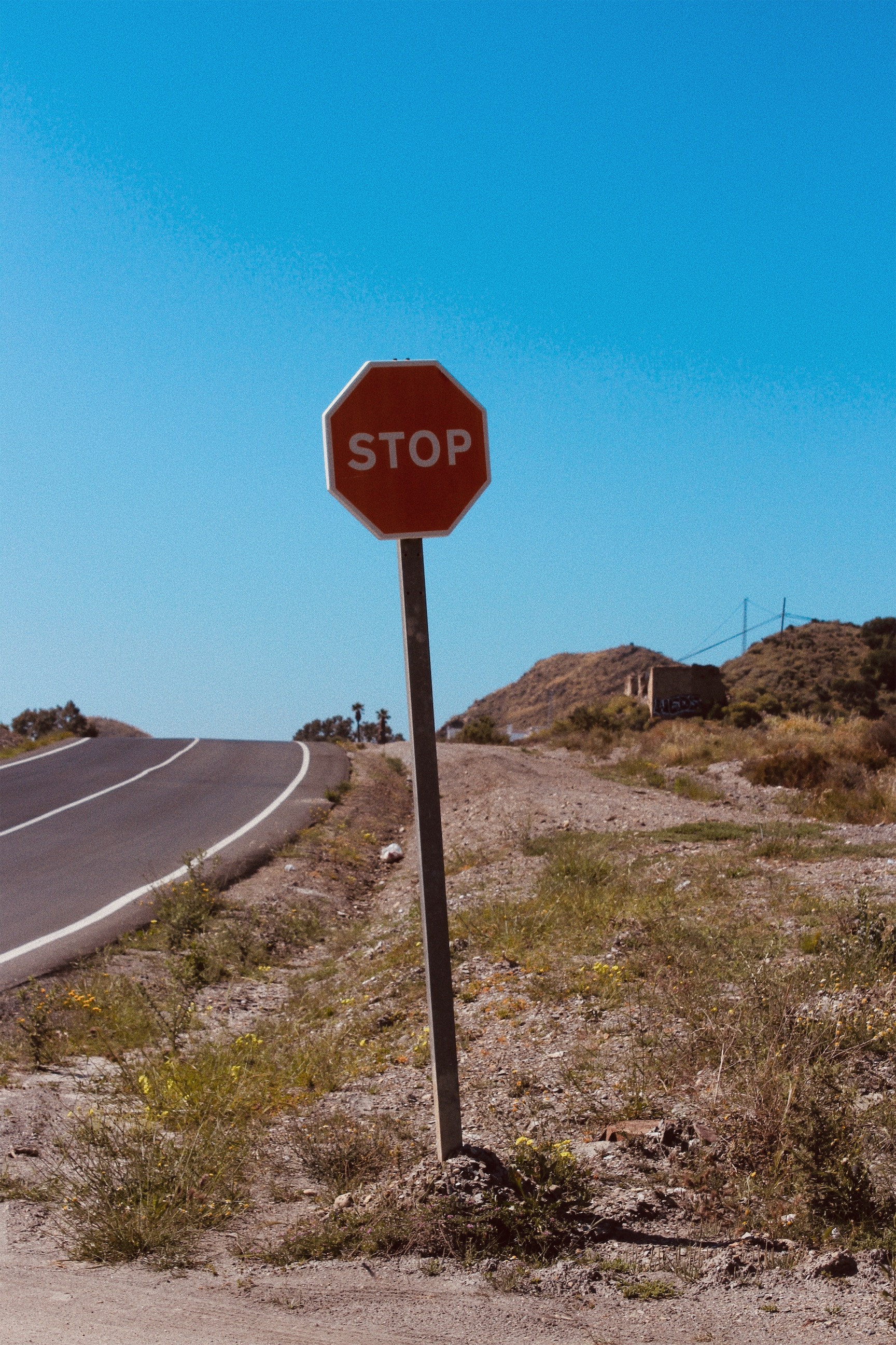
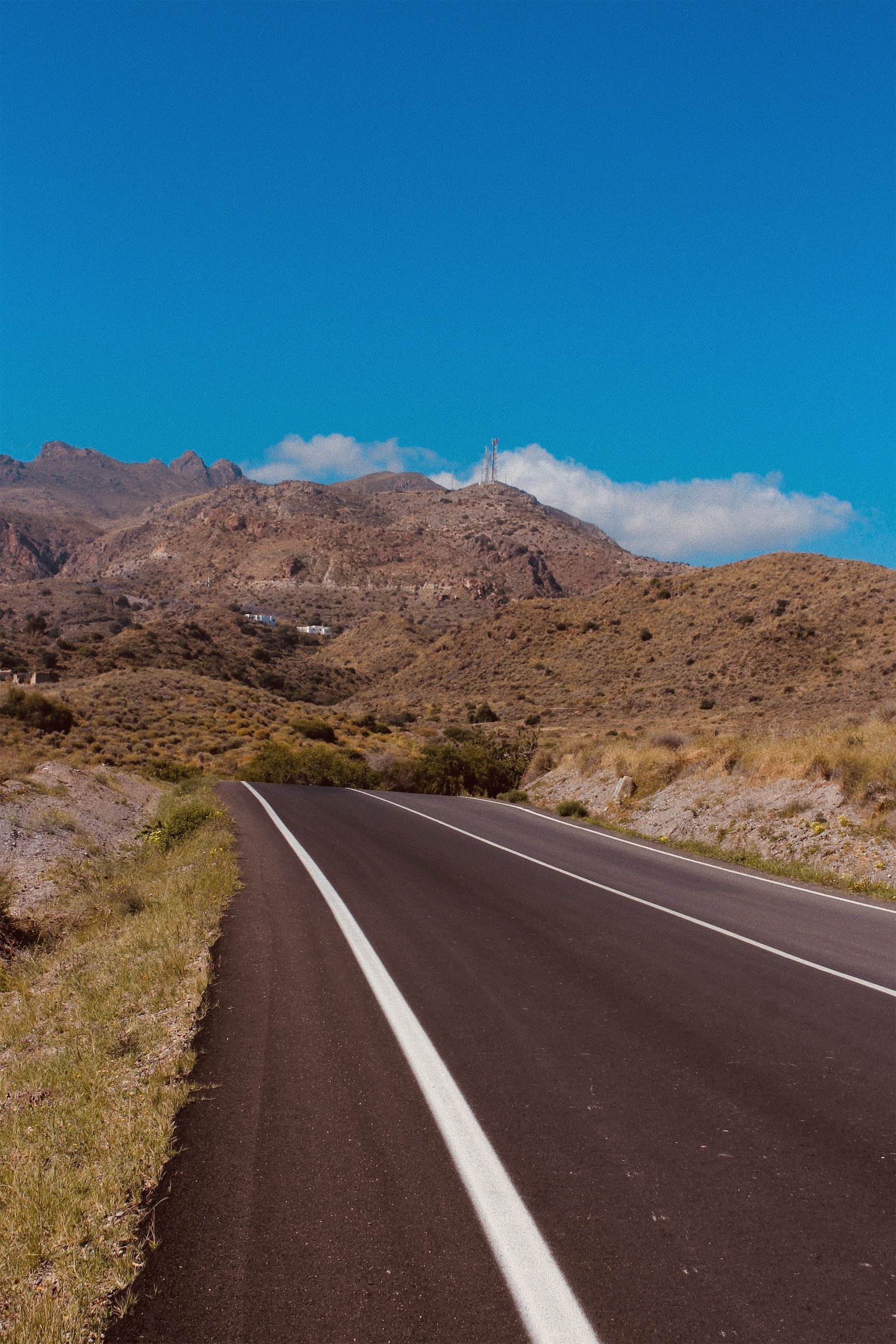
For my third photo shoot in response to The New Topographics, I decided to capture images in Stephen Shore’s photography style. He was known for his use of colour in photographs to increase the sense of detachment. Shore would often photograph intersections and roadside landscape.

I captured several images of the roadside landscape in Mojacar. All the images depict how man has altered the land by damaging vegetation and constructing roads. The combination of nature and urban development emphasise the concept of man having control over the landscape.

Once I selected the best images on the contact sheet, I downloaded them onto my phone and added the filter vivd warm because of the intense warm effect. This replicates Stephen Shore’s use of colour in his photographs and the film effect. The filter also intensifies the blue sky making the image appear vintage along with the grain.

Contact Sheet
Final Outcomes
Evaluation

My final outcomes have been successful because they reflect the control and power humans have over the landscape. The images depict a landscape altered by humans and reflect the growing unease about how the natural landscape is being eroded by urban growth. Works labelled The New Topographic show the relationship between man and nature through the photographic documentation of anthropogenic influences upon the land and scenes of suburban sprawl. The banal aesthetic can also be seen through the simple compositions of my photographs. The barren nature of the landscape in the southeast corner of Spain emphasise the monotonous uniformity of the urban features laid upon it.

My Recreations of my Images

These are the selection of images that I will use as my final piece. After manipulating the images on adobe lightroom and adjusting settings such as contrast, vibrancy, highlights, shadows, whites, blacks, cropping, changing to monochrome, saturation, vibrancy and clarity. 

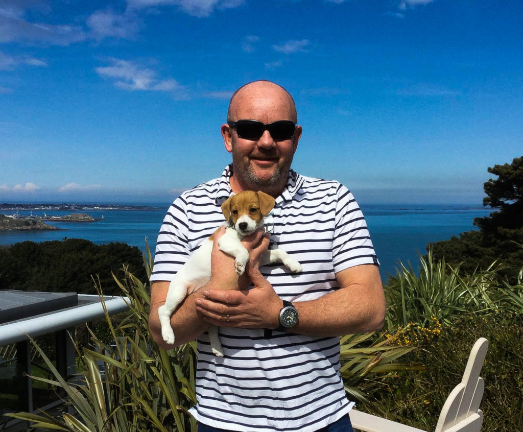
The first two images that I have inserted below are similar to the original image in terms of the subjects are both holding animals in both the old and recreated photo, a similar(ish) stance is also replicated in the new photos and the emotions/ facial expressions are similar. The images are of my dad. My dad has always shared a love for animals, and these images clearly portray that. Unfortunately animals don't tend to have a long life span, however these images show that although death occurs, life can also begin as other animals are brought into their lives.


For the images of my dad, the original image was taken on his travels in Australia. There aren't any koala bears in Jersey anyway, however I still wanted to replicate my dad holding an animal so I thought it was best fit that I recreated him holding my dog Salty instead. I like the colour scheme in both the images, it's almost like the denim blue of my dads shirt in the first image swapped with the background of the recreational image, and the white background of the original image swapped onto my dads t-shirt in the recreational image. I also like how both the koala bear and the dog are looking in the same direction. I also took this photo on my iPhone 7.
I decided not to recreate this image of myself, my sister and my grandma, and instead just simply rework into the image. I am inspired by Carole Benitah's 'à la plage'. Especially the cut out of the figures in it. What I plan to do is to cutout my grandma from the image, then sew around her cut out. I will also get a separate piece of paper and place glitter on it. I will then glue the photo on top of the paper so only the cutout of my grandma will display the glitter. My reasoning for doing this is that I want to expand on the negative space. My grandma was also a very glamorous lady, and the glitter can display some elements of that glitter. My reasoning for cutting out my grandma  is that she has now passed away, and although she is in that photo, the loss of her feel like there's almost a hole that's missing from my childhood.
A manipulated image of myself, my sister and my grandma when I was a young child.
For this recreation image, I decided to take some elements of the original image, but change up the image as well. I decided to change the subjects in the image to our family friends, I also changed the location of the image - the original image was taken in Ireland, to our family friends garden, I also changed the angle of the shot to a one closer to both the subjects and to the ground. I like how there are trees in both of the image as it shows that all children no matter what age of time still like playing outside in gardens. I also like how the element of playfulness remains in both images and the innocence that remains in the recreation image. I took this photo with a DSLR camera and used a 50mm lens. 
For this final piece I am incorporating a few elements. I recreated my mum with my little sister, however I decided to keep the school photo of myself and my sister and will be cutting us out with a Stanley knife and then inserting ourselves into the recreational image. I'm doing this because both of the photos of me were taken at a similar time, and I remember meeting my little sister almost like it was recently. Therefore although time has changed and my little sister has grown up, the memory is still fresh and young in my mind. To take the photo I used an iPhone 7.