Displaying my Final Outcomes

Idea 1:

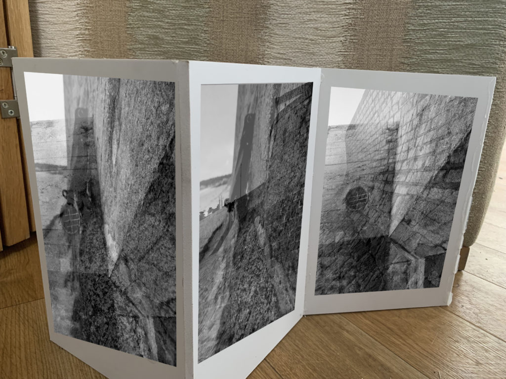
In my first idea I want to showcase my sea wall images using a sculpture/naturalistic style. I decided to get 3 planks of wood and attach them together to almost create a wall, the idea is to stick my wall photographs onto the wall to create a wall. The framing technique itself is abstract and creates a metaphorical meaning, but the images are being displayed in a naturalistic way, as they are not being folder or used to create an object. This juxtaposing idea will help to emphasis the importance of the sea walls during the war and will nicely showcase these successful outcomes. The three images will be printed as A5 images in black and white, in order for them to fit onto the wall.
Idea 2:

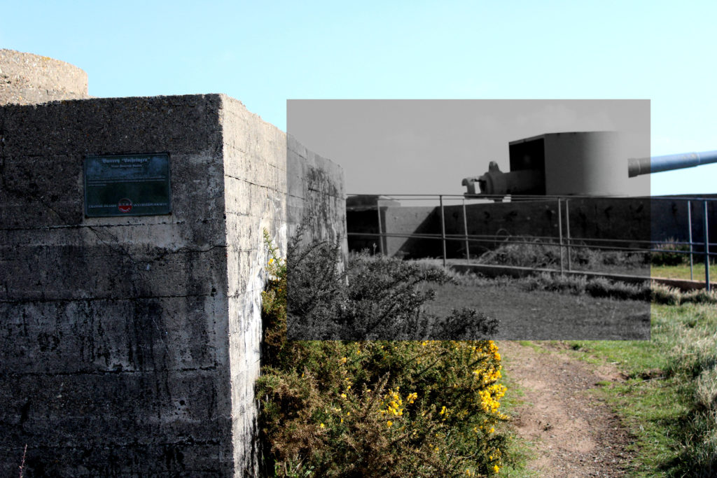
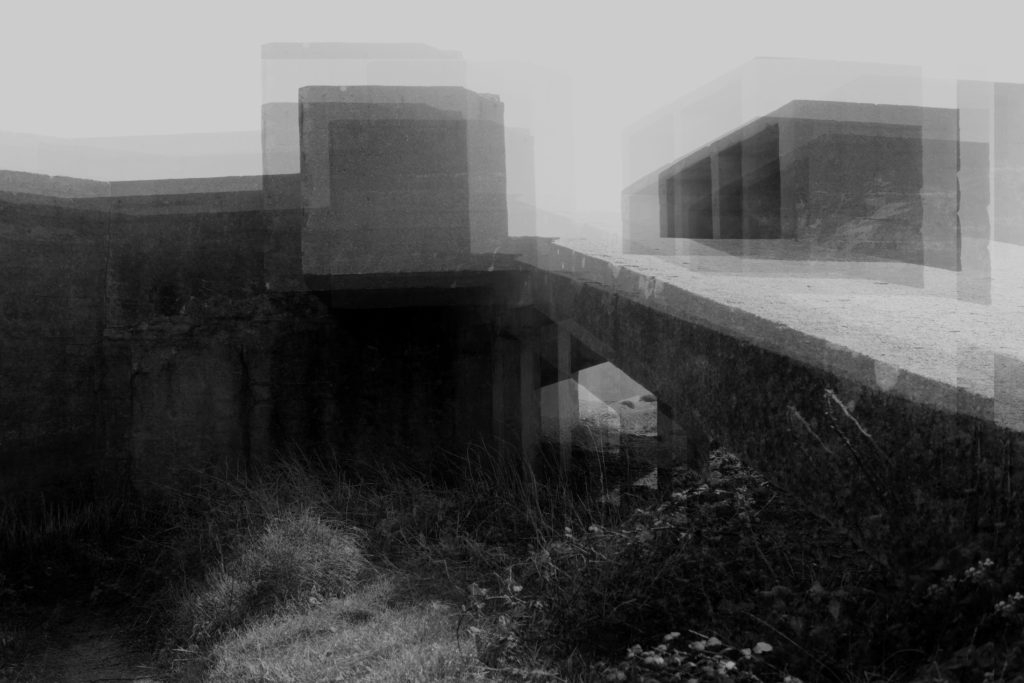
The next idea I want to showcase the most successful outcome, in my opinion, from the project. The abstract photograph was inspired by Khan, and allows viewers to rethink the purpose of the bunkers and reminds us of the purpose of the bunkers during Jersey’s Journey through WW2. The reason why I want to showcase this image is because I believe the edit is interesting to look at due to the distorted look, and how the formal elements work together to create this interesting piece. The image works best alone as it holds a lot of meaning and is powerful enough to stand alone. I intended to print this out as an A3 print and frame it in a black frame, which should help to emphasis the meaning and purpose of the bunkers. I decided to print the photograph as an A3 image as I wanted to showcase the size scale, how the bunkers are a large architecture in real life. Metaphorically, it showcases how the bunkers had the most impact during the second world war, which hold strong links to my project title.

Idea 3:

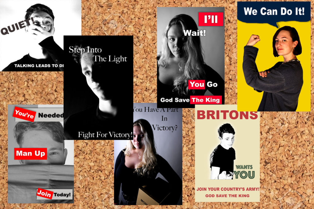
For my next final outcome I want to showcase my 7 propaganda images. I decided to display these images on a cork board in order to show contextual factors of the images. The cork board was occasionally used during the war to display propaganda, in work places and shops, so I decided to implement it into my work. Due to the images being not as successful I have decided to print them out as A5 images, it will ensure that they fit on the board. The photographs all work well together as they manipulate the viewers to believe and do what they say. Although this final piece is not as strong it will still showcase the development of the project and another aspect of Jersey’s Journey through the second world war.
Idea 4:

For my next final outcome I want to create a large version of Talmor’s work, using my images. This outcome will take more of the sculpture route as I randomly place fragments of an image on top of each other to create an overall distorted image, to take away connections and memories from the bunker. I will print out the three images below as A3 images and tear them up, then on a piece of foam board I will begin to randomly place the segments, ensuring the overlap and create a distorted piece. I am printing the images large to remind viewers of the actual size of the bunker and how they had a massive impact in Jersey’s Journey through World War 2 The idea will make the image will showcase formal elements such as form and shape due to the 3D element that it will hold. This idea is another successful photograph manipulation I produced as it clearly holds strong links to the project title.

Idea 5:

For my final outcome I want to display the three images which are in the style of Knez’s photography. I will display the three images by placing them on foam board next to each other with the images being 5cm apart from each other and 5cm away from the edge. This framing method takes the more contemporary route of framing and displaying, allowing the more naturalistic images to be displayed. I have decided to showcase these images as they have strong links to the project title and show my ability to manipulate my images in a different way. I really like the way the three images compliment each other and all work together to showcase how the bunkers have developed since the war and the Journey they have been through. I will print these images out as A4 images, I want them big to showcase the size but not as big as the other bunker images as the outcome is not as strong and as powerful as the other two ideas above.

Mo Devlin

Frozen Posies series

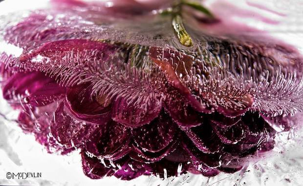
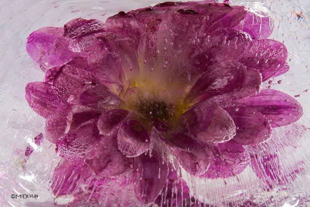
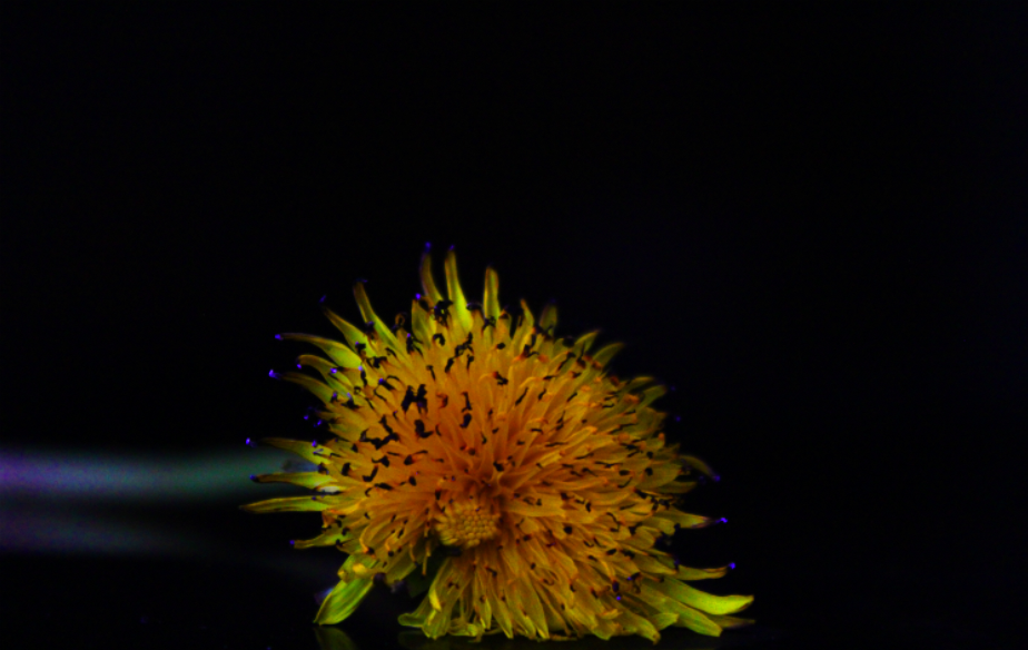
Devlin perfected the art of photographing fish in their aquatic environment. Mastering the dynamic of how light travels through water was only the first of many steps in the frozen flower process. That intense sense of spontaneity Devlin captures is the result of a very deliberate process. These images are not simply stumbled upon, but meticulously created.

Freezing his “models” is the most important part of the process. When tap water is frozen the impurities show themselves as clouded white ice. Devlin experiments and continues to perfect his ability to control the outcome of how the ice forms and captures the subject. Sometimes the bloom itself can be the source of impurity.  Any substance, natural or added to the plant, may cause large areas of clouded ice. Blooms with high sap or sugar content or flowers purchased that have been given a preservative, pose the biggest challenge.

One thing that occurs and is cultivated through his photos is the appearance of “ice trailers.” These are simply bubbles that have been squeezed out of the organic material then stretched as the freezing process continued. The science behind their formation is amazing.

Flowers add to any room a feeling of beauty and grace. They are delicate beings, alive with sensuality. Mo Devlin’s Frozen Flowers capture all that and more. The ice adds a “look again” dimension to this gorgeous photography that draws us in and fires our imagination.

MOOD BOARD FOR STEPHEN GILL

Mood boards showing a mixture of Stephan Gill’s work. His work shows clear use of double exposure giving a strong and powerful effect to the images. He also presents the idea of overlaying different images, almost giving an ink splodge effect. I believe this to add great detail to the image and it add excitement and sense of individuality as if differs from the norm photograph that a regularly taken. To me, a lot of Gill’s photographs have a rather cold feeling towards the image with over exposure commonly used i the background to enhance the contrast between the light in the background against the dark (often black) markings on top. This clearly helps emphasis all the aspects of the image creating a more visually pleasing image.

Ideas and questions to ask myself when creating my own work inspired by Stephen Gill

Top Outcomes from ‘The Journey of Jersey through the Second World War’ Project.

Sea Wall:

The three images below are my top outcomes from the sea wall photo shoot and edits, inspired by Gina Socrate. The photographs are considered successful as they showcase my ability to use and adjust camera settings for effect. It shows my ability to use different depth of fields, focus points and experimentation with different formal elements. The double exposure technique in these three photographs all clearly show a clear message of how the sea walls changed and developed during the second world war. In addition, the technique creates a unique and interesting outcome which changes our perception of the sea wall, justifying how they are successful.

Bunkers:

The next few images showcase my successful experimentation with the bunker images, which showcase another stage is Jersey’s Journey through the second world war. All of the images take a different approach to the idea, but are all as strong, in meaning, as one another. The four images have all been inspired by artist research and showcase my favorite outcomes from the bunker photo shoots. They can be considered successful as they show my ability to use different tools and approaches to manipulate my images, moreover it shows my competence to use and adjust camera settings for different effects.

Propaganda:

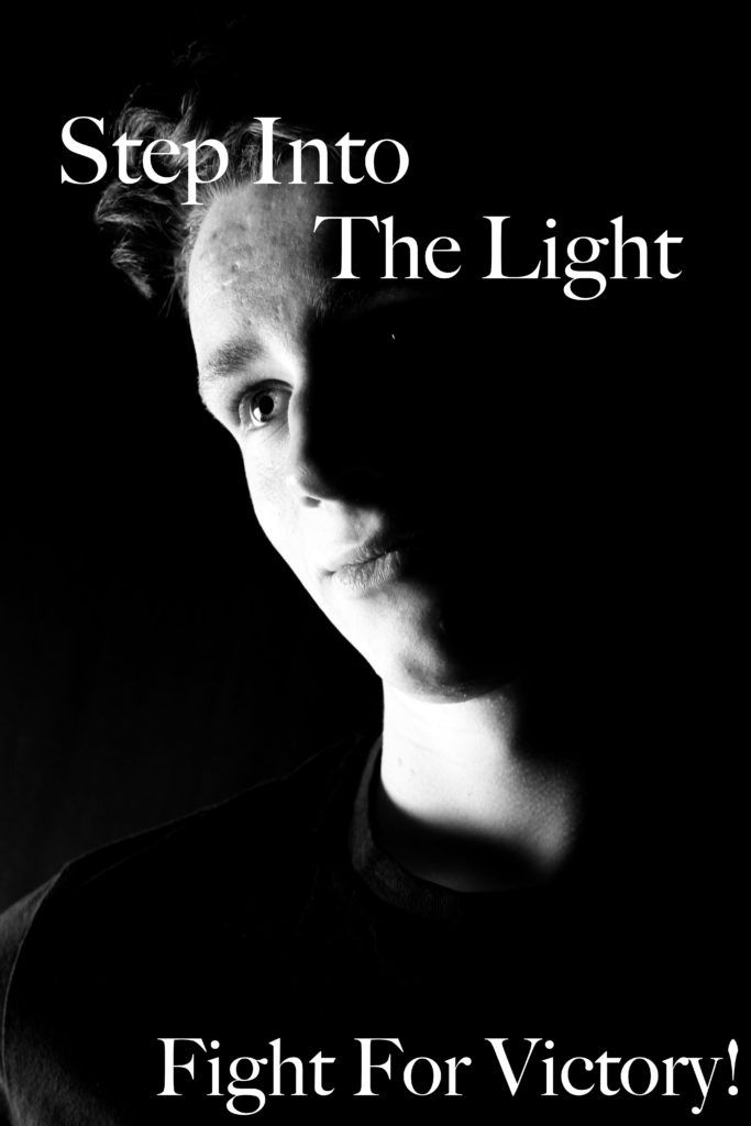
The next photo shoot and approach I took was looking at propaganda and the impact it had in Jersey’s Journey through the Second World War. Although the imagery is successful, I do not believe that it is as strong as the bunkers and the sea wall, due to the less links it has towards the project title. However, the images are successful as they showcase my ability of studio photography and the use of artificial lighting to achieve effects such as chiaroscuro. In addition, it shows how I am able to take a graphics design approach to manipulate my images.

How To Display Images

Contemporary Approach:

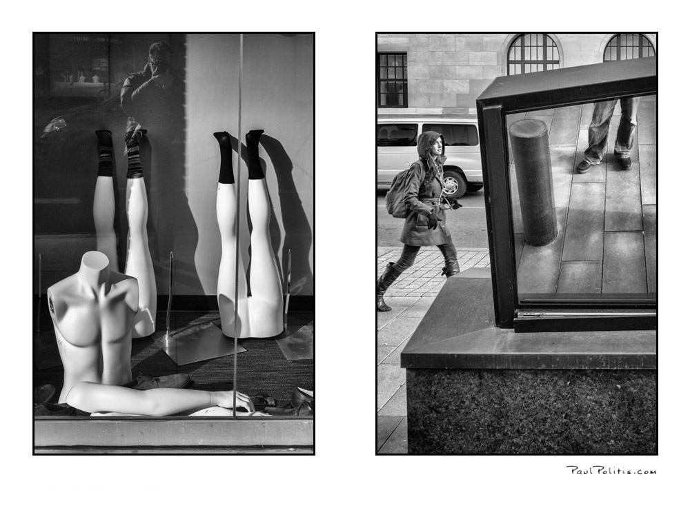
The contemporary approach to displaying images is very naturalistic, and is the method used the most often. This is simply displaying images in a frame, window mount or next to each other. The simplistic method of framing allows the imagery to be shown off and the meaning of the photographs to clearly be displayed. This method should be used for more naturalistic photographs and any high quality images which showcase good camera skills and successful editing technique.

Sculpture:

Using sculpture to display our photographs is the opposite to the contemporary approach. This his when we use images to sculpt a bigger image or object. The method is much more hands on and showcases our photographs in a new and different way. This method can be considered more abstract but, showcases imagery in a unique way. Sculpture is most appropriate when wanting to display abstract images, images that work together and photographs which can be used to display the meaning in a different way.

Diptych/ Two Frames:

The diptych method is when you display two images next to each other, which usually work well together or juxtapose one another to convey an overall meaning to the two images. The method of displaying these images is very much taking the contemporary route, so the imagery and framings is more naturalistic.

Triptych/ Three Frames:

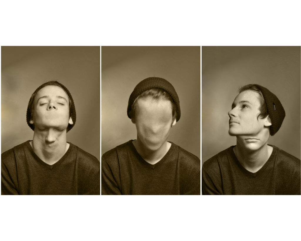
The triptych method is when you display three images next to each other, these photographs usually work well together or juxtapose one another to convey an overall meaning to the two images. The method of displaying these images is very much taking the contemporary route, so the imagery and framings is more naturalistic.

Grid:

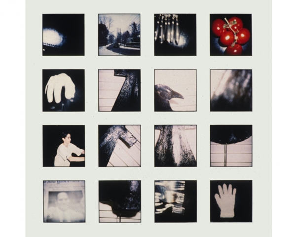
This method of framing is when we display multiple images together, as these images are apart of a photo series, work well together or juxtapose each other to convey an overall meaning to the two images. The method of displaying these images is very much taking the contemporary route, so the imagery and framings is more naturalistic.

Eclectic:

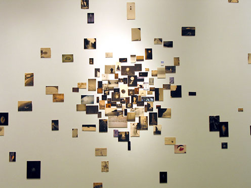
The Eclectic method of displaying is when we display multiple images of different sizes, shapes (landscape and portrait) in a random (spread out and different locations) manner in order to present a series of images. Usually these images are apart of a photo series, work well together or juxtapose each other to convey an overall meaning to the two images. The method of displaying these images is very much taking more of an abstract route to framing due to distorted and unorganised layout.

The New Topographics

The New Topographics: photographs of a man altered landscape

The New Topographics was a term created by William Jenkins in 1975 to describe a group of American photographers such as Robert Adams and Lewis Baltz. Their pictures had a similar banal aesthetic, in that they were formal, mostly black and white prints of the urban landscape. They brought a new perspective to landscape photography that focused on an objective documentation of locations.

These images of the man altered landscape carried a political message and reflected the growing unease about how the natural landscape was being eroded by industrial development and the spread of cities. Work labeled New Topographics emphasised the relationship between man and nature through the documentation of Industrial intrusions on land and scenes of suburban sprawls, motels and parking lots.

These New Topographic photographers were less concerned with portraying an ideal image of nature and were more interested in showing plainly how man has altered it. They were photographing against the tradition of nature photography.


Theme of Landscape Urbanization

WHAT IS LANDSCAPE URBANIZATION:

Over the years, numerous landscape studies have described the impacts of urbanization, such as fragmentation of habitats, loss of farmland and loss of historical connections and previously coherent cultural landscapes. Thus, the story of how landscapes fall victim to urbanization (and, more generally, to the march of societal progress) has been told and retold. While the object being lost varies, the overall story remains the same. The course of events seems to have been decided in advance: landscape sacrificed for the progress of cities. The process of urbanization is thereby depicted as a fight between city and countryside, a fight in which the countryside loses every time. Rural landscapes of the past are set in contrast to advancing suburbs, shattered habitats, shrinking farmland and placelessness. Documenting, analyzing and raising public awareness of losses of past landscape qualities is no doubt an important task for landscape research, but is it the only one?

Urbanisation: Reductionist approaches to urbanisation have come to focus on quantitative measurements of a limited number of parameters for such a long time that these limited and very specific insights into urbanisation seem to have affected (or even replaced) the very idea of a complex and multidimensional process. This issue provides richer illustrations of the process by widening the scope of the features studied.

Landscape: Rather than viewing landscape as a passive arena for urbanisation, this special issue discusses the complex role of landscape and engages in landscape theory to gain a greater understanding of the processes of urbanisation.

Histories: With histories, in the plural, this special issue opens the way for a more diverse understanding of urbanization, beyond the standard modern perception of urban progress/expansion and rural decline. While these three concepts form a common base, use of relational thinking in the papers included in this special issue offers ways of altering and revisiting existing ideas of landscape, histories and urbanization.

LANDSCAPE URBANIZATION IN PHOTOGRAPHY:

Plan for photoshoot two

For this shoot I will be using 35mm film as it is the closest method I can use to how Adams took his photos. I will aim to produce 72 images with one roll being in colour being mainly based in the alps then with the second roll roughly 10 images from it will be taken in the alps and the remaining frames will be taken in the marsh lands near me as it is a natural site and there will also be some taken of a cliff face and large rocks.

PROJECT 2- STEPHEN GILL

Stephen gill born in 1971 Bristol, UK began his love for photography at an extremely young age due to the influence from his father and his interest in insect which created Gill’s initial interest with collecting bits of pond life to inspect under his own microscope.

Gill now focuses on his inspirations from the surroundings of the inner city life in East London and heading towards looking at Sweden as well and looking into the idea of reflecting and portraying images that help describe and emphasis the times we are currently live in. His work is often made up of long-term photo studies exploring and responding to the subjects in great depth. Throughout his career Gill has experimented with a large array of trials for examples, he mainly worked with black and white imagery from 1984 then followed by a lot more colour interpreted in his work in mid 1990s.

It’s said that until around 2003 his work has been said to have an extremely descriptive and typographical approach towards the subjects.

After working mainly in black and white from 1984, his practice since the mid 1990s was mostly in colour.Eight of his photo studies made between 1997 and 2003 were assembled and published as chapters in a book called Field Studies in 2004, which also toured as an exhibition. As previously mentioned Gill enjoyed to experiment and in January 2003 he bought a Bakelite 1960s box camera produced by Coronet for only 50 pence from Hackney Wick Sunday market, which was near where he lived at the time. The camera had a plastic lens, and lacked focus and exposure control.
Over the next four years he had used the camera to photograph within the extremely varied environment of Hackney Wick, including waterways and allotments; and to make portraits of people at the Sunday market and who lived and worked in the area.

It was then announced that the area Gill had been focusing his photography on would be redo eloped for the 2012 summer Olympics and 2012 Summer Paralympics.

Gill claims that this finished body of work was steered, informed and shaped by the place itself. And his approach to making the work was more reacting, responding and being carried by the subject rather than seeking out ideas that were already formed in the mind. This stage of photography he named as an idea as starting over or walking away from the old. It was important that his content was first as he believed it played an important role in rather than the technique.

An obsession with this part of London lasted over ten years and led to many different series including – Hackney Wick, Archaeology in Reverse, Warming Down, Buried, Off Ground, A Series of Disappointments, Talking to Ants and Best Before End.Best Before End looks at the phenomenon of energy drink consumption. This time rather than describing the subject, Gill used the drinks as an aid to make the finished images as the negatives partly processed in energy drinks of different kinds. It allowed the drinks to shift and alter the images with a small amount of manual intervention.