Journey of Urbanization/Unknown journeys: Landscape Romanticism 3

HOW: For this photo shoot, I used my regular DSLR camera in order to capture the images.

WHERE: These images were taken again at Sorel point in St.John where I conducted my first photo shoot, this time focusing on the granite mining site there.

WHEN: This image was taken during the early/mid morning meaning that the shadows which are cast are at a very steep angle, giving different shadows than if it were to be taken during mid-day.

WHO: I attempted to incorporate both the landscape and people into my work, being representative of the human impact upon Jersey.

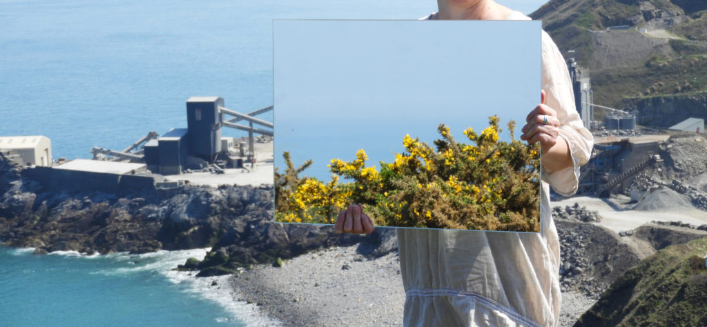
WHAT: The difference between this photo shoot and my previous which included the mirror is the inclusion of a model which is symbolic of the human impact on nature and landscapes.

WHY: One of the themes which I was trying to convey through my work was landscape romanticism therefore I tried to capture the sublime nature of the landscape and how it has been altered through man-made forces which are clearly reflected in the mirror.

MOST SUCCESSFUL IMAGE:

CRITICAL ANALYSIS:

VISUAL:

The first thing which strikes the viewer whilst looking at this image is the mirror which is in the hands of the model, in it we can see the reflection of the Ronez quarry plant. This was the exact point which I wanted to capture in my photography, the impact we humans have on the landscape itself. The plant itself is mining away at the side of the cliff, excavating the rock and altering the coastline over time. There is a clear juxtaposition in the image between the undisturbed nature in the backdrop of the image and the quarry plant being reflected in the mirror. Another very effective aspect of the image is the lack of a face the model has, being hidden behind the mirror and only having her arms and torso showing. it gives the model and ambiguity and removes any character or recognizable features, making her less of a focal point in the image. In a way this image also represents how we are a part of nature, we were created equally, yet in the reflection we see the man made quarry plant, separated from nature therefore part of a separate reality. There is also a sense of the surreal and natures power with the presence of the vast expanse of sea in the background of the image. It almost goes on forever as the line between the sky and sea is hazy. As it was a very bright and clear day when this image was captured, the colors are striking and powerful. In the reflection though, everything seems to be just that bit more monotone and dull, again representative of the ways in which we have harmed the planet and the less than promising future we are heading into.

TECHNICAL:

The day on which I conducted this photo shoot, I was greeted with ideal weather conditions. No wind and very clear skies. Due to the very bright weather conditions, I had to lower the ISO of my camera down to 100 to avoid having over exposed images. During this photo shoot I also experimented with capturing panoramic images, yet I soon realized that the logistics of framing and displaying one of these pieces would be very difficult therefore I scrapped the idea. Again the logistics of carrying a heavy mirror down a cliff path was quite challenging yet I didn’t want to compromise and stuck with it, producing some very impressive images at the end of it. I set the white balance of my camera to 5500 k as this is ideal for using outside in direct sunlight, creating images which aren’t too cool or too warm. The aperture of my camera was set at f/4.8 this meant that the exposure of the image wasn’t too high and the focus was universal.

CONCEPTUAL:

When exploring the theme of landscape urbanization, one of the largest impacts humans have is the change in environment through mining, physically changing the shape and makeup of the landscape itself. Mining is the extraction of minerals and other geological materials of economic value from deposits on the earth. Mining has the potential to have severely adverse effects on the environment including loss of biodiversity, erosion, contamination of surface water, ground water, and soil. The formation of sinkholes is also possible. Other than environmental damage, mining may also affect the surrounding population’s health as a result of contamination caused by the leakage of chemicals.

CONTEXTUAL:

There were five products for which the island was famous, many years ago, only one of which is still extracted in any quantity. The best known is granite, a primary rock, composed of crystals of quartz, felspar and mica, all closely united.

Jersey has three main colors in granite: red, pink and white, the shade of the stone being dictated by the impurity of the felspar.

The use of the colourful local granite has done much to enhance the Island, so much more than the dank black granite achieves for Guernsey. Complementary to the hard granite is the soft rotten granite which was quarried in large amounts as gravel. A most splendid example of this stone may be seen at the lower end of Les Varines, in St Saviour, where the walls forming the sides of the road may be presumed to be, upon passing by, of solid red stone. Upon closer inspection, however, it crumbles at the slightest touch.

Granite is, by virtue of its hardness, difficult to produce in large quantities, and so, to provide the large quantities necessary to satisfy the demands made by the 18th and 19th century housebuilders, quarries for an inferior secondary rock, Diorite, were opened up.

This stone is softer than granite, and may be dressed in a very short time with very little work. It was used for walls of gardens and houses, in the latter being used with cornerstones of granite or of the ‘new fangled’ bricks.

OTHER SUCCESSFUL IMAGES:

CONTACT SHEETS:

Action Plan for Final Piece

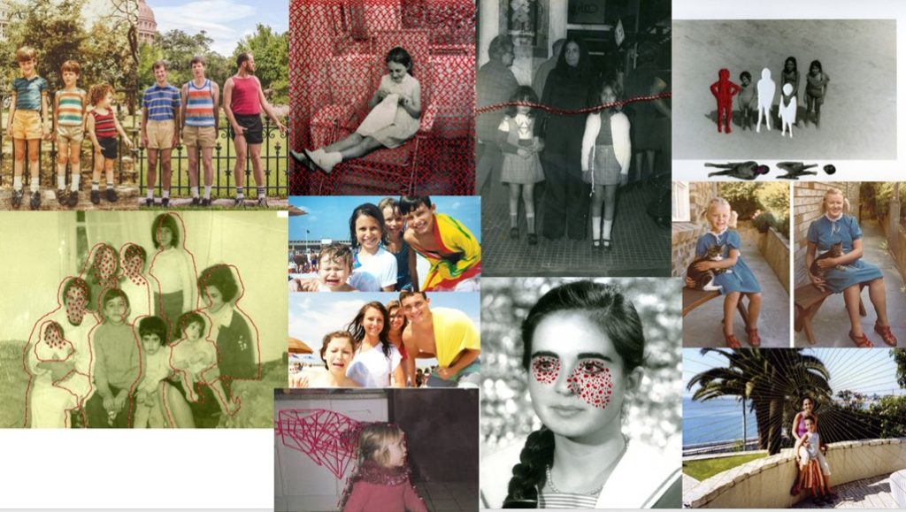
My plan of action is to find some childhood photos and to either rework into them, completely replicate them, or recreate them but tweak some details. After I have manipulated and printed them off I will then rework into them using a number of methods including, cutting them, collaging, sewing into them, layering them, and drawing into them. 

To get these images, I will find childhood photos of myself/my family, then conduct a number of mini shoots of taking a couple of photos to recreate some of the childhood images and then manipulate them using adobe lightroom. I'm not going to recreate all of the childhood images as some of them need to be reworked into to display their significant meaning.

When recreating the images, I will be using the images as reference, but will make different arrangements and adaptations to display the change and the journey of life. Also not all of the images will be able to be taken in the same location because some of them were taken in foreign countries for instance when I lived in Ireland there were photos taken that I cannot identically recreate unless I fly over to where I once lived.

For everybody, every day is a new experience and my project is based on the journey of life, and how time affects every individual and how everybody's experiences shape them into the person they have become today.

Once I have reworked into my images, I will then frame them in both old and new frames to show the diffrences between time.

Heath Ledger Response

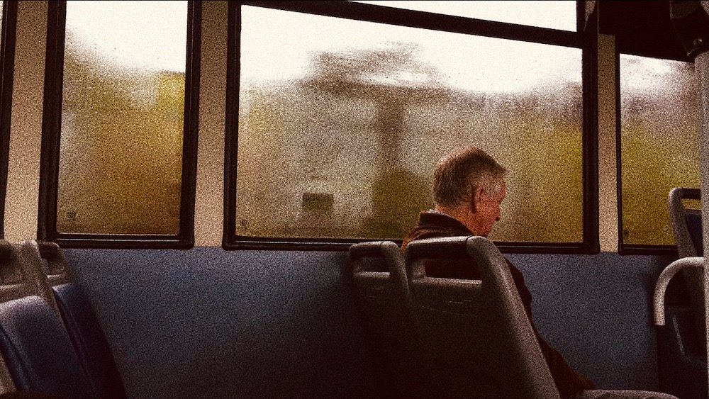
Below is a small contact sheet of the images I have thought about using as a apart of a response to Heath Ledger’s work. I did not plan on doing an entire photo-shoot with many photos because I wanted mine to match the unplanned experimental element of Ledger’s work. By planning a large photo-shoot with everything planned out, my outcomes would therefore be less authentic and wouldn’t match well with what my aims were.

Editing
Because most of Heath Ledger’s photos were presumably taken on film and then developed and edited later, I wanted to create the same sort-of effect without having to go through the entire process of using film. I ended up just using my phone to capture some random moments out and about. Then I just edited them very simply on the Ios Photos App & VSCO as I didn’t want to over complicate things. I used the Vivid Warm filter and the maximum amount of grain which made the digital photos look more grainy like real film.

Adding a basic filter to all the photos.
Adding grain to all the photos.

Next I plan on printing out all of the photos above and starting to work on manipulating them by hand and creating a response to Ledger’s work. I plan on using nail polish, paint, pencils etc to manipulate my photos. I am also not sure if I will end up manipulating all of the photos because some aren’t as str

Comparing and Contrasting

Here I will be comparing and contrasting one of my own outcomes and one image created by Cindy Sherman as she is who I feel has influenced me most and would therefore be good to compare my work with.

Cindy Sherman’s work shows the three-quarter length, Italian Renaissance-style portrait as Sherman takes on the persona of the Mona Lisa. Wearing a 15th-century style Italianate dress, Sherman allies herself with one of art history’s most famous, iconic paintings. I can compare this to my photograph as I have generated an image where my subject takes on the idea and almost persona of Anna Nicole Smith who became one of the most memorable of the Guess Girls. For my recreation I tried to create a recognisable image when placed next to the original but with slight differences, the original is seductive almost and I wanted to place a young ordinary girl in as the subject to produce different ideas of the way women are represented to show my subject in a way that people would normally be against, this idea of sexualising young girls is thought of as bad however a professional model was and sometimes still is okay which is the ideas I tried to take on with showing this advert in a different way. For Cindy Sherman the photograph of her as the Mona Lisa is no true replica, the photo is meant to call to mind the original, without literally copying it which is a little different to what I have done which shows a contrast between my work and Sherman’s. This idea of not literally copying is that Sherman creates a mental distance between the real and the imitation just barely apparent, yet somehow haunting. One might say that Sherman suggests that viewers rethink their familiarity with the original and question how its conventions of depiction continue to condition the way that even we, hundreds of years later, regard every representation of the ‘female’. This is some of the ideas I was trying to put across and as comparing the two photographs can show similarities in the way that they are set out and the production behind them howver also shows the contrasts in Sherman’s work and my recreations in the accuracy in the way they are produced.

Final Outcomes and Displays

Below shows all of my outcomes that I have produced for this series I will be displaying my photographs on black mount board and on separate boards and have them as a collection series. This shows them edited and next to their outcomes and a suggested idea of the individual displays.

GAP 1994

This is one of my two outcomes for the 1990’s, I chose to do two for this era and then choose this specific ad as I feel it represents something different that was happening with the use of more diverse advertising slowly starting to come into play around this time especially for women. I feel this ad has a different tone to the other 90’s one it seems to be aimed at a different age of girls and I feel is showing something to do with the way advertising was developing for women and shows part of the journey that it was on.

I feel that my outcome was successful in that it looks like the original ad. At some points the image seemed to be turning too dull or too dark while editing howver I feel I found a good place and that the writing helps to enforce the ideas I have been trying to show of having a familiar face in an ad give you a different perspective maybe.

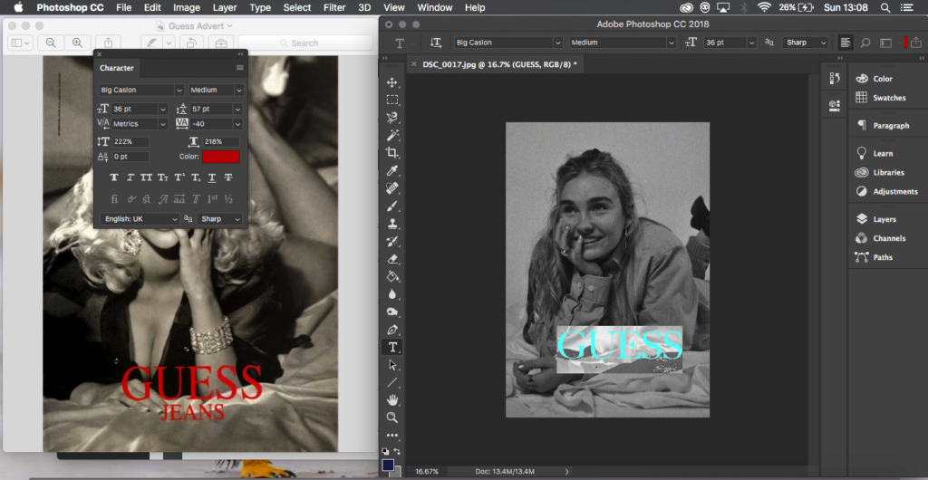
Guess 1993

This was the second ad I chose from the 1990’s and I did this as it was the one era I found had one of the most drastic different types of ads and this was a good ad to represent that, the way that the original subject is lying it’s main representation is sexualising women with what minimal clothes she’s wearing and her position. This is a large difference compared to the GAP advert where the clothes are covering and it is more innocent compared to this which is why I chose those two as I feel it shows a large development and difference that was occurring only 2 years apart.

I feel my recreation is more successful with the full edits in place of the writing, before I think it was an okay image and recreations however it wasn’t perfect due to having the outfit difficulties of trousers and no heels however I feel this in a way does help to enforce that thought of real people, familiar faces in these ad’s and that can create a different reaction, this is what I feel makes this outcome successful.

Rosie the Riveter 1943

I chose to do this recreation as it is one of the most famous ad’s or posters that I feel exists from this time even though it wasn’t at the time of it’s release I feel it has become a big symbol of strong females and feminism and this is why I chose it, the ad was produced only around the time when men weren’t there to do the work in the early 40’s and then wasn’t seen till feminism movements began and I feel that is important in how to think about how women are portrayed and at what times they are portrayed in certain ways.

I feel that this image was one of my better recreations and one of my most successful images with how it turned out in the camera originally and after editing, I feel it fits well with what I am trying to produce and show and the image works well. If to do it again I would have my subject more towards me however I do feel that it was one of my more successful photographs.

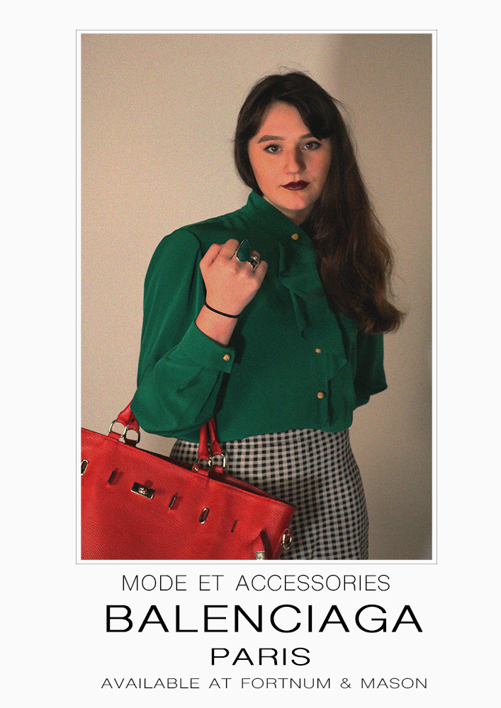
Balenciaga 1983

This ad I chose as I feel it is quite explicit in the era it is representing as the 80’s has quite distinct looks, for me this ad was saying and representing two things which is why I chose it: One that this was the starting decade of the working business women which is empowering but two, it also still has the tight pencil skirts the fitted waist and pouted lipstick covered lips which to me speaks that although moving forward had not moved away from this almost sexual representation which is why I chose this ad.

I feel that my outcome for this was good as it shows similar attributes to the original, I feel if done again I could turn my subject more towards me face on however I feel the tilt in her stand still makes the photograph work well.

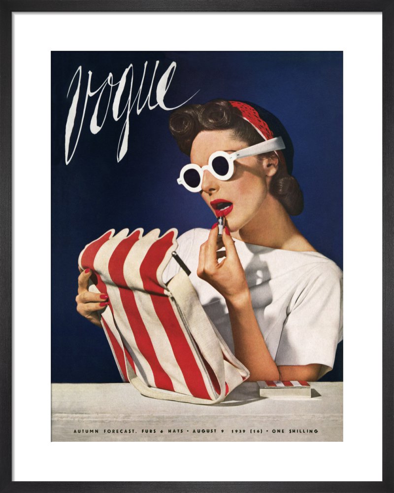
Vogue 1939

This ad I chose as it was quite difficult to find something do-able around this era for me but as well out of those I found I felt this one stood out to me from the year that it was taken and how it looked, the ad was produced n 1939 the begining of the war and women were still being portrayed as having to make themselves up with makeup and I feel it shows a contrast how just 4 years on women were being pushed into overalls to work in factories which is why I felt this should be the ad from this era I recreate.

I feel my outcome worked well in the end with being a good depiction, although I don’t feel it is my strongest image I feel it still works well and has the elements it needs, I had struggles with props and the heights of chairs however I still feel that my image works well as a recreation and in showing the development.

Louis Vuitton Modern

This is my final outcome for my modern day recreations, I chose to incorporate this and this specific outcome as I feel it symbolizes something about how women are still portrayed and the role they have. Marilyn Monroe is not just a missed pop culture icon, she is a symbol of what once was seen as the ideal female and continues to be shown as sexual in the modern day by her facial expression and position in the ad. This is why I chose this ad as it shows how even though the journey of feminism has come far, older faces are still used in subtle ways in maybe not the way wanted.

I feel my outcome was successful and worked well with what I had and I am happy to include it into my final series with the last editing I feel it brings it together. I slightly enjoy how the bag and box I have used do not look similar to the ad as I feel it creates a statement as it doesn’t look as expensive and done up which is what is usually portrayed and I feel has turned a difficulty into a slight positive.

Mock Up Displays:

Below shows the mock ups of how I plan to individually present my outcomes as a collection and in a simple manner as I feel they look good and work well almost showing as display posters with just a frame.

Final Editing

Below shows my final editing and adjustments to the photographs I plan to use as a series. I have placed them next to their original Ad’s and have included some of the editing processes that I took to reach my outcomes as some took more editing and developing than others.

Balenciaga 1980’s:

To edit this photograph I placed my outcome onto an A4 document and scaled it in a similar way to the original advert so that there is some boarder around the photograph and more space at the bottom. Next I created a small single line clear box around the photograph as this is a detail from the original ad I wanted to keep. Next everything was very simple and using the text tool I typed in what the original ad had written and scaled everything with the spaces and size of text as well as trying to find the best writing font I could to match the original.

‘We Can Do it’ 1940’S:

This editing process was slightly more complicated for me that the others I’d had done, while looking at the original ad I could spot that the figures head went slightly over the speech bubble and this would be something I would attempt to do. First I duplicated the background layer so I had two of my image, I then traced around the subject and the frame with the polygonal lasso tool so that only the background was selected and this enabled me to delete it so that I was left with a layer that had only the figure on it, next I went and found the shape tool for a speech bubble and sized and added on on top the top of the photograph. In the layers I moved the speech bubble to be under the layer with just the figure so that her head would go over it, I then spent my time resizing the bubble. After I went on to add the text and spent time sizing it and finding a good font, like the bubble I placed the text layer underneath the figure layer so that the subjects head would slightly reach over like the original.

Guess 1993:

For this piece of editing I just had my image and the original side by side and by eye I created text and turned it to red and tried to find the best font I possibly could to match that of the original ad, this was some of the simpler editing as I just needed to add text to the image.

GAP 1994:

This editing was simple like the above however I feel was effective, for this image I did go back and work into the actual image itself, enhancing it so that the colours weren’t so dull and were popping a bit more, after that simper with the Guess advert I had the original and mine next to each other and I placed text in and tried to find the best match for font and align the words in the same way. For this one I also added the prices that were in the original image as I felt this could be effective and gave it more of an advert feel.

Finalising

All outcomes from photo-shoots:

Below shows all of my outcomes from photo shoots after I have edited them as separate outcomes for their individual photo shoots I feel they have all been successful and that I can use them in some way to generate outcomes and a final display and outcomes while exploring my chosen idea through journeys and pathways.

For my initial ideas on ways that I can display and finalize my ideas and my photographs I thought about putting my photographs into a series together to show the progression of the different styles and takes on the way that women are and presented with the different times the original ad’s were produced.

Inspiration and Ideas:

A lot of my inspiration has come from Cindy Sherman and the way in which she develops her photographs and produces them, a lot of her work falls under different series that have themes and ideas that connect all of her images together, as well she develops photographs that I can relate my work to and my ideas and thoughts I am trying to put across in the photographs.

Cindy Sherman forces the audience to reconsider stereotypes and cultural assumptions her work for me speaks that it’s over exaggerating or not at all the realities of what people assume and when placed in this manner makes people realise as it is explicitly over exaggerated with the makeup or the way she is positioned or clothes and I feel this has a large impact on the way that the assumption can now be read.

For me the recreations of adverts was to show the journey and progession of advertising for women but also to highlight those representations by no longer having the ad with a professional model stood infront or as a painting or drawn verion of someone such as the Vogue 1939 ad or the Rosie Riveter poster, (both used real people howver they are not direct photographs) but instead have a regular person stood in front of the camera producing these ideal ads, as for me I feel it can help show and suggest exactly how these ad’s are representing women, I feel it has a slight impact by being able to see someone you may possibly know in those positions and clothes rather than someone who is always placed in them.

This was the idea and concept I have tried to take with me throughout the process in my head while developing these types of recreations and adverts.

Displays and Outcome Ideas:

For my final outcomes my ideas that I have been thinking of have been to have a series of images either all of the same board or stood separately but displayed together. For this my idea was to fully recreate the ad so to have all of the writing across from the original ad to create it into a full recreation. I’d like my displays to be quite simple in the way that they show the photographs.

For ad’s with writing on and as proper print ad’s I have 6/7 I have one photograph that doesn’t fit the trend of the photographs and I don’t feel it would work to then have them all together and one out so I am generating other ideas to see if I could produce a different outcome for that photograph.

  • For this series I am tempted to produce my photographs in A3 as I feel they would look good and impact as large, however I also feel that producing them in A4 would create a good effect as magazines and places that the ad would usually be shown would be found at A4 size.
  • My 6 photographs that I have from print adverts I plan to have as a series displayed separately in one frame each but have them as a part of a collection
  • Or I demonstrate and display them all together in a style similar to the way I have presented them above and also below:
  • For my extra outcome I feel I could do something with producing very simple separate images to display beside it to show a kind of journey or development and I will explore this idea as I edit and develop that image separate from my series of images.

Photoshoot Two Contact Sheet Images

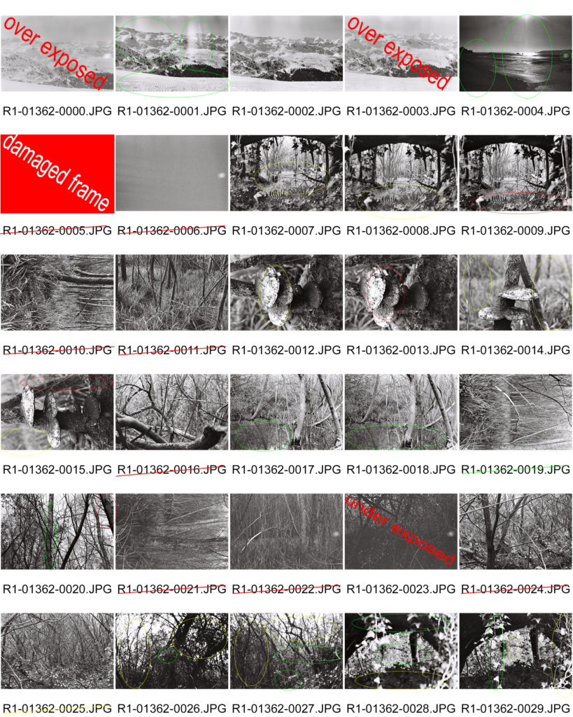
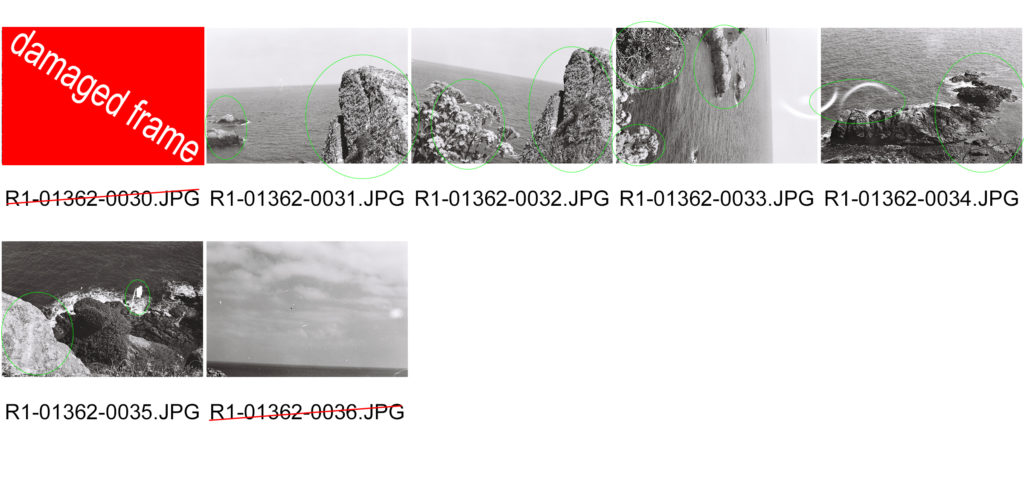
From this photo shoot I have produced a set of images that I feel has the essence of Ansel Adams in and my inspiration can be clearly seen from them. I have decided not to edit these images or retouch them in any way because i tried to frame them correctly and i want them to be as they were taken as it was a set of images taken using 35mm film and I didn’t want to fix any ‘imperfections’ as they are are what make film photography what it is.