


What is Propaganda?
Propaganda is information which is extremely biased and subjective, it can be considered to be misleading. It tends to promote political view points in order to persuade viewers to believe in the information and viewpoint being provided. The imagery tends to use loaded language which produces an emotional response to the information which is being presented. In a 1929 literary debate with Edward Bernays, Everett Dean Martin argues that, “Propaganda is making puppets of us. We are moved by hidden strings which the propagandist manipulates.” There are 7 different types of propaganda which are:
Why was Propaganda used during the war?
Propaganda was used during the war in order to persuade British men to fight in the war. The type of propaganda used was mainly bandwagon as the images tried to persuade audiences to take a course of action, to join the army and fight for their country. Due to the persuasive and misleading nature of propaganda it lead to many English men, young and old, joining the army and fighting, leading to millions of deaths. The posters never focused on the negative effect of joining the army, only the positives and why men should be joining. The images and captions were usually captivating, persuasive and can sometimes come across as threatening which almost forces viewers to do as the image says. As mentioned propaganda had a massive impact within the second world war, as it lead to many deaths, which will help to present another stage of Jersey’s journey through the second world war.

What is Tableaux Vivant?
The phrase itself is a French phrase which translates to ‘living picture’. A tableaux vivant is a static scene where there is a singular or multiple models telling some sort of story. These paintings and images are usually well thought out, not only in terms of lighting and camera settings but also in terms of costume, positioning, background as all these factors contribute to the message being sent across to the receiver of the image. This type of imagery combines aspects of theatre and photography to create a staged reality.

How does Tableaux and Propaganda Link?
The two link, as my idea is to replicate some of the more well known propaganda images in the style of Tableaux vivant. This photography technique will allow me to carefully think and replicate the manipulative imagery and will allow the same conceptual and contextual elements to be presented to viewers. Doing this will allow the project to move onto another idea and also showcase a new element of the Journey of Jersey through the second world war, along side my knowledge and understanding of different photography techniques and styles
Action Plan:
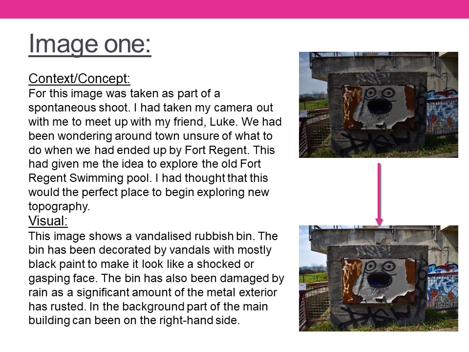
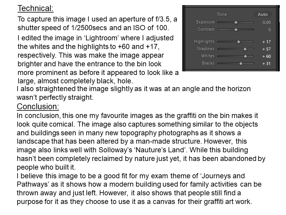
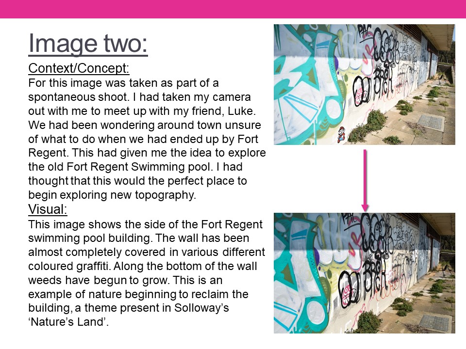
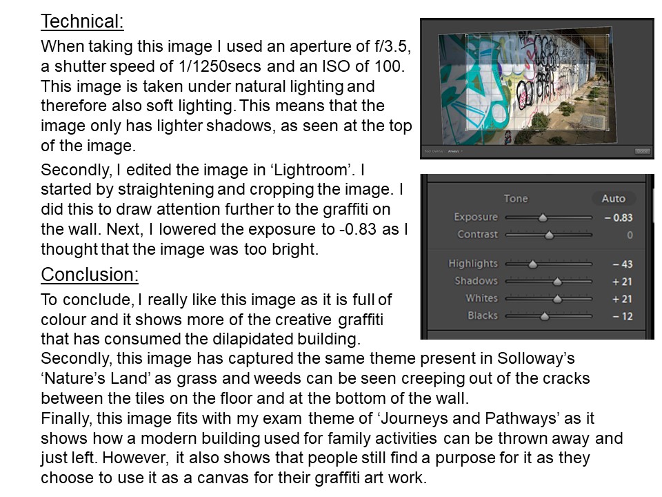
For my third sets of edits I wanted to showcase my ability to use different elements of photoshop in order to showcase further development into the importance of bunkers during Jersey’s journey through the second world war. Due to my top outcomes already looking somewhat distorted I wanted to keep the edits simple but still make them further distorted. My Initial ideas of edits are:

For my first experimentation I wanted to use the acetate as an image which was taken back in the war and the bunker behind it as an image taken from now, which begins to present Jersey’s Journey through WW2. The image itself looks as if the acetate is being peeled back to reveal the idea that the bunkers have been isolated since the war and nothing much has changed to them, which successfully allows the aim of the edit to be showcased. To make this idea seem more realistic I used the quick selection tool and selected the acetate part of the image, once selected I pressed ctrl + u and lowered the saturation so the acetate was in black and white and the background was in colour. Then I adjusted the levels and curves to allow detail to be shown within the edit. I believe that this is my top outcome from the photoshoot as it shows clear camera skills such as depth of field, focus, ISO and aperture. It clearly presents the formal elements of texture, shape and space due to the use of camera settings along side the editing use. Moreover, it showcases my ability to use different tool within photoshop in order to manipulate and image to create a certain effect. I really like the way the photograph has turned out as it is visually stimulating to look at and allows Jersey’s journey through WW2 to be presented.
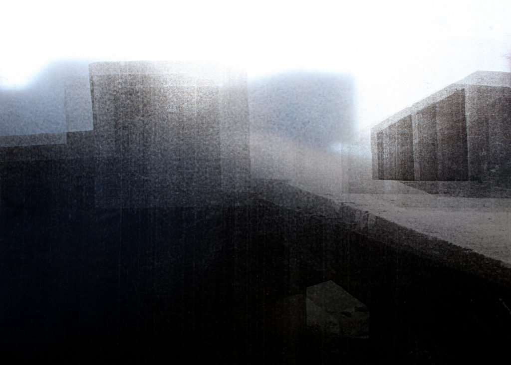
In my second edit I used an image where the acetate was held up to the camera and the shadows of the bunker is found in the background of the image. Already, this image is very distorted so to add to the effect I decided to add a blur to the image which creates texture, almost as if I have raised the ISO on my camera to create noise. The idea behind this is to make my viewers rethink the way the bunkers look and realise the use of them during the second world war, which allows the journey of the subject to start to be presented within the viewers head. I believe that this image is successful as it allows contextual and conceptual, how and why the bunkers where used in the war (presented in a unpleasant way due to the blur and acetate and shadows) and how they have been left alone factors to easily be communicated to the receiver due to the distortion created. This image is also successful as it shows my ability to think creatively and critically towards what I am wanting to capture as well as my camera and photo manipulation techniques.
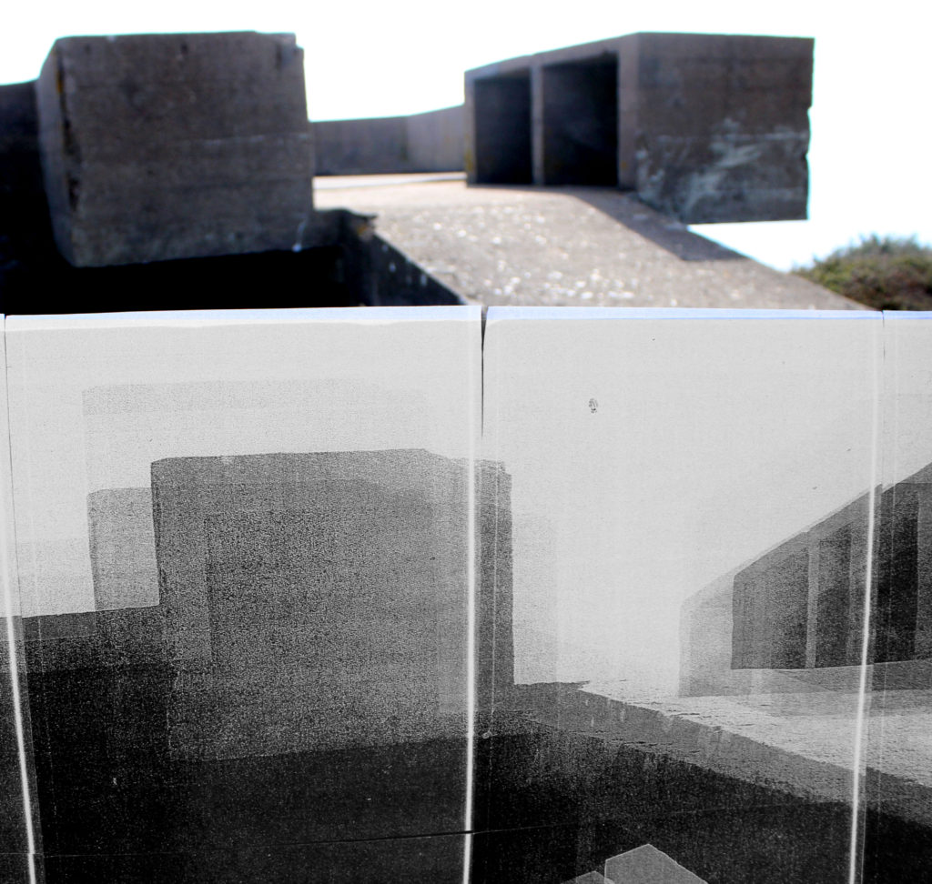
This next edit is not as successful as the others, needless to say I have decided to keep it in order to showcase my exploration and thought process. I selected this image as it is of the bunker and the massive image of the same bunker that I printed off. The idea was to showcase the size of how large the bunker is, which would metaphorically show how big of a role the bunkers had within the second world war. However, I do not believe that this idea is presented through the edit. I also used a colour splash to create this edit, having half in colour and half in black and white, same steps as the first edit. The final outcome is not great as the edit is not visually stimulating to look at, which is due to the image itself. The way it was taken is not the best as it is clear that I have used the wrong camera settings. In my opinion the conceptual factor is still slightly being presented, but the technical, visual and contextual aspects are not as strong which is making this edit less successful.

The idea behind this edit was to make the acetate blend into the sky, making it seem like a past memory, as I purposefully made the image over exposed. To do this I made this photograph naturally lighter by adjusting the levels and curves, I also cropped the image to take away the bottom of the image, which slightly distracted the viewers eyes. Although, I do like the way it looks I believe that it could have been more successful, there is something to it which is missing or needs changing which is making me not like the edit that much. I think it is due to it looking too artificial which takes away a strong link to the contextual factor. The edit clearly presents the journey of Jersey through WW2 and allows the conceptual factors to be presented, I think it is again the technical element which is lowering the successfulness of the image. Needless to say, I have been able to show my creativity to produce a new concept to present the same ideology.
Evaluation:
To evaluate I believe that I have been able to show my ability to think creatively to produce outcomes to a follow up photoshoot to an idea. I have been able to show clear further exploration to an initial idea and have been able to create links between the images and Jersey’s Journey through the second world war. The images themselves, showcase my ability to adjust and use camera settings to create different effects, and show that I have carefully thought out how and why I am capturing an image in that way. Furthermore, I have been able to show my ability to use photoshop to manipulate my images, using the different tool provided in order to create a stronger link between my photographs and the theme of Jersey’s journey through the second world war. Although, these edits are not my strongest set of edits produced I still believe that they have some elements which makes them strong, but they show my exploration to this theme. If I was to further manipulate these images I would look at printing out an image of a bunker in colour, then using the acetate I would place it over the top, which creates a distortion but also presents then VS now. This would be further development to the first edit and would show Jersey’s journey through WW2. Although I have enjoyed looking at Jersey’s bunkers and there importance I feel as if I have explored them in enough detail, and if I was to do further exploration it would be to much and the images would not be ‘as good’ as the images above and the first photoshoot.
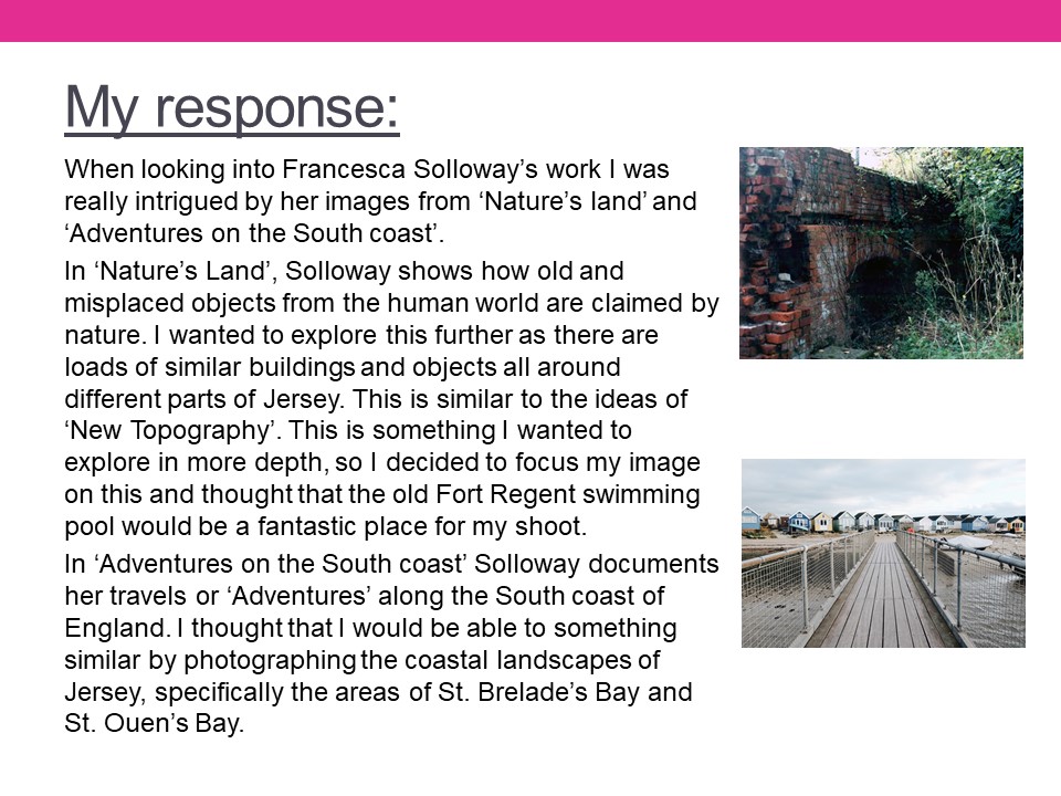


A vanitas photograph or painting is a symbolic form of art which emphasizes the pointlessness of pleasure (such as wealth), the reality of morality and the certainty of death. Typically the subject within the images juxtapose one another, with symbols of wealth and security placed next to subjects representing death, showing the futility of joy due to the fact that it is, in the end, meaningless.

Vanitas artwork and photography makes use of multiple subjects placed next to each other in order to show the contrast between life and death, bringing the 2 polar opposites together in 1 image to emphasise their differences. As some of my work will take inspiration from the process of life and the journey towards death for the subjects of the photographs, I will be taking inspiration from vanities photography in order to use the multiple panels next to each other (triptych) to separate the different subjects, which in turn represent (at the left panel) life, youth and beauty and, (on the right panel) death, deterioration and the end of the journey, and thus my work takes inspiration from vanities artwork.


Vanitas artwork and photography is used by a small number of modern artists, who use it to create images that represent gluttony, and use modern privileges in life (technology, modern food, luxuries) while placing them next to a representation of death in order to convey the futility of all of these luxuries.


| Lighting | Aperture |
| Natural light if images are taken outside. Artificial if they are taken inside. | 2.8 f when I take portraits I like to blur the background. I find it makes my subjects stand out more. |
| Place | Concept |
| Around school. The youth in one of their natural habitats. | The journey of youth, youth as a journey and the difference of 21st century youth. |
| Props |
| Books, pens anythings that shows what today’s youth are like. Playful items, studious items. |