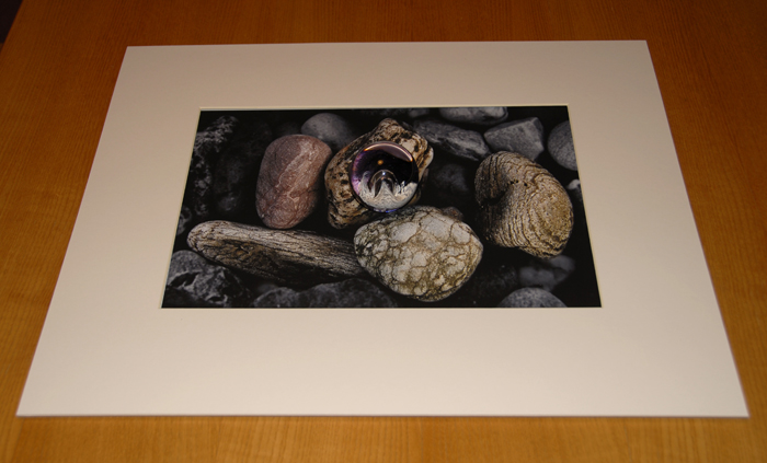
When given the theme Journey’s and Pathway’s, I immediately had an idea about a physical journey, such as an outing of some sort. At the beginning, I wanted to stick with just landscapes, but as I carried on, I started working more with photo montage. I really enjoyed working with photo montage as I think some of my best photos have been from using that method of photography. Also, I really enjoyed street photography and capturing people’s journeys to their final destinations.
The first photographer I decided to research was Andrew S. Gray. I had already looked at this photographer in my Pre AS task, but I wanted to further explore his work and his technique of taking photos. I enjoyed working with ICM as it creates very interesting and unique photos, and I really liked the final images I had from this section of my journeys and pathways theme.
The next portion of this theme I explored bus journeys. I found the photographer Stephen Calcutt on Pinterest. He goes around London and takes photos of people through vandalised bus stops. I really like how he mixes the bus stops with the people, kind of a juxtaposition of life and death. I think the photos I took for this portion were very good and I liked how I edited them on photo shop.
Next, the idea of physical journeys sparked my ideas and street photography instantly came to mind. I researched a bunch of street photographers and found the photographer Damian Chrobak. I really liked the simpleness and emotions that his work portrayed, so I decided to go to town and take photos that captured uniqueness and individuality. I am really happy with how these sets of photos came out and one photo from this project was probably one of my favourite photos from this theme.
After working more street photography, I looked at buildings and car journeys. I went to the St Saviours abandoned hospital with my mum and on the way there, I took some photos of things I saw. I wasn’t satisfied with the photos I took as I feel they were lacking something special and they just looked okay, which isn’t what I was looking for.
Next, I started looking more into photo montage. I found 4 artists that I really loved and wanted to pull inspiration from. Ryan Mulford, Rocio Montoya, Merve Ozaslan and Marko Köppe. I really liked how all these photographers edited there photos, and I really like editing photos on photo shop with this style of photography. I also printed photos out and stuck other photos on top of them. I really enjoyed working in this style, which is why my final photos for this exam were all photo montage.
Overall, I am really happy with the outcome of this theme and I really enjoyed using different techniques and styles. One thing that I could’ve done better was to open up my ideas a bit and explore different types of photography and print out a few more photos, but I am still satisfied with how I did things.


