


Gosia Wlodarczak is a Polish artist who now works and lives in Melbourne, Australia. ‘Gosia Wlodarczak’s cross-disciplinary drawing practice has extended into performance, installation, sound and film. Her work is motivated by a fascination with the mind’s relationship with the outside world conducted through the senses. Using only what she sees around her, she uses the drawn line as a materialisation of being present in the world and in a moment. She works in private and public spaces rather than an artist’s studio, interacting with the stimuli of the outside world and ordinary life, translating her ‘living energy into the drawn line’. She has been exhibiting her work since the 1980s with her most recent solo exhibit being A Room of Facial Deconstruction, Queensland University of Technology Art Museum, Brisbane (2018).
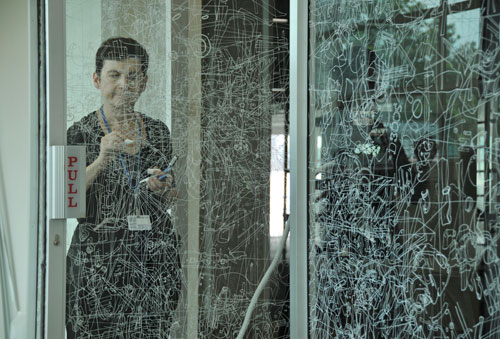

Wlodarczak does not produce her artwork at home or in a studio. Instead she does them in real time at the exhibition. The artists’ explorations into video document and expand her multi-discipline practice. The core of her work is drawing, using surfaces such as walls, floors or even set dinner tables as live environments in which to draw “in the moment”. I plan to experiment with the techniques that this artist uses in my own work. I have already began working a blog post on recreating archive photos of Jersey using the methods that Gosia uses. I intend on using a piece of acetate and tracing over 2 different photos with a white pen to create the same effect she has, and then create some layers over the top and then experiment with that.
Gosia Wlodarczak
‘I draw my environment as I see it, in real time – tracing and re-tracing the visible. I only draw what I see. Seeing, the act of drawing and the drawing itself are evidence not only that I exist, but also that I exist in the present moment. I never draw from imagination. The immaterial (energy and time) are converted into the material (pigment forms line). Every single glance produces a drawn shape. Every drawn shape both embodies and documents corporeal existence.’
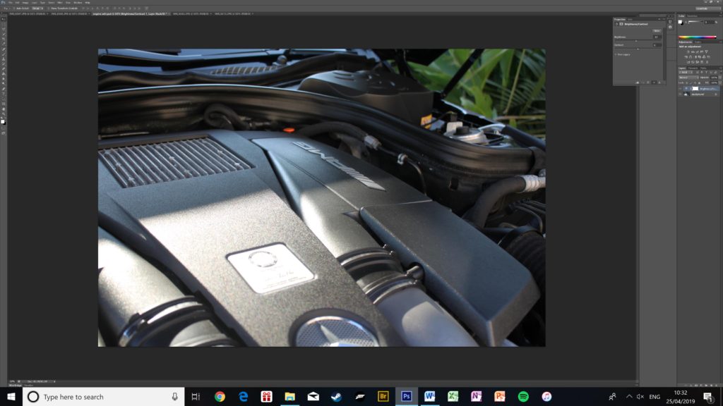
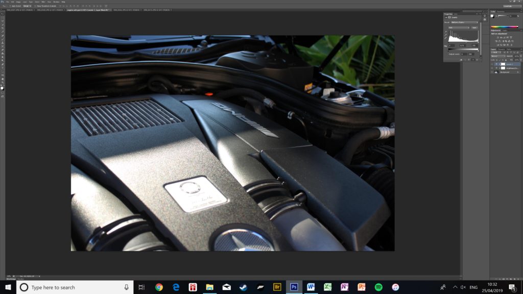
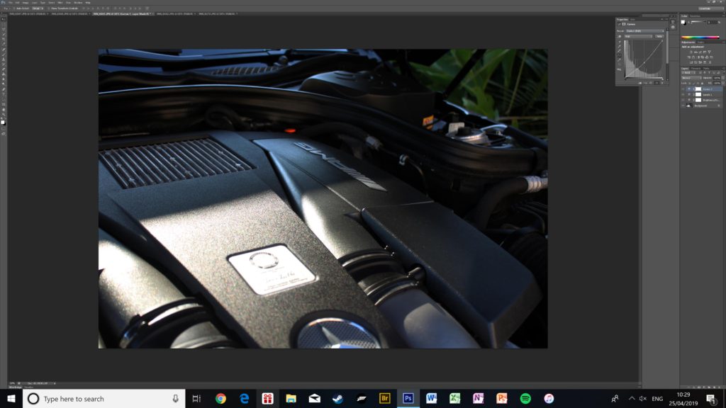

WHY I CHOSE THESE IMAGES:
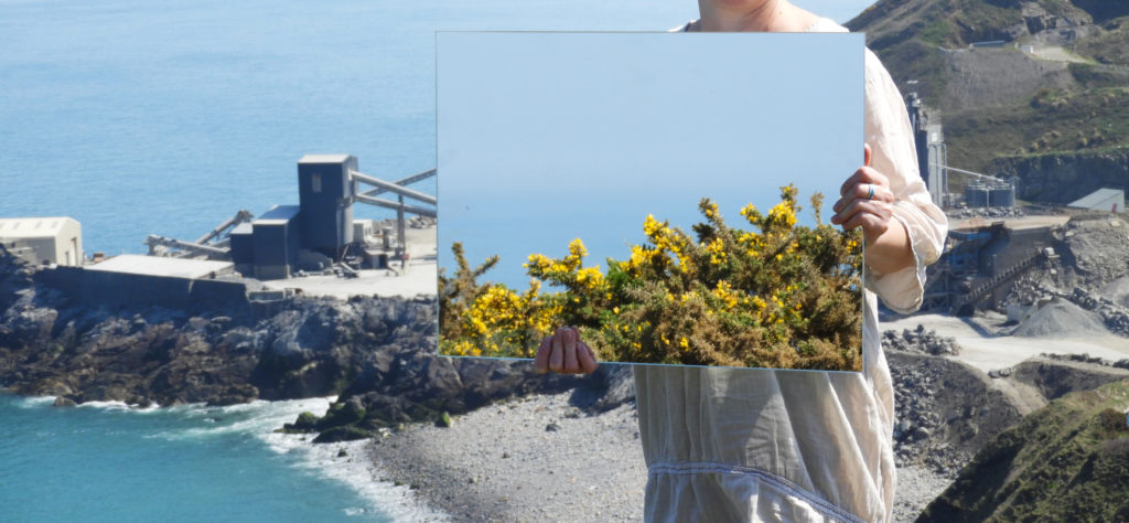
The main reason for me selecting these final six images was due to the fact that they follow the theme of my overall project very well which is the exploration of landscape urbanization around Jersey. The first set of images is fairly simplistic and minimal. The way in which we see the human impact is very subtle, for example in image 2, in the reflection we can see a man made structure yet it is surrounded by a dull and calm sea. The color pallet of the first set is a lot more subdued therefore making them great to pair with images which may be more complex or dramatic in other aspects. Set 2 , although similar, has some key differences which make it perfect to pair with set 1. They both follow the same theme and tackle similar issues, yet the addition of a model in set 2 means that more symbolism is added to the images. It is very much like set 1 but additional elements. Instead of having a subtle color pallet, the images are bright and saturated. They include organic and man made structures in them such as the quarry in the backdrop and the various rock formations around it. It is a lot more clear what the suggested theme is in these images as opposed to set 1, allowing the viewer to understand them with the aid of set 2. The theme of surreal nature and landscape romanticism is also a lot more apparent in set 2. The vast expanses of sea and high cliff tops in the backdrop allow the viewer to feel a sense of awe whilst looking at the images.



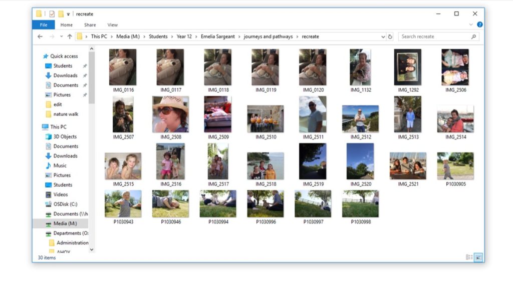
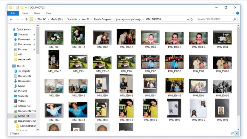
Here are screenshot of the folders on my computer that have my childhood photos and recreated images. I have re-tweaked my replications by adding new characters, changing some of the locations and changing some of the composure. I have used a DSLR camera, iPhone 8 plus and iPhone 7 to take photos of some of the images.
HOW: For this photo shoot, I used my regular DSLR camera in order to capture the images.
WHERE: These images were taken again at Sorel point in St.John where I conducted my first photo shoot, this time focusing on the granite mining site there.
WHEN: This image was taken during the early/mid morning meaning that the shadows which are cast are at a very steep angle, giving different shadows than if it were to be taken during mid-day.
WHO: I attempted to incorporate both the landscape and people into my work, being representative of the human impact upon Jersey.
WHAT: The difference between this photo shoot and my previous which included the mirror is the inclusion of a model which is symbolic of the human impact on nature and landscapes.
WHY: One of the themes which I was trying to convey through my work was landscape romanticism therefore I tried to capture the sublime nature of the landscape and how it has been altered through man-made forces which are clearly reflected in the mirror.
MOST SUCCESSFUL IMAGE:

CRITICAL ANALYSIS:
VISUAL:
The first thing which strikes the viewer whilst looking at this image is the mirror which is in the hands of the model, in it we can see the reflection of the Ronez quarry plant. This was the exact point which I wanted to capture in my photography, the impact we humans have on the landscape itself. The plant itself is mining away at the side of the cliff, excavating the rock and altering the coastline over time. There is a clear juxtaposition in the image between the undisturbed nature in the backdrop of the image and the quarry plant being reflected in the mirror. Another very effective aspect of the image is the lack of a face the model has, being hidden behind the mirror and only having her arms and torso showing. it gives the model and ambiguity and removes any character or recognizable features, making her less of a focal point in the image. In a way this image also represents how we are a part of nature, we were created equally, yet in the reflection we see the man made quarry plant, separated from nature therefore part of a separate reality. There is also a sense of the surreal and natures power with the presence of the vast expanse of sea in the background of the image. It almost goes on forever as the line between the sky and sea is hazy. As it was a very bright and clear day when this image was captured, the colors are striking and powerful. In the reflection though, everything seems to be just that bit more monotone and dull, again representative of the ways in which we have harmed the planet and the less than promising future we are heading into.
TECHNICAL:
The day on which I conducted this photo shoot, I was greeted with ideal weather conditions. No wind and very clear skies. Due to the very bright weather conditions, I had to lower the ISO of my camera down to 100 to avoid having over exposed images. During this photo shoot I also experimented with capturing panoramic images, yet I soon realized that the logistics of framing and displaying one of these pieces would be very difficult therefore I scrapped the idea. Again the logistics of carrying a heavy mirror down a cliff path was quite challenging yet I didn’t want to compromise and stuck with it, producing some very impressive images at the end of it. I set the white balance of my camera to 5500 k as this is ideal for using outside in direct sunlight, creating images which aren’t too cool or too warm. The aperture of my camera was set at f/4.8 this meant that the exposure of the image wasn’t too high and the focus was universal.
CONCEPTUAL:
When exploring the theme of landscape urbanization, one of the largest impacts humans have is the change in environment through mining, physically changing the shape and makeup of the landscape itself. Mining is the extraction of minerals and other geological materials of economic value from deposits on the earth. Mining has the potential to have severely adverse effects on the environment including loss of biodiversity, erosion, contamination of surface water, ground water, and soil. The formation of sinkholes is also possible. Other than environmental damage, mining may also affect the surrounding population’s health as a result of contamination caused by the leakage of chemicals.
CONTEXTUAL:
There were five products for which the island was famous, many years ago, only one of which is still extracted in any quantity. The best known is granite, a primary rock, composed of crystals of quartz, felspar and mica, all closely united.
Jersey has three main colors in granite: red, pink and white, the shade of the stone being dictated by the impurity of the felspar.
The use of the colourful local granite has done much to enhance the Island, so much more than the dank black granite achieves for Guernsey. Complementary to the hard granite is the soft rotten granite which was quarried in large amounts as gravel. A most splendid example of this stone may be seen at the lower end of Les Varines, in St Saviour, where the walls forming the sides of the road may be presumed to be, upon passing by, of solid red stone. Upon closer inspection, however, it crumbles at the slightest touch.
Granite is, by virtue of its hardness, difficult to produce in large quantities, and so, to provide the large quantities necessary to satisfy the demands made by the 18th and 19th century housebuilders, quarries for an inferior secondary rock, Diorite, were opened up.
This stone is softer than granite, and may be dressed in a very short time with very little work. It was used for walls of gardens and houses, in the latter being used with cornerstones of granite or of the ‘new fangled’ bricks.
OTHER SUCCESSFUL IMAGES:


CONTACT SHEETS:


My plan of action is to find some childhood photos and to either rework into them, completely replicate them, or recreate them but tweak some details. After I have manipulated and printed them off I will then rework into them using a number of methods including, cutting them, collaging, sewing into them, layering them, and drawing into them.

To get these images, I will find childhood photos of myself/my family, then conduct a number of mini shoots of taking a couple of photos to recreate some of the childhood images and then manipulate them using adobe lightroom. I'm not going to recreate all of the childhood images as some of them need to be reworked into to display their significant meaning.

When recreating the images, I will be using the images as reference, but will make different arrangements and adaptations to display the change and the journey of life. Also not all of the images will be able to be taken in the same location because some of them were taken in foreign countries for instance when I lived in Ireland there were photos taken that I cannot identically recreate unless I fly over to where I once lived.

For everybody, every day is a new experience and my project is based on the journey of life, and how time affects every individual and how everybody's experiences shape them into the person they have become today.

Once I have reworked into my images, I will then frame them in both old and new frames to show the diffrences between time.
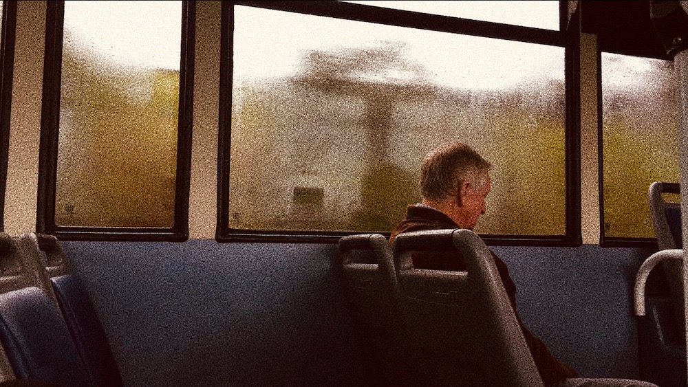
Below is a small contact sheet of the images I have thought about using as a apart of a response to Heath Ledger’s work. I did not plan on doing an entire photo-shoot with many photos because I wanted mine to match the unplanned experimental element of Ledger’s work. By planning a large photo-shoot with everything planned out, my outcomes would therefore be less authentic and wouldn’t match well with what my aims were.




Editing
Because most of Heath Ledger’s photos were presumably taken on film and then developed and edited later, I wanted to create the same sort-of effect without having to go through the entire process of using film. I ended up just using my phone to capture some random moments out and about. Then I just edited them very simply on the Ios Photos App & VSCO as I didn’t want to over complicate things. I used the Vivid Warm filter and the maximum amount of grain which made the digital photos look more grainy like real film.


Next I plan on printing out all of the photos above and starting to work on manipulating them by hand and creating a response to Ledger’s work. I plan on using nail polish, paint, pencils etc to manipulate my photos. I am also not sure if I will end up manipulating all of the photos because some aren’t as str
Here I will be comparing and contrasting one of my own outcomes and one image created by Cindy Sherman as she is who I feel has influenced me most and would therefore be good to compare my work with.


Cindy Sherman’s work shows the three-quarter length, Italian Renaissance-style portrait as Sherman takes on the persona of the Mona Lisa. Wearing a 15th-century style Italianate dress, Sherman allies herself with one of art history’s most famous, iconic paintings. I can compare this to my photograph as I have generated an image where my subject takes on the idea and almost persona of Anna Nicole Smith who became one of the most memorable of the Guess Girls. For my recreation I tried to create a recognisable image when placed next to the original but with slight differences, the original is seductive almost and I wanted to place a young ordinary girl in as the subject to produce different ideas of the way women are represented to show my subject in a way that people would normally be against, this idea of sexualising young girls is thought of as bad however a professional model was and sometimes still is okay which is the ideas I tried to take on with showing this advert in a different way. For Cindy Sherman the photograph of her as the Mona Lisa is no true replica, the photo is meant to call to mind the original, without literally copying it which is a little different to what I have done which shows a contrast between my work and Sherman’s. This idea of not literally copying is that Sherman creates a mental distance between the real and the imitation just barely apparent, yet somehow haunting. One might say that Sherman suggests that viewers rethink their familiarity with the original and question how its conventions of depiction continue to condition the way that even we, hundreds of years later, regard every representation of the ‘female’. This is some of the ideas I was trying to put across and as comparing the two photographs can show similarities in the way that they are set out and the production behind them howver also shows the contrasts in Sherman’s work and my recreations in the accuracy in the way they are produced.