
“Born in Istanbul, graduated from Mimar Sinan Fine Arts University as an ceramic artist in 2010. She created “Choke Jungle” brand (co-founder) and started to design ceramic jewellry. Her ceramic works are featured by known magazines such as British Vogue, Elle and Marie Claire. She has been working on collage projects since 2012.”
Examples of her work:
“Natural Act”
“Natural act is composed by several collages based on the questions of the relation between nature and the humanity. It is basically a critical presentation referring to the fact that each of us is part of the nature. it seeks the answer whether greed, urbanization, mechanization and detaching from the nature is favorable or coherent for human or not. In that sense natural act appears with its all colors when our emotions are paralysed in the vital points of the cliche and dull city life.”


My Plan:
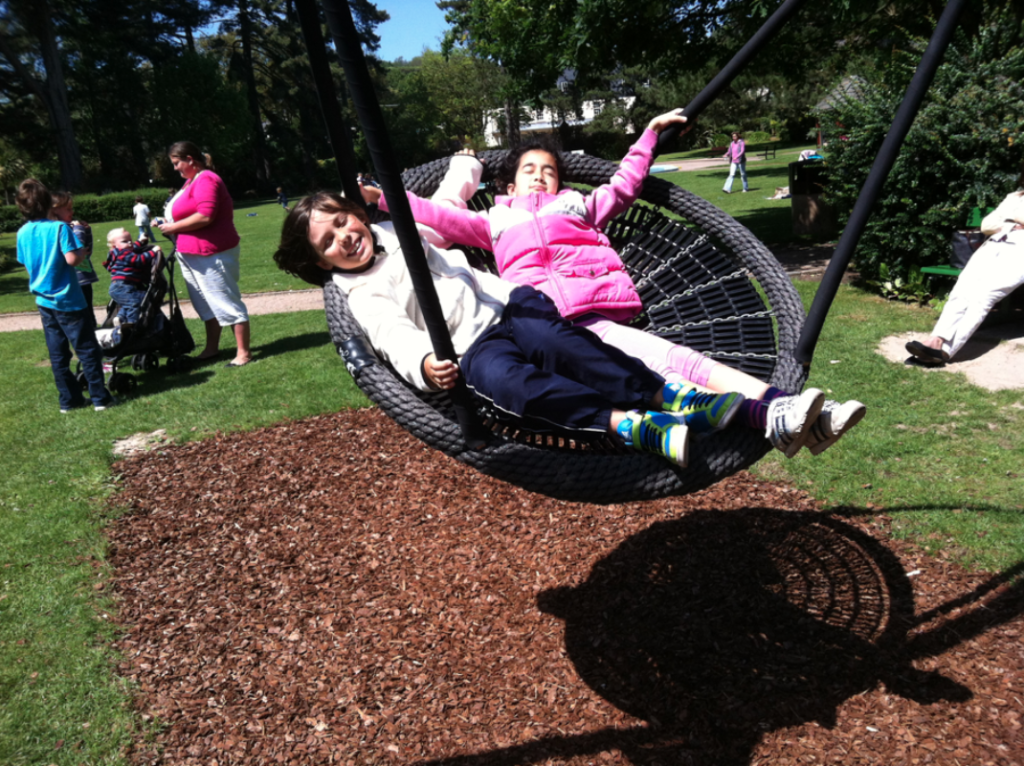
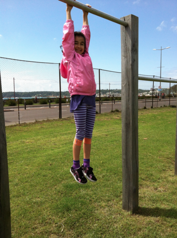
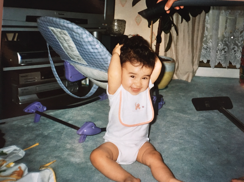
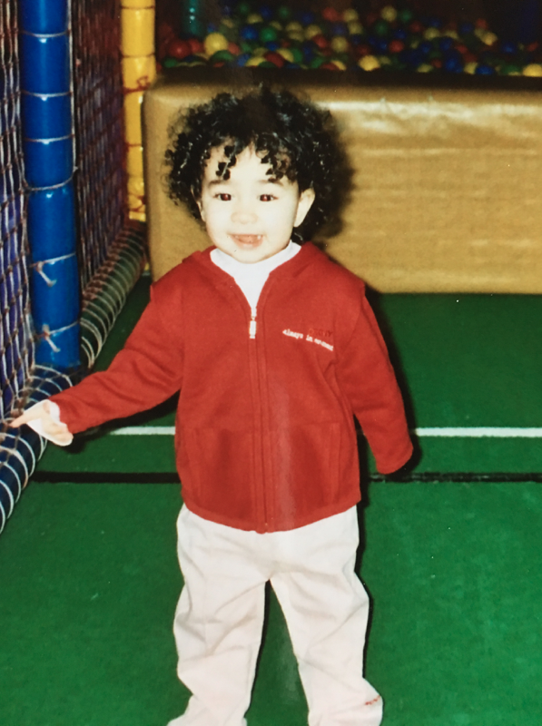
For this project, I will be using photos from when I was younger and using photos that I have taken of the beach and water to achieve a similar look to Ozaslan. I wanted to link the journey of growing up with this project, so I will be using photos from when I was a baby to when I was a child.
Photos I Will Be Using:
Editing Process For First Photo:
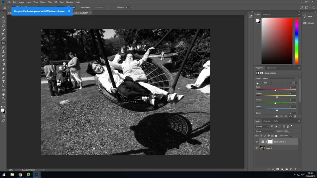
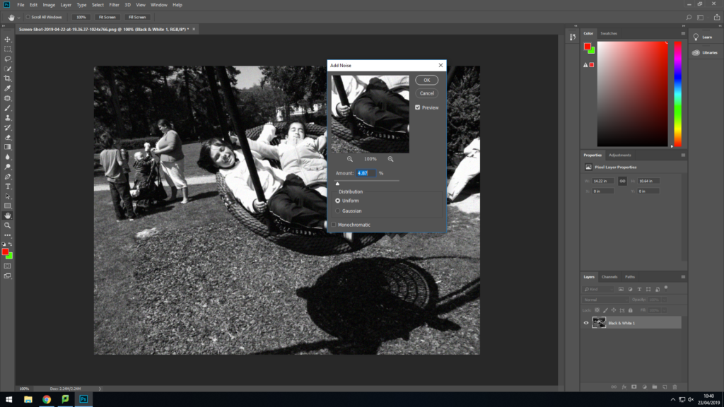
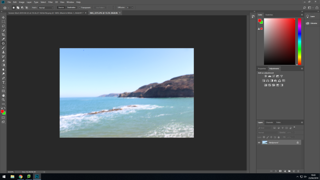
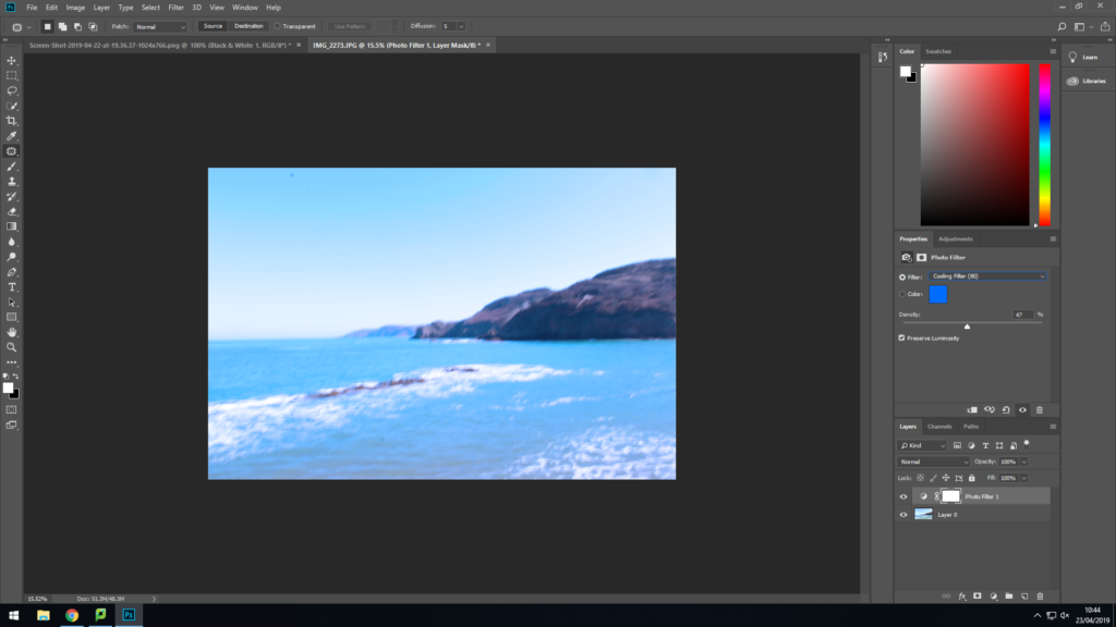
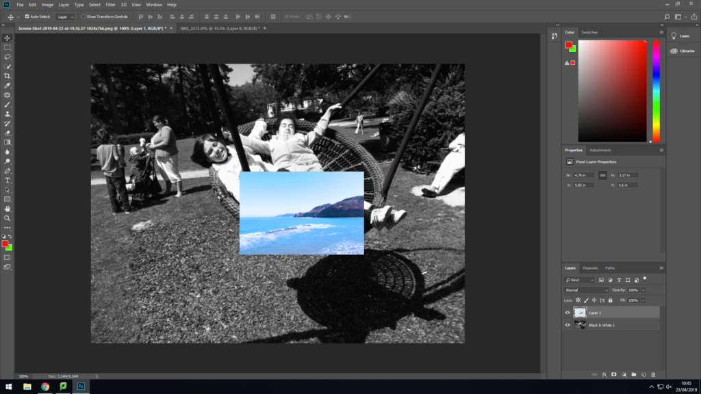
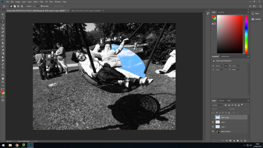
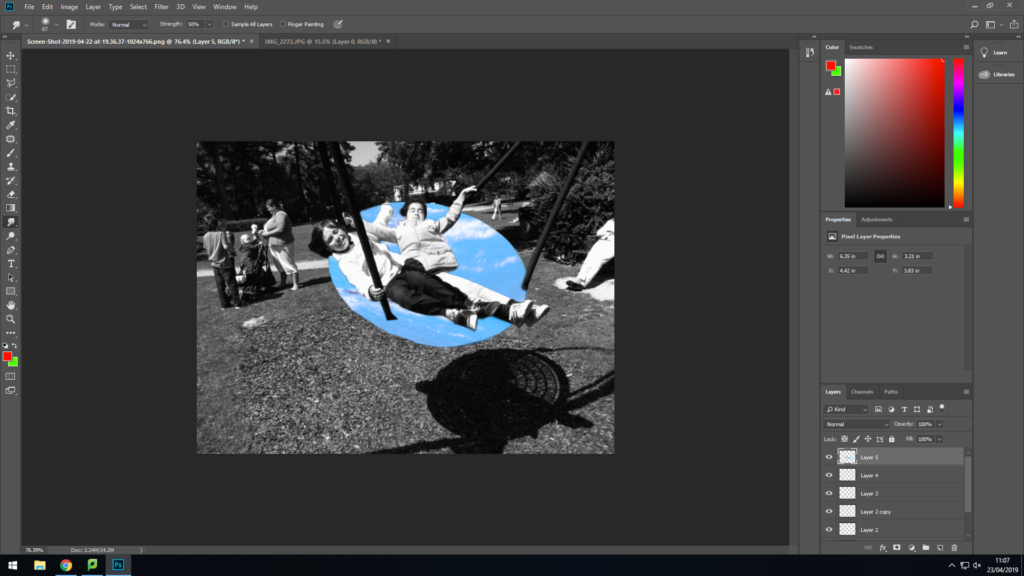
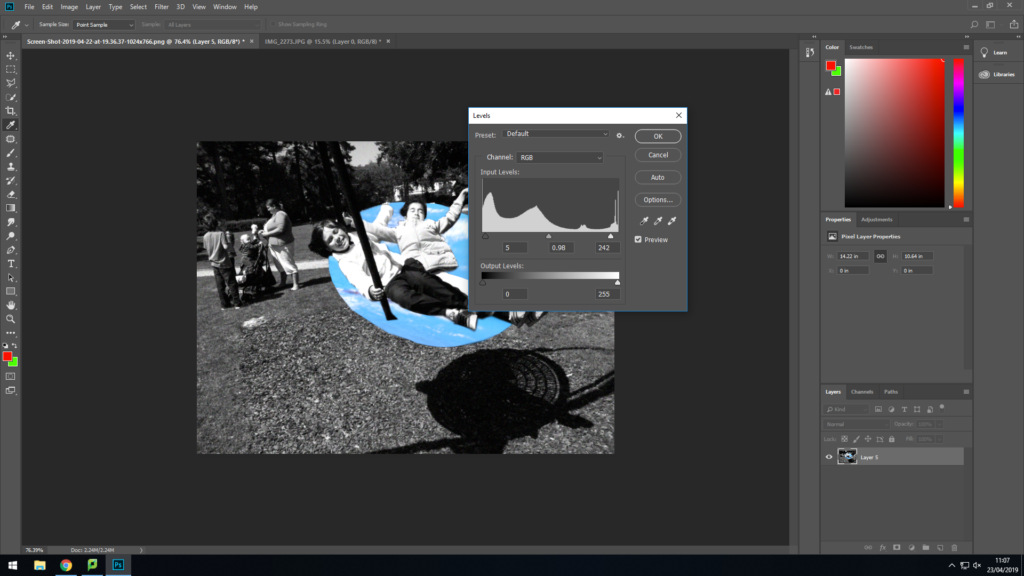
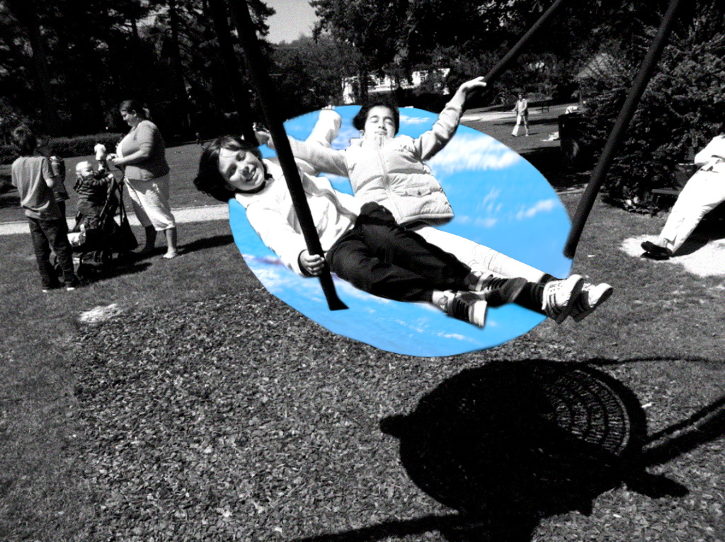
I am pleased with how this photo turned out, but I think if I use better images of the ocean I think it’ll look much better. I think if i get images of the sea from google images it’ll make the photo better.
2nd Photo:
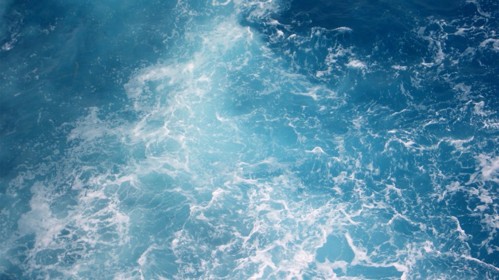
http://backgrounds4k.net/water/
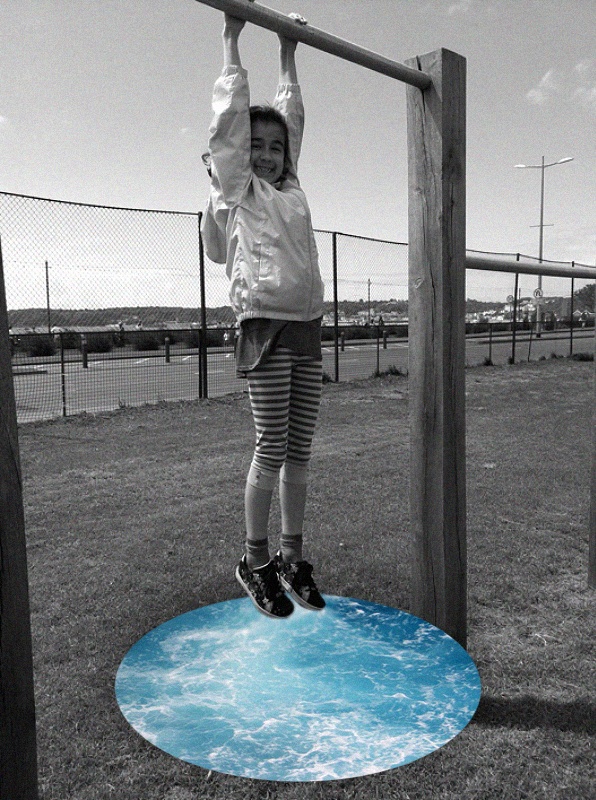
I really like how this photo turned out. I think the drop shadow around the sea looks really effective and like how the black and white makes it look more vintage.
3rd Photo:
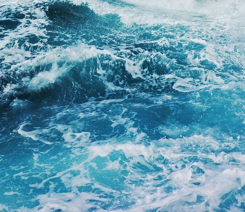
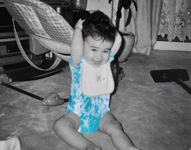
I really like how this photo turned out. I think the blue sea really stands out and brings attention to the model. I also think the use of noise adds a old and retro feel to the photo.
4th Photo:
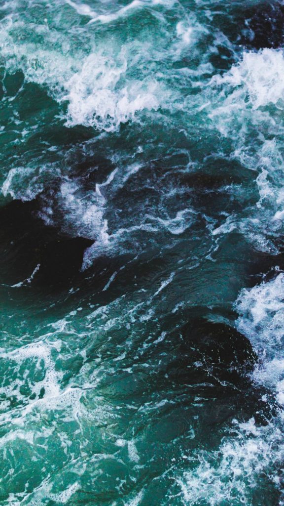
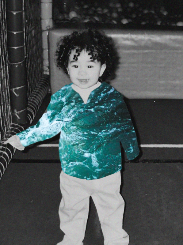
I really like the colour if the sea in this image. I think the green/blue colour stands out very well and compliments the black and white photo.
Best Image:

I personally think this is my best image from this project. The placement of the sea is perfect and it looks very smooth. I also really like the amount of noise I used in this photo.
