Virtual Gallery of Final Images

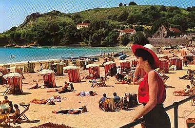
Jersey is where I have grown up from birth, it’s a beautiful place and I am thankful to call it my home. It may only be small, but it’s coastlines and beaches are breathtaking. As a person who lives on the island I believe I underestimate the importance of Jersey’s surroundings of water and I wanted to explore this as the first part of my final project. Jersey has been an island for approximately 8,000 years: therefore, apart from the last 60 years, the only way for people to come or leave the island has been by sea. Over the centuries the way in which boats have been powered has changed – muscle power, wind power, steam power and now diesel power. Being an such a small island means that the sea was once our only way of migration, transportation of goods and exploration, so it’s easy access to the sea is the only reason why it now has 166,083 people living on it and 726,800 tourists, although some of this tourism is now due to air transportation it’s crucial to note that this hasn’t always been an option and Jersey was a popular holidays destination before planes were easily accessible. Jersey luckily didn’t go through a fatal natural disaster, but it is similar in the way that it had to undergo masses of urbanization in order to make it’s place in the world of tourism. Jersey did it in a different way though, so far Jersey’s natural beauty hasn’t been affected to the extent of Thailand, but with an ever growing population and housing problem we could begin to ruin it. In conclusion I want to capture a series of photos of Jersey’s most popular and busiest beach (St Brelade), to emphasis it’s natural beauty, rather than it’s man made attractions. The beaches are the main influence of holiday makers and I believe as inhabitants we forget that. My concept links to the theme of journeys and pathways because it’s about how Jersey has gone ion this journey on industrialization throughout the years via overseas trade and economic development but the beaches have still to this day remained the islands most prominent features.

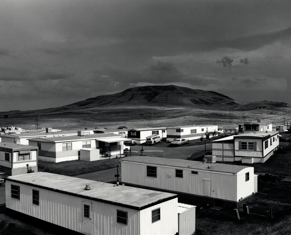
The photograph splits a Colorado environement in two. On the top Adam presents an ominous mountain with clouds similar to the classic nature photograph, while on the bottom he captures the harsh edges of mobile homes blasted with sunlight. The contrast between the angular houses and the smooth edge of the mountains creates an obvious conflict between humans and nature. It is a site of interaction between humans and the inhuman. The photograph works to recognise the American West as a landscape scattered with human development rather than an untouched natural environment.

Frank Gohlke deconstructs the viewers concept of landscape by depicting an empty parking lot in the foreground with only a glimpse of nature in the mountainous background. All together, the photo feels hollow with centred framing and a lack of human presence. Through the picture, Gohlke provides a negative view of the modern interaction between humans and nature.

Side by side these photos reveal certain aspects of the new topographic aesthetic. They move from a celebration of nature to a critique of humanity’s desire for expansion. At the same time, the images create a sense of despair in their subjects through straight on angles and centre framing.
Stephen Shore is an American photographer known for his images of banal scenes in the United States, and for his pioneering use of colour in photography. He was the only photographer part of the New Topographics who shot in colour. It seemed to increase the sense of detachment in his photographs of intersections and streets. Shore was influenced by Ed Ruscha, the conceptualist of California cool. He trained his lenses on the uniquely banal architecture that was along the roadside landscape.

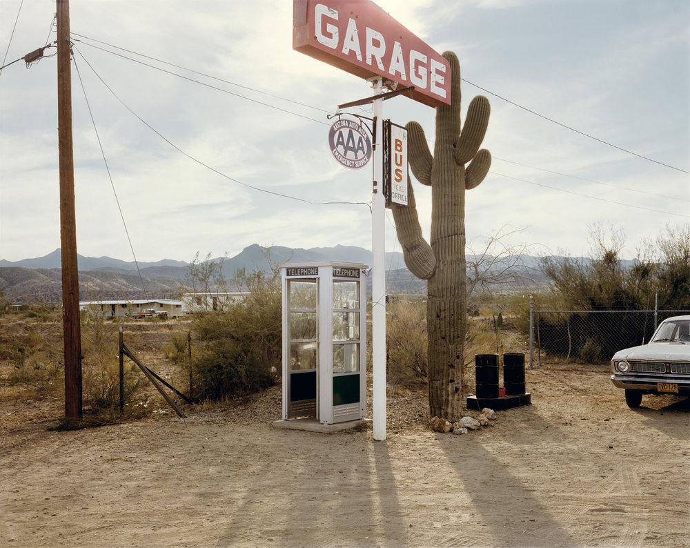

In this image the matching colours hold the image together: the red in the Pepsi sign resonates with the red in the “99 cent” hamburger sign. This picture shows the random and blunt effect of humans on the landscape, dependent on conveniences such as long distance communication systems and fast food. The abandoned telephone booth in the middle ground of the photo is one of the aspects showing how man has altered the landscape.


I have narrowed my final selection of images into groups of four, according to the theme into which they fit, all while still being related by the concept of journeys and pathways.
Set 1:
Set 1 is all about the harsh nature of time, and how we are eventually all forgotten. I wanted to use the idea of decay and deterioration to portray the just how insignificant we are really are as humans, and how there is nothing we can do to stop time from taking its course. However, I didn’t want to just go and find a dead animal and use it as a way to show the pointlessness of things in the grand scheme of time and space, etc. Instead I wanted to show the corrosion of something that should theoretically last longer than animals or people. I found that the abandoned tractor managed to convey a slightly stronger meaning and atmosphere of loneliness, even if it doesn’t give you the immediate visceral reaction of seeing a decaying animal.
Set 2:
Set 2 is much more focused around psycho-geography, and the notion of being constantly being watched by something or someone. It focuses on aspects of surveillance and security and the impact it can have. I linked the newspaper found in a hedge with the security cameras because at the angle the photo was taken from, with the main word visible in the headline being “convict”. The idea of being watched is also included as it is much easier to catch criminals due to the increase in cameras and technology, however I also wanted to highlight the impact that this new age of cameras can have on people that aren’t criminals. The idea behind the discarded coffee cup image is that all of your mistakes are recorded nowadays, and even the smallest things that you do in public will most likely be seen by someone or recorded, whether by a security camera, or a camera on a phone, once again showing how little privacy we really have in the modern era. My plan for framing this set it to gather a variety of small computer components (circuit boards etc.) and stick them onto the surrounding frame.
Set 3:
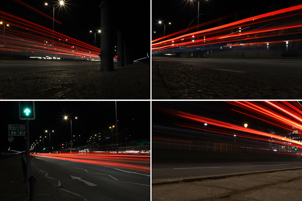
Set 3 is a slightly more overt way of looking at Journeys and Pathways as it focuses literally on the journey of a car going down a pathway. Yet despite how simple the idea is, it is a good way to visually show a “journey” as you can physically see where the car has been as it goes past the camera, and Because of this, light trails are great for literally showing a viewer the journey of a car.
Set 4:
Set 4 was inspired by the work of the Boyle Family’s work, specifically Mark Boyle, who created the group of images known as “The Ground We Walk On”. The concept is fairly straightforward, yet the images are so effective at showing something that we all interact with every day, but put very little thought into. The ground can show so much about the history of a place, with all of the small cracks in the side of a pavement to the small tire indentations on roadside lines, and to emphasize this in my images, I specifically went on this shoot while it was raining so I could get the most definition in different textures, as well as giving the images fairly flat and even lighting, without too many hard shadows.
Set 5:
Set 5 is another example of time changing the environment around us without people really noticing. For instance, the image on the bottom left with a small stream and sand banks either side shows this because there will never be the same formation of sand after the tide comes in. To contrast the freely changing sand, I also included images of Elizabeth Castle to show just how strong it is in comparison, even when the sea is at its strongest, the castle is not changed, yet the sea is still very slowly eroding the stone and rocks, which means in a few hundred/thousand years, the castle could start to lose structural integrity.
Set 6:
This Set of images was partially inspired by photographer John Davies and his work in taking pictures of heavily built up areas to show the repetition in modern life, and just how similar things that are “personal” are. I went on this shoot to originally follow the same style as Davies, but decided to put my own spin on it when I was editing. To show how small we are as people, I used a Tilt-Shift blur in Photoshop to create the sensation of a tiny model town that was taken with a macro lens. I found that this not only helped the images stand out more, but also helped to show how we think that we are in control, when in reality, there’s so much that can’t be controlled (just like how models in a model town are not in control)
Lewis Baltz was a visual photographer who became an important figure in the New Topographics movement of the late 1970s.
His work is focused on searching for beauty in desolation and destruction. Baltz’s images describe the architecture of the human landscape. His pictures are the reflection of control and power that human beings have. Like his contemporaries Robert Adams and Stephen Shore, Baltz focused his camera on architecture of tract housing, office parking lots and industrial parks.
Lewis Baltz documents the changing American landscape of the 1970s in his series, “New Industrial Parks Near Irvine, California”. The project’s 51 pictures depict structural details, walls at mid distance, offices and parking lots of industrial parks. Contrast and geometry are important in these pictures, but what makes them consistent is Baltz’s attention to surface texture and lifeless subject matter.


Idea 1:
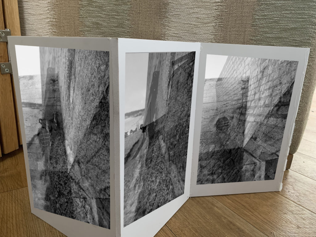
In my first idea I want to showcase my sea wall images using a sculpture/naturalistic style. I decided to get 3 planks of wood and attach them together to almost create a wall, the idea is to stick my wall photographs onto the wall to create a wall. The framing technique itself is abstract and creates a metaphorical meaning, but the images are being displayed in a naturalistic way, as they are not being folder or used to create an object. This juxtaposing idea will help to emphasis the importance of the sea walls during the war and will nicely showcase these successful outcomes. The three images will be printed as A5 images in black and white, in order for them to fit onto the wall.


Idea 2:
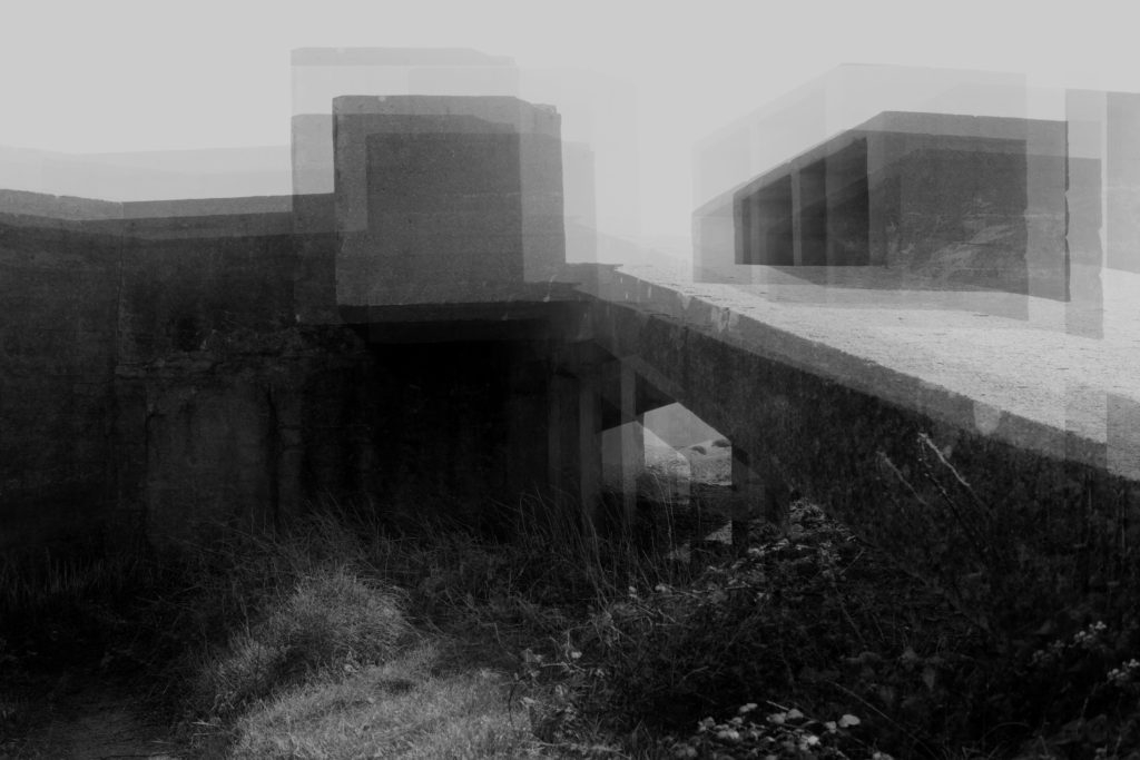
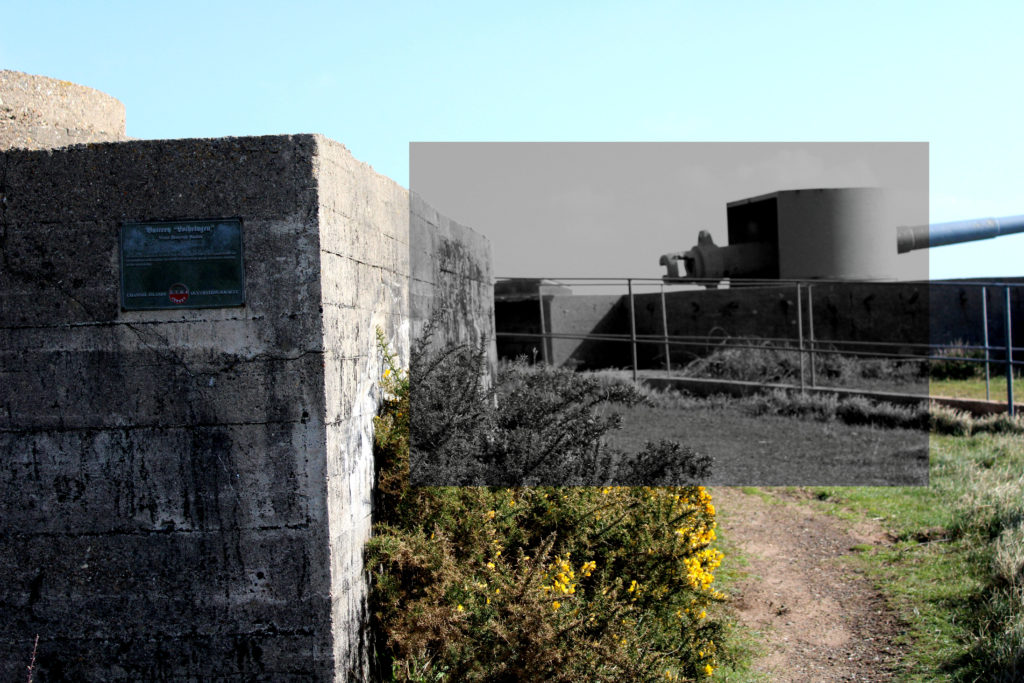
The next idea I want to showcase the most successful outcome, in my opinion, from the project. The abstract photograph was inspired by Khan, and allows viewers to rethink the purpose of the bunkers and reminds us of the purpose of the bunkers during Jersey’s Journey through WW2. The reason why I want to showcase this image is because I believe the edit is interesting to look at due to the distorted look, and how the formal elements work together to create this interesting piece. The image works best alone as it holds a lot of meaning and is powerful enough to stand alone. I intended to print this out as an A3 print and frame it in a black frame, which should help to emphasis the meaning and purpose of the bunkers. I decided to print the photograph as an A3 image as I wanted to showcase the size scale, how the bunkers are a large architecture in real life. Metaphorically, it showcases how the bunkers had the most impact during the second world war, which hold strong links to my project title.
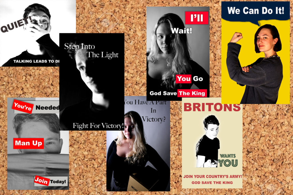
Idea 3:
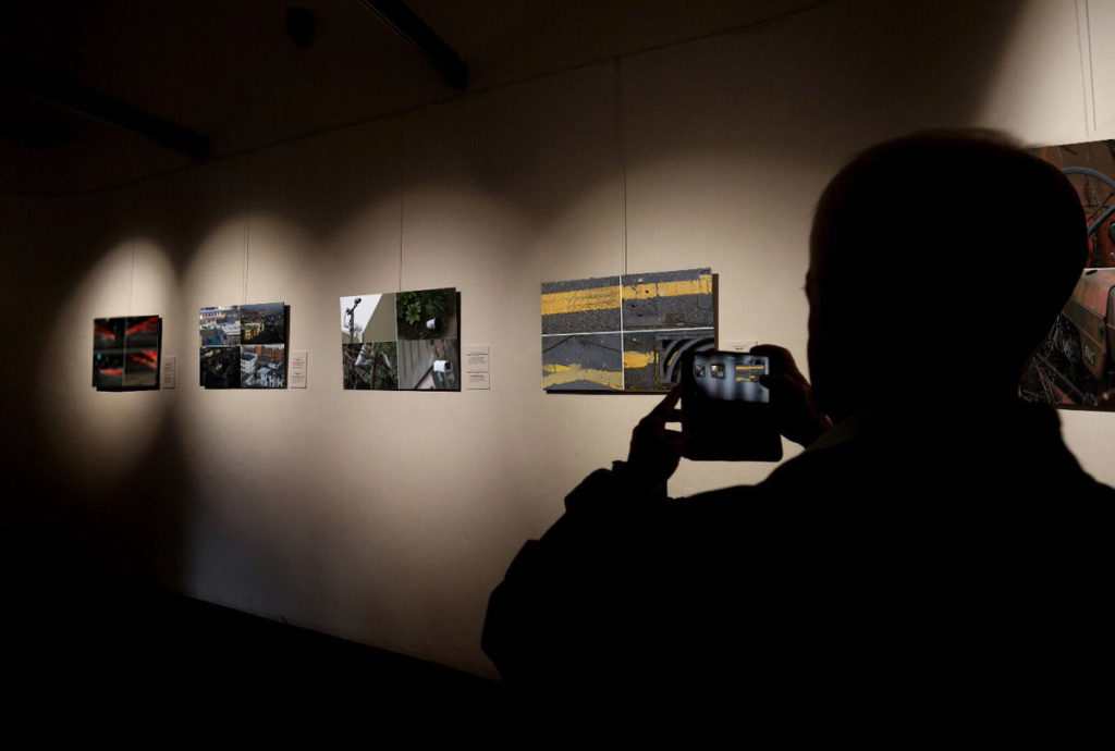
For my next final outcome I want to showcase my 7 propaganda images. I decided to display these images on a cork board in order to show contextual factors of the images. The cork board was occasionally used during the war to display propaganda, in work places and shops, so I decided to implement it into my work. Due to the images being not as successful I have decided to print them out as A5 images, it will ensure that they fit on the board. The photographs all work well together as they manipulate the viewers to believe and do what they say. Although this final piece is not as strong it will still showcase the development of the project and another aspect of Jersey’s Journey through the second world war.
Idea 4:
For my next final outcome I want to create a large version of Talmor’s work, using my images. This outcome will take more of the sculpture route as I randomly place fragments of an image on top of each other to create an overall distorted image, to take away connections and memories from the bunker. I will print out the three images below as A3 images and tear them up, then on a piece of foam board I will begin to randomly place the segments, ensuring the overlap and create a distorted piece. I am printing the images large to remind viewers of the actual size of the bunker and how they had a massive impact in Jersey’s Journey through World War 2 The idea will make the image will showcase formal elements such as form and shape due to the 3D element that it will hold. This idea is another successful photograph manipulation I produced as it clearly holds strong links to the project title.


Idea 5:
For my final outcome I want to display the three images which are in the style of Knez’s photography. I will display the three images by placing them on foam board next to each other with the images being 5cm apart from each other and 5cm away from the edge. This framing method takes the more contemporary route of framing and displaying, allowing the more naturalistic images to be displayed. I have decided to showcase these images as they have strong links to the project title and show my ability to manipulate my images in a different way. I really like the way the three images compliment each other and all work together to showcase how the bunkers have developed since the war and the Journey they have been through. I will print these images out as A4 images, I want them big to showcase the size but not as big as the other bunker images as the outcome is not as strong and as powerful as the other two ideas above.


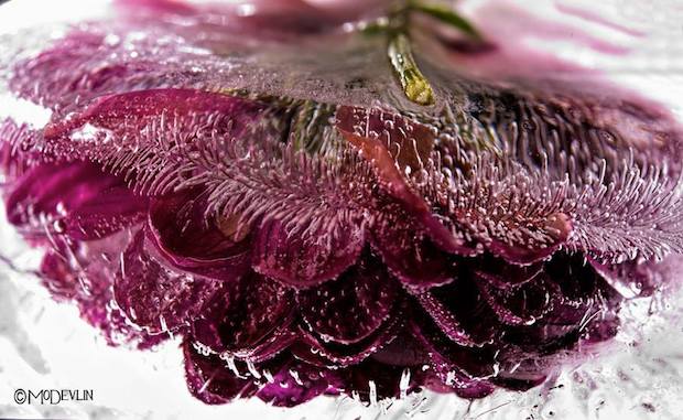
Frozen Posies series
Devlin perfected the art of photographing fish in their aquatic environment. Mastering the dynamic of how light travels through water was only the first of many steps in the frozen flower process. That intense sense of spontaneity Devlin captures is the result of a very deliberate process. These images are not simply stumbled upon, but meticulously created.
Freezing his “models” is the most important part of the process. When tap water is frozen the impurities show themselves as clouded white ice. Devlin experiments and continues to perfect his ability to control the outcome of how the ice forms and captures the subject. Sometimes the bloom itself can be the source of impurity. Any substance, natural or added to the plant, may cause large areas of clouded ice. Blooms with high sap or sugar content or flowers purchased that have been given a preservative, pose the biggest challenge.
One thing that occurs and is cultivated through his photos is the appearance of “ice trailers.” These are simply bubbles that have been squeezed out of the organic material then stretched as the freezing process continued. The science behind their formation is amazing.
Flowers add to any room a feeling of beauty and grace. They are delicate beings, alive with sensuality. Mo Devlin’s Frozen Flowers capture all that and more. The ice adds a “look again” dimension to this gorgeous photography that draws us in and fires our imagination.

Mood boards showing a mixture of Stephan Gill’s work. His work shows clear use of double exposure giving a strong and powerful effect to the images. He also presents the idea of overlaying different images, almost giving an ink splodge effect. I believe this to add great detail to the image and it add excitement and sense of individuality as if differs from the norm photograph that a regularly taken. To me, a lot of Gill’s photographs have a rather cold feeling towards the image with over exposure commonly used i the background to enhance the contrast between the light in the background against the dark (often black) markings on top. This clearly helps emphasis all the aspects of the image creating a more visually pleasing image.

Ideas and questions to ask myself when creating my own work inspired by Stephen Gill

Sea Wall:
The three images below are my top outcomes from the sea wall photo shoot and edits, inspired by Gina Socrate. The photographs are considered successful as they showcase my ability to use and adjust camera settings for effect. It shows my ability to use different depth of fields, focus points and experimentation with different formal elements. The double exposure technique in these three photographs all clearly show a clear message of how the sea walls changed and developed during the second world war. In addition, the technique creates a unique and interesting outcome which changes our perception of the sea wall, justifying how they are successful.

Bunkers:
The next few images showcase my successful experimentation with the bunker images, which showcase another stage is Jersey’s Journey through the second world war. All of the images take a different approach to the idea, but are all as strong, in meaning, as one another. The four images have all been inspired by artist research and showcase my favorite outcomes from the bunker photo shoots. They can be considered successful as they show my ability to use different tools and approaches to manipulate my images, moreover it shows my competence to use and adjust camera settings for different effects.


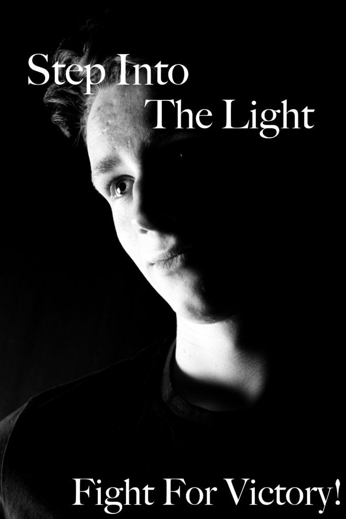
Propaganda:
The next photo shoot and approach I took was looking at propaganda and the impact it had in Jersey’s Journey through the Second World War. Although the imagery is successful, I do not believe that it is as strong as the bunkers and the sea wall, due to the less links it has towards the project title. However, the images are successful as they showcase my ability of studio photography and the use of artificial lighting to achieve effects such as chiaroscuro. In addition, it shows how I am able to take a graphics design approach to manipulate my images.