A5:
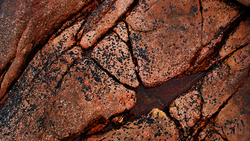
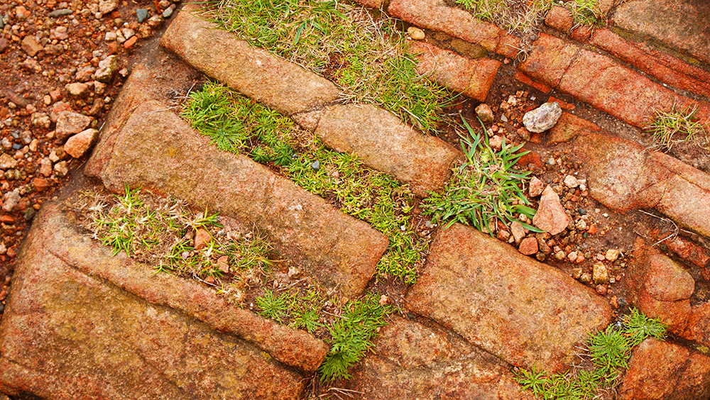
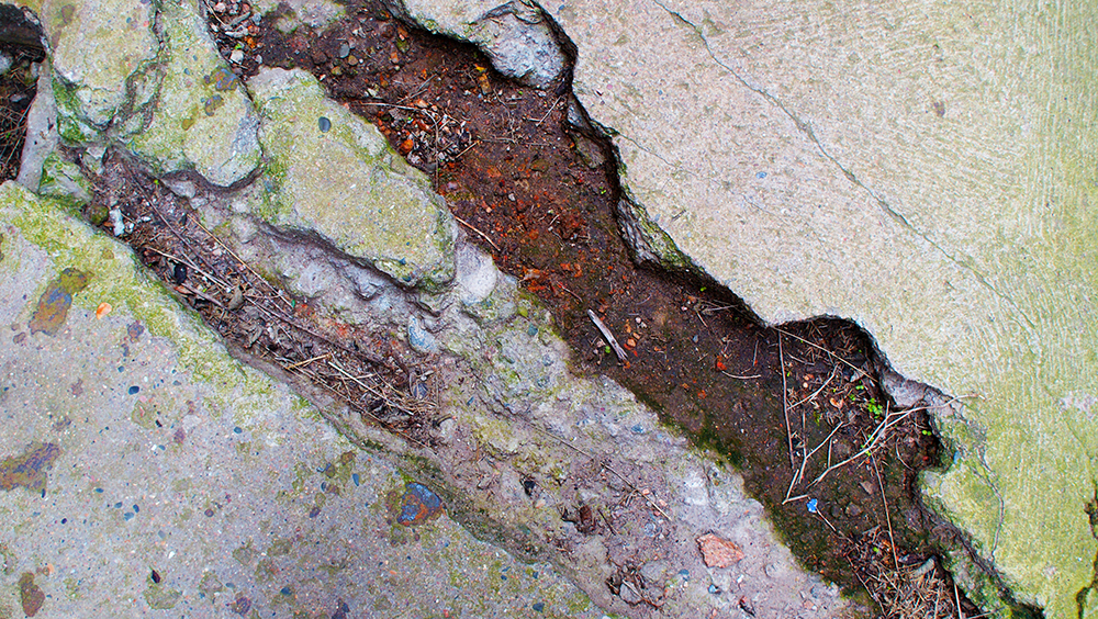
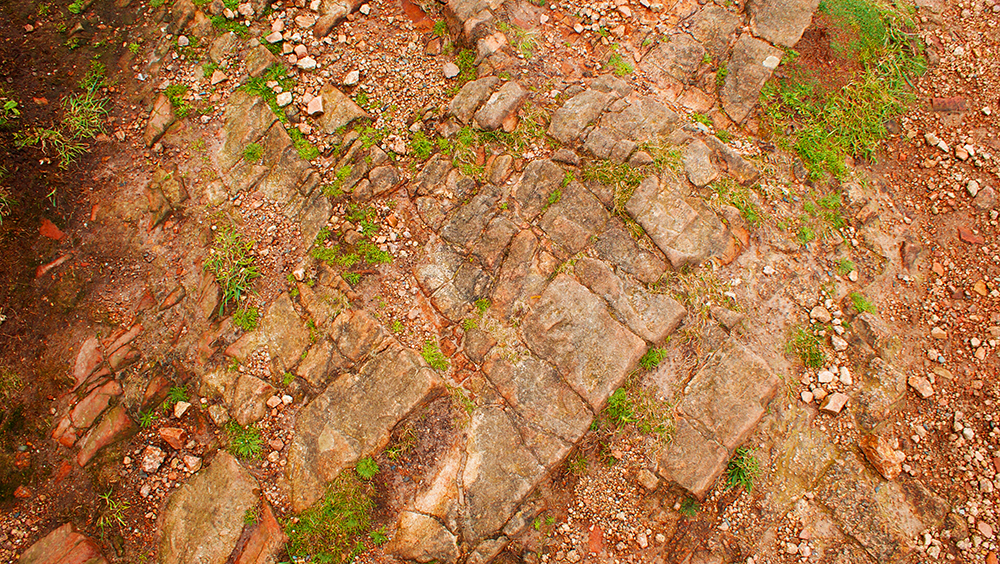
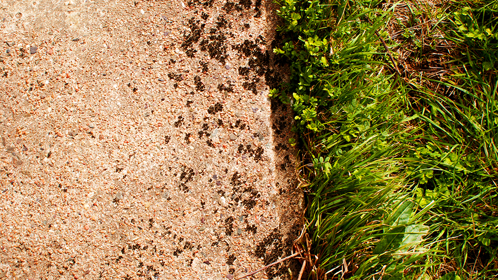
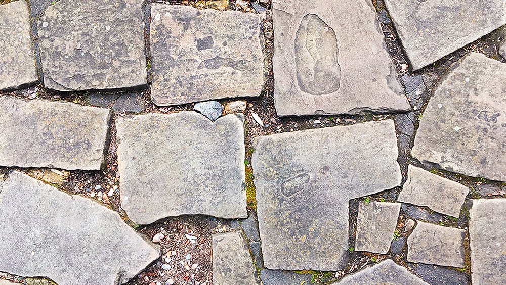
For all of these images, I took the same approach when it came to the editing. I increase the brightness and contrast in each of them, to lighten them up but also give them depth and shadows, and then changed the curves and exposure. I then went onto the vibrance, hues, saturation and colour balance and changed them all in the same way, increasing the vibrance significantly, the saturation only a little bit to add bit of a more intensity to the colour, brought the hues into the negative part of -15, and changed the colour balance to the number squence of 10, -5, -10, which in the end resulted out with the images i’ve come out with now.
A4:
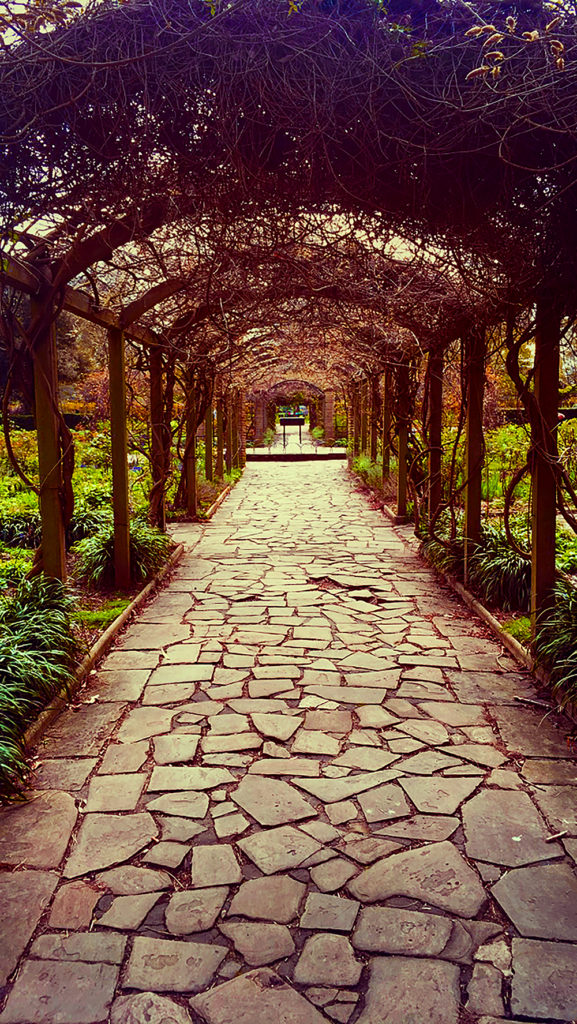
To edit this image, I went to increase the colour dramatically. I added an extra layer and used the paint tool with the soft edged brush to add a little bit of orange in the middle of the image, which you can barely pick up when you look at it, but still makes a difference compared to the original image. I then increased the brightness, vibrance and contrast in the image, and played around with the colour balance, hues and saturation to get to outcome I have now.
A3:
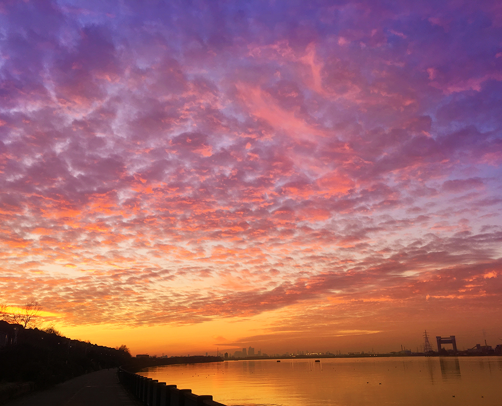
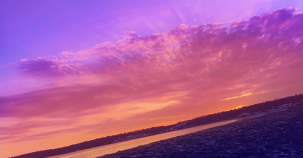
After cropping them to my desired length, cutting out anything unnecessary, I went to edit them in the style of Paul Reiffer. To do this, I added extra layers on top of the original image and used the paint tool with a soft edge brush to add colours such as blue, purple, pink, orange and yellow. I then reduced the opacity low enough until I got my desired effect, and then merged all the layers down so it made one layer in total. I did this to add more vibrant colours to the images and make them stand out in a way which Reiffer’s work does. After this, I played around with the brightness, contrast, and vibrance, increasing them all and making the colours stand out more. I then changed the hues and colour balance, having the images have more of a blue, purple and yellow tint to it.

Leah : now show how you will group and display these images / frame them.
You should also look at the photographer DAvid benjamin Sherry for his over saturated images that explore sensitive “earth issues” such as climate change and over-development vs nature and protected spaces.