Set 1 
Set 2 
Set 3 
Set 4 
Set 5 
Set 6
I have narrowed my final selection of images into groups of four, according to the theme into which they fit, all while still being related by the concept of journeys and pathways.
Set 1:
Set 1 is all about the harsh nature of time, and how we are eventually all forgotten. I wanted to use the idea of decay and deterioration to portray the just how insignificant we are really are as humans, and how there is nothing we can do to stop time from taking its course. However, I didn’t want to just go and find a dead animal and use it as a way to show the pointlessness of things in the grand scheme of time and space, etc. Instead I wanted to show the corrosion of something that should theoretically last longer than animals or people. I found that the abandoned tractor managed to convey a slightly stronger meaning and atmosphere of loneliness, even if it doesn’t give you the immediate visceral reaction of seeing a decaying animal.
Set 2:
Set 2 is much more focused around psycho-geography, and the notion of being constantly being watched by something or someone. It focuses on aspects of surveillance and security and the impact it can have. I linked the newspaper found in a hedge with the security cameras because at the angle the photo was taken from, with the main word visible in the headline being “convict”. The idea of being watched is also included as it is much easier to catch criminals due to the increase in cameras and technology, however I also wanted to highlight the impact that this new age of cameras can have on people that aren’t criminals. The idea behind the discarded coffee cup image is that all of your mistakes are recorded nowadays, and even the smallest things that you do in public will most likely be seen by someone or recorded, whether by a security camera, or a camera on a phone, once again showing how little privacy we really have in the modern era. My plan for framing this set it to gather a variety of small computer components (circuit boards etc.) and stick them onto the surrounding frame.
Set 3:
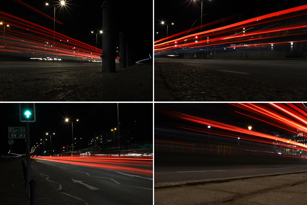
Set 3 is a slightly more overt way of looking at Journeys and Pathways as it focuses literally on the journey of a car going down a pathway. Yet despite how simple the idea is, it is a good way to visually show a “journey” as you can physically see where the car has been as it goes past the camera, and Because of this, light trails are great for literally showing a viewer the journey of a car.
Set 4:
Set 4 was inspired by the work of the Boyle Family’s work, specifically Mark Boyle, who created the group of images known as “The Ground We Walk On”. The concept is fairly straightforward, yet the images are so effective at showing something that we all interact with every day, but put very little thought into. The ground can show so much about the history of a place, with all of the small cracks in the side of a pavement to the small tire indentations on roadside lines, and to emphasize this in my images, I specifically went on this shoot while it was raining so I could get the most definition in different textures, as well as giving the images fairly flat and even lighting, without too many hard shadows.
Set 5:
Set 5 is another example of time changing the environment around us without people really noticing. For instance, the image on the bottom left with a small stream and sand banks either side shows this because there will never be the same formation of sand after the tide comes in. To contrast the freely changing sand, I also included images of Elizabeth Castle to show just how strong it is in comparison, even when the sea is at its strongest, the castle is not changed, yet the sea is still very slowly eroding the stone and rocks, which means in a few hundred/thousand years, the castle could start to lose structural integrity.
Set 6:
This Set of images was partially inspired by photographer John Davies and his work in taking pictures of heavily built up areas to show the repetition in modern life, and just how similar things that are “personal” are. I went on this shoot to originally follow the same style as Davies, but decided to put my own spin on it when I was editing. To show how small we are as people, I used a Tilt-Shift blur in Photoshop to create the sensation of a tiny model town that was taken with a macro lens. I found that this not only helped the images stand out more, but also helped to show how we think that we are in control, when in reality, there’s so much that can’t be controlled (just like how models in a model town are not in control)
