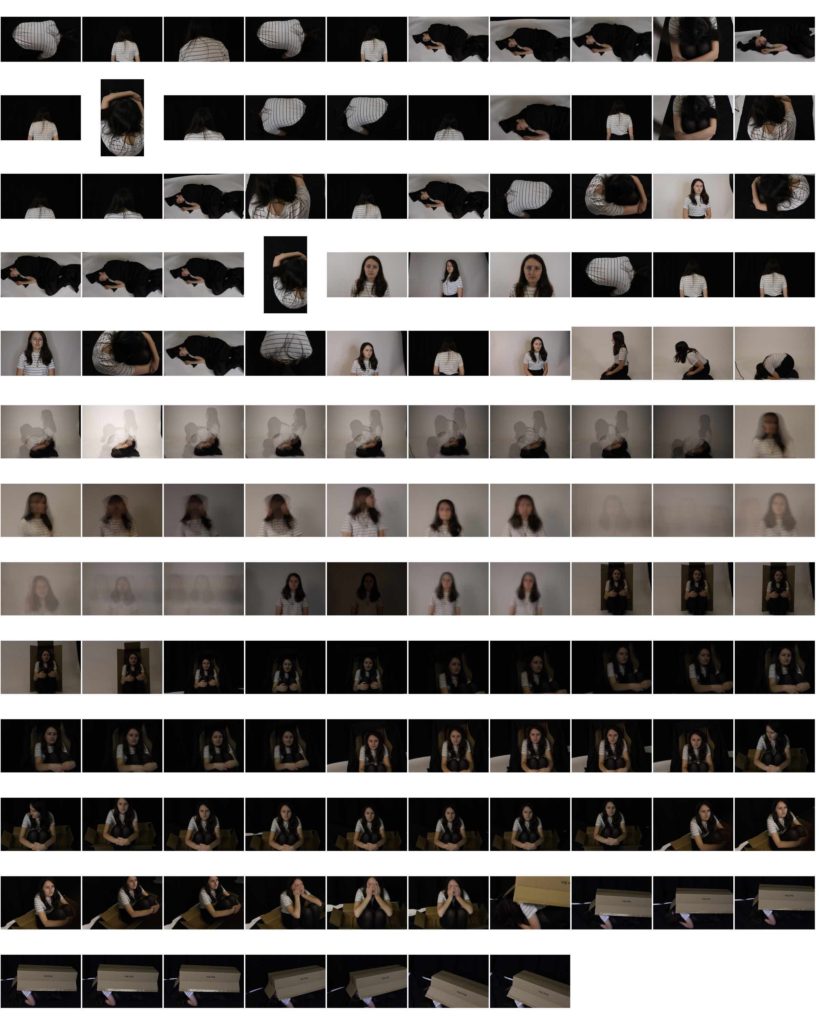
these contact sheets are to show a detailed progression of my thoughts and ideas on the subject of my chosen photographer. By doing this in the process i am understanding his way of working and his artistic eye and what he wants to capture emotionally and physically in the photo.
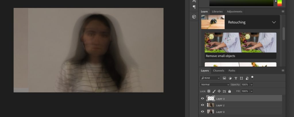
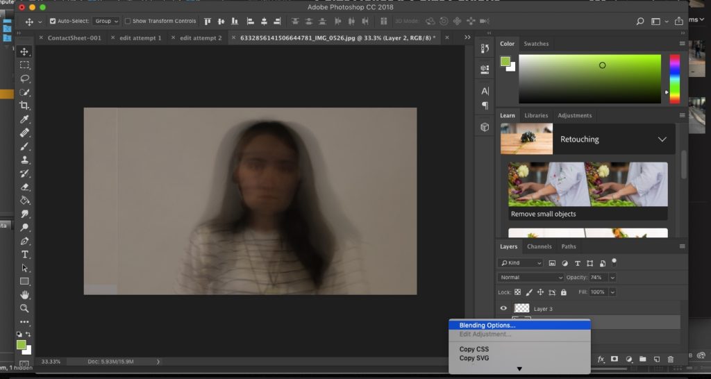
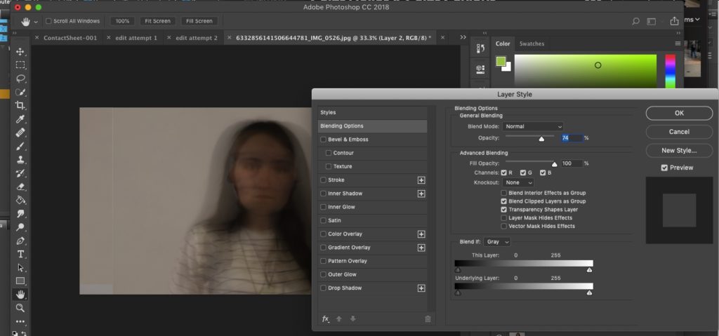
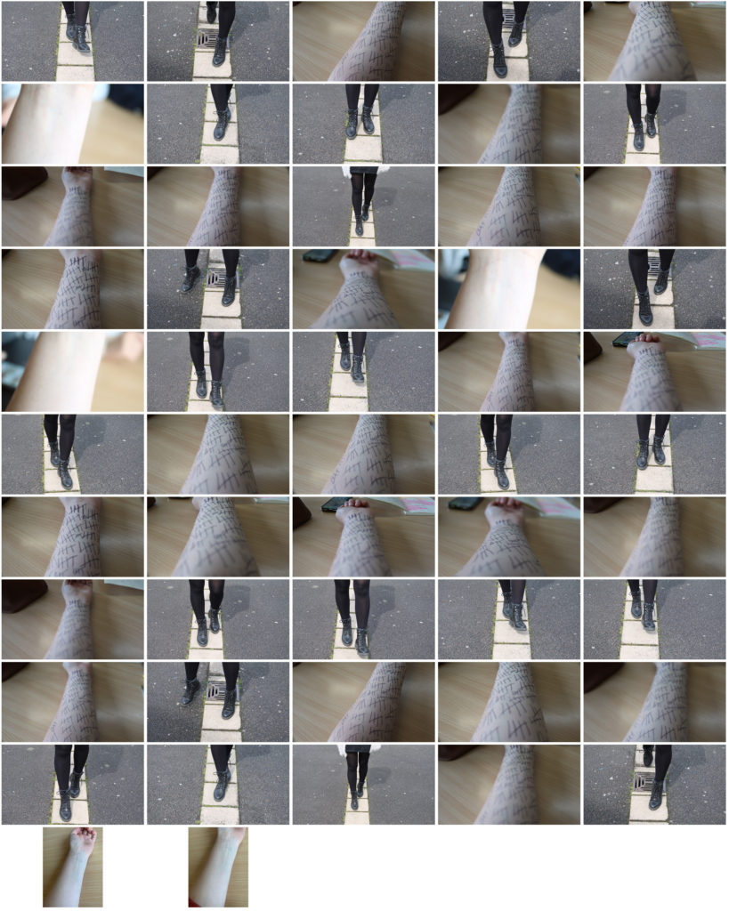
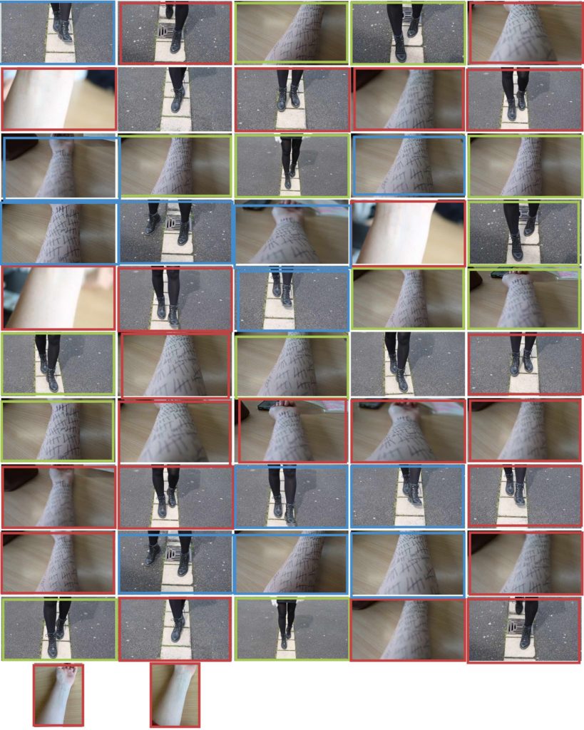
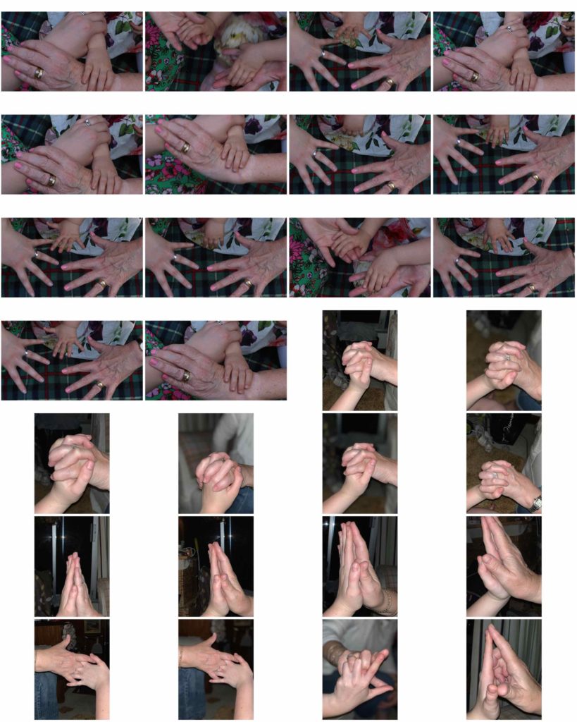
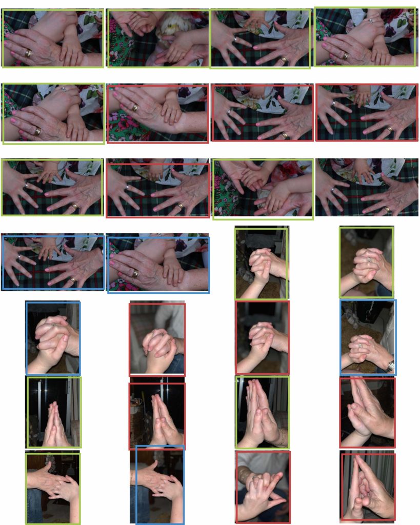
idea 1, photoshoot 1 – katie joy crawfordgreen mean good images red mean bad. the good images are generally the ones that have my ideal exposure and have a pleasing composure with and interesting subject. most of the images i took using multiple exposures came out well however they came out looking rather similar and so times the position of the subject matter sometimes was off. otherwise the images came out resembling my vision for this particular photoshoot. edit experimentstep 1step 2step 3 step 4idea 1 photoshoot 2 – john william keedymy vision for this shoot was to demonstrate the stereotypical characteristics of OCD. images i liked had the model stepping between cracks as that could show precision.some of the images in red she’s stepping of the cracks therefore making my message invalid. the ones in green show nicely her moving between the cracks. the other images show compulsive and obsessive nature by having a tally thingy marked multiple times on the arm of the subject seemingly endless. the red ones are out of focus and/or are not framed correctly. the blue ones represent the ones that i could use for editing but aren’t really strong enough for my final images sleclection.
idea 1 photoshoot 3 – edward honakeraim of this was to gain images mostly for manipulation and editing purposes. the ones in red are ones that i couldn’t use editing due to the position of the subject r the exposure. the lighting was also off in these images. the ones in green the subjects facial expressions are what i was wanting ad she its facing how i want to her. edit experiment 1edit experiment 2idea 2 photoshoot 1 – robyn mcguffickeidea 2 photoshoot 2 – bill voliaones i chose framed well lighting nice fitted with my artist ones not not framed good boring or didn’t capture what i wanted or my settings weren’t rightidea 3 – photoshoot 1 – peter funchphotoshoot i didn’t like. boring images hard to find good ones. the ones i liked were the ones that had the most people in similar to my artist. i wanted these to come out more candid which some did but others didn’t have much content at all.idea 3 photoshoot 2 – boyle family
green interesting because matched artist and lighting good an red either boring or just didn’t look right.
For my first photo-shoot, I have decided to focus on taking inspiration from the photographer Chris Porsz , and have decided to recreate archival photographs from the past (using the same now grown subjects) in order to portray the journey of the subjects through their life, and to show the changes they have undergone in the time between the 2 images being taken. The comparisons will be easier to make due to the fact that the subjects will be recreating the same poses in the same environments, thus showing a reflection between the 2 time periods, and showing the differences and similarities between the subject then, and now.
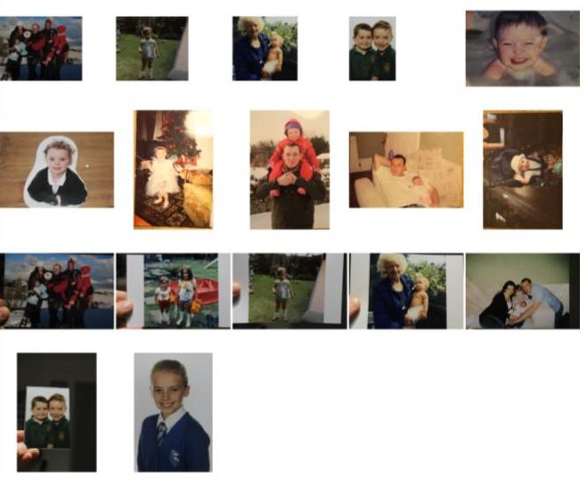
The below images are the archival images that I may be recreating using the same subjects:
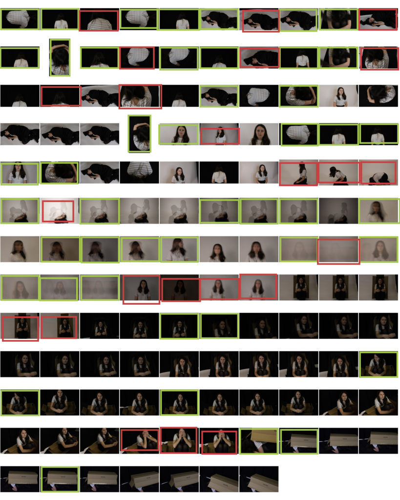
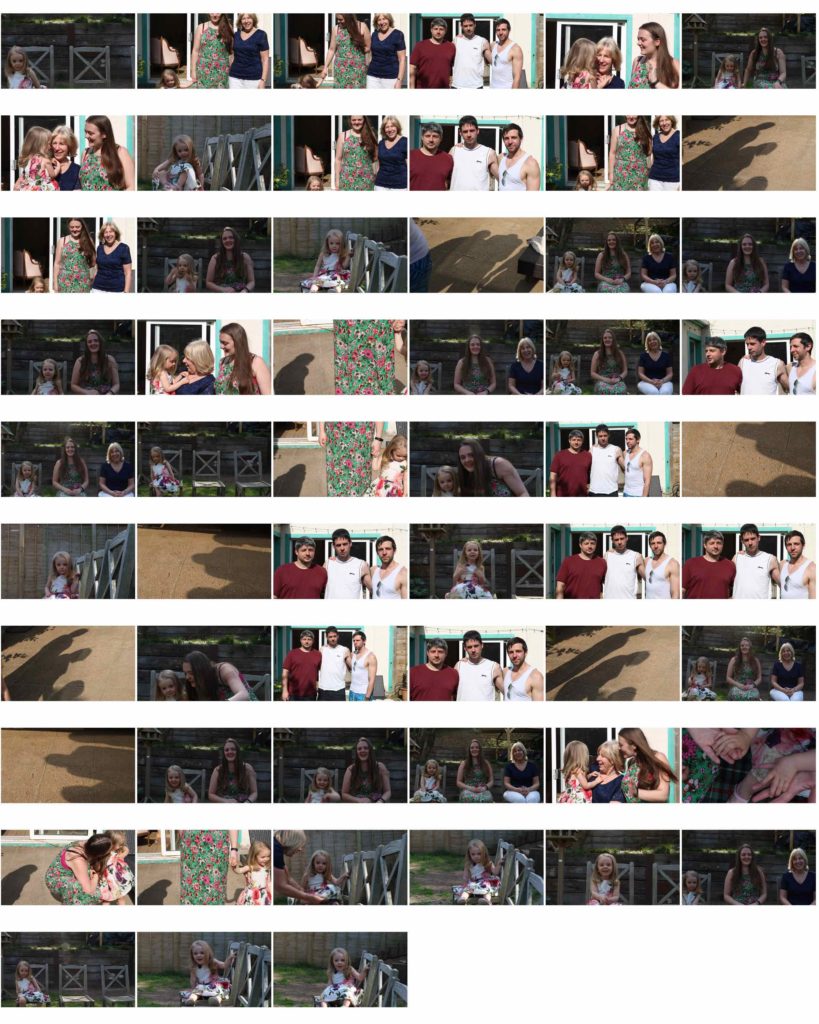
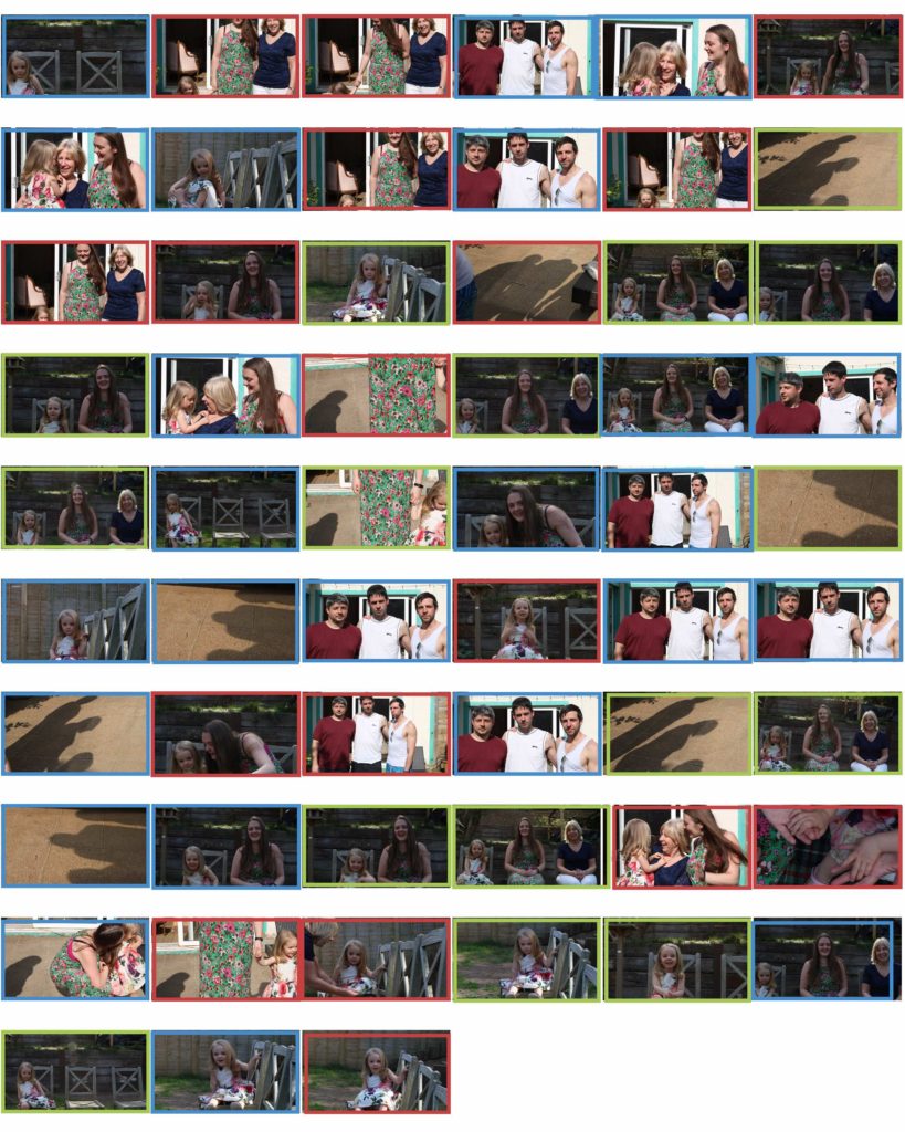
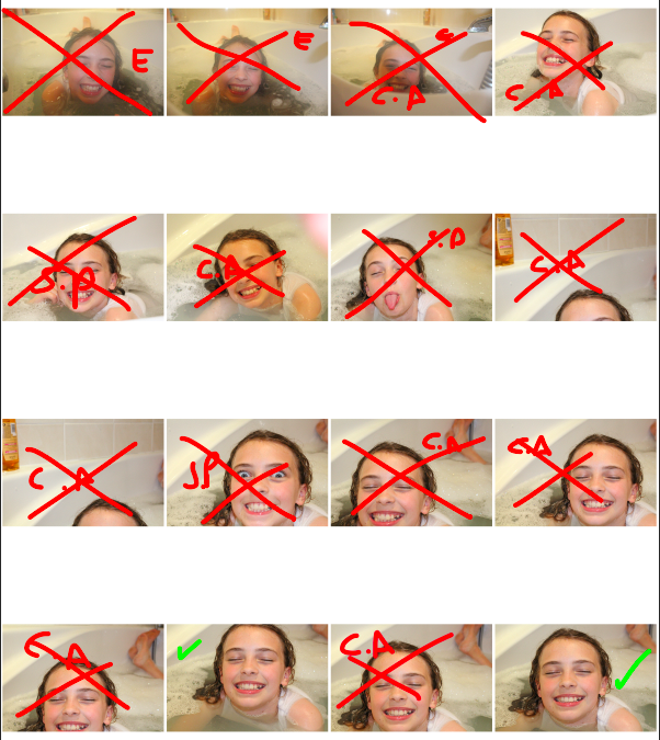
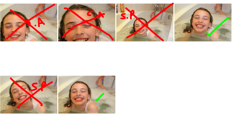
The following images are contact sheets showing my decision making process for the images that I will carry through to the editing process:
Key: Red S.P = subject posted incorrectly – Red cross = rejected image – Red C.A = camera angle is incorrect – Green tick = possible final image
I also edited the original, archival images in order to make them seem more 2D and flat, rather than lying on the original background that i took the images on. The contact sheet for the archival images is below:
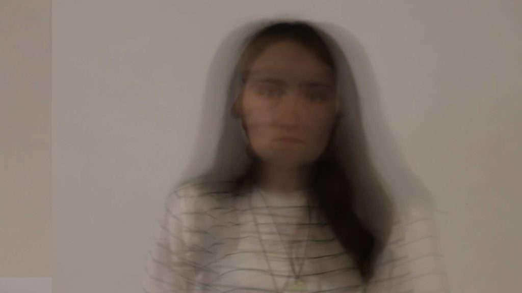
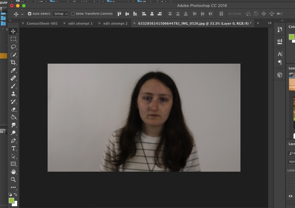
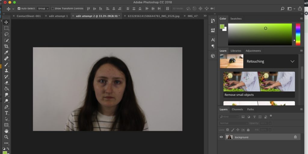
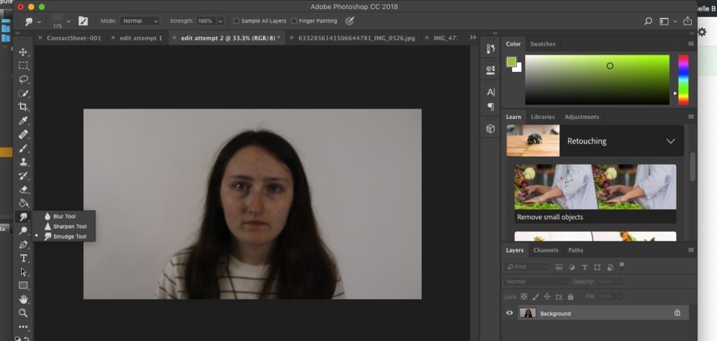
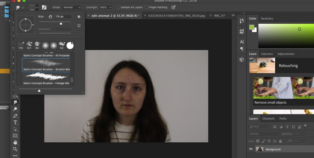
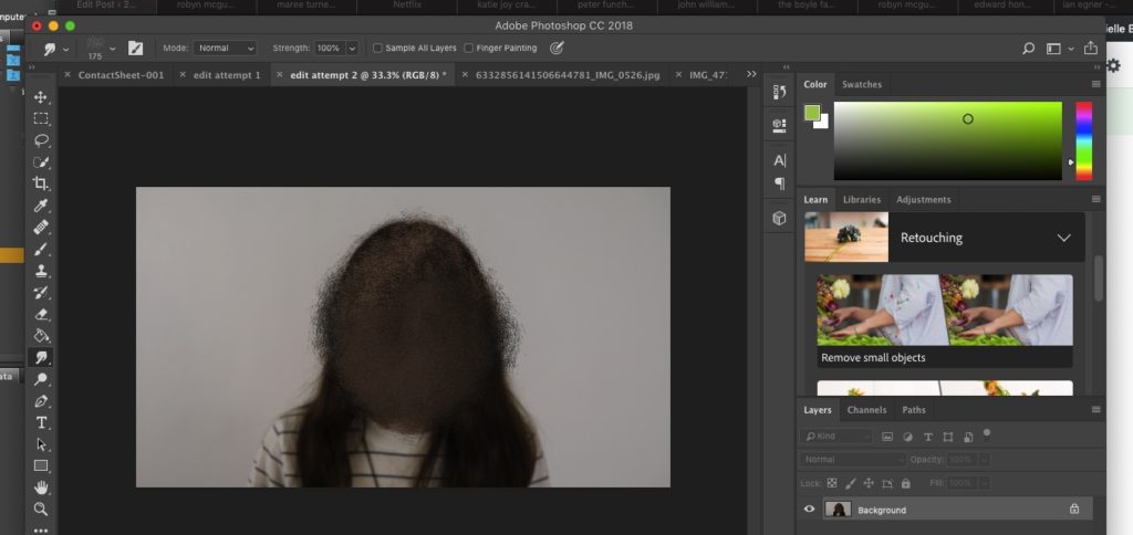
On top of the above contact sheet, I have also made use of Photoshop in order to edit some of the images rather than taking multiple photographs of subjects, I have used a single image that is more recent (e.g a school photo) and have edited it to match the original so that the 2 can be compared. Below is an example of an image I will be editing to match the original:
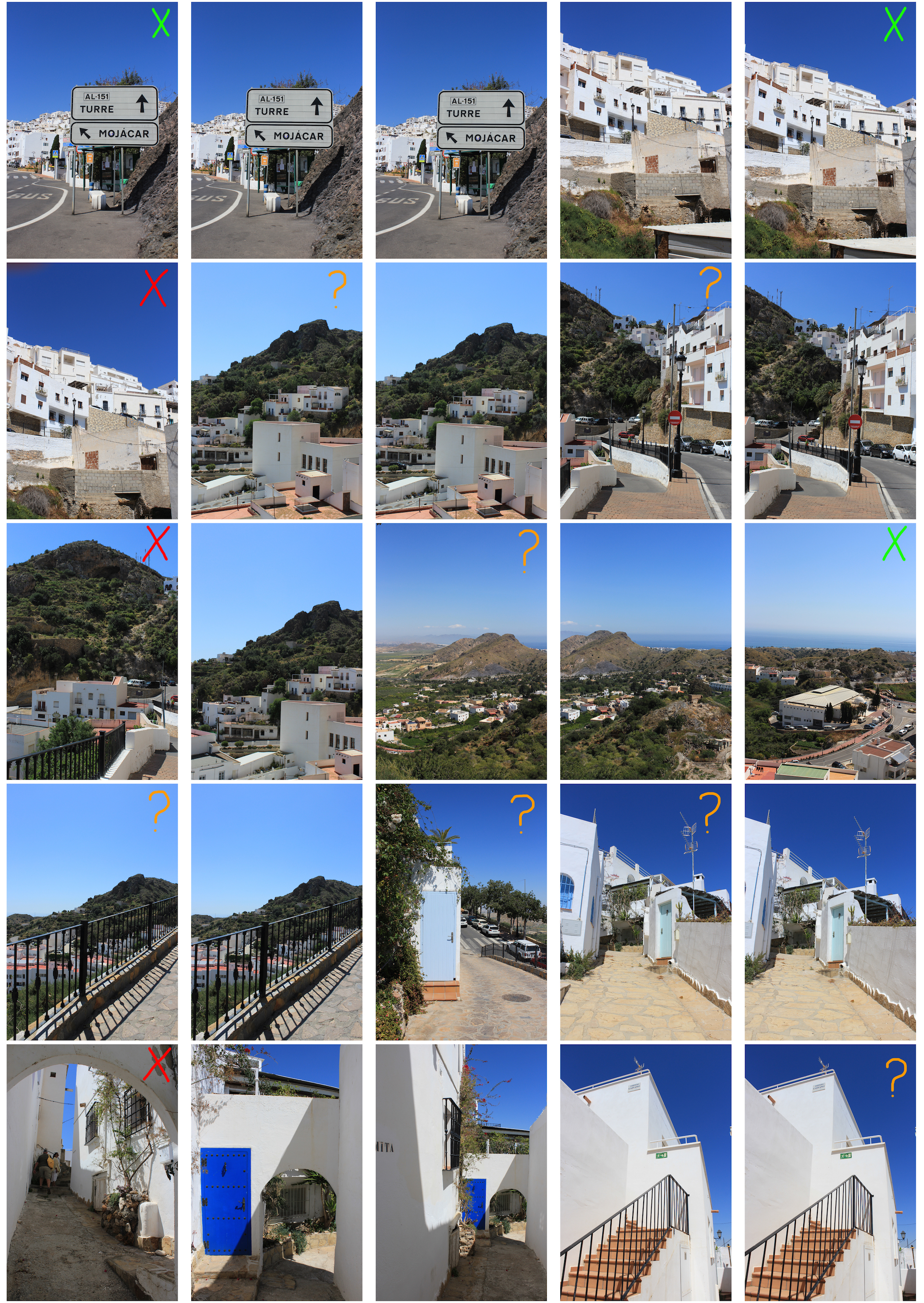
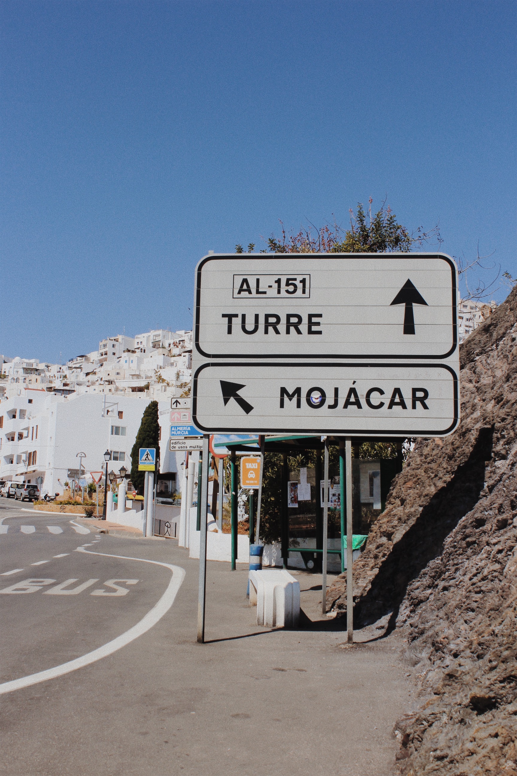
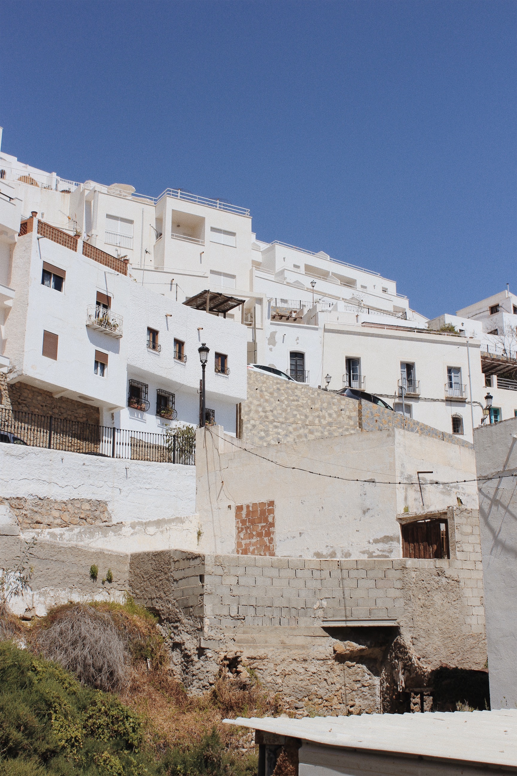
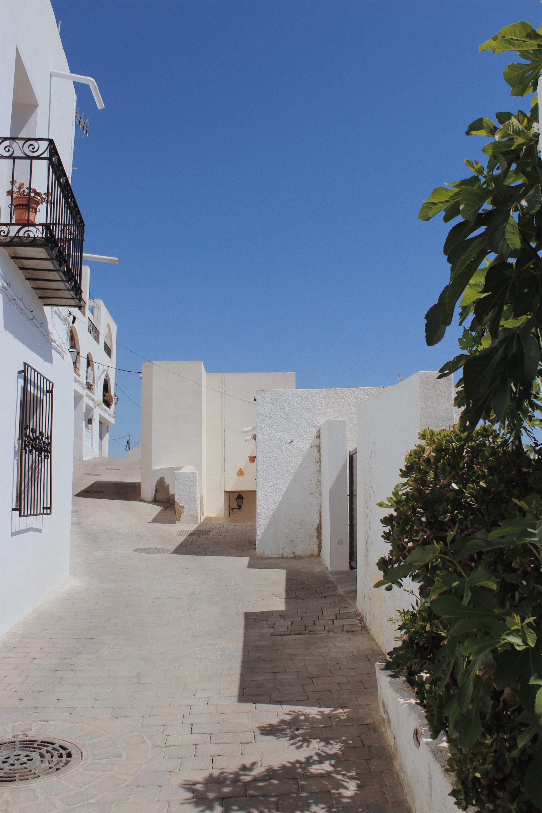
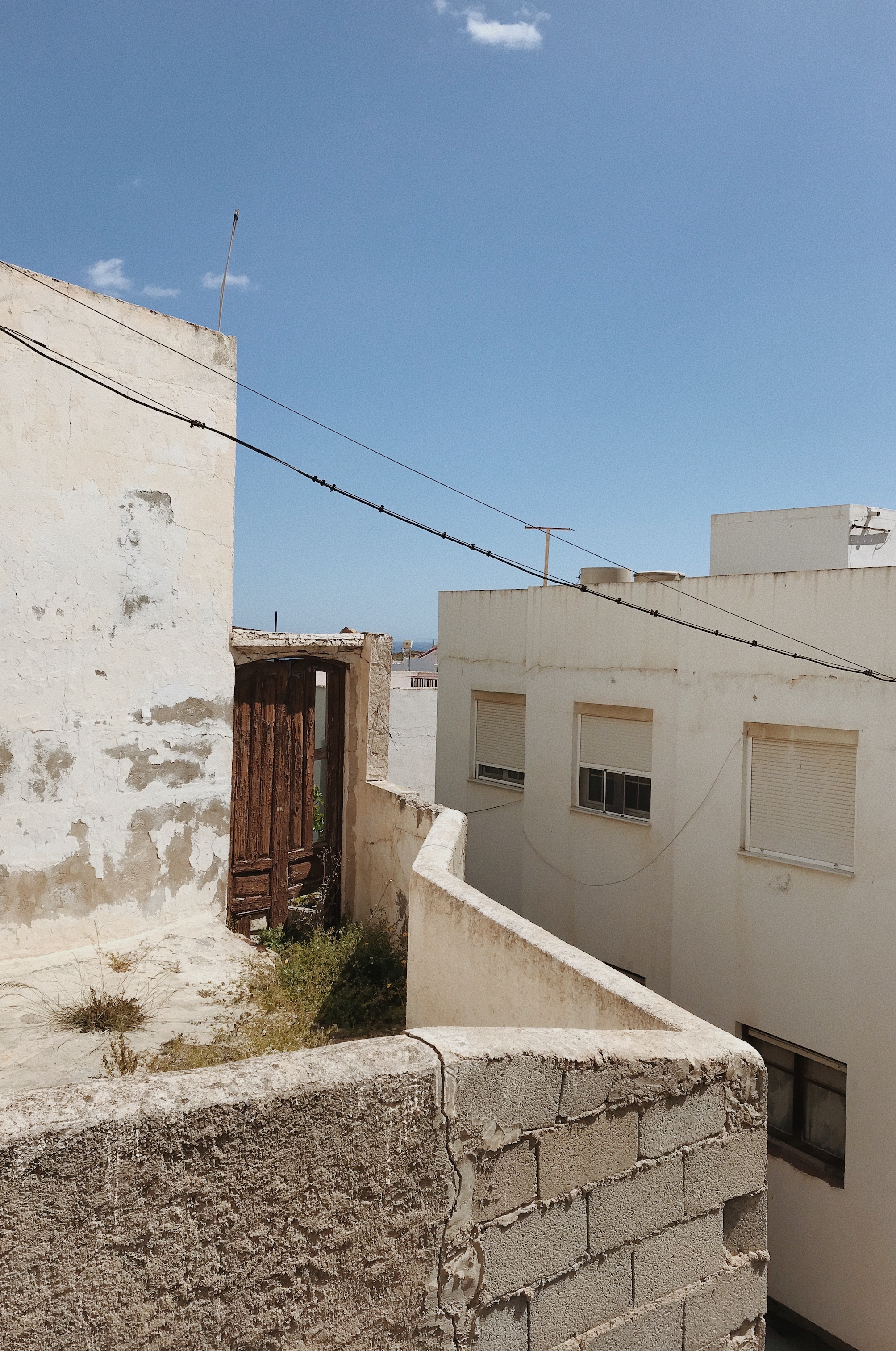
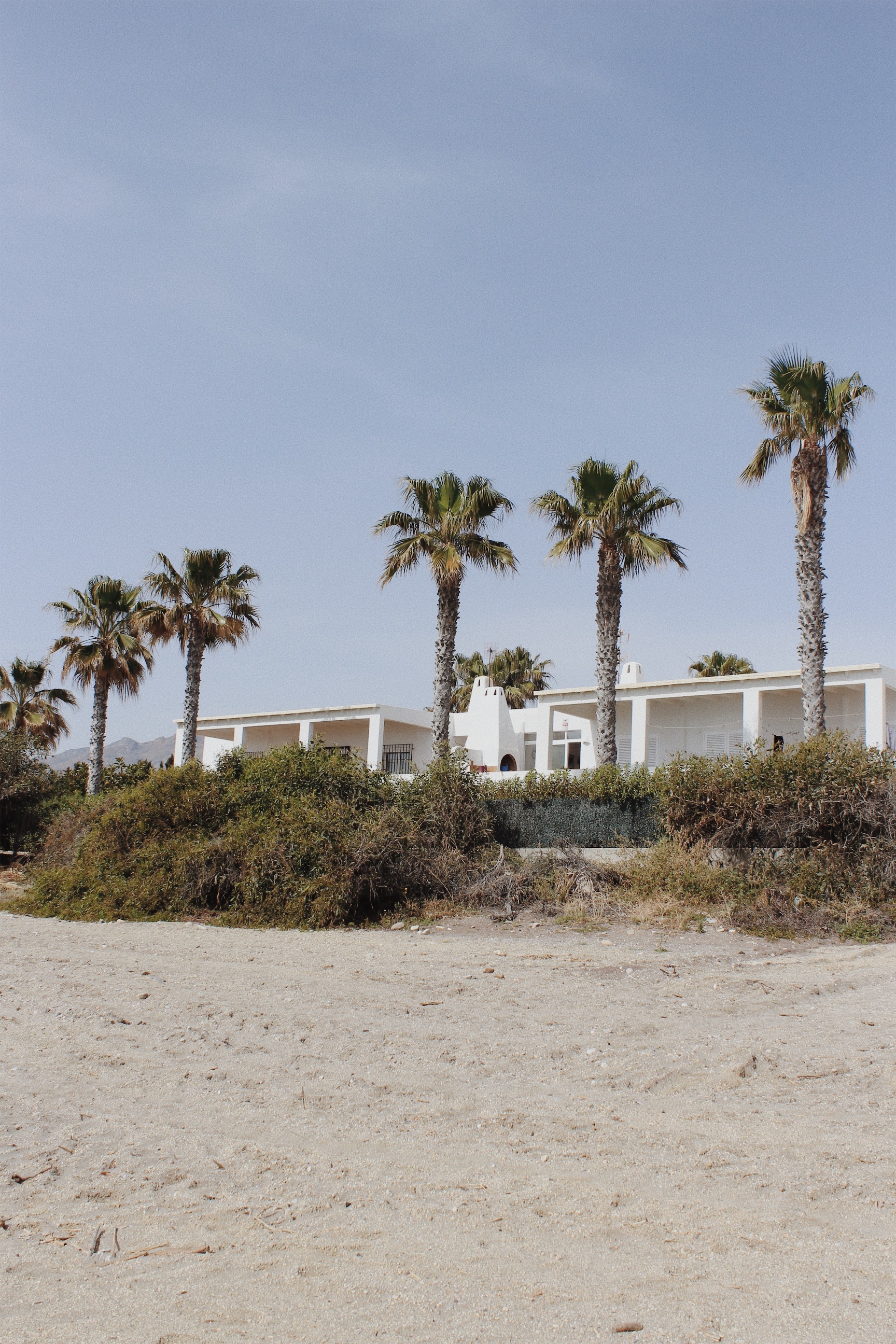
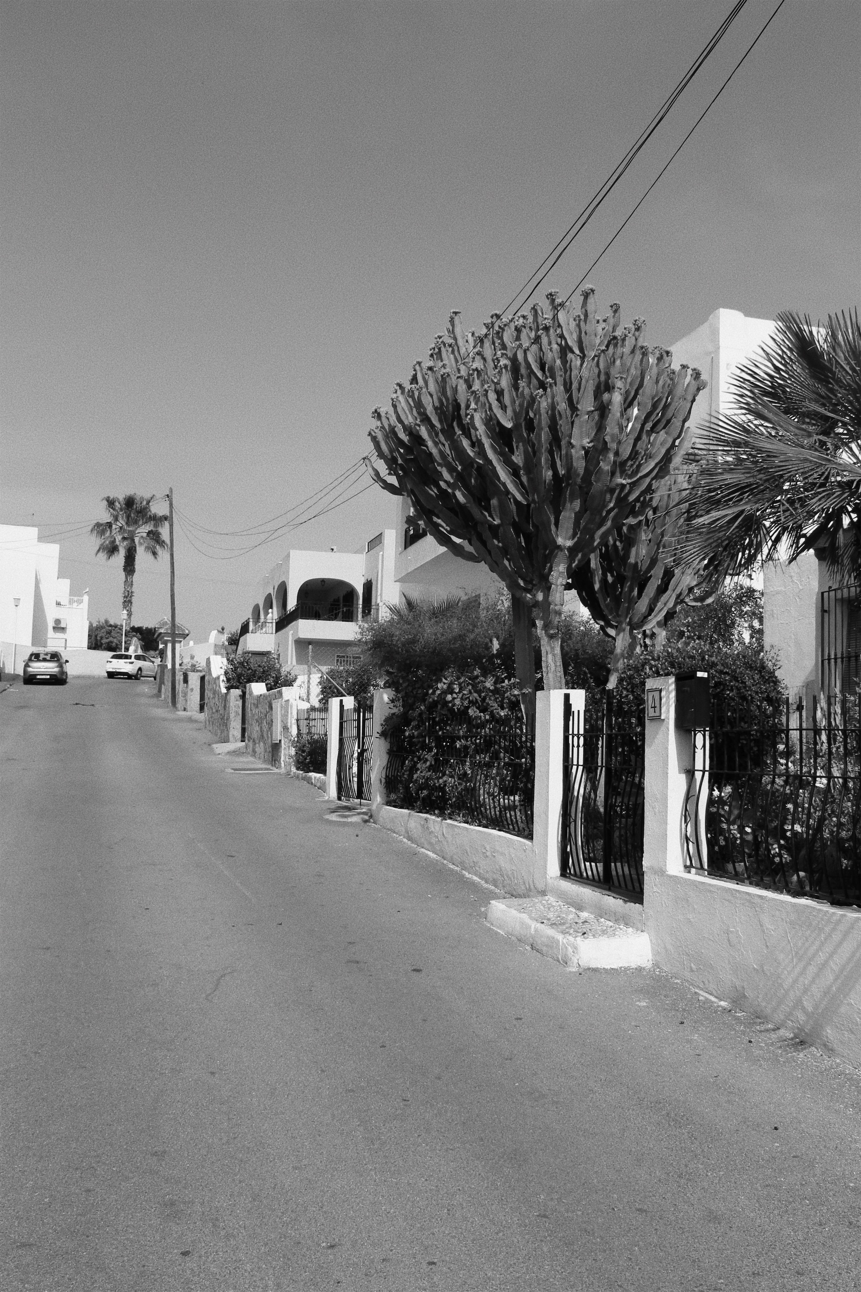
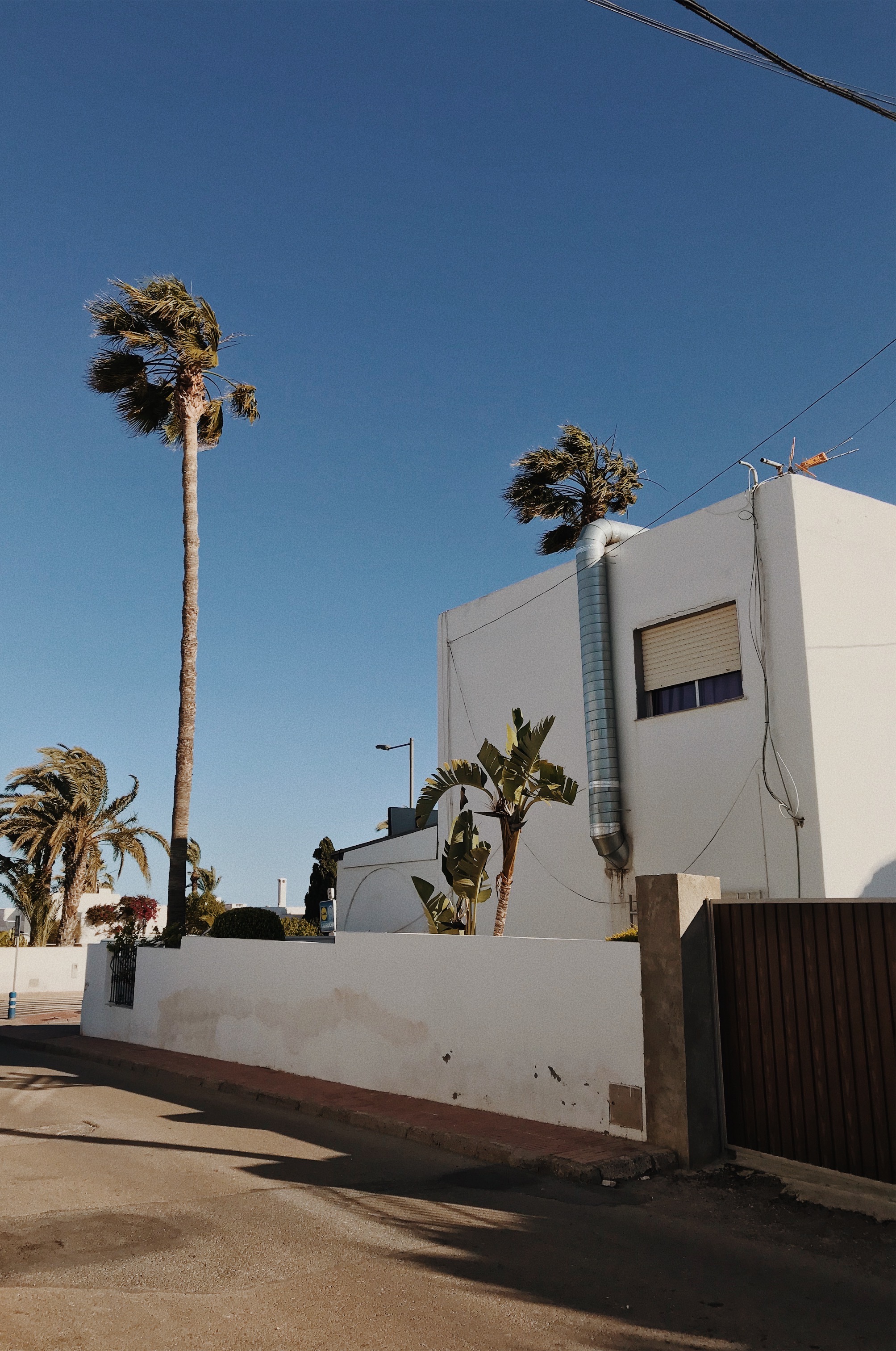
For my second photoshoot in response to The New Topographics, I decided to take pictures in the old town of Mojacar. This location has a maze of narrow streets, white houses and trailing bougainvillaea. The old town clings to a rocky hillside. This was another great location to take pictures because it is an unusual urban development built by the Moors. The viewer can clearly see how man has altered this land through the architecture upon the landscape.
After the photoshoot, I put all the images onto a contact sheet to make a selection of the best images in response to The New Topographics. The selected images have then been edited on VSCO so I could make the images appear like film by adding filters and grain. Most of the final outcomes have remained in colour while one image has been turned black and white.
Contact Sheet
Final Outcomes
Evaluation
This photoshoot was successful as I managed to capture 50 images of urban development whilst I was in the old town of Mojacar. This meant that I had several photos to select from. I captured various pictures of different architecture to show the control and power human beings have over nature. I think my pictures reflect the style of the photographers involved in The New Topographic since my final outcomes have a banal aesthetic of the urban landscape.
At the beginning of this project I had many ideas on different approaches I could take to showcase Journey’s and Pathway’s, after lots of thoughts and inspiration I decided to set my project to the Journey of Jersey through the Second World War. This title is very broad which allowed me to explore different aspects of Jersey’s war, such as Bunkers, Liberation Day, Sea Wall and Propaganda. It also provided me the opportunity to explore and research different aspects of the second world war and how it impacted Jersey, this was exciting for me as learning about the past is naturally something that interests me. I started off by exploring Gina Socrates work who captured Jersey Sea Wall, which was built not only to stop the tide hitting the island but to keep other armies from invading Jersey. A while back I viewed Socrates work at the CCA gallery where she explained her methodology of using the double exposure and explained why she conducted the photo shoot, her passion for her work and outcomes interested and excited me which allowed a successful first photo shoot. My first photo shoot was inspired by Socrates, where I explored capturing the subject of the sea wall at different viewpoints and with different shutter speeds. The exploration allowed me to showcase my ability of landscape photography and ability to adjust my camera settings and the use of natural lighting. When creating the edits of these images I wanted to replicate Socrates double exposure, which created a successful outcomes which showcased an aspect of Journey’s Jersey through the second world war. Although this shoot and edits where successful, I did not see any opportunity for further exploration. My next aspect of Jersey World War was Jersey’s bunkers and how they where used for the German army to help prevent other armies entering the island. For this shoot I looked at two artists who captured the same subject which was Jonathon Andrew and Paul Virilio, both artists produced high quality imagery of bunkers which helped inspired the way I captured the bunkers. Within this photo shoot I produced many successful outcomes which reinforced my competence of capturing landscape images, with different depth of field. When editing I struggled for inspiration in how to manipulate the images, as I wanted to keep the images socially acceptable and still showcase the same meaning as the artists researched. This is when I found and analysed the work of Idris Khan who distorted his subject by creating multiple layers, turning down the opacity of the layers and then slightly moving them. I liked the effect it had on his imagery and so tried in on my photograph, which lead to one of my strongest outcomes, it also inspired other editing ideas which shows further development towards the project. Due to the high success of this photo shoot and edits I decided to conduct another photo shoot using some of the imagery created, this lead to further exploration and my ability to think creatively. In this photo shoot I printed some of my work on acetate and held up to the camera lens to distort the bunkers in the background. I also printed out my most successful image into 8 A3 fragments which made up the whole picture, the idea behind this was to showcase how big the bunkers actually are and metaphorically how they had a massive impact during Jersey’s Journey through the Second World War. I managed to get some successful outcomes, but the images where not as good as the original photo shoot. The edits showcased my ability to use Photoshop and the different tools within the software to manipulate the images. I felt that I had explored bunkers a lot so I decided to move onto my next idea which was propaganda. I wanted to showcase how war propaganda was used to manipulate men to join into the wars army. I researched Barbara Kruger who created imagery like propaganda but addressed issues in 1945 society, as well as war propaganda and tableaux photography to understand what makes a successful propaganda. In the photo shoot I conducted it in a studio to showcase my ability to use artificial lighting and different types of lighting. It also allowed me to showcase my ability to explore and do tableaux photography. During the editing process I looked at using videography, I looked at using gifs of my model getting into the famous position. I also recreated Kruger’s work, then using war photography and Krugers work I created my own propaganda. Although I created successful outcomes, they where not as strong as my bunkers work but still showcase development and exploration towards the project. Due to a lack of time I was not able to conduct anymore photo shoots, I decided to do two more artists research to produce more edits. I research Knez and Talmor who looked at providing a way of reflecting on the past, but in different tones and ways. Then using successful images from my bunker shoot I decided to create edits in the same style. Doing this I produced many strong outcomes which I am now using as final pieces due to the success and meaning it holds. I believe that this project is successful as I have been able to produce many high quality photographs due to my competence in adjusting camera settings for effect. Moreover, I showed my competence of using Photoshop and hand crafts to manipulate my images. I have been able to explore multiple aspects of Jersey’s war in order to showcase the Islands Journey through the Second World War. If I had the opportunity to expand the project I would look at liberation day, and how the islanders celebrated when the Germans left the island, which would have linked with Martin Parr. To conclude, I believe that this project has been highly successful and I am proud with the final imagery produced.
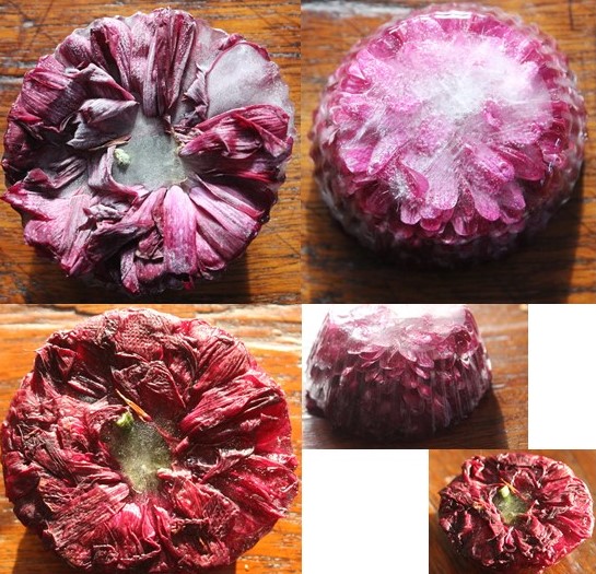
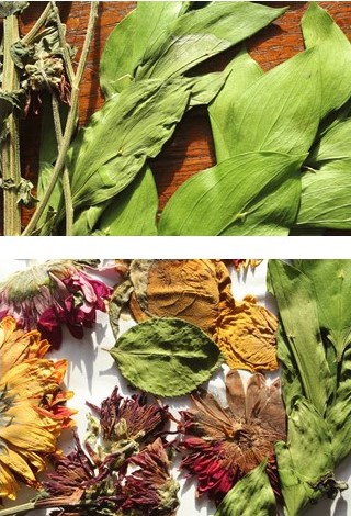
Set 1 is focusing on the idea of being ‘frozen in time’, freezing a living thing in time so we can observe its current state for longer.
Set 2
Set 2 focuses on again preserving something so that it can last longer and be admired for longer.
Set 3
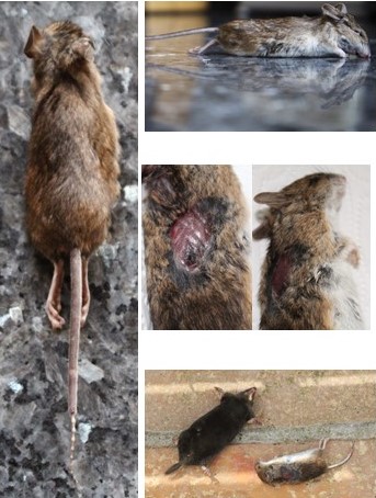
Set 3 focuses on the innocent deaths of rodents who can’t be preserved due to nature being its process at the moment of death, Hence why i wanted to capture them in their frozen moments so that the documentation of the death can be observed.
Set 4
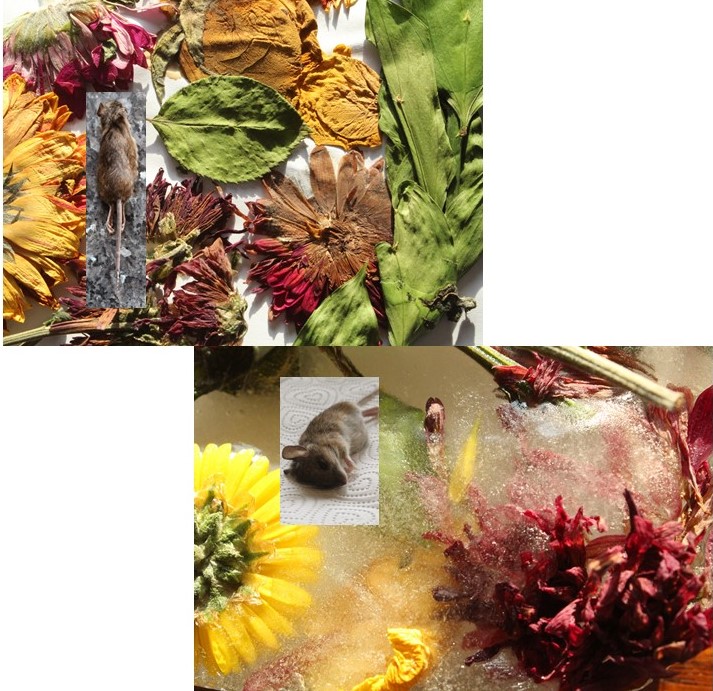
Set 4 shows how both ideas are linked, and both reflect different stages of the life cycle.
Set 5
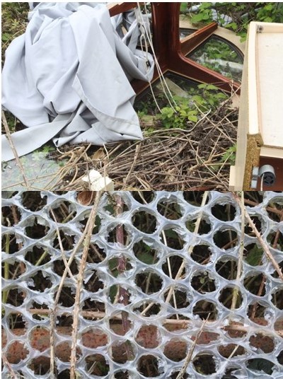
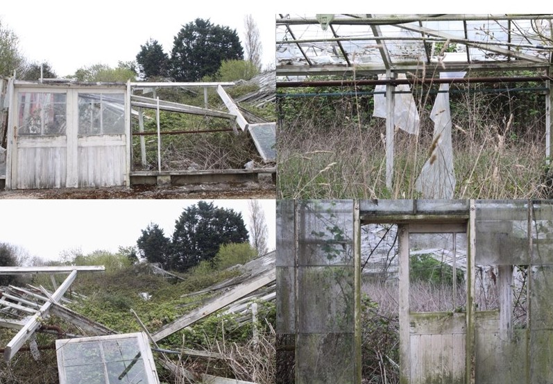
Set 5 reflects the disturbance of man and nature and how natures life cycle has been broken by man due to fly-tipping and miss-disposed rubbish.
Set 6
Set 6 again shows how humans have disrupted and abandoned a once cared for environment and left it to rot.
For all of these images, I took the same approach when it came to the editing. I increase the brightness and contrast in each of them, to lighten them up but also give them depth and shadows, and then changed the curves and exposure. I then went onto the vibrance, hues, saturation and colour balance and changed them all in the same way, increasing the vibrance significantly, the saturation only a little bit to add bit of a more intensity to the colour, brought the hues into the negative part of -15, and changed the colour balance to the number squence of 10, -5, -10, which in the end resulted out with the images i’ve come out with now.
A4:
To edit this image, I went to increase the colour dramatically. I added an extra layer and used the paint tool with the soft edged brush to add a little bit of orange in the middle of the image, which you can barely pick up when you look at it, but still makes a difference compared to the original image. I then increased the brightness, vibrance and contrast in the image, and played around with the colour balance, hues and saturation to get to outcome I have now.
A3:
After cropping them to my desired length, cutting out anything unnecessary, I went to edit them in the style of Paul Reiffer. To do this, I added extra layers on top of the original image and used the paint tool with a soft edge brush to add colours such as blue, purple, pink, orange and yellow. I then reduced the opacity low enough until I got my desired effect, and then merged all the layers down so it made one layer in total. I did this to add more vibrant colours to the images and make them stand out in a way which Reiffer’s work does. After this, I played around with the brightness, contrast, and vibrance, increasing them all and making the colours stand out more. I then changed the hues and colour balance, having the images have more of a blue, purple and yellow tint to it.
For my final response to the theme of Journeys and Pathways, I chose these images:
A5:
SONY DSCSONY DSCSONY DSCSONY DSCSONY DSC
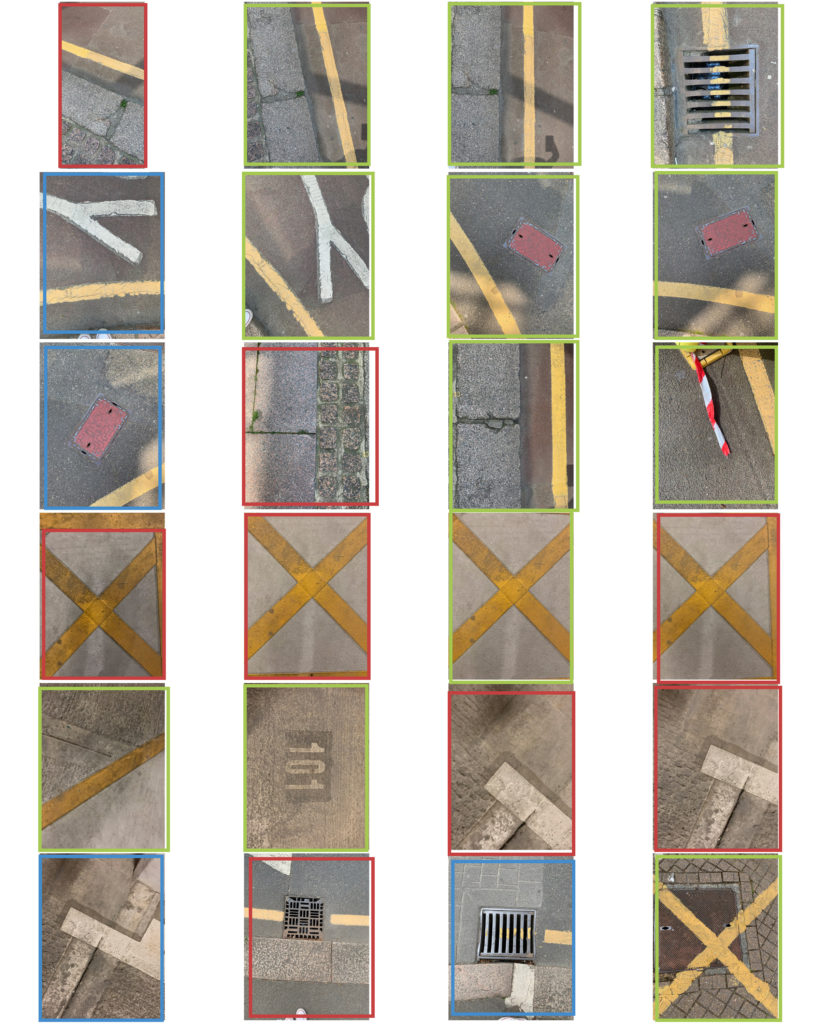
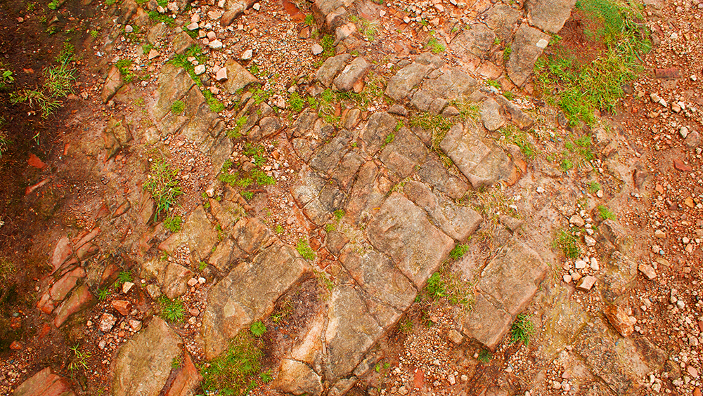
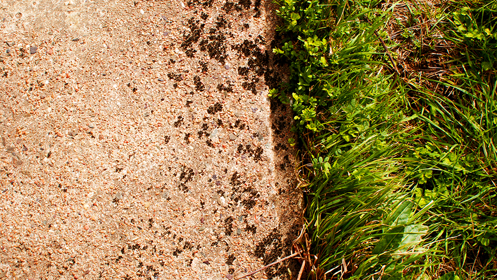
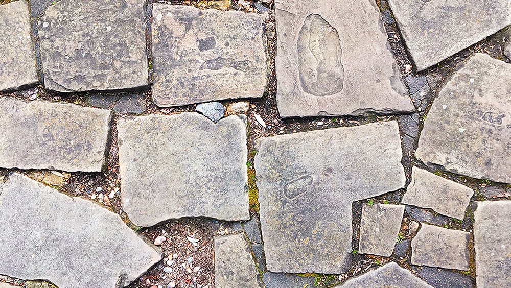
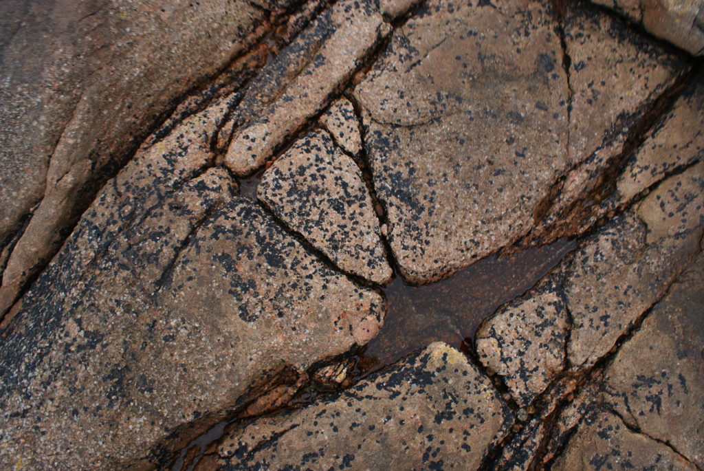
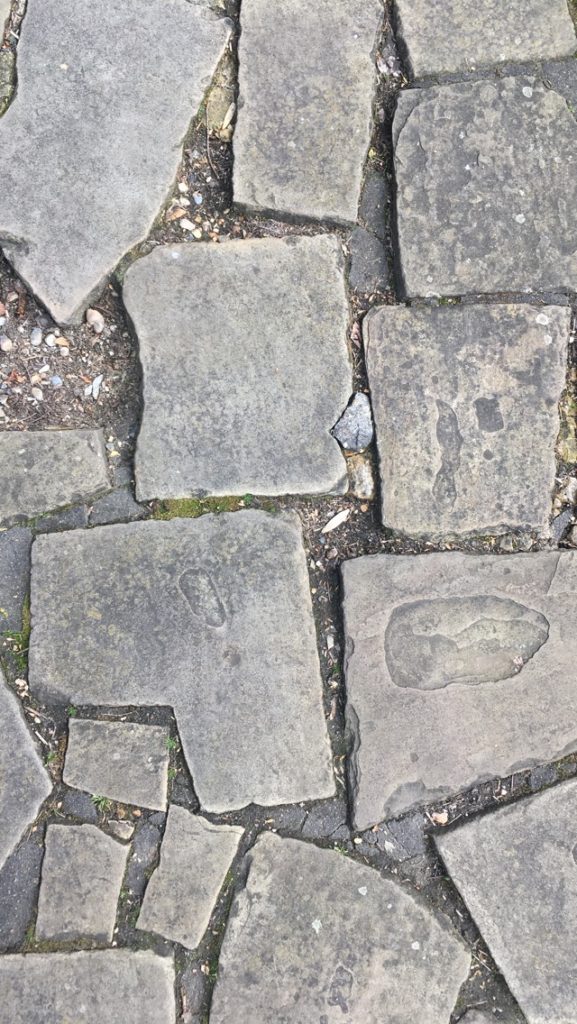
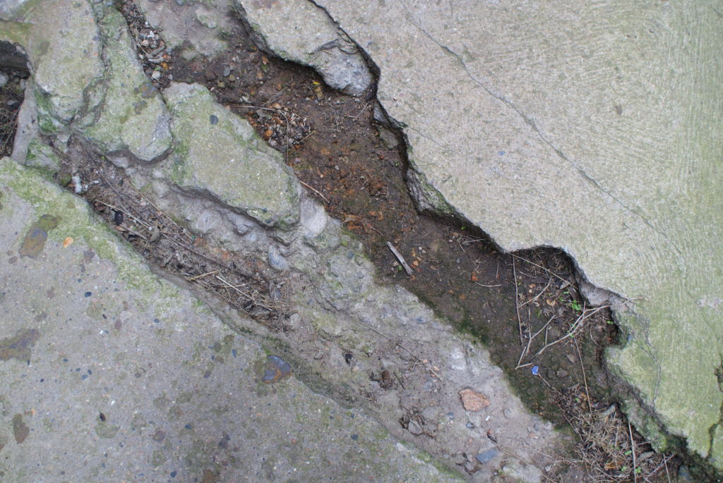
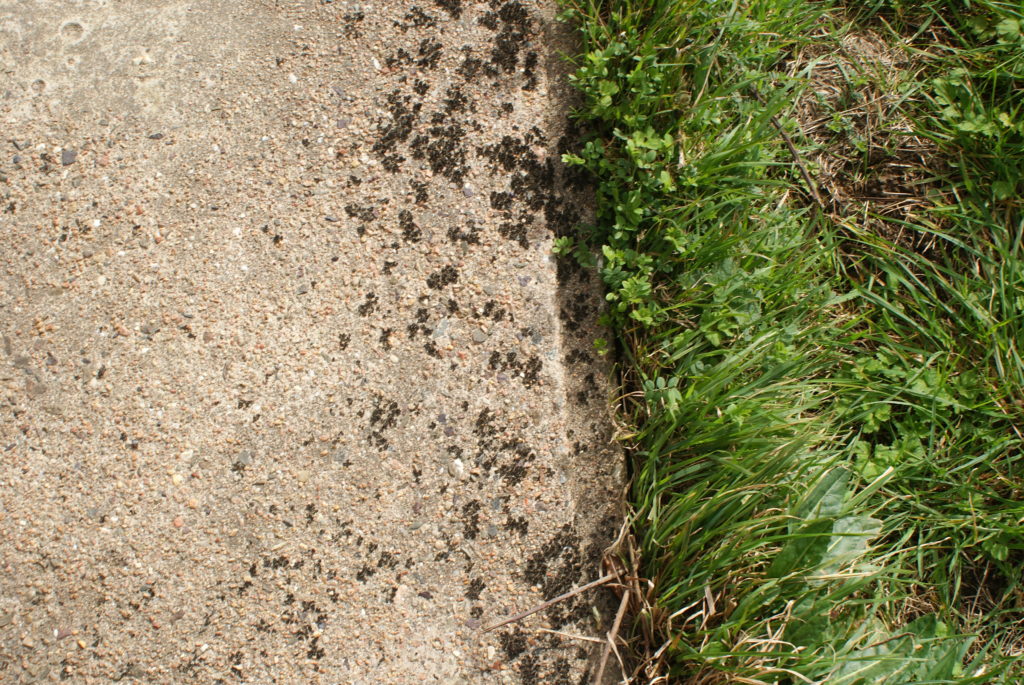
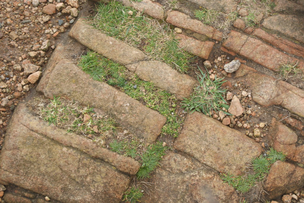
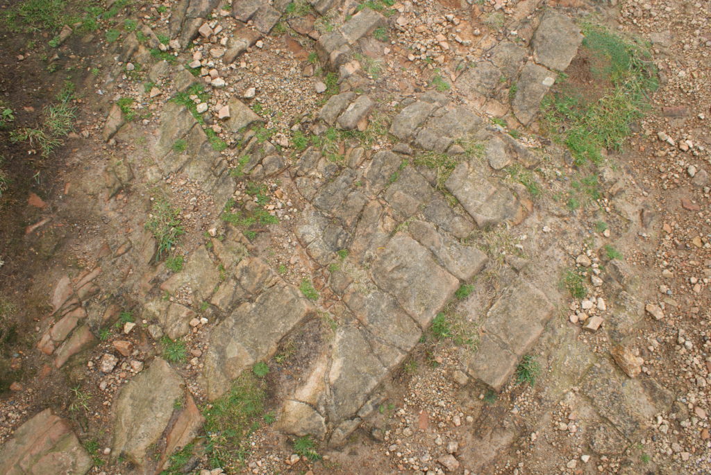
I chose all of these images because I beleive they relate to the theme of Journeys and Pathways, and each of the places where these images have been taken have a history and have been through a journey. For example, the first image of the rock is from Corbiere, the lighthouse in Jersey, where a groundskeeper drowned while trying to rescue visitors who were stranded at the lighthouse when the tide came in. The second image is from The Sexby Garden in Peckham, central London, where the park was created in 1906 on land which used to belong to the last farm in Peckham. The third image is from Noirmont in Jersey, the floor where German soldiers walked over when they invaded the island and built their bunkers and cannon holders. And the last two images are from Grosnez castle in Jersey, which was created in 1330 to provide local farmers refugee from French attacks, but was mostly destroyed in the mid 1600’s. These images were inspired by The Boyle Family, who go around taking pictures of floors which seem interesting.
A4:
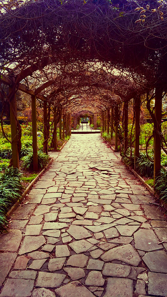
I chose this image alone because I think there can be much done to it which can result in an amazing final image. Although I wasn’t inspired by any photographer when taking this image, I believe that I could distantly relate it to the work which Mikko Largerstedt does. Although this image wasn’t taken at night, it does focus on the aspect of a pathway, which some of Largerstedt’s works do. With some editing and adding of colour and vibrancy, I believe I could relate it even more to his work.
A3:
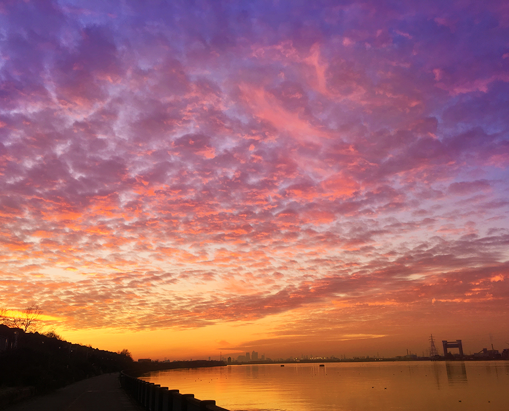
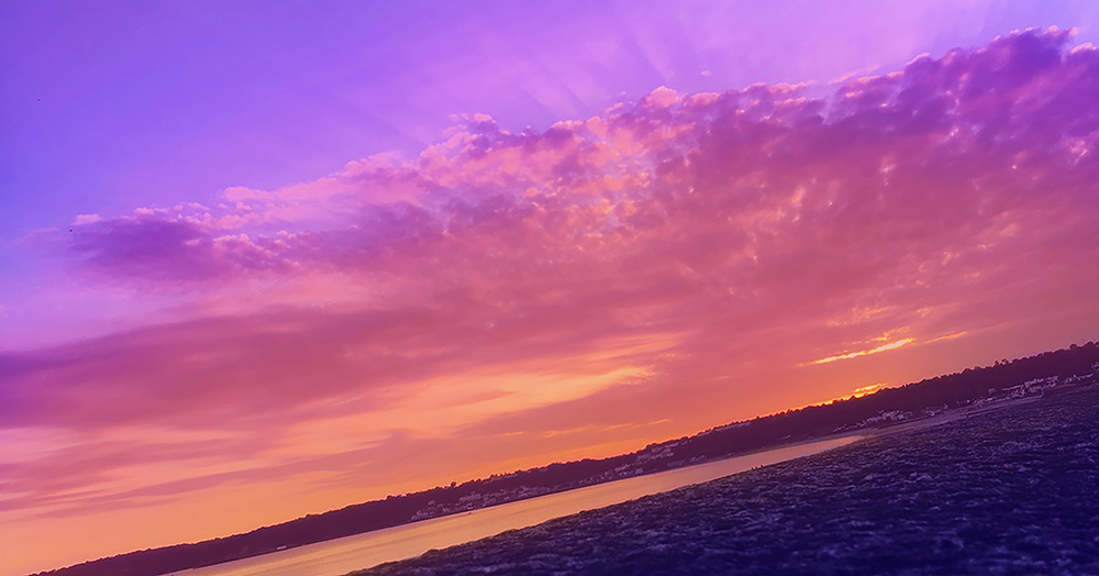
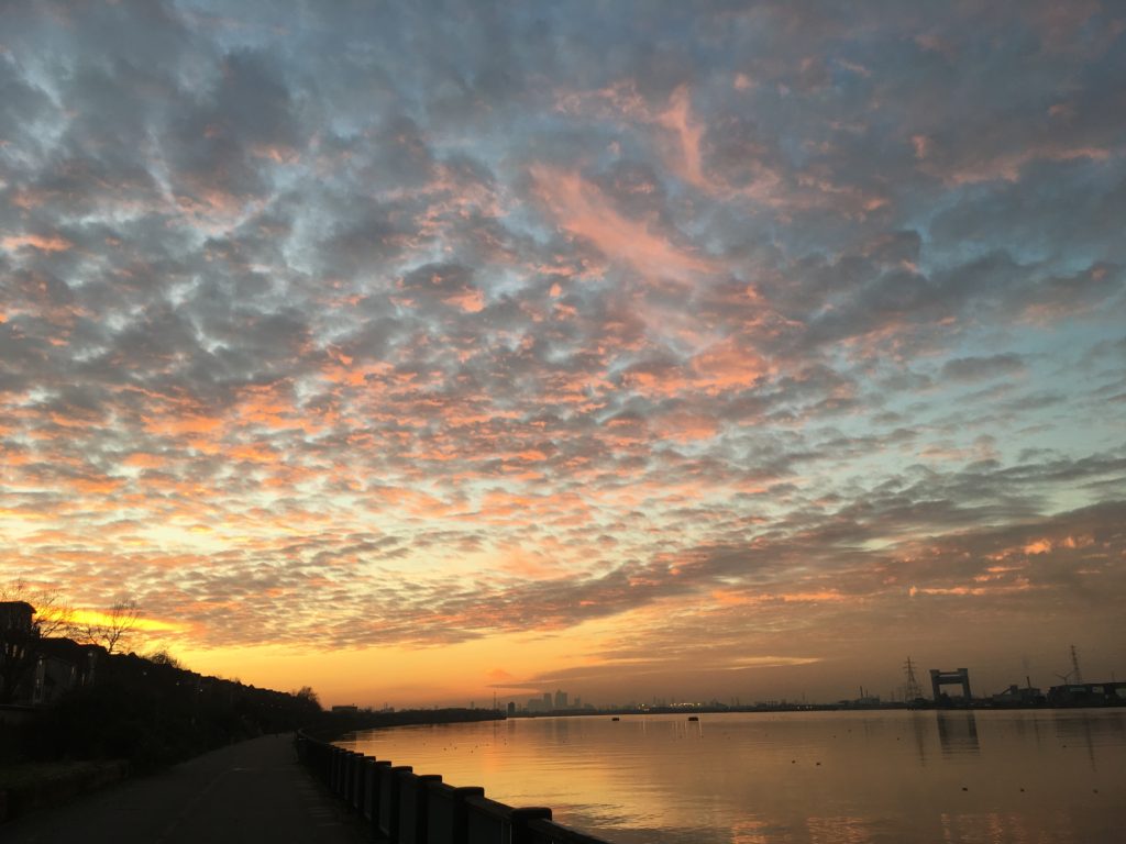
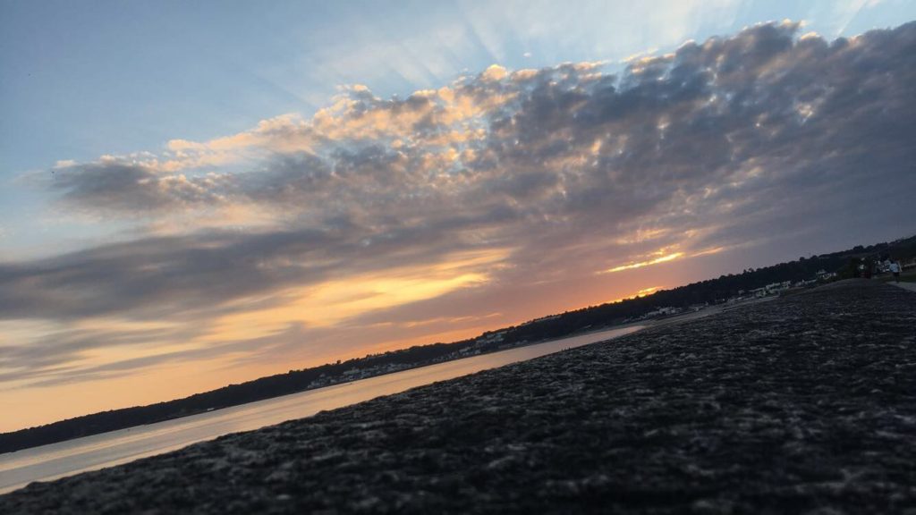
These images were chosen because I think they were the best out of all the pictures I took for sunsets and sunrises. They both seem dramatic with the clouds and the colours, with the setting and rising suns hidden from view but their light still significantly visible in the images. I also think they’d work best with the photographer Paul Rieffer, who takes pictures of stunning sunrises and sunsets with amazing colours and views. With some editing, I believe I can replicate what Rieffer does.
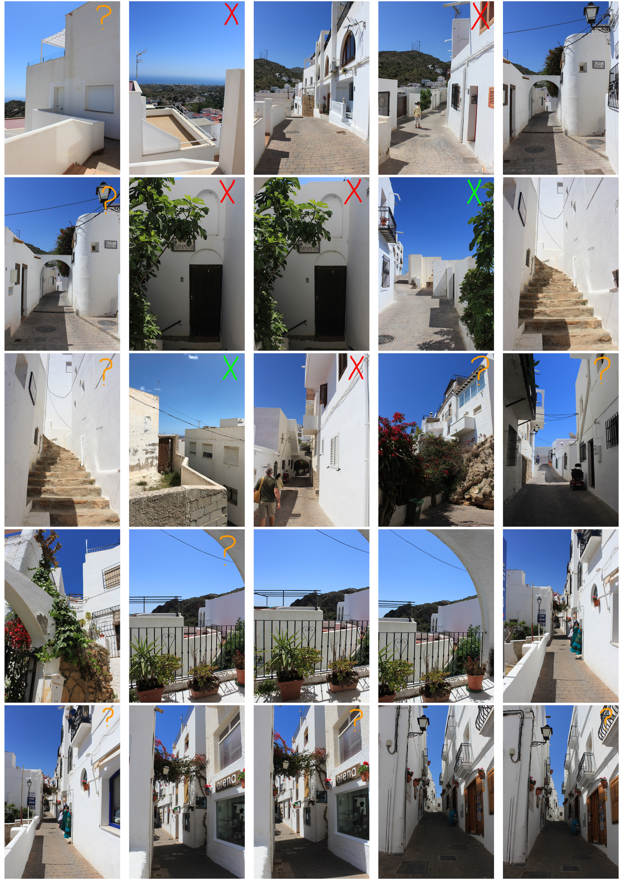
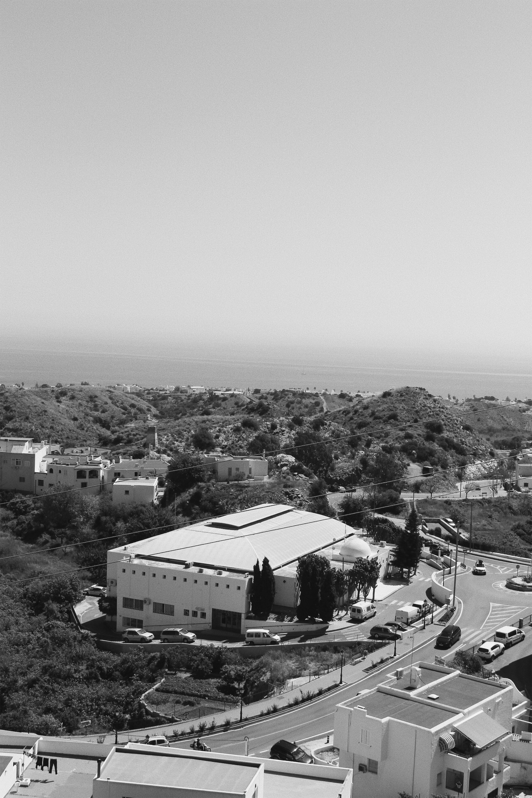
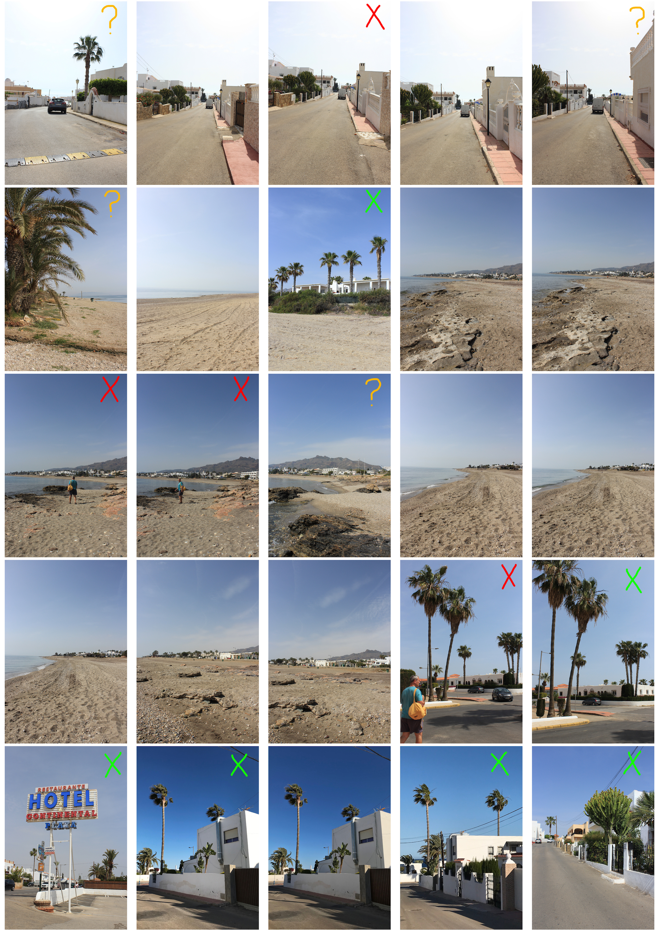
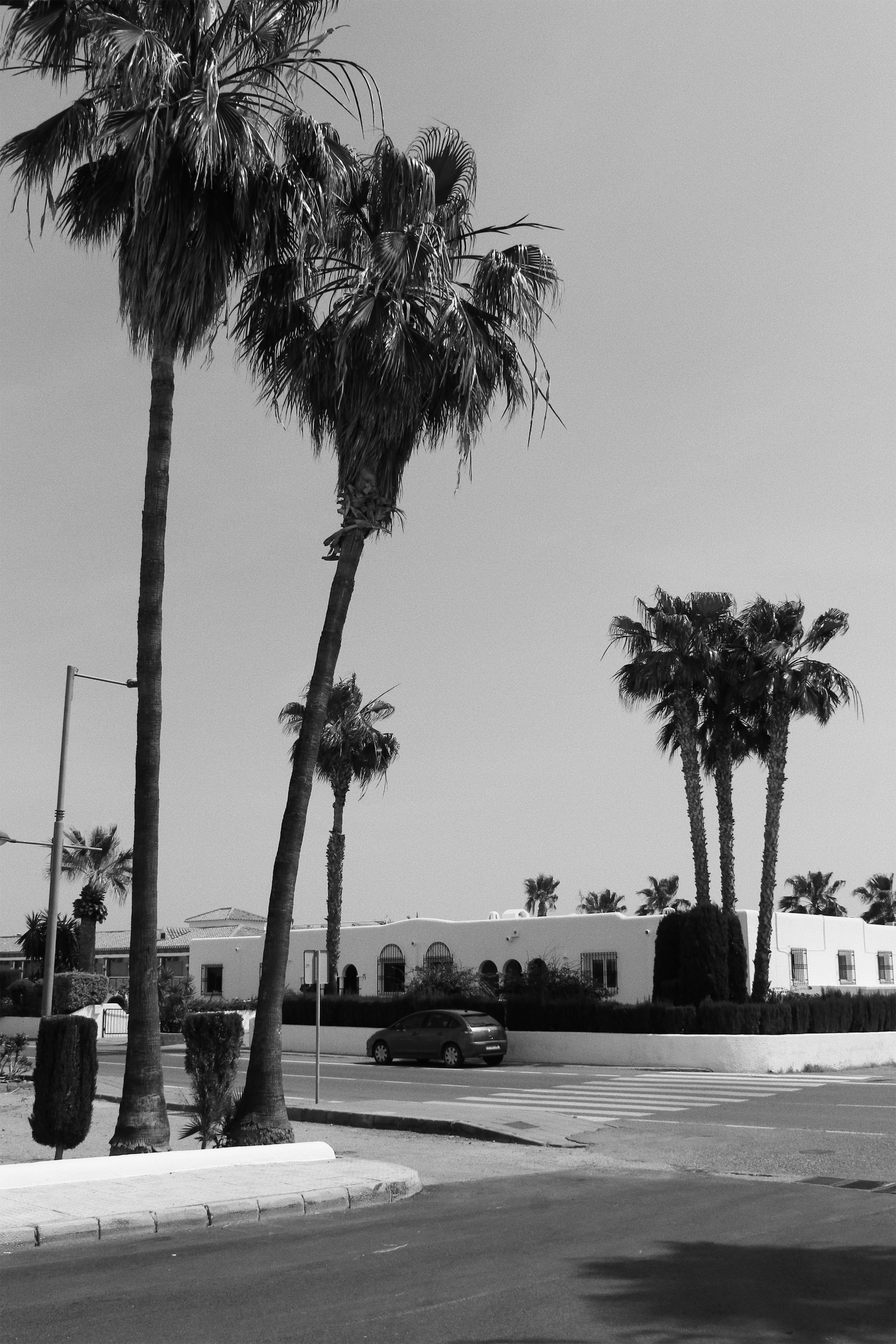
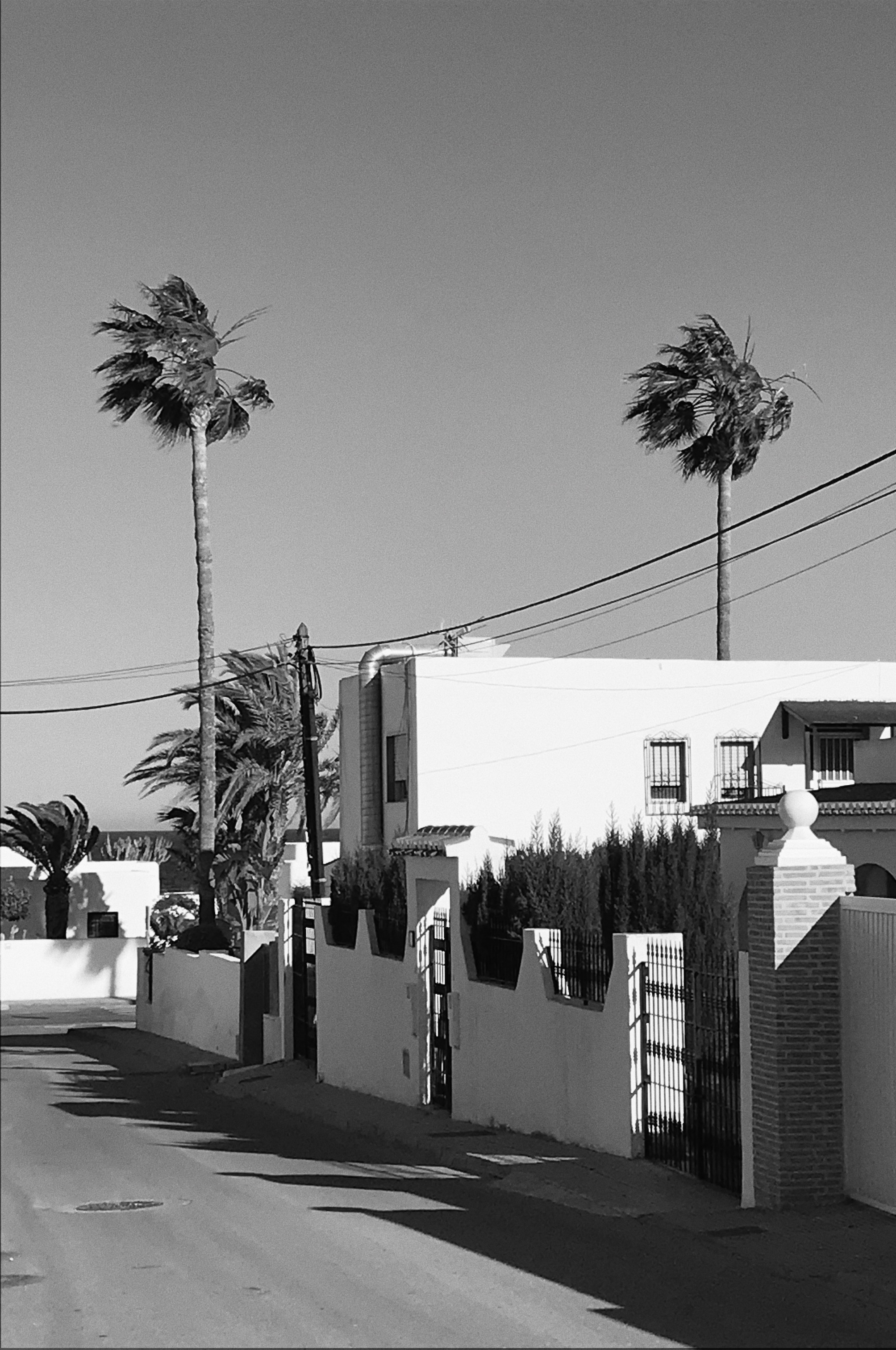
To respond to The New Topographics, I went along Mojacar Playa a tourist resort located on the coast. I took several pictures of man altered landscapes so when I uploaded them onto the contact sheet I could select the best images to edit on VSCO. I wanted to show how the natural landscape was being eroded by urban development through my images.
Mojacar, in the province of Algeria is officially a desert region and is certainly an arid part of Spain. Mojacar was the perfect location to take pictures responding to The New Topographics since it has lots of white washed houses that have been constructed over the years. Lots of these houses have been constructed on or near natural features such as the beach and the mountains behind Mojacar town.
Contact Sheet
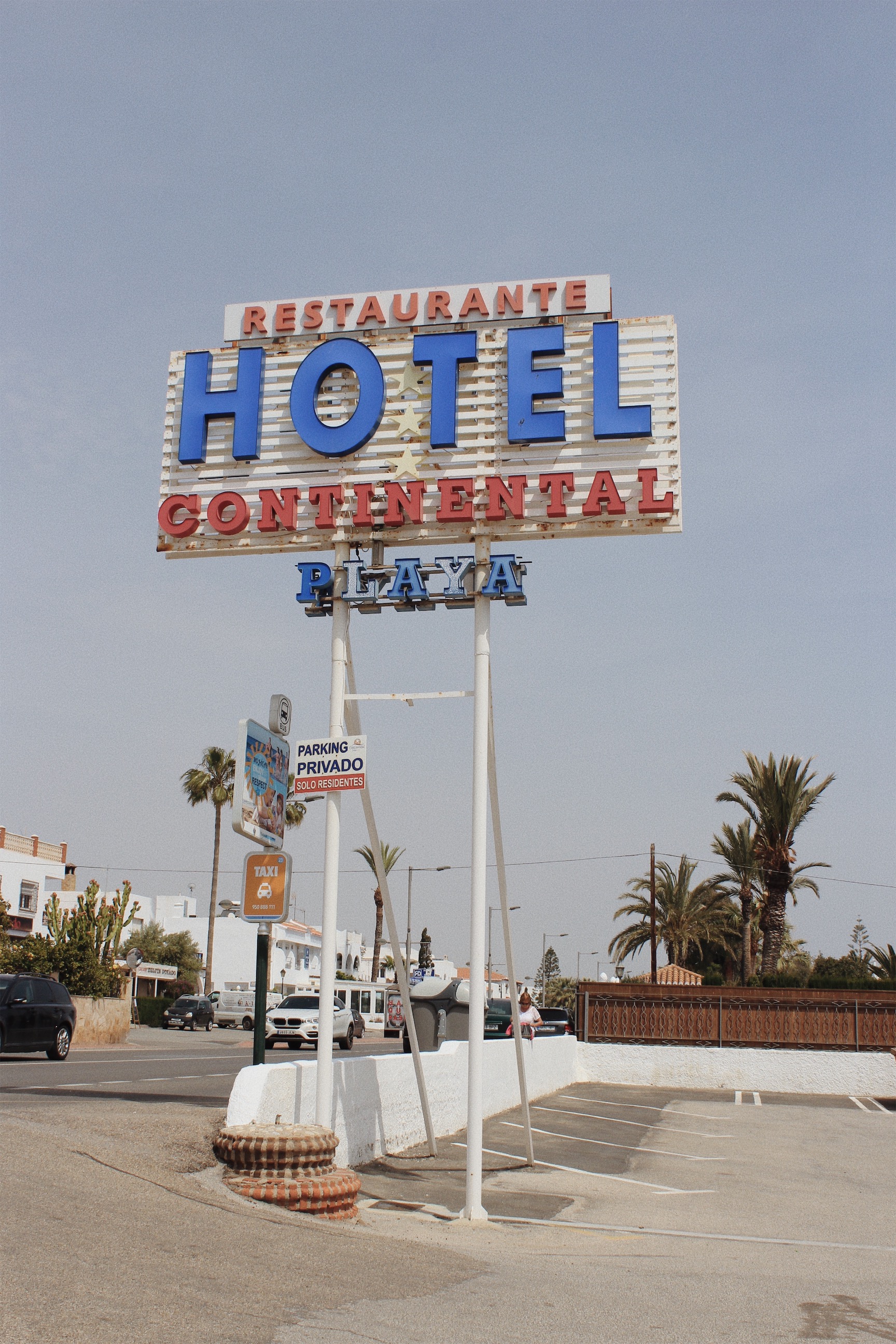
Final Outcomes
Evaluation
Overall I think my photoshoot for my first response to The New Topographics was successful since I managed to capture several images where nature and man made constructions are present in the same place. The pictures I have captured have a similar banal aesthetic to the photographers who were part of The New Topographics such as Robert Adams and Lewis Baltz. When editing the images on VSCO, I altered the saturation, exposure and contrast. I also added filters and increased the grain to make my images appear like film. Most of the photographs labeled “The New Topographics” were in black and white, so I decided to add b&w filters to a few of my final outcomes.