Julien Knez:
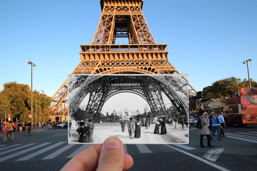
Julien Knez was a French photographer, who captured the city of Paris between 1871 and 1968. She took a photograph of a location in Paris and then went back to that same location many years later and recaptured the same building at the same angle. Knez had a passion for photography and this project was inspired from the love of his city. His artistic aim was to showcase the history of Paris, but show how it has developed into the modern age.


In the image above we are presented with the bottom of the Eiffel Tower, where a vintage picture of the subject is held up to the background of the image, creating a juxtaposing image. When first looking at the image we are drawn the vintage image in the centre of the frame in the foreground, as it is almost the odd thing out in the image. My eyes then move around the background absorbing what the message is getting across. Conceptually, Knez is showcasing how famous landmarks do not change it is what is around the landmark which changes. Contextually, it showcases how the landmark has importance to the French culture, and how it has been there for a long time due to this. As mentioned before the main focus point is the vintage image. The main formal elements being presented is space, tone, texture and line. This is presented through the way the two images work together to present the tower as a whole. Texture is very important to the image as it is mainly presented in the vintage image as it is seen in black and white, and also presented in the background of the modern structure for the tower, which helps to build the conceptual factor of the image. In order to create the juxtaposing image the vintage image is seen in black and white and the modern day image is in colour, which emphasises how it has not changed and creates a more powerful and visually stimulating image. When the vintage photo was taken, there would have been no DSLR, cameras and it was likely that film was used. This meant that all images where black and white, with a lot of noise being presented. Images would often have defects to them due to the developing of the image, in the image above we can see a white fade on the edge of the image which is a defect which was created when developing the image. In the modern image it is likely that a DSLR was used to capture it, meaning Knez has more control over the settings he used. Everything seems to be in focus, which suggests that a wide depth of field has been used along side a quick shutter speed. No noise is presented, suggesting a low ISO and the image is not darker or lighter meaning a normal aperture has been used. Moreover, the white balance seems to be set to an outdoor lighting as the image does not seem to be off colour. The lighting used is natural lighting as we can see the a little bit of a sun set in the background, and it stands to reason as the image was taken outdoors. In my opinion I like how the image overall presents the historical factors of Paris and meets the artistic aim of Knez. The photograph itself is ascetically pleasing to look at and is visually stimulating. You are able to see the in-depth thought process of Knez, and how he chose his camera settings to create this successful image.
Dafna Talmor:
Dafna Talmer is a London based visual artist who works with photographs, videos, curation and collaboration. Her imagery is displayed locally and internationally in many galleries, due to the success of her photography. At college she studied BA in Fine Arts and Photography, which opened up her eyes to photography, letting her career take flight. Her work has gained her many awards, such as the MACK First Book Award 2018. Her knowledge is now being shared with other students as she works as a university lecturer, but still keeps up photography as a hobby.


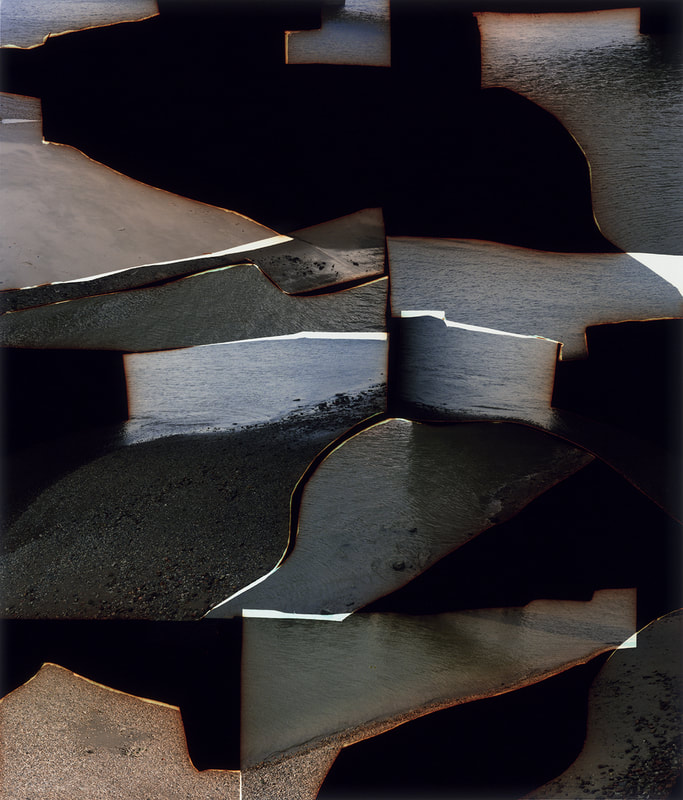
The image above is apart of Talmor’s constructed landscape series which was showcased in the Tate Modern art gallery in London. The image above is chaotic to say the least, the eyes are moving round the frame trying to gain an understanding of the image and what it happening, showcasing the abstract nature to it. After a while I realised it was an image or multiple images which have been ripped up and put together in a random order, the juxtaposition being used changes the way we view the piece of work. The images overlap each other, creating form, and it seems as if some have been slightly burnt, holding pejorative connotations towards the location. Conceptually, this has been done to transform a specific place – initially loaded with personal values, memories and connections – into a space that has verb emptied and become more subjective and universal towards other viewers. The photograph presents a metaphorical aspect as she tries to ’empty’ out the content of a photograph, by combining them in an unnatural way. Contextually, this may have been done as past memories of Talmor may have negative connotations, so by doing this the places apart of her past loose meaning and helps her to forget about the bad experiences. Visually, the image is very ‘in your face’ due to the lack of space and how the images do not connect, which in my eyes creates a more powerful meaning. The main formal elements being presented is space, line, tone, colour and shape, which is presented through the random positioning of the images and how the work together. This image is presented in colour which emphasises hows the image is being emptied and distorted to loose all connection with the location. Technically, the image is hard to analyse due to the image being torn and randomly placed. However, I do believe a quick shutter speed was used and there is no intended blur. The ISO is likely to be low as well as there is no intended noise being presented through each segment. The whole image seems to be in focus which suggests that a wide depth of field is being used as well as a normal aperture (f/5.6) as the whole image is in focus as well as the image not being naturally lighter or darker. It is clear to say that natural lighting has been used to capture the images as the image is of water which is located outside. We can clearly see a sunset in the water suggesting a reflection of light, due to the image being torn it destroys the beauty of the sunset showing how it is emptying the image, and the lighting itself is slightly darker, implying that no other lighting was used. In addition, it is likely that the white balance is set to a normal outdoor setting, as the image itself does not look off colour. In my opinion, I really like the abstract looking image of Talmor, as it captivates viewers into looking and working out what the image is, allowing the meaning to be conveyed. The image has pejorative connotations, but still pleases the viewers making it successful.
Action Plan:
As an action plan I want to create images which are inspired by Knez, showcasing how some of Jersey’s historical features has not changed since the war, showcasing how Jersey Journey after the war. As time is short, I do not have the time to conduct another photoshoot, so I intend to use the images I already have and use photoshop to create an outcome like the above image. I also want to experiment with handcraft to create outcomes like these, showing my ability to manipulate photographs not using a computer. I also want to make my own version of Talmor’s work using my bunker images, to empty the image and release all connotations and emotions towards Jersey’s bunkers, showcasing the Journey of Jersey through/after the second world war.
