Edits – Knez + Talmor Inspired

Knez Replication:

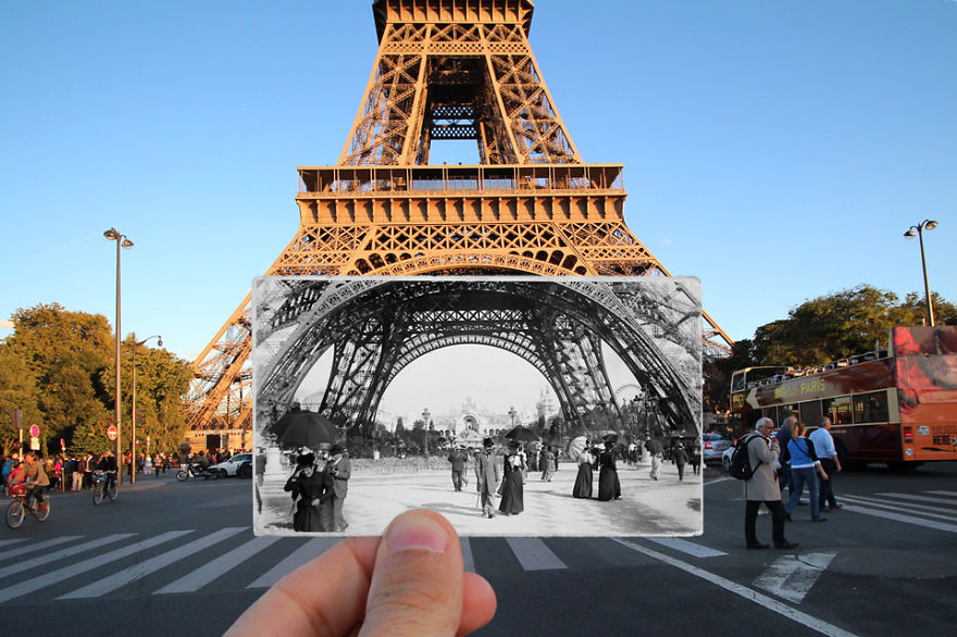
As previously researched Knez wanted to showcase the historical factors by using old vintage photographs of landmarks and holding the vintage image up to the landmark, in the exact same location but many years down the line, which presents the journey of the landmark. To implement this into my work I decided to use my successful images and showcase how the subject has changed overtime, showcasing the Journey of Jersey after the war and how these places have developed. I started off by making exact replications of Knez’s work. To do so I opened up the image I wanted to use twice, on one of the page I converted the image black and white (ctrl + u). I then placed the black and white image on top of the colour version of the same image. Using the rectangular marquee tool I selected an area I wanted to be black and white and selected layer via cut. I then deleted the black and white layer leaving me with the square in black and white and the original coloured image. The first image is the most successful as you are able to see the difference in the two colours and presents the same conceptual factors of Knez.

Comparison:

To compare my work to Knez’s work there are many similarities, the main one being I used the same method and ideology, to create my outcome, as Knez. We both used black and white images in the same location/angle of the coloured image to showcase how the landmark has changed. Due to this we both have presented the formal elements of space, tone, texture through the technique use. One main difference is that I produced my image using photoshop, making it seem more artificial, where as Knez actually used an old photograph and took it to the location, which make a more realistic image showcasing his excellent photographic skills. We both have used natural lighting to capture our subjects, which is mainly because the subjects are located outdoors, which again makes the image more naturalistic. We both went around the idea using the same artistic aim, however I wanted to showcase Jersey Journey after the second world war and Knez showcased how landmarks in Paris has changed, which presents a slight difference. Another major difference is that the subject being captured is completely different, which is due to the different conceptual factors we wanted to showcase. Similarly, both images use good camera skills: We both used a wide depth of field, quick shutter speed, low ISO and normal aperture. Using similar camera settings has allowed my replication to be more successful and showcase my ability to clearly and accurately replicate work. To conclude, I believe my image is very much like the artists, but still has my own artistic style within it, which makes it successful and one of my favourite outcomes produced.

Talmor Replication:

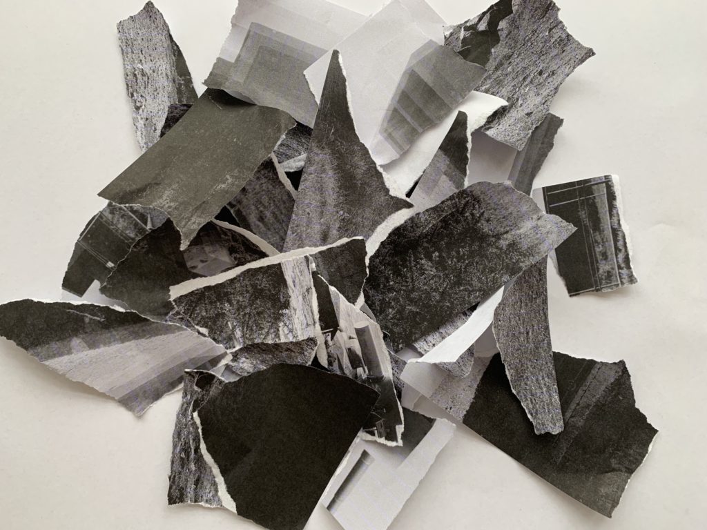
The image below is my attempt at creating Talmor’s work. I used three of my top bunker images to achieve this look. I printed all three in black and white on A4 paper. Once printed I then ripped them up and started randomly placing the sections in different locations on a piece of white A3 paper, ensuring they overlap. This simplistic craft idea distorts the viewers and makes them question what is being showcased. When they realise it is Jersey’s bunkers they then question why it is like the way it is, which allows the aim of Talmor to be presented, take away emotion, connection and connotations aways from building to make us think more subjectively about them. This allows us to understand that the bunkers had a massive impact in the journey of Jersey in the second world war, but showcases how we should remember what happened but not hold as much connection emphasising the Journey of Jersey. This powerful message is successfully conveyed in my work.

Other Experimentations:

Comparison:
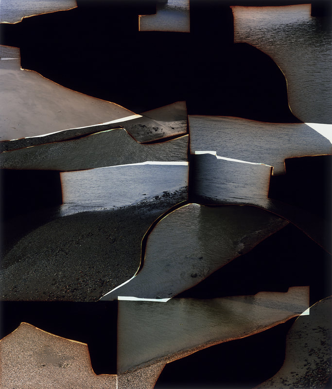
The main similarity shared between both images is the technique used to create the photograph, we both tarred our images and randomly layered them on top of each other to create an overall abstract looking image. Another similarity, is that we both used the same artistic aim which was to detach viewers from any emotional/memories to the specific location. Contextually, we both have different contextual factors as to why we created them, Talmor’s was her own memories, where as mine is more general as it is the viewers memories of the war and the importance of Jersey’s bunkers during the second world war. Needless to say the subject in both images are different because of the different contextual factors. Another difference is that my image is in black and white where as Talmor’s is in colour, which makes my image have more tonal contrast making it more abstract and creates a more distorted look. My image is much more busier than Talmor’s as I have more tarred up bits and used three different images where as Talmor only used one image, which means the meaning of my image is more disguised and harder to work out. In addition, Talmor’s montage takes up the whole frame where as mine only takes up the centre, as it would have been too chaotic to take up the whole of the frame. Moreover, Talmor seems to have burnt the segments to distort and empty out connections , which showcases her emotion more within the image, where as I only tore my image into segments Similarly, both images have used similar camera settings such as natural lighting, quick shutter speed, low ISO and wide depth of field, making the actual segments very similar. Both images are successful in what they do, as you can see I understood the requirements to recreate Talmor’s work and implemented it into my response and still managed to add my own artistic style to it.

Craft Ideas:

After the high success of the image manipulation in the style of Knez and Talmor I decided to further explore there nature but in my own artistic style to showcase the Journey of Jersey through WW2

In this first Idea I printed out an image of a bunker, once in colour and once in black and white. I simply teared up the black and white image and carefully stuck it down to the coloured image to showcase the bunker’s journey after the second world war, which presents the ideology that nothing has changed as they have been left alone. I really like the way this edit has turned out as it showcases the same conceptual and contextual factors as the edit of the replication of Knez’s work, which outlines how this edit can be successful. It also clearly shows my ability to use other methods to manipulate my image and showcases further exploration into this project.

For my final edit I wanted to showcase how propaganda now a days means nothing and how we understand how it manipulated people back during the war, outlining the Journey of Jersey through/after the second world war. To achieve this I printed out the above, I then. cut out the head region in a square and screwed it up into a ball. I then unravelled the ball and took a picture of the creased paper. Then using photoshop I opened up the original image of the propaganda and the picture of the creased face. Using the quick selection tool I cut out the face and placed it onto the original image. Using ctrl + t, I adjusted it so it was the face was the right size and fit perfectly on my model. Finally I added a drop shadow to the creased face layer to make it stand out. I really like the way this edit has turned out as it changes the way we view the propaganda and allows us to realise how the poster has almost decayed as it’s lost meaning, as we begun to realise what propaganda was doing to us.

Evaluation:

To evaluate these edits I believe that I have produced some successful outcomes which showcases further exploration into the Journey of Jersey through the second world war. These edits begin to look at what Jersey is like after the war, presenting the Journey of Jersey after the war, but still have strong links to the original title of the project. I have been able to successfully replicate another artists work by using photoshop. I have also been able to showcase my ability to use hand crafts to manipulate my images, and shows my ability to use artists work to inspire mine. I have thoughtfully made decisions about how I will edit and manipulate my images to produce strong conceptual factor, which link to the contextual factors. Moreover, I was successfully able to replicate Talmor’s work and implement it into my theme, in order to showcase the ideology that people are trying to loose attachment from Jersey’s bunkers due to their role and impact during the Journey of Jersey through the second world war. It has allowed me to think differently about different ways of displaying images and has allowed my crafts skills to clearly be utilised and shown. The images produced are very successful and will be considered to be used as final images, in order to display my best work which showcases the Journey of Jersey through WW2.

Comparing Julien Knez to Dafna Talmor

Comparison:

Both images are capturing a subject and showcasing its history, but in different ways. In Talmor’s imagery we are presented with a landscape which has been torn up to showcase a detachment of memory from the images. Where as Knez’s work showcases a landscape but holds a picture of the landscape taken a while ago to the landscape now a day at the same position and location, which is creating a journey of the landscape in a more positive light. The two artists have different approachs to showing a journey, but are both high successful in what they do. Contextually, Talmor wanted to destory any memory or attachment to that location due to negative experiences within that location. Where as, the contextual reasoning behind Knez’s work is showcasing how Paris has changed but the famous landmarks have not. In Talmor’s work there is a lack of space which suggests that the landmark should not hold any space in her head, which differs from Knez’s work as there is more space due to the location of the landmark and how Knez is trying to showcase it’s beauty. Talmor has created a very distorted outcome which almost revolts viewers making the location seem unpleasent. The background of both images are plain which allows the subject, in Talmers work it is the different fragments and in Knez’s work it is the architecture presented in the foreground of the image, to be the main focus point. Technically, both images share similar camera settings although they are very contrasting in what they do. Both have used a quick shutter speed to capture the images as there is no intended blur within the image. Alongside this they have both used a low ISO as there is no intended noise being presented. In addition, both have used artificial lighting which is shown in Talmer’s work as there is a reflection of a sunset in the water, and is clearly shown in Knez’s work as the landmark is outside and the sky suggests a sunny day. In both images it seems that a wide depth of field has been used as the whole frame is in focus, in Talmer’s work all the segments seem to be in focus which showcases this technique. Moreover, a normal white balance seems to be used (outdoor/sunlight) as the images do not seem to be off color. In addition, the images do not seem to be naturally lighter or darker which suggests the aperture is set to a normal setting. In my opinion I prefer Talmor’s photography due to the abstract nature of it and how there is no set way to look around the image and how it can be interpreted differently. However, I can still appreciate Knez’s work as it is just as successful in what it does.

Artist Research – JULIEN KNEZ + Dafna Talmor

Julien Knez:

Julien Knez was a French photographer, who captured the city of Paris between 1871 and 1968. She took a photograph of a location in Paris and then went back to that same location many years later and recaptured the same building at the same angle. Knez had a passion for photography and this project was inspired from the love of his city. His artistic aim was to showcase the history of Paris, but show how it has developed into the modern age.

Mood Board showcasing Knez’s work
Knez’s photograph of the Eiffel Tower

In the image above we are presented with the bottom of the Eiffel Tower, where a vintage picture of the subject is held up to the background of the image, creating a juxtaposing image. When first looking at the image we are drawn the vintage image in the centre of the frame in the foreground, as it is almost the odd thing out in the image. My eyes then move around the background absorbing what the message is getting across. Conceptually, Knez is showcasing how famous landmarks do not change it is what is around the landmark which changes. Contextually, it showcases how the landmark has importance to the French culture, and how it has been there for a long time due to this. As mentioned before the main focus point is the vintage image. The main formal elements being presented is space, tone, texture and line. This is presented through the way the two images work together to present the tower as a whole. Texture is very important to the image as it is mainly presented in the vintage image as it is seen in black and white, and also presented in the background of the modern structure for the tower, which helps to build the conceptual factor of the image. In order to create the juxtaposing image the vintage image is seen in black and white and the modern day image is in colour, which emphasises how it has not changed and creates a more powerful and visually stimulating image. When the vintage photo was taken, there would have been no DSLR, cameras and it was likely that film was used. This meant that all images where black and white, with a lot of noise being presented. Images would often have defects to them due to the developing of the image, in the image above we can see a white fade on the edge of the image which is a defect which was created when developing the image. In the modern image it is likely that a DSLR was used to capture it, meaning Knez has more control over the settings he used. Everything seems to be in focus, which suggests that a wide depth of field has been used along side a quick shutter speed. No noise is presented, suggesting a low ISO and the image is not darker or lighter meaning a normal aperture has been used. Moreover, the white balance seems to be set to an outdoor lighting as the image does not seem to be off colour. The lighting used is natural lighting as we can see the a little bit of a sun set in the background, and it stands to reason as the image was taken outdoors. In my opinion I like how the image overall presents the historical factors of Paris and meets the artistic aim of Knez. The photograph itself is ascetically pleasing to look at and is visually stimulating. You are able to see the in-depth thought process of Knez, and how he chose his camera settings to create this successful image.

Dafna Talmor:

Dafna Talmer is a London based visual artist who works with photographs, videos, curation and collaboration. Her imagery is displayed locally and internationally in many galleries, due to the success of her photography. At college she studied BA in Fine Arts and Photography, which opened up her eyes to photography, letting her career take flight. Her work has gained her many awards, such as the MACK First Book Award 2018. Her knowledge is now being shared with other students as she works as a university lecturer, but still keeps up photography as a hobby.

Mood Board Showcasing Talmor’s work
Talmor’s image

The image above is apart of Talmor’s constructed landscape series which was showcased in the Tate Modern art gallery in London. The image above is chaotic to say the least, the eyes are moving round the frame trying to gain an understanding of the image and what it happening, showcasing the abstract nature to it. After a while I realised it was an image or multiple images which have been ripped up and put together in a random order, the juxtaposition being used changes the way we view the piece of work. The images overlap each other, creating form, and it seems as if some have been slightly burnt, holding pejorative connotations towards the location. Conceptually, this has been done to transform a specific place – initially loaded with personal values, memories and connections – into a space that has verb emptied and become more subjective and universal towards other viewers. The photograph presents a metaphorical aspect as she tries to ’empty’ out the content of a photograph, by combining them in an unnatural way. Contextually, this may have been done as past memories of Talmor may have negative connotations, so by doing this the places apart of her past loose meaning and helps her to forget about the bad experiences. Visually, the image is very ‘in your face’ due to the lack of space and how the images do not connect, which in my eyes creates a more powerful meaning. The main formal elements being presented is space, line, tone, colour and shape, which is presented through the random positioning of the images and how the work together. This image is presented in colour which emphasises hows the image is being emptied and distorted to loose all connection with the location. Technically, the image is hard to analyse due to the image being torn and randomly placed. However, I do believe a quick shutter speed was used and there is no intended blur. The ISO is likely to be low as well as there is no intended noise being presented through each segment. The whole image seems to be in focus which suggests that a wide depth of field is being used as well as a normal aperture (f/5.6) as the whole image is in focus as well as the image not being naturally lighter or darker. It is clear to say that natural lighting has been used to capture the images as the image is of water which is located outside. We can clearly see a sunset in the water suggesting a reflection of light, due to the image being torn it destroys the beauty of the sunset showing how it is emptying the image, and the lighting itself is slightly darker, implying that no other lighting was used. In addition, it is likely that the white balance is set to a normal outdoor setting, as the image itself does not look off colour. In my opinion, I really like the abstract looking image of Talmor, as it captivates viewers into looking and working out what the image is, allowing the meaning to be conveyed. The image has pejorative connotations, but still pleases the viewers making it successful.

Action Plan:

As an action plan I want to create images which are inspired by Knez, showcasing how some of Jersey’s historical features has not changed since the war, showcasing how Jersey Journey after the war. As time is short, I do not have the time to conduct another photoshoot, so I intend to use the images I already have and use photoshop to create an outcome like the above image. I also want to experiment with handcraft to create outcomes like these, showing my ability to manipulate photographs not using a computer. I also want to make my own version of Talmor’s work using my bunker images, to empty the image and release all connotations and emotions towards Jersey’s bunkers, showcasing the Journey of Jersey through/after the second world war.