Chosen Photograph:

Chosen Photograph
This is the photograph I have chosen to edit and finalise for this recreation, I feel my model is posed the best in this photograph and the angle is the best and it looks like it has the best potential to be the best recreation of the original Ad. I feel it has good lighting that can be edited and adjusted to fit right and create a good image and there is enough of a background showing for me to turn the back blue.
Editing Process:

Editing 1
To begin with I began by editing the brightness and the contrast of the photograph, I adjusted both of them due to the style of the original ad being quite vibrant in its colours quite harsh which is why I adjusted the contrast and then as well the brightness as to be able to have the image as well lit.

Editing 2

Editing 3
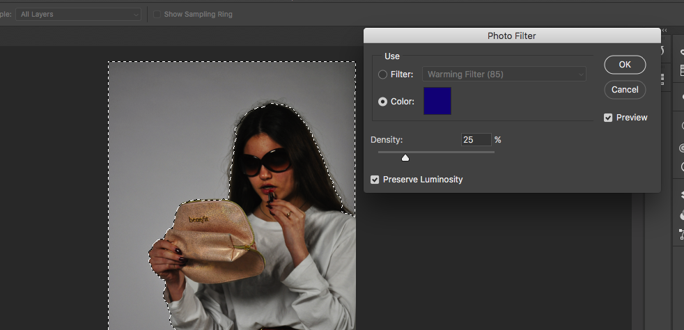
For the next part I selected around my subject and around the frame so that only the background was included in the selection I then went and played around with the colour photo filters to find the right shade of blue to put as the background of the image. I left the table unselected as although it was very low down in comparison to the original AD I did not feel I would be cropping it out so left it clear to be kept in the photograph.
Final Outcome:
Below shows my final outcome from the photoshoot and the editing, I feel this photoshoot and recreation turned out well as it shows a different side of the advertising in fashions as it is a recreation of a different time when fashion was having different sides between two very different decades, overall I feel it has been a successful outcome.

Final Outcome
