Below I have analysed a selection of images from my final choices in order to give a better understanding of the thought process behind choosing them, why I edited them, and what I will use them to represent in my final display:

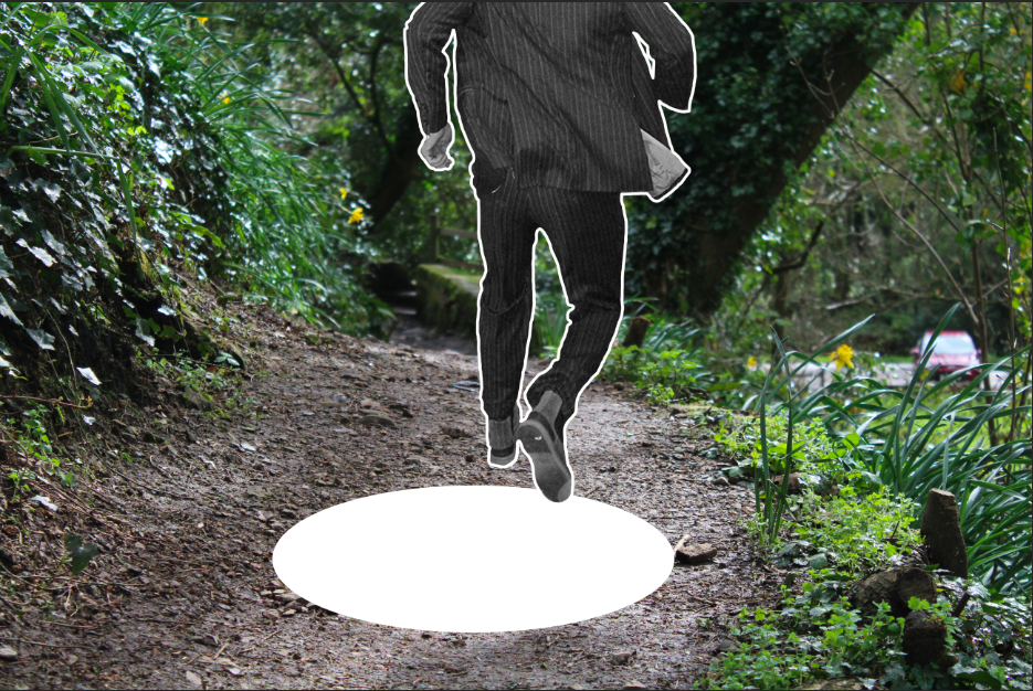
I have chosen the above image as one of my final images, as I feel it is one of the more successful finals from the editing process. I have edited the saturation and contrast of the image, in order to create a slightly unrealistic and bold colour scheme for the image, which I feel helps to show the contrast between all of the shapes in the background, creating a more cartoon like, unrealistic appearance. I feel that by creating this effect, the viewer can see the subject as falling through a completely different scene, which is made more realistic and possible by the concept that the scene may be fictional and not real. Therefore, the image seems more likely to the viewer, and therefore they are able to concentrate on the image more easily. As well as the background saturation and contrast being edited, I added a white outline to the subject and a “hole” below the subject. The white outline is used in order to separate the subject from the background, and to create the effect that the subject is a sticker, which has been added to the incorrect background. I decided that this was more effective than using a ripped paper effect, as it is cleaner and sharper, and more easily differentiates between the subjects outline and the background while still maintaining the shape of the subject, and unlike the ripped paper effect, this outline does not create a large amount of white space, which distracts from image itself. In total, I have used this image to create the effect that the subject is falling through the image, into the hole blow. I have made it as obvious as possible that the subject does not belong in the image, by creating a “sticker” effect, and heightening the contrast in colour between the subject and the background. This way, the message that the subject has been placed on the “Wrong Journey” or “Wrong Path” is made clear, and follows with the exam title “Journeys & Pathways”.
The above 2 images are additions to the first, and will be displayed with the first image as they follow the same concept and appearance, but using different backgrounds and subject poses. I have decided to display these 3 images, as i feel that they give a wide variation of the different backgrounds and subjects, which will help to emphasize the different journeys and pathways that the subject has been placed in that are incorrect and wrong (thus continuity is shown through the different images, much like a story-board).
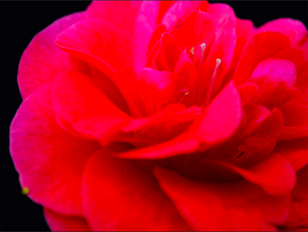
I have chosen the above image as a final image, as I feel that it is one of the best outcomes from the photo-shoot involving the use of 3 panels, and the representation of a decaying flower, with each panel representing a different stage in the decay. To create the above image, I made use of the editing process, and either lowered of heightened the saturation and contrast in order to give the effect that the flower was loosing its colour, and therefore the decline of the flower can also be emphasized not only through its physical appearance in terms of shape, but also the different colors between the panels. By editing the background so that all backgrounds present as the same shade of black, I am able to draw all of the viewers attention to the foreground containing the subject, and in addition, when displaying the work the 3 frames backgrounds will merge into 1, showing the connection between the 3 panels (as they all represent the same flowers 1 lifetime) while also separating the panels in order to show different stages of the same life. In total, this image is used to represent the journey of a fragile object (a flower) through its life, representing each stage of its decline through a single image (which help to emphasize the shortness and fragility of life and health) from the beginning of the flowers life (its healthiest) to the end (as it dies). This concept follows the Journeys & Pathways title, as it follows the objects journey through life, health and death.
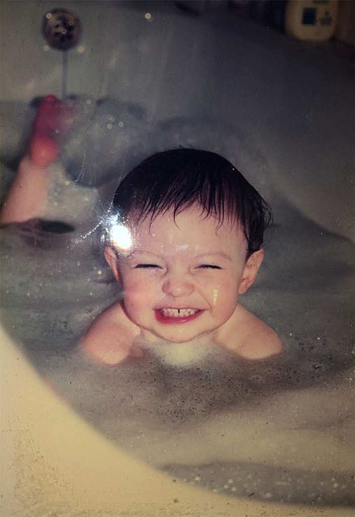
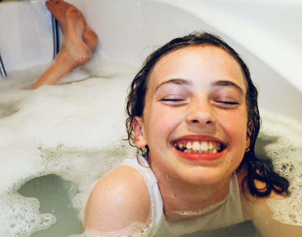
The above images are also examples of images that I have chosen as my final outcomes. The concept behind this photo-shoot was to recreate archival images using the same subjects and locations in order to show the development of the subject and the environment over the course of time between the 2 images. I feel like the above images are the best examples of recreating the original images, as I feel that the subject and the environment are posed correctly to mimic the original image, and the editing process I went through in order to make the new image seem slightly more worn (and similar to the original) has allowed for the similarities between the images to be seen not only in the subject and environment, but also in the colour and style of the photograph. I feel like this image is a good example of showing the journey of life, from beginning through to the present, as it displays the similarities and differences between the 2 time periods effectively, and through the use of only 2 images, allowing the viewer to get an inside look in on the subjects life, while still only being restricted to 2 images, leaving questions unanswered such as the identity of the subject, along with what event led up to their present life, and how their journey has effected who they are as a person in the present.


