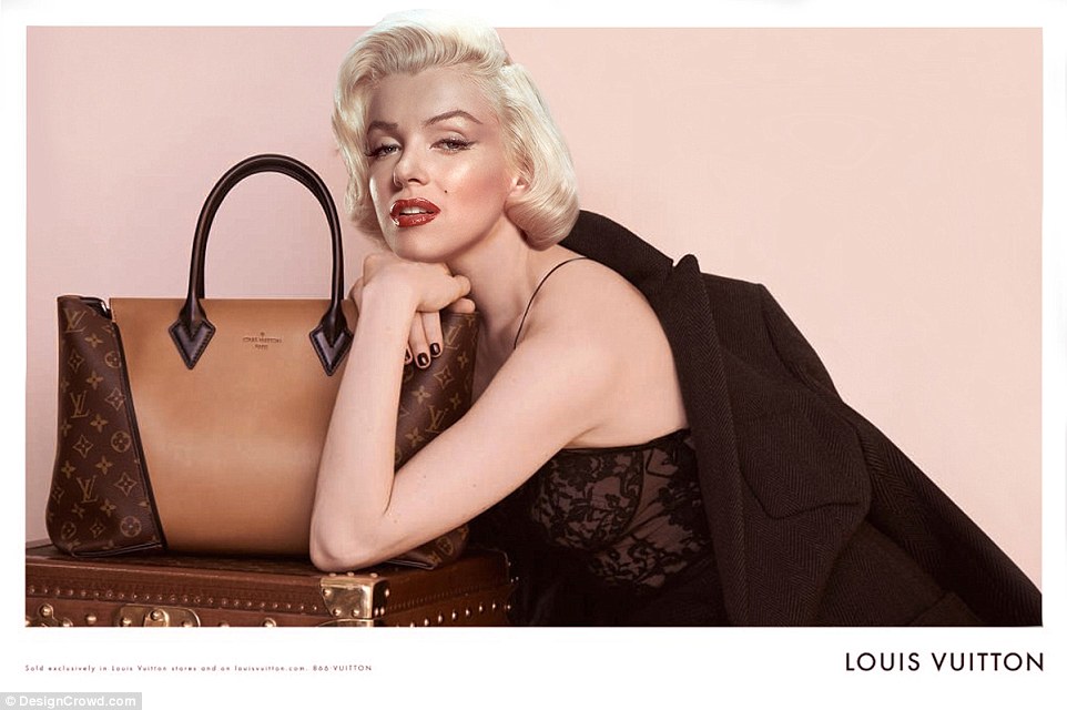
Chosen Photograph:
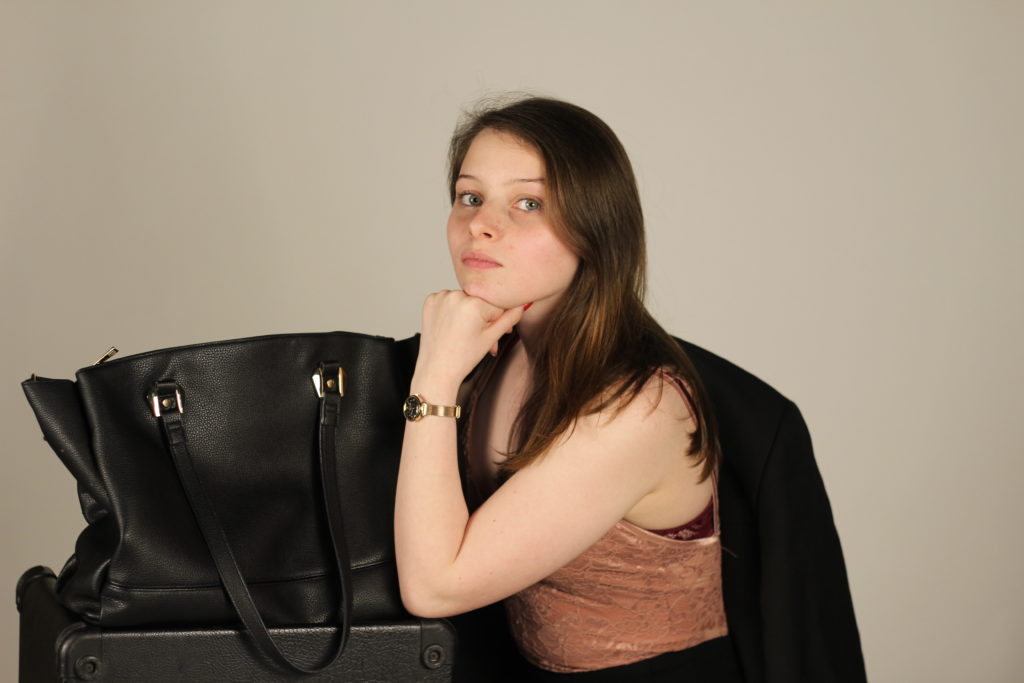
Chosen Own Response
Above shows the photograph I have chosen to edit and develop, this I feel is my best photograph as I feel it has the best composition in relation to the original advert. I think that the lighting is good and gives me room to work with the photograph and edit it. I think that I am a good distance away from the subject in this photograph as it gives me the ability to edit the image like the advert with having her head come into the boarder and also means she is not too small in the frame or large.
Editing Process:

Editing 1
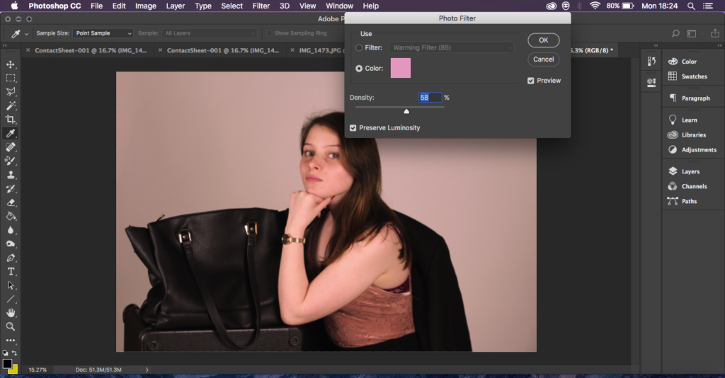
Editing 2
For the first two steps I adjusted the brightness and placed a pink hue across the whole photograph. I did this to get the pink tones out that the original photograph has and also to make the photograph not so dark. To have the pink show through well.
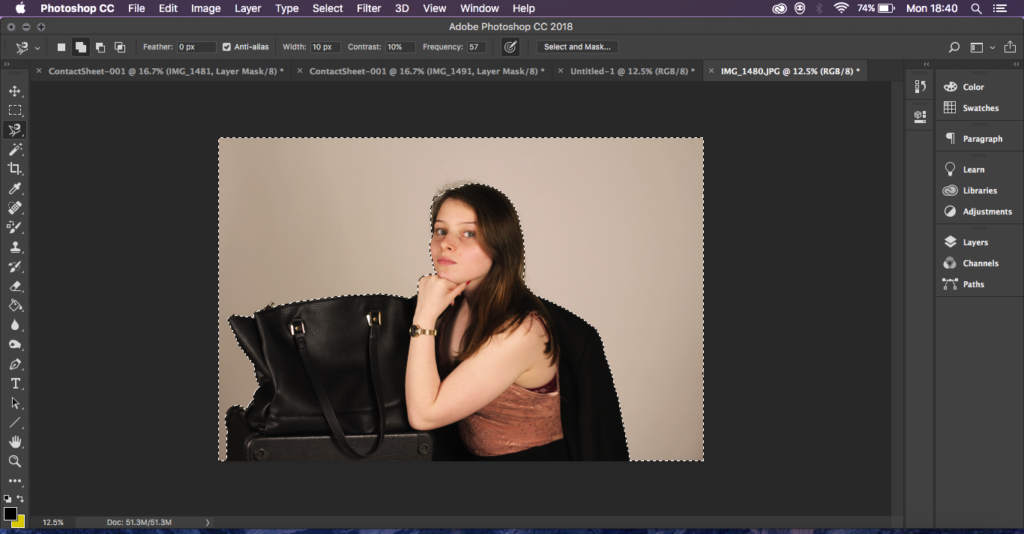
Editing 3
Editing 4
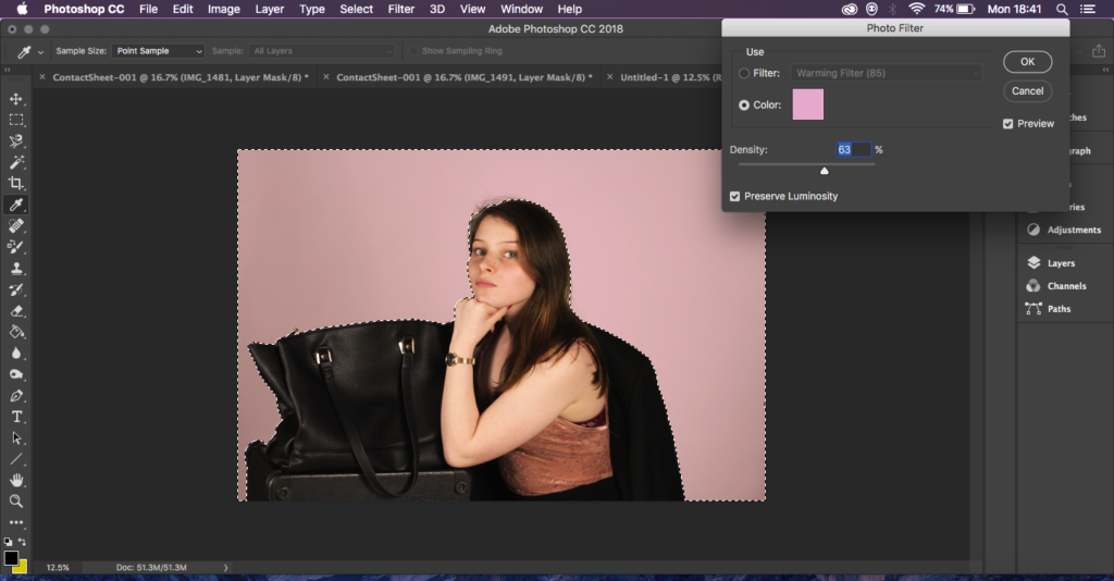
Next I went and used the magnetic lasso tool and made my way all from the bottom and all the way around my subject and then around the frame, I did this so that I would just have the background of my image selected and then I could go in and make the background an even more vibrant pink to match the original without changing the colours and tones on my subject.
Editing 5

Editing 6
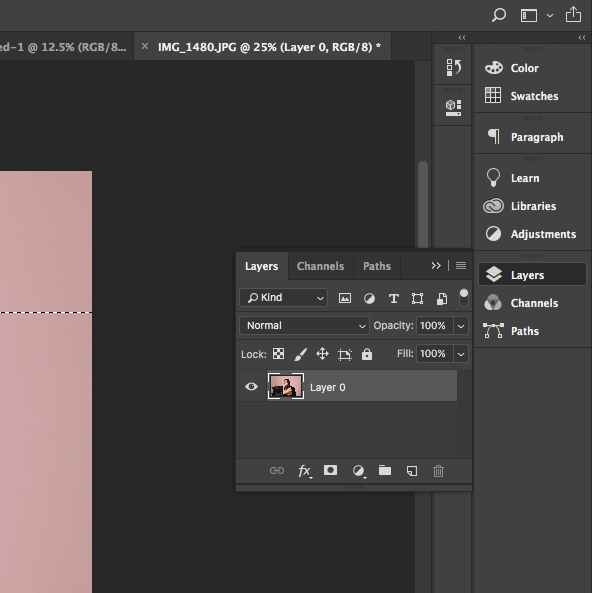
Next I went and unlocked the layer so that I could take the polygonal lasso tool and cut away the top of my image leaving the top of her head out of the frame with a clear background so that I could then move it.

Editing 7
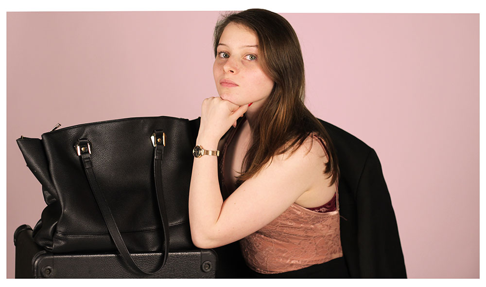
Lastly I created a separate white document that was larger than my image and placed the cut out image on top to give it a white boarder like the original ad, I then cropped down the boarder to get it all the right size and merged the layers.
Final Outcome:
I am happy with the way that my final editing turned out, I feel I have replicated the original photograph as best I can and it has worked well in showing a development of ads and how they’re used which is what I wanted to generate.
Edited Final Outcome

