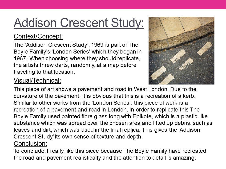
The Boyle Family

Mark Boyle who was born in Glasgow, collaborated with his partner Joan Hills during the 1960s. Their project ‘Journey to the surface of the Earth’ began in 1968 – 69. After being blindfolded, they threw darts at a world map, in order to pinpoint 1,000 areas of the earth’s surface to duplicate. When travelling to a selected site, the Boyles would throw a T-square in the air to select a random area to replicate. In the 1970s their two children assisted in producing these works. Together they operated under the name ‘Boyle Family’.

Image Analysis
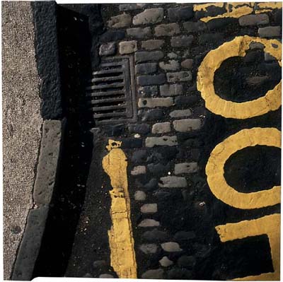
This photograph depicts a street corner and a road with yellow markings and different textures of tarmac and cobbles. The image shows exactly what you would see if you looked down onto an area of road and because of this I think the image was taken handheld due to the angle that is shown through the photograph. The colours of the photograph are typical and natural, along with the shadows and lighting created by the natural light. The road looks like it’s damaged and decaying which shows the viewer what you can find by simply looking at places that are usually overlooked. The photograph doesn’t have much depth, except for the curb but even this appears to be on the same level as the road, possibly because of the bird eye view style of the shot. The photograph reflects the time period, with a new style of making roads. The tarmac covering the cobbles shows the advancement in society as well as the destruction of the pattern. The photograph gives a profound sense of reality since the image is so simple yet effective since it displays the view that everyone would be able to see on a day to day basis, but would never look at twice.

Wolfgang Tillmans – Case Study

Alongside portraiture, landscape and intimate still lifes, Tillmans pushes the boundaries of the photographic form in abstract artworks that range from the sculptural to the immersive.

German-born, international in outlook and exhibited around the world, Tillmans spent many years in the UK and is currently based in Berlin. In 2000, he was the first photographer and first non-British artist to receive the Turner Prize.

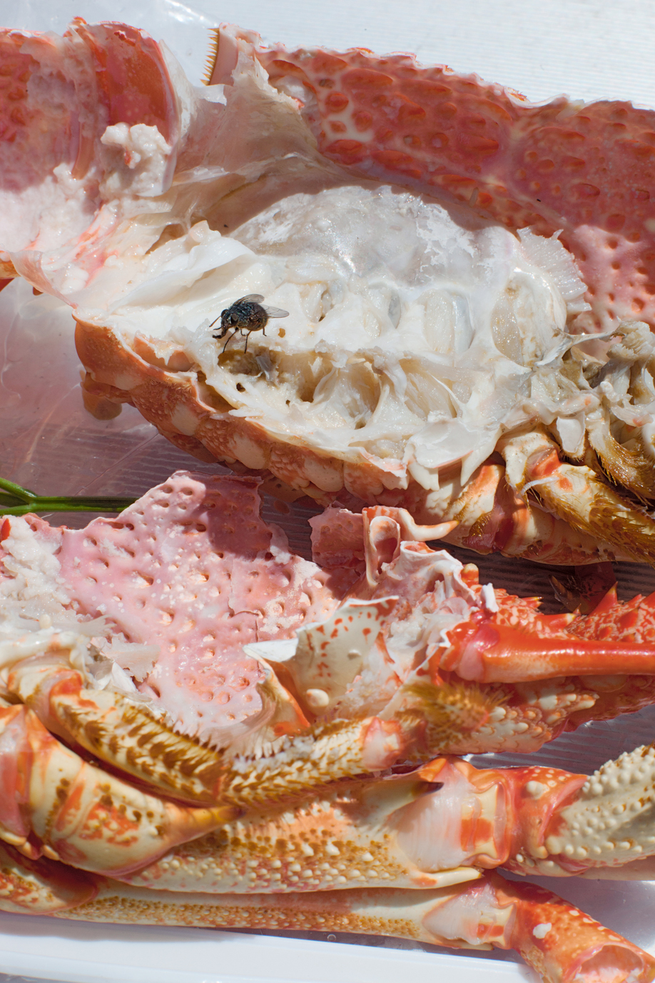
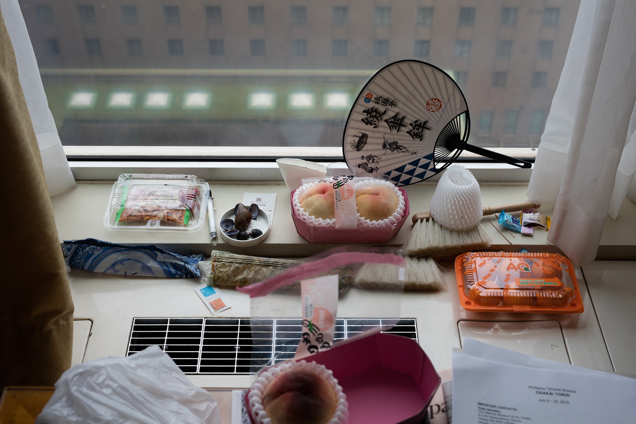
Osaka Still Life

Photo Analysis

Technical

Natural lighting has been used within this photo due to the light source being soft and warm toned casting soft shadows that follow the silhouette of the once alive crab. This warm toned helps bring out the warm colour palette of pinks and oranges. To capture this image, Tillmans used an analogue camera due to the warmth of the picture and the low contrast throughout the image.

Visual

The focus within the image in my opinion is the fly feasting on the lifeless colour-explosion. I think this because the whole image is soft toned and brightly coloured with the interruption of this black figure. At the bottom of the composition, the first exposed shell is facing ‘bottom up’ with the once living crab’s legs surrounding the exposed shell. In the middle of the image, there’s a gap on the left that gives a glimpse of a green basil leaf. At the top of the image, the rest of the exposed crab is facing upwards along with a fly on top of it.

My responses


Best Image

Visual:

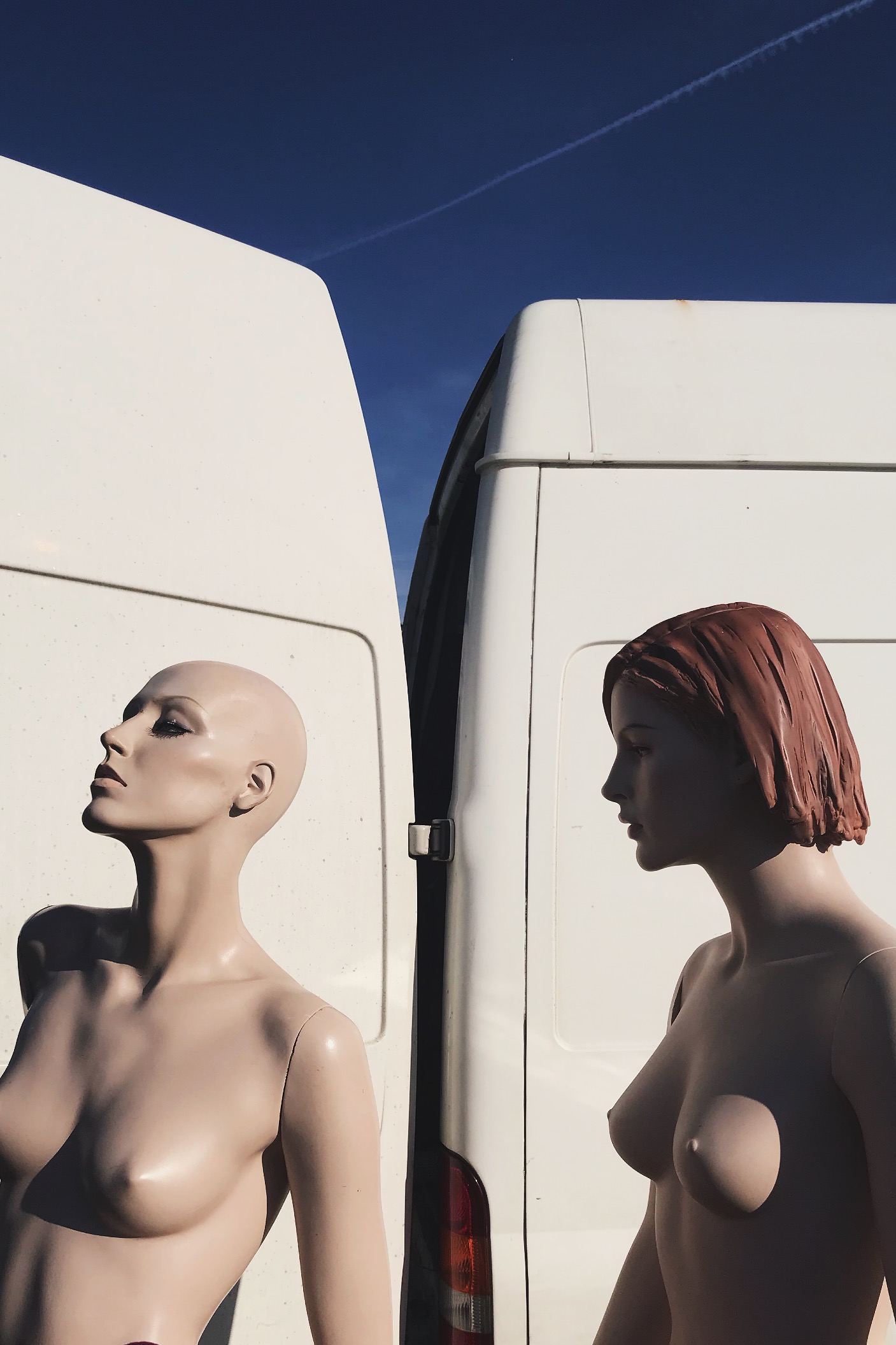
In this image i see this as a rule of three, the first section being the solid blue sky, then the white of the van then the bottom being the mannequins. This rule of 3 gives the viewer a pattern that is memorable and easily recognizable. I also like this because it hasn’t got a busy background making the central subject the mannequins. This picture was taken on a very early morning, this is casting sunlight onto the mannequins from the right direction, thus creating flowing shadows and contrast on the perfectly sculpted silhouettes. Due to this also being taken on film, the picture is very warm. 

Technical: 

Again, this image can be divided into a clear rule of three : solid blue at the stop, solid white in the middle, then the skin coloured mannequins. This contrast of colour palette due to the white and light blue complementing the fair skin tone of the mannequins. The shadows cast on the mannequins reinforces their “perfect” silhouette and refines their shape and posture.

Contextual:

I took this photo at a flea market in Brighton when the sun was just rising. I would’ve happily bought these mannequins home with me due to them having more refined bodies compared to boring plain white ones we have around us. I asked the seller where he found or got them from and he said that his husband worked for Selfridges in London and these specific Mannequins where left for rubbish just because they were never used. So this man took them home and used them to model his artworks and designs he made to promote and sell his work. 

Journeys and Pathways – Shoot 2 (Tilt-Shift & John Davies)

Contact Sheet:

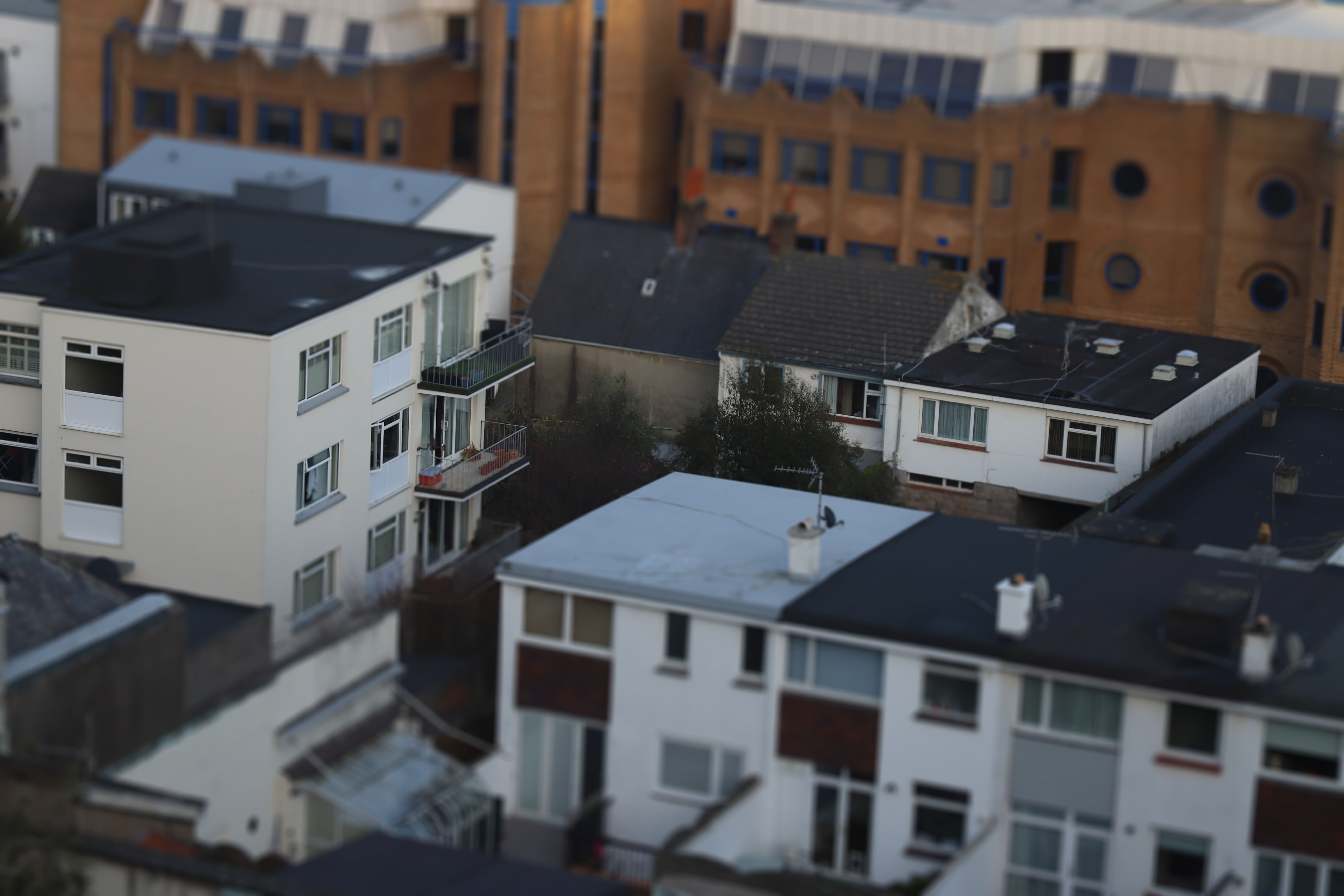
For this shoot I originally wanted to focus on a recreating the work of John Davies, however when editing, I found that using a tilt-shift lens effect in Photoshop (by using the quick mask tool in Photoshop, then using the gradient tool to select which area I wanted to be in focus, then deselected the quick mask, and finally added a lens blur from the ‘tools’ section of the quick bar) made the idea of ‘Journeys and Pathways’ stand out more than just landscape images. I utilized this effect to show how small everything really is, or at least how small it can seem. The final outcome of my images looked like this:

Final Images

Out of all my images, I found that this one worked better than most others taken in terms of creating a realistic looking tilt-shift effect, in essence making the buildings look like tiny scale models. I think the angle, and visibility of what is behind the subject in focus helps create this effect.

For this image, I liked how the wider angle helps this it in showing much more than some of the other images, making it look more like a smaller model city. However I think that the shot would have looked nicer if the houses in the foreground weren’t there. Despite this, I do think it once again supports the message of showing how small we are, especially seeing the Avenue in the background, stretching into the mist on the other side of the island.

Unlike the first 2 final images, I wanted to show a more close up view on the buildings, and personally I find this image looks most like a model building set, and really emphasizes the miniature/model look that I was aiming to create. However, I struggled in photographing more interesting buildings for these shots as they were taken around the Fort Regent area, and therefore meant I had very little to work with in terms of getting nice buildings at the right angle, yet I still think this image works for the message I’m trying to put across.

Idea 1 – Journey of An Object

Objects help us identify what happened in our world’s history and happenings alongside stories of previous owners. Pictures show progression in how far we’ve come with politics/ fashion/trends/architecture/transport/culture/communities, all reflecting past times that could benefit future times. Old magazines and newspapers help us understand how minor events connected with major events. Personal trinkets tell stories how someone once lived their life reflecting what hobbies they liked alongside their occupations. History always benefits the future. We take all of our ideas from the past and either improve them or retain them so that we can evolve using these ideas. A way a building was built 50 years ago isn’t remotely the same as a building nowadays however those buildings helped us to adapt the ideas that work and use them again. 

Snooper’s Paradise

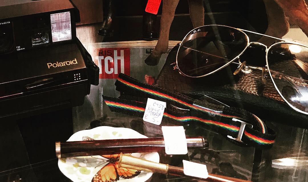
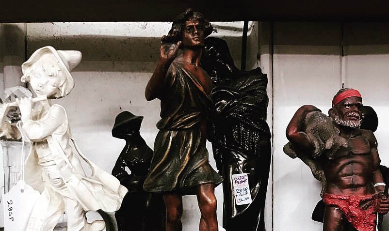
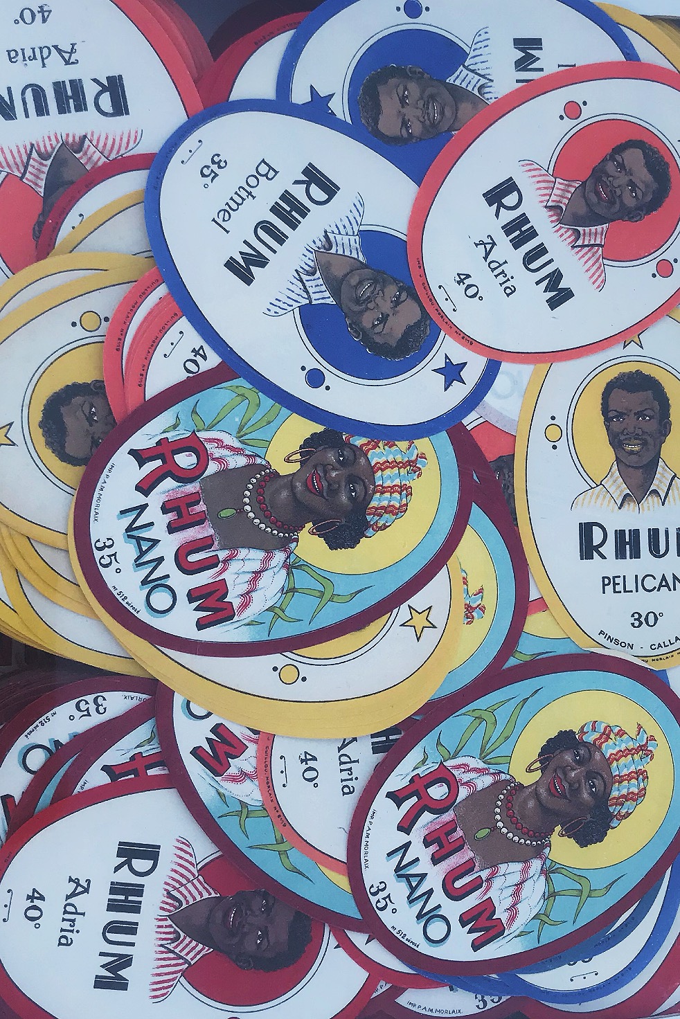
When first visiting Brighton, I was introduced to a shop in North Lane called ‘Snooper’s Paradise’. This shop has 3 floors of brick a brac history, from car number plates, to 300 year old books, cassette tapes, to stamps, this store has every part of history inside. This shop introduced me to my love of dated objects. I have purchased many old vinyls, cassette tapes, old magazines, photographs, sunglasses, crazy fashion and original 1935 glass bottles to use around the house. My love for old things is eternal, this is due to these objects reflecting simpler times where music was soulful, people where vibrant and fashion was outrageous. My favourite era is the 70’s, because people were encouraged to let go and feel free; hippies and naturists ruled the world. This free spirit helped people to speak up about any problems and political issues without hesitation making equality and race prime topics. 

On my most recent visit there, I purchased some items which I thought held the most history that I could capture in frames. I purchased: stamps, a competition rosette, a 1975 Playboy magazine, a photograph of an architect, a Vaseline container, train tickets and a cassette.

Photoshoot Idea

 My main photoshoot idea is to utilize the style of archival photography so that the only central focus within the composition is the object.

 The only examples I could find were only stock photos due to the fact that I want a specific look: object main focus, plain background.

For lighting, I would use 3 separate light sources: one that cancels out any shadows from behind, one light source coming from the left then another from the right. This surround lighting would create a complete white wash so that there is no shadows overcasting the objects or there surroundings.