

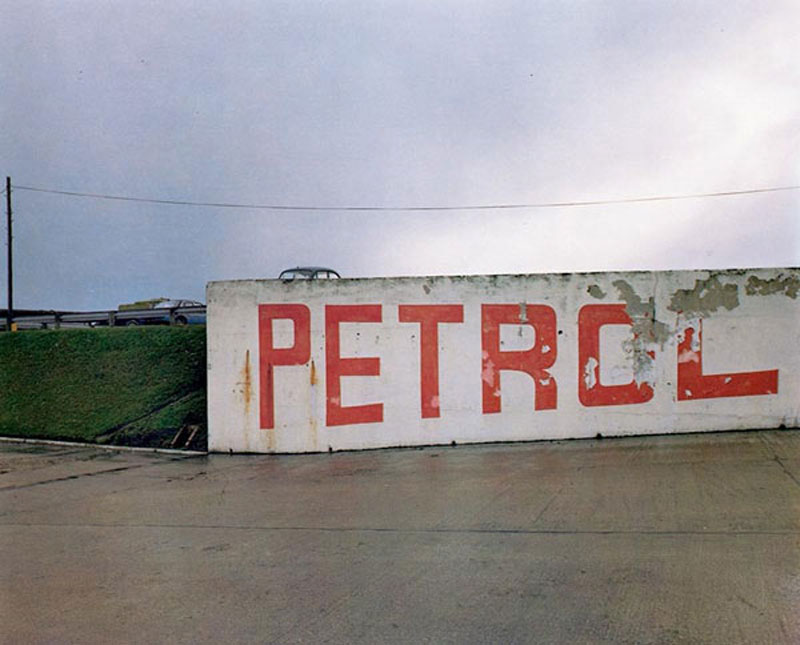
Paul Graham is an English born, self taught documentary photographer whose work has won various awards including the likes of the Deutsche Börse Photography Prize as well as the Hasselblad Award. Graham is a very prolific artist with many published works and exhibitions. As stated before he is a documentary photographer and as such most of his work features small aperture to capture a lot of detail in the scene. I like the flat tones he uses juxtaposed with strong colors, often sticking to two or three main colors as to not over saturate the image.
The image appears to use a high F stop due to the wide range of detail captured. The photo’s look as though they were taken using a Digital SLR with a low ISO due to the abundant natural lighting in the scene (using a higher ISO would leave the image overexposed) as well as the lack of noise in the image despite the age of the camera considering this work was published back in 1983. There is some slight color noise in the darkest areas of the photograph however this is likely due to the age/ quality of the sensor. There is a strong tonal contrast image between the lights and darks however the highlights aren’t too overpowering. The vibrancy of the colors despite such a flat scene suggests the use of a slow shutter in conjunction with a tripod due to the lack of any motion blur.
The image features two strong key colors, that being the orange of the paint as well as the bright green on the grass/ trees in the area accompanied by some more subtle blue tones. There as some light purple tones visible in the darker areas of the image. The image uses the Fibonacci curve as to draw attention to the writing on the wall. The images composition features very strong lines separating layers of the foreground and the background. There is a strong sense of texture created in the image by the rough surface of the concrete as well as the detail in the grass/ trees. The roofs of the houses almost create the effect of a repeating pattern.


HOW:
For this photo shoot, I used my regular DSLR camera in order to capture the images.
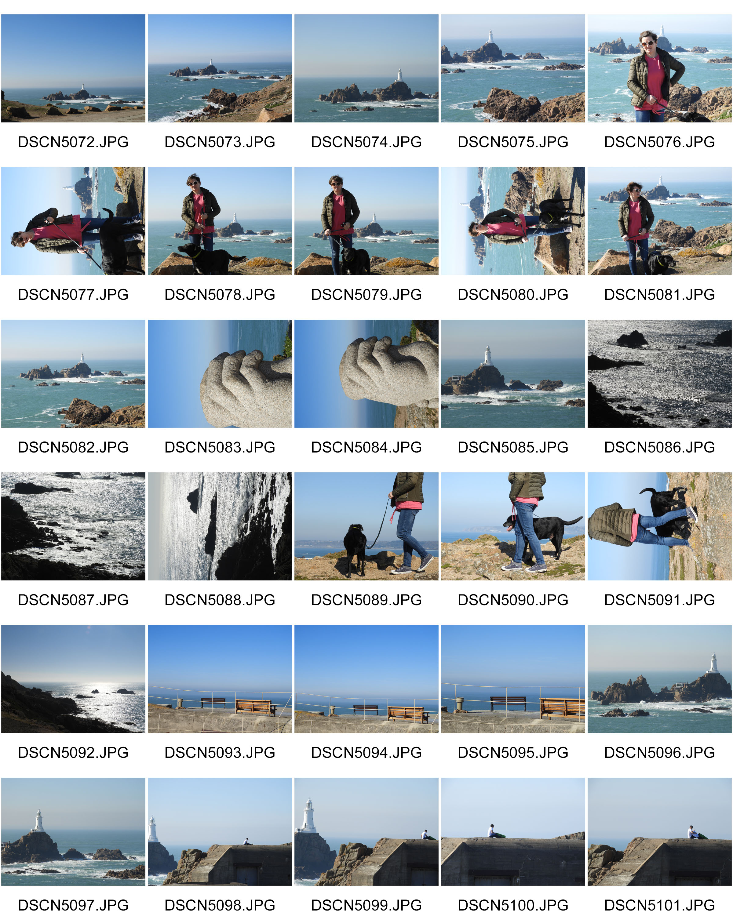
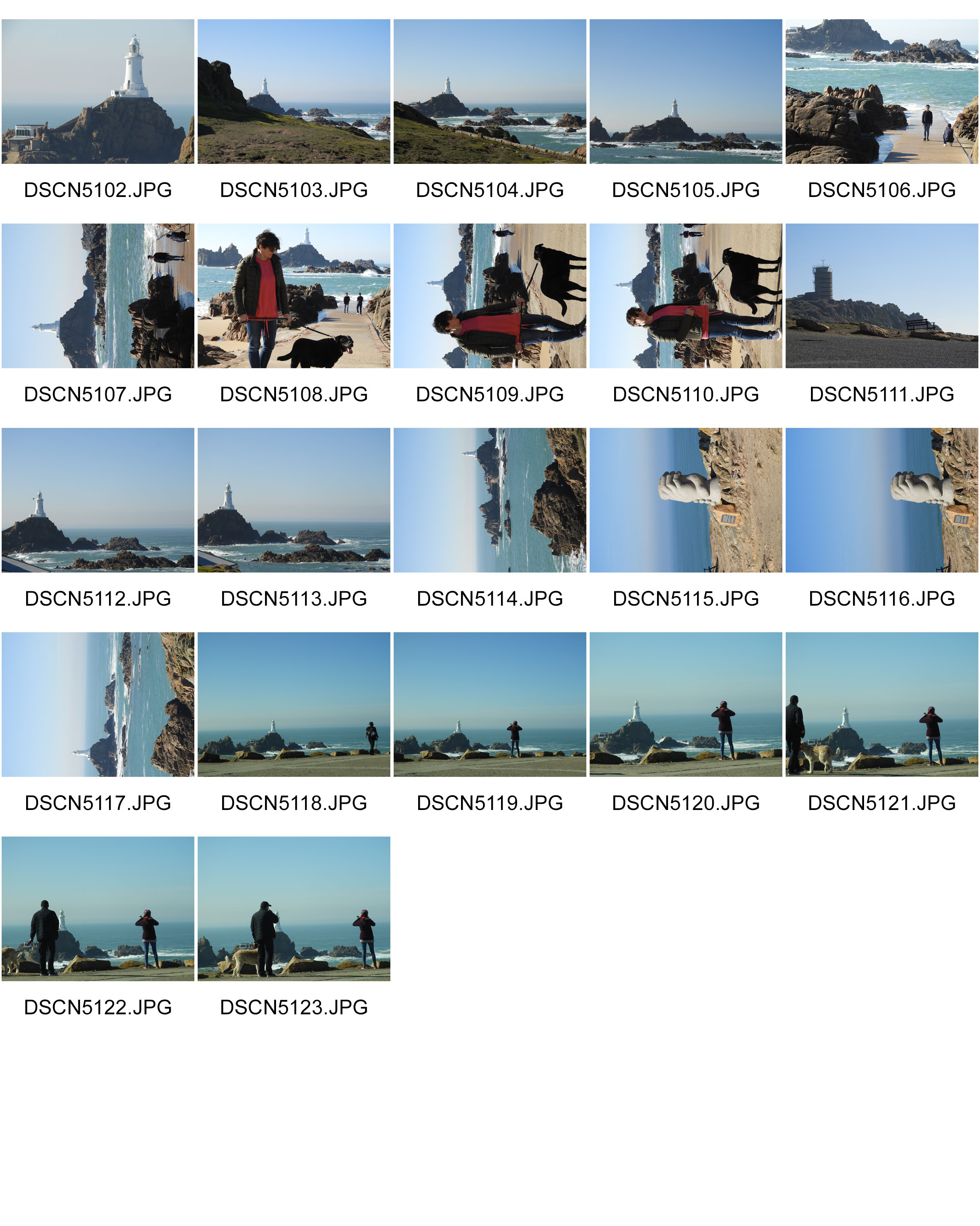
WHERE: I conducted this photo shoot in Corbiere as I thought it represented well the natural beauty we have here in Jersey. I also found the different skyline and horizon very interesting.
WHEN: This image was taken during the early morning meaning that the shadows which are cast are at a very steep angle, giving different shadows than if it were to be taken during mid-day.
WHO: I attempted to incorporate both the landscape and people into my work as I was experimenting with different themes and subjects to take forward into my project.
WHAT: Corbiere is very well know for its stunning cliffs and amazing lighthouse which is situated in the middle of the sea.
WHY: One of the themes which I was trying to convey through my work was landscape romanticism therefore I tried to capture the sublime nature of the landscape and how it has been altered through man-made forces.
MOST SUCCESSFUL PIECE:
CRITICAL ANALYSIS:
TECHNICAL:
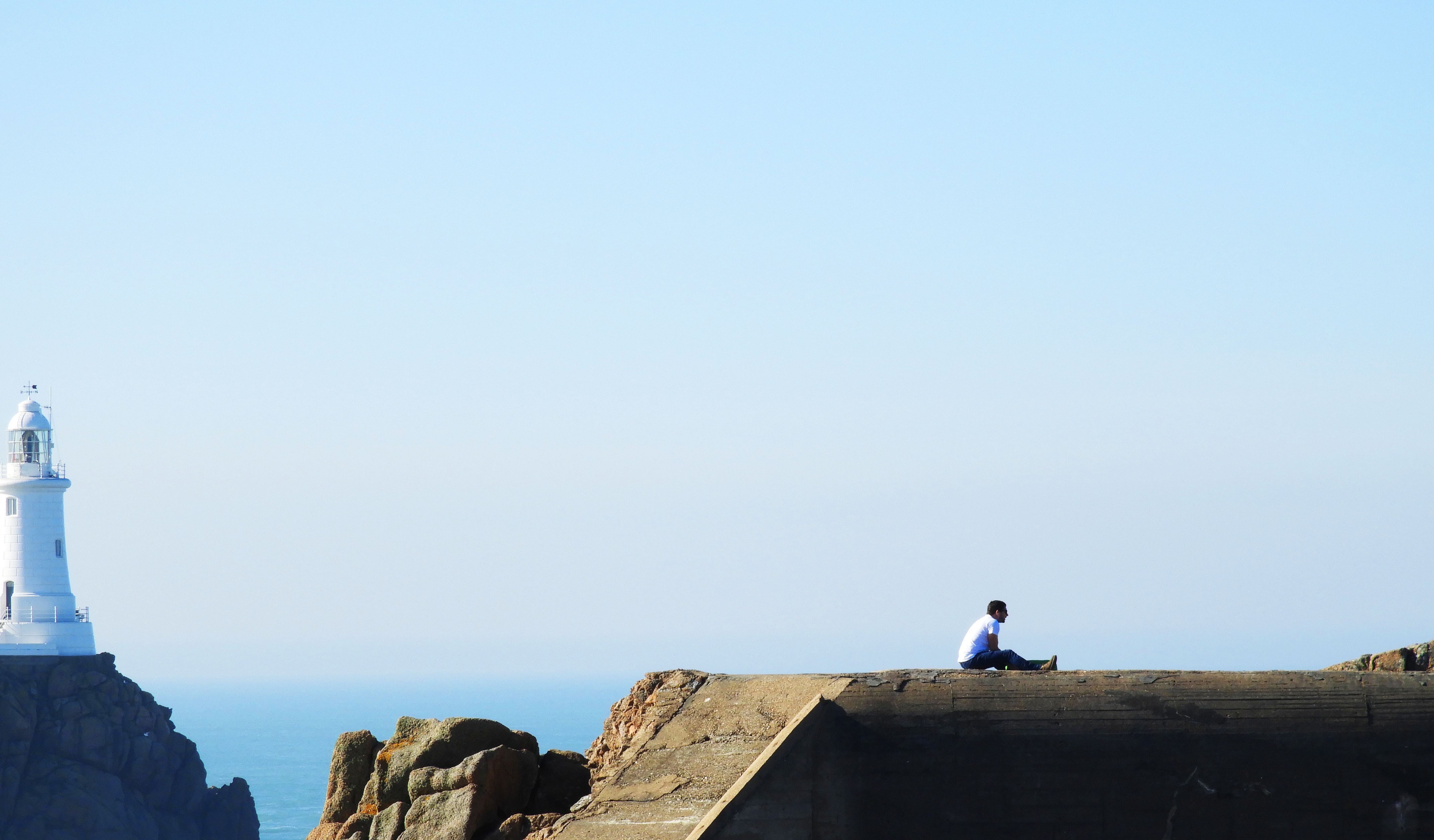
In terms of actually taking this photograph, no special changes had to be made overall. I used the manual setting on my camera, using ISO 200 as it was a fairly bright day and I did not want the image to be overexposed. The image above was taken using manual zoom on my camera, increasing the focal length to 35mm as this allowed me to capture a detail shot of the landscape. The original image encompassed a lot more of the landscape but I decided to crop it in order to draw more attention to the man sitting atop the bunker, as this better captures the themes which I wanted to portray through my photography.
VISUAL:
The editing techniques which I used in this image means that a sort of minimalist image was created, yet retaining elements of landscape romanticism. An aspect which can be looked at is the minuscule looking person sitting atop the bunker, being overridden by the sublime nature of the landscape which appears massive in comparison to the measly human. One of the most striking things about this image is the symmetry created and the continuation of the line between the sea and the top of the bunker. It sort of mergers the two elements into one and creates harmony between the two. Another contrast in the man made and natural is the color pallets of the two entities, the lighthouse and sea being mostly blue based whilst the bunker and human have orange and warm tones. The majority of the attention in the image goes to the bottom third of the image as this is where the focal point lies. The combination of the 3:1 ratio between the emptiness and focal point mean that it is a fairly minimal image, with simple linear elements and few colors overall. Although touching on the minimalist style, it is style evidently exploring landscape romanticism and human impact by including the bunker and sea in the backdrop. As this image was captured quite far away, there is no real sens of foreground but rather only a mid ground and backdrop. The bunker and man being in the mid ground and the sea and light house being in the back drop.
CONTEXTUAL:
Violent seas have caused many a shipwreck at Corbiere over the years. The name, which is probably derived from corbeau, the French for crow, is commonly found elsewhere in the French-speaking world, notably in Guernsey, the north Brittany coast, central France and Switzerland.
Jersey’s Corbière is first recorded in the 1309 Assize Roll, when the issue arose of a tub being washed ashore there, and it was a regular occurrence for a ship to founder on the rocks when rounding the corner of the Jersey coastline in stormy weather and its cargo to be washed up on the sands of St Ouen’s Bay.
It was not until 1873 that the lighthouse was constructed which now allows ships to plot a safe route. It is 11 metres tall and was the first lighthouse in the British Isles to be constructed of concrete.
The light can be seen from a distance of over 25 kilometres, but this has not stopped smaller vessels from taking a short cut through the rocks off the coastline en route from Jersey to Guernsey and coming to grief after striking a hidden rock.
CONCEPTUAL:
Two of the major styles my work tackles in this photo shoot is landscape romanticism and minimalism, each being very distinct from each other yet creating striking impact within visual media.
Minimalism is a style employed by many 20th Century artists, using a minimum amount of components such as colour, shape, line and texture. Within the art world it is considered an extremely subjective concept, leaving interpretation and meaning up to the viewers perception of the work.
Some appreciate the openness of this idea, embracing the freedom of interpretation, where others despise the lack of direction or subject matter. For photographers, this is less of an issue, as more often than not, a photo remains a real-life moment captured on film. Despite this, we can employ some of the techniques of minimalism to enhance the impact of our work.
Romanticism was (and is) an international movement that swept Western Europe and Russia at the end of the 18th and beginning of the 19th centuries. It expanded to North America beginning around 1830. As a movement, Romanticism drew its inspiration and energy from various sources:
OTHER SUCCESSFUL IMAGES:
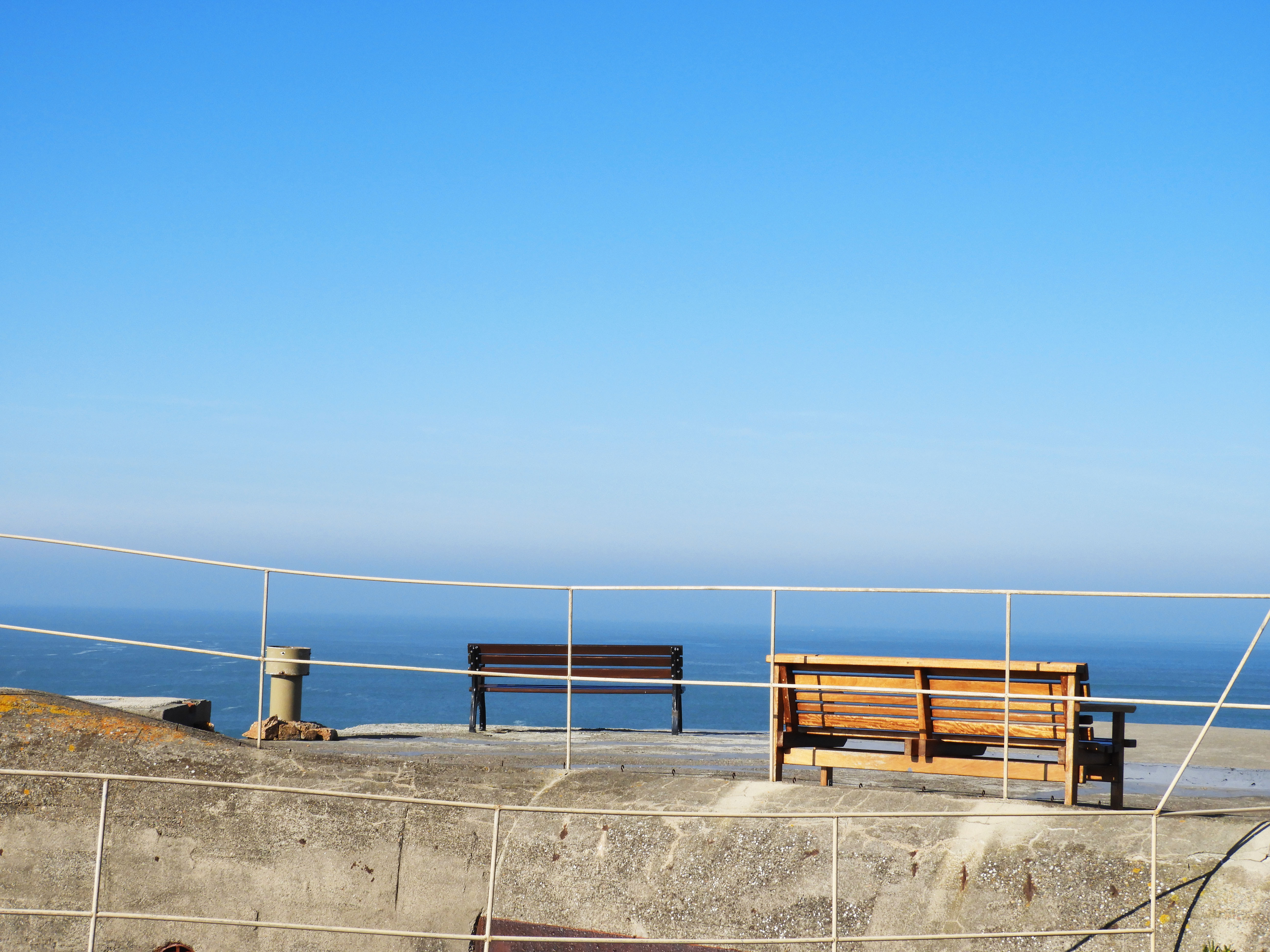
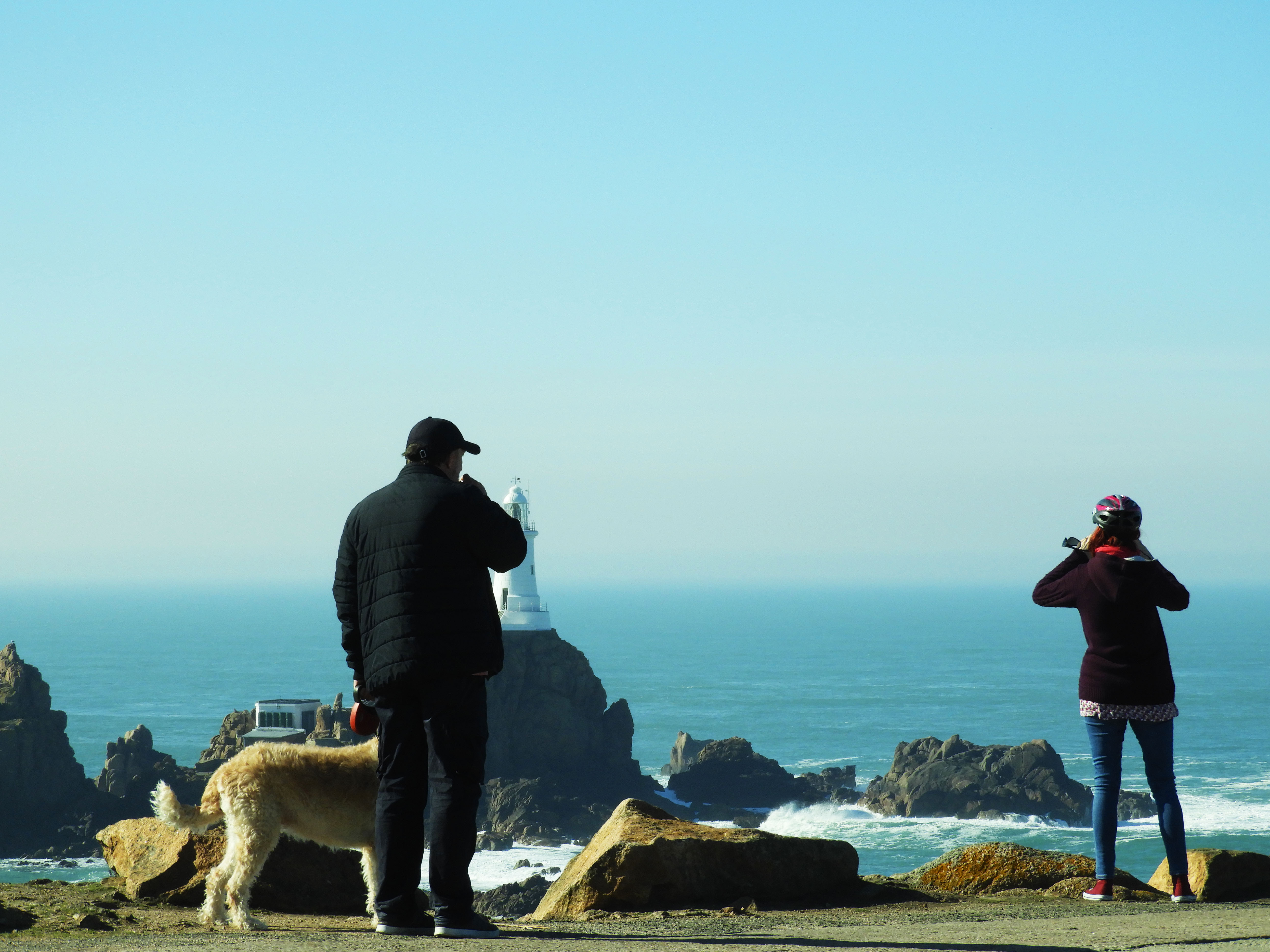
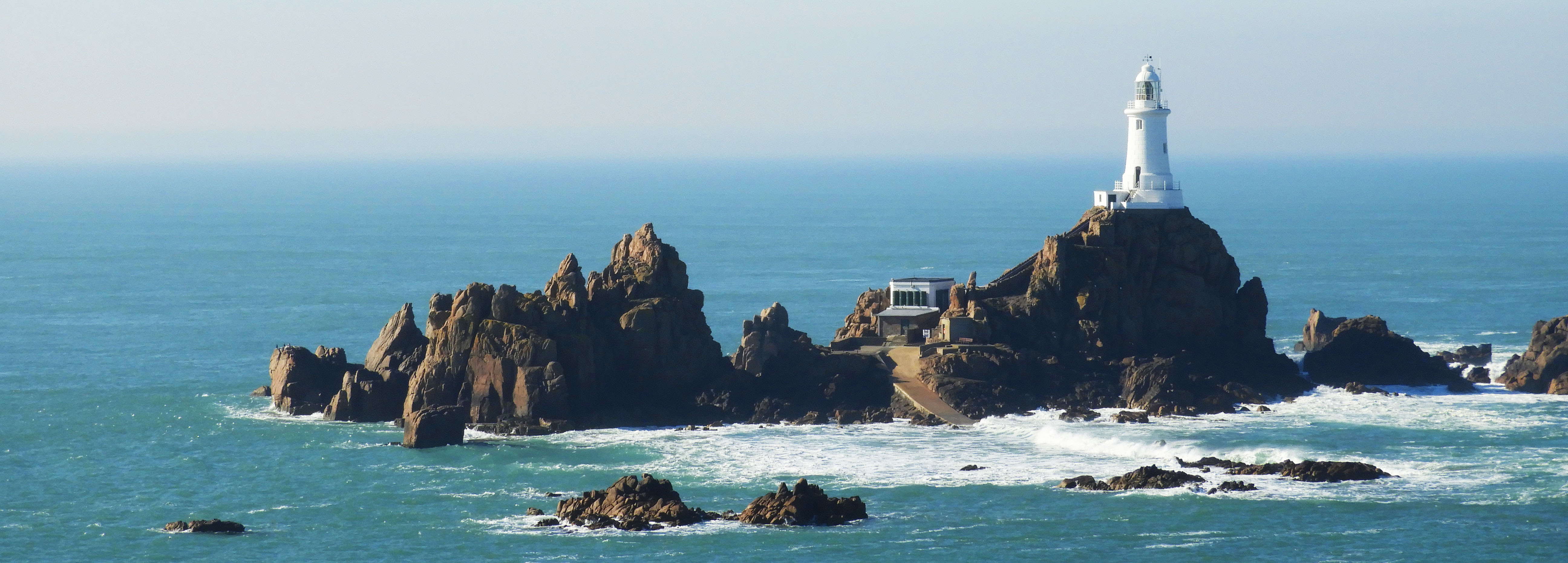
Before I started to do photo shoots based on other photographers, I wanted to get a rough idea of what would be good to photograph to start me off on the theme of Journeys and Pathways. As an experimental photo shoot, I went out on multiple occasions and took pictures of what I thought could fit into the concept of the theme.
Contact sheets:
In these images I concentrated on getting images on which I thought could relate to the theme. I took images such as actual pathways, the water and waves coming in on the beach, pictures of my feet walking, pictures of the view from when I was on a plane, and footsteps on the beach.


Chosen images:


Final edited images:

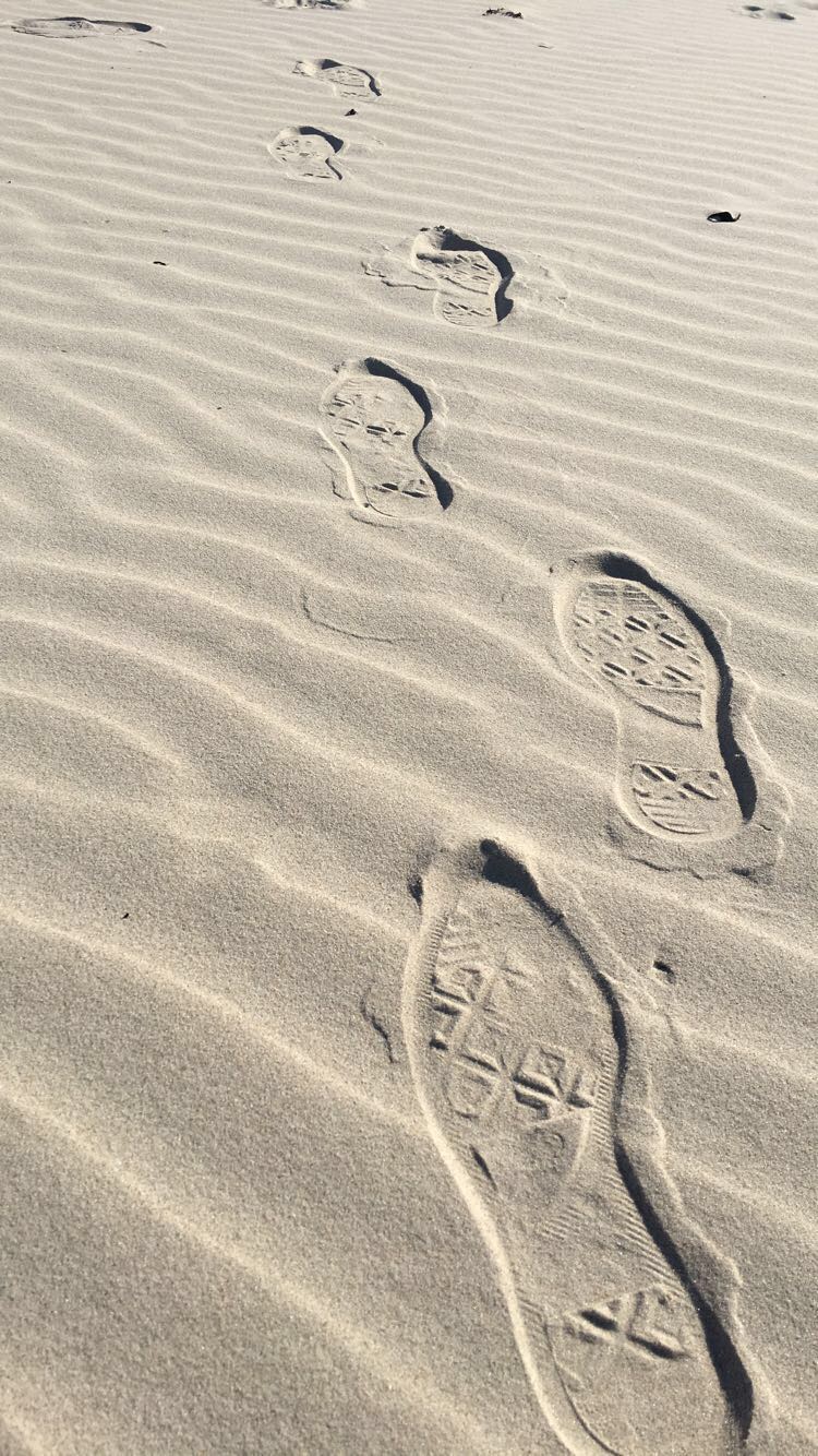
In this image I decided to add more colour and to blur out the further steps to create more of a depth to the picture. To do this I first cropped the image to get out the unwanted parts in the background and then played around with the brightness and contrast, increasing them both equally to lighten the light areas and darken the shadows. I then went and increased the exposure a little bit, and increased the vibrance and saturation a significant amount, making the sand look more golden. I finished with changing the hues in the image.
What I like about this image is the neatness of it, the sand around the footsteps seem calm and natural, and then the footsteps in the sand bring some sort of chaos with them, messing the sand up as they go. This could portray the effects which the journey of someone can bring, making their imprint on the surroundings around them. I also like how the image becomes darker as it comes closer towards the camera, as it adds to the depth of the picture.
What I should have done to improve the picture was to maybe angle the camera more upwards, maybe getting more of the surrounding beach which would have added more to the image. I also think I should have maybe darkened the edges of the image when editing, which would have given it a nice effect and made the viewer focus more on the footsteps than the actual sand.

In this image I decided to edit it only a little bit. I first cropped the image so it was smaller and focused more on the moving leg, and then I went and increased the brightness and contrast in the picture. I then followed on by going straight onto the vibrance and increasing that only a little bit to give the image more of a colour to it, and then finished off by using the dodge tool to brighten the whites of the shoe, making it pop out against the dark background and rest of the shoe.
I like this image because it has a certain movement to it, as if the person in the image is in a rush to get to a certain destination, and I feel as if that’s clear in the image. While the surroundings are all blurred and moving, the foot in the middle of the image seems to be more focused than the rest of it, although it too was caught in the middle of movement like the rest of the image, and I feel like that gives it a nice affect.
However, I feel I could have done better with this image by getting it more focused on the foot and leg in the image. While it’s not as blurry as it’s surroundings, it’s still a bit out of focus and I think it would have been more successful if I had been able to get the camera to focus on it a bit more.

In this image, I wanted the viewer to focus more on the path and less on the beach surrounding it, so to do this I started editing this image by dropping it down to a point where the stone pathway was the only thing you can see in the middle of the image, removing the sky and most of the sea out of the photograph. I then blurred out the surroundings which were further out, and a little bit around the image to make it easier to focus on the pathway. And then, to add a bit of colour and light, I increased the brightness and contrast like i’ve done on my other images, and then increased the vibrance and played around with the hues until I got my desired outcome.
What I like about this image is that the stone pathway is right in the middle of the image and continues vertically until right to the end, which was the effect I was looking for. I also like how each side of the pathway are different, with one side being nice and sandy while the other side seems almost swamp-like and covered in seaweed, which could be interpreted in many different ways.
Although, what I don’t like about this image is the quality. Since I took it on my phone, it didn’t come out as good of quality as a digital camera would take it in, so I think i’ll be re-taking this image again but using my camera instead of my phone, and see what kind of results I get, and hope that it’s much higher quality then what the phone could give.
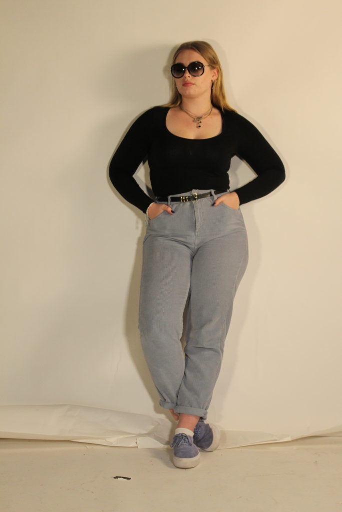
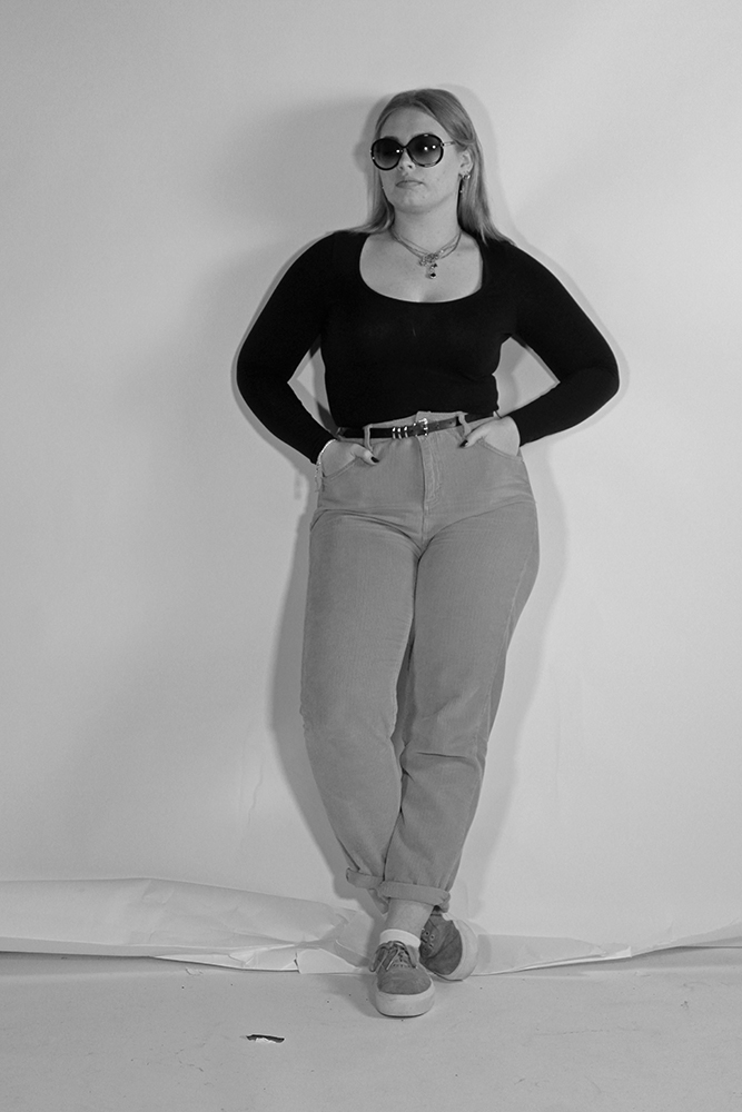
Above shows the photograph I have chosen to edit in response to the fashion photograph I was recreating. I have chosen this image as it was one of my most clear photographs and I feel replicates the original best. I also feel that in this photograph the lighting was working well compared to some of the other outcomes I produced and the subject is standing in the most similar way to the original photograph.
My aims while editing this photograph is to not adjust the photograph too much but to adjust the light and contrast to then put a black and white filter over the top to then create an accurate final outcome.
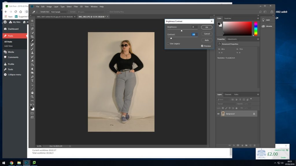
For the first step towards turning the photograph into black and white I started by adjusting the brightness and the contrast slightly so that I had the best amount of shadows and highlights that I felt would work well once in black and white.
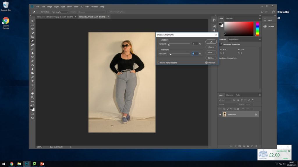
Next I went in and only slightly adjusted the actual shadows and highlights just to enhance what I previously did with the brightness and the contrast.
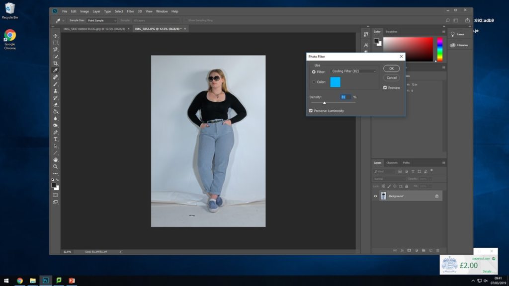
For the next step I experimented with placing a cooling filter over the top of the photograph to see how this would effect the image when putting it into black and white to take away the yellow and warm tones.
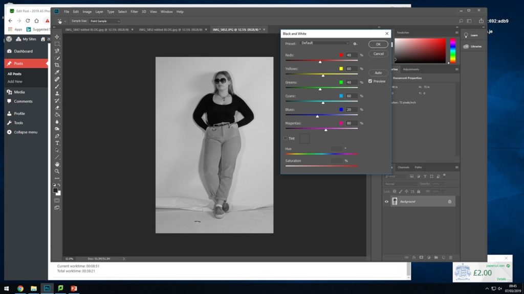
Finally I placed the black and white filter over the top of the photograph to recreate the final photograph best and to enhance this photograph itself more.
This shows the final outcome for my finished edited photograph, I feel the photograph worked well. I feel it works well in the black and white tones and placing the cooling filter over the top also worked well with enhancing the photograph.
The early 1960’s featured a number of diverse trends. It was a decade that broke many fashion traditions, mirroring social movements during the time. During the late 60’s there was a backlash by radical feminists in America against accouterments of what they perceived to be enforced femininity within the fashion industry. Instead these activist wore androgynous and masculine clothing such as jeans, work boots or berets.
For this photoshoot I will be taking the images in the studio to give me the best lighting for recreating these AD’s I will use two different subjects one in each of the images. I am going to be dressing the subject in clothing that is almost exact or close to what the subject in the original image is wearing.
For the first recreation seen below I have found someone I feel will work best to take on this photograph and I have asked them to dress in a way similar to that of the original picture for the best possible recreation I can gain.
I will be trying to show my inspiration from Cindy Sherman by the way I am having my subjects try to embody the way the original subject was standing and acting.
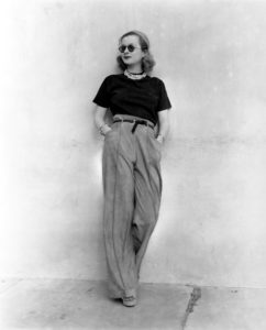
Above shows the photograph that I have chosen to recreate. I had my subject stand against the wall and try to recreate the pose that the model was standing in herself. What I feel could have been done better would be to find an actual wall to take the photographs against rather than in the studio however I feel the rips on the floor of the studio I feel help with the recreation.
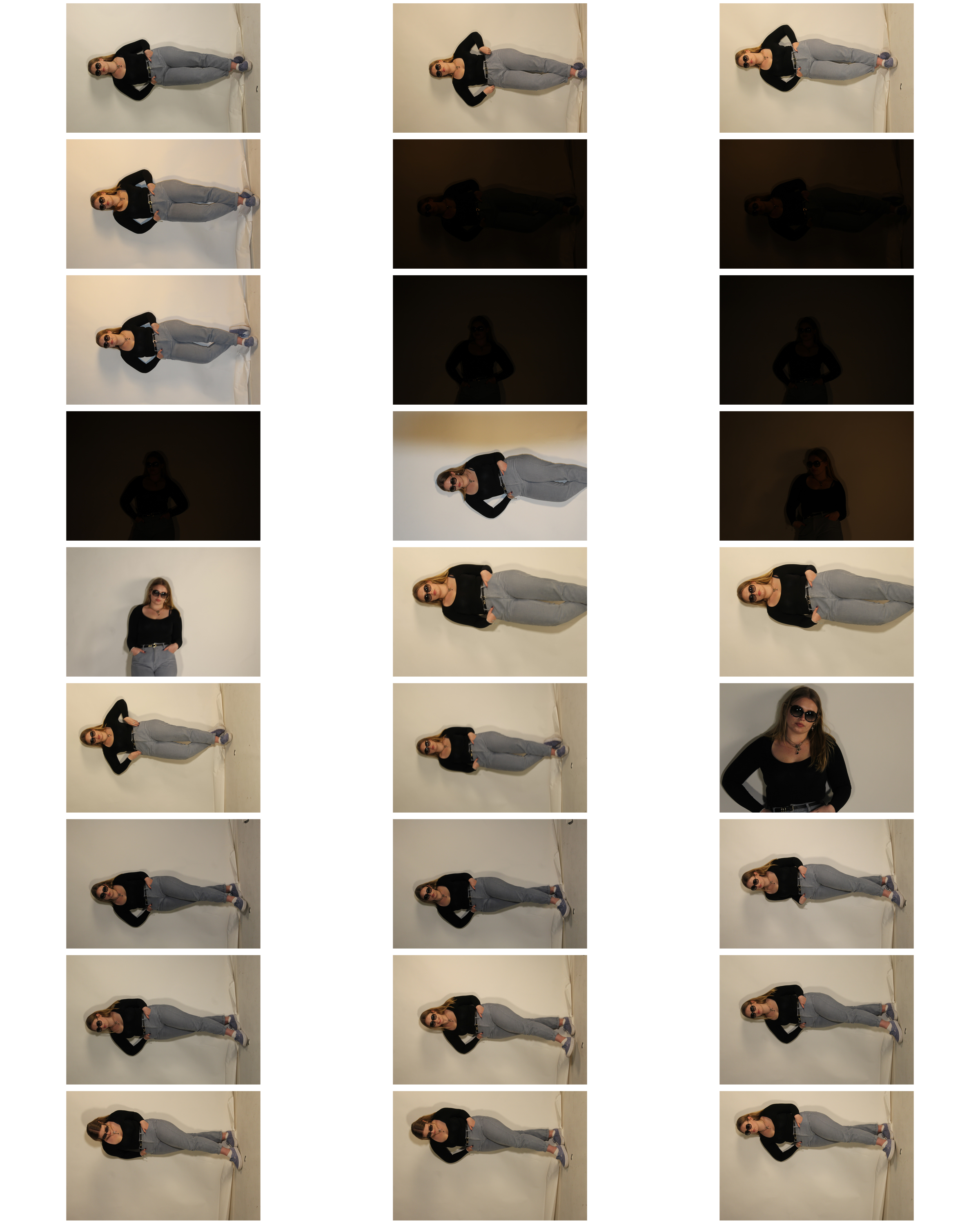
 Above shows a contact sheet of the images I produced on the day of the photoshoot. As can be seen some of the photographs came out too dark when I began to adjust the light, however this was able to be fixed in the camera settings with some adjustments. Taking and thinking of the inspiration from Cindy Sherman I tried to have my subject embody and look at the original image a couple of times to try and recreate and represent the woman in the original photograph.
Below shows my 6 personal best outcomes from the photo shoots. After selecting these I will go in and start editing my 2 favorites to be more like the original picture and to enhance them more.
HOW: I used my regular DSLR camera for this photo shoot.
WHERE:
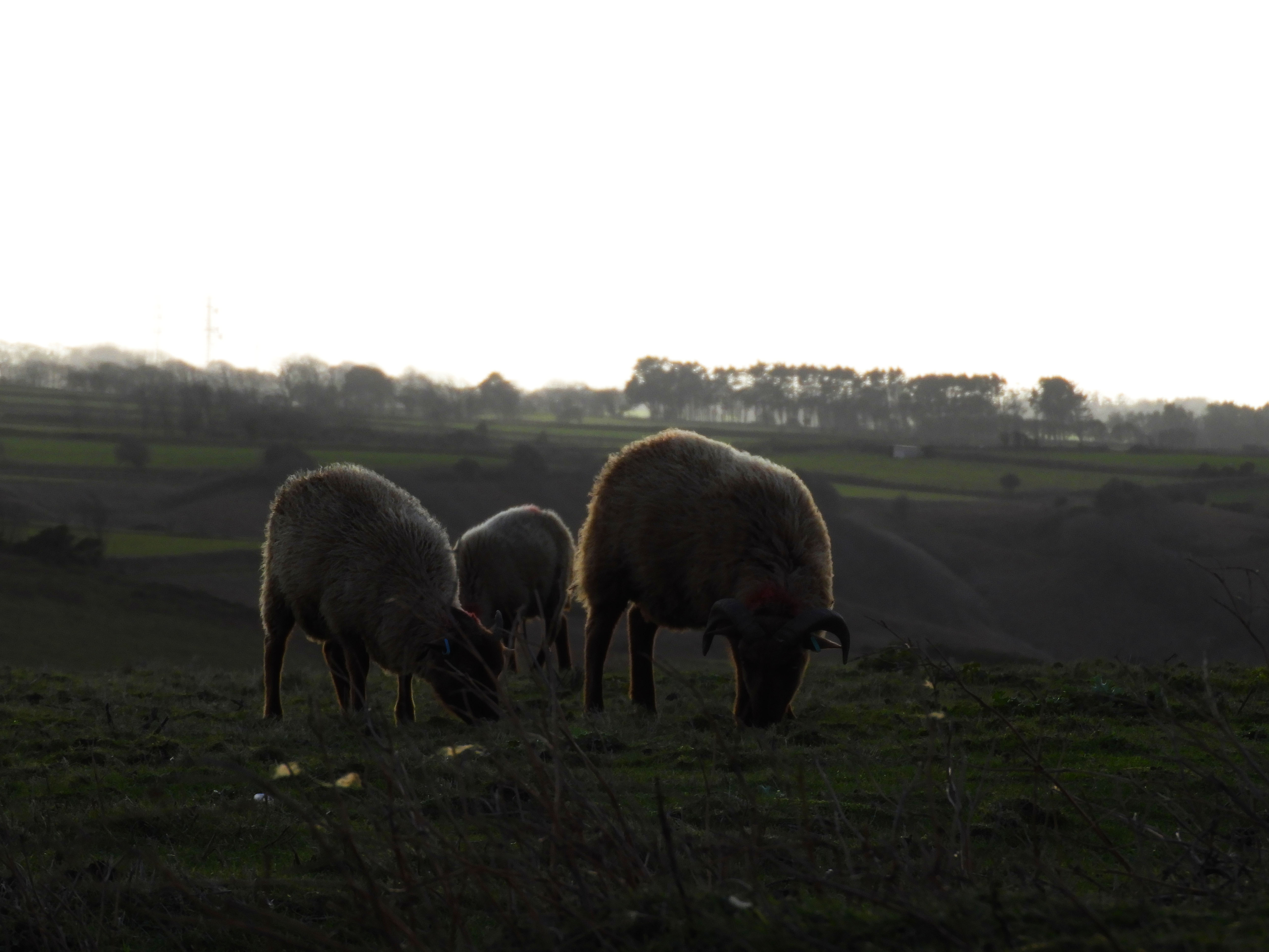
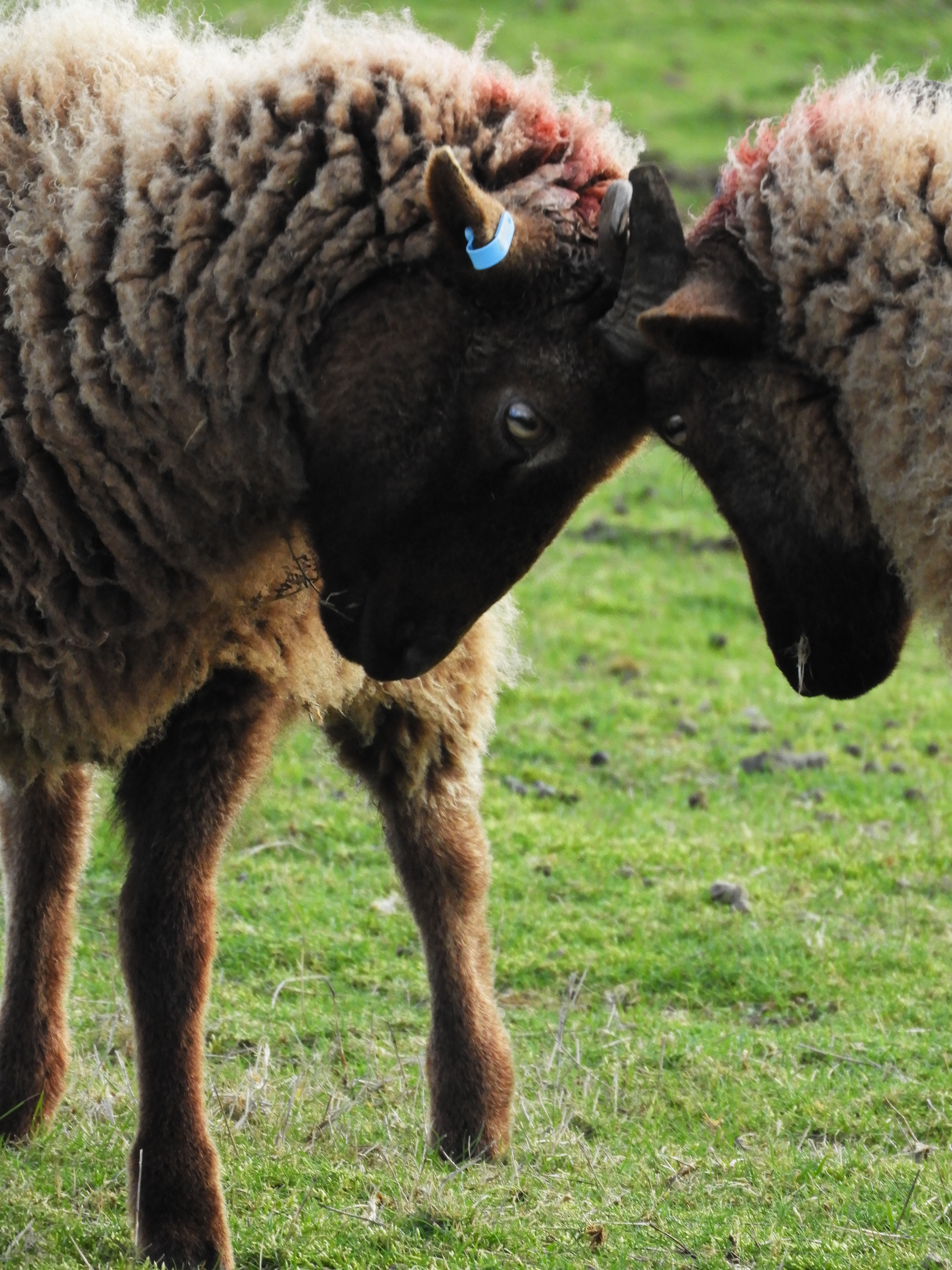
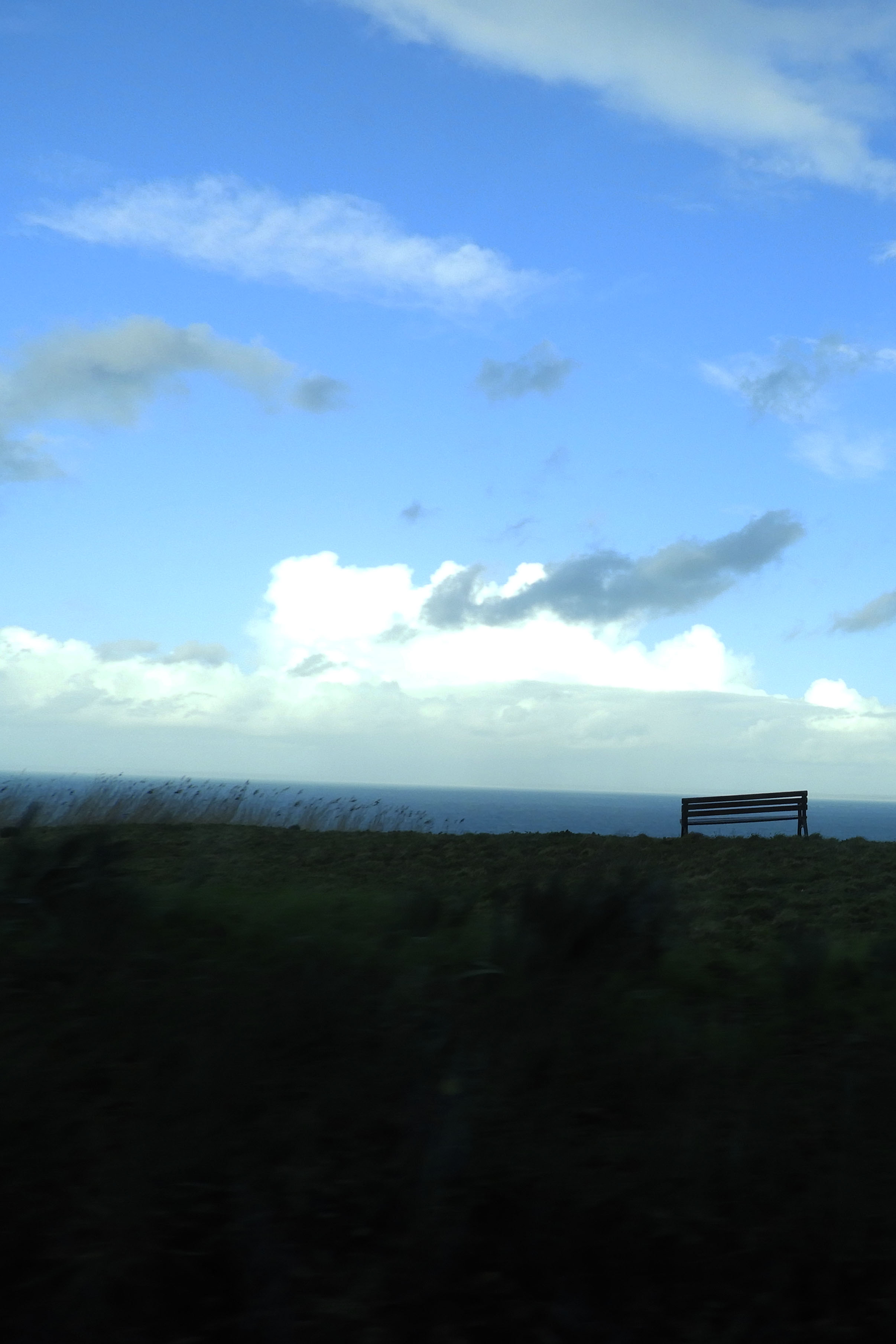
I chose to conduct the photo shoot in an area which I find very interesting and I find myself visiting this walk over and over again due to the natural beauty it has. It is a small cliff path walk in St.John which is situated within a sheep farm, therefore whilst conducting the photo shoot, I will be able to incorporate not only the landscape but also the animals.
WHEN: In order to avoid direct sunlight I went out during the early morning to take photos, this meant that shadows were cast in different directions which provided variation. The cloudy weather conditions also meant that the lighting shifted a lot throughout the photo shoot, being very light and dark at points.
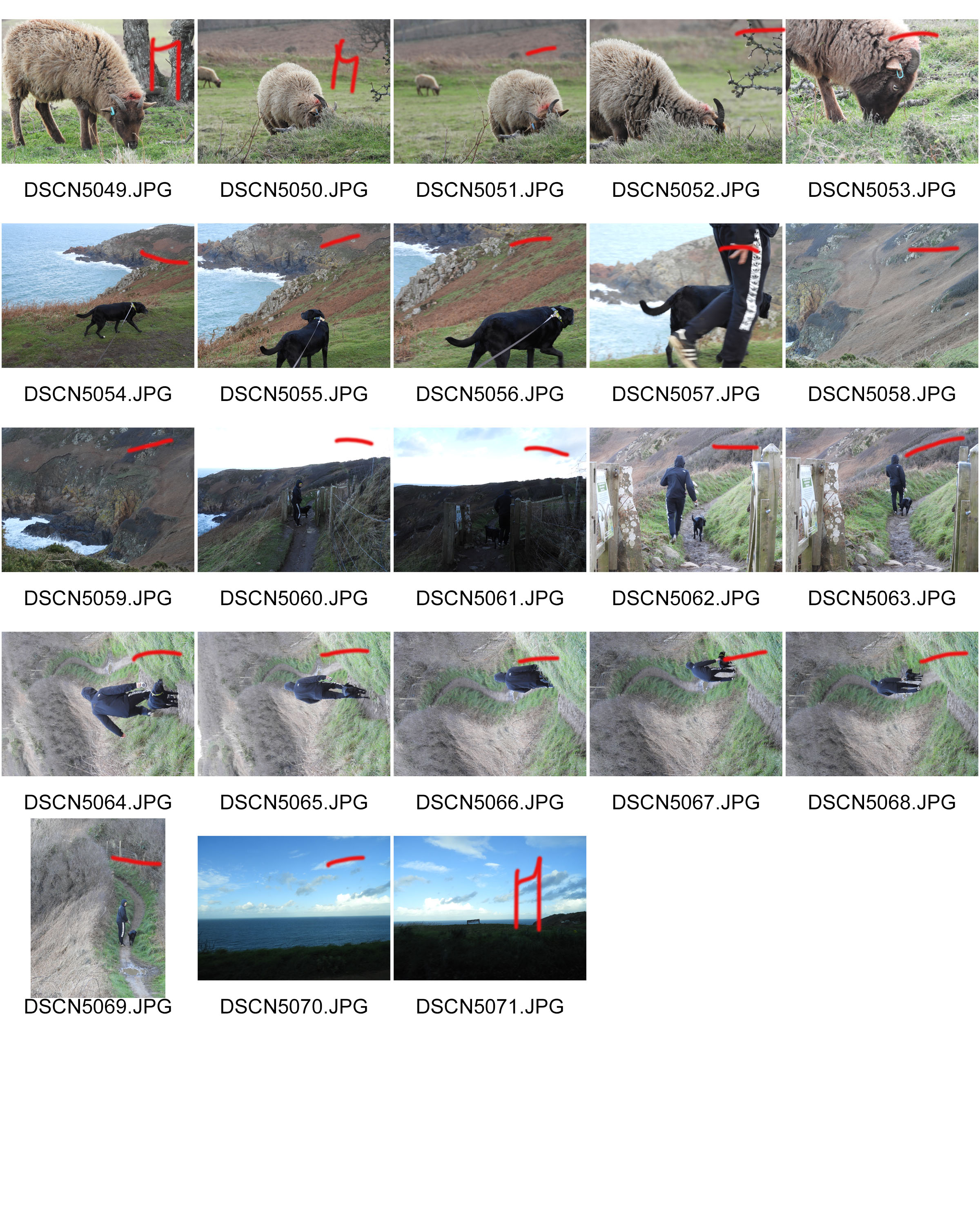
WHO: I was initially attempting to capture the pathways around Jersey, as an experimental concept, yet when I got there I captured an abundance of images of the sheep there as I found them to be quite interesting.
WHAT: This was an experimental photo shoot which was an initial idea from the title “journey’s and pathways”, there was no specific theme or subject I was attempting to capture with this shoot.
WHY: This was my initial response to the title of “journeys and pathways” project, it was a basic response to the title which fulfilled its literal meaning.
CRITICAL ANALYSIS:
VISUAL:
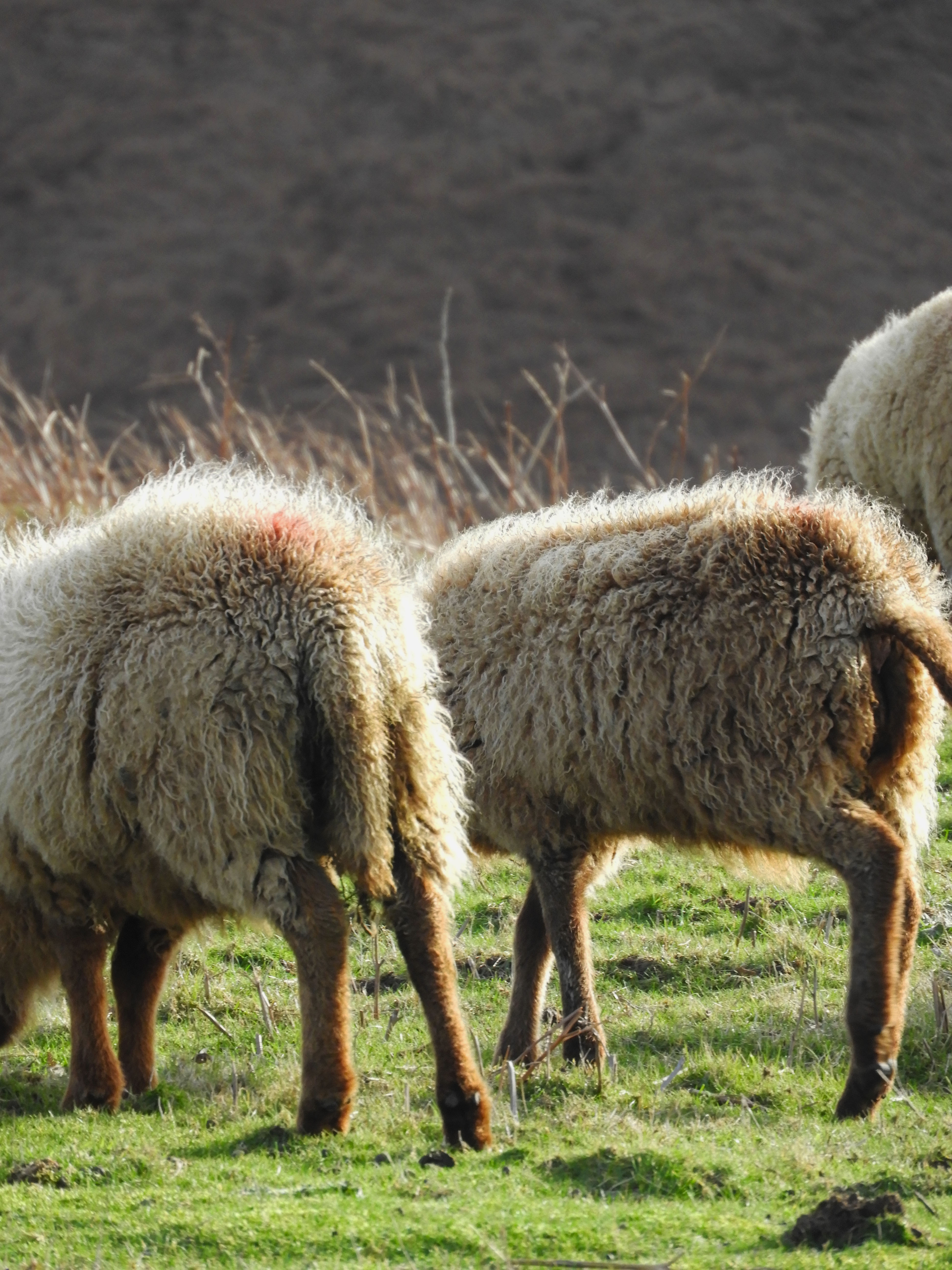
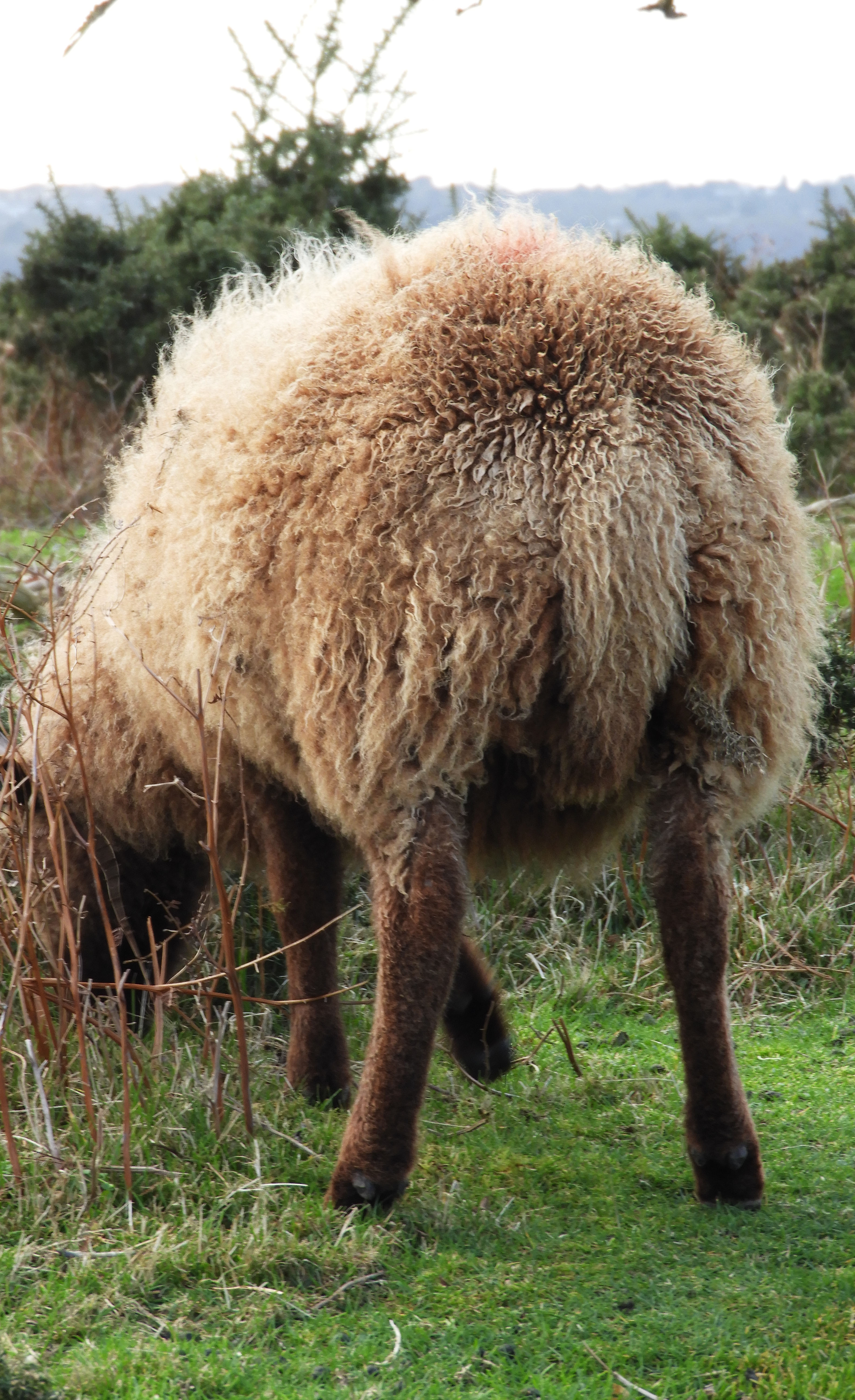
This photo shoot was done during 2pm in the afternoon when the sun was not directly above in the sky but shifted slightly to the right, therefore in the image we see a shadow being cast of the sheep to the left hand side of the image. The light which is cast onto the sheep is also trapped in its wool, making it have a sort of halo effect. There is an element of comedy to this image with the fact that you cannot see the faces of the sheep and only their backsides. Whilst taking this image, I zoomed in quite far in order to capture the detail in the wool. There is a distinct foreground and background in this image, the distant hill being located in the background and the sheep in the foreground.
TECHNICAL:
This was one of the most challenging photo shoots to do in my opinion due to the less than ideal weather conditions that I experienced during the shoot. At Sorel point, the cliff path walk where I did my photo shoot, the wind was extremely strong and unforgiving on the given day when I took my images. I was unable to use a tripod as during previous shoots with similar weather conditions, the set up would simply be blown away. Bulky set up like that would have also likely scared away the sheep, who I was very keen to see up close and capture pictures of.I had to crouch down for most of the shoot as this ensured that less wind was blowing against me and therefore the camera was more stable.
CONCEPTUAL:
As an initial concept, I took the literal meaning of “journeys and pathways” and took a literal journey at one of my own personal favorite places in Jersey, Sorel point in St.John. An area full of natural beauty, highlighting the beauty of Jerseys varied coastline. It was taking a trip into the beauty of natural, touching the concept of landscape romanticism.
Although its definition has been debated profusely for decades, Romanticism generally defined was an artistic and intellectual movement originating out of the late 18th and early 19th century Europe. Its movement was seen to reject the typical ideas of order, calm, harmony, balance, and idealization.
As an artistic style, it is strongly emotional, evocative of a vivid imagination. Sometimes, it actually represents the irrational emotions and subjective experiences of the artist.
CONTEXTUAL:
The sheep which reside on the pathway from Sorel point going to Devils Point are called Manx Loaghtan, a rare breed of sheep native to the Isle of Man. It is sometimes spelled as Loaghtyn or Loghtan. The sheep have dark brown wool and usually four or occasionally six horns.
The Manx Loaghtan is one of the Northern European short-tailed sheep breeds, and descends from the primitive sheep once found throughout Scotland, the Hebrides, and Shetland Islands. The word Loaghtan comes from the Manx words lugh dhoan, which mean mouse-brown and describe the color of the sheep. This breed is primarily raised for its meat, which some consider a delicacy. The meat has recently received EU recognition and protection under the Protected Designation of Origin scheme, which requires products to originate in a specific region.
The Rare Breeds Survival Trust has characterized the Loaghtan as “at risk”. By the 1950s there were only 43 surviving specimens. Manx National Heritage developed two healthy flocks. These have given rise to commercial flocks on the Isle of Man, United Kingdom and Jersey. Even so, today there are still fewer than 1,500 registered breeding females
CONTACT SHEETS:
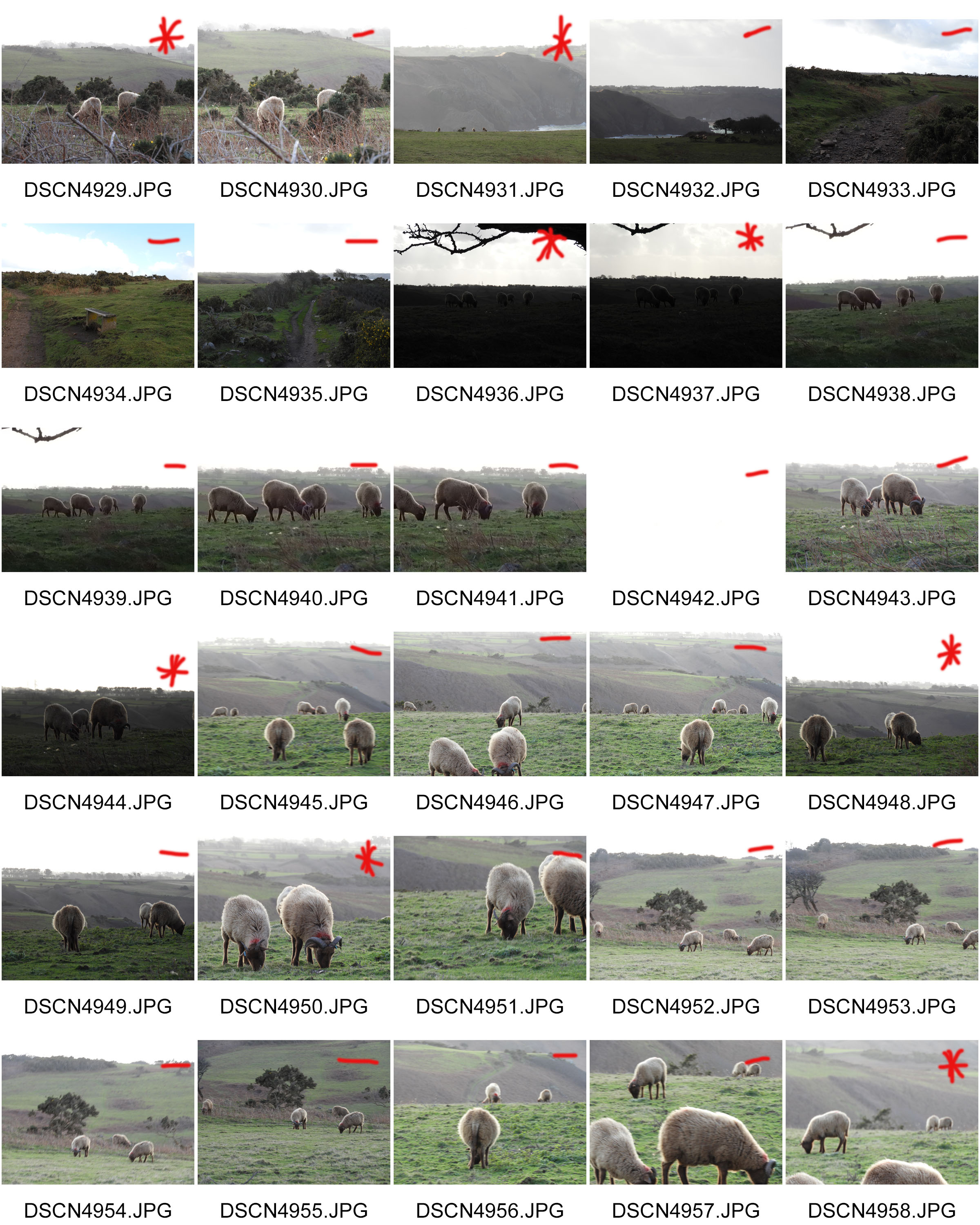
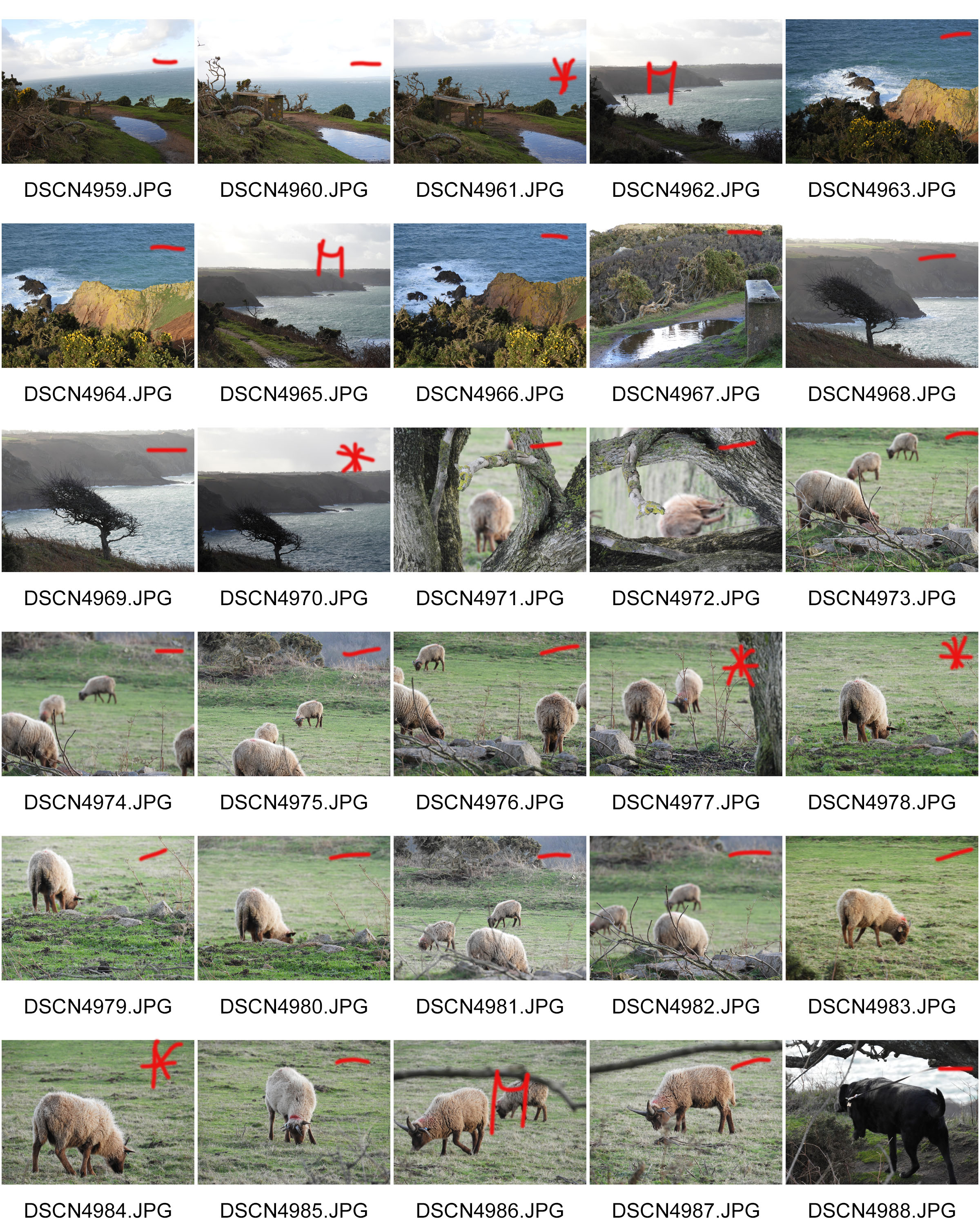
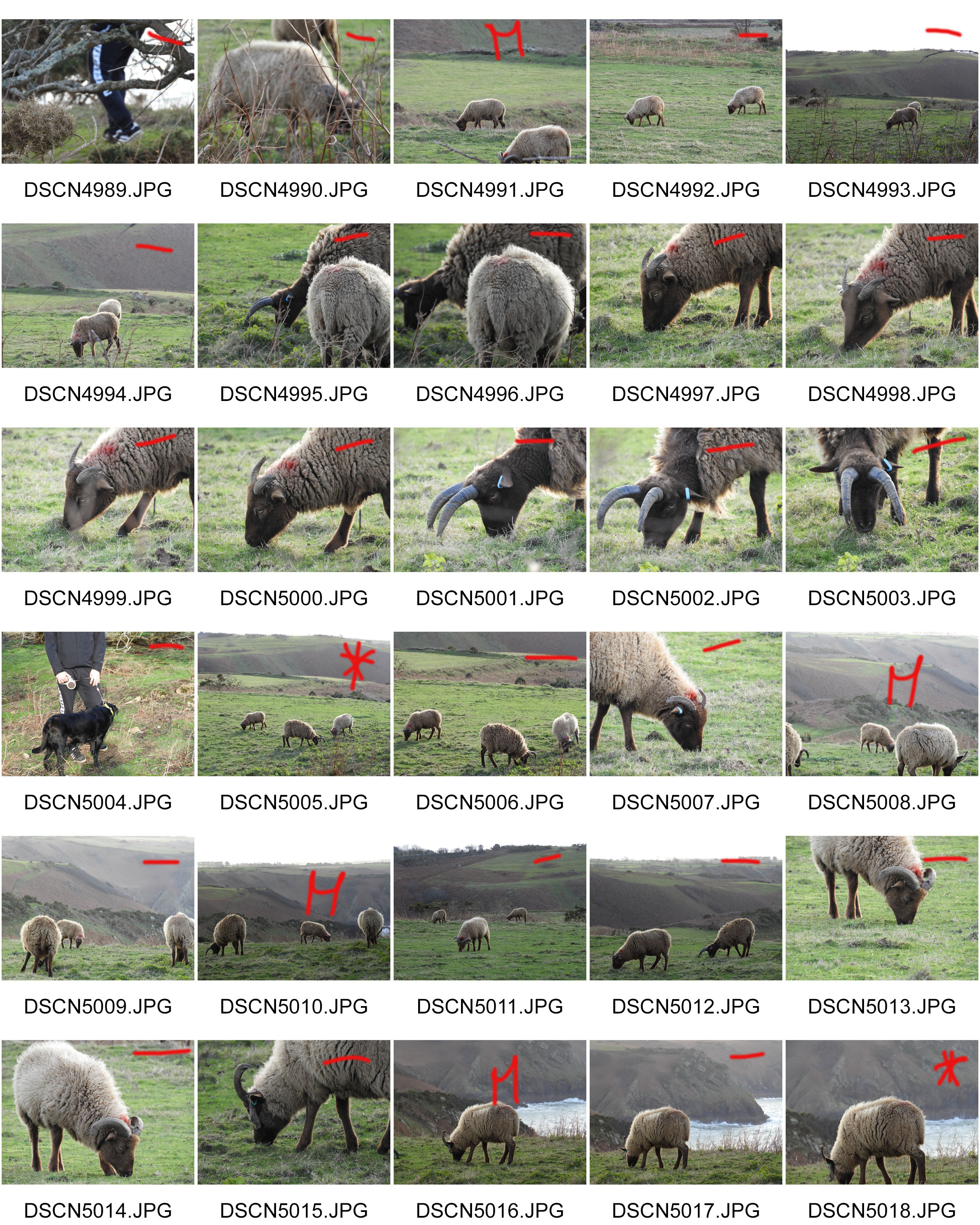
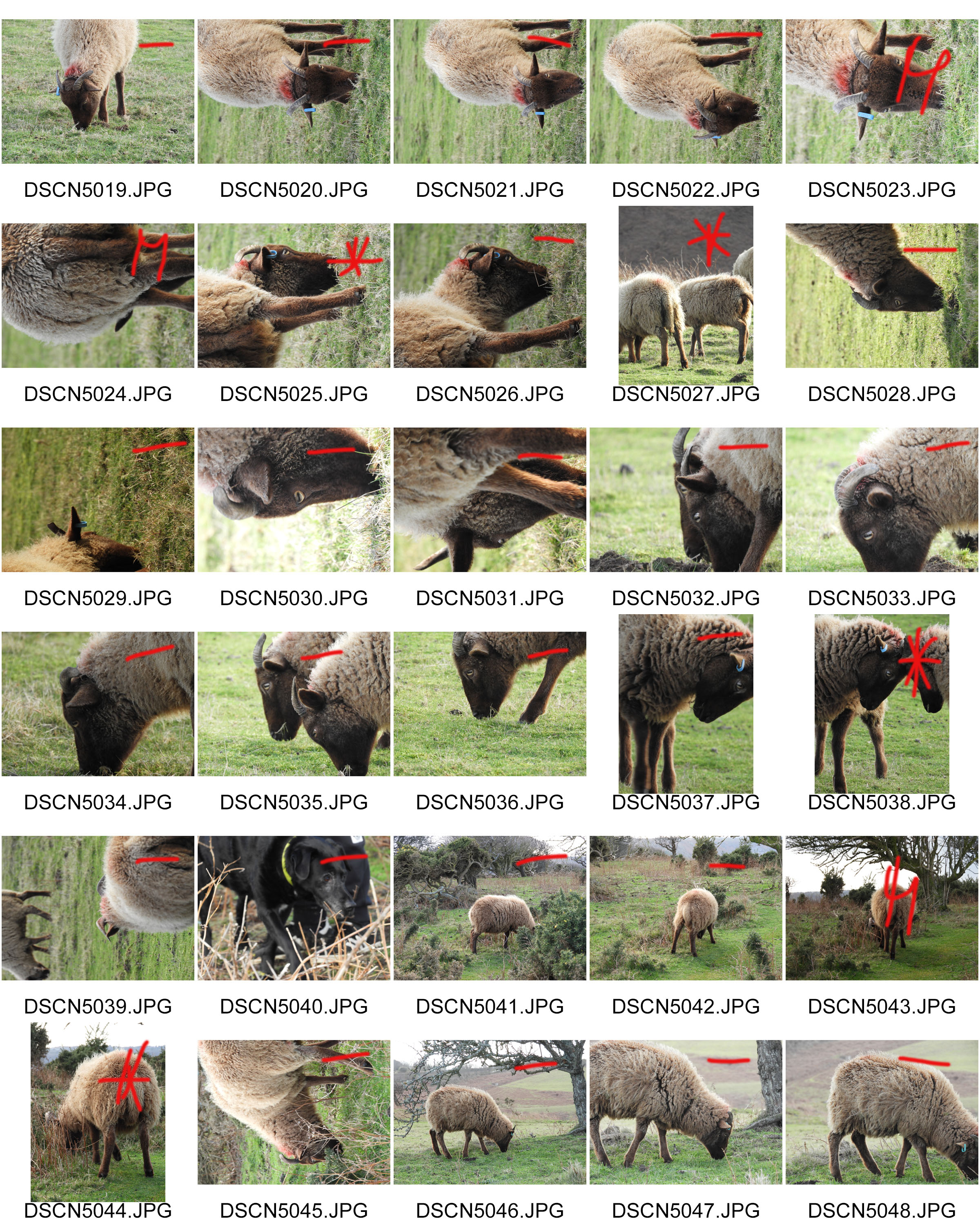
To start my ‘Journeys and Pathways’ project, I began by looking at The Boyle Family. I was intrigued by their approach and was fascinated by their accurate replications and attention to detail.
However, I decided against continuing with my own response to The Boyle Family as I didn’t want my final outcomes to have a similar style to that of The Boyle Family’s work.
Next, I want to look at the works of American photographer, Lee Friedlander.
Planning:
The aim of this photoshoot is to capture images which are able to capture the contrast of Jersey’s seawall during the war compared to now, the same aim as Gina Socrates. In order to do this I will capture more macro and texture photographs, to capture the war side as it showcase the more unpleasant side of the sea wall. To capture the walls beauty, I will look at capturing more landscape images which outcast onto the beach. I want to be able to show experimentation with camera settings and so I will be adjusting the ISO to create a subtle noise to work with the textured images. Moreover, I will look at experimenting with different angles, shutter speeds and white balances. One thing I noticed from Socrates images was that her images seemed to have a hint of orange/yellow to help show historical factors, by adjusting my white balance and using the Hue setting on photoshop I believe I will be able to achieve this effect within my work. The location of the photoshoot will be down at First Tower// Saint Helier sea wall, as it is a long wall which will provide multiple opportunities to capture different images of the same stimulus. I will also capture St Ouen’s sea wall as that is the wall Gina captured when she conducted her photoshoot.
Contact Sheets:


 Evaluation:
To evaluate this photoshoot I believe that I have been semi-successful with the images that I have taken. I believe that I have met my artistic aim by capturing the two bipolar uses of the sea wall, in order to present Jersey’s journey through the second world war. However, I do believe that I could have taken more images in order to have more outcomes to work with during the editing process. I was able to capture my images at different viewpoints, from a straight on angle to a birds eye view (which where not as successful as they where captured on a plain ride create a blur to the images). In order to further develop this idea I am going to manipulate my top outcomes on photoshop. I am wanting to create double exposures, level, adjust curves, hue and saturation in order to not only make my images have stronger links to Socrates, but to further develop my presentation of the change in the sea wall in the second world war.
Easton Chang is an award winning photographer who specializes in capturing advertising and commercial photographs. His work is based in Sydney, Australia and comes to cover North America, Asia Pacific and Pan-Europe. He captures his automotive photographs in studio and on location to achieve the best results. He has received several awards for his creative and stunning photographs such as 2013 Australian Advertising Photographer of the Year, 2012 Australian Advertising Photographer of the Year and 2011 Automotive Photography Awards Judging Panel.
These are my favourite photos by Easton Chang:
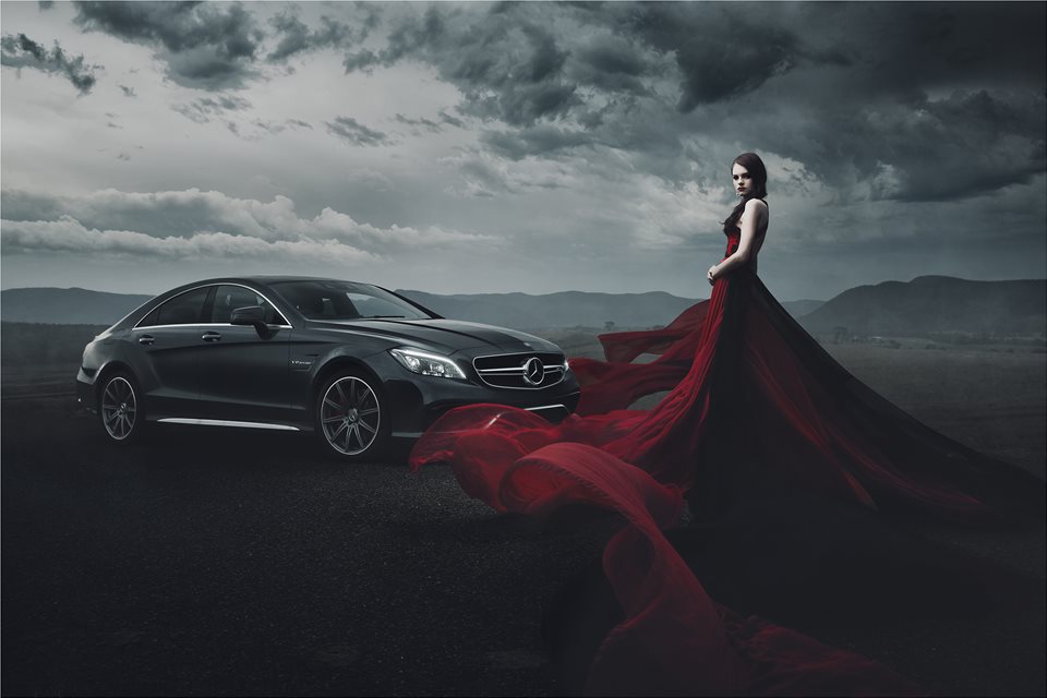
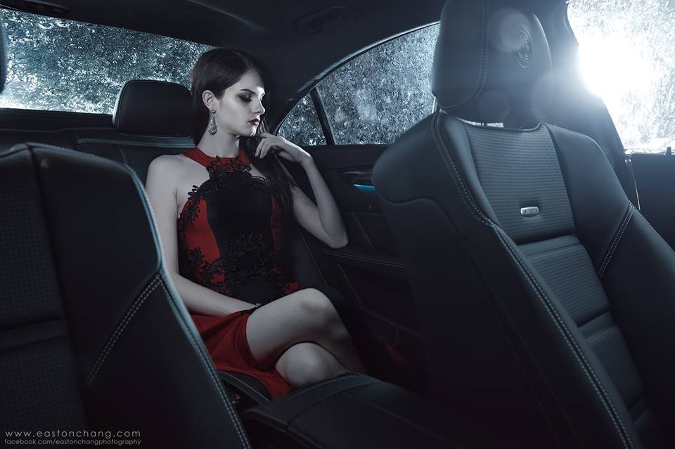

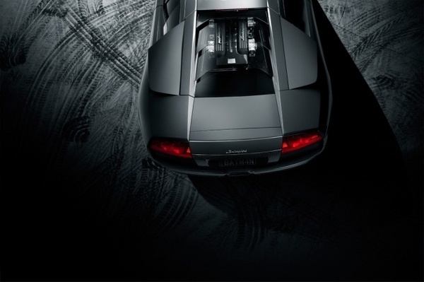
 This is my favourite photo by him, its main features are strong, bold shapes throughout. The sculpted shape of the car in the middleground strengthens the image and adds structure to it. The lighting of the photo helps achieve these shapes and lines, it is angled to catch the different depths of different areas of the car. The woman in the dress in the foreground as has very strong shapes But these aren’t as straight and organised as the ones of the car, but they have a deep red colour and real sense of depth which makes the photo much more eye catching. This is strengthened by the red dress being the only element of the photo which has strong and brighter colour. It also draws your eyes to the right side of the photo, and away from the centre which is the weakest point of any image. The lighting also changes throughout the photo, as you look from left to right the photo gets much darker; the right side of the dress, the clouds, and even the mountains are much darker. The mountain range in the background adds more depth to the photo, it also helps minimize any blank space in the photo.
Overall, the lighting, structure, and layering help make the photo look sleek, eye catching, and full.
How/why the case study will influence my work:
He has influenced the way I will utilise colour in my photo shoots. Being very reserved with the use of colour makes the colour that is there more powerful. I will also be more careful with lighting in my photo shoots; using less lighting creates more shadows and makes shapes more prominent.