Editing – Journeys And Pathways Test Shoot

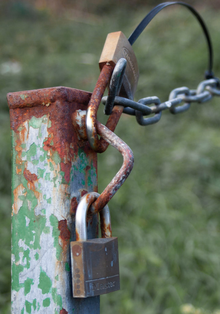
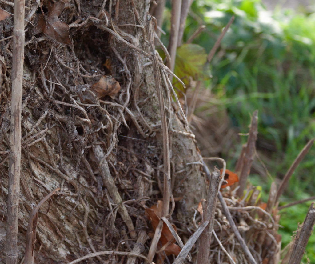
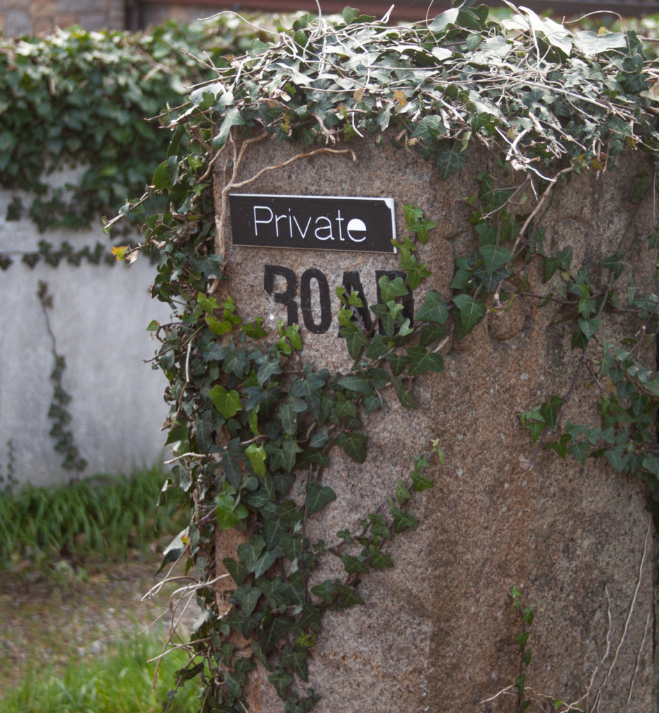
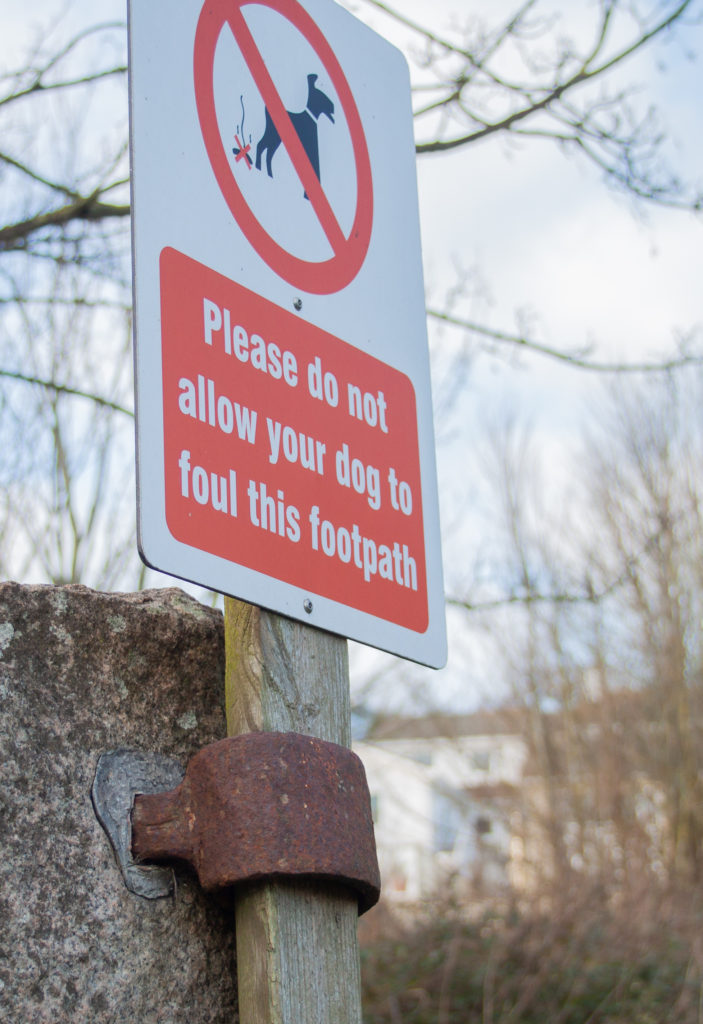
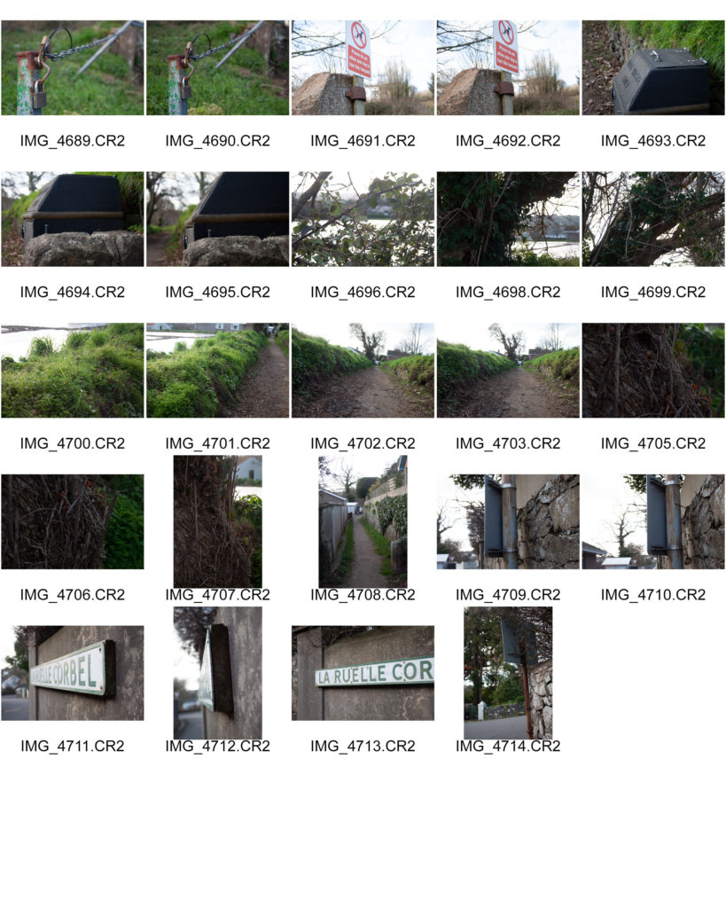
Some of my best images of the shoot were close up, almost macro photography and as such I have cropped them to emphasize the best qualities of the composition. I increased the exposure on most of the images as they were taken in the CR2 format and thus were rather dark. I also experimented with the color more than normal as I chose to carry out this photo shoot around noon with a grey sky, this resulted in images with flat lighting which allow colors to be easily adjusted. Individual colors had their hue, saturation and luminance manually adjusted. Other general edits include removing chromatic aberration and accounting for any distortion caused by the lens using light rooms lens correction filters.

Photo-shoot Plan

Where: I will be taking photos along my house off of Beaumont road.

What: I will be photographing various barriers including fences, stop signs, no entry signs etc. I will attempt to include an aspect of Paul Graham’s style into these photos.

When: I will be taking these photos at mid-day in order to produce a flat lighting which will allow for more options when editing the photos.

PHOTO ANALYSIS

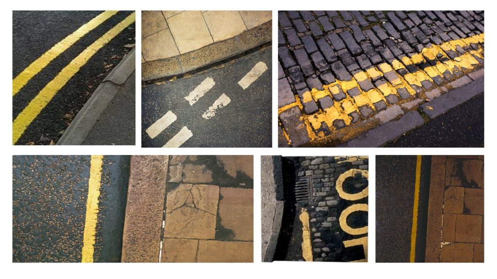
Mood board of The Boyle Family’s road and line pieces:

Road works

Image result for the boyle family

Technical;
This image is represented in a much darker way rather than just the use of daylight, as the appearance seems much darker and gloomier compared to just a bad and dark weathered day. I think the use of filters were used to present a more texturised and provide a different feeling and emotion towards the image. The aperture used for this image is represented deep, sharp, focused lens due to the raw and precise lines and textured within the image. Due to the darkness of the image its suggest that the exposure is much lower as there is little room for excess light being presented. When considering the color balance and temperature this image to me portrays a much warmer feeling due to the darker colors being filtered in and lack of natural day light.
Visual;

When considering the presentation of the image and the layout it has a strong feeling of organization with the yellow line being perfectly parallel to the pavement this provide an idea of a symmetrical presentation. However the uneven shapes on the pavement set a less aesthetically pleasing vision due to the harsh textured cracked and antithesis of black and white cracks made throughout the tiles. This image clearly shows a high level of textures due to the shows and filters used to emphasis the key details. When looking at this image it is evident that the eye view is from above and give the representation of looking down at the ground through the camera.

Contextual;
Conceptual;

When The Boyle Family first started creating images under a name together they had a similar pattern that they followed and a particular vision they continued to contribute to when adding to the collection following the additional ideas. When producing image, the Boyle Family’s idea is not have a focused subject but aims to make art that does not exclude anything as a potential subject. Over the time this has included things like: earth, air, fire and water, animals, vegetables, minerals, insects, water creatures  etc. In this case I believe this case to be concentrating on possibly the idea of earth looking in different types of ground with the different textures portraying different feeling towards the image.

Times of the day: Photoshoot 1

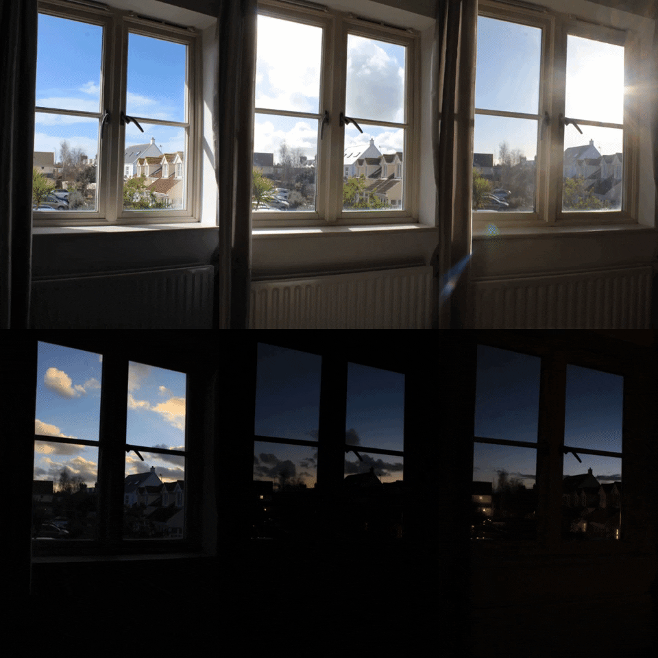
To respond to journeys and pathways I decided to photograph the sky throughout the day every hour so I would be able to capture the different positions of the sun as well as the movement of the clouds and the colours of the sky. I set my camera onto a tripod and placed it near a window so I could capture several images of the sky from inside my house. The viewer can then see the gradual progression from day to night from one viewpoint.

This project relates to the theme since it’s the journey of the day from sunrise to sunset. I started taking images at 11:00 am and finished around 7:00pm. Once the time got closer to 5pm, I decided to capture more images frequently since this time of the day is when the sky changes the most in terms of colour.

I decided to create a gif with these images on the website GIPHY to show how the sky changes throughout the day in a quick video that continues in a loop. I decided to have each image show up for 0.2 seconds to create a slideshow. 

Times when an image was taken
  • 11:20 am
  • 11:40 am
  • 12:00 pm
  • 2:50 pm
  • 3:30 pm
  • 4:00 pm
  • 4:30 pm
  • 5:20 pm
  • 6:00 pm
  • 6:20 pm
  • 6:40 pm
  • 6:50 pm
  • 7:00 pm
  • 7:10 pm
Evaluation

Creating a gif to present these images was a good idea since the viewer can rapidly see the movement of the sun and the clouds. The gif also turned out smooth when played since the images were all taken from one angle. Taking images through the window helped to frame the sky.

Future Photo Shoot Idea

An idea for a future photo shoot is to take several images throughout the day of the tides so the viewer can see the extreme change from low tide to high tide in Jersey. Jersey may be a small island, but it can boast some of the biggest tides in the world. When it recedes, the immense body of water seems to melt into the horizon, only to surge back to shore with alarming speed.

Response to the Boyle Family

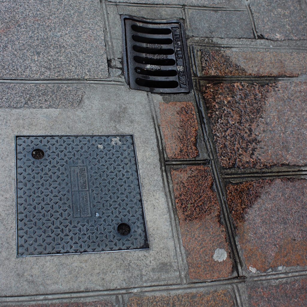
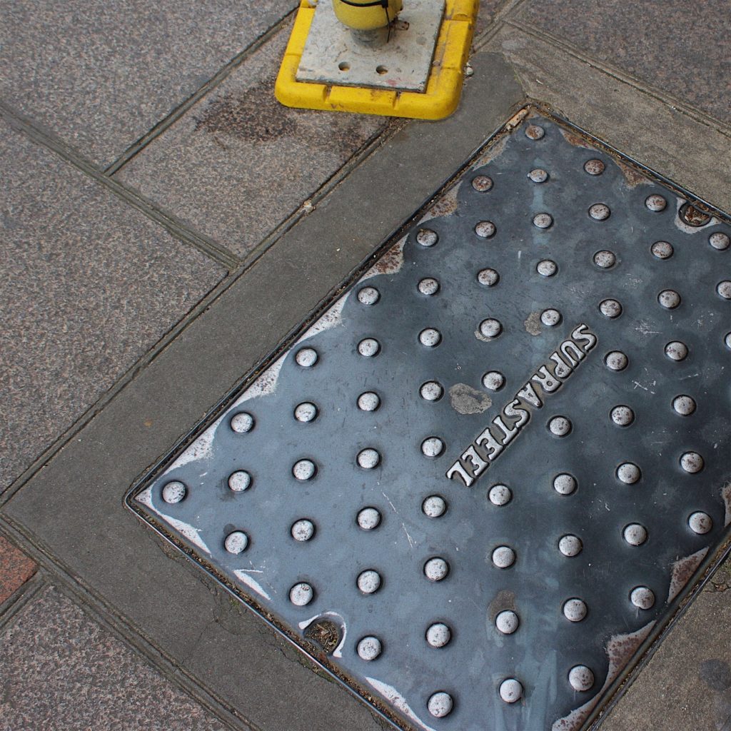
The photography work of the Boyle Family that I’m responding to typically examines the surface of the earth, road markings and manhole covers.

I walked around the urban area of St. Helier. I wanted my images to have the same style as the Boyle’s photographs by capturing pictures of the ground from my viewpoint. This displays the view that everyone sees on a day to day basis but never looks at twice.

When taking pictures, I made sure to show the various different qualities on the ground. Like the Boyle family, I wanted to capture images of street corners, roads with yellow markings, different textures of tarmac and cobbles.

Once I had enough photos, I made a contact sheet to help me select the best images. There is no editing on their images so I kept it minimalistic by slightly adjusting the contrast, brightness etc. I also cropped the images into a square since they had unwanted space around them.

Contact Sheet
My Response

Shoot one Plan

For my shoot I will be in the French alps, I plan to find high points on mountains that have large views with clear skies. I plan to take mostly photos with my digital camera and then exaggerating the colours in Photoshop afterwards then making it black and white but I will be taking my film camera with black and white film and I will be trying to use colour filters to get the result I want. However, where as Adams could look at his images straight after as he was using a field camera if I try and take the images in black and white on my film camera I will not be able to instantly see how my images have turned out.

Comparing Paul Virilio to Jonathon Andrew

Comparison:

The main similarity between both images is that they are capturing the same subject, bunkers which where used during the war, which informs us that the two images share the same contextual factors (How the bunkers have been neglected and isolated since the war). Needless to say the way they have gone about capturing the subject is very different to one another, which showcases their artistic style and preference. This is clearly shown as Andrew’s work is presented in color, which makes the bunker more appealing. An affordance of having the image in color is that it allows the environment to clearly be showcased allowing us to understand how the bunker seems to be in the middle of nowhere and how the time (night time) at which it was taken allows the setting to portray the contextual factor of bunker isolation. Where as Virilio’s work is in black and white which creates an eerie tone towards the image and showcases isolation in a more visual way. An affordance of having the image black and white allows a high tonal contrast, making all the lines, texture showcase how the bunker has been worn and torn during it’s time of isolation. Another similarity is that both images use a narrow depth of field, the subject of the images is the main focus point and the backgrounds a slightly out of focus, allowing viewers attention to be solely focused on the bunkers which showcases the images purpose. This is reinforced as the background of both images are plain making our eyes focus on the bunkers. Both images showcase the formal elements of shape, texture, line and form, which are all presented through the bunkers and the position of them in the frame. Technically speaking the two artists have used similar camera settings to capture their subject. They both have used a quick shutter speed, as there is no intended blur visible in the images. As mentioned before they both have a narrow depth of field, and have similar focus point. The ISO of both is likely to be similar (low) as there is no noise being presented within the images. Another similarity is that both photographs have used artificial lighting as the subject is located outside. However, Andrew’s work has the bunker more lit up compared to Virilio work which could suggest that he used a form of artificial lighting to capture his image. In addition, as it is night time in Andrew’s work there is less light in the background compared to Virilio’s image which seems to be taken during the day, allowing the sun to light up the whole image. Another way the two images are similar is that they share the same conceptual factors. This is they both wanted to showcase the aftermath of the war and how we are left with the bunkers which is constantly reminding us of what occured in the war. Moreover, both images nicely link into the project of the Journey of Jersey through the Second World War. In my opinion I prefer Andrew’s work, due to the way he lit up the front of the bunker, leaving the background dark as it illuminates the idea that the bunkers have been isolated. Needless to say, I do really like the way Virilio showcases the isolation of the Bunkers.