Response to Stephen Calcutt

Stephen Calcutt

Image result for stephen calcutt photographer

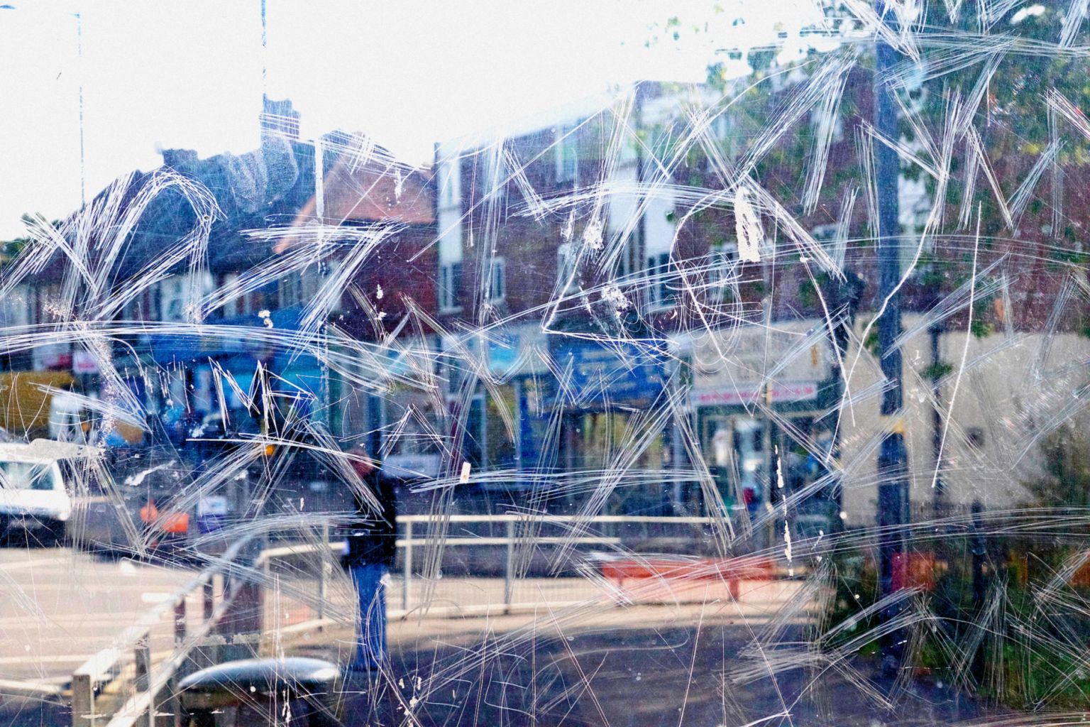
“Reflecting the work of abstract artists and following in the footsteps of photographers such as Saul Leiter. Stephens unique form of street photography is a consequence of frequenting bus stops and shelters around the City of Birmingham. Graffiti can be great art, however for Stephen, the etched, scrawled and scratched graffiti into the Plexiglass windows of the bus stop feels like a violation. The graffiti etched and scrawled in the bus stop windows seem to be expressions of frustration or anger, hate and  love  written into the Plexiglass.

The  windows full potential as a clear barrier between yourself and the elements are compromised when the view beyond is obscured, distorted and blurred by the scratches. The the graffiti etched window becomes a  lens. Stephen merges the graffiti and the view beyond, focusing his camera on the etched lines. The view beyond is put out of focus. The graffiti and view are merged  into a single plane. A new perspective is created, that retains and emphasises the energy of the graffiti. Its swirls, zigzags, lines and curves, slash across the abstracted view like paint strokes. At first glance, the photos may be mistaken for abstract paintings. Then closer inspection reveals they are in fact photographs.

The subject matter that is out of focus is also fairly mundane. Often when waiting for a bus the view is not particularly exciting. The human activity he prefers  capture is not very dramatic. When combined with the mundane graffiti and the mundane view it adds to his  desire to create a new  image that ordinarily would be uninteresting or unnoticed. Even the title of each work is mundane, the descriptions of each photograph are  very droll.

The  way he uses the camera for this project is like painting with light. He breaks the rules for getting a traditional photograph. He puts the view that is usually the focal point out of focus. Stephen then focuses on what would normally be avoided. However, the resulting images are very dynamic and often vibrant. There is a metamorphosis, the mundane graffiti and the often-mundane view are merged into a fresh new image. There is an attraction to the paradox that his work invokes. Stephen makes unique beautiful images out of the vandalised bus stop windows.

Stephen loves the images he produces. However, he doesn’t condone the vandalising of the bus stop windows that provide the lens for his work. The Bus Stop series is a unique approach to photography. Bus Stop brings the current social issue of a specific form of vandalism to the fore. The art works are  a product of modern vandalism. Vandalism that has found the Plexiglass windows of bus shelters an ideal medium to express feelings. Although Stephens work has so far been derived from the city of Birmingham it is an issue familiar to the many people of all ages who travel by bus in urban and rural settings across the UK. His  photography challenges people to look at the issue vandalism. From the protagonists to the observers of their markings. It also challenges people to see the potential beauty in mundanity.” https://www.stephencalcutt.com/about-me-stephen-calcutt

Examples of his work:

Image result for stephen calcutt photography
Stephen Calcutt
Image result for stephen calcutt photography
Stephen Calcutt
Image result for stephen calcutt photography
Stephen Calcutt
Image result for stephen calcutt photography
Bus Stop 91 – Stephen Calcutt
Image result for stephen calcutt photography
Stephen Calcutt
Image result for stephen calcutt photography
Bus Stop 16 – Stephen Calcutt

My Response:

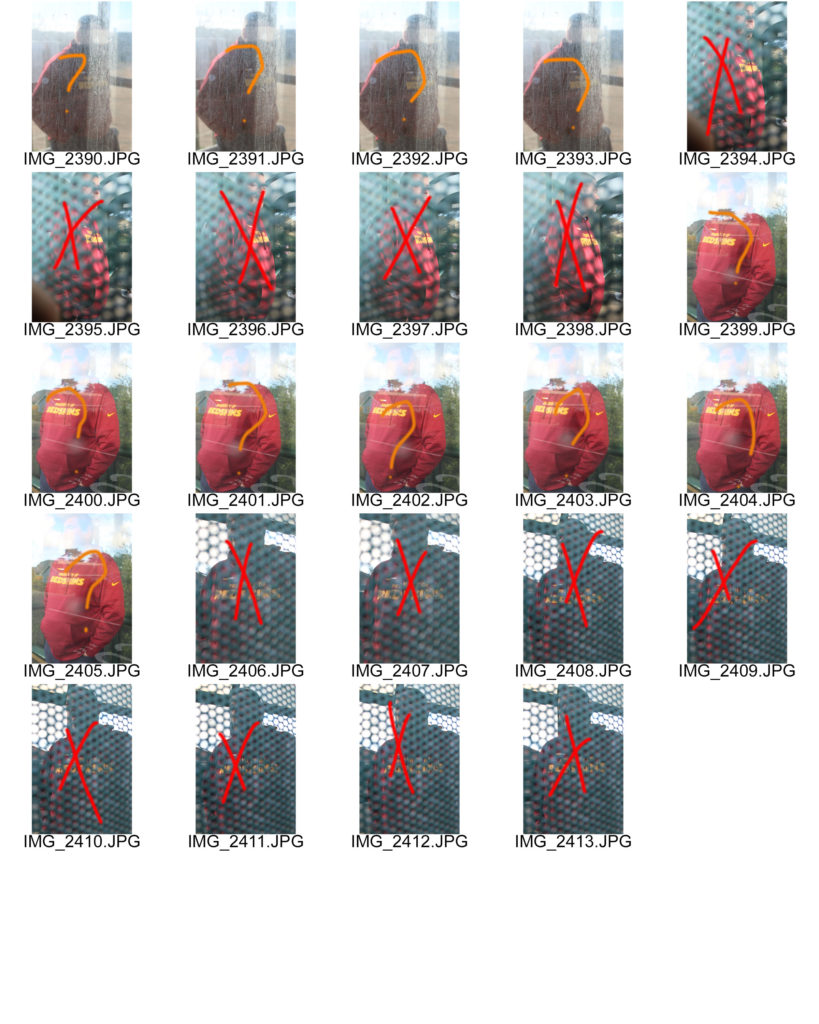
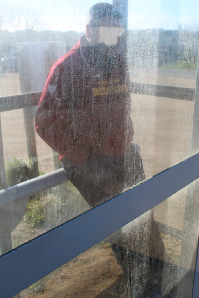
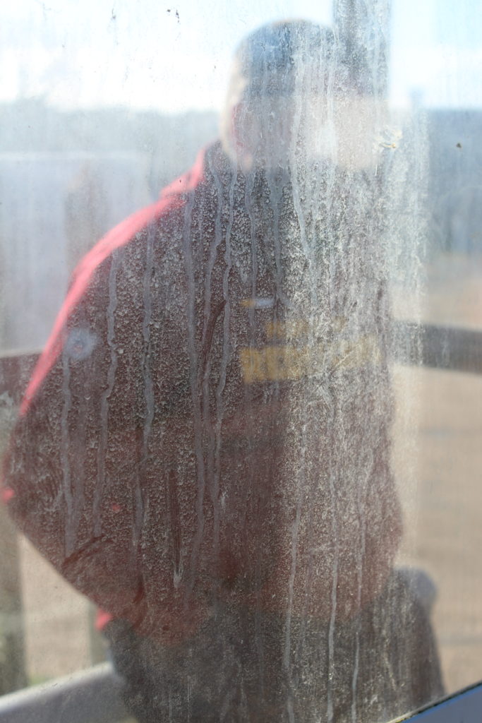
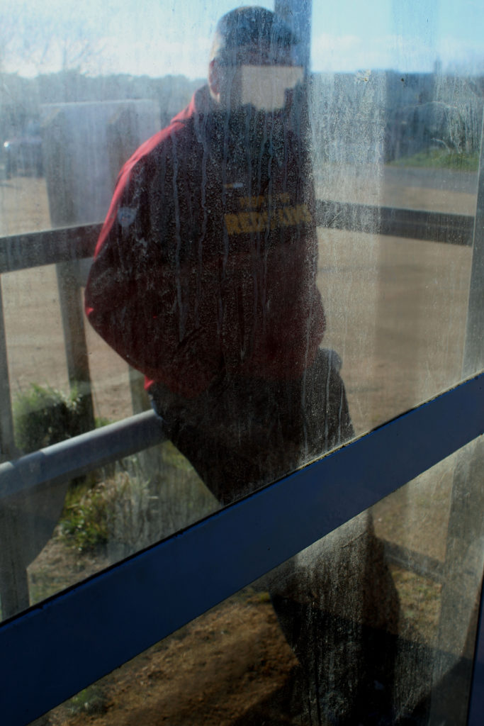
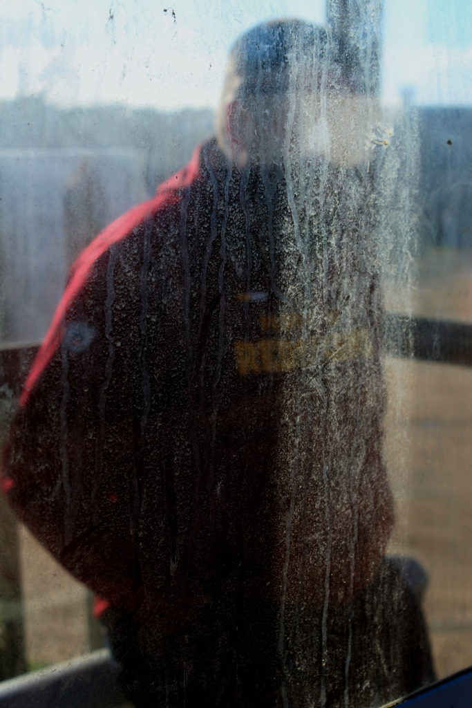
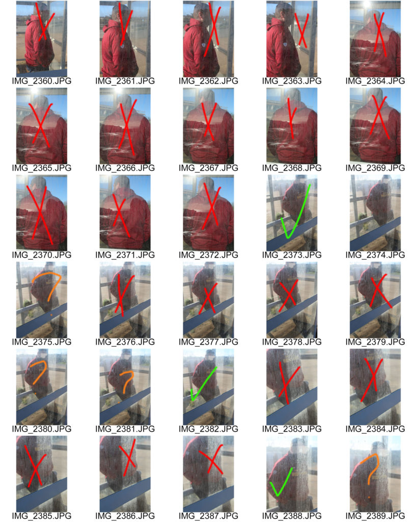
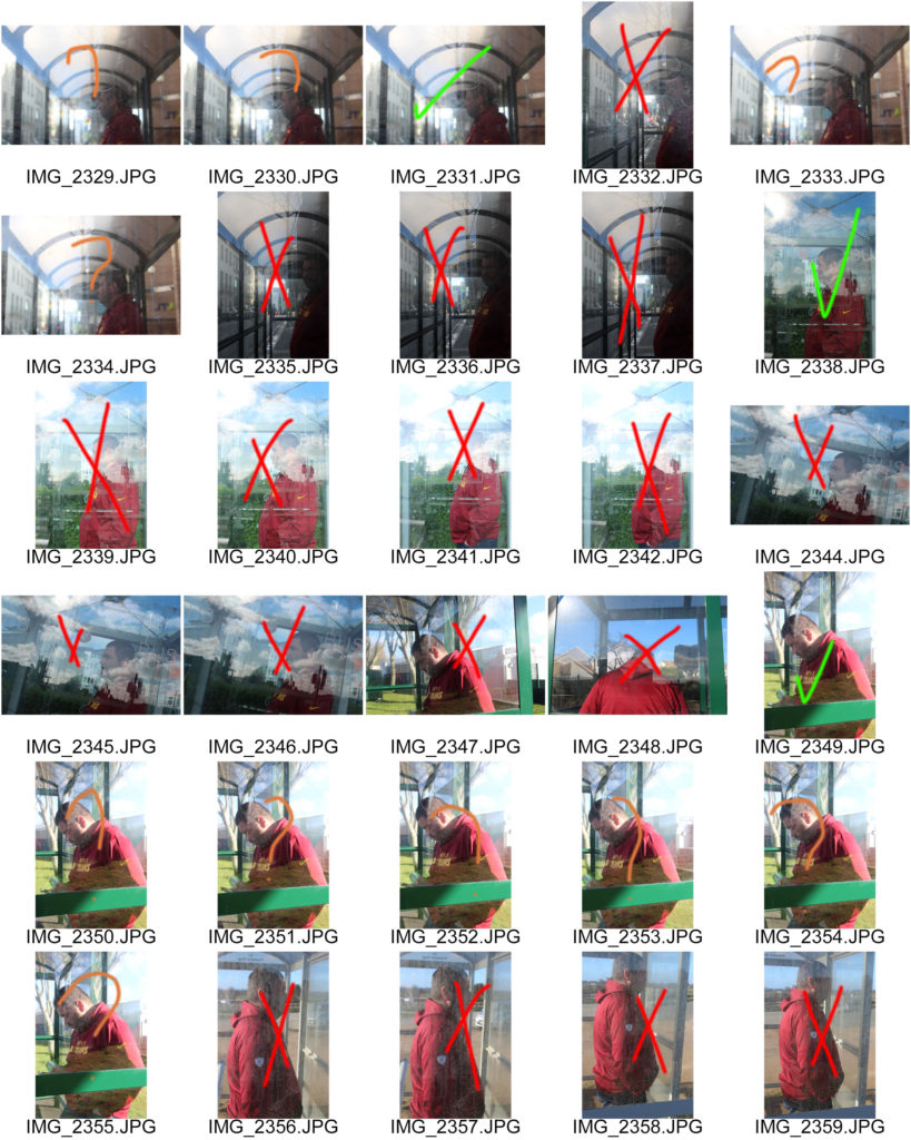
I will be taking photos around jersey at a few different bus stops so I can capture Stephen’s style. I will be using my canon camera to take these photos. I am linking this to Journeys and Pathways by showing the physical journey of taking a bus to get to your desired location. My step dad was the model for this photo shoot because I did this on a Sunday so there wasn’t a lot of people at the bus stops.

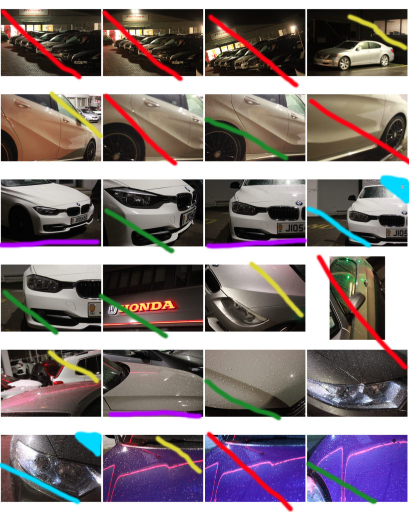
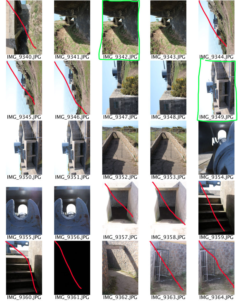
Contact Sheets:

Red – No

Orange – Maybe

Green – Yes
Final Images (Unedited):
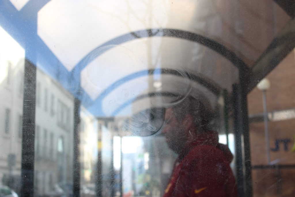
I liked these final images but they were a little over exposed and needed editing.

Final Images (Edited):

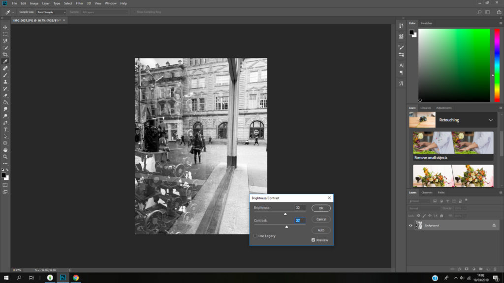
I used Photo Shop to edit these images.
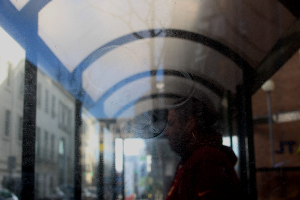
Overall, I am very happy with the outcomes of these edited photos. I think I capture Calcutt’s style really well, whilst still incorporating my style in the images.

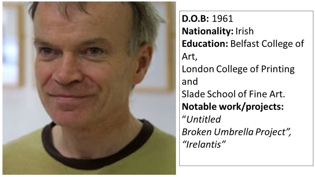
Case Study: Sean Hillen

Sean Hillen is an Irish artist who’s work makes use of the photo-montage method in order to merge images together, showing the contrast between 2 contrasting scenarios that are linked together in a more figurative sense. Hillens work often approaches topics such as violence, politics, literature and history. After growing up in unison with the conflict in Northern Ireland, Hillen learned to appreciate the different meanings that could be portrayed by merging images together, to create an image that drew the eye of the viewer due to the colours and lack of context, but with closer inspection conveys a meaning of some description. Often, Hillens work contains meanings that are personal to him, and some of his work is created with aesthetic as a priority, rather than a meaning or reason.

“When you take a photograph, you take a whole world, a cosmos, with you. And then when you collide it with something else you have a whole new level of meaning, entering, penetrating, sliding against one another.” – Hillen

As my second photo-shoot involves merging contrasting images together to represent a subject being on an incorrect path (where the environment doesn’t match what the subject represents) I have focused my case study on Hillen.

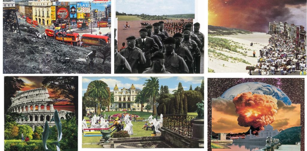
Hillen uses photo-montage to create landscape images in which parts of the landscape completely contrast other sections, emphasizing a split between 2 wolds which have been forcibly merged together. Hillen’s work uses images from different settings and locations and merges them with their complete opposites, creating 1 single image in which the scene looks naturally and organically merged, but the context of the image is twisted or wrong.

Examples of Hillen’s work can be seen below:

The contrast between the images Hillen uses in each piece of work is clear, and the use of bold colour and shapes allows for the images to clearly outline where the images physically come together, although they fit together smoothly.

I will be taking inspiration from Hillens work in order to produce my second photo-shoot, in which I will take an image of a a subject representing a certain career/lifestyle (e.g a suit to represent an office worker), and I will use a photo-montage technique to insert the subject into an environment that does not match the context of their background (e.g an office worker in a forest) to place emphasis on the theme of being on the wrong path/journey. I will be taking inspiration from Hillens out of context imagery, and the idea of merging 2 images together to create a more visual than figurative meaning.

Second photo shoot

In this photo shoot I learned from the mistakes I made in the first photo shoot and took sharper images at more intriguing angles. It was also raining during this photo shoot; which helped reflect lights off the paintwork of the cars and make them more shiny in general, as well as create extra details which make the photos look sharper.

Journeys and Pathways – Introduction + Initial Plan

 Here are some of my initial ideas on the exam title of ‘Journeys and Pathways’.

I want to keep this topic on one level so that it all relates to Jersey, this is because I was born here and I’ve lived here over 5 years now, therefore I know the island well, however I don’t know that much about what it used to be like, there are many things which my Jersey relatives would remember and reminisce about which I (being a teenager in the 2000s) would have no idea about. So I want to explore the evolution of Jersey and the journey it has been through over the years, and maybe even talk to some Jersey born people who’ve lived here their entire life, and get their opinions on what’s changed over the years.

I think my main areas of exploration on this topic are going to be related to: the evolution of Jersey streets and architecture over time, street photography=art on Jersey streets and the expectations vs reality of what Jersey can look like to outsiders vs how it actually is.

-urban architecture/design

-street photography

-art into the streets

-drawing & painting over photographs

-buildings/landscapes in jersey, over time

-murals, introduction of art into the streets

-expectations vs reality on how Jersey can be seen by outsiders vs how it actually is.

Beginning with the evolution of Jersey streets over time, I’ve been coming up with some ideas on how I would be presenting this research, other than just having two photos beside each-other as this seems uninteresting to me. I would like to join the two (the old and the new) together somehow.  My current idea is to search and find for archival photos of the old Jersey streets and then go into the exact same spot (if i can) and retake the new photo. This would show the development of the streets but wouldn’t really connect them. Therefore I thought I would incorporate a bit of art into it as-well and trace over the new retake photo, using clear plastic paper and a white pen to clearly show all the new additions and the modernity of what has changed but also linking both eras into one piece.
Moving onto the topic of art on Jersey streets. I personally feel like the streets are lacking some murals/street art, of course there are some very impressive ones which I like seeing when I’m out and about, but in my opinion they aren’t enough compared to some places in London/Amsterdam where there is so much art and creativity going on the streets, I feel like the look of Jersey can very much be dominated by the fact it is known for being a ‘tax haven’ and a financial industry area. So sticking with my initial idea of painting and drawing over some street photography photos in Jersey, I would like to experiment and ‘play around’ with how Jersey could’ve/still can turn out if the island would have taken a more creative approach instead of a standard finance/business look.
For my final idea, I really want to explore the expectations of Jersey as a supposedly well-off, tax haven island, with lovely beaches and complete safety vs what it actually is like to live here now + what it was like in the past, and see the realities of things. Such as some disturbing past and recent crimes and why the island is regarded as being ‘full of secrets’. For this specific idea of comparing the expectation vs the reality, I looked at the work of Alice Wielinga, an artist which I will be doing a case study and response to in the near future as a part of my project.
This is a brief mood-board from some of my initial ideas about street photography, which I made before looking into other ideas.

Kristen Lewis Information

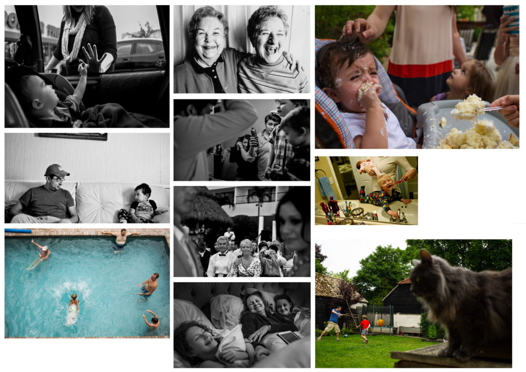
This is a mood board of Kristen Lewis’ work. Her work is all about family, generational journeys and the journeys we take in our families.

Kristen Lewis is based in Denver and classifies herself as a ‘documentary family photographer.’ Her work centres around families or travel because she is very close to her family and often travels with friends or family. The majority of her work comes from these sessions she does called Day in The Life sessions where she spends twenty four hours with a family and documents their daily journey and what they do for a day.

She’s been using Nikon cameras since 2000 and her dominant lens is the Nikon 35mm f/2.

A picture of her gear from https://shotkit.com/kirsten-lewis/.

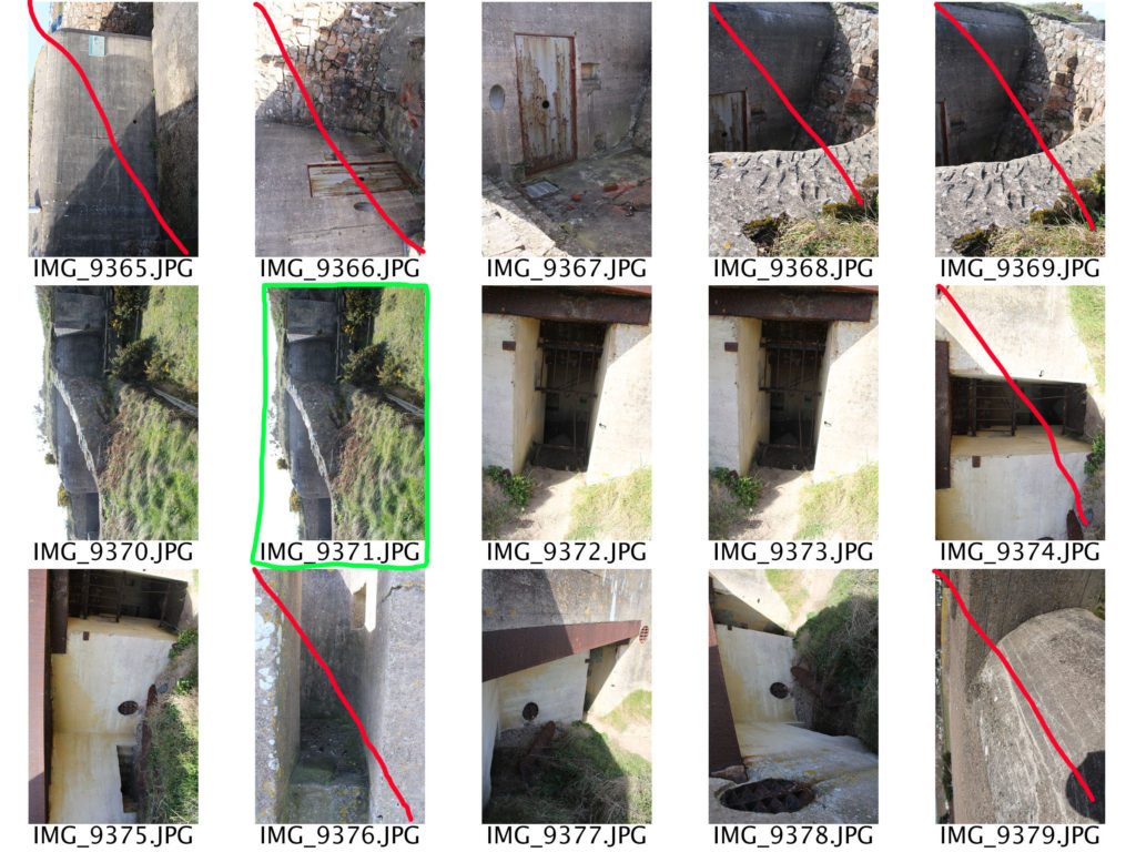
Photoshoot 2 – Bunkers

Planning:

For my second photoshoot I want to capture Jersey’s bunkers in order to show another stage of Jersey’s journey through the second world war. The aim of the photoshoot was to showcase different camera techniques in order to showcase the use of the Jersey bunkers during the second world war. I am going to capture the bunkers down at Noirmont, as there are multiple bunkers to capture providing many photograph opportunities. Moreover, the background of the bunkers are almost empty down at Noirmont which makes my images more like the artists I studied, making stronger links. I intended to take landscape images to capture the whole bunker, but I also intended to capture portrait macro shots. I will be capturing the images at a straight on and worms eye angle to showcase Jersey’s bunkers. With regards to camera settings I will be using a quick shutter speed, low ISO (so I do not have an intended blur), the daylight white balance, and manual focus in order to create a short depth of field like my case studies used. Furthermore, I intended to explore the bunkers (so I am not just capturing a landscape image of the whole bunker) which provides my own exploration towards a subject matter. I am doing this to provide more images and different content to work with as well as being able to showcase different camera techniques.

Evaluation:

To evaluate this photoshoot I believe I have managed to produce some strong outcomes which show my ability to use different camera settings (shutter speed, ISO, white balance) to create different effects. Moreover, I have been able to show my recreation of my artist that I researched and further images showing my style of photography capturing the same subject. I think that my images present the theme of Jersey through the second world war as it showcases Jersey’s defence mechanisms and how they have been almost abandoned and isolated since the war presenting them almost like ruins showing there importance of the second world war, providing another aspect of Jersey’s journey through the second world war. As an action plan I intended to manipulate my stronger images like Virilio and Andrew’s photographs. Moreover, I want to experiment with different ways of showcasing Jersey’s bunkers, allowing me to experiment with photoshop to provide evidence of my knowledge and skill using the software.