CAROLLE BENITAH

Carolle's work is described as "a subjective interpretation of childhood memories and a refashioning of image and identity".

Carolle often describes her feeling of isolation and alienation when she looks through family photos of her from when she was a child. Benitah began her career as a fashion designer and set out to amend and rework her childhood photos with methods such as cutting, sticking, sewing, collaging. Her extreme minute details that she incorporates displays an almost re-connection and de-connection the the photographic archive to her childhood. Carolle embellishes and embroids her work with thread that is either red, black or gold; also adding beads.

Benitah describes that "The precise and slow process is a metaphor for remaking myself and for the passage of time". She further on explains that "The red thread is a connecting thread, leading me through the maze of my past". Benitah uses the red through her childhood photos. "It's the colour of violent emotions, of blood, and of sexuality."
Benitah uses the black thread for the photos of her in her adolescence. "Adolescence is represented by black for the anguish associated with this period of my life.
The colour gold is used for the photographs of herself during her adulthood. She describes how the colour gold is "the colour of affective ties, of fidelity and of dis-incarnation".

Benitah describes her work as an exorcism, as she explores how the memories of her childhood aids her in understanding the woman she has become. She also believes that the past is never permanent but its constantly being evolved and constructed by the present.

Kristen Lewis Analysis, Contact Sheet and Editing

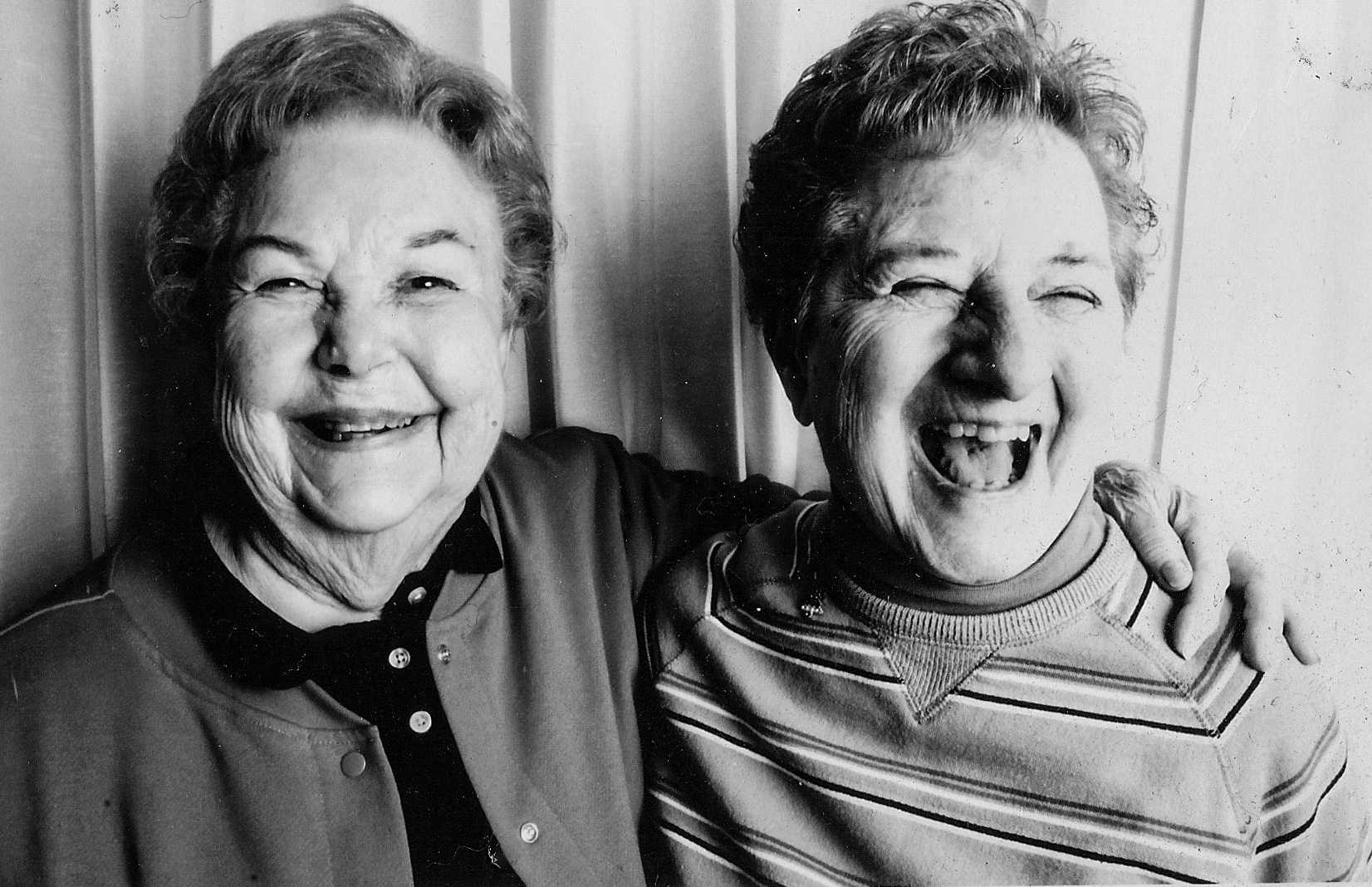
Image result for kirsten lewis photography

Lighting: I think this image has artificial lighting because the subjects are indoors. The light is probably coming from the side be cause part of the subjects’s faces are in shadow. There’s a lot of contrast in the image because the tones go from their illuminated faces to dark shadows with out much in between.
Visual: There’s an almost symmetrical look to the image. This is because of the lines in the background and how the subjects in the foreground look similar and take up the same proportion of the image.

Conceptual/ Contextual info: The subjects in this image are of the photographer’s grandma and the grandma’s best friend. At the time the image was taken the two subjects had been friends for 70 years. The photographer said, ” They have taught me that friendships and love are what keep you youthful and happy and they are 2 of the most important things in life”.

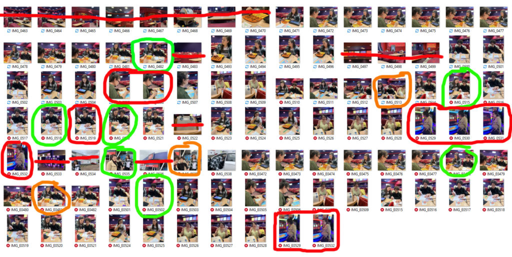
I like the images in green. To me they represent the same idea that Lewis’ goes for in terms of a day in the life. Some of them also show the generational journey in the way it shows different generations and the difference between them. The ones in red I don’t really like. The first one is blurry and the three in a row is too staged.
In terms of journey these images are important to me because Bingo is my Grandma’s only hobby and she’s been going to that specific Bingo Hall for decades. Back then instead of a massive empty room with hundred playing online, you couldn’t get a seat sometimes. She used to go with her brother but stopped after he died. My Aunt has recently been taking her back to the Bingo after my Grandfather died. What’s also important about these images is how you have three generations in them and you can see the difference between the generations. My Grandma is playing bingo by stamping with a marker like she always has however my Cousin is playing it on an ipad. I like the ones in green because they have good framing and they show what I want to be shown. The ones in red are either blurry or too staged.

Reflection on My Edits

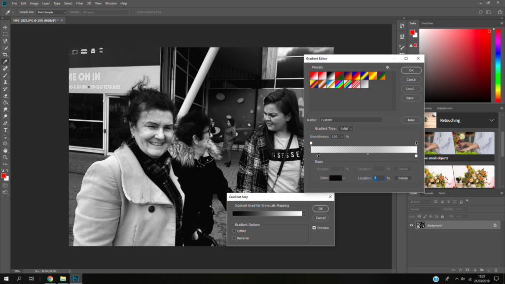
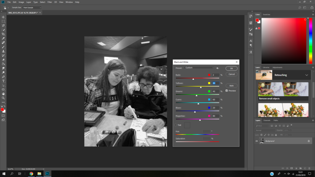
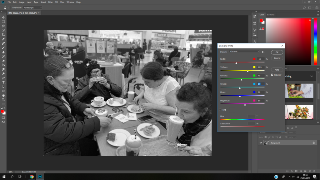
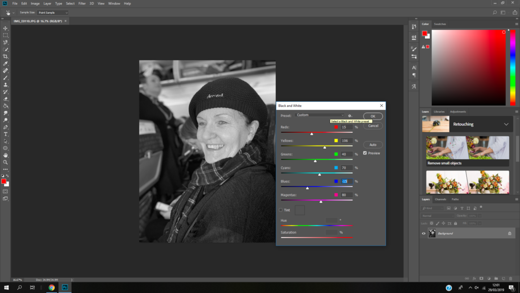
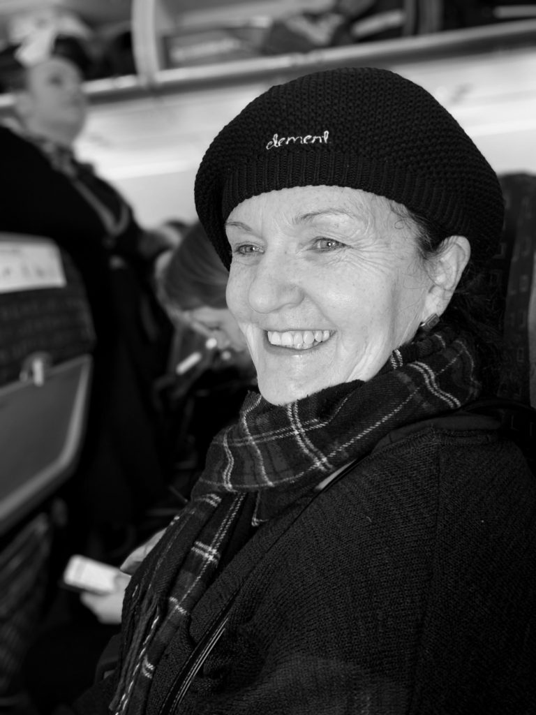
I think my images reflect the photographer’s style. I have taken picture of a family’s journey through a day. I’ve documented events that happened through the day just like the photographer. I made them white because then I could make them sharping by creating contrast and because the photographer edits her images to be black and white a lot of the time. I like my use of depth of field when taking the images because the subjects stand out and there’s a softness to the images.

Response to Luke Fowler

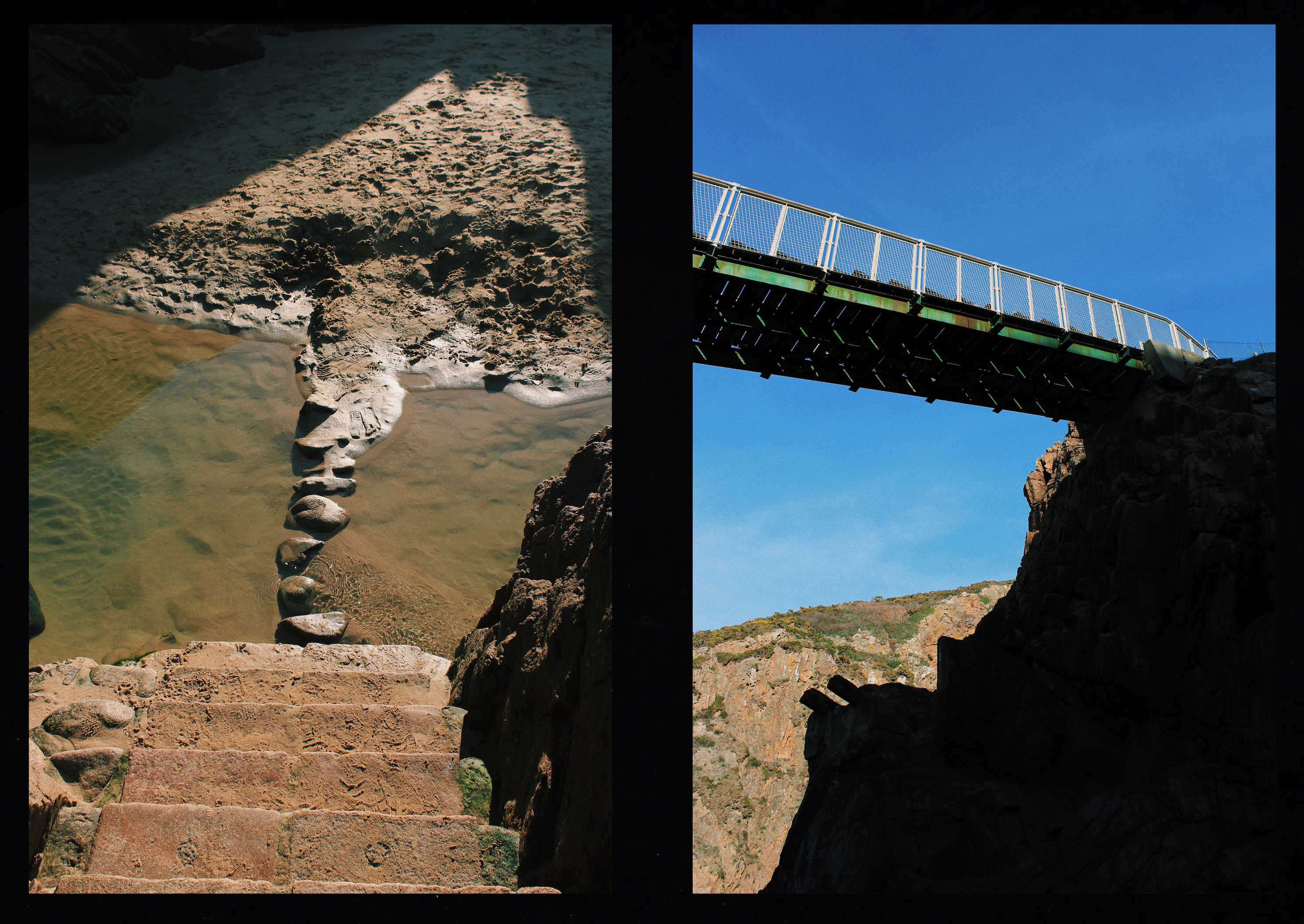
To respond to Luke Fowler’s photography work, I have exposed two images on one frame. I have them side by side to explore the relationship between two juxtaposed images. The images that I paired will seem unrelated in terms of subject and viewpoint, but there is a link that connects them together. I also included a black frame that surrounds the two images to replicate his two-frame films. Like Luke Fowler, I wanted to create a story between two still images so viewers can explore the visual dialogue between them. 

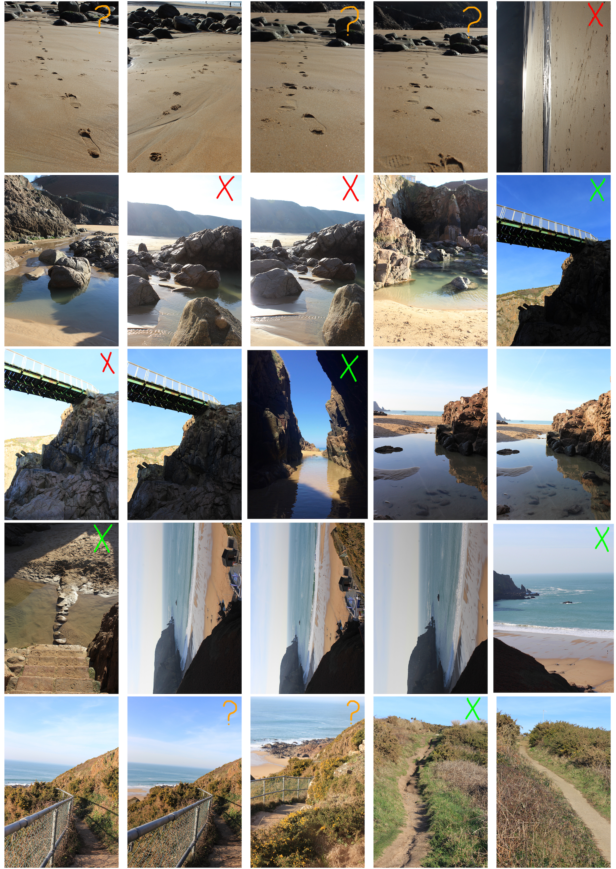
I went to Plémont Beach to capture images that link to my theme journeys and pathways. Once I had taken several images on my camera, I downloaded them onto my phone so I could edit them with VSCO. I used this editing app to create a film effect on my images to replicate Luke Fowler’s photography style. I did this by altering the exposure, contrast, saturation and grain as well as applying the same filter to each pair. Once all the images had been edited, I joined the pairs on Photoshop with a black background which created a frame around the images.

Contact Sheet
My Response

This pair shows juxtaposition through calm vs dramatic. The image to the left depicts a calm scenery since the cave at low tide has a pool of still water. A cave is an enclosed area and creates a sense of security. However, the image to the right shows a view facing outwards towards the sea where you can see the dramatic waves crashing against the coastline.

These two images depict a bridge. However, the bridge on the left is natural since it has been made by cobbles whereas the bridge on the right is man made and resistant. The image on the left captured the bridge from above making it seems small and insignificant unlike the bridge on the right which has been captured facing upwards, emphasising the fact that it is more powerful.

This pair of images show the difference between natural and manmade pathways. The pathway on the left has been formed by people damaging the vegetation so water can erode the soil and create a rough footpath. The pathway on the right image has been constructed by man. They link together since they are both pathways but created in different ways. Both pathways are steep, heading upwards in the same direction and have been captured in a similar composition.