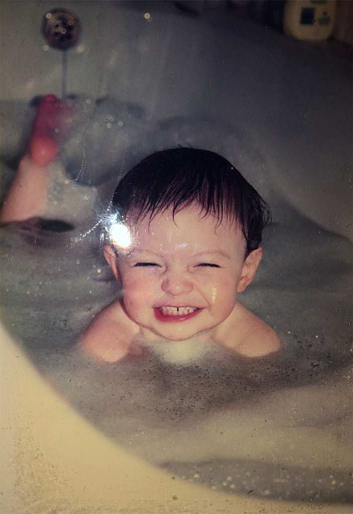
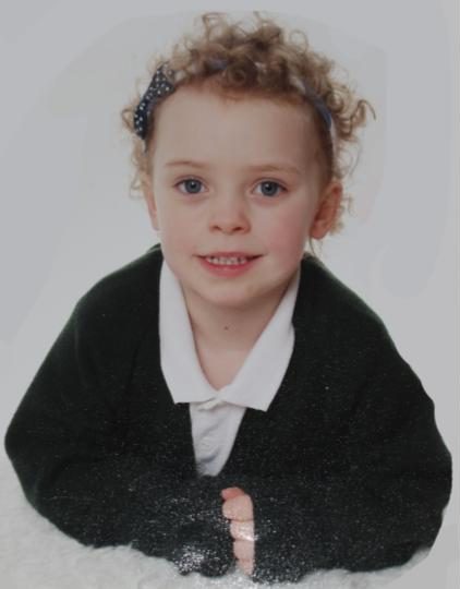
During the editing process for my final images, I made use of Photoshop in order to edit the saturation and colour of the images (which was the main point of focus). I did this in order to match the style of image with the original images, in order to create more points to compare the 2 images. This often requires raising the saturation and lowering the brightness, to give the effect that the new image was old.
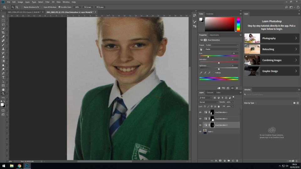
In order to make the new image more similar to the original (and therefore provide more continuity) I edited the newer image so that the jumper of the subject was a similar colour to the jumper of the same subject in the original image. I did this by using the quick select tool to highlight the jumper, before using the saturation tool to change the colour from blue to green. This gave a point of similarity between the 2 images, and allows for the viewer to focus more on the differences in the subjects face, posture etc rather than the colors (which hold less meaning).
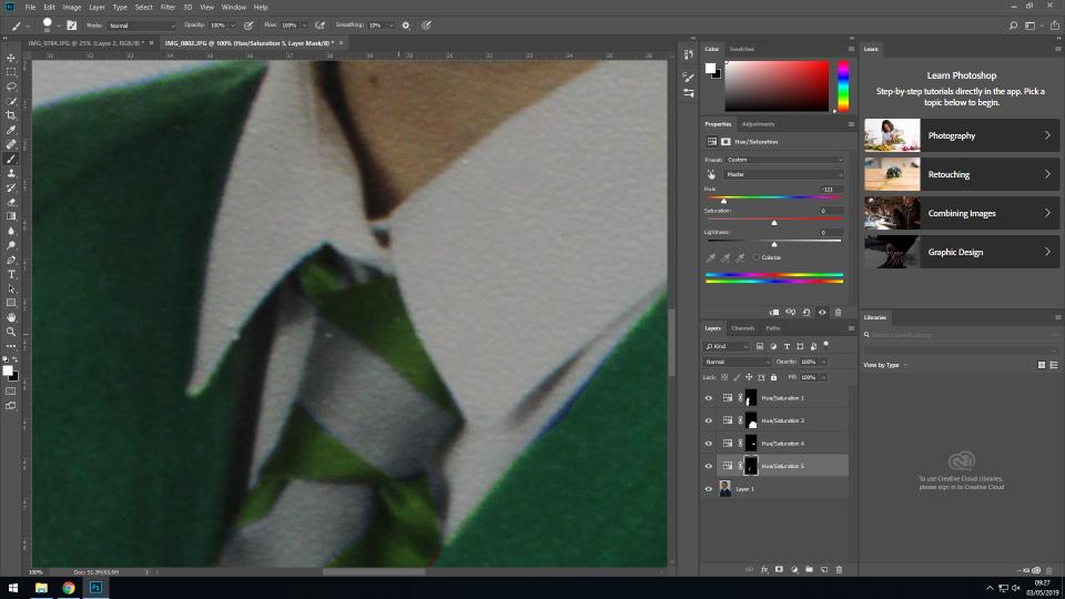
I also edited the colour of the tie in order to match the rest of the image. As the tie was a smaller area with a less simple shape, I used the lasso tool to do this, and the saturation option to change the saturation to a greener shade. This allowed for continuity to be carried throughout the subjects whole outfit.
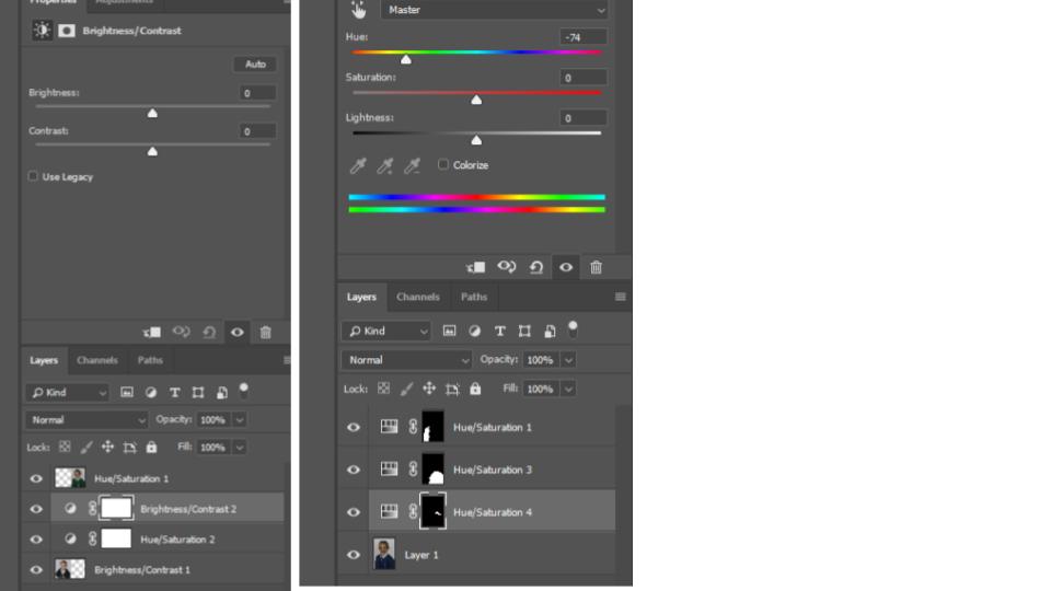
The original image is the subject at an earlier stage in their life, and so to match the tones of the original image with the newer image, I lowered the brightness and heightened the contrast in order to change the overall tones of the image.
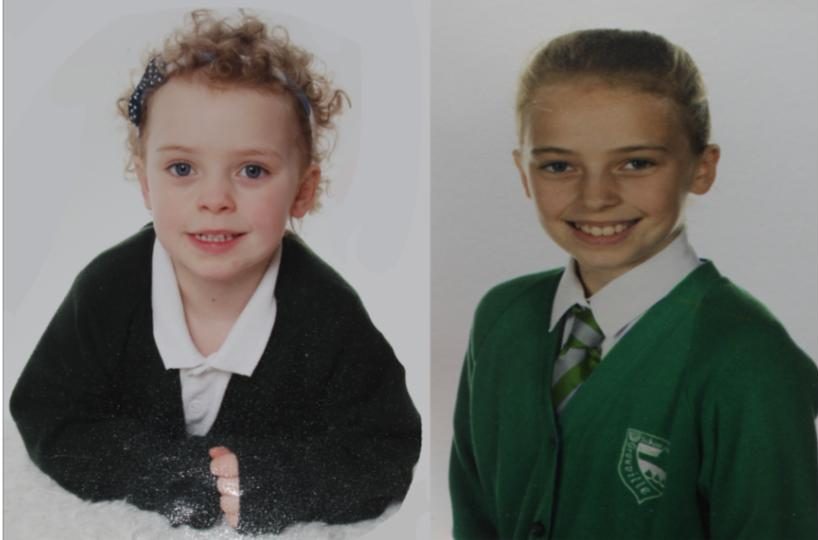
Above is the original image on the right, and the edited image on the left. The left image has been cropped, and the background expanded to create a square image, and the brightness and contrast have been edited so that they better match the newer image in terms of tone and lighting.
The final image is a side by side comparison of the 2 images, showing how the subject has developed through her life, without drawing attention away from the important aspects of the image (such as the facial structure changes, the hair growth, and other aspects that have changed that are not simply the clothing):
For the second image, I changed the saturation and contrast of the newer image to allow for the tones to match slightly more with the original image:
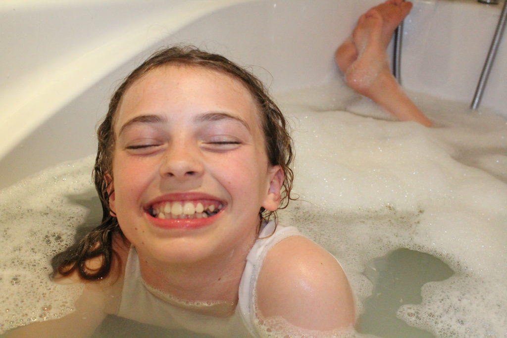
The original image I took involved the subject facing the wrong way, and so in Photoshop I simply flipped the image to resolve this, and have the subject facing in the same general direction as the original subject. In addition to this, I raised the saturation and contrast substantially to give the image a more orange overtone, which I feel both draws more attention to the image, and gives it a more vintage feel (showing similarity between the original and new image so that attention is not drawn just to the difference in shades and colors).
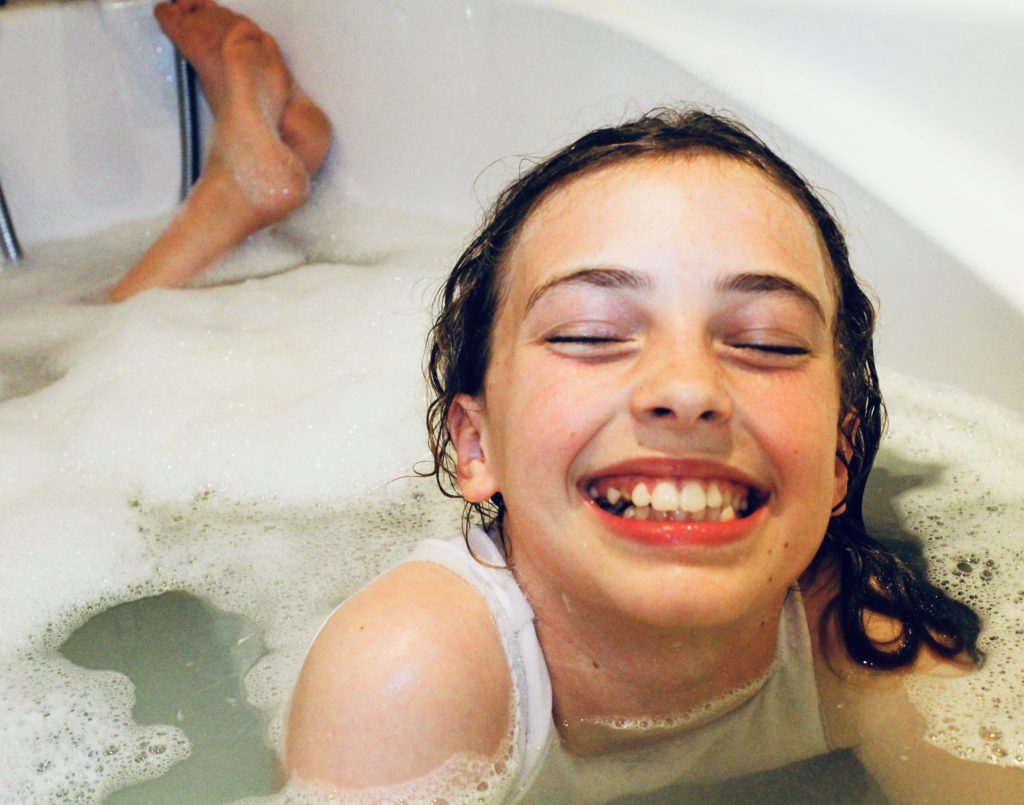
This image will be displayed with the archival image below, showing the contrast between the 2 images, and the difference in the subject, showing how she has changed over the years between the 2 images.
