For my edits with the Bunkers I wanted to produce final images which looked like my artist research who inspired this photoshoot. However, when I started experimenting I found it hard to find a way to make my photograph look like Jonathon Andrew’s work as his lit up bunker was taken at nighttime with artificial lights lighting up the bunker, but I knew I could make an image look like Paul Virilio as his work was simple to edit. Due to the simplicity of Virilio edits, I decided to conducted further experimentation and research into potential ideas in order to showcase my photoshop skills and make more interesting images.

Further Experimentation Ideas
- Conceal Reveal
- Building Float
- Double Exposure
- Idris Khan Inspired
I decided to attempt an Idris Khan inspired edit. In order to get a better understanding of Khan’s work I have decided to create another case study which will allow me to see the requirements of his work, which I can then implement into my work.
Idris Khan:
Idris Khan is a British based photographer/artist who intends to showcase history, art and music through densely layered imagery. Khan is a Muslim , which is one of his interests within photography, people say that his work is “compressed memories”, which creates a more powerful meaning towards his photography. He can be considered a successful photographer as his work has been displayed in multiple exhibitions around the globe, from Canada to Switzerland. One of Khan’s most successful moments was being asked to create a new wall of drawing for an exhibition for the British Museum in London
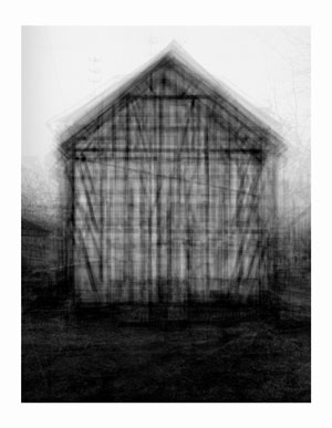
The image above is my favourite image that Khan has produced. Initially my eyes are drawn to the subject of the image which is the shed located in the centre of the frame. The more I look at the subject of the image the more detail I notice from the overlapping of the subject. The technique of overlapping has produced quite an abstract looking image but helps to present a narrative for the time of history he is trying to present. Technically speaking the overlapping may have been created on a photo manipulation software by duplicating, moving and Turing down the opacity of a lawyer, or it may have been created using a slow shutter speed. Having the slow shutter speed he could have moved his camera slightly which would have created this effect, however the image would be much more blurred than it is. In my opinion I think he has done this on a photo manipulation software which means a normal shutter speed was used. Alongside this I believe the ISO will have been raised as there is an intended blur and noise being created which has added to the texture which is being presented by the subject of the image. The depth of field being used seems to be narrow as the subject is mainly in focus with the background and foreground being slightly out of focus. The aperture Khan used may be slightly lower as the image seems to be naturally darker, so having this setting lower will make sense. In terms of the white balance I believe the image was taken using a normal outdoor white balance. The lighting is quite cold due to the grey and black which creates a eerie mood and helps to emphasis the historical aspect of the image. To achieve this I believe he took the image with natural lighting, but when the clouds covered the sun creating the coldness towards the image. The subject itself is the main focus point and presents the formal elements of Texture, through the overlapping, space, as the subject is located in the centre of the Fram creating a sense of space, shape, as the overlapping creates an overall abstract looking building. The image is presented in black and white which allows the image to show clear tonal contrast, presents the historical factors and adds to the overall eerie mood which is being created. Contextually, Khan wanted to showcase this building as an impressionistic drawing or blurred film, how things where when he was young. This was his artistic aim throughout this series. Conceptually, Khan wanted to present buildings but make them seem strangely imposing and alien like making viewers rethink about what the world is. To apply this concept into my work I will use a similar effect to make people rethink and understand the importance the bunkers had within the second world war in Jersey, thus helping to provide context to those who may not know why the bunkers actually exist.
Below are my attempts at producing super imposed photographs like Khan:
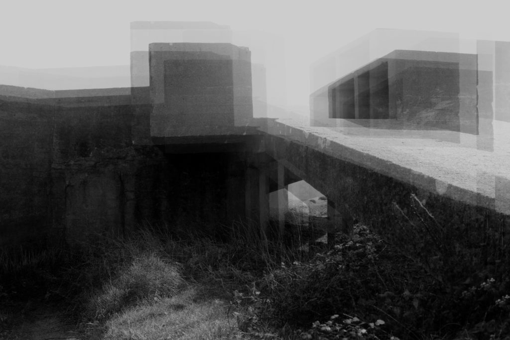
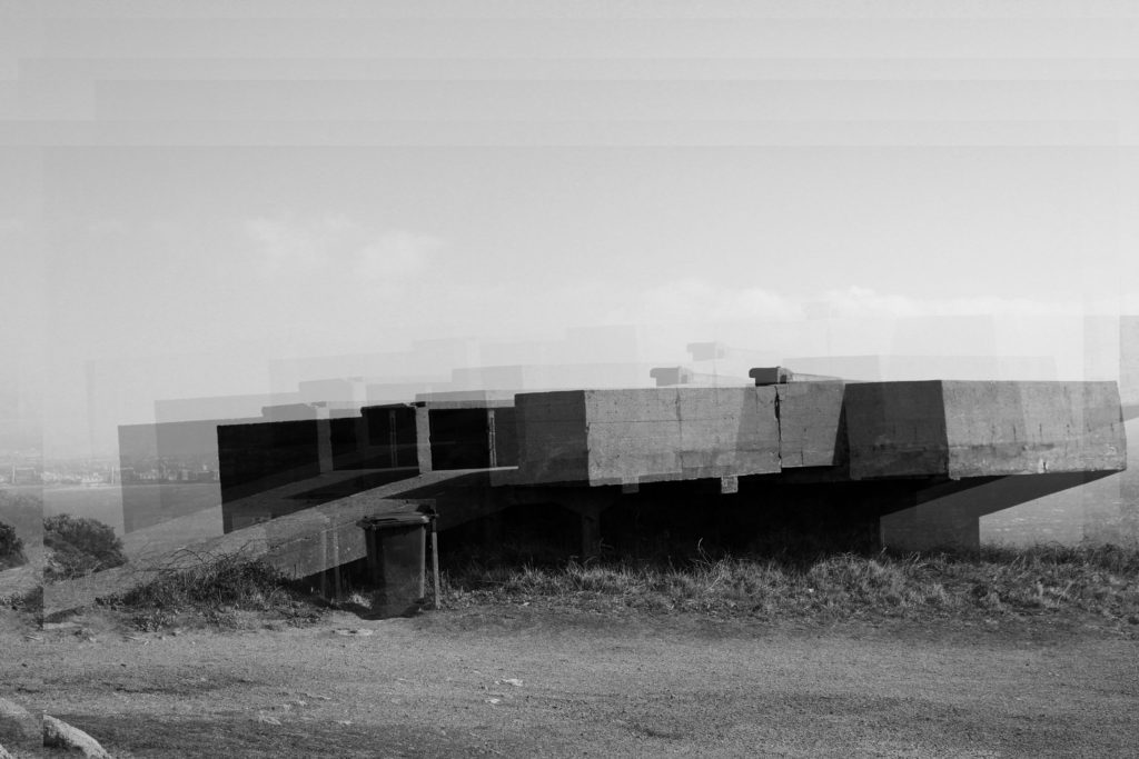
In order to create these images I started off by levelling and adjusting the curves of the image to create effect. I then desaturated my image, and duplicated the layer. Once the layer was duplicated I turned down the opacity of the layer and moved it slightly, repeating the duplication process slightly until I was happy with my final outcomes.

Comparison:

Khan Work 
My Work
I believe that my outcomes are very similar to Khan’s imagery showing my ability to take inspiration from an artist an applying it to my work. When editing my images I took the same aim as Khan which allowed me to produce such accurate responses. To compare we both have used the layering technique which makes a visually stimulating and abstract photograph which showcase a historical event. Moreover, they are both in black and white clearly presenting the formal elements of texture, space and shape. Both elements seem to have intended noise which means that my editing technique has made my image seem more like Khan’s creating another similarity. One difference is that my duplications are more spread out, as I much prefer the look when it is more spread out as it helps to guide my viewers eyes around the image. Another difference is that Khan’s image has more structure with the lines which allows the effect to stand out where as mine is much softer which makes a weaker effect. Both images have presented a cold atmosphere due to the lighting and editing being combined creating an overall eerie tone towards the two images. Khan’s image is much more darker where as my image presents a more natural look which overall does not make that much of a difference. I believe that my image has more historical context towards it creating a more powerful meaning compared to Khan’s. As shown both images are much like one another but both showcase our own artistic style, creating successful abstract images.
Action Plan:
To further this experimentation I have decided to print some of these outcomes on acetate, to which I will hold up to the camera lens and recapture some of these bunkers. Moreover, I will use them to use a back projector which will project my images onto abstract walls creating further experimentation and cool outcomes. In addition, I have printed on of the images into 8 different segments of A3 paper, I intend to stick these onto card creating a massive bunker, take this big image to the location and capture the bunker itself with the big image showing the big impact it has. This will be my further experimentation towards this area of research.
