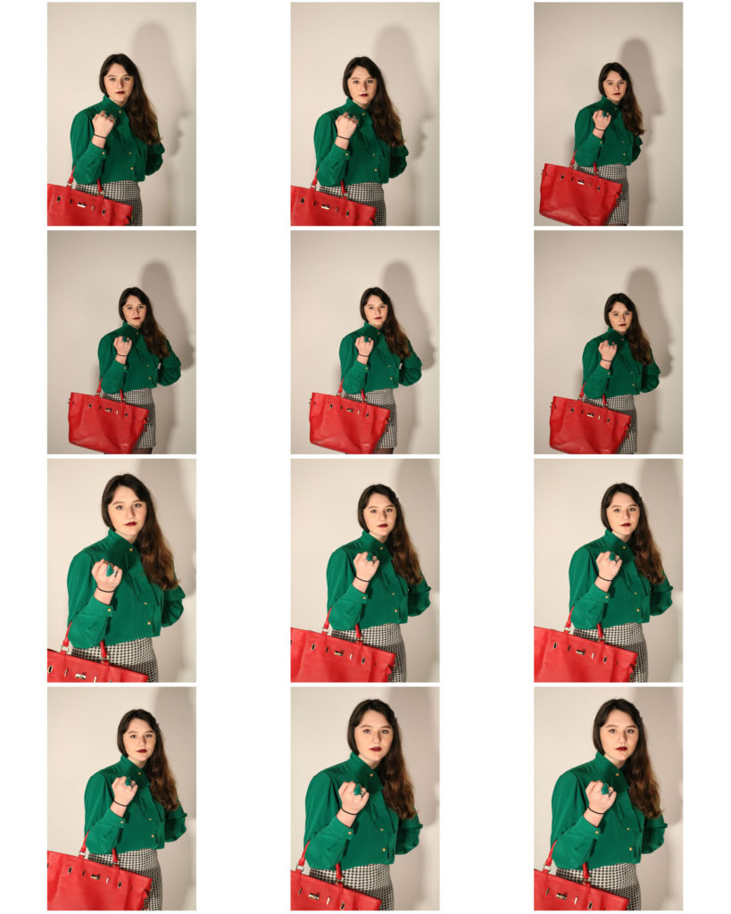
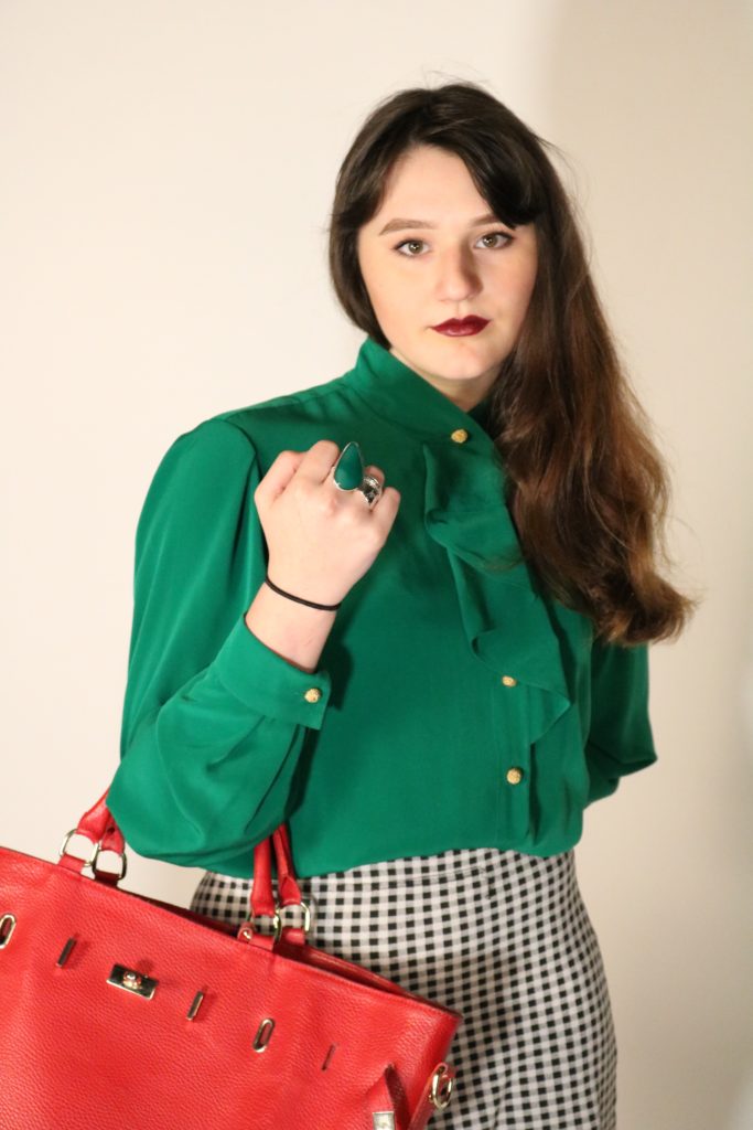
Comparing Paul Virilio to Jonathon Andrew

Comparison:

The main similarity between both images is that they are capturing the same subject, bunkers which where used during the war, which informs us that the two images share the same contextual factors (How the bunkers have been neglected and isolated since the war). Needless to say the way they have gone about capturing the subject is very different to one another, which showcases their artistic style and preference. This is clearly shown as Andrew’s work is presented in color, which makes the bunker more appealing. An affordance of having the image in color is that it allows the environment to clearly be showcased allowing us to understand how the bunker seems to be in the middle of nowhere and how the time (night time) at which it was taken allows the setting to portray the contextual factor of bunker isolation. Where as Virilio’s work is in black and white which creates an eerie tone towards the image and showcases isolation in a more visual way. An affordance of having the image black and white allows a high tonal contrast, making all the lines, texture showcase how the bunker has been worn and torn during it’s time of isolation. Another similarity is that both images use a narrow depth of field, the subject of the images is the main focus point and the backgrounds a slightly out of focus, allowing viewers attention to be solely focused on the bunkers which showcases the images purpose. This is reinforced as the background of both images are plain making our eyes focus on the bunkers. Both images showcase the formal elements of shape, texture, line and form, which are all presented through the bunkers and the position of them in the frame. Technically speaking the two artists have used similar camera settings to capture their subject. They both have used a quick shutter speed, as there is no intended blur visible in the images. As mentioned before they both have a narrow depth of field, and have similar focus point. The ISO of both is likely to be similar (low) as there is no noise being presented within the images. Another similarity is that both photographs have used artificial lighting as the subject is located outside. However, Andrew’s work has the bunker more lit up compared to Virilio work which could suggest that he used a form of artificial lighting to capture his image. In addition, as it is night time in Andrew’s work there is less light in the background compared to Virilio’s image which seems to be taken during the day, allowing the sun to light up the whole image. Another way the two images are similar is that they share the same conceptual factors. This is they both wanted to showcase the aftermath of the war and how we are left with the bunkers which is constantly reminding us of what occured in the war. Moreover, both images nicely link into the project of the Journey of Jersey through the Second World War. In my opinion I prefer Andrew’s work, due to the way he lit up the front of the bunker, leaving the background dark as it illuminates the idea that the bunkers have been isolated. Needless to say, I do really like the way Virilio showcases the isolation of the Bunkers.

Women In Propaganda

Looking into the United States in World War II and specifically the representations of women in the propaganda
http://oberlinlibstaff.com/omeka_hist244/exhibits/show/homefront/propaganda

Although the war crisis led to new realms of autonomy for women on the home front, women also became targets of propaganda that emphasized women’s sexual and domestic roles in ways that limited their sense of agency during the war years. Through different and, often, contradictory avenues of propaganda women were presented as victims, domestic beings, and as threats. Wartime propaganda portrayed women as sexually vulnerable victims in danger of the hyper-sexual desires of the enemy. This cannot however be said the same for all women in propaganda as in some cases they were shown as strong or taking on man’s roles such as Rosie the Riveter.

The examples below show and discuss the representations of women I feel should be questioned and are wrong and it all shows how women were used as an object in the wartime propaganda.

Women Seen As Domestic Figures:

More so than at any previous time in the US history women were breaking out of their traditional gendered roles by participating in the labour force, join the military, wartime propaganda helped to limit them to the classic roles of mothers, faithful girlfriends who contributed to the war effort solely through domestic means.

Unlike the infamous ‘Rosie the Riveter’ posters generated during the war, much of propaganda posters became tools to emphasize the significance of women’s war effort in the domestic realm. The trope of the mother-daughter duo illustrated in posters such as ‘Even a little can help a lot -NOW’ and ‘We’ll  have lots to eat this winter, won’t we Mother?” emphasize the significance of women both as domestic beings canning foods and pasting stamps and as mothers reproducing children who will become assets to society. This branch of propaganda maintains traditional femininity and domesticity, thus suggesting that when men return home from the war they will be returning to a normal life where women raise children and tend to the house while men earn money.

Women as Victims:

One way in which women’s sexual and domestic roles became defined by propaganda was through propaganda designed to encourage enlistment and the purchase of war bonds by depicting the outcome on the home-front if the US were to lose. The main theme that the propaganda campaign chose to focus on was the effects of the war on women. The majority of this propaganda portrayed women in one of two ways. First, and more frequently, women were depicted as young, innocent victims of sexual violence inflicted by hyper-sexual enemy soldiers. The other way in which women were illustrated was as helpless mothers clinging to their children as enemy violence threatens to annihilate them and their homes. Both of these depictions reduce women’s agency as passive participants in the war effort and illustrate them solely as vulnerable victims of enemy violence.      

Not only does the war bonds campaign provoke fears about mother and, thus, family vulnerability in the face of the enemy, but it also emphasizes the susceptibility of young American women to the hypersexual desires of enemy men. Once again, the narrative of American men needing to defend and preserve the honor and morality of American women is used to benefit the war effort.

Women As A Threat:

In contrast to posters of women as the weak, vulnerable victims of sexual desires, an entire campaign designed to fight venereal diseases (VD’s) recast women’s sexuality as a threat to soldiers the nuclear family, and, thus, the nation. This poster campaign often illustrated women as “bad girls”—dangerous and “loose,” in contrast with other campaigns depicting the “good girl” image of smiley mothers and housewives. The venereal disease propaganda is particularly gendered both in who appears on posters and who the targeted audience is.

The fact that women are demonized based on their sexual behaviors illustrates the larger societal need to control women’s morality and sexuality. Instead of being liberating, women gaining more autonomy over their bodies became a threat to the fundamental values of the American nuclear family. Women who were sexually active did not fulfill their traditional gender role and became outcasts who were looked down upon for having ‘loose’ morality.

Contact Sheet for Daniel Antunes and edits

I liked a lot of these images because of their composition and their detail. I also like how in some of the street images the yellow street light reflects in the wet ground and puddles.
The four I circled red together were taken in an elevator so the pictures are blurry and you can see the smudges on the glass. The ones in orange I like but I’m not too sure about. Those are the ones that I need to crop and edit in order to see if they’ll be any good.
The ones I circled in red I didn’t like because they weren’t composed well and weren’t particularly interesting. These are images that I took for my photo shoot two that I believe reflects Antunes’ style. He does a lot of street photography, pictures in the rain and images with a reflective surface.
Antunes does a lot of his edits in black and white.

Editing and Developing: 3

Chosen Photograph:

Above shows my chosen response to edit and enhance in response to my chosen advert. I have chosen this photograph as I feel my model is placed in one of the best positions and it is also one of my clearer images. As well as being clear I feel even though this photograph is slightly bright it gives me room to adjust this and experiment with it.

My aims for editing this photograph is to generate a response that clearly shows a resemblance and a link towards the original photograph and to also show some suggested inspiration towards Cindy Sherman.

Editing Process:

To being with I started by adjusting the brightness and the contrast of the photograph, the photograph I was recreating had quite dark tones and wasn’t too bright so I was trying to recreate and generate this.

Next, still keeping in mind the style of the original photograph I was recreating I decided to add ‘noise’ to the photograph to create a more believable recreation to create an almost blurred image without loosing any sharpness on the features.

Finally I went back in with the brightness and the contrast editing for the final touches to create it more similar to the original I was recreating.

Final Outcome:

This shows my final edited outcome, overall I feel happy with the way the photograph turned out in resemblance to the original. I feel I have created a successful photograph with what my aims were and that I have personally met them.

Romanticism Case Study

Romanticism (also known as the Romantic era) was an artistic, literary, musical and intellectual movement that originated in Europe toward the end of the 18th century, and in most areas was at its peak in the approximate period from 1800 to 1850. Romanticism was characterized by its emphasis on emotion and individualism as well as glorification of all the past and nature, preferring the medieval rather than the classical.

Caspar David Friedrich was an influential artist from the Romanticism era, his work was based on grand landscapes and making the scene that was in front of him more beautiful than it actually was by adding more vibrant colours.

an example is one of his paintings called Wanderlust.

Image result for Caspar David Friedrich

Recreation 3 // Balenciaga Paris | 80’s

For this photoshoot I will be taking another of the print advertisements that I have found to recreate in some way similar. I will again be keeping in mind Cindy Sherman and the way she embodies ‘characters’ and try to have my subject try this and have their own take on the image.

Background:

The era of the 80’s evokes very visual aesthetics that can be found specifically in this era. The high brands found in the 80’s prove to still set trends for today’s fashions, most of which people are familiar with Chanel, Versace, Armani and Balenciaga. The 80’s saw a rise in women moving into professions that were previously dominated by men. This trend sometimes lead women in these professions to not be taken seriously as they were often seen as primarily objects of desire rather than independent with ambition. This social issue created a movement named “Dress for success” or “Power dressing” with encourage the wearing of mote angular clothing that generally made them appear larger through the use of shoulder pads or sizable lapels and collars.

For these reasons I am choosing for my third recreation to produce a photograph resembling one of the Balenciaga adverts produced in 1983. I feel at this point I can show some of the developments of how woman and adverts were produced, in this era heavily woman were going into business work and were creating a new name for themselves.

Plan:

I will again be doing the photoshoot in the studio as this is most likely where the original was taken as it seems to be quite a stage studio like photograph with studio lights. I will also ask my subject to dress in a way similar to that of the original photograph, for example with a shirt of a similar style with the added skirt and bag. As it being a recreation I would like to get the outfit as similar as possible however there may be slight alterations of colours as to what is available however I would like to keep the same concept in place.

Third Recreation:

Above shows the advert I will be trying to produce. The photograph is a studio taken photograph that I will try to recreate. I dressed my model in a way that replicated what the original model was wearing as well as wearing a similar hair style to that of the original photograph.

Above shows the contact sheet of my outcomes from the photoshoot. I feel the better photographs are the ones that are coming slighting closer to the model rather than the ones which are father away. Some of the photographs turned out slightly dark however I feel that the majority of the photographs worked well and how I wanted them to be produced.

Unedited Best Outcomes:

I feel that these three are my best outcomes from the photoshoot due to where my subject is positioned and how they are some of my more clear photographs. I am going to move forward and edit one of the following photographs too enhance it to be more like the original photograph.

Guerrilla Girls // Manet’s Olympia

Guerrilla Girls

Tate Website Article about the Guerrilla Girls

Guerrilla Girls is an anonymous group of feminist, female artists devoted to fighting sexism and racism within the art world. The group formed in New York City in 1985 with the mission of bringing gender and racial inequality into focus within the greater arts community. The group employs culture jamming in the form of posters, books, billboards and public appearances to expose discrimination and corruption. To remain anonymous, member don gorilla masks and use pseudonyms that refer to deceased female artists. According to GG1 identities are concealed because issues matter more than individual identities.

Many feminist artists in the 1970’s dared to imagine that female artists could produce authentically and radically different art, undoing the prevailing visual paradigm. Shaped by the 1970’s women’s movement, the Guerrilla Girls resolved to devise new strategies. Most noticeably, they realized that 1970s-era tools such as pickets and marches proved ineffective.

Throughout their existence, the Guerrilla Girls have gained the most attention for their bold protest art. Their projects (mostly posters at first) express observations, concerns, and ideals regarding numerous social topics. Their art has always been fact-driven and informed by the group’s unique approach to data collection.

The Guerrilla Girls are drawing attention to and trying to rid of sexism as well as racism, I can relate what the Guerrilla girls do and their message to my work by looking at the links that I am aiming to show the changes or the no changes in the way women are portrayed and put forward in some of the era’s where the male gaze was very prominent.

I can also relate the Guerrilla Girls to the ideas of Cindy Sherman as her photography aims to force the audience to reconsider common stereotypes and cultural assumptions, among the latter political sarire, caricature, the graphic novel, pulp fiction, stand-up comedy (some of her characters are indeed uncomfortably “funny”).

Both the Guerrilla Girls and Cindy Sherman show that they are against the objectification of women and the idea of the male gaze. I feel I can gain inspiration and ideas from them as I look to move the project forward and look more closely at the time periods I am recreating the adverts from to understand where women stood at that time to then reflect on how they are being presented in those ads.

My Blog Post Surrounding Cindy Sherman
Cindy Sherman’s Work

Manet’s Olympia and it’s Impact

One of the figures who Inaugurated modernism to the history of the art is the renowned French Painter Édouard Manet. As one of his most celebrated paintings Olympia shook the society and made a huge impact on the upcoming generations of artists. The highly controversial composition was painted in 1853 and exposed to the public 2 years later. It represents a nude woman in a leisure pose with a servant bringing flowers. The daring look of a shameless woman caused quite a stir and the public considered the painting indecent since it displayed a sex worker in her boudoir. In relation with that is the fact that the very name Olympia was associated with sex workers in 1860’s Paris.

Manet’s Olympia has been used during the 1970’s as an important reference in the context of the male gaze proposed by the feminist movement. Especially the Black feminists argued that Manet did not include the figure of the maid for the artistic convention, but to create an ideological binary between black and white, good and bad, clean and dirty.

MY ONGOING RESPONSE TO CHRIS PORSZ

Chris Porsz compares and contrasts old photos that he had previously taken of individuals and retakes the images years later of the same individuals. My plan of action is to find old photos of my family and friends that were taken in my childhood, and recreate those photos to then be able to contrast them as well. My concept is to display how the journey of life shapes each individuals pathways and how each individuals experiences shapes who they have currently become. Although it can be viewed as a dark subject, some of the individuals have passed away so therefore my work will show how their journey of life has come to an end and how the individuals have learnt to deal with the loss. Also how some of the individuals (such as dogs or old friends) have been replaced in their place and how their journey of life has just begun.


HERE ARE MY OLD PHOTOS THAT HAVE BEEN MANIPULATED:
This image is of my Mum and our old dog Millie.
This image is of my mum and her friend in Australia.
This image is of my younger sister Poppy.
This image features my family friend Georgie and my Grandma.
This image is of (from left to right) myself, my sister Poppy, my twin sisters Scarlett and Phoebe and our neighbor Satanter which was taken when we lived in Ireland.
In this image, both myself and my sister Poppy were getting ready for our first horse riding lesson in Ireland.
This image was taken in the hospital when myself and my sister Poppy went to the hospital to visit our mum and meet our twin sisters for the first time (Scarlett was the twin in the photo).
My Dad is the individual in this image, who was holding a koala in Australia.
This image is of myself, my Grandma and my sister Poppy, which at the time we had stolen my Grandma’s glasses.
My Mum in this image was travelling in Australia and was in an outback bar.
This image is of my cousin and Dad on one of their holidays.
This is another photo of my Mum which was taken in Australia.
This is a passport photo taken of my Dad.
Here is an image of myself and my younger sister Phoebe when we lived in Ireland.
Here is another passport image taken of my Dad.

Photo-shoot 1: Planning

For my first photo-shoot, I will be taking inspiration directly from photographer Bill Voila, and will be editing together a series of 3 photographs to present the journey an individual experiences from birth until after death, essentially condensing a whole life experience into 3 pivotal moments, including childhood, a main life event, and the changes that occur due to the death of an individual.

I will be using 3 different photo-shoots in 1 in order to produce the 3 different styles of images, that I will then merge together in order to form the layout for the final images.

Left: https://fashion-history.lovetoknow.com/fashion-history-eras/history-childrens-clothing
Middle: https://www.express.co.uk/news/uk/981563/Nurse-Margaret-Fortescue-World-War-1-anniversary-death
Right: https://www.flickr.com/photos/harlowirish/8155303100

The above image is a montage of image I found online (NOT my own images) in order to represent the layout that will be used in my own work. From left to right, the images will display a journey from childhood to adulthood, where a single event that represents the life work of the individual will be represented in the middle image. In contrast, the final image will be a representation of the death of the individual, with the way they are remembered/ have influenced the community presented as an example of how the journey through life doesn’t necessarily come to an abrupt end at death.

Examples of what I will use to represent the middle event of the subjects life include:

  • Securing a career/job
  • Achieving a life long goal
  • Illness or disease
  • Family crisis
  • Personal crisis
  • Loss (of family/job/house e.t.c)
  • Random event changes the direction of an individuals life

Examples of what I will use to represent the first event of the subjects life include:

  • Childhood/archival photos
  • Images of children playing
  • Life before the large event (showing contrast)

Examples of what I will use to represent the last event of the subjects life include:

  • What the world is like after the death of the subject
  • A representation of the reason behind the death of the subject
  • A scene showing the contrast between the beginning of life and what it looks like towards the end

Artist Research – Paul Virilio + Jonathan Andrew

Paul Virilio:

Mood Board showcasing Paul Virilio’s photographs
Bunker Archaeology – Paul Virilio

Paul Virilio is a French photographer, who was born and raised on the Northern coast of France. The Second World War created a big impact of his city, and impacted his personal life. His city was bombed and held captive by the German Navy. In 1958, Virilio conducted a phenomenological (he science of phenomena as distinct from that of the nature of being.) where he looked at military space and bunkers built by the Nazi’s during the Second World War.

“Historian of warfare, technology and photography, a philosopher of architecture, military strategy and cinema, and a politically engaged provocative commentator on history, terrorism, mass media and human-machine relations.” – Quite describing Virilio by two Geographers.


In the image above, the subject of the image is the bunker which is located in the centre of the frame, which is the main focus point of the image as my eyes are instantly lead there. My eyes then move towards the background which is empty, clearly presenting the formal element of space. This presents an eerie tone towards the image and presents the idea that the Bunkers are desolate and have not been used for a while. The bunker itself presents to formal element of texture and shape which are used to present and emphasise the contextual features of bunkers. The image itself is presented in black and white, which allows the image to show high tonal contrast, which shows how the Bunkers are almost worn out, as its been a long period of time since they where used in the second world war. A small depth of field is presented as the Bunker seems to be the subject most in focus, the background and grass in the foreground is slightly out of focus, which allows the viewers to mainly concentrate on the bunker. Moreover, the Bunker seems to be slightly lighter than the background which also makes the subject visually seem the most important in the image. The dark background is almost pathetic fallacy as it represents the depressing times the war brought to Jersey and represents the depressing reasons of the Bunkers. The image seems to be in focus, suggesting a quick shutter speed, and there is no intended blur which implies that a low ISO and a normal aperture was used to capture the image above. Contextually, the Bunkers where built by the Germans to protect themselves from other army’s and to make and reload their weapons. These Bunkers are located near the sea, allowing the Nazi’s to attack those trying to enter Jersey, moreover the bunkers where well hidden and hard to find. Conceptually, I believe Virilio was trying to present the aftermath of the war, and the marks it has made in certain locations, reminding us about the horrible times of the second world war. In my opinion I like the way Virilio has presented the bunkers as isolated and makes them seem ‘horrible’ reinforcing the idea that the bunkers where used for horrible purposes, making the image successful.

Jonathon Andrew:

Mood Board Showcase Jonathon Andrew’s Photograpgy
Jonathon Andrew – Bunker

Jonathon Andrew was born in Manchester and currently lives and works in Amsterdam. He has many years of experiences capturing multiple locations. He travels the world capturing different aspects of different places, with his work being displayed in magazines such as National Geographic. His current project is capturing ruins of WW2 defence, so far these images have been presented in the Daily Mail and multiple blogs. Due to his success he has won many awards for his photographs and has helped teach lectures to students on how to capture landscape photography.

To analyse the photograph above, the main focus point is the bunker which is located in the centre of the frame. This is presented not only by the positioning of the bunker in the frame, but also by having the Bunker lit up and the background being darker. The image is taken at night time which allows the technique of lighting up the bunker to stand out more. The bunker itself clearly presents the formal elements of space, texture, shape and line. This is presented by the bunker being ‘worn out’ and old helping to present the contextual factors of the image. Space is presented through the location of the bunker, the subject is the centre of the frame and the background and foreground is empty, which represents how the bunker has been isolated leaving nothing left. The subject of the image is in focus and the background of the image is slightly out of focus which shows a narrow depth of field, it also showcases a quick shutter speed as the image has a clear focus. This is further supported by the ISO being low as there is no intended blur, and the aperture is low. The lighting used seems to be natural, but the white light surrounding the bunker seems artificial. A back light could have been placed behind the bunker or could have been added using a photo manipulation software. Contextually, the image is presenting the same contextual factors as Virilio, which is: the Bunkers where built by the Germans to protect themselves from other army’s and to make and reload their weapons. These Bunkers are located near the sea, allowing the Nazi’s to attack those trying to enter Jersey, moreover the bunkers where well hidden and hard to find. Conceptually, the image is presenting the impact of the bunkers during the war and is showcasing how the bunkers have been isolated but kept to remind people of the horrors of the war. In my opinion this piece is eye opening as it reminds viewers of the horror of war, through the Beauty of the bunker in this image, which almost creates a Juxtaposition within the image, making the photograph strong providing my reasoning to why I find the image interesting and successful.

Action Plan:

As an action plan I want to produce a photoshoot where I capture Jersey’s bunkers in order to showcase another aspect of Jersey’s journey through the second world war. This will present the defence mechanisms that was put in place by the Nazi’s. I have been inspired to follow in a similar style to Virilio but edit my images more like Andrew’s work, creating a combination of both photographers work.