
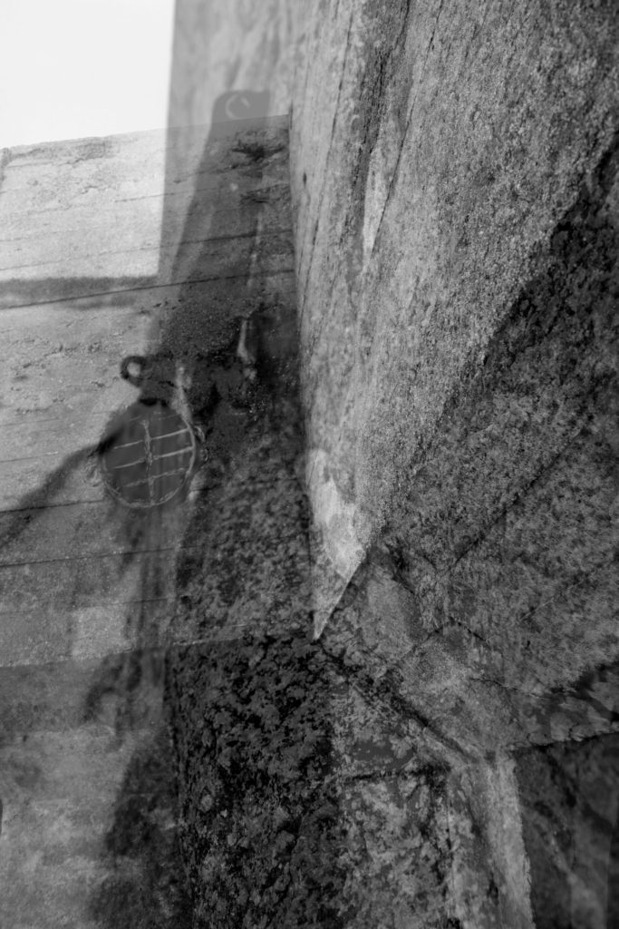
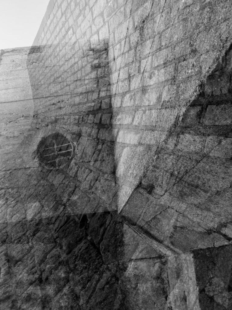
Within these edits I wanted to recreate the double exposure technique that Gina Socrates used in her photo shoot of capturing Jersey Sea wall. Doing this technique will allow to showcase the before and after of the sea wall, presenting the Journey of the sea wall in Jersey, plus showing a part of Jersey’s journey through the second world war. I decided to create three double exposures, using different images, to create different effects and present different formal elements.
To prepare the images, before combining them, adjusted the levels and curves, in order to have the textures of the walls to stand out (presenting the clear formal element of texture and shape). I then adjusted the hue and saturation in order to make the images black and white, which made a clear contrast in tonal regions. At first I experimented with changing the hue, in order to present the modern image of the wall to have a different look to the ‘older’ image to create a clear contrast and meet the aim of this photoshoot. However, I did not believe that this suited the effect I was trying to present and decided to turn the images back to black and white. Once I had all my images ready I opened up a new document, and placed both images onto the document. Using the transformation tool (ctrl + t), I adjusted the size of both images ensuring they fit onto the page. Then the image on the top layer, I turned down the opacity of the layer in order to reveal the layer underneath it. I then flatten the two layers and adjusted the levels again to ensure that the photographs had similar tonal contrast. I repeated this step with all the images until I received the outcomes I wanted.


Images Used 
To Create 
My Double 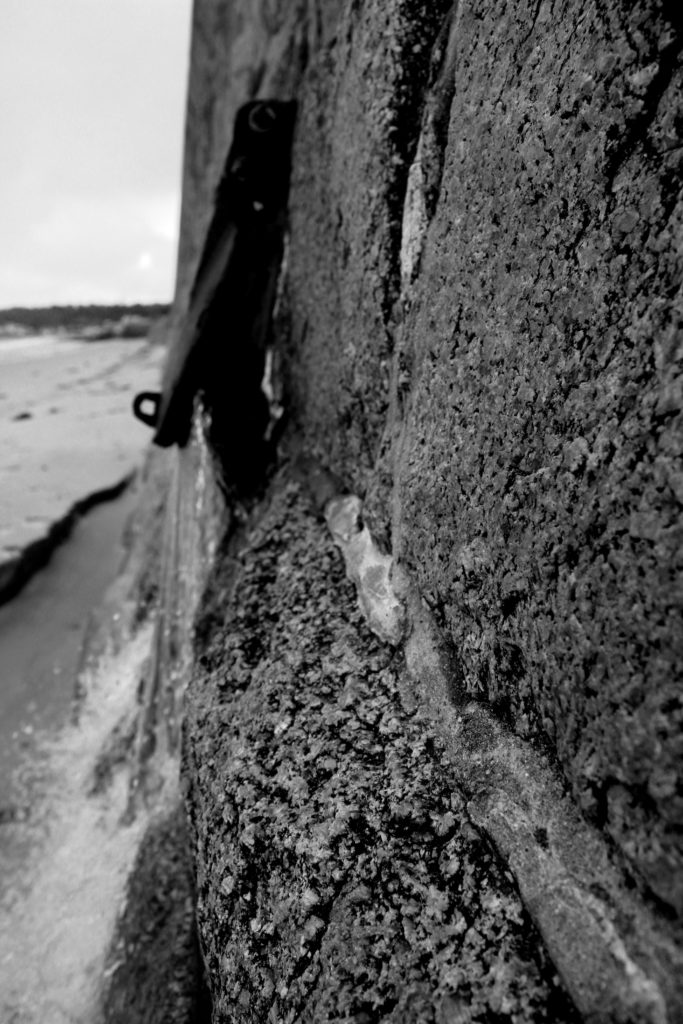
Exposure
Comparison :
My Image 
Gina Socrates
To compare my image to Gina Socrates there are multiple similarities and differences, but both present the same idea and contextual factors. One of the similarities is that we have both captured the same subject but have both taken different approaches in order to do so. I looked at macro images and focused on different areas of the wall which would showcase different formal elements. However, Socrates looks at the build up of the wall from a wider angle. In contrast, my images are presented in black and white as I wanted the texture and lines (detail) of the wall to clearly be presented to my viewers, however Socrates presents her images in colour with a hint of yellow/orange which also presents the texture of her subject. Personally, I believe that the black and white looks much better as it presents a more visually pleasing image overall, however, Socrates work is still successful. Another similarity is that we both took our photographs with the same aim, but both came out with different outcomes. We both used a double exposure effect in order to present the journey of Jersey’s seawall during the second world war, however she managed to do hers by changing the camera settings whereas mine where created using photoshop. Her blend of images is a lot smoother and the images fit nicely together, mine also do this but only slightly have areas where the two images do not fit (these are very small and therefore hard to notice. Moreover, my images are much sharper, presenting the formal elements much stronger creating a more powerful overall image, where as Socrates work are much weaker but still showcase a powerful image. My image is quite busy and lacks space, however Socrates work has more space and emptiness allowing time for the viewers to take in the message of her work. Overall, I believe that mine and socrates work share many similarities but showcase our preferred artistic style within the image. I also think that we have both come out with similar outcomes and therefore showing the success of my photoshoot and final images from the section of the project.