Background:
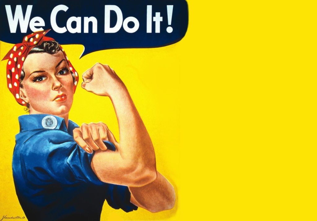
“We Can Do It!” is an American World War II wartime poster produced by J. Howard Miller in 1943 for Westinghouse Electric as an inspirational image to boost female worker morale. It was seen little during the war and was rediscovered early 1980’s and was widely reproduced, often called “We Can Do It!” but also called “Rosie the Riveter” after the iconic figure of a strong female war production worker. The image was used to promote feminism and other political issues begining in the 1980’s, it was incorporated in 2008 into campaign materials for several American politicians. Compared to all this during the war time the image was strictly internal to Westinghouse, displayed only during February 1943, and was not for recruitment but to exhort already-hired women to work harder. People have seized upon the uplifting attitude and message to remake it into many forms including self empowerment, campaign promotion and advertising.
I am choosing to recreate this specific poster to indicate the changes in this era of the 40’s as I feel it has that showing of development and progress and is a widely known poster, it represents how woman were being treated at the time and suggests towards how they were being advertised as they now took on ‘mans work’. I feel that it is a good example to show how women began to be portrayed when men weren’t there and then that it got picked back up during a strong female movement.
Plan:
For this photoshoot I will be taking the image in the studio to give me the best lighting for recreating these AD’s I will use two different subjects one in each of the images. I am going to be dressing the subject in clothing that is almost exact or close to what the subject in the original image is wearing.
For the second recreation seen below I will adjust the persons hair and find clothes and props best suited to the photograph. The aim of this photoshoot is to create an accurate recreation of the photograph below and try to show and explain some of my inspirations coming from Cindy Sherman.
Second Recreation:

Rosie the Riveter | 40’s
Above shows the Poster I was recreating, for this recreation I took the photographs in the studio as this enabled me to have a plain background as to edit the image on and the poster itself also has a plain background. I dressed my subject the same or similar as the figure in the original and took the time to get her to pose in the same manner.

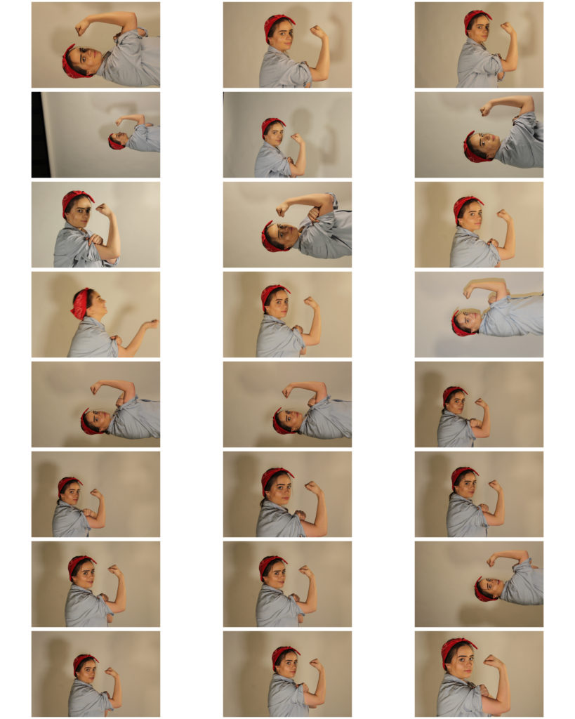
Contact Sheet of Outcomes
Above shows the contact sheet of my outcomes from the photoshoot, some of the photographs came out a little dark however I should be able to edit these images and fix that in Photoshop.
I feel I have tried to show my inspirations coming from Cindy Sherman through the work by having my subject en body the person in the original ad and begin to represent herself in that way.
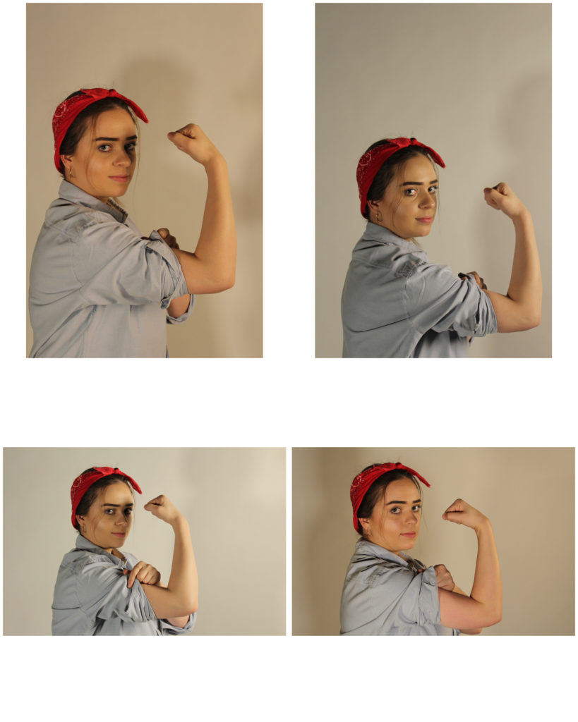
Unedited Best Outcomes:
Below shows what I think to be my best outcomes before I am editing the images to enhance them more and edit them to be more like the recreation. These are the four I think are the best however I will only experiment with editing one or two of them.

Best Outcomes
