Editing and Developing: 2

Chosen Photograph:

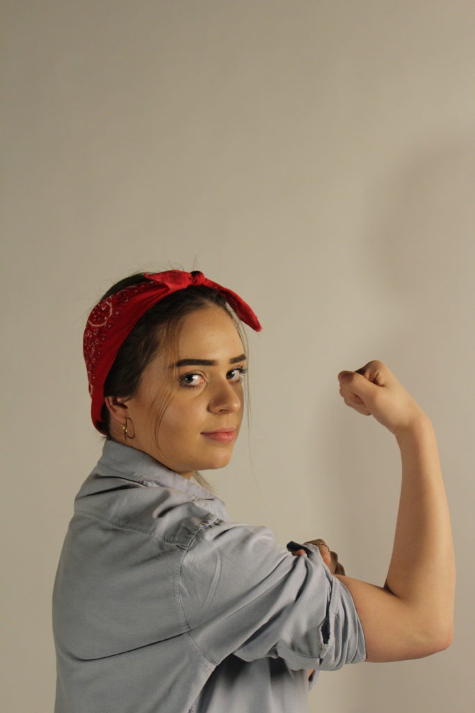
Above shows my chosen image to edit and experiment with, I have chosen this photograph as it was one of my most clear image and I feel that my subject is positioned well in the frame and there is good eye contact and facial expressions with the camera. The lighting is also good for in this photograph there is no need for too much adjusting of the brightness in this photograph which is why I have chosen to edit this photograph.

My aims while editing this photograph is to create a yellow tint in the background of the photograph to replicate the yellow background of the original poster as I feel this will really help the photograph to become better and enhance it.

Editing Process:
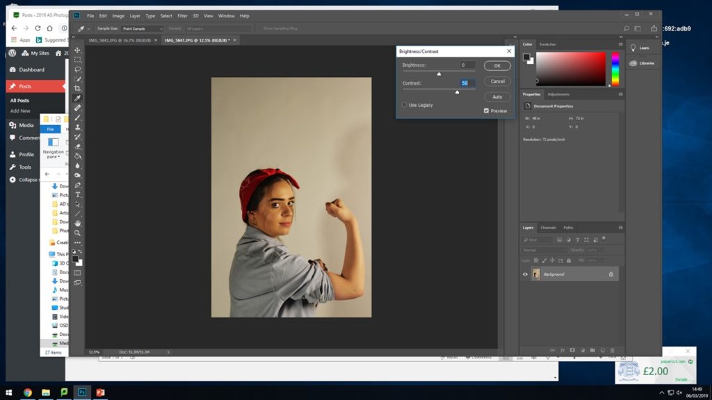
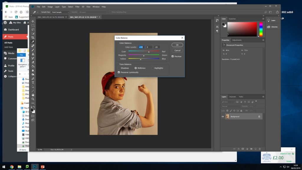
I began by adjusting the brightness and contrast so that I have a good base for adding on the filters for the colours.
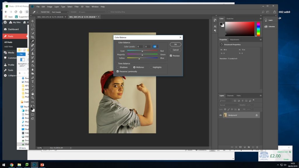
For the next two steps I experimented, adjusted and edited the strengths of the yellow and red colour tones coming through in the photograph. I did this so that there were already tints coming through and to make it easier to place the yellow warming on top.
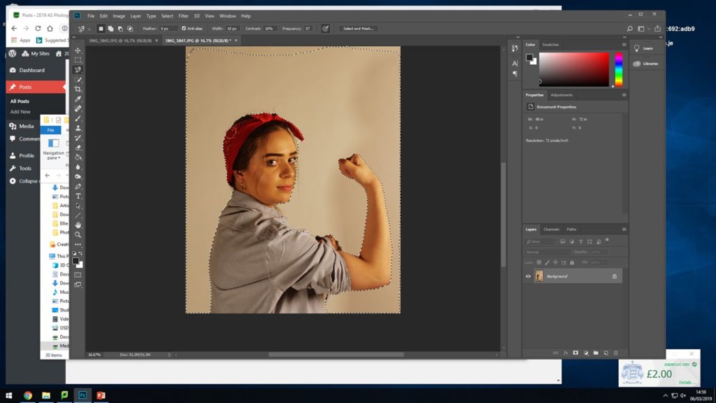
Here I selected the whole background area surrounding my subject, when adding on the warming and yellow filter I didn’t want them to mess and alter the colours and tones of the subject in the image, I wanted to try and keep the red and the blue of her shirt and head band so I selected al the way around her body and around the frame of the photograph to have a specific place to add the filters.
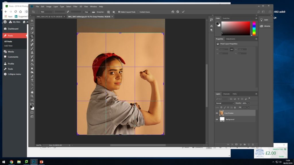
After adding on the filters I experimented with cropping the photograph down so that the subject fills more or less of the frame and see where it sits best as I did not want too much unnecessary blank space above her head.

Final Outcome:

This shows the final outcome for how I edited the photograph, I used the warming filter (81) as it had more yellow tones in which I felt worked well with the original photograph and also worked with this recreation. I feel this photoshoot and editing was a success and that it generated an accurate outcome I am happy with that I feel works well.
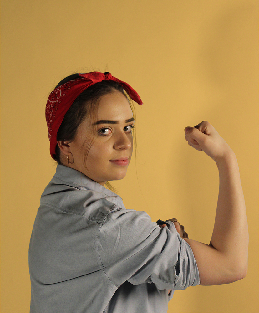
Recreation 2 // Rosie the Riveter | 40’s

Background:

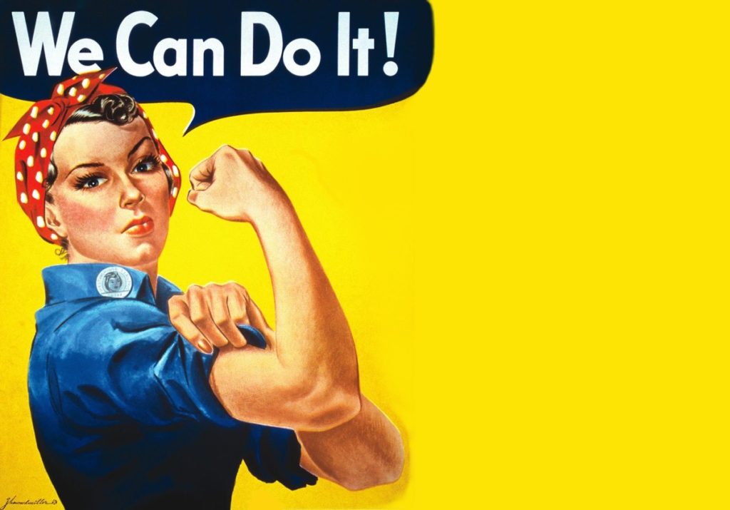
“We Can Do It!” is an American World War II wartime poster produced by J. Howard Miller in 1943 for Westinghouse Electric as an inspirational image to boost female worker morale. It was seen little during the war and was rediscovered early 1980’s and was widely reproduced, often called “We Can Do It!” but also called “Rosie the Riveter” after the iconic figure of a strong female war production worker. The image was used to promote feminism and other political issues begining in the 1980’s, it was incorporated in 2008 into campaign materials for several American politicians. Compared to all this during the war time the image was strictly internal to Westinghouse, displayed only during February 1943, and was not for recruitment but to exhort already-hired women to work harder. People have seized upon the uplifting attitude and message to remake it into many forms including self empowerment, campaign promotion and advertising.

I am choosing to recreate this specific poster to indicate the changes in this era of the 40’s as I feel it has that showing of development and progress and is a widely known poster, it represents how woman were being treated at the time and suggests towards how they were being advertised as they now took on ‘mans work’. I feel that it is a good example to show how women began to be portrayed when men weren’t there and then that it got picked back up during a strong female movement.

Plan:

For this photoshoot I will be taking the image in the studio to give me the best lighting for recreating these AD’s I will use two different subjects one in each of the images.  I am going to be dressing the subject in clothing that is almost exact or close to what the subject in the original image is wearing.

For the second recreation seen below I will adjust the persons hair and find clothes and props best suited to the photograph. The aim of this photoshoot is to create an accurate recreation of the photograph below and try to show and explain some of my inspirations coming from Cindy Sherman.

Second Recreation:

Above shows the Poster I was recreating, for this recreation I took the photographs in the studio as this enabled me to have a plain background as to edit the image on and the poster itself also has a plain background. I dressed my subject the same or similar as the figure in the original and took the time to get her to pose in the same manner.

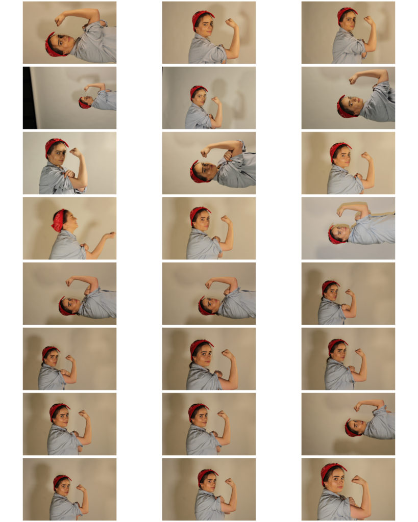
Above shows the contact sheet of my outcomes from the photoshoot, some of the photographs came out a little dark however I should be able to edit these images and fix that in Photoshop.

I feel I have tried to show my inspirations coming from Cindy Sherman through the work by having my subject en body the person in the original ad and begin to represent herself in that way.

Unedited Best Outcomes:

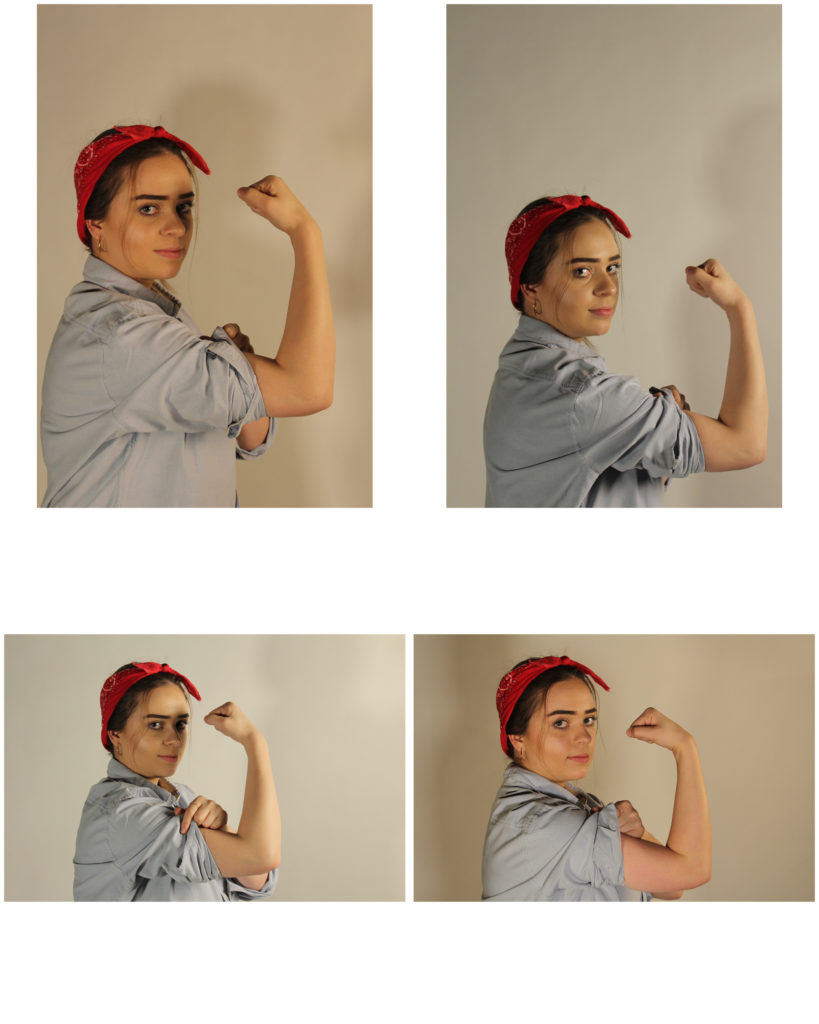
Below shows what I think to be my best outcomes before I am editing the images to enhance them more and edit them to be more like the recreation. These are the four I think are the best however I will only experiment with editing one or two of them.

The Boyle Family

Boyle Family is a group of collaborative artists based in London. Mark Boyle and Joan Hills met in Harrogate, Yorkshire in 1957, Joan a single mother who had left her art and architecture studies to bring up her son and Mark was serving in the army. Within months they were collaborating, initially exhibiting their work under Boyle’s name until their work became widely known and they exhibited as Mark Boyle and Joan Hills. When their children, Sebastian born in 1962 and Georgia born in 1963, began to collaborate with them from the late 1970s onwards, the group became established as Boyle Family.

Boyle Family is best known for the earth studies: three-dimensional casts of the surface of the earth which record and document random sites with great accuracy. These works combine real material from the site (stones, dust, twigs etc) with paint and resins, preserving the form of the ground to make unique one-off pieces that suggest and offer new interpretations of the environment.

Their project ‘Journey to the Surface of the Earth’ was launched in 1968 – 69. After being blindfolded, they threw darts at a world map, in order to pinpoint 1,000 areas of the earth’s surface to duplicate. On travelling to a selected site, the Boyles would throw a T-square in the air to select a random area to replicate.

Image result for boyle family
The Boyle Family

Visual:

In this image done by the Boyle Family you can clearly see what is the side of the road and part of the pavement next to it. At first glance there’s not much to the image, but with closer inspection you can see all kinds of details and history within the part of the floor they decided to take. You can see every individual texture on the surface, the cracks on the pavement and the light hitting the bumpy surface of the road.

Technical:

The lighting coming from the left side of this image seems a bit artificial, as if coming off of a street light since it’s only lighting up that part of the image and, from what I see, nothing else. As this image is actually a painting replicated from a photo that the Boyles took, it’s hard to asses the technical factors of it but what I can say is that, to take this image which they painted from, it looks like they might have used a long-lensed camera to get that close-up, focused effect in the image.

Case Study – Paul Graham

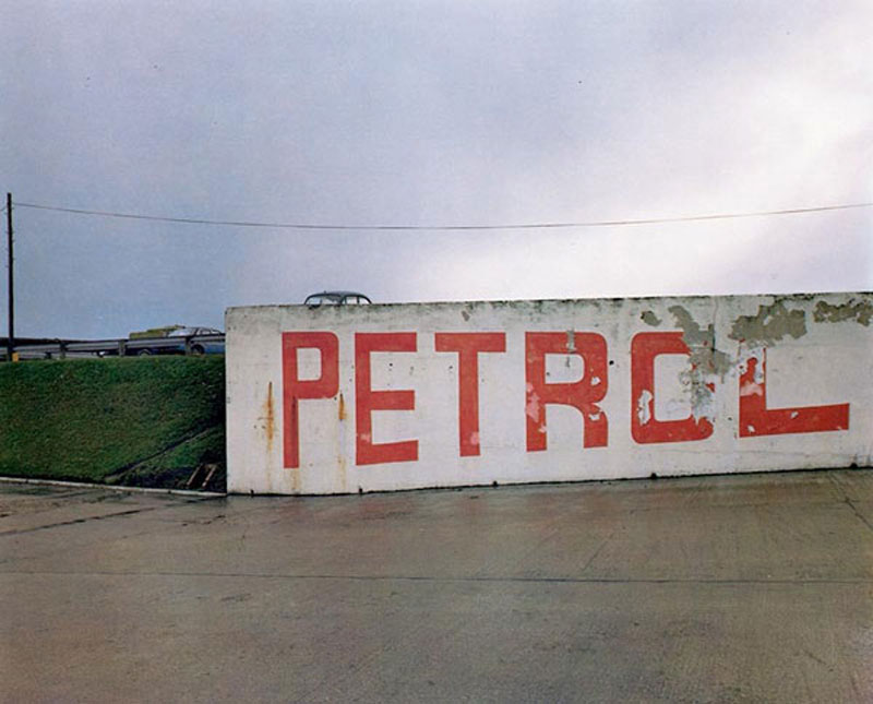
Paul Graham is an English born, self taught documentary photographer whose work has won various awards including the likes of the Deutsche Börse Photography Prize as well as the Hasselblad Award. Graham is a very prolific artist with many published works and exhibitions. As stated before he is a documentary photographer and as such most of his work features small aperture to capture a lot of detail in the scene. I like the flat tones he uses juxtaposed with strong colors, often sticking to two or three main colors as to not over saturate the image.

The image appears to use a high F stop due to the wide range of detail captured. The photo’s look as though they were taken using a Digital SLR with a low ISO due to the abundant natural lighting in the scene (using a higher ISO would leave the image overexposed) as well as the lack of noise in the image despite the age of the camera considering this work was published back in 1983. There is some slight color noise in the darkest areas of the photograph however this is likely due to the age/ quality of the sensor. There is a strong tonal contrast image between the lights and darks however the highlights aren’t too overpowering. The vibrancy of the colors despite such a flat scene suggests the use of a slow shutter in conjunction with a tripod due to the lack of any motion blur.

The image features two strong key colors, that being the orange of the paint as well as the bright green on the grass/ trees in the area accompanied by some more subtle blue tones. There as some light purple tones visible in the darker areas of the image. The image uses the Fibonacci curve as to draw attention to the writing on the wall. The images composition features very strong lines separating layers of the foreground and the background. There is a strong sense of texture created in the image by the rough surface of the concrete as well as the detail in the grass/ trees. The roofs of the houses almost create the effect of a repeating pattern.

Image result for paul graham photography