Photo-shoot Mood-boards:

I have created a mood-board for each of the ideas/concepts I have developed for the “Journeys & Pathways” project. Along with the inspiration I have taken from my artist research, I also took inspiration from examples of similar concepts and ideas online, and have developed a mood-board based on these findings, which will help with my inspiration for the different ideas:
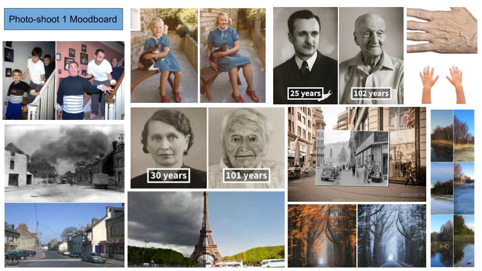

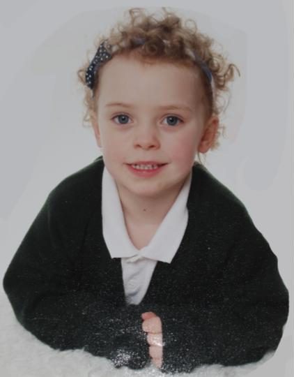
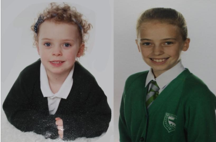
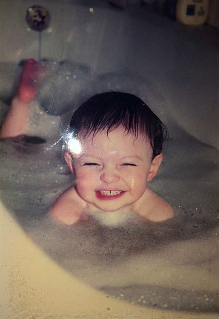
My first photo-shoot involves recreating vintage/archival/past images using the same subjects and the same environment, in order to show the differences and similarities between the 2 times, showing the development of the subject and how their journey through life effected their looks, attitude and the environment around them. I have taken inspiration from other photographers who have recreated vintage images, as well as images that show objects and monuments at different times, displaying the differences and similarities depending on the environment.
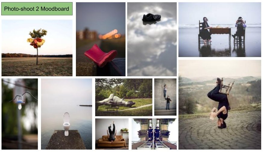
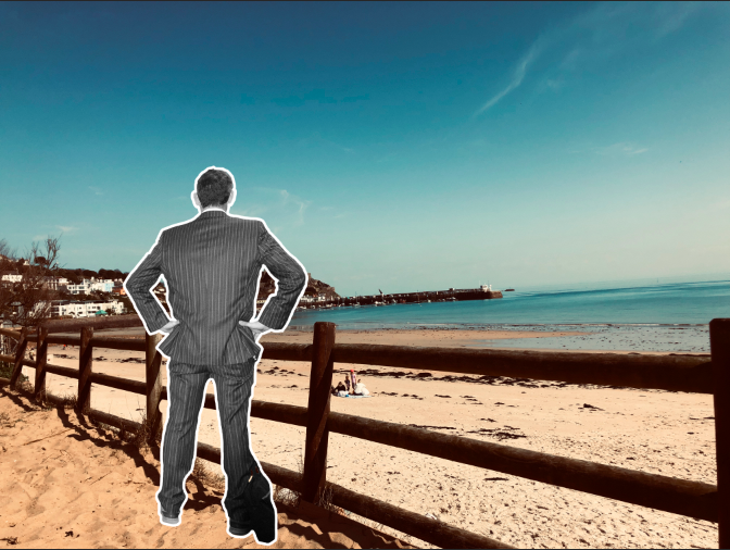
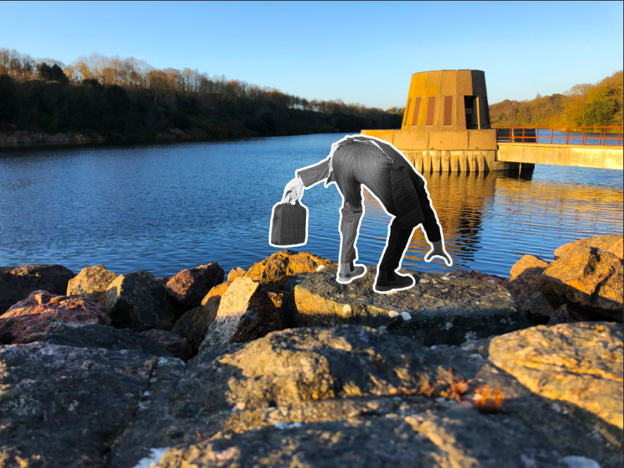
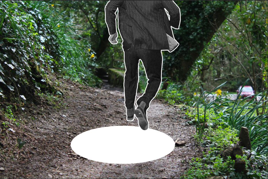
My second photo-shoot involves placing subjects in an opposing or incorrect context or environment, to create a contrast between the subject and the background, showing that the subject is on the incorrect or a countering path to one they should be on. In order to make this mood-board, I took inspiration from images that depict subjects in odd places, where they do not belong. I also researched into images using human subjects, where the people have been placed in the incorrect settings so that their involvement in the image does not make sense to the viewer, and rather creates an element of confusion and mystery.
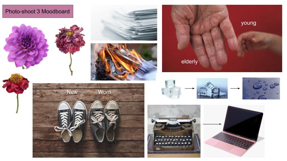
My third photo-shoot revolves around showing the decay of objects through their lives, and documenting the different stages of this process. I have taken inspiration from a variety of objects (household objects, flowers, people) in order to provide myself with the chance to work with multiple objects.

CAROLLE BENITAH

Carolle's work is described as "a subjective interpretation of childhood memories and a refashioning of image and identity".

Carolle often describes her feeling of isolation and alienation when she looks through family photos of her from when she was a child. Benitah began her career as a fashion designer and set out to amend and rework her childhood photos with methods such as cutting, sticking, sewing, collaging. Her extreme minute details that she incorporates displays an almost re-connection and de-connection the the photographic archive to her childhood. Carolle embellishes and embroids her work with thread that is either red, black or gold; also adding beads.
Benitah describes that "The precise and slow process is a metaphor for remaking myself and for the passage of time". She further on explains that "The red thread is a connecting thread, leading me through the maze of my past". Benitah uses the red through her childhood photos. "It's the colour of violent emotions, of blood, and of sexuality."
Benitah uses the black thread for the photos of her in her adolescence. "Adolescence is represented by black for the anguish associated with this period of my life.
The colour gold is used for the photographs of herself during her adulthood. She describes how the colour gold is "the colour of affective ties, of fidelity and of dis-incarnation".

Benitah describes her work as an exorcism, as she explores how the memories of her childhood aids her in understanding the woman she has become. She also believes that the past is never permanent but its constantly being evolved and constructed by the present.

Kristen Lewis Analysis, Contact Sheet and Editing

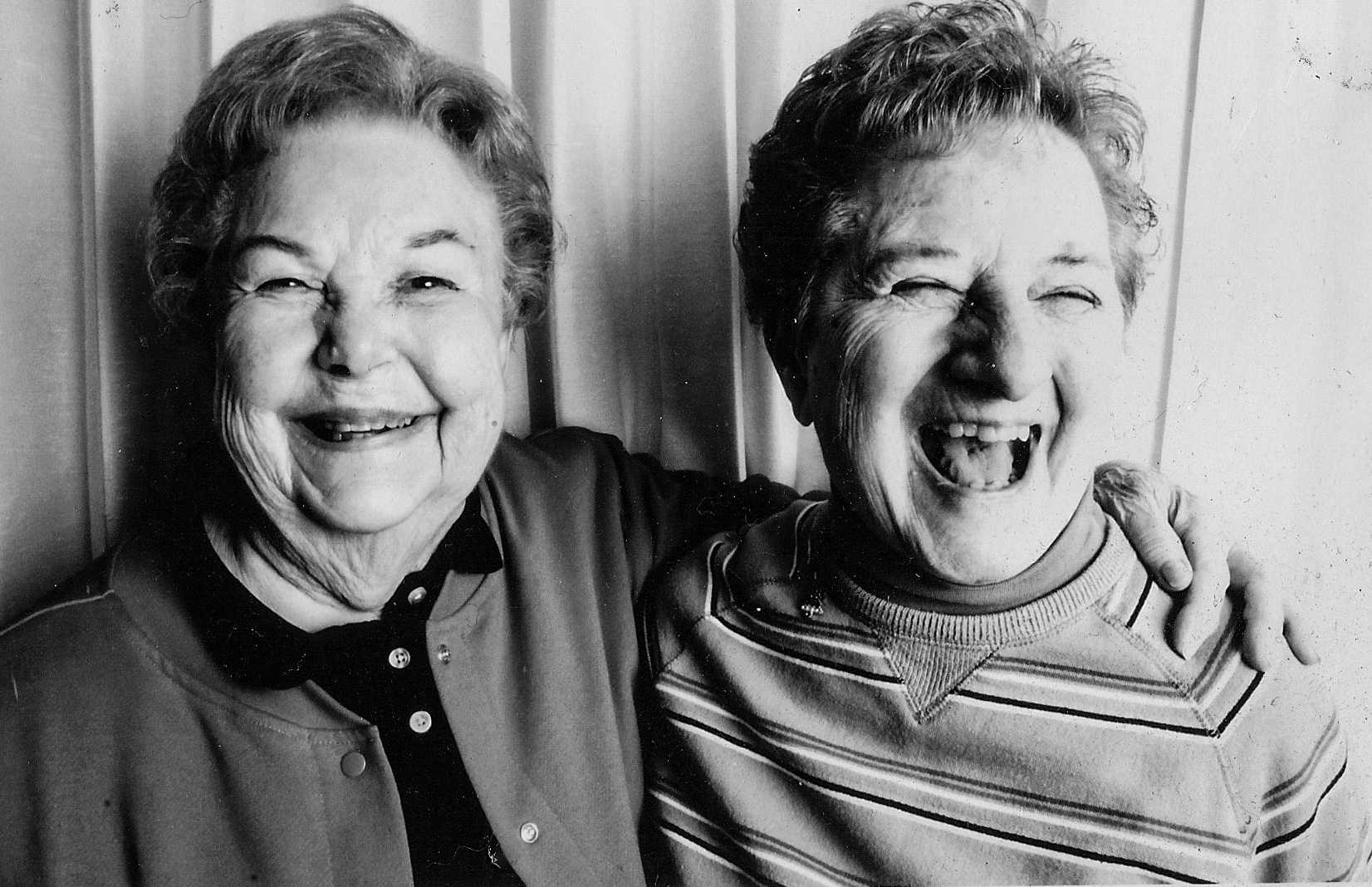
Image result for kirsten lewis photography

Lighting: I think this image has artificial lighting because the subjects are indoors. The light is probably coming from the side be cause part of the subjects’s faces are in shadow. There’s a lot of contrast in the image because the tones go from their illuminated faces to dark shadows with out much in between.

Visual: There’s an almost symmetrical look to the image. This is because of the lines in the background and how the subjects in the foreground look similar and take up the same proportion of the image.

Conceptual/ Contextual info: The subjects in this image are of the photographer’s grandma and the grandma’s best friend. At the time the image was taken the two subjects had been friends for 70 years. The photographer said, ” They have taught me that friendships and love are what keep you youthful and happy and they are 2 of the most important things in life”.

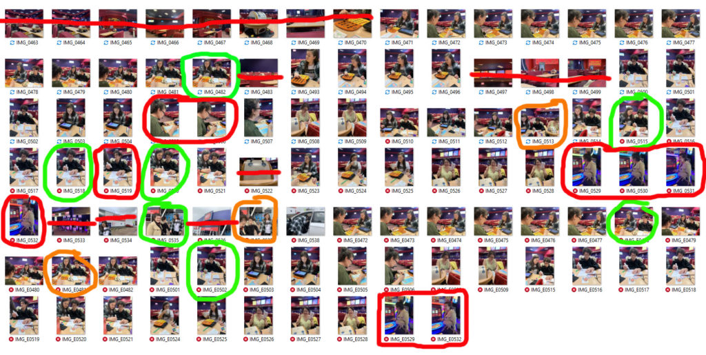
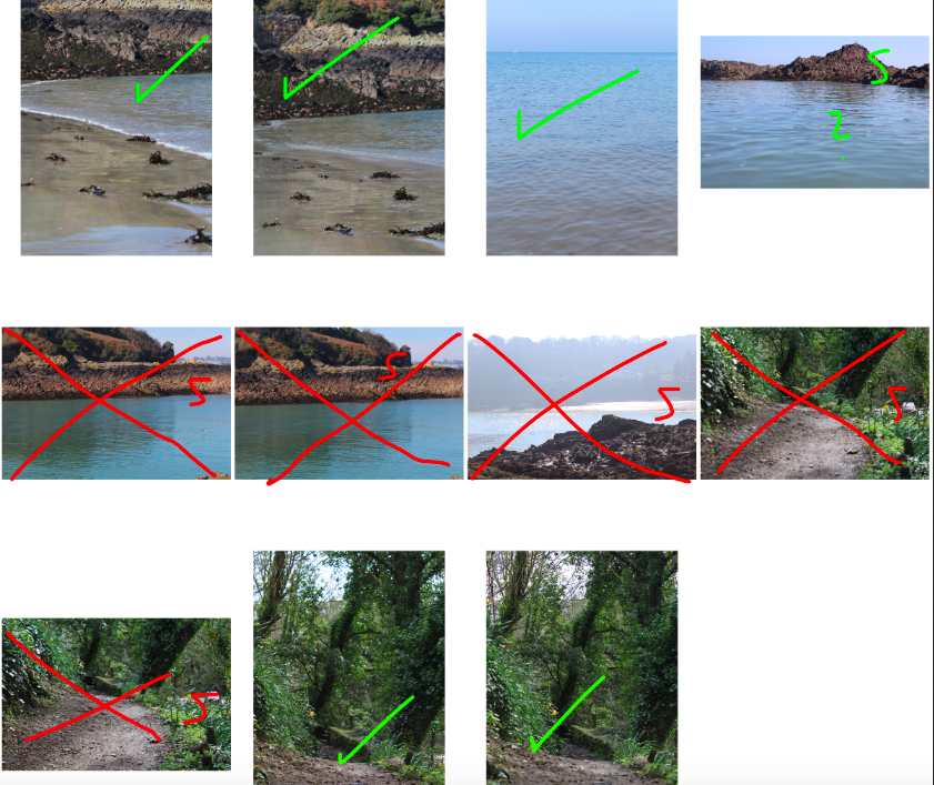
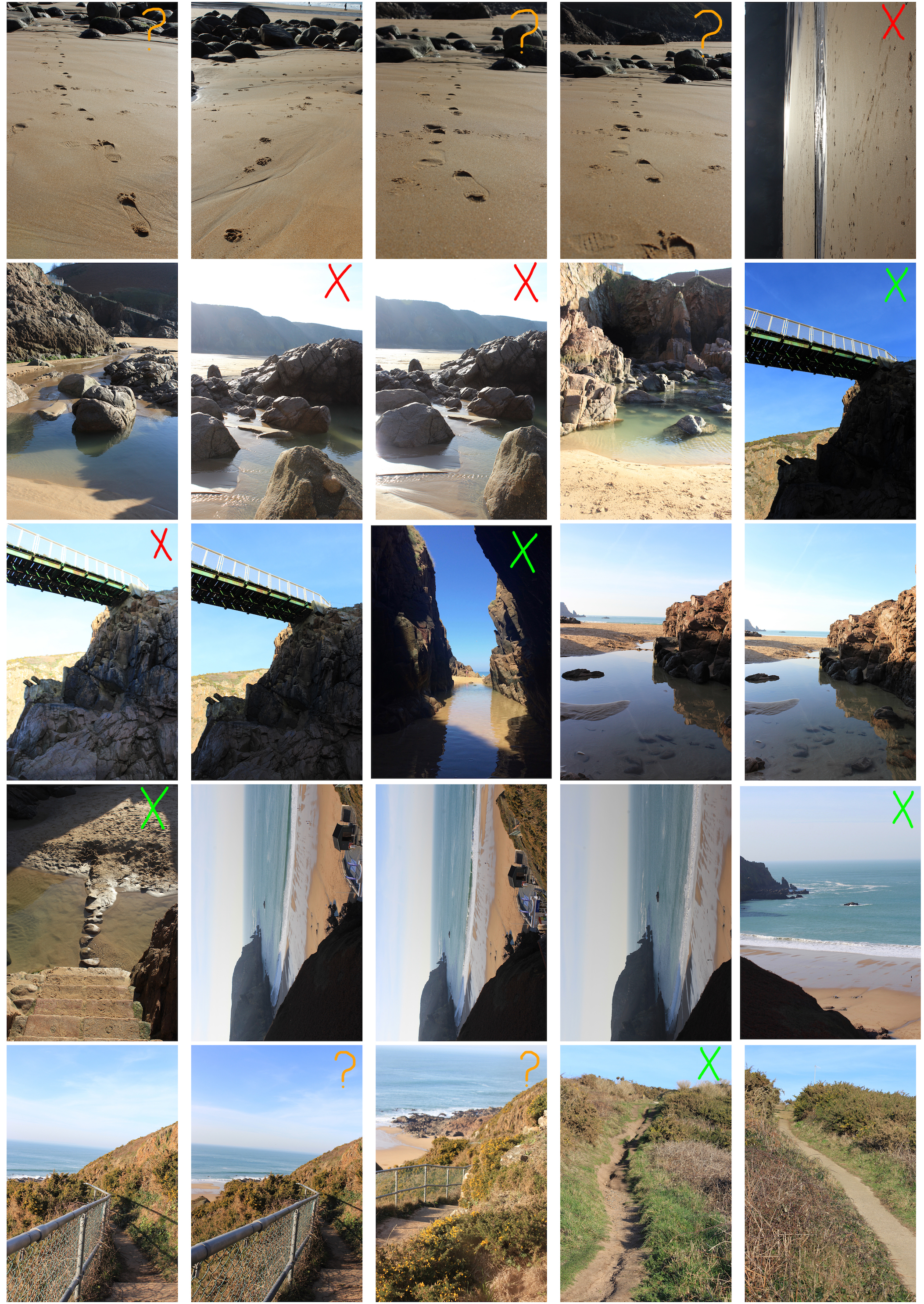
I like the images in green. To me they represent the same idea that Lewis’ goes for in terms of a day in the life. Some of them also show the generational journey in the way it shows different generations and the difference between them. The ones in red I don’t really like. The first one is blurry and the three in a row is too staged.
In terms of journey these images are important to me because Bingo is my Grandma’s only hobby and she’s been going to that specific Bingo Hall for decades. Back then instead of a massive empty room with hundred playing online, you couldn’t get a seat sometimes. She used to go with her brother but stopped after he died. My Aunt has recently been taking her back to the Bingo after my Grandfather died. What’s also important about these images is how you have three generations in them and you can see the difference between the generations. My Grandma is playing bingo by stamping with a marker like she always has however my Cousin is playing it on an ipad. I like the ones in green because they have good framing and they show what I want to be shown. The ones in red are either blurry or too staged.

Reflection on My Edits

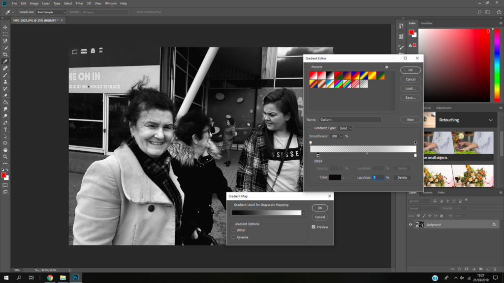
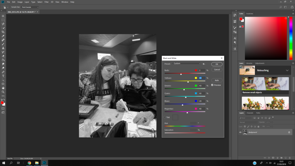
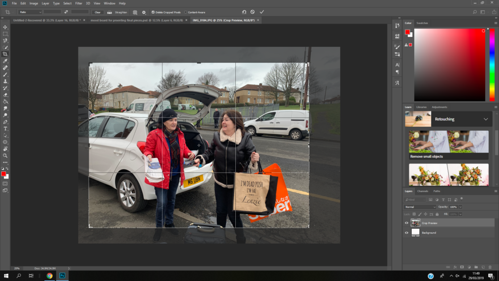
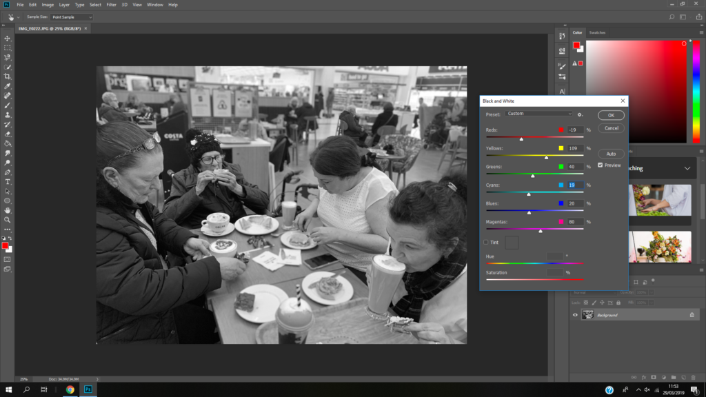
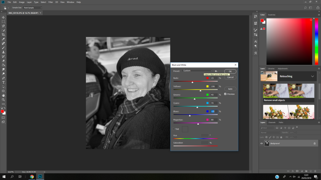
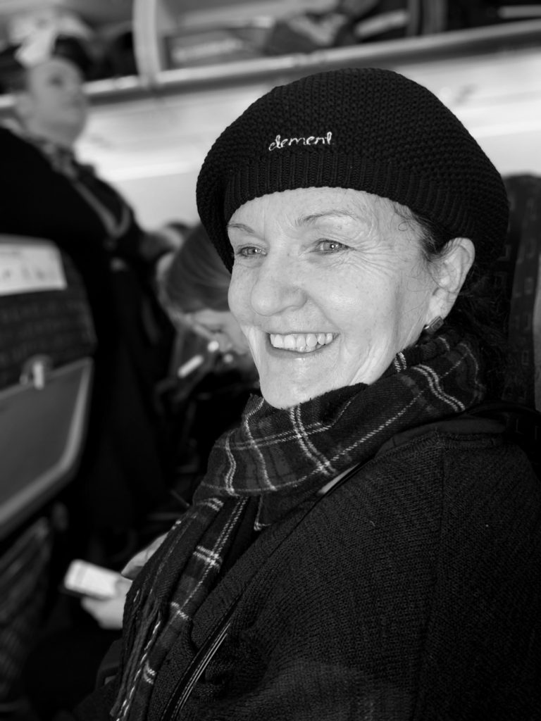
I think my images reflect the photographer’s style. I have taken picture of a family’s journey through a day. I’ve documented events that happened through the day just like the photographer. I made them white because then I could make them sharping by creating contrast and because the photographer edits her images to be black and white a lot of the time. I like my use of depth of field when taking the images because the subjects stand out and there’s a softness to the images.

Response to Luke Fowler

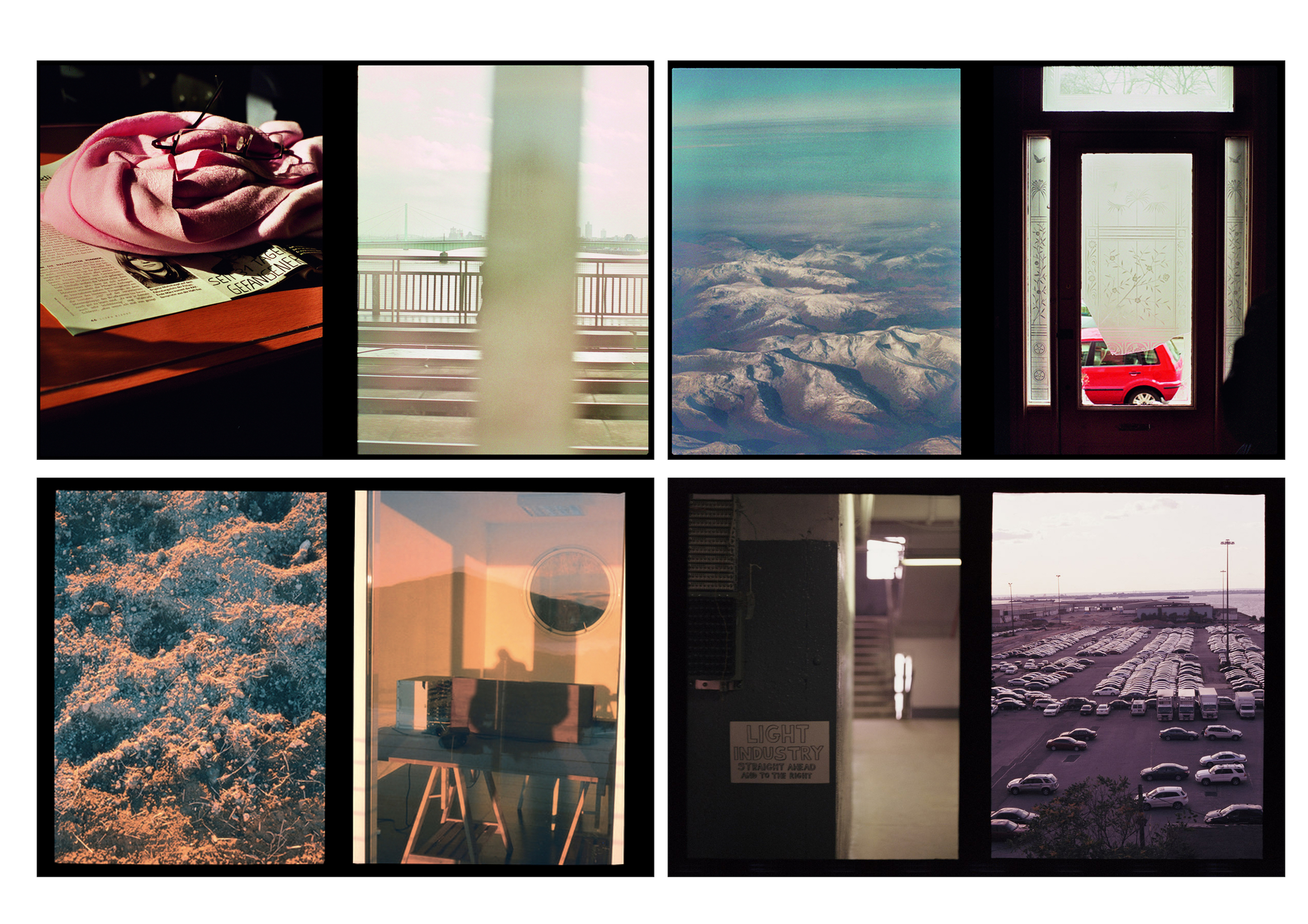
To respond to Luke Fowler’s photography work, I have exposed two images on one frame. I have them side by side to explore the relationship between two juxtaposed images. The images that I paired will seem unrelated in terms of subject and viewpoint, but there is a link that connects them together. I also included a black frame that surrounds the two images to replicate his two-frame films. Like Luke Fowler, I wanted to create a story between two still images so viewers can explore the visual dialogue between them. 

I went to Plémont Beach to capture images that link to my theme journeys and pathways. Once I had taken several images on my camera, I downloaded them onto my phone so I could edit them with VSCO. I used this editing app to create a film effect on my images to replicate Luke Fowler’s photography style. I did this by altering the exposure, contrast, saturation and grain as well as applying the same filter to each pair. Once all the images had been edited, I joined the pairs on Photoshop with a black background which created a frame around the images.

Contact Sheet
My Response

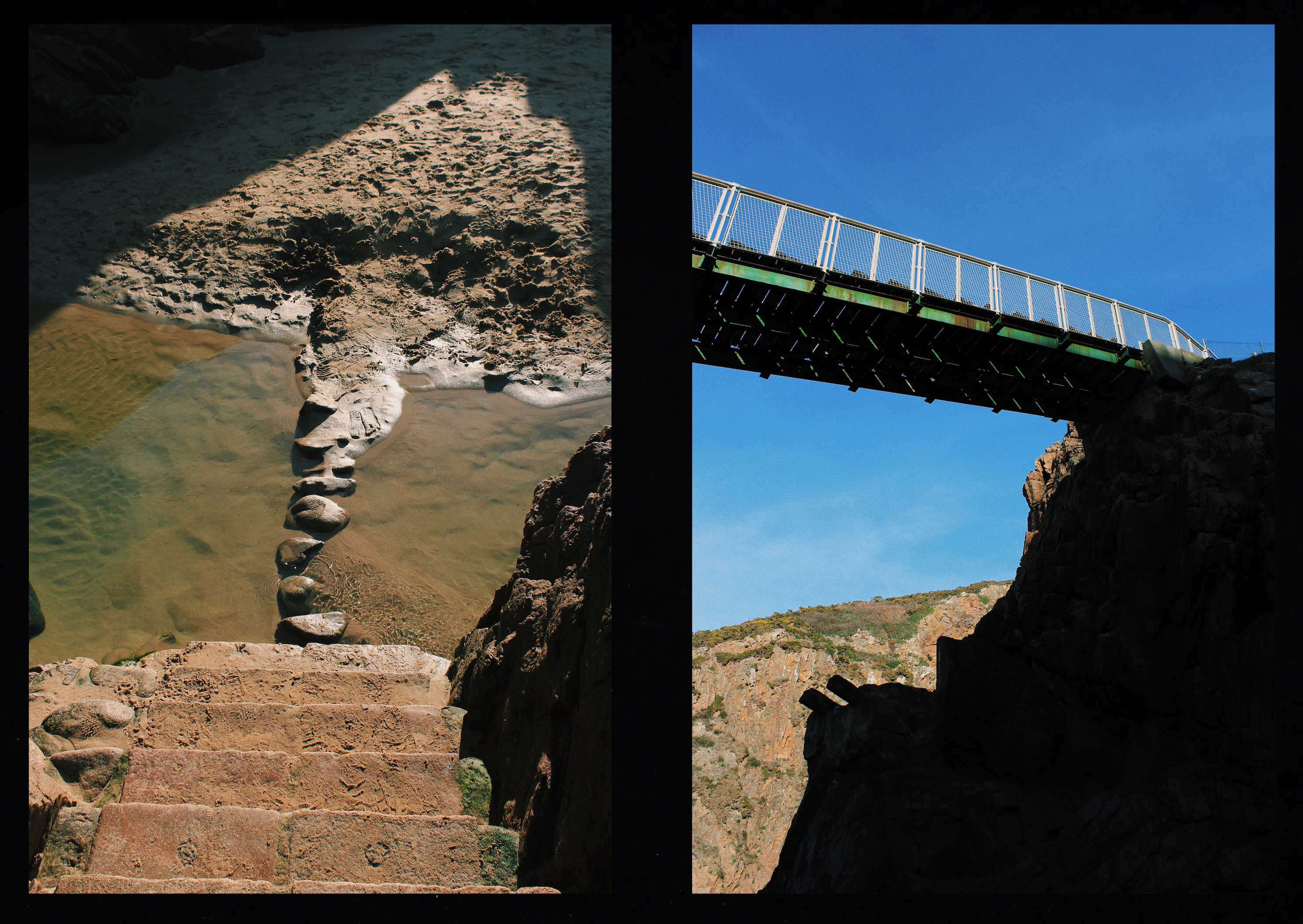
This pair shows juxtaposition through calm vs dramatic. The image to the left depicts a calm scenery since the cave at low tide has a pool of still water. A cave is an enclosed area and creates a sense of security. However, the image to the right shows a view facing outwards towards the sea where you can see the dramatic waves crashing against the coastline.

These two images depict a bridge. However, the bridge on the left is natural since it has been made by cobbles whereas the bridge on the right is man made and resistant. The image on the left captured the bridge from above making it seems small and insignificant unlike the bridge on the right which has been captured facing upwards, emphasising the fact that it is more powerful.

This pair of images show the difference between natural and manmade pathways. The pathway on the left has been formed by people damaging the vegetation so water can erode the soil and create a rough footpath. The pathway on the right image has been constructed by man. They link together since they are both pathways but created in different ways. Both pathways are steep, heading upwards in the same direction and have been captured in a similar composition.

Luke Fowler

Luke Fowler is an artist and filmmaker, based in Glasgow. In 2016, he documented his artistic residency in Bamburg, Germany. Fowler created the double images by using a half camera frame, exposing two images in one frame. After developing the first roll, he was amazed by the resulting diptychs. This was the start of his new project, resulting in his book Two-Frame Films. The book addresses the fine line between photography and film.

In the book Fowler discusses how ‘the blink of any eye’ has a different meaning to us humans than it does with the camera. When we blink we are blind to the world in that instant. However, a camera takes in everything in that one blink when we press the button. Since we are blind in the instant when the photographic image captures everything, these images are a false representation of life. By printing two images side by side, he aims to emphasise the momentary nature of photography.

Sometimes it’s clear that two images are made in quick succession. Other pairs seem unrelated, possibly having been taken some time apart and in different locations. In other cases, although the two images seem unrelated in terms of subject, location and viewpoint, a poetic link creates a connection. This could be related to a particular quality of light, a compositional link, a colour or related atmosphere.

Quote

The way in which he combines the images in Two-Frame Films shows that Fowler is first and foremost a filmmaker, creating a narrative of, and an interaction between, multiple images. These new narratives created by the diptychs, question photography’s reliability as a way of documenting ‘real’ life in a single, still frame. He shows us how we can create a story, or tell our own story, through combining the chance fragments as exposed by photographs.
​- From the GUP website

Image Analysis

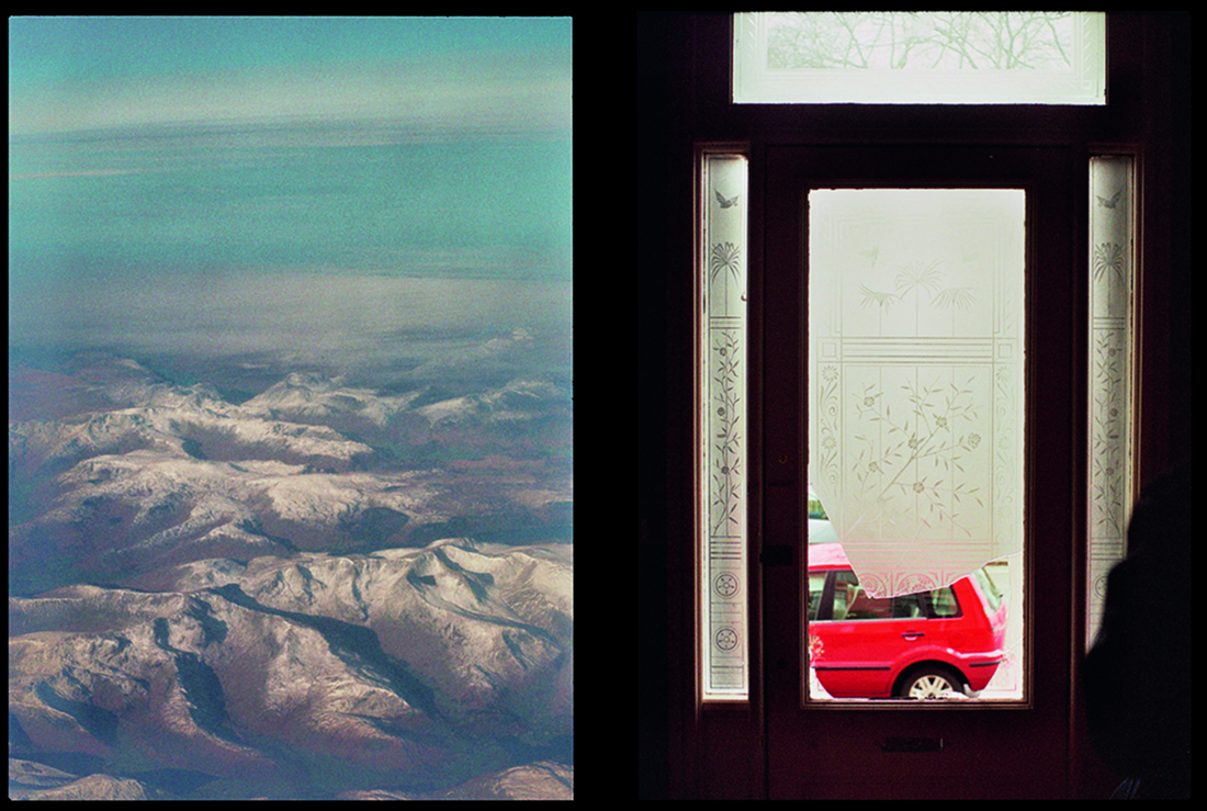
This image consists of two pictures with a black frame that surrounds them. The left image has been taken from a high level since it looks down upon the mountainous vast land. The right image has been taken inside a house. You can see that the front door has been broken since a part of the glass is missing which reveals a vivid red car on the other side. There is a connection between these two images. The right image represents being trapped indoors and seeking to go out on a road trip adventure since the broken glass reveals the desire to be outside. The left image depicts the outside world from above and shows the vast area of mountains which emphasises the amount of land there is to see and explore. Luke Fowler’s work explores the relationship between two juxtaposed images to affect the ways in which a viewer engages with the work. The diptych of the two still images enables us to explore the visual dialogue between them.

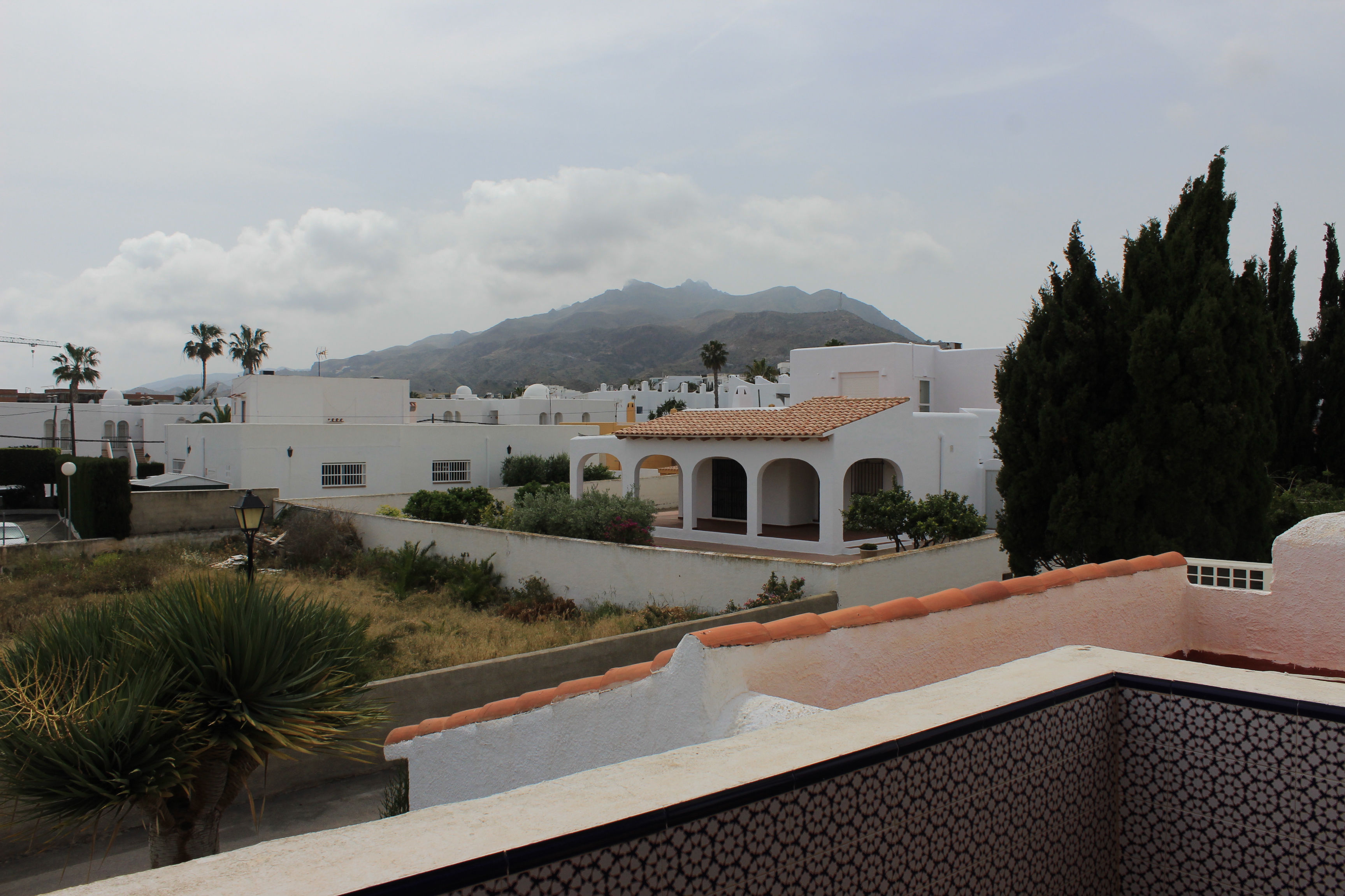
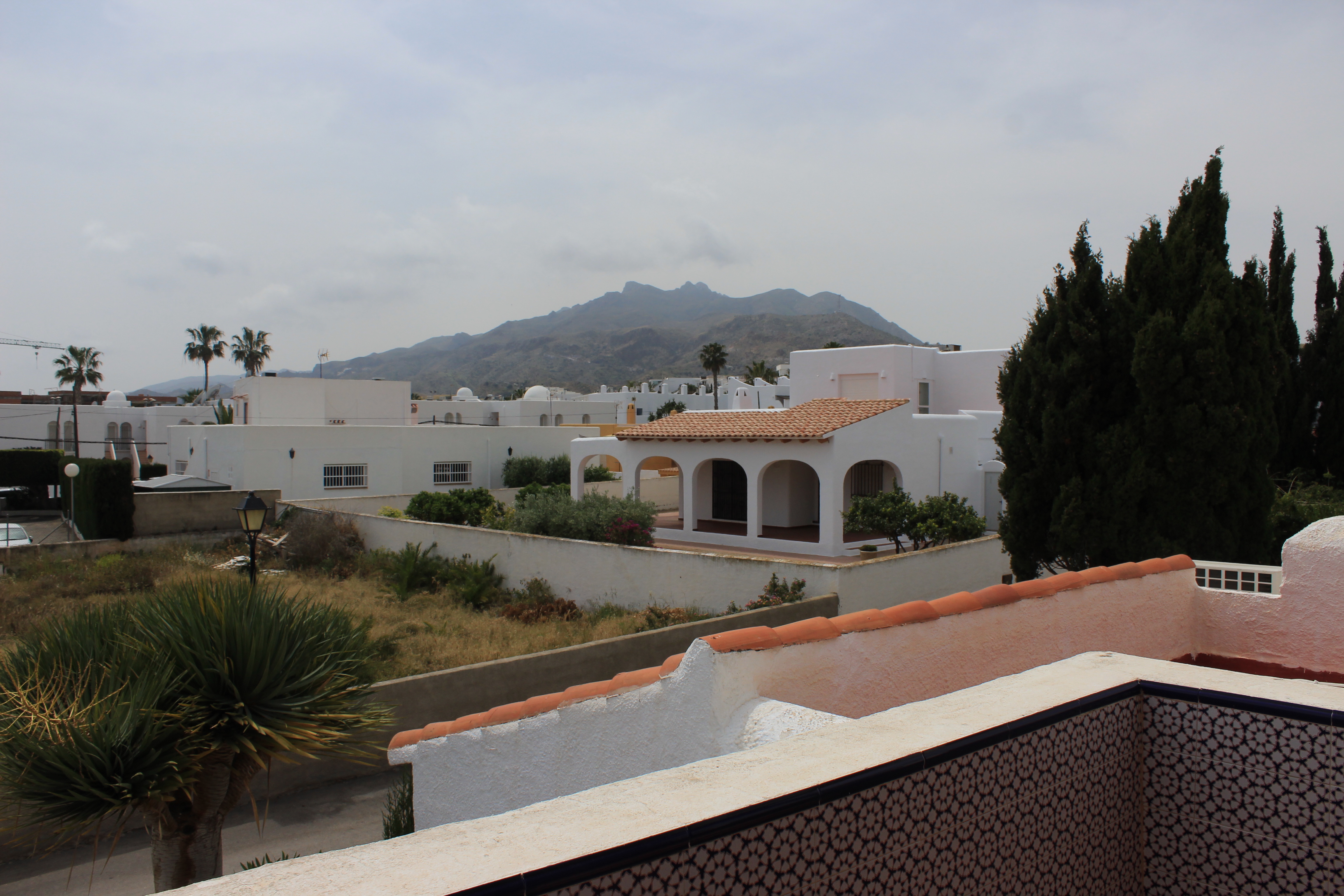
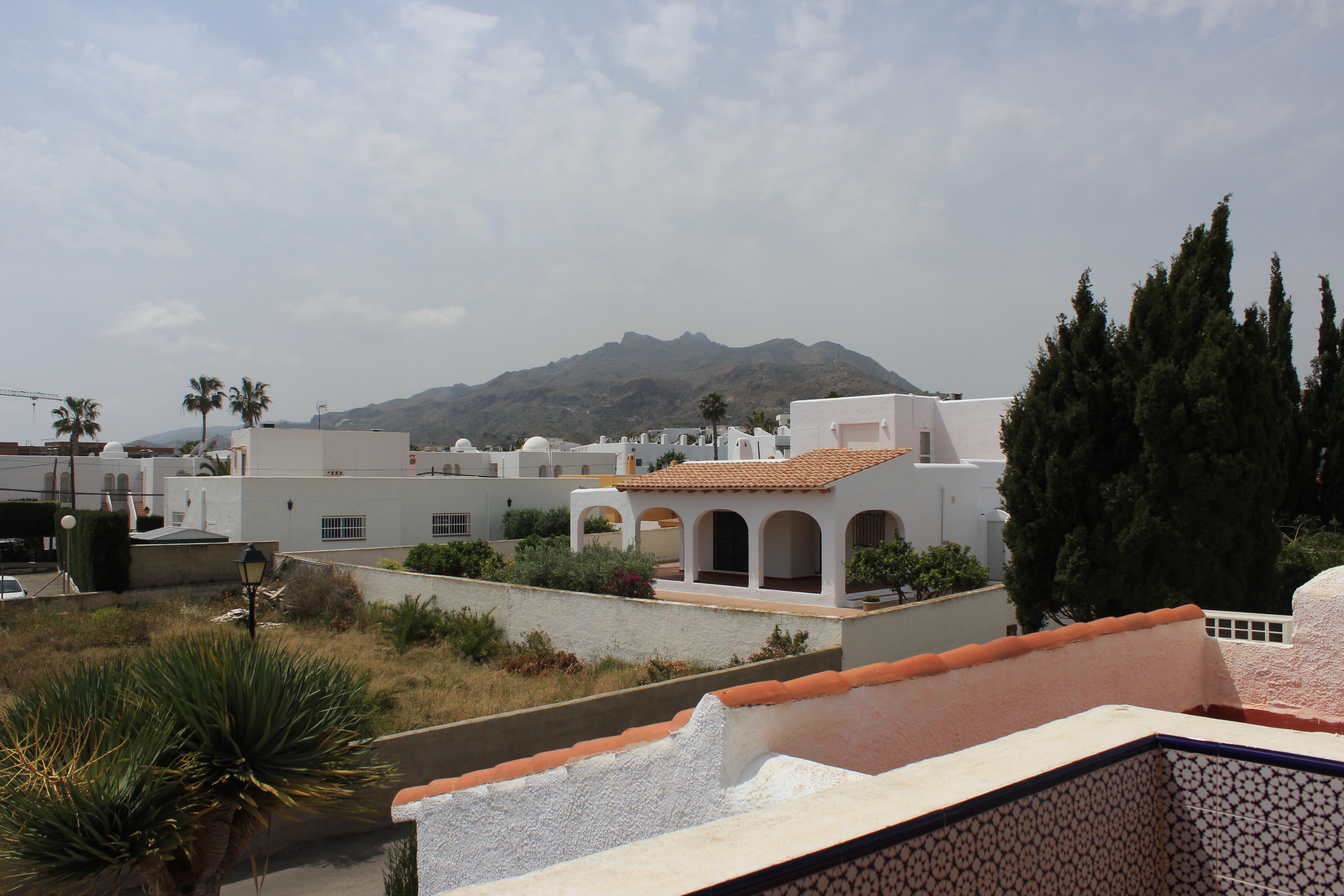
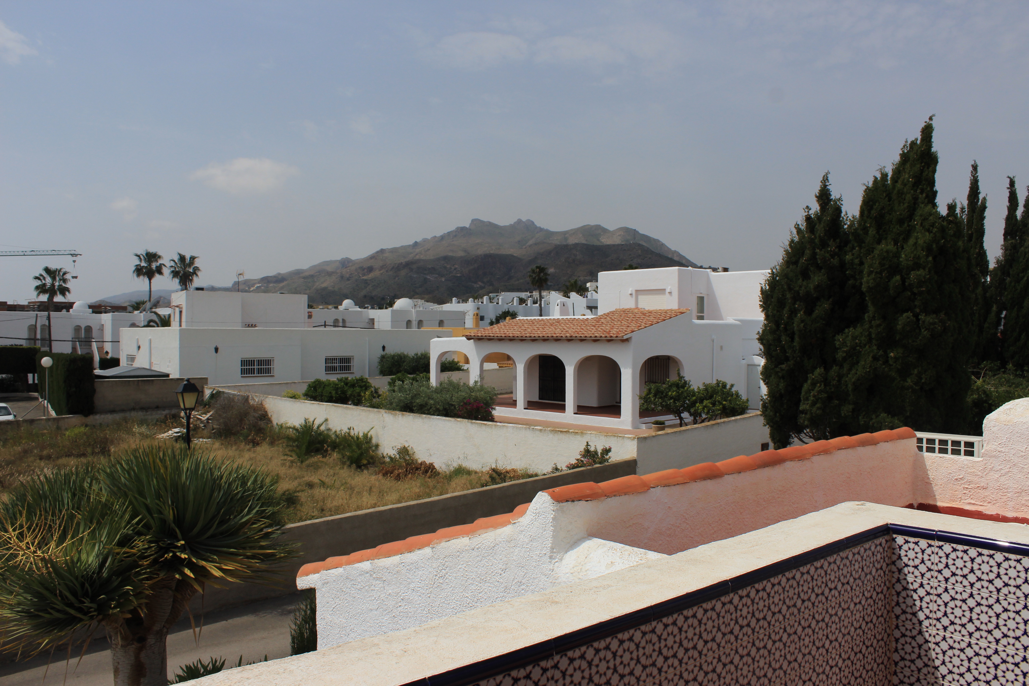
Times of the day: Photoshoot 2

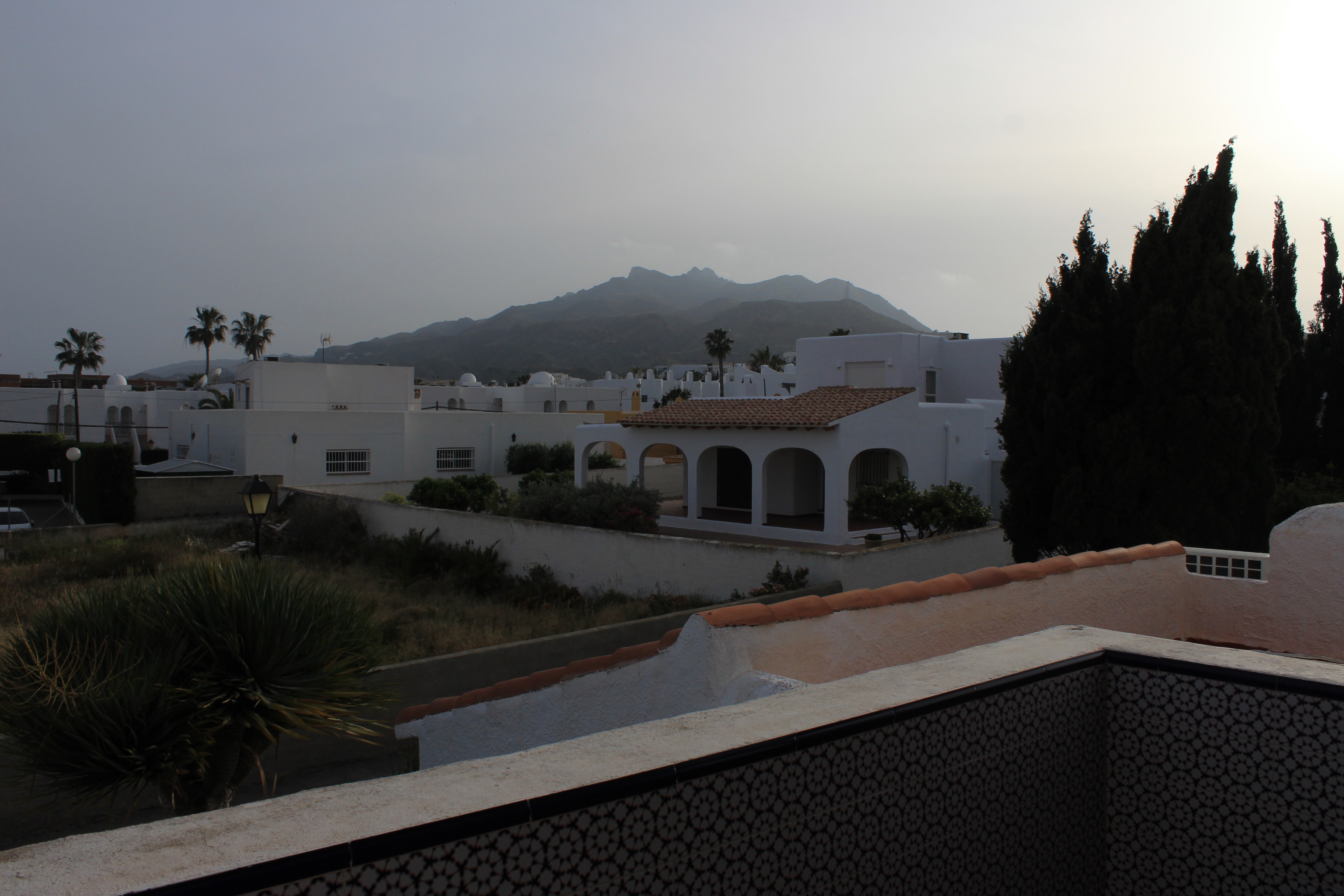
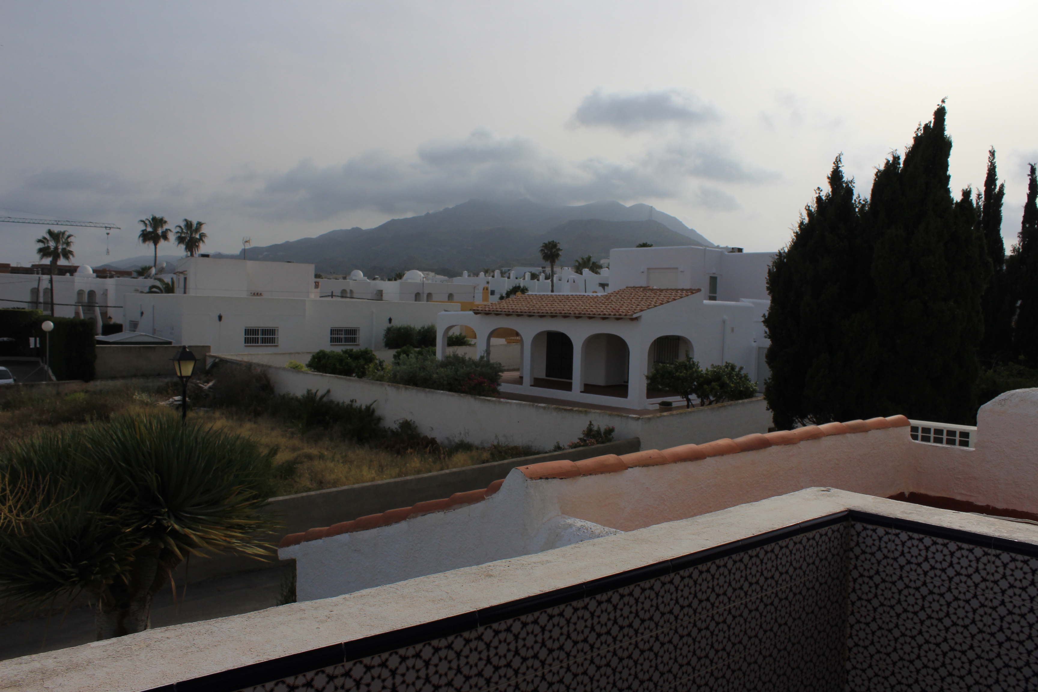
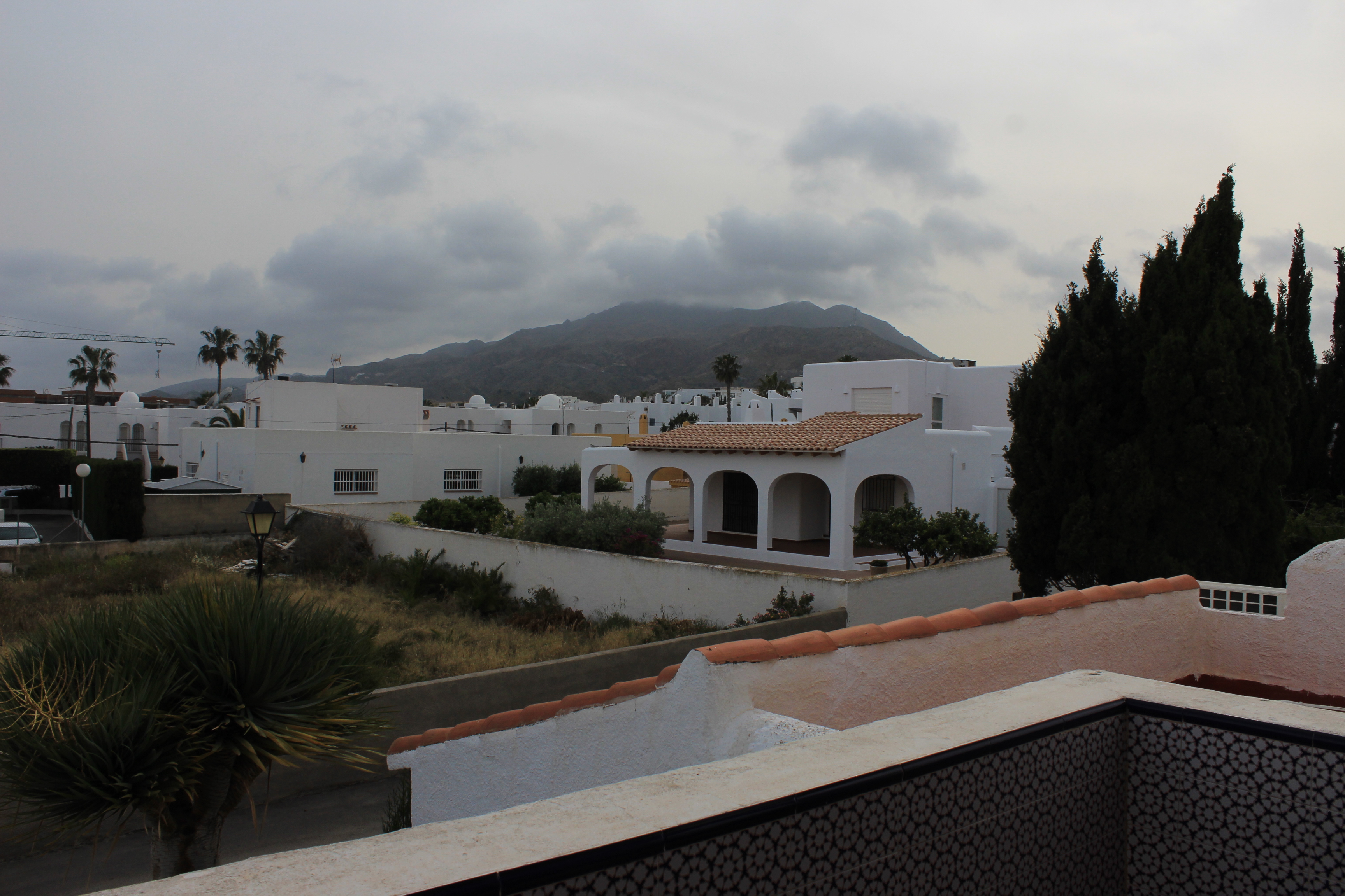
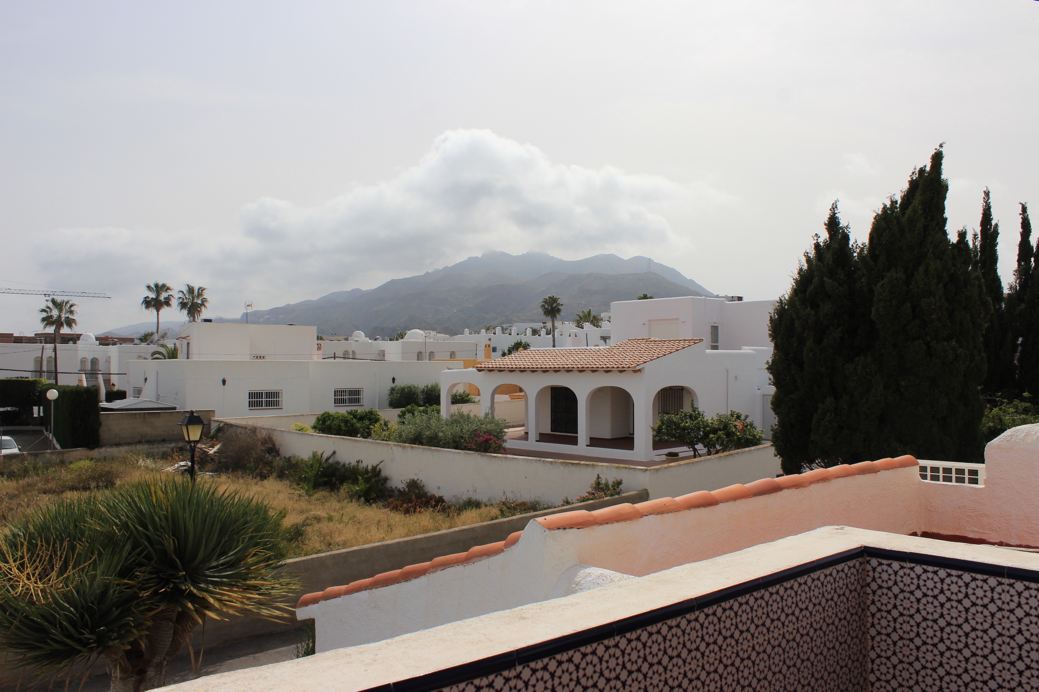
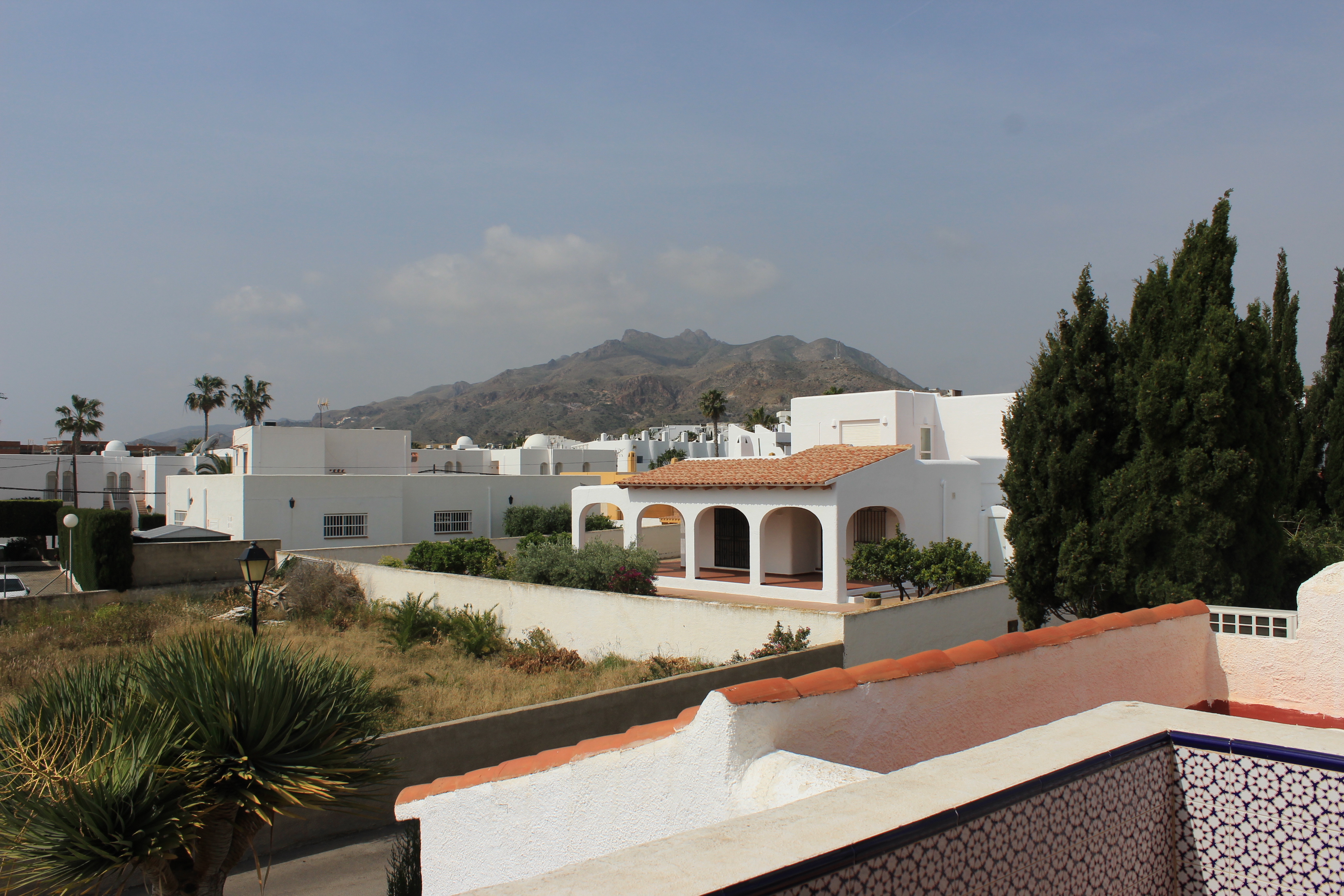
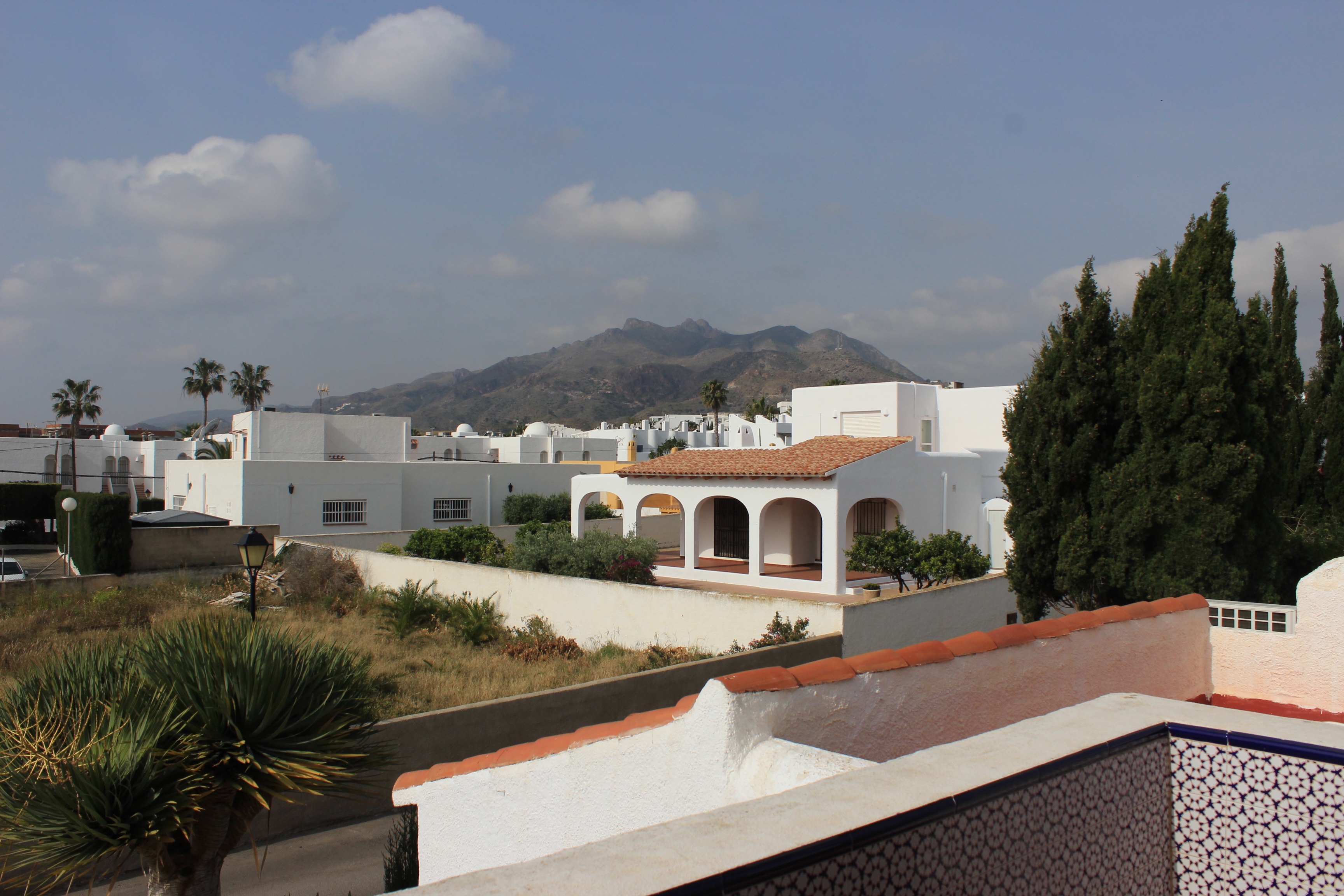
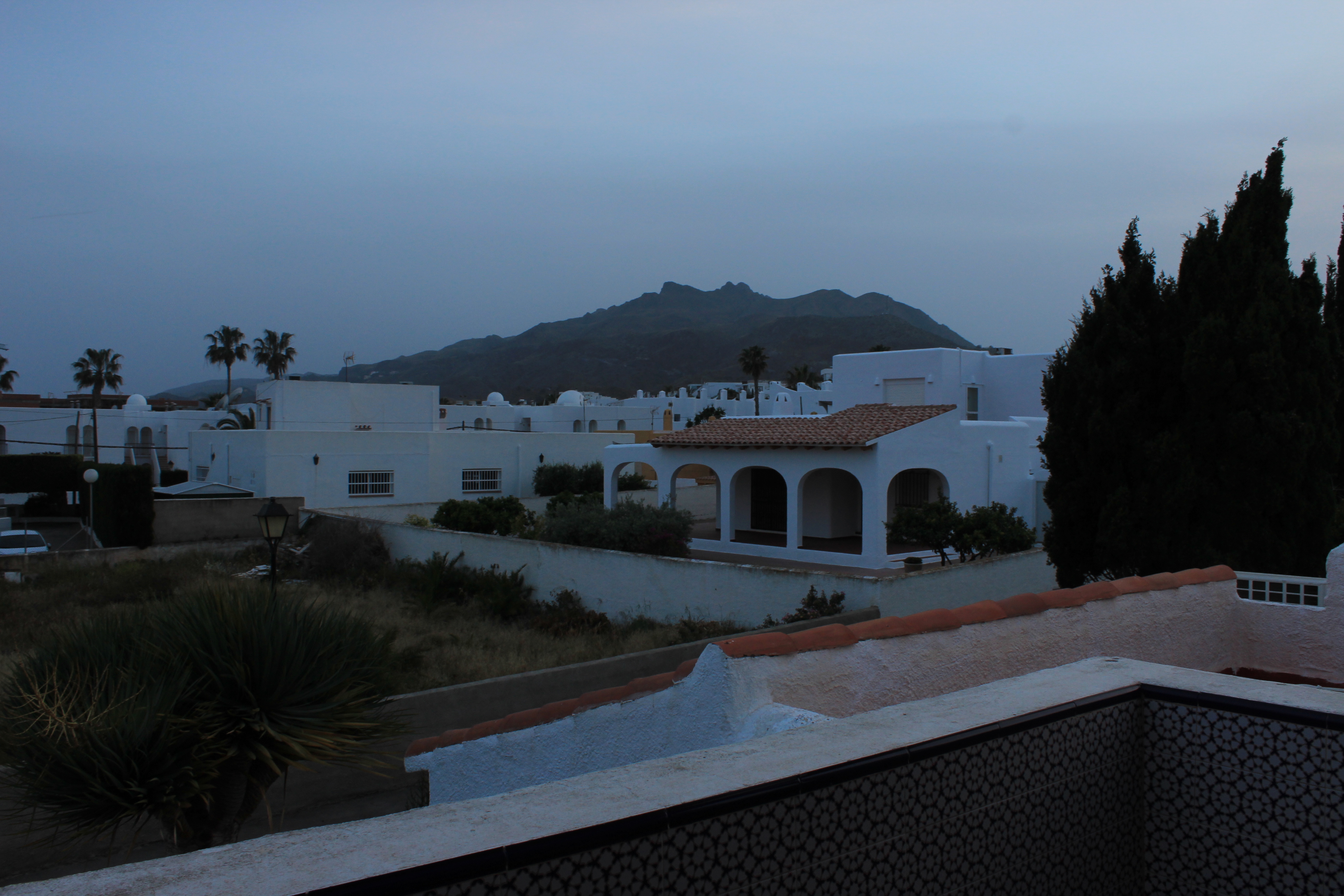
I decided to do another photo shoot where I capture pictures every hour, throughout the day, in the same location. I took pictures from a balcony in a villa adjacent to the beach. From this location I was able to obtain a clear view overlooking the mountains located behind the village of Mojacar. Before I began the photo shoot, I had to choose a position on the balcony so I knew where I would need take pictures from every hour. This allowed me to maintain the same view of the landscape throughout the photo shoot.

10:30am
11:30 am
12:30 pm
1:30 pm
2:30 pm
3:30 pm
4:30 pm
5:30 pm
6:30 pm
7:30 pm
8:30 pm

Photo-shoot 2: Planning

For my second photo-shoot for the Journeys and Pathways project, I will be focusing on the idea of representing the concept of being on the wrong path or journey, emphasizing the contrast between the subject and the location they are found in (showing that they are on the wrong path in a more literal sense).

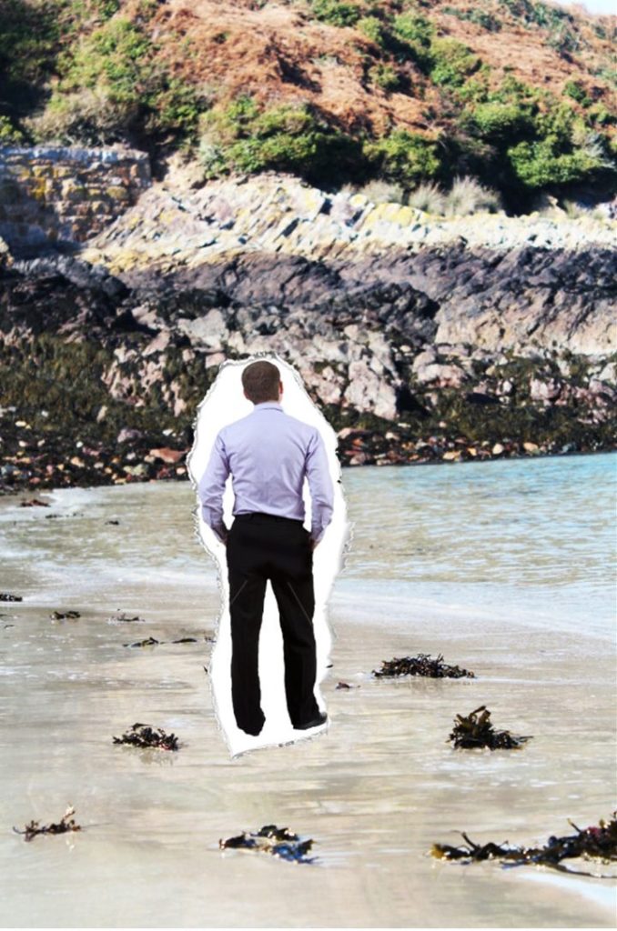
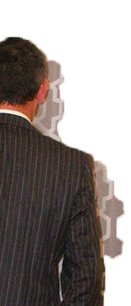
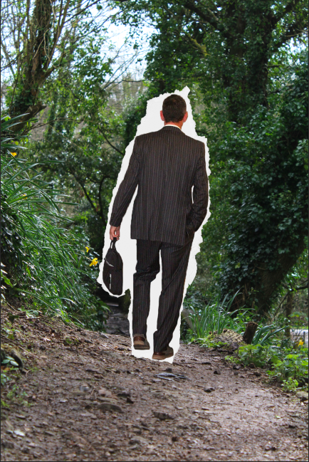
In order to follow the theme of a subject being on the wrong path, I will be taking landscape images of different landscapes and environmental situations, and will be editing images of subjects (representing different professions and lifestyles through clothing) into these images, as if they have been torn from their original path and stuck in an out of context, contextually inaccurate environment. I will be using a photo-montage style of editing in order to achieve this, and the final images will look similar to the below image;

Image of subject: https://www.istockphoto.com/th/photos/one-man-only

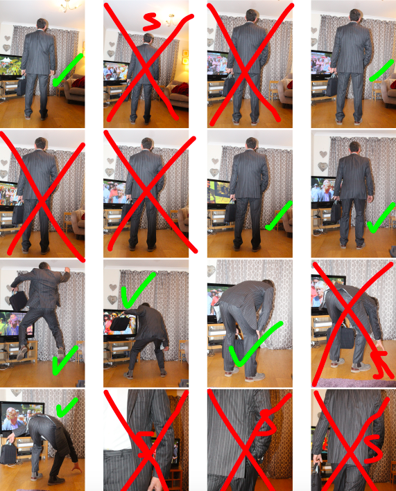
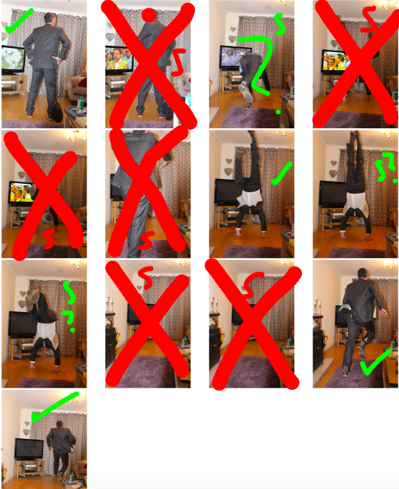
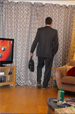
My first set of images includes all of the images that will be used as the subjects of the final images. These images are taken before the editing process, which will remove the background of the subjects, and will insert them into the correct environment image:

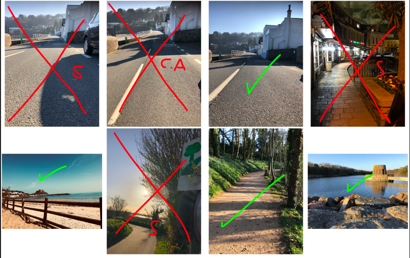
This photo-shoot will involve multiple locations and multiple representations of subject careers and backgrounds. For my first set of images, I compiled images to be used as the backgrounds. The following contact sheet contains all background images:

Photo-shoot 2: Editing

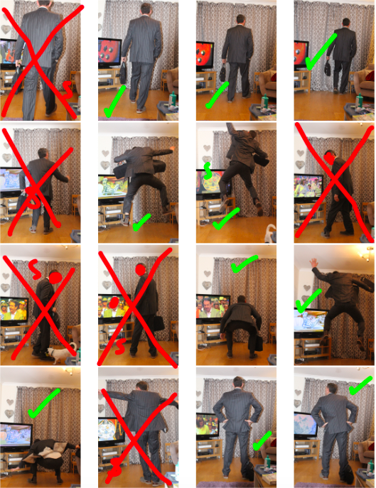
My second photo-shoot includes more heavy editing, as it involves merging 2 separate images so that the subject looks to be making their way through the scene. This photo-shoot is based around the fact that the subject is on the incorrect path, and has been placed in a scene that doesn’t match the context of what the subject represents (an office worker).

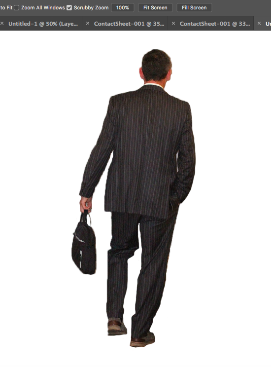
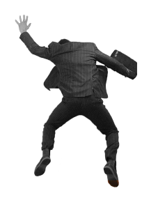
In order to do this, I used Photoshop to cut the subject from the background, in order to separate the body so that it can be edited onto the background:

After the subject was separated from the original background (using the quick selection tool) I used the eraser tool to tidy the boarders:

I then changed the colour gradient of the subject to greyscale, as I felt that by doing so, I could emphasise the separation and contrast between the background and the subject, and I would also be able to show the contrast between nature (the background) and the mundane reality of working life (represented by the subject), as the use of black and white coloring shows the negative effects that a repetitive modern job (such as working in an office) can have on an individual:

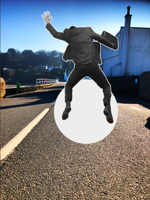
I then edited the subject onto the final background, which I chose from a selection of images I took of settings that did not seem to match the attire of the subject (e.g forests, beaches):

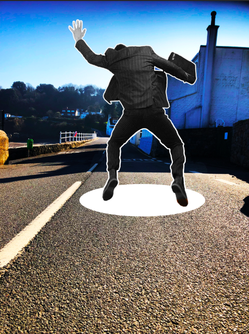
Final edits included either adding paper tears around the subject (as If they have been torn from their original journey/path and placed in a different one) or the addition of a “hole” through the scene, as if the subject is falling through the wrong scene while on their journey.

here is an example in which I used a torn paper effect, as if the subject has been removed from his original path and placed on a random/incorrect one.

This was the process for all of the images, until I produced all of the final images.

Photo-shoot 1: Editing

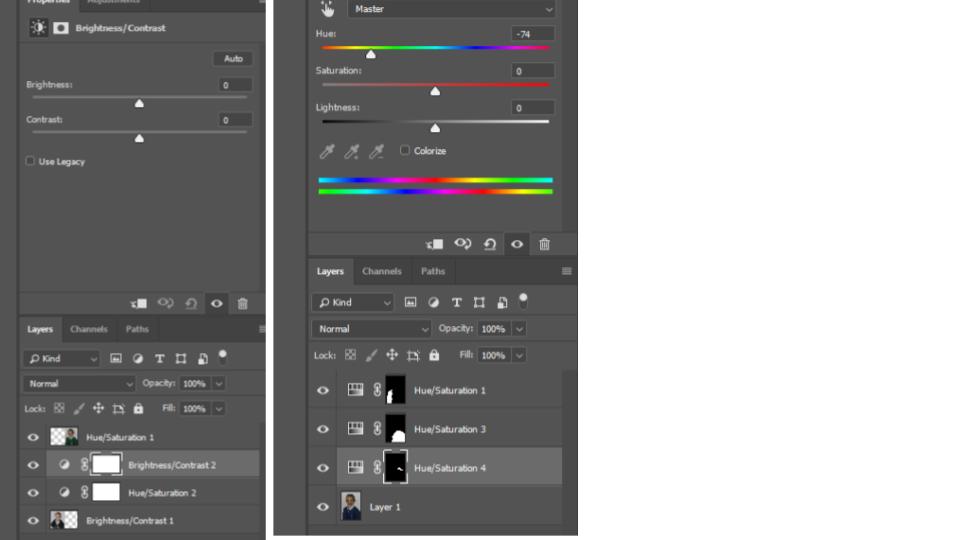
During the editing process for my final images, I made use of Photoshop in order to edit the saturation and colour of the images (which was the main point of focus). I did this in order to match the style of image with the original images, in order to create more points to compare the 2 images. This often requires raising the saturation and lowering the brightness, to give the effect that the new image was old.

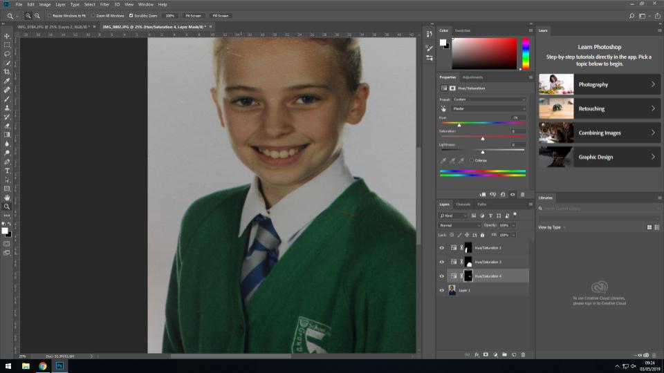
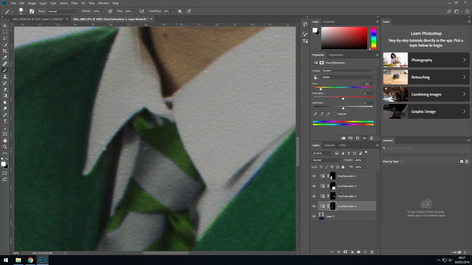
In order to make the new image more similar to the original (and therefore provide more continuity) I edited the newer image so that the jumper of the subject was a similar colour to the jumper of the same subject in the original image. I did this by using the quick select tool to highlight the jumper, before using the saturation tool to change the colour from blue to green. This gave a point of similarity between the 2 images, and allows for the viewer to focus more on the differences in the subjects face, posture etc rather than the colors (which hold less meaning).

I also edited the colour of the tie in order to match the rest of the image. As the tie was a smaller area with a less simple shape, I used the lasso tool to do this, and the saturation option to change the saturation to a greener shade. This allowed for continuity to be carried throughout the subjects whole outfit.

The original image is the subject at an earlier stage in their life, and so to match the tones of the original image with the newer image, I lowered the brightness and heightened the contrast in order to change the overall tones of the image.

Above is the original image on the right, and the edited image on the left. The left image has been cropped, and the background expanded to create a square image, and the brightness and contrast have been edited so that they better match the newer image in terms of tone and lighting.

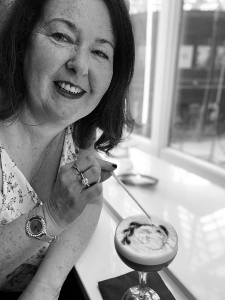
The final image is a side by side comparison of the 2 images, showing how the subject has developed through her life, without drawing attention away from the important aspects of the image (such as the facial structure changes, the hair growth, and other aspects that have changed that are not simply the clothing):

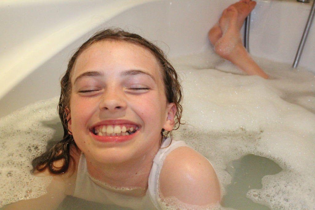
For the second image, I changed the saturation and contrast of the newer image to allow for the tones to match slightly more with the original image:

Image before editing

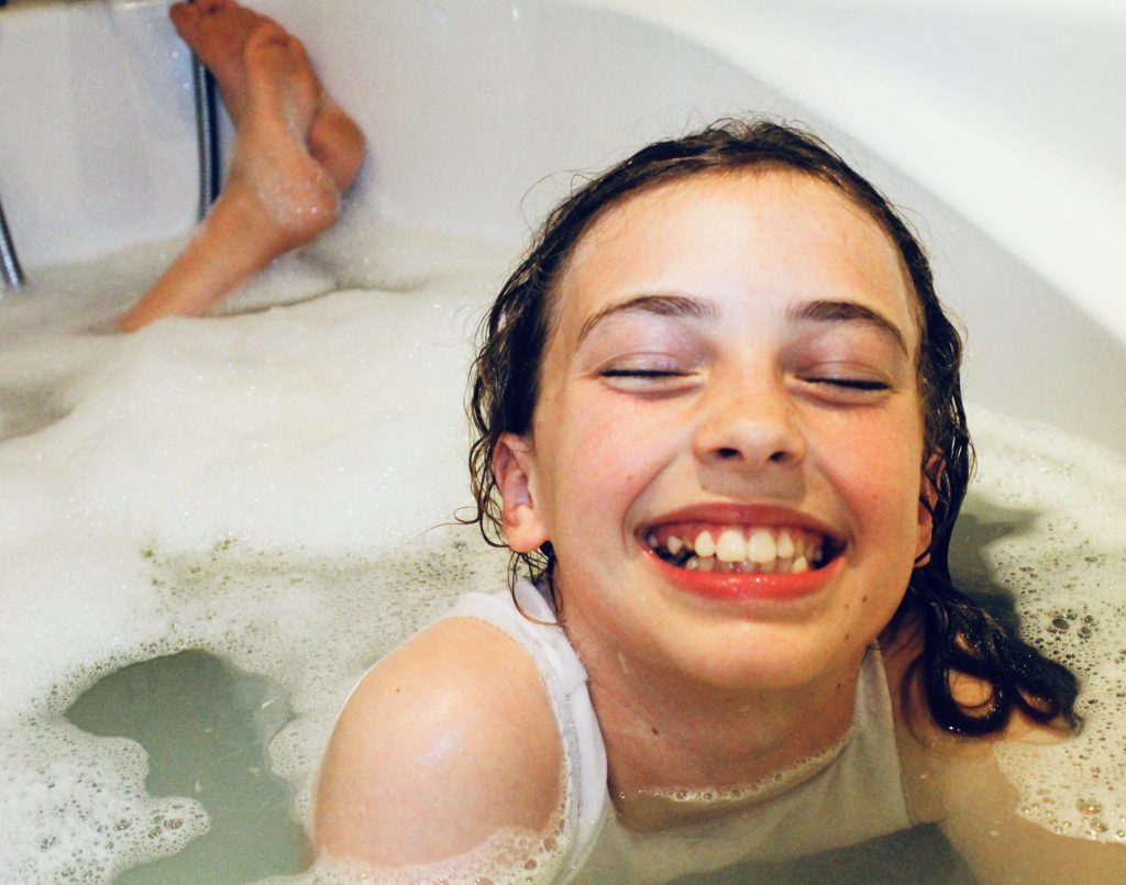
The original image I took involved the subject facing the wrong way, and so in Photoshop I simply flipped the image to resolve this, and have the subject facing in the same general direction as the original subject. In addition to this, I raised the saturation and contrast substantially to give the image a more orange overtone, which I feel both draws more attention to the image, and gives it a more vintage feel (showing similarity between the original and new image so that attention is not drawn just to the difference in shades and colors).

Image after editing

This image will be displayed with the archival image below, showing the contrast between the 2 images, and the difference in the subject, showing how she has changed over the years between the 2 images.