
THE JOURNEY OF LIFE: The idea that I have for my project is to find old photos of my family and friends and recreate those photos. I think that this will link to the exam title 'Journeys and Pathways' because it shows how their journey through life have changed them, through natural causes such as growth and age, and also experience as they will be reliving their experiences. I will also be recreating photos of myself through self portraiture to show how I have developed and grown and how my own pathway has changed me. CHRIS PORSZ: https://www.boredpanda.com/photographer-recreates-images-40-years-later-chris-porsz-reunions/?utm_source=google&utm_medium=organic&utm_campaign=organic Chris Porsz is a photographer who captured hundreds of images in the city of Peterborough in Cambridge in the 1970's, 80's and 90's. He is a street photographer, however, years later he tracked down the subjects of his photographs and recreated the photos in the same places with the same people.IMAGE ANALYSIS:
This image is called 'Sisters'. The first image was taken in 1980 and the second image was taken in 2013. In both of the images natural lighting is used, however, in both of the images there is also a reflection of the buildings opposite. The focal point of the images are the three sisters, however you could also argue that the dramatic change of both the girls and buildings is also a focal point of the photographs. Although the white balance of the first image incorporates the cool tone of the purple, it can be arguable that the main tone of the image is a warm tone due to the intensity of the sisters vibrant red jumpers and the warmth of the bricks of the building. However, the second image can be seen to have a more muted and controlled white balance. The first image has a clear contrast to the second image with its intense saturation compared to the second image with its casual almost under-saturation. The second image is a lot crisper than the first image with it focused and un-grainy quality. The first image is a lot more grainy and unfocused than the first. The contrast of the intensity and vibrancy of colour of both images can show multiple aspects such as the quality of the cameras, the concept of the images at the time and could also show how time has affected the girls approach to colour by the way they present themselves. The textures in both images are also contrasting, the first image is a lot more rough looking with the bricks and rough paintwork of the window, however the second image seems more smooth with the smooth wall and cleanly installed window. Line runs through both images from the lines in the windows, to the lines of the bricks, to the lines from the curtains in the first image.There are also lines from the building that are being reflected in the windows. The windows could represent the separation the girls have from the outside world. Also, in the second image the women have a more somber expression on their faces which could represent how aging and growing up can be viewed as a negative aspect, and how childhood lures the girls into a sense of security and happiness. It could also display the girls innocence and how adulthood transform them into women, and how their experiences have influenced their outlook on life. Their clothes in the second image can be viewed as "toned down". This could represent how society has shaped them and manipulated them into believing what is acceptable to wear and what is not as their clothes in the first image is a lot more colourful as children aren't as pressurized to wear certain things and dress a certain way. In the second image, the woman on the far left is wearing a hijab. She wasn't weaing a hijab in the first image and this could represent how as she has grown up, her religion has forced her to look a certain way, or it could represent how she has become more dedicated towards her religion. Left to right, Shehnaz Begum, her twin sister Rukhsana and their older sister Itrat were spotted sitting in the window of their house on Cromwell Road. 'We often used to perch in the window and watch what was going on in the road,' said Shehnaz. 'My twin sister and I were about seven and Itrat was nine. We loved riding our bikes with the other children in the street and were good friends with another set of twins. Mum said we were quite a handful'. The three sisters still live in Peterborough and see each other regularly. Shehnaz, who is divorced, has a daughter and looks after elderly and disabled people, together with her twin, who is re-married and has five children. Itrat works for the post office and is married with six children. https://www.boredpanda.com/photographer-recreates-images-40-years-later-chris-porsz-reunions/?utm_source=google&utm_medium=organic&utm_campaign=organic HOW THIS MAY INFLUENCE MY WORK: I am going to use Chris's concept of comparing images taken in the past with the current and recreating the scenes in the photographs. I am going to look through my family's photo albums and find images that I will recreate with my family members. I will then place them next to each other to display how they have developed and changed over time and how they've had to adapt to their experiences and environment.
Monthly Archives: February 2019
Filters
Exploring Journeys and Pathways – Nature Walks
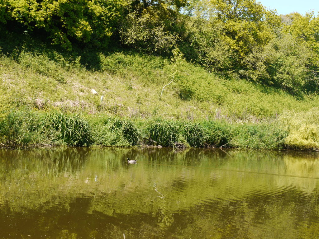
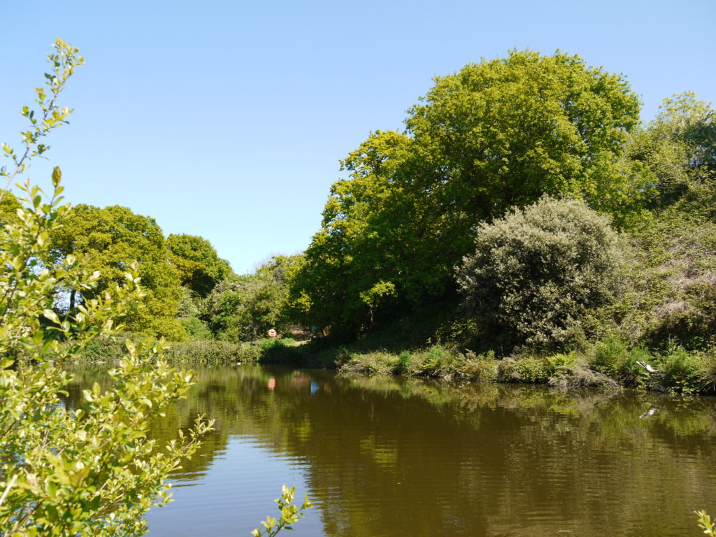
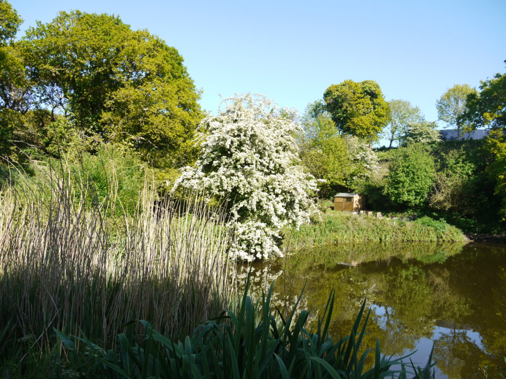
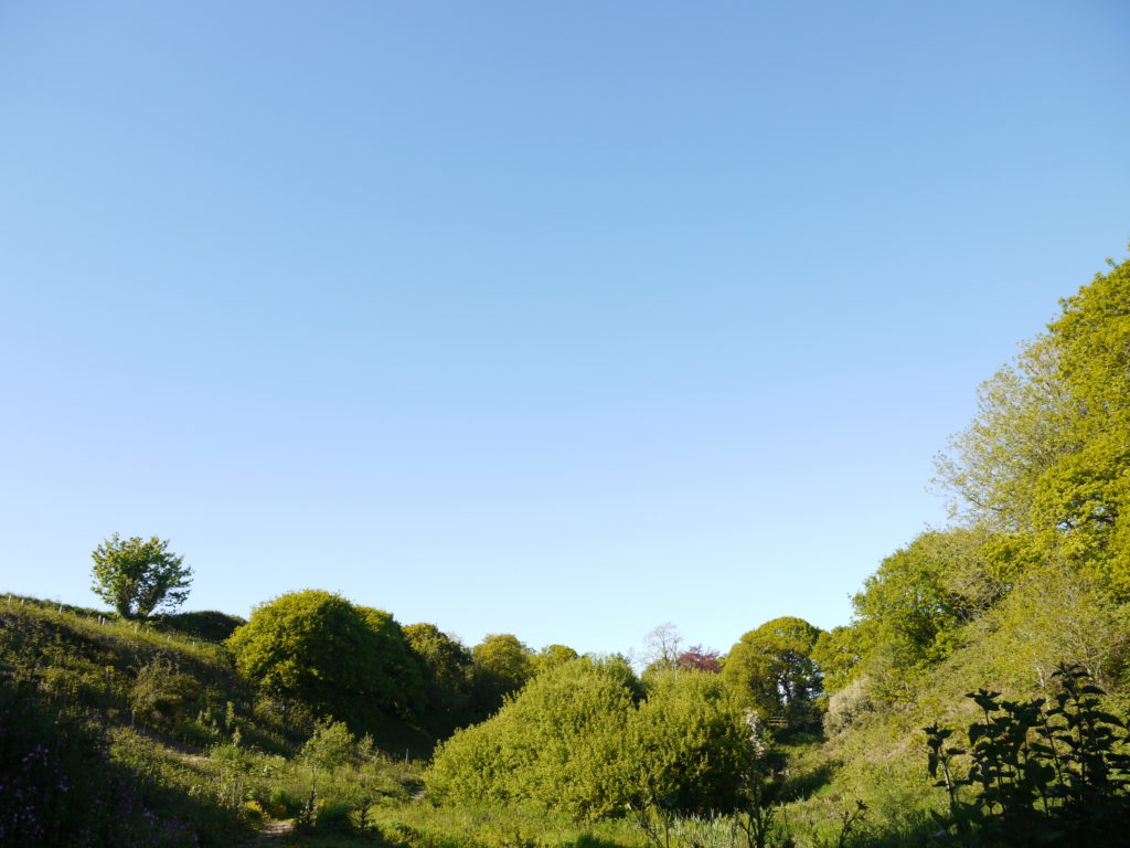
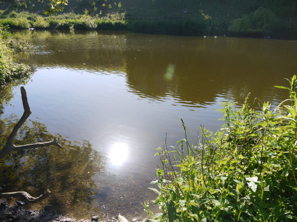
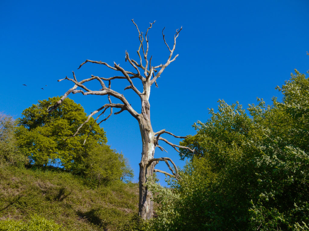
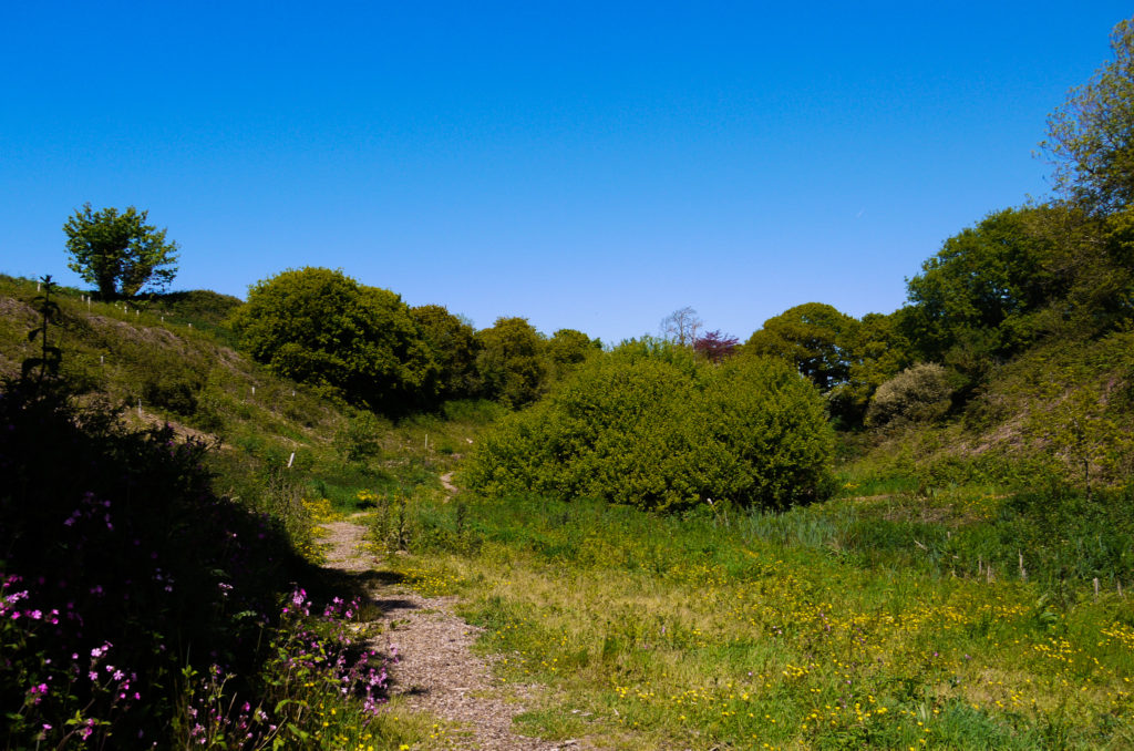
One idea I have for the topic of journeys and pathways is going on a nature pathway. I went for a quick walk and documented some of the things I saw such as the landscape and the different flowers/plants that I encountered on the way. What I need to improve on some of the images is the focus and exposure, as some of the images such as the buttercups are over-exposed and out of focus. However I do like some of the landscape images I took.
Although I do like the idea of documenting nature walks, I don't think I would like to document them for my project. My reasoning is that I would prefer to study something more conceptual and meaningful. For example, I believe that documenting people would be more suited to my project because each and every person has a different and I could explore the journey of life.
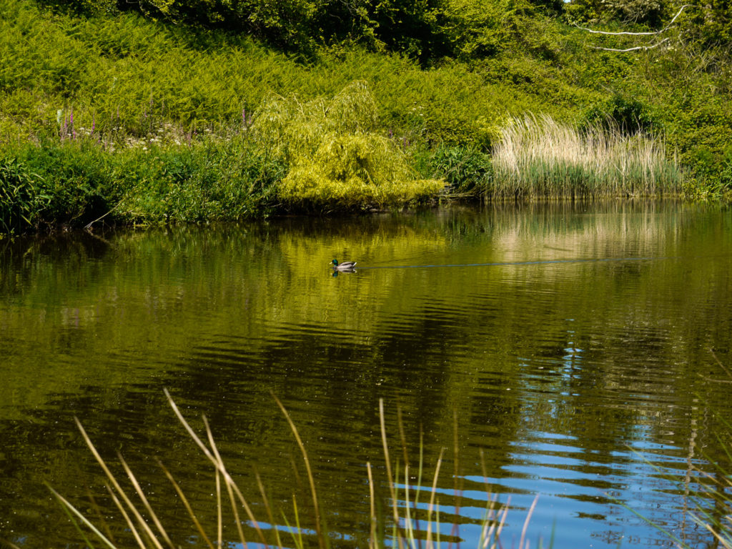
Just below the gallery are some of the images that I manipulated from this photo shoot. I used adobe lightroom to manipulate the exposure, contrast, highlights, shadows, whites, blacks, vibrancy and I cropped some of the images. I wanted to bring out the vibrancy and colour of the images and also fix some of the exposure problems. My favourite image is of the fox gloves because I love the pop of magenta, I also like the depth of field in the image.


My Manipulation of Some of the Images From the Photo shoot


Ansel Adams – Romanticism case study
Ansel Adams was an American landscape photographer and environmentalist known for his Black And White images of the American West. Adams helped found the anti-pictorialist Group f/64, an association of photographers advocating “pure” photography that favoured sharp focus and the use of the full tonal range of a photograph.
Adams was a life-long advocate for environmental conservation, and his photographic practice was deeply entwined with this advocacy. At age 12, he was given his first camera during his first visit to Yosemite national park. He developed his early photographic work as a member of the Sierra Club. He was later contracted with the U.S Department of the interior to make photographs of U.S. National Parks; his work and his persistent advocacy helped expand the National Park system.
Adams went to to these national parks and then used his camera with a colour filter to make the picture look more dramatic than it actually was. He knew that one day the national parks would become tampered with and impure so he wanted to preserve the memory that he had, and what he saw at the time.
Here are some of his images:
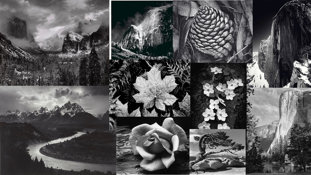
He used his camera to place himself in areas where there is a large amount of action in the scene, he also had very little open sky showing in them and this meant that all the focus was on the trees, the mountains and the lakes.
He believed alot in the style of strait photography, this is that he used a very high f stop. The reason that he did this is because he believes that having a low f stop isn’t the way that we see the world and that having a low f stop is hiding the true reality. As I said earlier he was part of a group called f/64 they were a group of people who believed in taking photos with a high aperture.
Case Study:Dan Marker-Moore
Brief Biography:
Dan is an American photographer and cinematographer. He specializes in landscapes, mainly cityscapes as he grew up in Chicago and then moved the New York. Before he’s a photographer, he’s a motion graphics and animation artist by profession. The photos of his I am going to be focusing on are time slice photographs. “A time slice is more than a photograph. A time slice takes a series of photographs and combines them into one single image. It takes slices of the same photograph offset in time from several seconds up to a few minutes.” Dan says he takes around 30,000 photos to complete his time slice work. He takes his photo’s over time in order to capture the environment at different times.
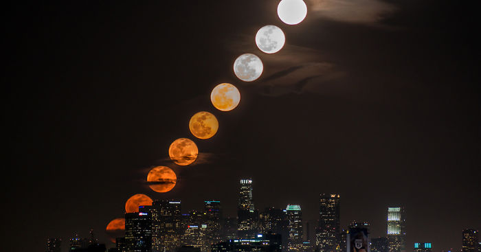

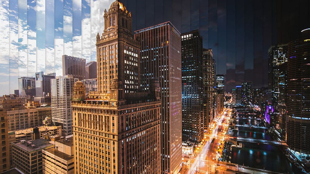

Analysis:
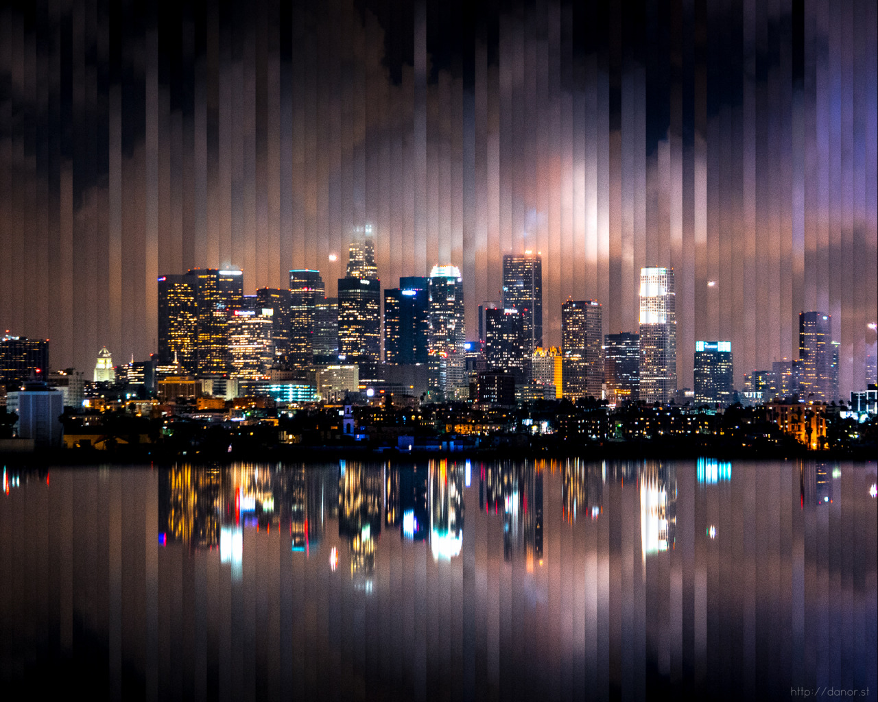
This photo of Dan’s is of Los Angeles at night. The famous skyscrapers of American city life in which he grew up around are at the foreground of this photo and the bright lights reflecting off the water. The emphasis in contrast between the dark sky and the vibrant buildings exaggerate the idea that cities never sleep. It suggests that city people never get breaks, they are constantly moving, light are always on, cars beeping, people running to work, it’s constant pandemonium. There is a clear rule of thirds in this photo, in the middle is the city, the top is the sky and the bottom is the water. This mirrors the repetitiveness of city life and how its extremely structured, everyone gets up early goes to work then finishes work, commutes back home and then its repeated the next day .This symbolizes the difference between us and nature, we create the noise and pollution and the environment just has to deal with it. In comparison to the stillness of the sky and the water, even over time it remains the same, quiet and calm but the city is the opposite. It has a very cold tone, creating and eerie mood almost horror like, the water is so still and not much movement of clouds is occurring. He would have used a wide angle lens and put his camera on a tripod, which would have been kept in the exact same position in order to be able to create an accurate time slice of the city.
Why?
I chose Dan as my case study because I liked his idea of time being explored in just one place. Also I liked the modern feel to Dan’s work and how he focused on the light of the night, as I feel like day photography is more common than night photography. As it shows a journey without moving, emphasizing the fact that you don’t have to travel far to experience change. As well as I thought it suited Jersey because it is very small and you run out of place to go to, I wanted to capture the true beauty of Jersey, as I feel like our generation are very unappreciative of Jersey in winter. My aim is to capture an afternoon at the beach to go against the idea that most of my generation has that everywhere is same old, same old.
Case Study – Luigi Ghirri
Luigi Ghirri is an Italian born artist and photographer. Ghirri has achieved a far reaching reputation as a pioneer of contemporary photography due to his very systematic approach to photography. His picture often feature very baron backgrounds with a strongly contrasting subject. His photography often features very strong lines and structures, often photographing man-made objects or natural objects featuring very strong geometric shapes.
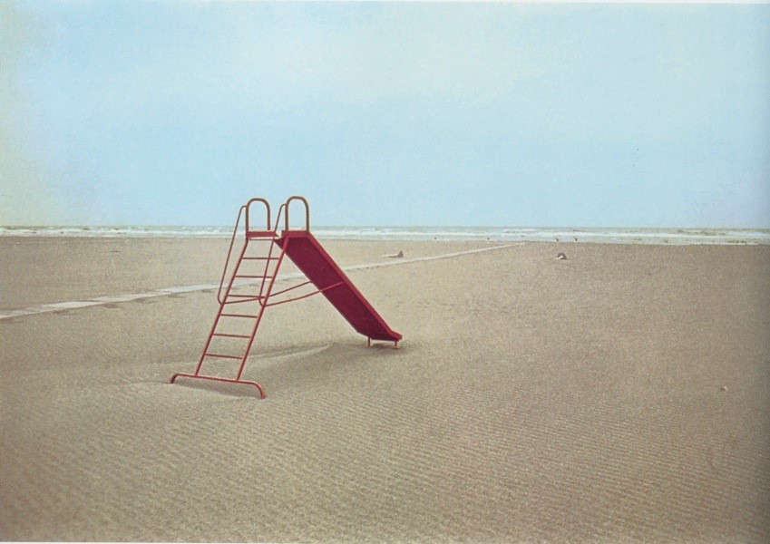
The lighting in the image is very flat and soft. This image is naturally lit however it seems as though it may have been overcast due to the lack of harsh shadows. It appears as thought the image was taken around mid-day as any shadows appear directly beneath the slide. The image appears to have been taken using a high F stop since the whole image is mostly in focus and there appears to be very little vignetting. There appears to be a considerable amount of grain and Gaussian blur in the image which suggests it is either taken on film (also suggested by slight discoloration on the right) or an old digital camera. The image looks rather cold.
The image features very flat tones across the background which is broken up by the strong contrast created by the bright red slide in the foreground. There is some texture created by the small ripples throughout the sand in the foreground. The piece features very strong lines with a strong emphasis on triangles created by the slide and the small stream of water across the sound. The ripples in the sand create a repeating pattern until they slowly go out of focus as they reach the background.
The image creates an uncomfortable feeling due to the lack of human activity in an area that is supposed to be full of life. It creates an uncanny scene as something just appears to be out of place, perhaps the strong contrast created by the slide.


The rest of this collection strongly stuck to the same look however most of them had stronger contrast and saturation then the image I analysed.
Luigi also has some interesting work which has been painted back in to which helps to emphasize the strong lines in the image.


I believe Luigi will influence my project as i like the subjects which he chooses to photograph and his strong use of contrasting colors. I find the idea of using flat tones to be interesting as well as it challenges you to use contrasting colors instead of contrasting tones.
Cindy Sherman
Cynthia Morris Sherman (born January 19, 1954) is an American photographer and film director, best known for her conceptual portraits.
She is best known for “Complete Untitled Film Stills,” a series of 70 black-and-white photographs which were meant to subvert the stereotypes of women in media (namely arthouse films and popular b-movies). In the 1980s, Sherman used color film and large prints, and focused more on lighting and facial expression.
She is a key figure of the “Pictures Generation”, a loose circle of American artists who came to artistic maturity and critical recognition during the early 1980s, a period notable for the rapid and widespread proliferation of mass media imagery. Sherman turned towards photography at the end of the 1970s in order to explore a wide range of common female social roles, or personas. Sherman sought to call into question the seductive and often oppressive influences of mass-media. Turning to self-portraits she extended role playing in fantasy Hollywood, fashion, mass advertising, an “girl-next-door” roles and poses. She called her audiences attention to the powerful machinery and make-up that lay behind the countless images circulating in an incessantly public, “plugged in” culture.

- Sherman’s photographic portraiture is both intensely grounded in the present while it extends long traditions in art that force the audience to reconsider common stereotypes and cultural assumptions, among the latter political satire, caricature, the graphic novel, pulp fiction, stand-up comedy (some of her characters are indeed uncomfortably “funny”), and other socially critical disciplines. Sherman’s many variations on the methods of self-portraiture share a single, notable feature: in the vast majority of her portraits she directly confronts the viewer’s gaze.
I am taking Cindy Sherman as my starting inspiration photographer as she looks into and tries to put forward and show and present something similar as to what I would like to explore and look into with the presentations of media and ad’s. As well as her use of tableaux photography as I will be generating recreations of advertisements and fashion ad’s taking them through the decades. I feel her style of work is something I would like to try and explore and develop throughout the project. I am finding my inspiration from her to do with the subjects she deals with and the styles of photographs that she generates.
Analysis (Below Image)
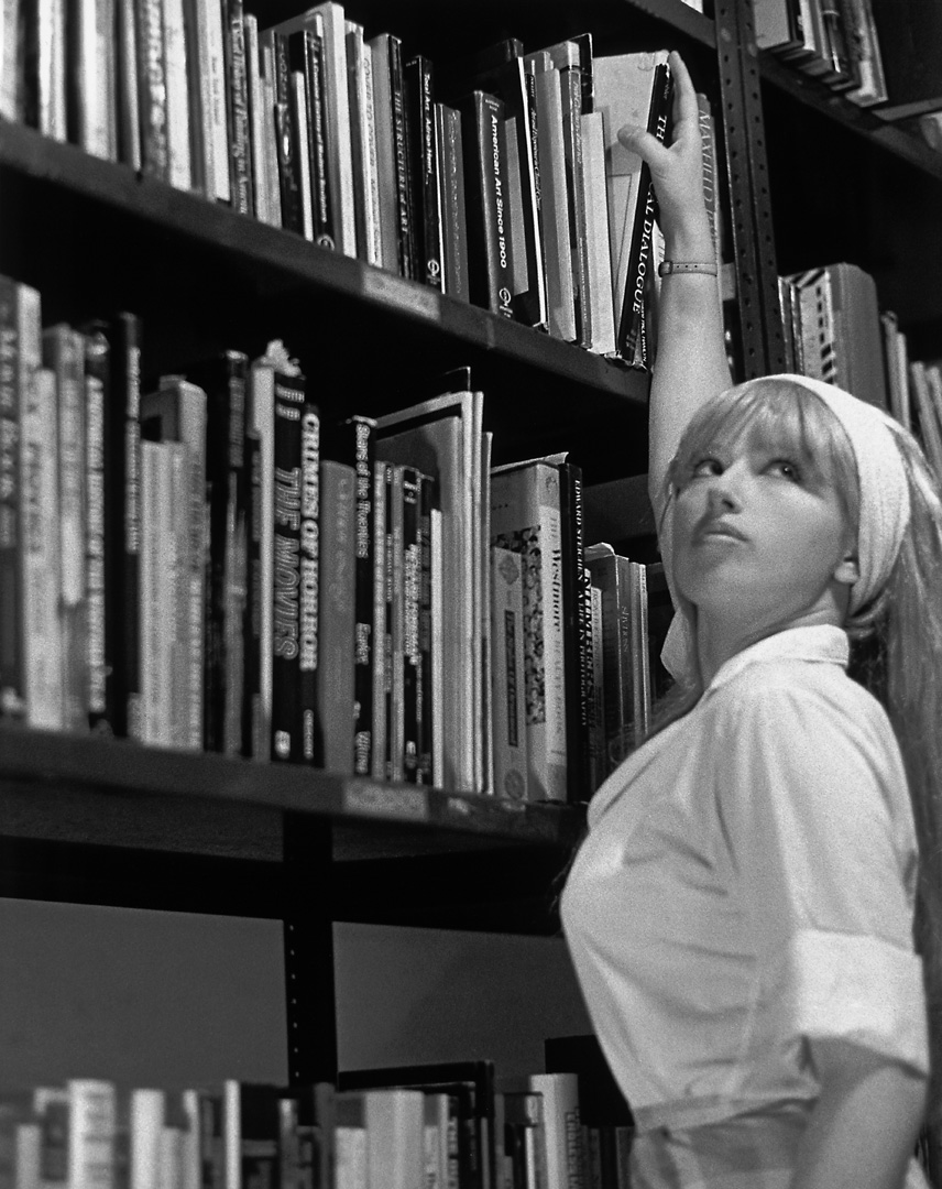
Contextual: Sherman was generating this image in a time where she was maturing in the 1970s among the discovering of the American Womens’ Movement, later known as the rise of Feminism. Sherman and her generation learned to see through mass media cliches and appropriate them in an ironic manner that made viewers self conscious about how artificial and highly constructed “female portraiture” could prove on close inspection.
Conceptual: For this image Sherman is employing herself in the image to suggest the central character in the 1960s’ “coming of age” romance, the young female intellectual on the verge of discovering her “true womanhood”, or the prototypical virgin.
Technical: The lighting in the image is coming from the top right of the photograph and is looking down on Sherman. The light coming from that angle could be artificial light being used to create effect and light her well as to see everything in frame and still create shadows and tones. The lens has it’s focus on Cindy herself we can see around the edges of the image that it is slightly blurred creating a sharp focus on her herself.
Visual: Sherman stands on the right side of the photograph which fits well with the idea of the rule of thirds as she doesn’t stand directly in the centre. As she leans and reaches upwards it creates a leading line for our eyes to travel all the way across her in a smooth way. There is a lot of pattern and repetition with the books creating repeating lines in a manner that is pleasing to the eye. The image being in black and white shows the range of tone in the photograph, her face is well lit creating lighter tones around her face, skin and hair and then we have some darker tones coming in around the book shelf where shadows would start to develop and the light may not be reaching.
Damian Chrobak – Case Study
Damian Chrobak

“Born in Jastrzebie Zdroj (Poland), Damian studied at the Academy of Photography in Warsaw. After his first year he decided to set off on a different path and began his search for a photography he could truly call his own. Born in 1977 in Jastrzebie Zdroj (Poland), Damian Chrobak has been a member of the Association of Polish Art Photographers since 2010 and is the founder of the Un-Posed street photography collective. After studying at the Academy of Photography in Warsaw, Poland, Damian moved to London in 2004, where he completed a Black & White Photography Course at the University of Arts in London. Since then he has been documenting the city’s street life. His work has been published in the United Kingdom, Germany, the United States of America, New Zealand, Poland and other European countries. He has also produced photographs for book and recording covers. He is currently based in London and working on documentary and street photography projects. Street photography is characterised by a high degree of sensitivity to aesthetic, psychological and sociological insight. The photographer plucks out from his surroundings seemingly random moments and reveals their significance. What is important for him in a photograph is a deeply humane reflection on the nature of the individual and society as a whole. The ordinary moments in everyday life often have a hidden meaning and can be interesting, humorous, bizarre or remarkable. Strolling through the streets of a twenty-first-century city, photographer tries to capture something timeless on film, an eternal truth about man, one which hasn’t changed for millennia.” http://un-posed.com/photographers/damian-chrobak
Examples of his work:

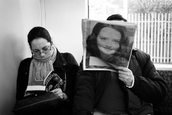


Image Analysis:
I will analysing this photo from Chrobak’s project “Everywhere I look, I’m Being Looked At”.

Conceptual:
I think this photo focuses on the idea of consumption and its impact on changing and shaping our daily routine. This photograph depicts ordinary situations, combining it with advertisements and people. This picture gives the meaning of how we are constantly surrounded by visual media and how it shapes our thinking and routine. It is as if in every corner of town we have eyes wanting to catch every passerby with a penetrating gaze giving its message to every passer-by. This photograph speaks of urban life filled with flow of information, recording our habits, interests and weaknesses.
Visual:
This photo is in black and white which gives it a very retro and old feel to it, it also has a dark tone. I can see that he has used a little of texture such as noise, which gives a grainy texture to the photo. The viewpoint of this photo is on the the advertisement because it is staring right at you whilst the people are looking ahead of them. This creates a sense of a personal feel, as if the photo is staring right at you.
Technical:
The lighting for this photo appear to be natural lighting. The ISO is probably set high because the subway looks quite dark, the shutter speed is low because the people in the photo are motion blurred and distorted. The photo has quite a high contrast and is at the right exposure. The aperture is quite low as mostly everything is focused.
Contextual:
This photo was taken in the busy streets and metro stations of London. This conveys what city life is like in London. It also gives another perception that London is very crowded place, and people are always on the move. The eyes can also shows the deeper meaning that they are literally peering back at you, as if to remind us that we are always being watched.
First Two Photoshoot Plans for Exam


Case Study: Bill Viola

Viola is a contemporary video artist who usually incorporated a mixture of audio, visual and spacial features in order to present his artwork. His work often focuses on conveying visual representations of basic and fundamental human experiences such as birth and death, while also experimenting with attempting to convey different aspects of human consciousness and spirituality using a visual format. Viola often works with contrasting images such as life and death, or different images conveying the opposite themes of one another in order to draw attention to the polar ends of human experience, and the contrast between the different stages of life.

Viola’s exhibition “Life, Death, Rebirth” looks into the 3 different stages of life; birth, death, and the events that occur in the space between the 2. Viola uses imagery of his own mother, lain in her hospital bed during the last days of her life, in order to convey the blunt truth of death, while at the same time uses audio clips of heavy breathing to further reinforce the reality of this stage in life. The first frame depicts a newborn child, or in some cases a clip of a woman in the late stages of labor. Accompanied by the audio of crying intertwined with the audio of heavy breathing, Viola is able to merge the presentation of different stages of an individuals journey through life in a more sudden, and almost sensory overloading manner. The presence of the subject suspended in water in the centre frame is used to represent the “suspension between birth and death”, or the journey of an individual between the 2, which Viola uses to represent the majority of an individuals life experience with a single frame. By presenting a subject as broad as “Life” simply and starkly through the use of 3 frames and overlapping audio recordings, Voila is able to present the journey of life in a very realistic and blunt manner, while at the same time allowing the viewer to experience a very engaging visual spectacle.

Violas work will influence my own as I am looking to experiment using 3 different photographs depicting the journey from youth to death, with the depiction of a life changing event as the centre image. I will be taking influence from Viola to do this, as the images will carry the same concept of his work, and will be laid out in a similar way, however my images will focus less on the conceptual, hidden meaning of being “suspended” between birth and death, and more on a meaning that can be easily deciphered from the visual images.

CCA GALLERIES VISIT – CARINTHIA WEST, RUPERT TRUMAN AND MIKE MCCARTNEY
As a class trip, we visited CCA Galleries and viewed the works of Carinthia West, Rupert Truman and Mike McCartney. Carinthia's drew me emotionally as I think she captures the emotions of her subjects so naturally. I also like the way she portrays her celebrity subjects in such a natural and carefree environment, showing how away from the limelight, they're just normal people. I also really liked Truman's photos because the more you look at them, the more minute but significant details you spot.


I also liked a lot of Truman's work because you have to really analyse the image to make sense and realize the multiple underlying indexical meanings hidden in the images. Also I like how some of the meanings are difficult to interpret, leaving the imagination to try and sense what is going on.

I liked some of McCartney's work, however I feel they weren't as emotionally involved as West's work. Carinthia West's work seems more raw and really catch the normalities and fun the celebrities have, and McCartney's work seems to me more forced, almost like they're staged. Although his images are aesthetically pleasing and are very interesting, especially to Beatles fans, i feel they aren't as natural and raw as West's work.