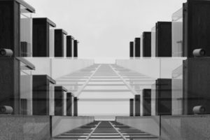
This effect is achieved by :
CTRL J > move tool > add a vector mask > paintbrush > size > opacity > blend
You can blend through your image giving it a ghostly appearance due to its opacity like the image above.

This effect is achieved by :
CTRL J > move tool > add a vector mask > paintbrush > size > opacity > blend
You can blend through your image giving it a ghostly appearance due to its opacity like the image above.
What is the focus point?

Autofocus points are what the camera uses to focus on a subject. You'll probably first notice them when you press the shutter halfway. Many cameras will emit a "beep," and some of the AF points will light up (often in a red or green color) in the viewfinder or on the display screen as seen below.

When using your camera in auto-focus mode, the auto-focus points will help you direct the focus to a particular location in the frame. This is extremely convenient because the focus of your photo may not always be in the very center where the camera traditionally likes to focus and meter. Autofocus points were introduced in film SLR cameras when the Canon EOS and Nikon F-series models were very popular. Since that time, the technology has moved into digital photography and is included in almost every DSLR as well as many point and shoot cameras. The introduction of AF points gave photographers greater freedom in focusing on certain subjects in the photograph. It mimics the freedom of manual focus while giving you the smooth, quick operation of autofocus. Autofocus points can also be connected to the camera's metering system in many models. This means that the camera will determine the appropriate exposure based on the chosen autofocus point, which is typically the photo's main subject. The number of possible autofocus points depends on the camera. Some cameras have a 9 point system, while other cameras have 11 points or even 51 points. The more AF points a camera has, the more options you have to fine-tune the focus.After reading up about the ways in which I could use my point system on my camera, I went out with a few friends to incorporate this into my photos, these were my results:
I tried to mainly focus on small details like webs and water to create a much more significant effect to the overall picture.
What is depth of field?

DOF is the zone of acceptable sharpness within a photo that will appear in focus. In every picture there is a certain area of your image in front of, and behind the subject that will appear in focus.

This zone will vary from photo to photo. Some images may have very small zones of focus, which is called shallow depth of field. Others may have a very large zone of focus, which is called 'deep depth' of field. Three main factors that will affect how you control the depth of field of your images are: aperture (f-stop), distance from the subject to the camera, and focal length of the lens on your camera.
Depth of field diagram In this picture below to the right there is a gradual focus change within the picture with a very narrow depth of field, allowing the photo to be in focus of one particular object. However to the left there is a much bigger depth of field stretching to infinity, allowing the backdrop to stay focused in detail at the same time.I decided to have a go with the method in a few of my photos, and so walked around school experimenting with it, these were my results:
I thought that messing around with the lighting would allow significantly for the viewer to notice what the focal point would be, and to my opinion I think that it worked.
Contextual The Purpose of the collection 'The Americans' is to document American society - higher and lower strata. The selection of photographs are a combination of street photography, portraits and documentary. The time of this photograph was a time when higher social classes over-ruled lower classes - African-Americans fell into the lower classes and because of their race, were segregated from white people.Robert Frank - Swiss-American photographer and documentary filmmaker:'Trolley, New Orleans', 1955. Visual In this photograph a selection of people sit, and are naturally framed by the white bars of the trolley - this could be viewed as a series of separate portraits. The rule of thirds brings the focus to the middle third of the photograph. The windows of the bus are directly on the center lines which naturally draws the attention to the people in the bus. This photograph clearly demonstrates the divide/segregation between the social classes. Technical The photograph was most likely to have been a very quick snapshot with little thinking time about the image. With these assumptions the photograph would have been shot with a fast shutter speed due to the clarity of what would have been a fast moving object. There is a high contrast in tonal range which creates a deep image with many layers - the darker foreground and the lighter background behind the bus. The reflections in the top windows suggest that the light was shining towards/on the object which is why there is a lot of tones and depth. Conceptual I believe Robert Frank selected this photograph because of how much it represented the social hierarchy at the time. The photograph clearly documents the segregation between races - white people at the front of the bus and black people at the back. The white bars that frame each portrait of the individuals also symbolizes this. The white bars in the photograph are very bold and stand out a lot, due to the high tonal range and contrast of the dark bus. The white makes a bold statement of the authority and power white people had over black people and reinforces segregation between the two races.

Robert Frank was a Swiss-American photographer and documentary filmmaker. His most famous work is his book “The Americans” in which he shows an outsiders view of American society in the 1950’s. His book consisted of 83 photographs.
In this image, Robert Frank uses different techniques to create the photo that he wants. A fast shutter speed seems to be used due to the sharpness of the possibly moving trolley. Frank also uses a low ISO to create a darker image. The natural lighting of the sun also helps to create a natural looking image that captures Americas society in the middle of their day. A deep depth of field is used as well to keep the image sharp and focussed.
This image has lots of different settings working well together but the image is cleverly structured by Frank to use the rule of thirds. The bottom and top of the window run along the horizontal lines whilst the old lady and the coloured man are placed at the vertical lines. This makes the image seem instantly appealing and interesting to the human eye.
In the photograph a high contrast is used in the black and white image to create a more dramatic image. The contrast comes from the white bars which cleverly break up the image into different sections because of the natural frames. This influences the viewer to view the photograph in more detail. The wide variety of tones between the black man and the white people adds even more contrast and drama in the image.
This photograph was taken in the 1950’s in New Orleans. It shows how the American society travels and the slight division of the whites and the blacks. As you can see, the white people are sat at the front and the black people are sat at the back, at this point in time the blacks did not have as equal rights as they do today so this documents the slow changes that have happened throughout history.
Racial segregation is shown in Frank’s photograph. There appears to be a social hierarchy from left to right. The white frames in the image segregate old people, white people, children and black people. On the left of the image you can see a white man partially hidden by a window; his separation and cover from the photograph represents how the whites were protected by society but the blacks weren’t.

Robert Frank was a Swiss American documentary/Street photographer, who documented the life in 1950’s America. His most famous work would be his 1958 book tilted ‘The American’ which consitsed of 83 photos. He began in photography as using it as way to escape the horror of World War ll and express his emotions. In 1047 he moved to America, however he did not settle there he went traveling in South America and Europe he then came back to the USA in 1950. Although he was excited for what he was going to experience in the USA this excitement quickly tuned into disappointment as he found the American lifestyle as a fast paced and overemphasis on money. He found the country to be bleak, lonely and disappointing which he expressed in he documentary photography of the country.
The image shown above is a famous image from his series ‘The Americans’ which is entitled ‘Trolley’ the image can be broken down in to different sections.
Technical
The image has lot of visual technical features that makes the image, one of them being the use of rue of thirds. as the image is clearly dived up into three sections it helps to that the onlooker can take more time into looking into the detail and texture of the image. The use of symmetry can also be classed in the rule of third as it helps to make the image more effective as the use of repetition is very pleasing to the eye. Another technique that is used in the image whether it was intentional r not it has been used in the image is the use of Anansel Adams Zone system, the darkest tones are in the space within the trolley are the lightest part is in the bars on the outside,
Contextual
This image highlights the struggle ans segregation in at the time. In the image the people on the trolley are very clearly separated into sections; White men, White woman, White children. Black man and finally Black woman. The image shows the struggle that black people would be facing having to give up there seats for others, being forced to sit at the back and having to be sectioned because there was something ‘wrong’ with them. So this image has a lot of contextual meaning to it.
Visual
The one of the visual feature of the image is the use of black and with and within that the high levels of contrast and highlights as it makes the image more dramatic. One of the natural feature tat has formed in the image is the frame like types of windows as it helps to break the image up into different sections.
Conceptual
One of the conceptual features is the meaning of the bars. Which can also be seen as prison bars which could have a symbolic meaning that the people are trapped in society beliefs in what they are/worth based on there appearance, which helps to bring a structure of the segregation in the society at the time.
FOCAL LENGTH / DEPTH OF FIELD / FOCUS Focal length is represented in mm. It is a calculation between the focal point - where the light rays converge to form a sharp image - and the digital sensor / film The focal length tells you how much of the view will be captured; the bigger the focal length, the narrower the view and higher the magnification - how much the camera is zoomed in. You can adjust focal length by twisting the lens of the camera.Depth of field Definition: the distance between the nearest and the furthest objects giving a focused image. There are two types of depth; shallow and deep. Shallow focuses on a closer object / subject while the background image is out of focus creating a blurred effect. Deep depth of field focuses on the whole frame so everything in the photograph is in focus. Aperture is used for depth of field. A smaller aperture [f22] focuses on the whole frame and a bigger aperture [f2.4] focuses on a particular object in the frame and blurring out the rest. Focus and focus points Focus allows the camera to take a picture in detail. A sharp focus will produce a photograph with sharp detail in the whole frame or a point in the frame. A soft focus produces the opposite effect. The point of focus can be changed by aiming the camera at what you would like to focus or changing the settings. The point of focus can be changed by pressing the AF button where 9 dots are displayed on the display screen. Choosing different points changes what the camera focuses on.
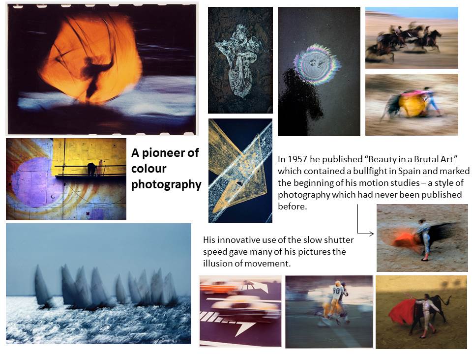
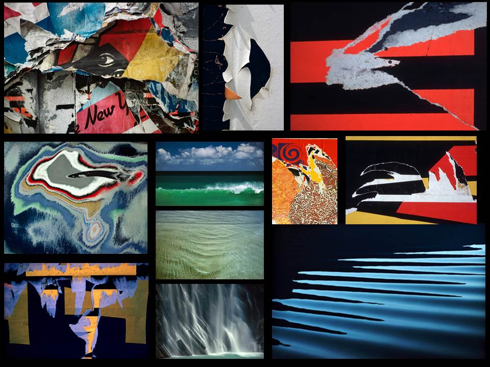
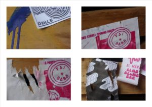
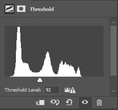
using the same techniques as Keld Helmer Petersen I edited four of the images from my most resent shoot. I opened each image onto Photoshop and cropped them all to squares, and changed the threshold to suit each picture. I then flattened each image and dragged them into a new tab which was a white square. Finally I arranged them into a collage format and saved it as a JPEG.
Sometimes called conceptual or concrete photography, it is meant by depicting a visual image that does not have an immediate association with the object world and that has been created through the use of photographic equipment, processes or materials.
I used colour to create abstract shapes. I adapted and edited the images to make the colours bolder because I thought they look dull and could be adapted more and could be made more interesting and visually pleasing. These are my original edits and then the more interesting edits.
I used Photoshop to create these edits. Firstly, I cut out the circular shape using the ‘elliptical marquee tool’ where I then cut out a circle from one of my chosen images. Once I had cut out a circle I pasted it onto a new document where I made a collage of four. I wasn’t happy with the final outcome so I decided to change the vibrancy of the image to it being very high and then used the paint bucket tool to fill the coloured areas in with a bolder colour. I made a collage of nine in a new document as I wanted to show of more of my edits.