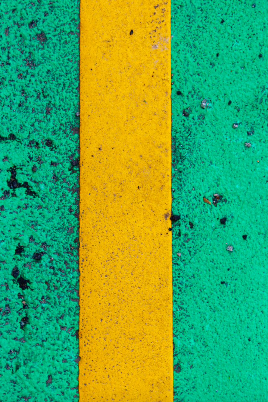
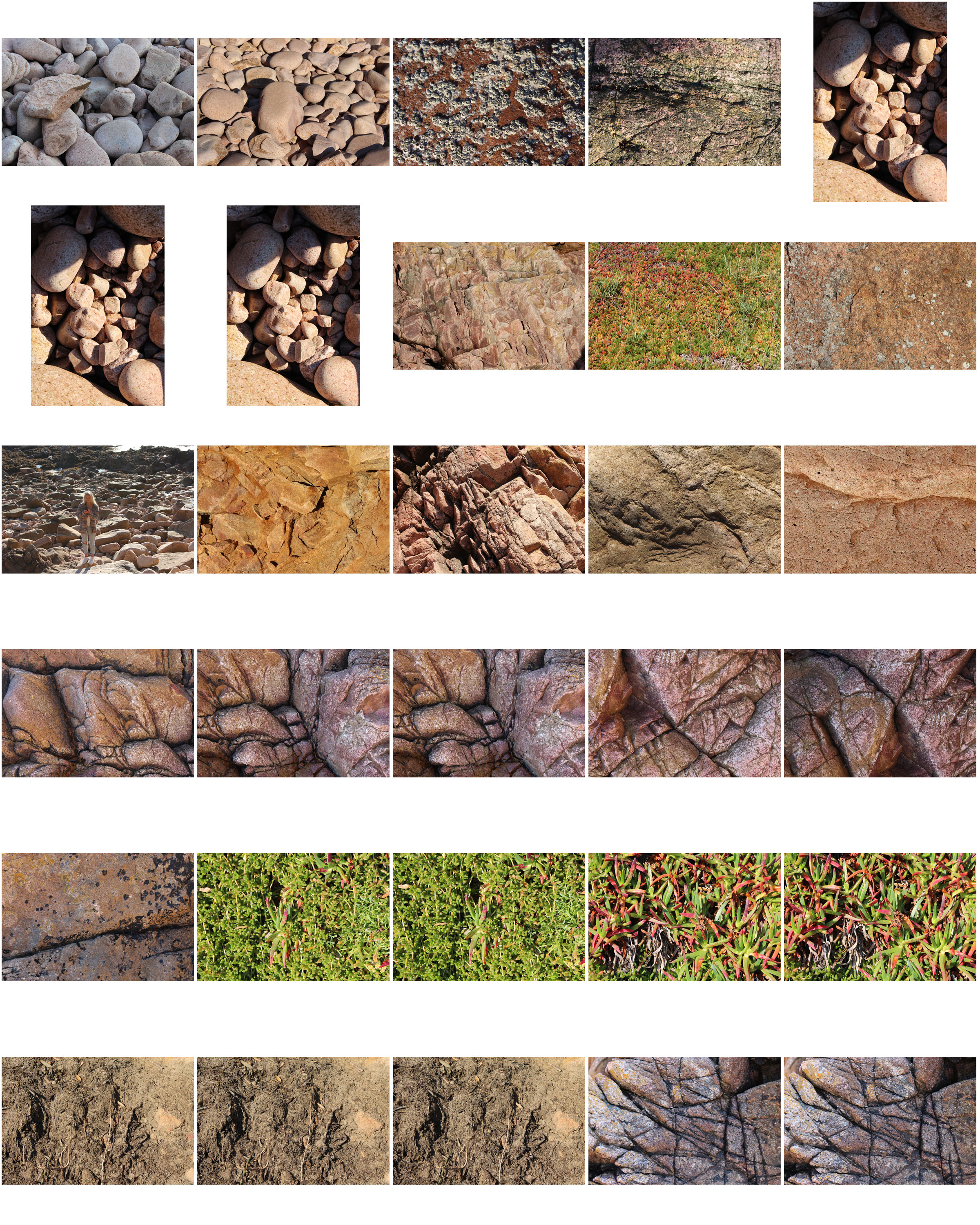
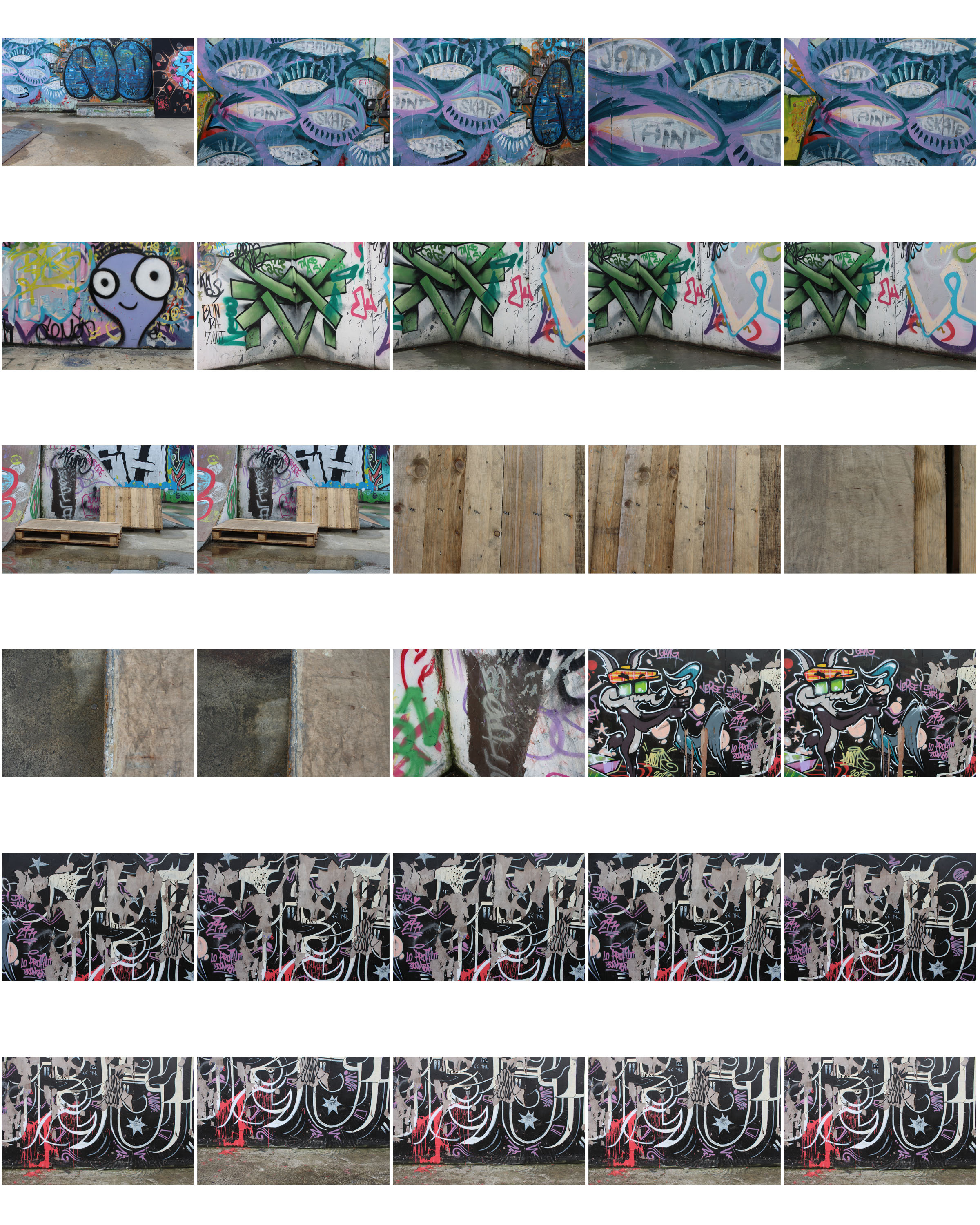
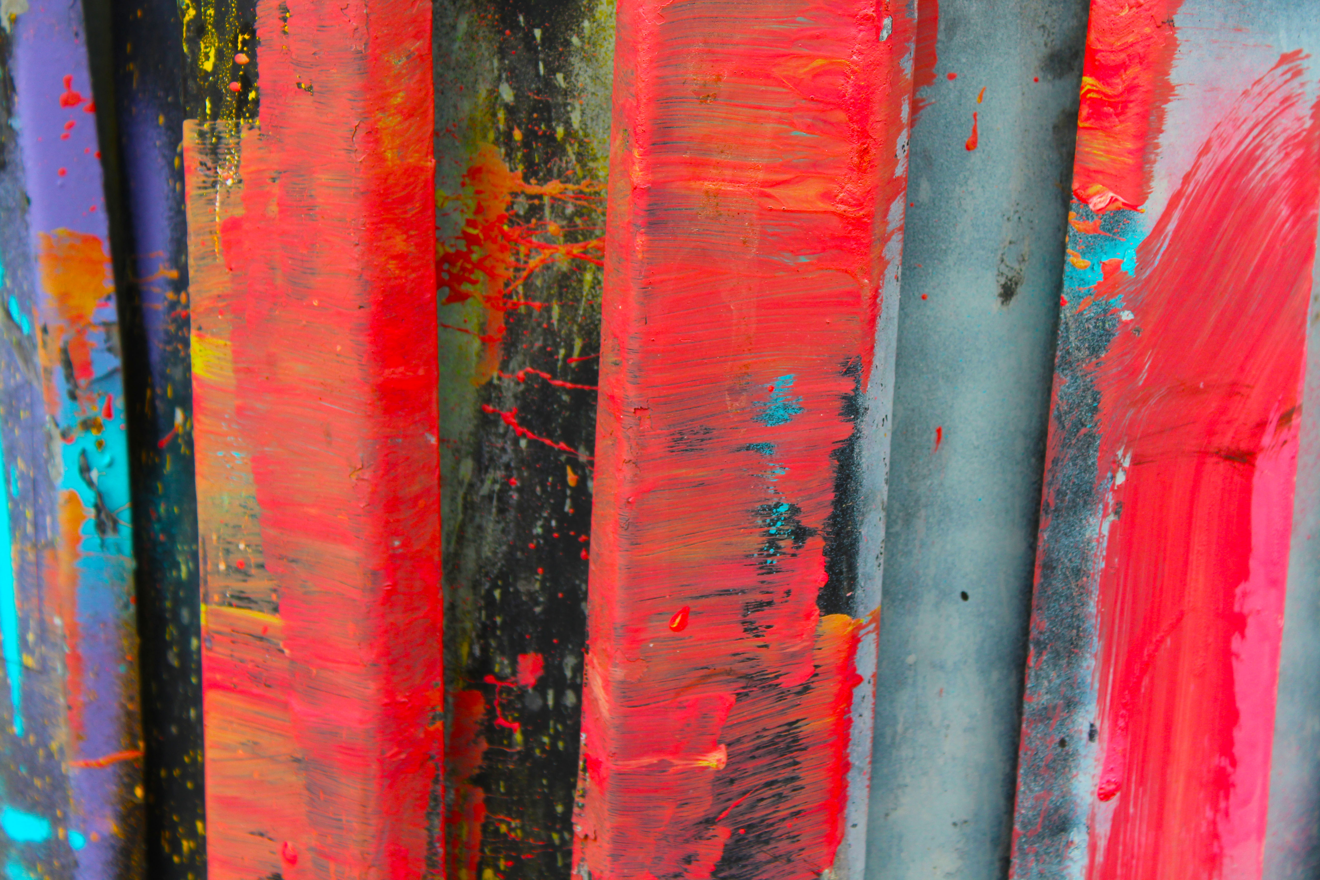
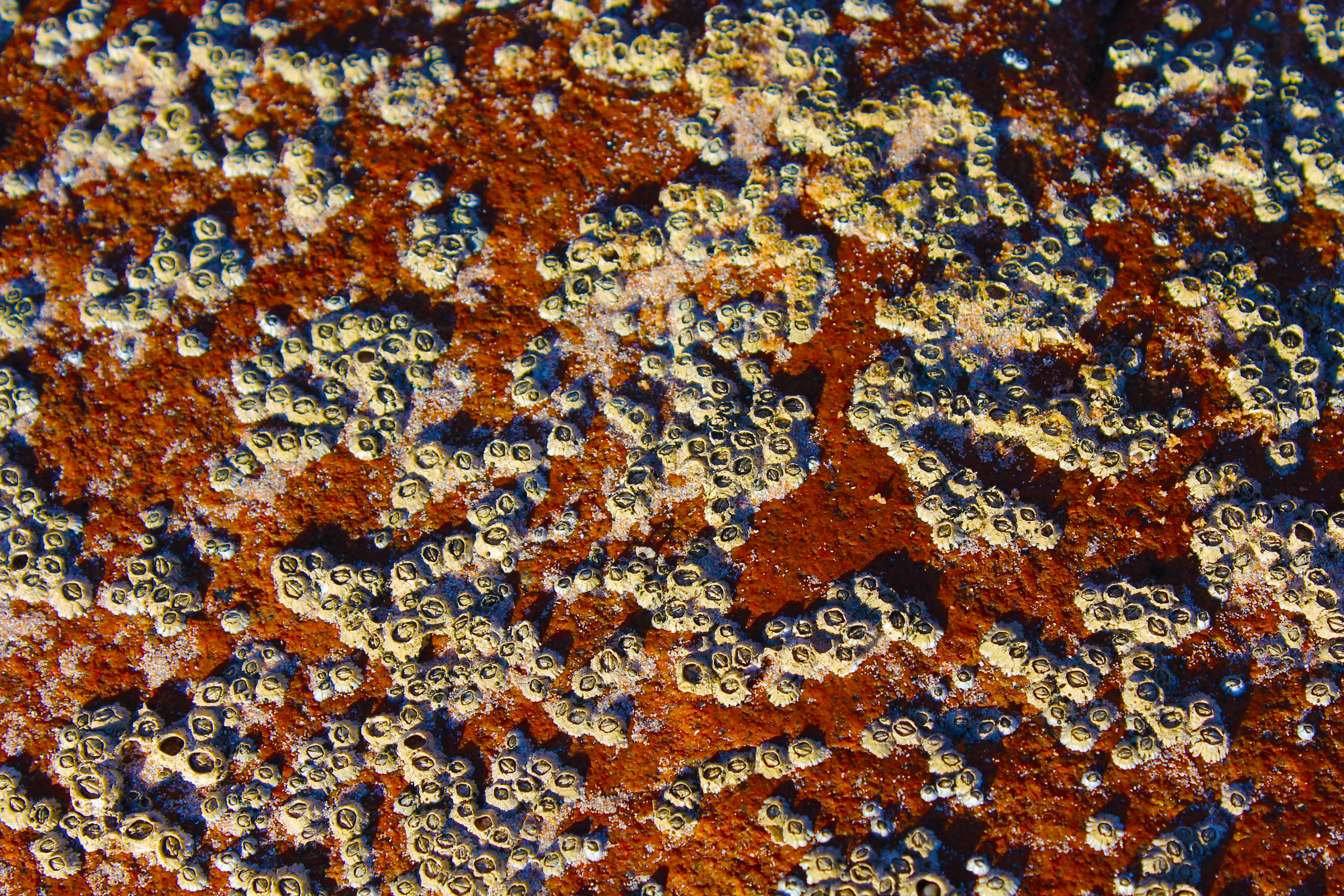
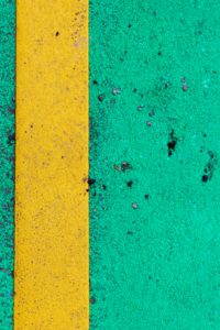
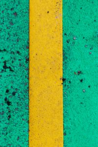
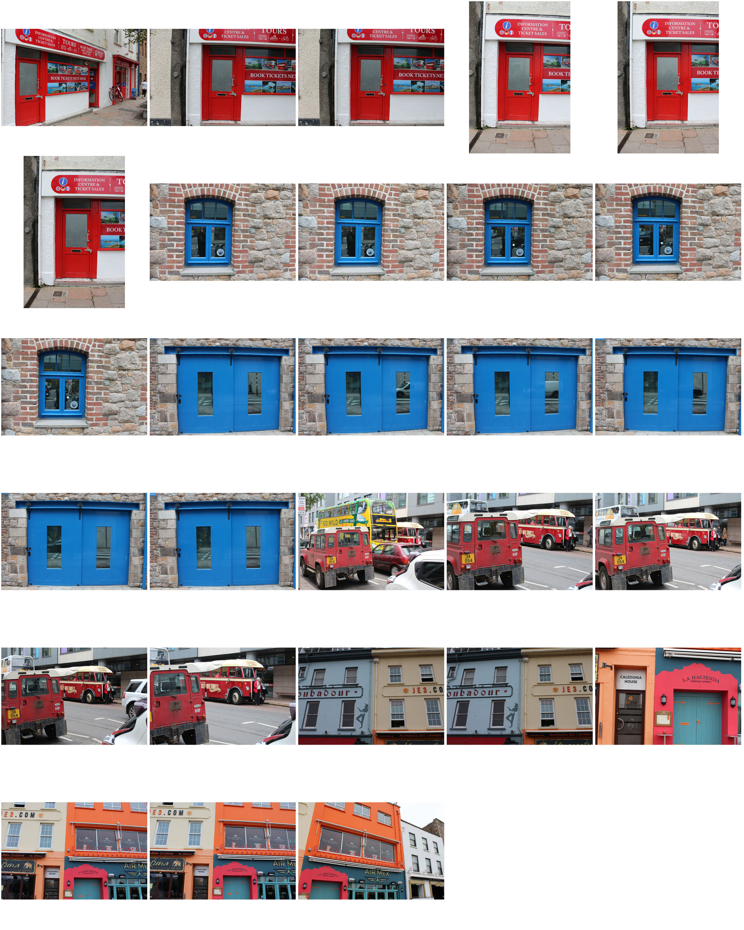
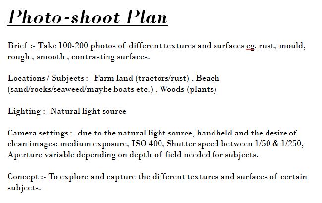
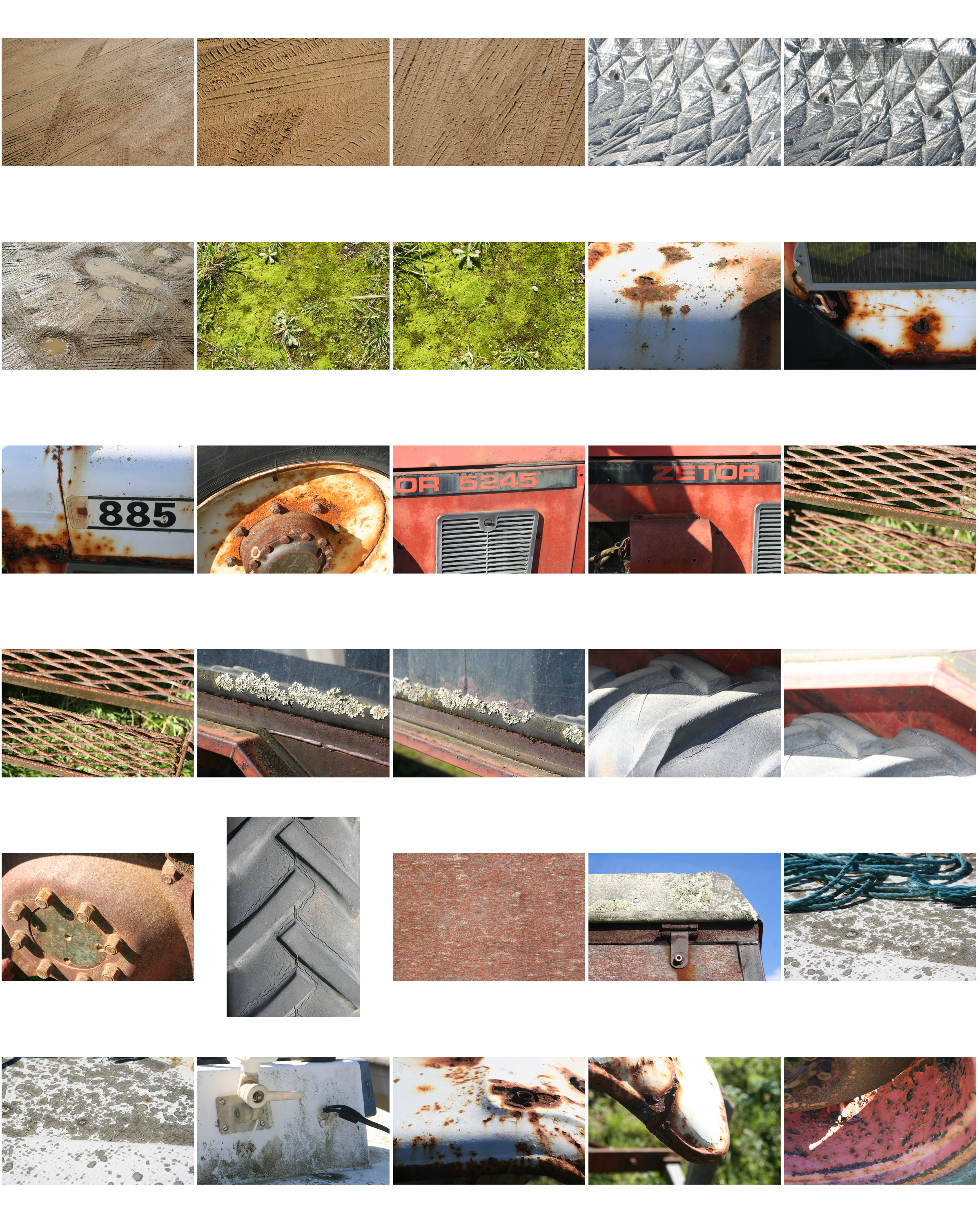
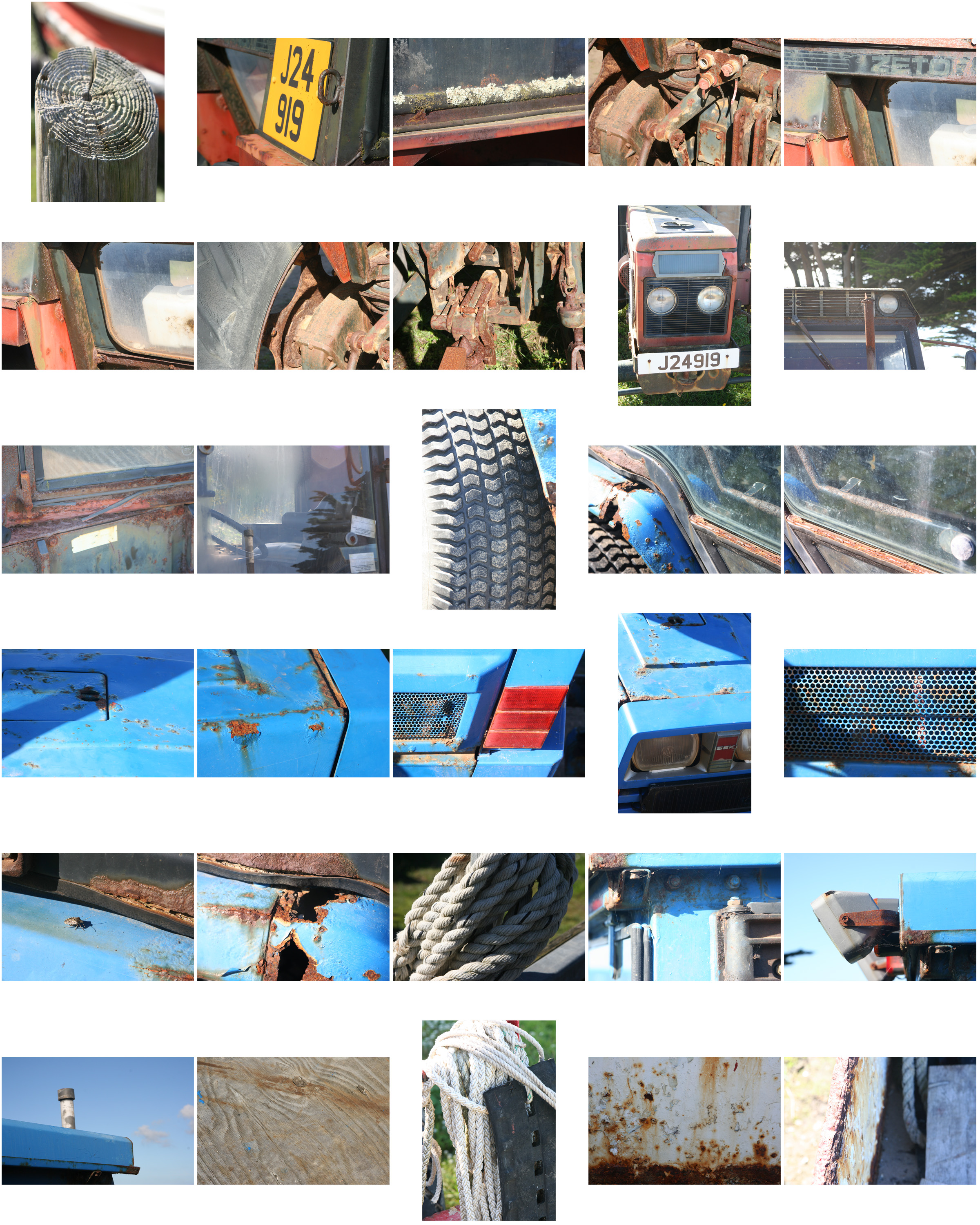
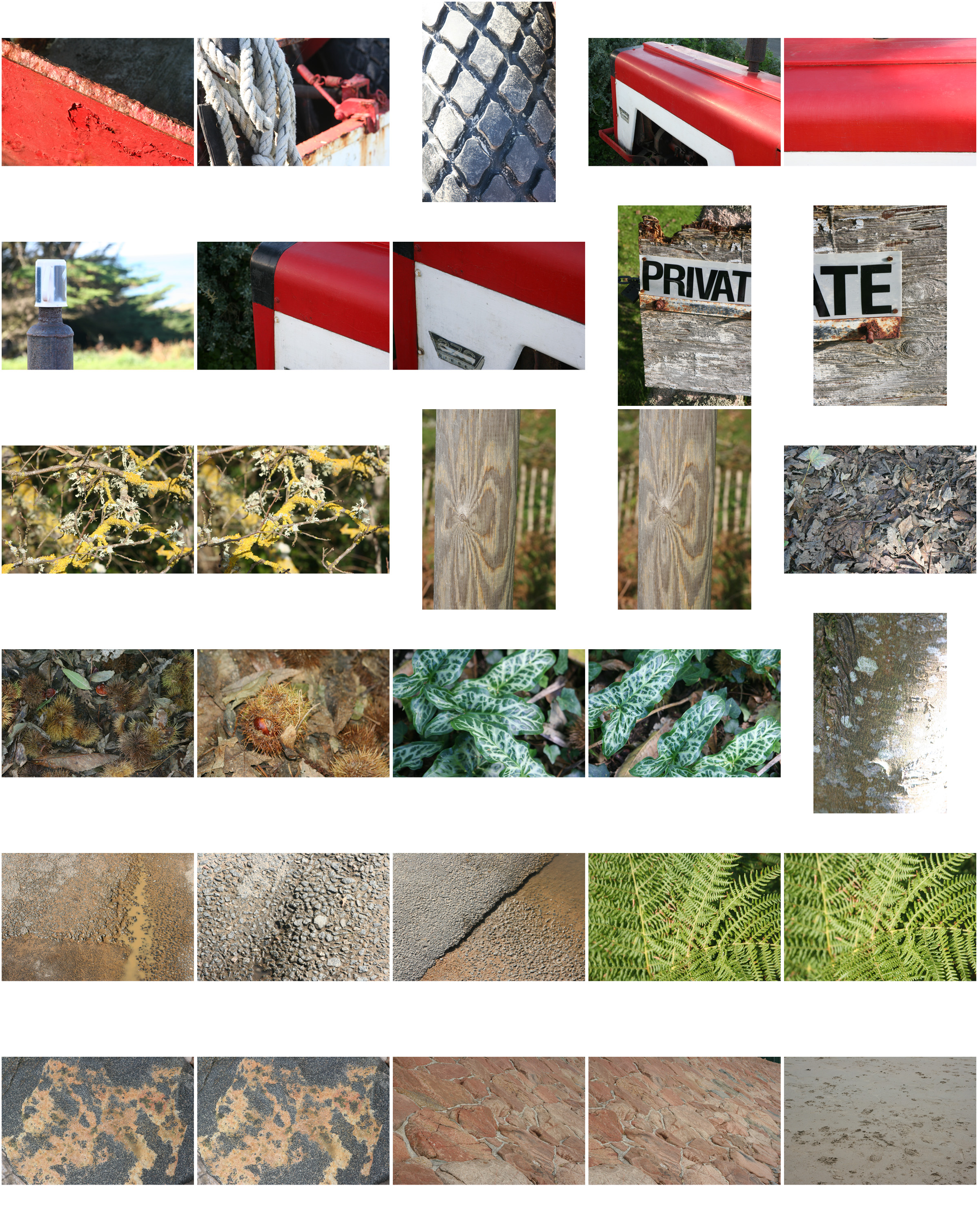
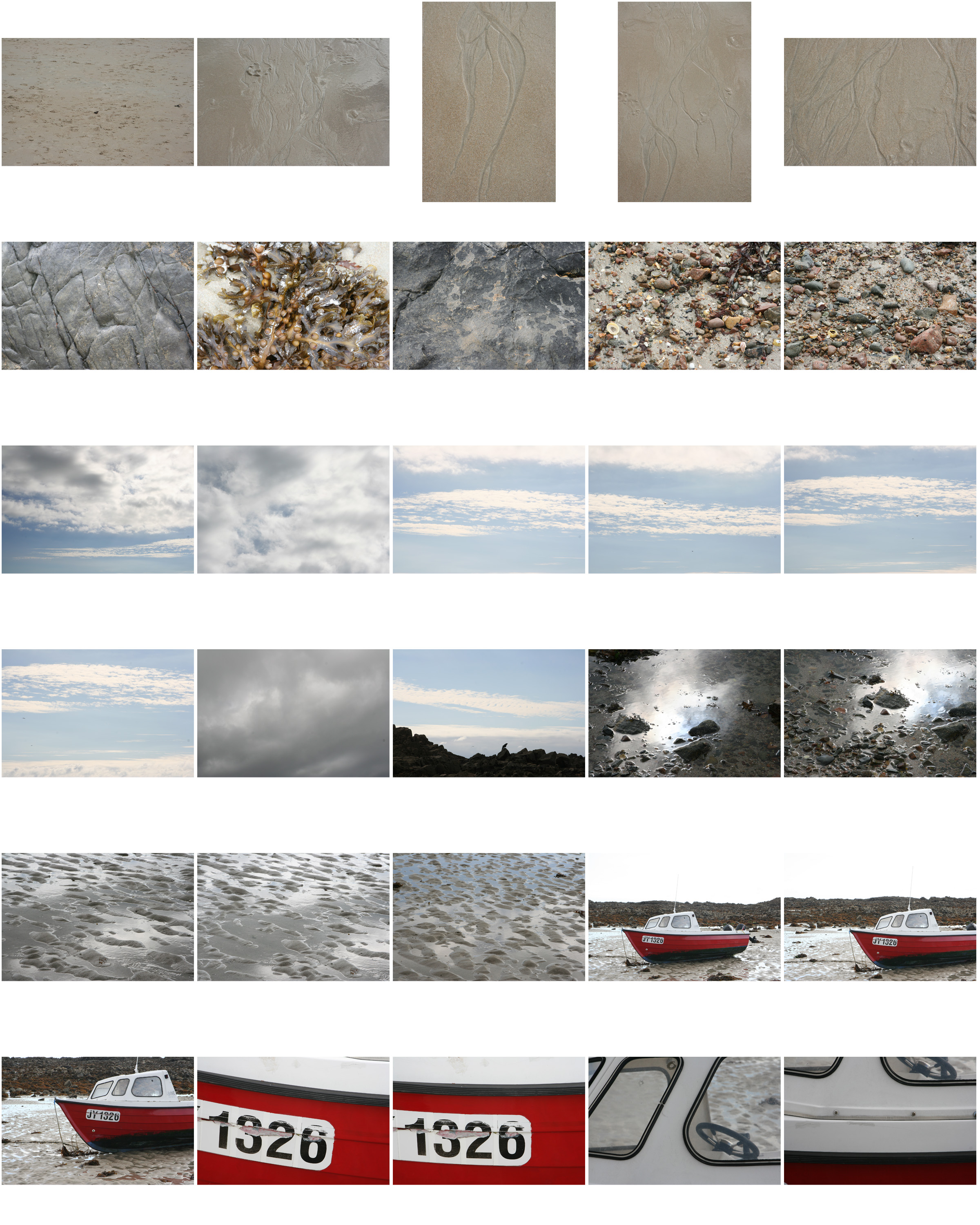
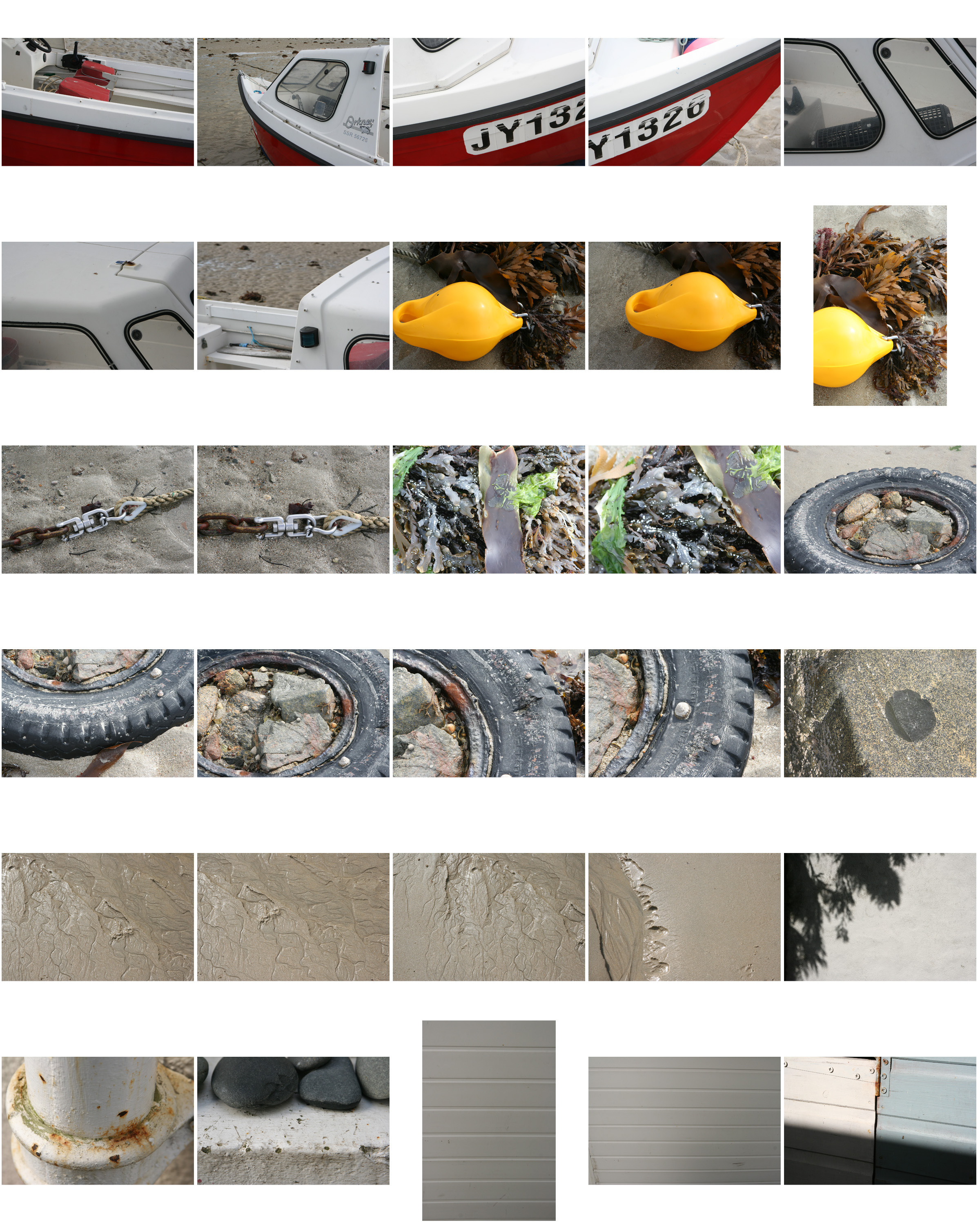
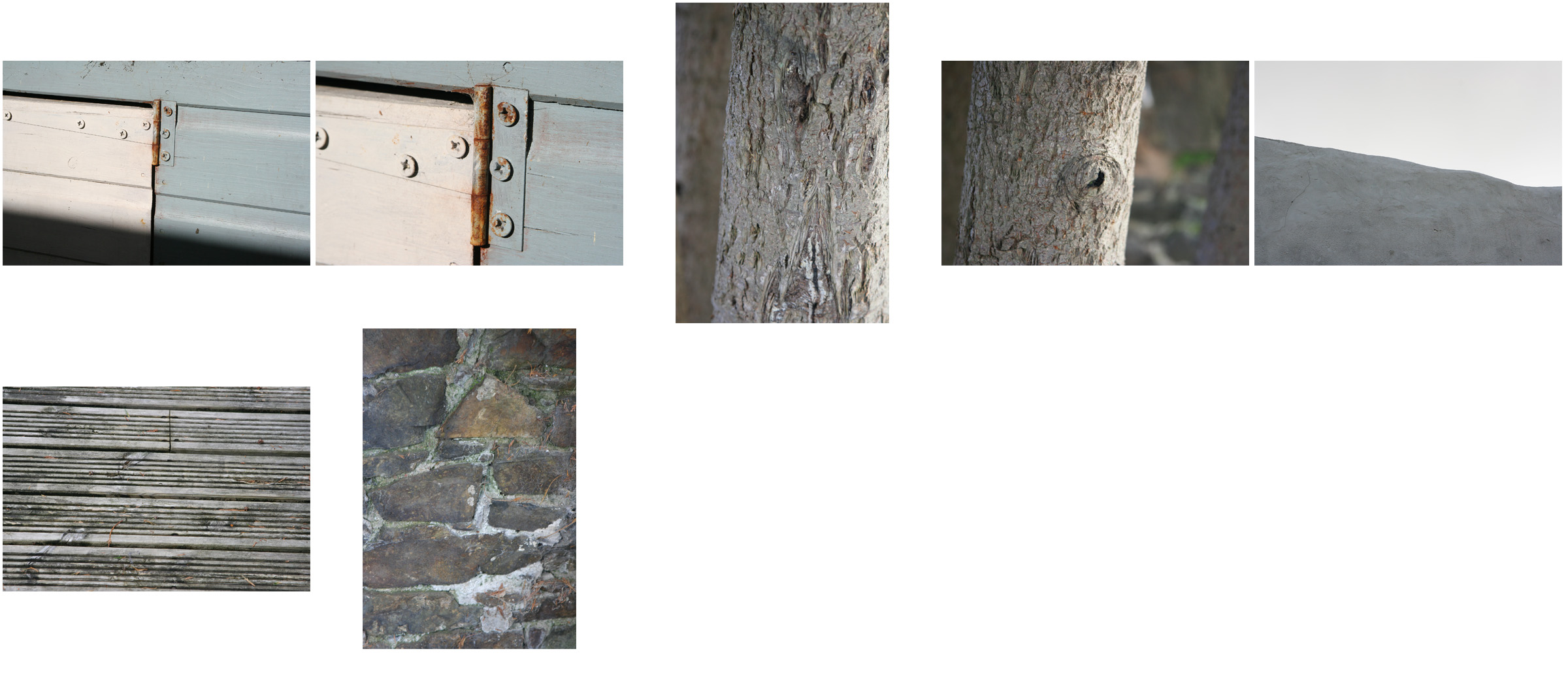
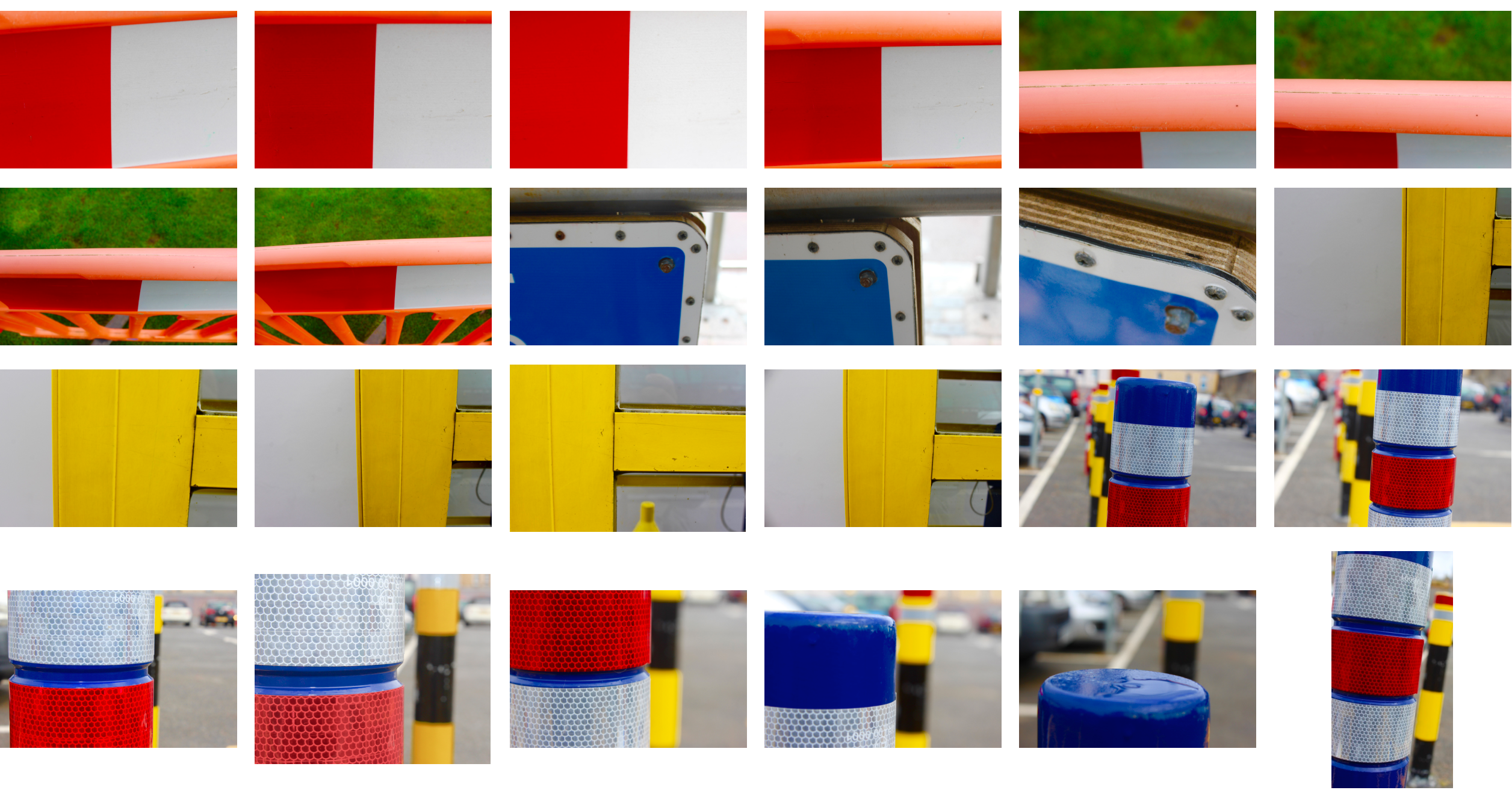
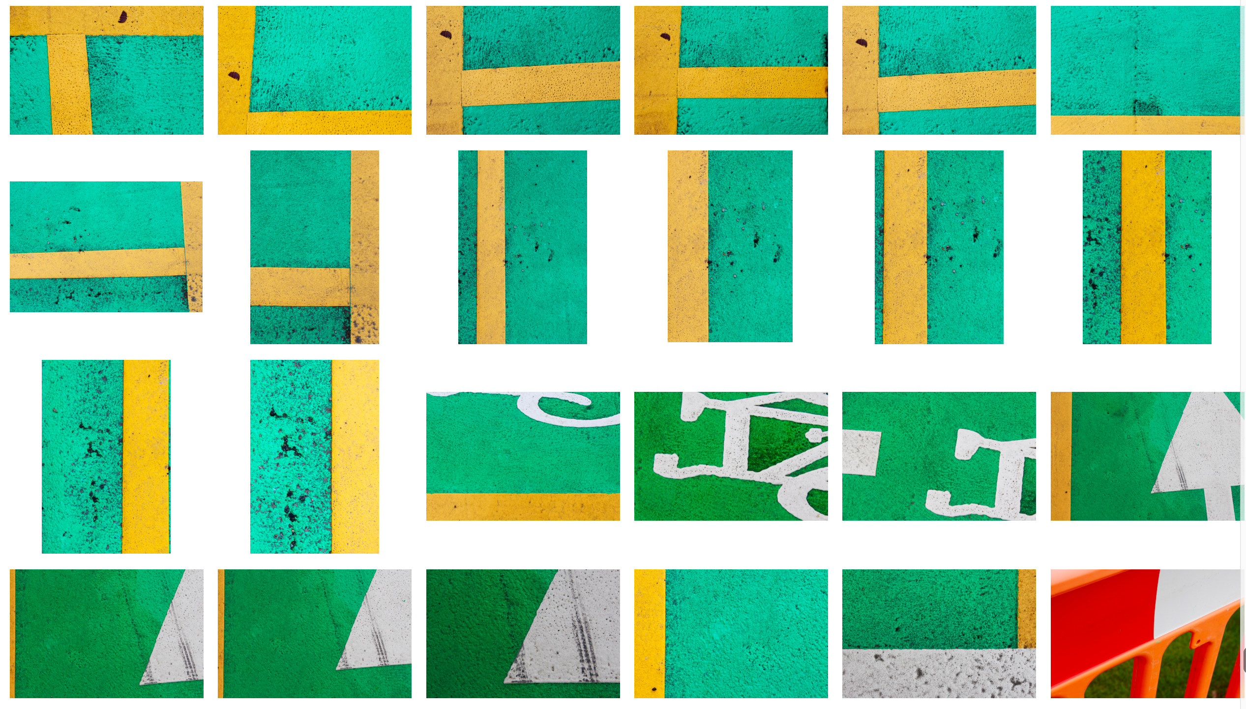
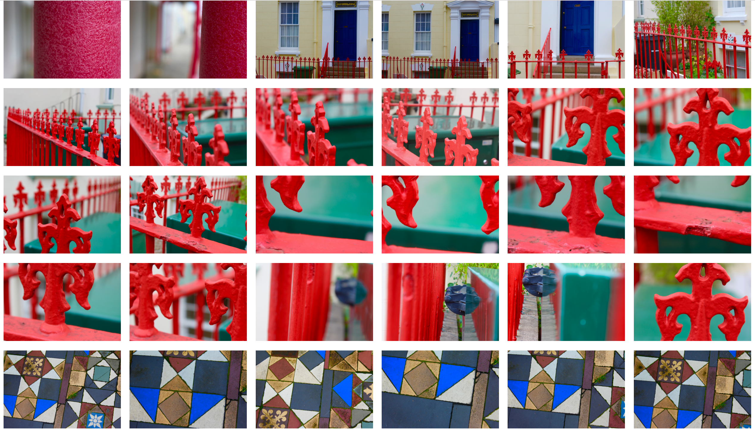
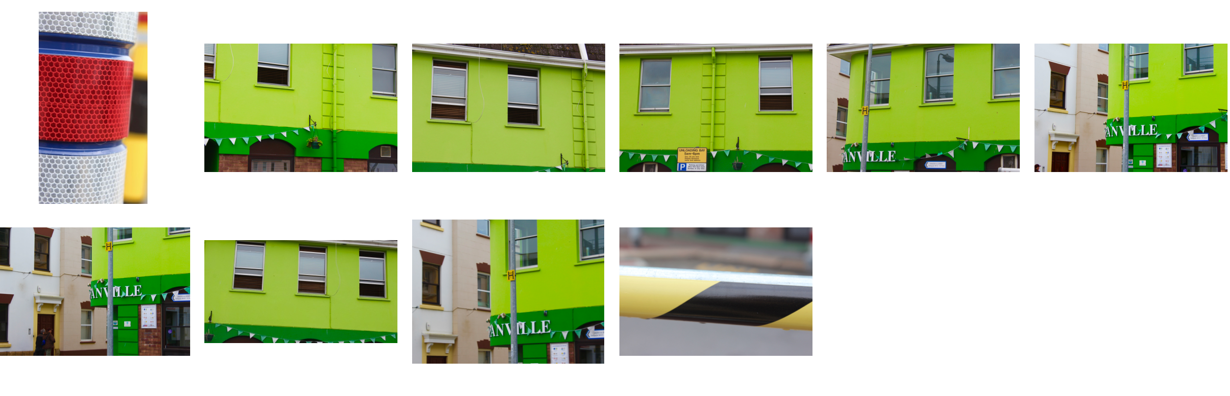
In this post I am looking at ways to present my final piece. Below are the three photographs that I am planning on presenting after deciding how I will present them. I am going to look at different ways of cropping and rotating them to find the most effective way of presenting them.
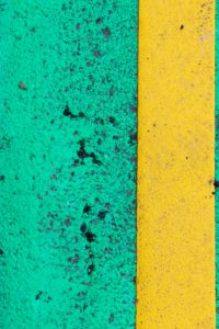
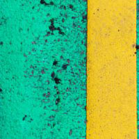
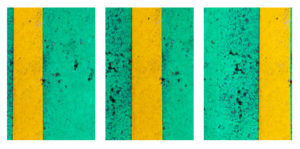
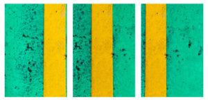
Square Cropping
Here I have taken each photo and cropped them to a square to see how it may look.
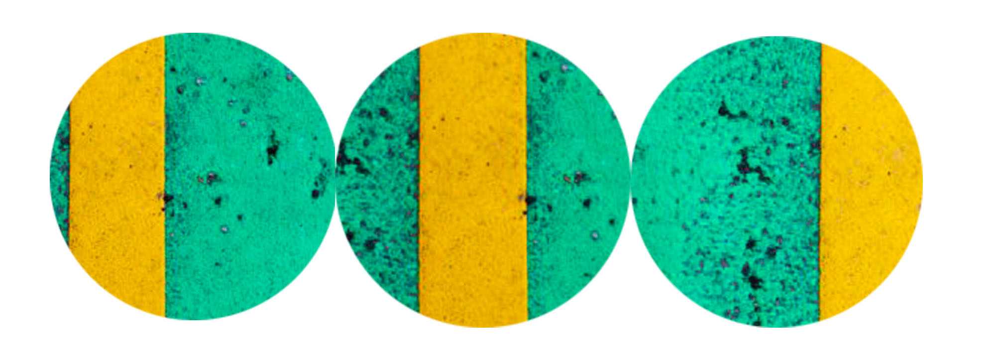
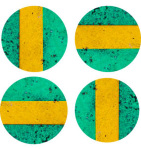
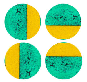
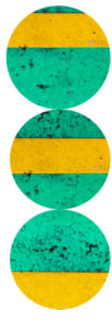
Circular Cropping
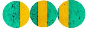
Here I have cropped the three images into circles to contrast the round edges of the circle with the sharp lines in the image.
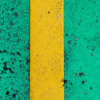
Rotation
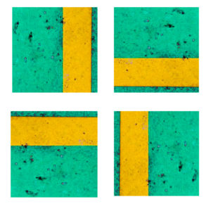
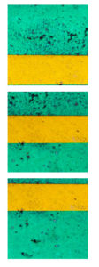
Here I have cropped the first image into a square and looked at the four possible ways of rotating it.
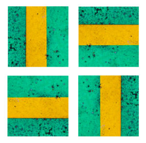
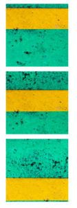
Below is the second image which i have cropped into a square and explored rotating it to see the effects.
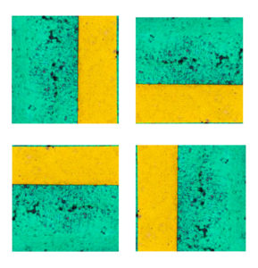
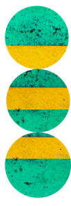
The set of images below show the third image cropped to a square and rotated, from these rotations I hope to gain an understanding of how I want to rotate it in my final piece.
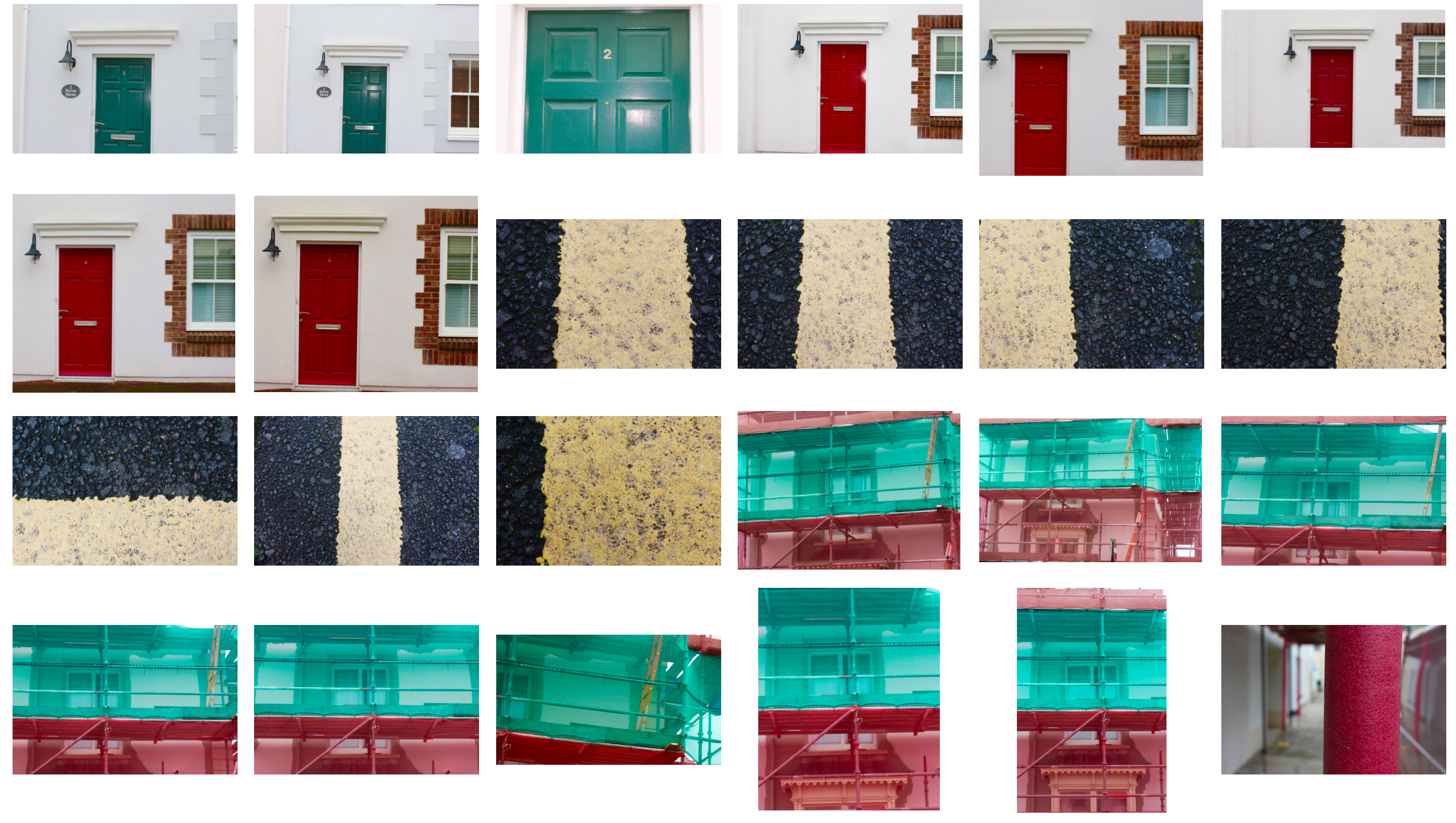
Here I have taken the first image and rotated it in four different ways to see which way works best.
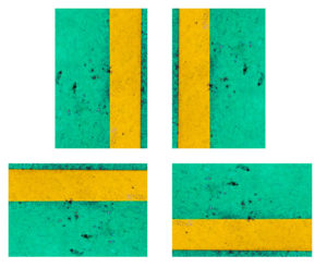
The below images are the second image which I have rotated in four different ways to find the most effective composition.
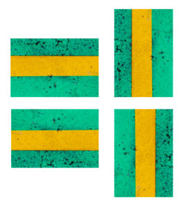
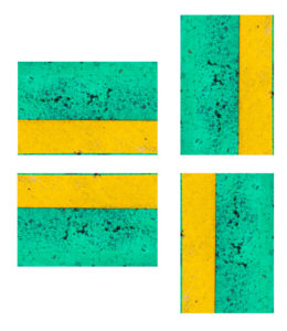
This is the third image rotated in different ways so I can decide which way will be most suitable for my final piece.
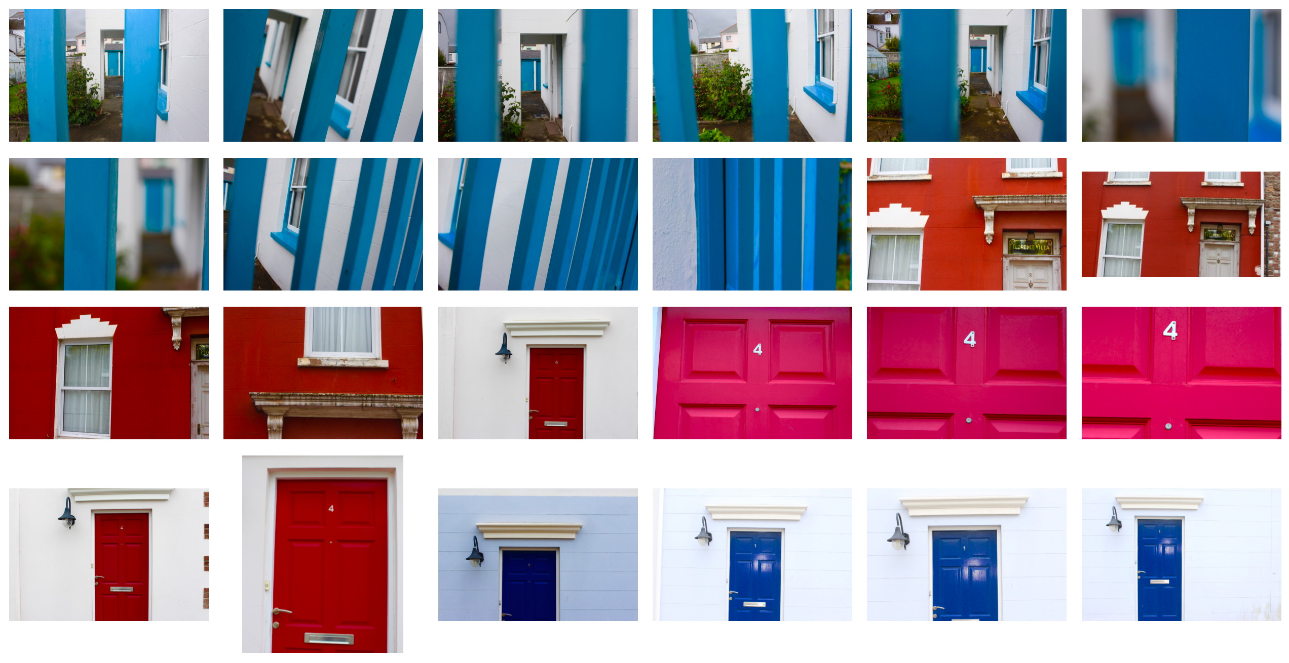
In these images I have cropped the image into a circle and rotated it in different ways to see the different effects.
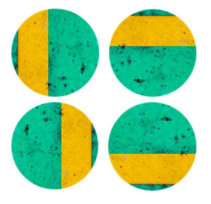
The below images show the second image rotated in different ways to help me decide which rotation I will use.
The below shows the third image cropped into a circle and rotated so that I can explore different styles of composition.
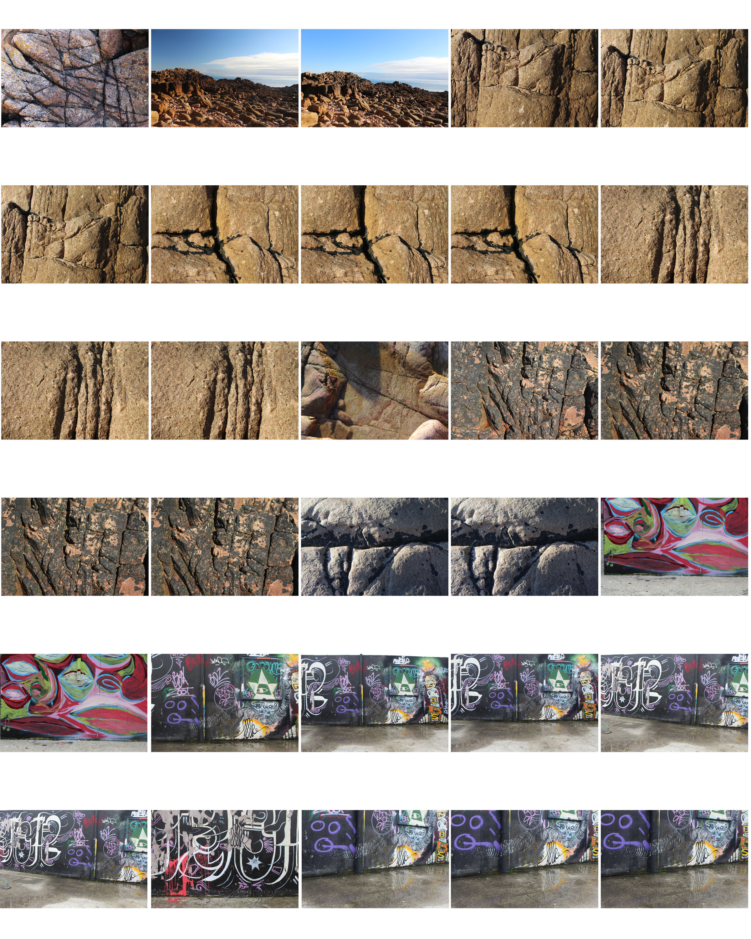
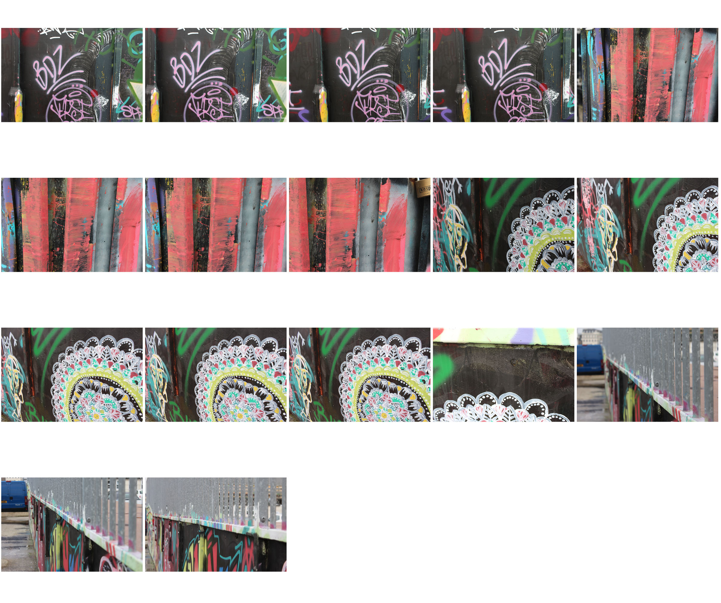
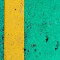
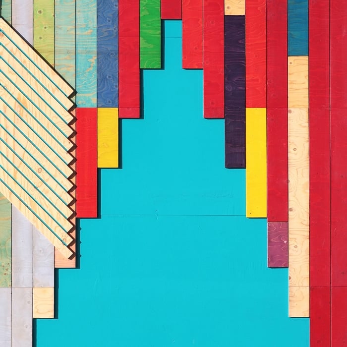
Composition
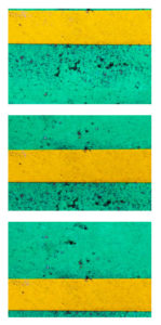
Composition 1
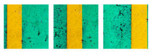
In this composition I took the three original images and lined them up horizontally so the lines were far apart to separate the images from each other. I don’t like how separated the lines are, they appear too far apart.
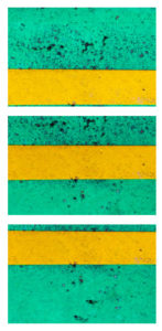
Composition 2
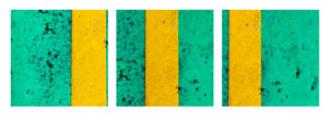
In this composition, I swapped image one and three to bring the lines closer together to create a sense of togetherness and to link the images. Due to this link and closeness between the images, I like this composition more.
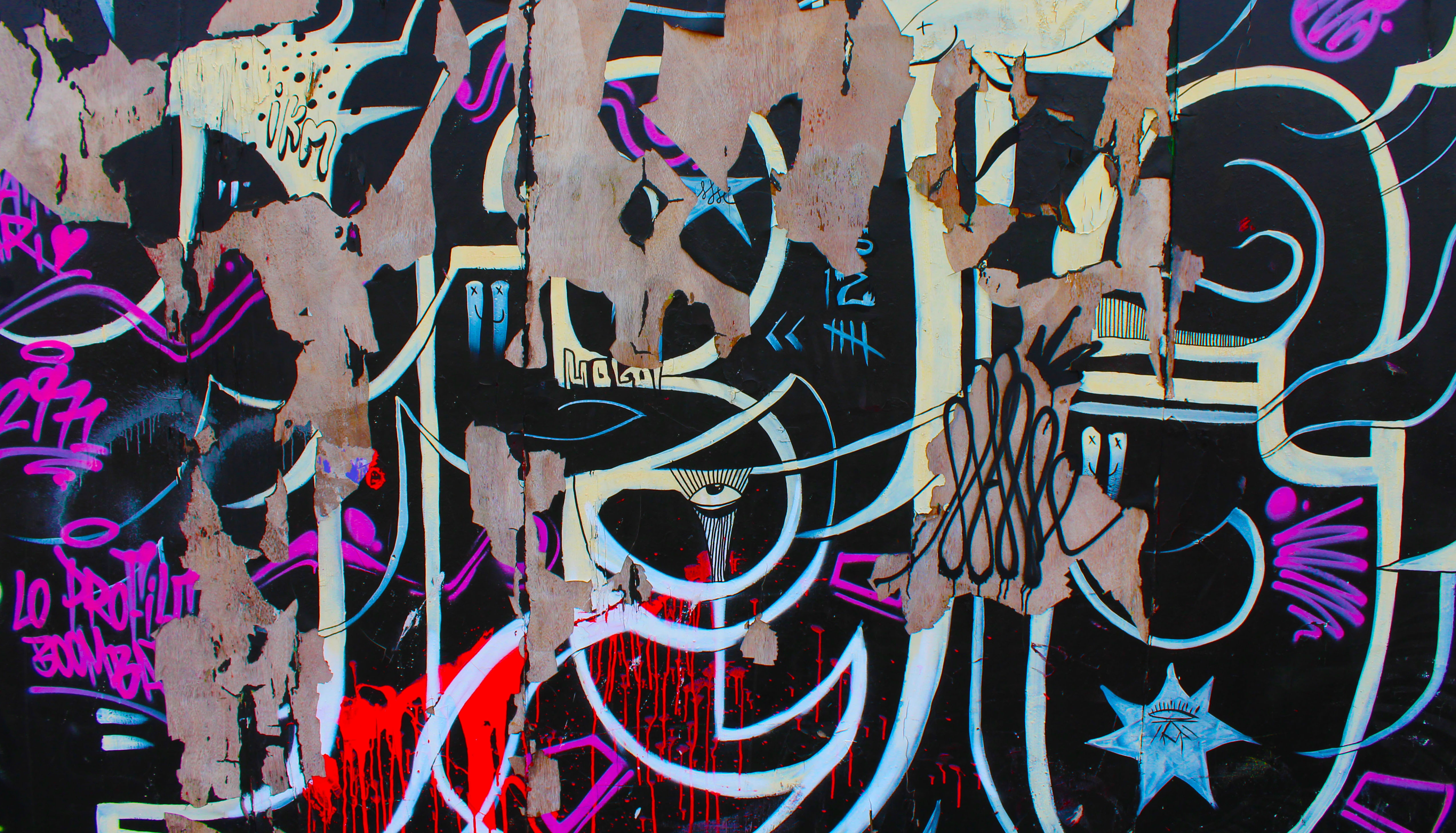
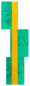
Composition 3
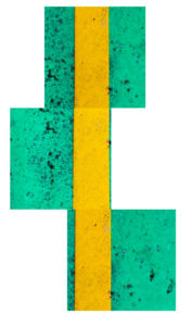
In this composition I pieced the images together to make a continuous line and bring the photos together to be one. In my opinion, this is one of my more creative compositions as it makes one image out of three images.
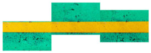
Composition 4
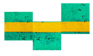
In this composition I rotated composition three to see the effects of the line going horizontally instead of vertically. I think that it looks better standing vertically as when standing vertically it looks less odd.
Composition 5
In this composition I rotated composition 2 to make the lines run horizontally to create a different effect. I like this composition because of the togetherness of the lines and the direction of them.
Composition 6
In this composition I rotated composition 1 to make the lines run horizontally to see what it would look like. As with composition 1, I do not like how far apart the lines are.
Composition 7
In this composition I have copied composition 1 but cropped the images to squares. I think it looks better in the original form than in square form
Composition 8
In this composition I have copied composition 2 but cropped the images to squares. In square form I cannot appreciate the togetherness of the lines as much as I believe the lines are cut too short.
Composition 9
In this composition I have taken inspiration from composition 3, I like the style of it but in my opinion it looks better with the original images as the line appears longer.
Composition 10
In this composition I have rotated composition 9 to make the line run horizontally. As I said about composition 4, I think the line looks better running vertically.
Composition 11
In this composition I have copied composition 5 but I have cropped it to a square. I still like the style but I think due to the square cropping, the lines do not appear longer enough.
Composition 12
In this composition I have copied composition 6 but the images are cropped to squares. I do not think it works as the lines are too far apart and not long enough.
Composition 13
In this composition I have copied composition 1 but cropped the images into circles. I think this helps to reduce the problem with the lines appearing too far apart.
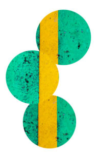
Composition 14
In this composition I have copied composition 2 but cropped the images into circles. I think this takes away from the image as the lines seem completely separated and due to the cropping in the first image, it is not obvious that it is a straight line.
Composition 15
In this composition I have rotated composition 14 to make the lines run horizontally. I think this works better as the middle image is a clear focus point in this composition.
Composition 16
In this composition I have rotated composition 13 the make the lines run horizontally. I think that the images look too separated in this composition due to the cropping and positioning.
Composition 17
In this composition I have taken inspiration from composition 3 to bring all of the images together to create one image. I like the style of the composition but I think the outline of the shape is too abnormal.
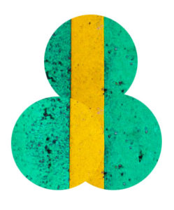
Composition 18
In this composition I have again taken inspiration from composition 3 but used circles instead of rectangles. In my opinion this type of composition works better with rectangles as it gives strong edges and shape whereas the circles don’t.


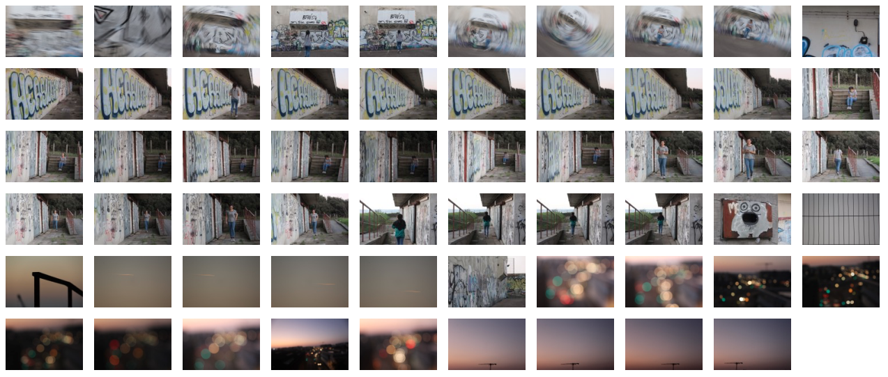


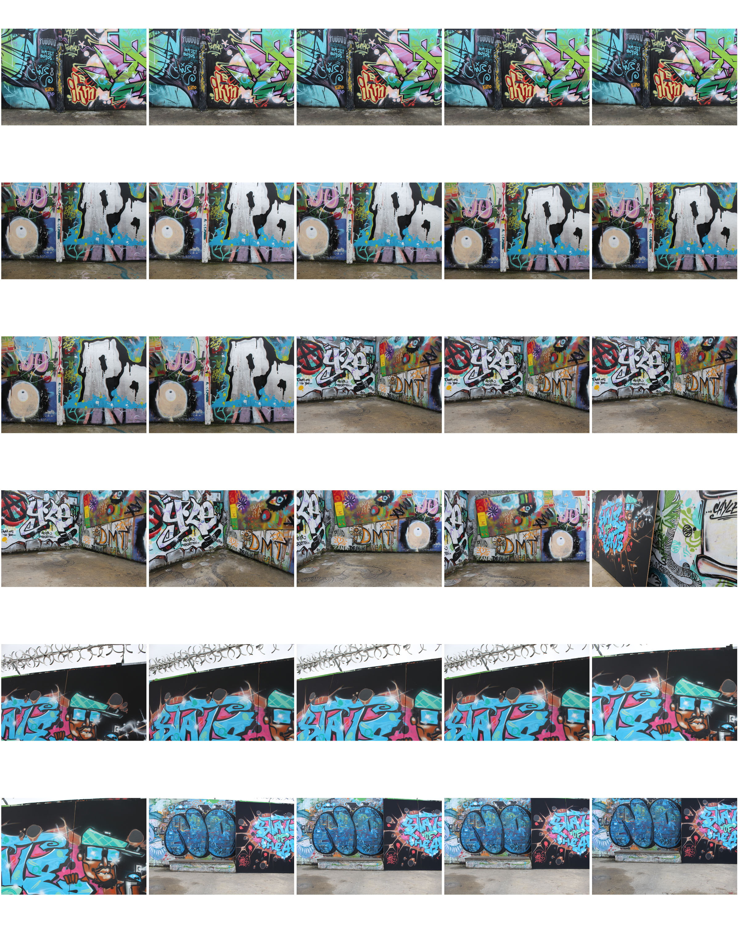
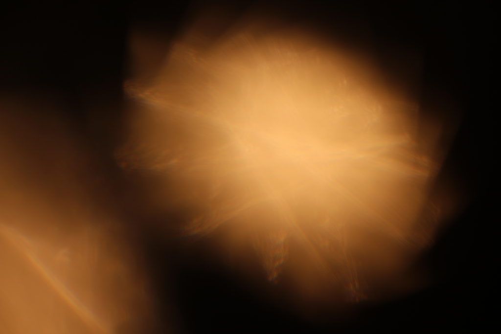
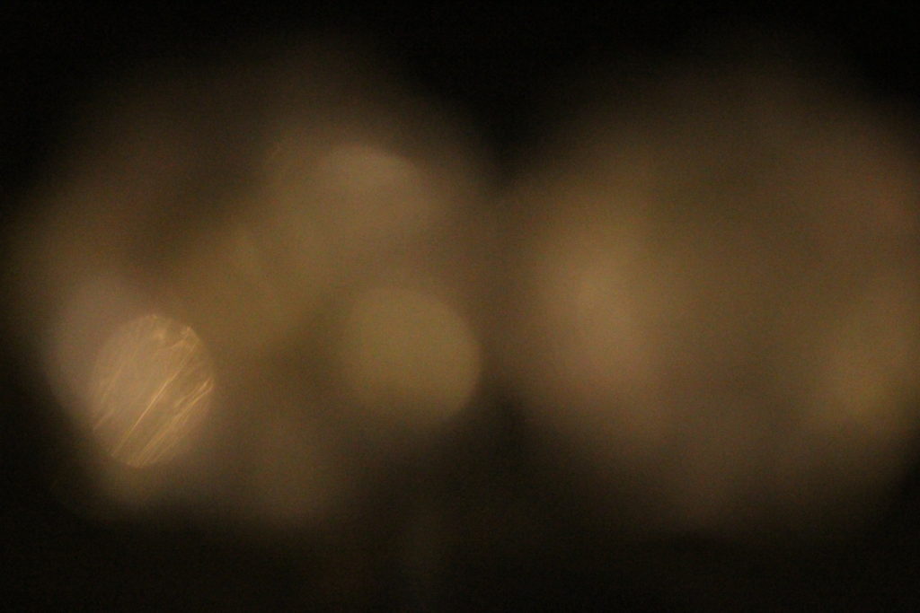
 Basically, bokeh is the quality of out-of-focus or “blurry” parts of the image rendered by a camera lens, – it is NOT the blur itself or the amount of blur in the foreground or the background of a subject. The blur that you are so used to seeing in photography, that separates a subject from the background, is the result of shallow “
 To achieve this effect, you must select a large aperture about f/2.8, 1.8 and 1.4, then get up close to the subject, and focus on what you wish to be 'sharp' whilst making the subject far from the background you want blurred out.
I really liked the way many photographers used the use of making lights into almost circular spheres, and decided to have a go at trying out the effect, by putting a clean glass over my lens to take the pictures it created the desired outcome, these were my results:
To achieve this effect, you must select a large aperture about f/2.8, 1.8 and 1.4, then get up close to the subject, and focus on what you wish to be 'sharp' whilst making the subject far from the background you want blurred out.
I really liked the way many photographers used the use of making lights into almost circular spheres, and decided to have a go at trying out the effect, by putting a clean glass over my lens to take the pictures it created the desired outcome, these were my results: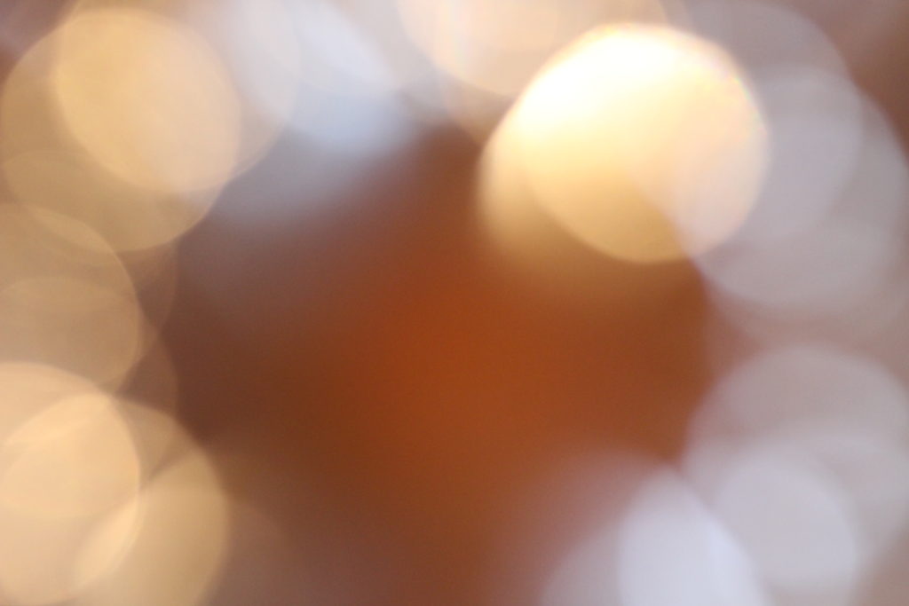

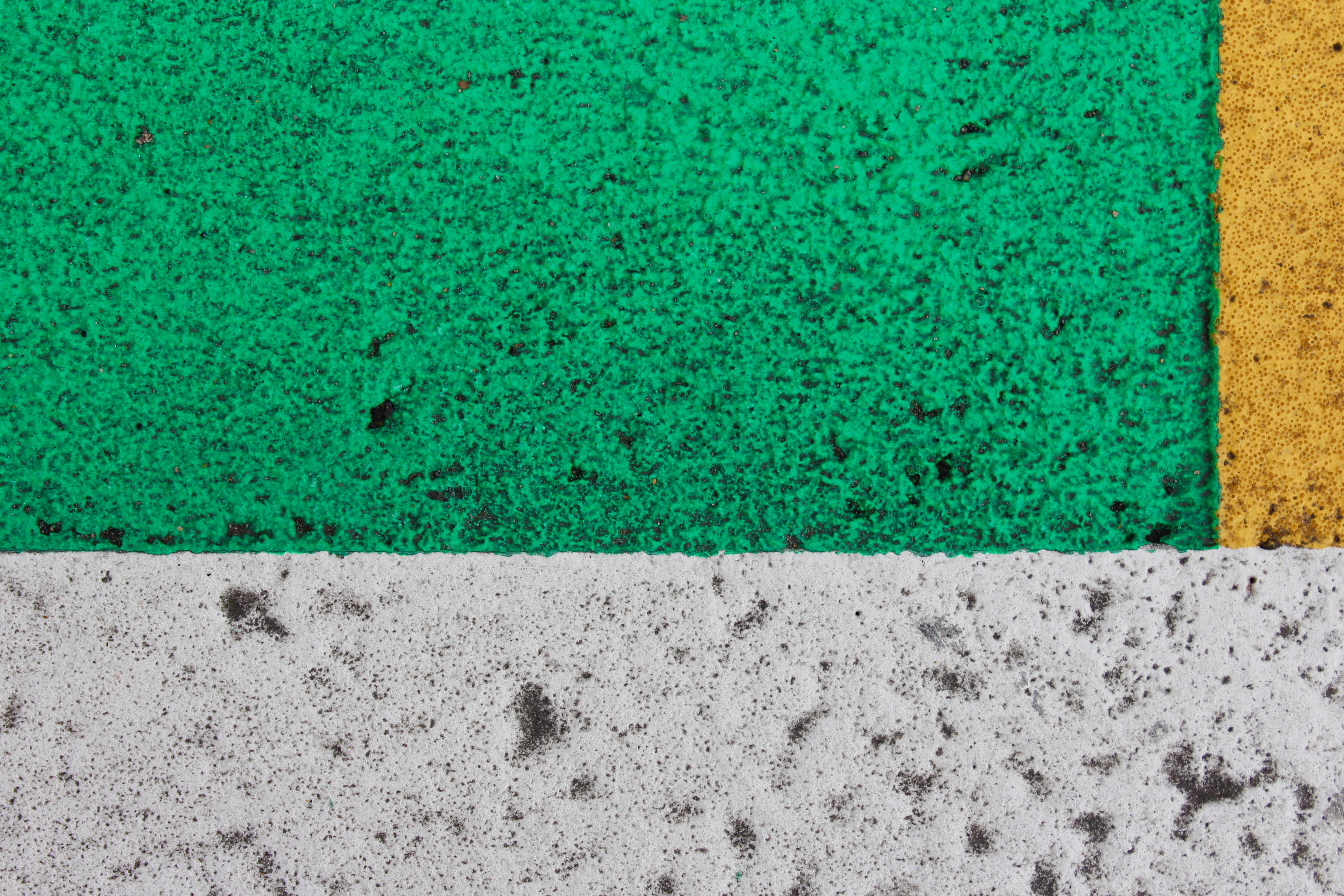


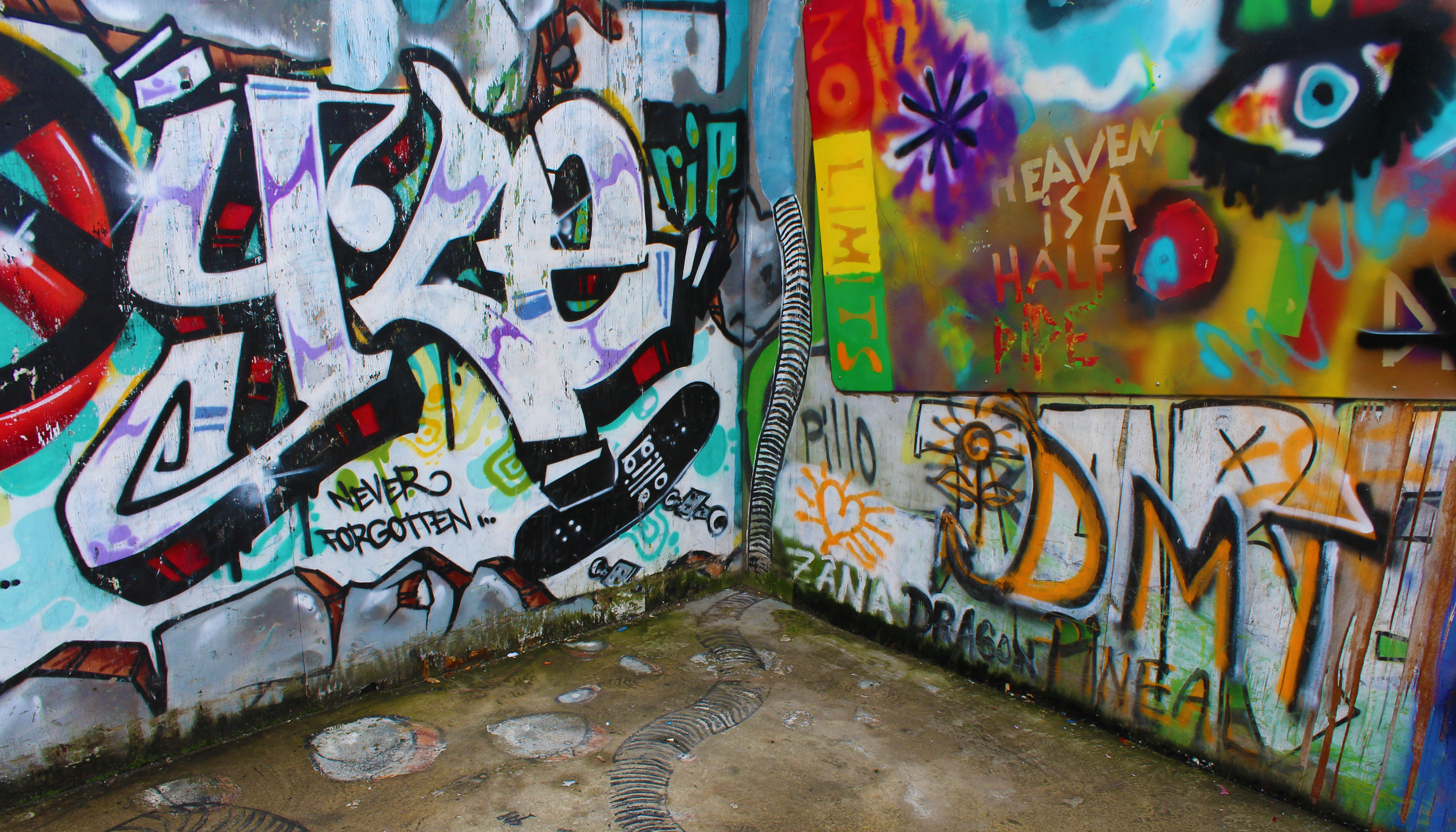
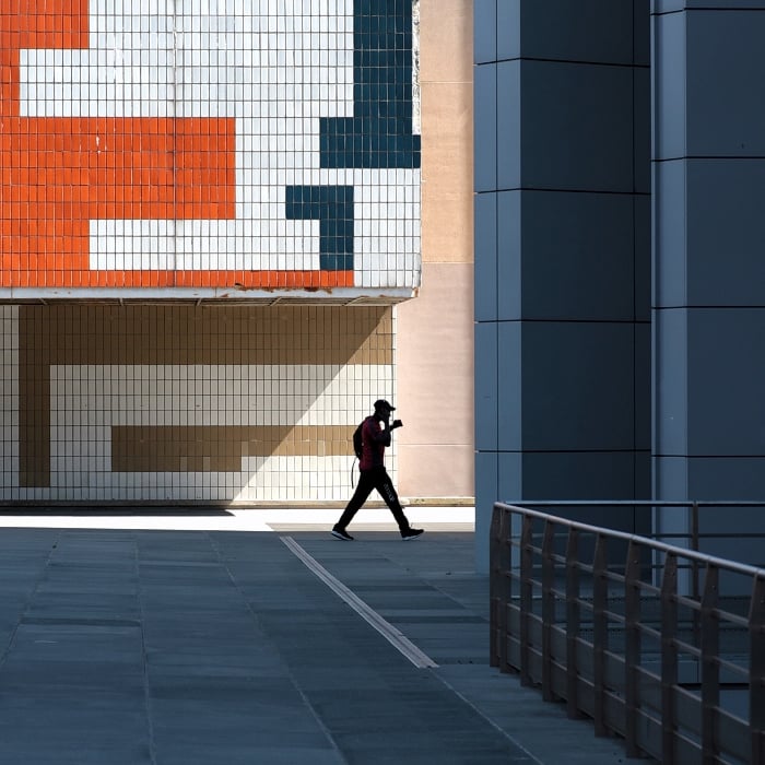
 My Favourite Photo: