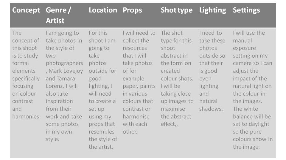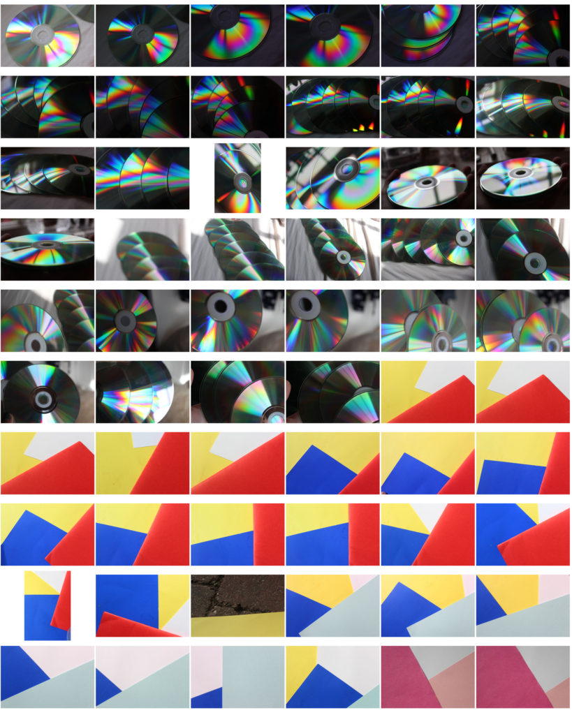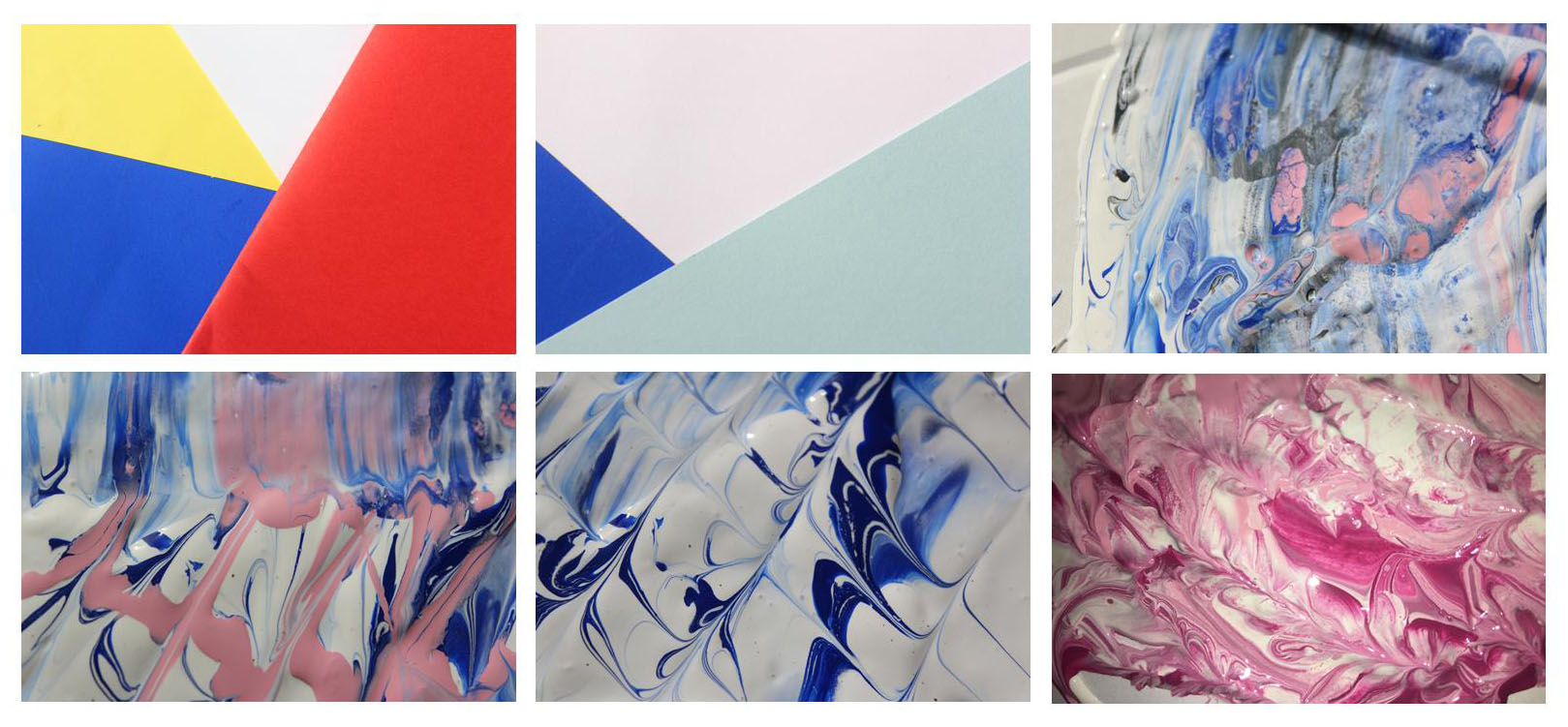


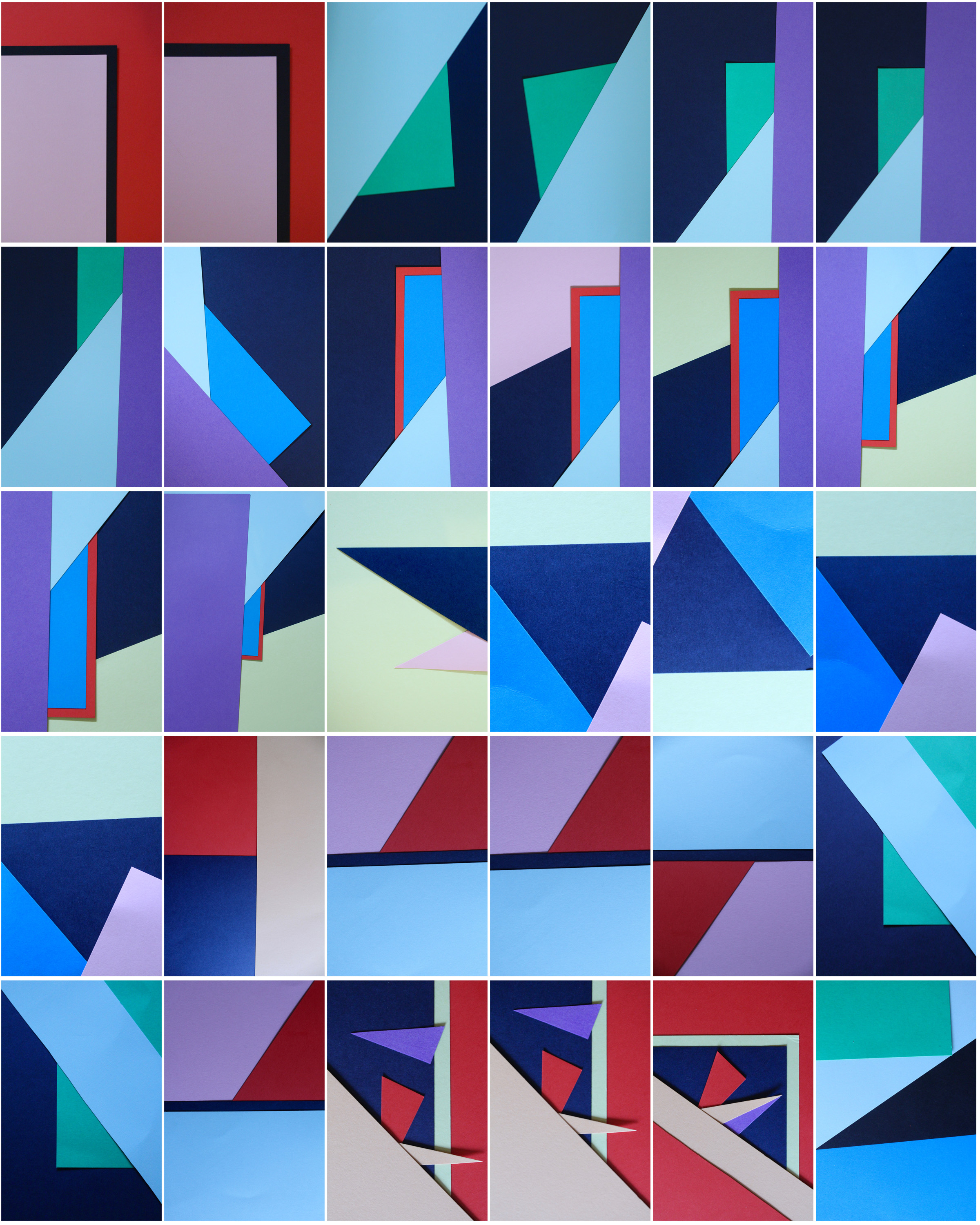
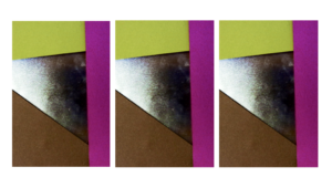
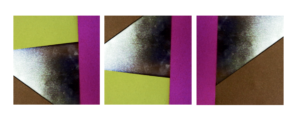
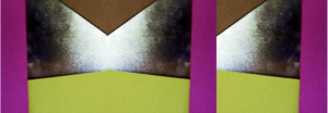
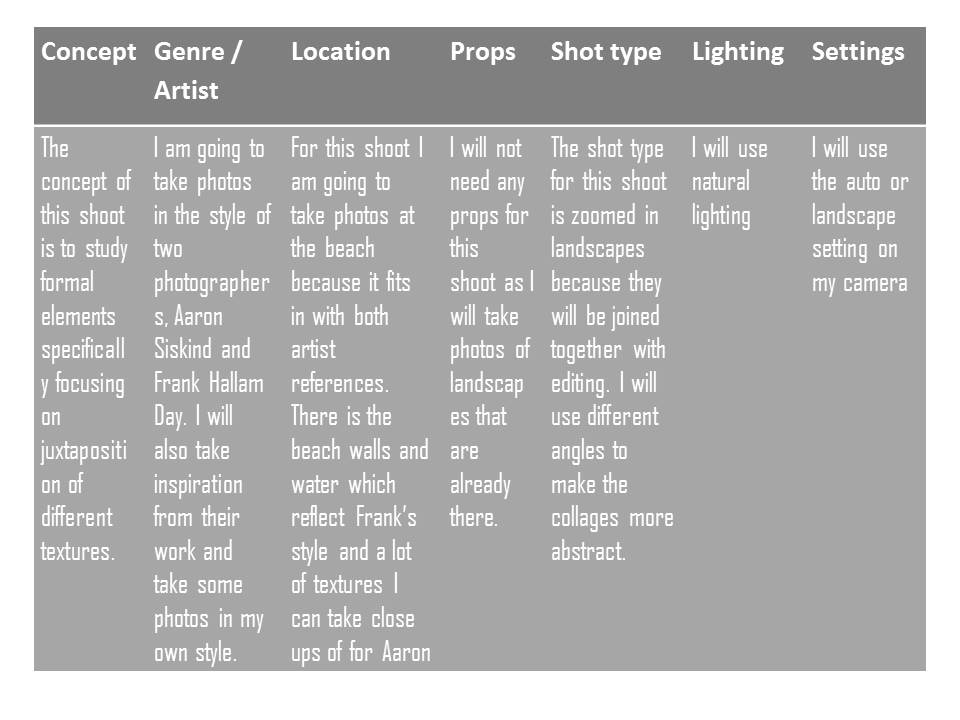
Taking inspiration from Tamara Lorenz, I tried to re-create her abstract photography using sheets of coloured paper and arranging them in different ways. I selected colours that complemented each other and cut pieces of paper to create traingles and other shapes to make the photos more interesting.
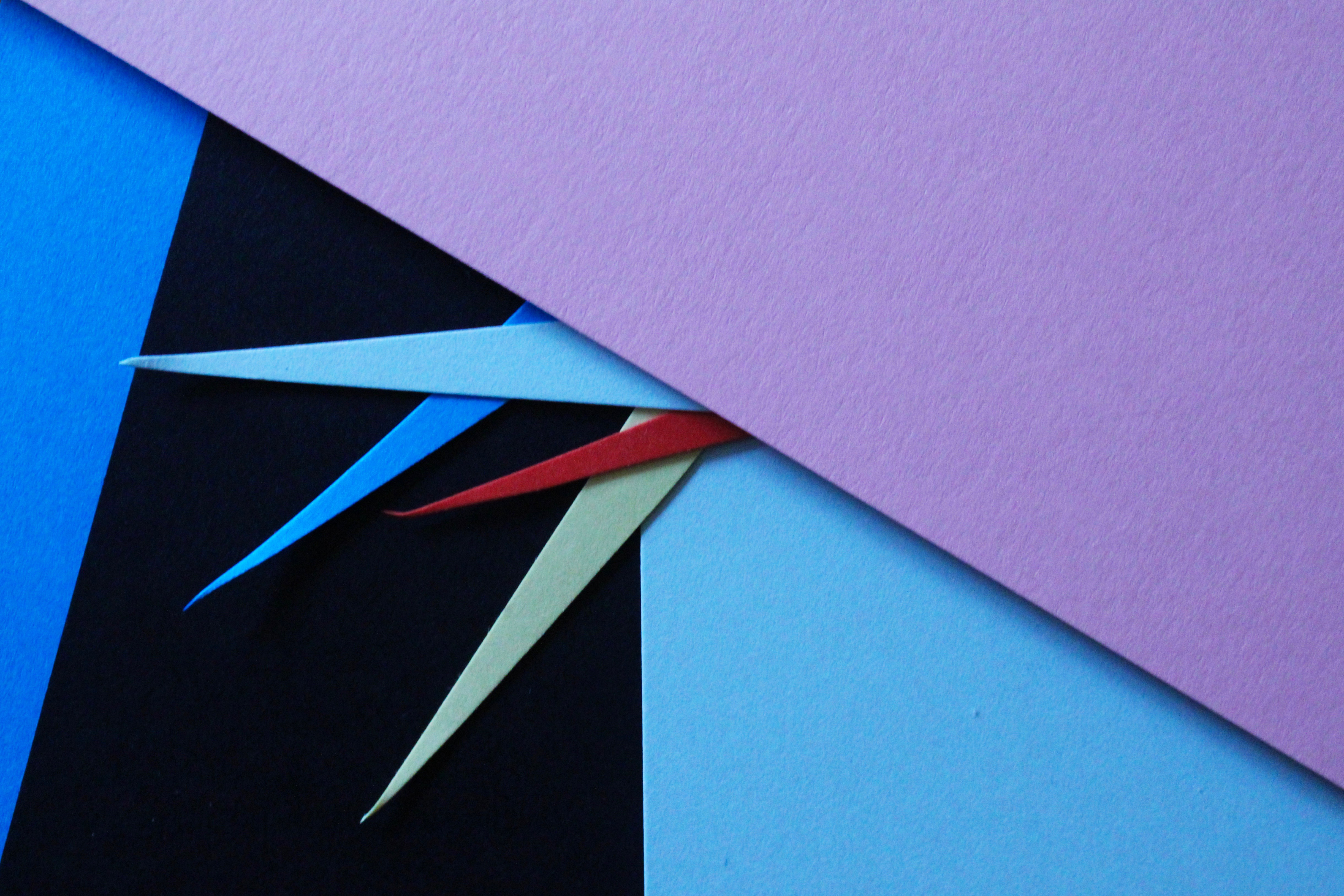
I especially like this photo and the colours I used to create the pattern. The red sheet of paper with the blue layered on top creates a bold outline and is the point where your eyes are drawn to. Like Tamara, the addition of strong planes of colour provide another source of contrast in addition to those of line, shape, tone and texture. The cold colours paired with the warm colour creates a contrast between the sheets. The paper layered behind is arranged to create distinct geometrical shapes, emphasising the straight lines. I experimented with different angles to place the paper and tried to find the most aesthetically pleasing arrangement. I experimented with flash and natural light and decided that natural was better. This work also shows similarities to Franco Fontana’s work using bold, vivid blocks of colour to link into abstract photography.
To further develop these photos I could arrange them in a different shapes, e.g. a circular shape, to frame the photos even more.
Mark Lovejoy
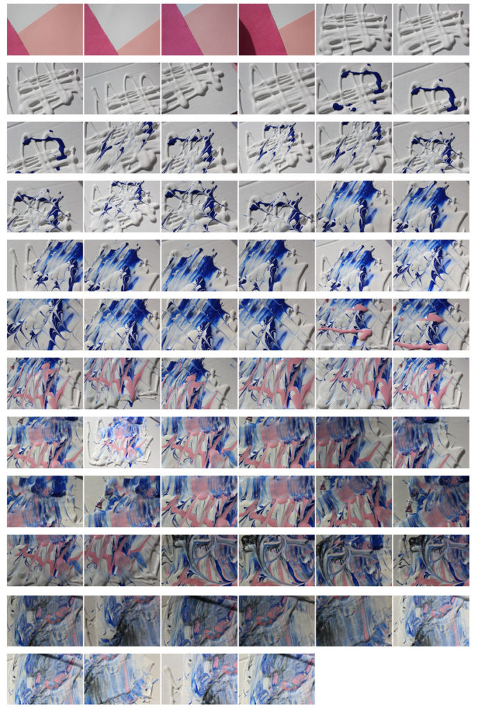
Mark Lovejoy is a painter and photographer from Texas. Alough from a glance his work looks like photographs of think mixed paint colours,m when we look closer we notice the detail in the images. Io make each image Mark mixes a variety of pigments with oils, resins and drying agents. he then takes multiple images when the paint is wet and dry so they can be manipulated and played with later. The light reflections and textures are retouched by editing which helps the images looks so detailed and created the illusion that they are standing of the page. When the paint has completely dried they no longer retail the same glossy look, this is why his work is thought of more as photography than painting because all that remains is the photograph.
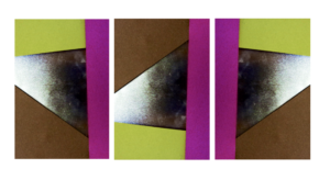
Tamara Lorenz
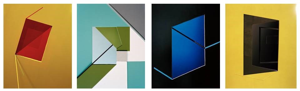
Tamara Lorenz is a German artist and photographer who creates various abstract constructions using different materials. a common theme running through her work is large areas of plane colour which contrast with the colours of the. the texture provided by the edges and shadows of the shapes makes the images look more 3D and ads depth. The photographs creates a type of illusion that becomes more complex the more you look at it.
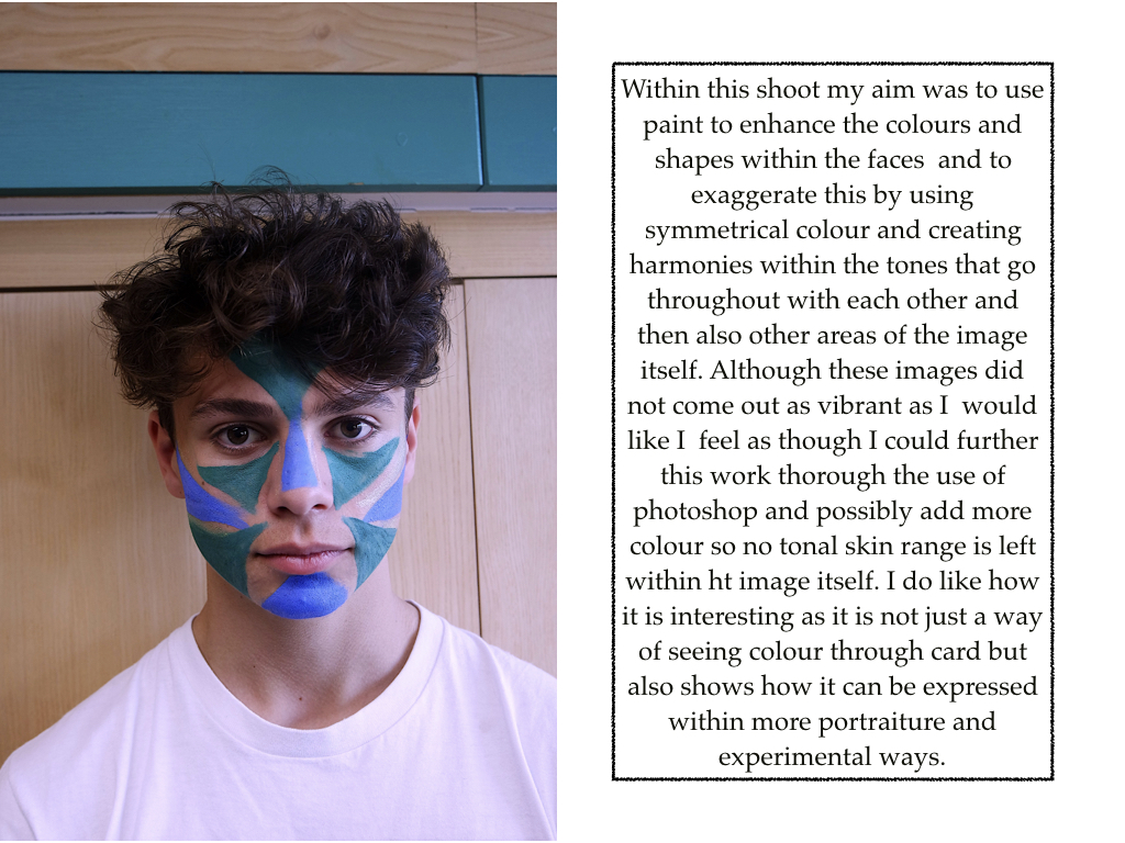
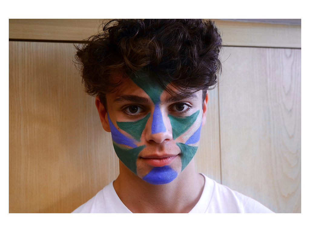
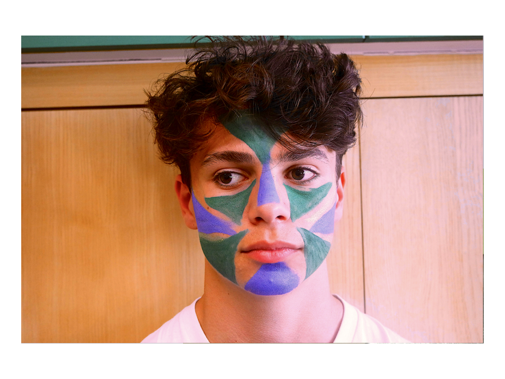
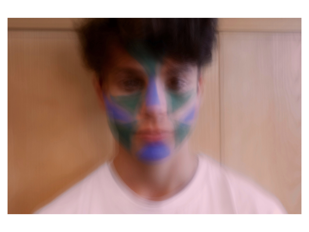
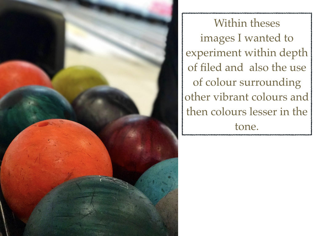
Best Images
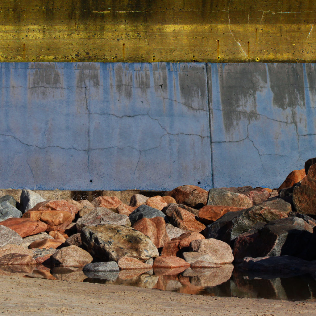
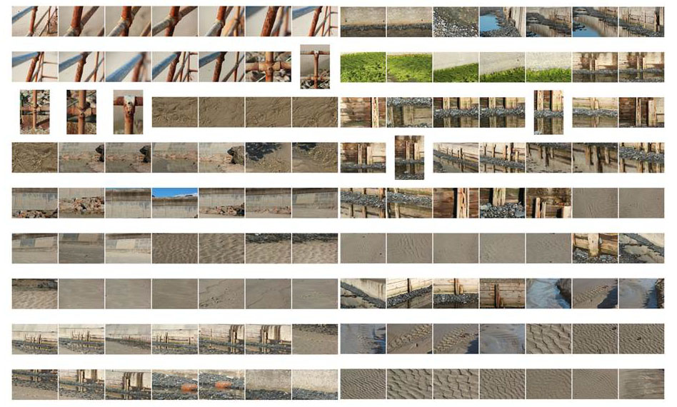
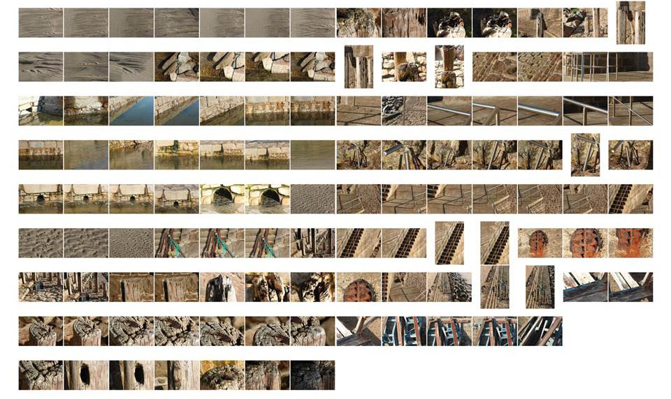
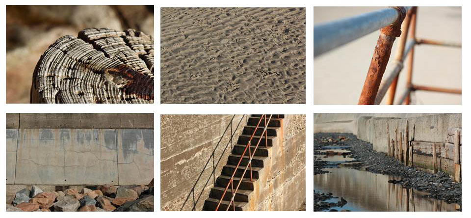
Using Photoshop I changed the hue ans saturation of selected areas of the image to replicate the bright colours we see in Frank Hallam Day’s work. This Image that I took had similar textures to his series of photos on ship hulls, it also has interesting summitry and pattern which reflects his style.
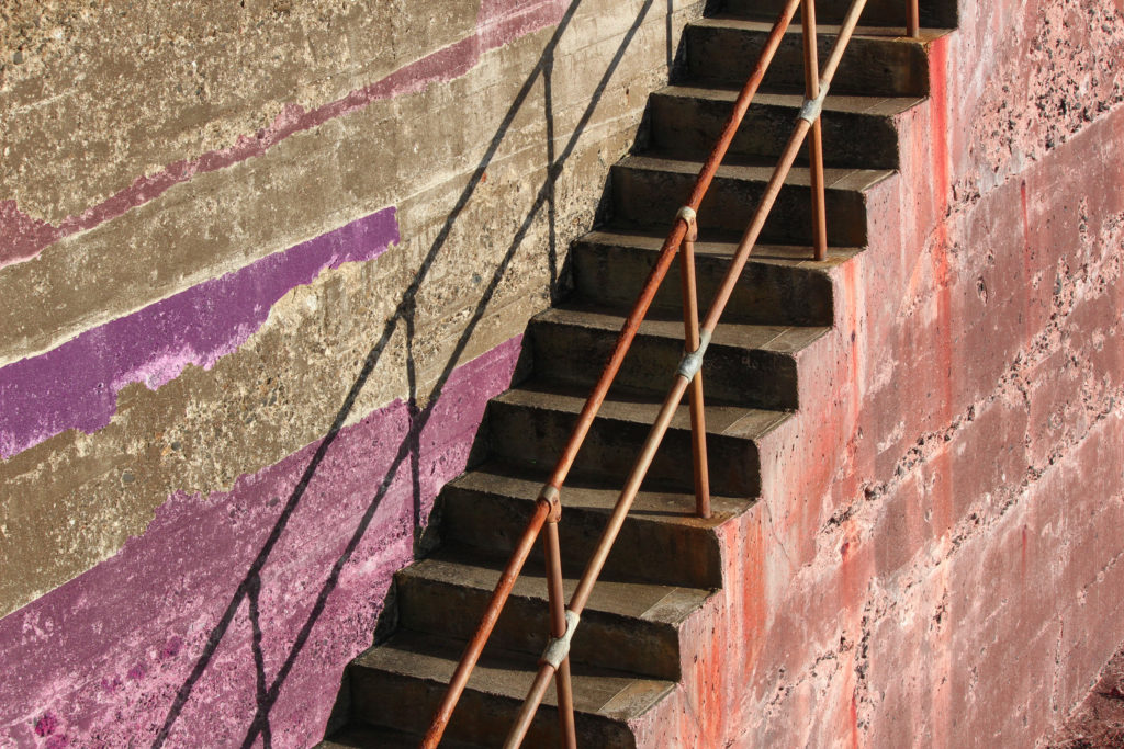
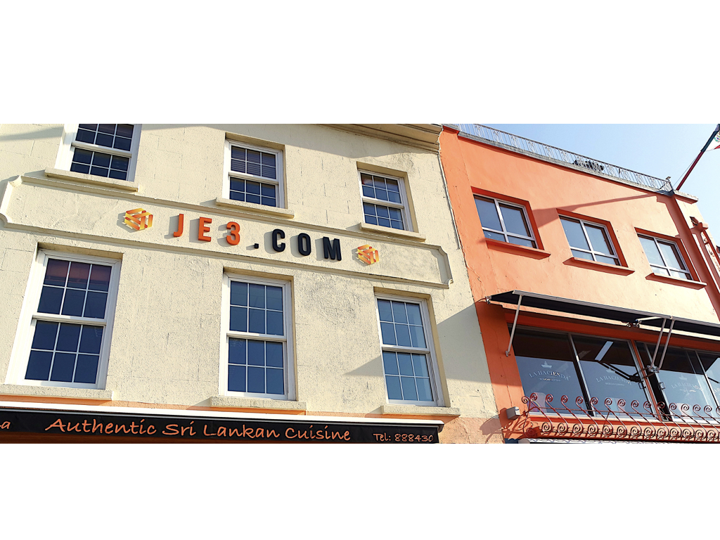
I chose to edit this photo of the sea wall because the horizontal lines reflected the style of Frank’s ship hull series. I changed the colour of the cement wall so it looked more vibrant, this helped the weathered detail in the picture stand out.
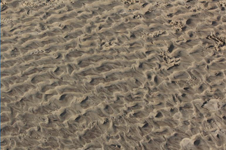
On the same shoot I also took some photos in the style of Aaron Siskind, originally I didn’t like this photo due to the lack of colour and depth, however after changing it to black and white and adjusting the contrast and brightness the photo shows the style of the photographer.
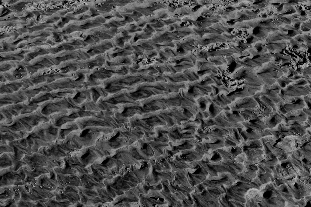
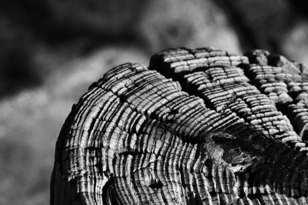
I also edited this photo of the textures in a piece of wood on the beach, the light and dark tones in this photograph reflect those in Aaron’s work. I used a long lens and a low aperture to take this photo which helped to blur the background, making the patterns of the wood look sharp and detailed.
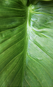
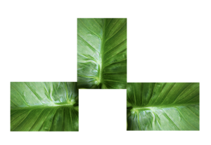
This was my image originally,I chose this image because it has a lines of symmetry throughout the middle and due to the colour being vibrant. I also thought that all the lines of detail would compliment the composition of the piece when experimenting with the layout .
For my first edited I simply repeated these images in lines exactly the same as before,with the the lines throughout it is more obvious and appealing to see and it also portrays the highlights throughout very well.
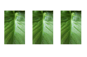
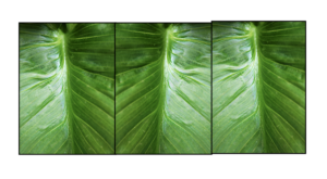
next I flipped these images to all be different,this creates a more abstract feel and a less fuller sense as to what the leaf really is and also shows the tones in different interesting experimental methods.
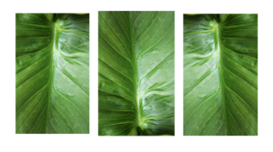
I then proceeded to put my images into a squared again continued these are different angles within th images and again have flipped images within the squares.

The next image is interesting because I wanted to shows a somewhat continuation of the lines through the second image which is also at a different angle so creates a center point and allows the image to become more dynamic and interesting. 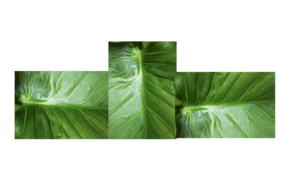
For This image I was again inspired by my previous experiment of the layout of the piece itself is making it so every center point is facing out of the middle. I still have point from the two opposite leaves.
within this last image I want to form a mirror limes and. a sense os symmetry to the pieces also added a boarder so aswell as forming the piece it also breaks the form into specific piece of the text.This piece is also divided into darks and lights within the division.
For these next images I wanted to focus more on the actual development of colour, this was in order to again experiment with form and how I can develop the different angles of the paper too.
These images are both slightly different angles of the colour itself. but I want to further this image to more of circular and line patterns .
Here I wanted to show a repeated pattern of the lines within the image but still showing the fragments of colour at the same time. I also exaggerated the colour in order to further exaggerate the vibrancy if the piece.
Within the two outside images are facing out in order to show a clear cohesion within the piece and symmetry too.But the middle image is the direct line as it is different to all the other images.
Here I also furthered the image into a squares and again flipped the image itself around too.
And lastly within this range you can see my lines of symmetry but a continuation of the line too.
Aaron Siskind
Aaron Siskind was an American photographer who’s work was popular in the 20th century. he became interested in photography in 1930 and joined a group of documentary photographers however after a time his work moved to a more abstract style. His photographs generally involve some sort of close up texture and his arrangement of objects within the frame was admired by other photographers in the abstract expressionist movement at the time. In the 1940’s and 50’s his work contributed to the avant-garde movement in America.
Frank Hallam Day
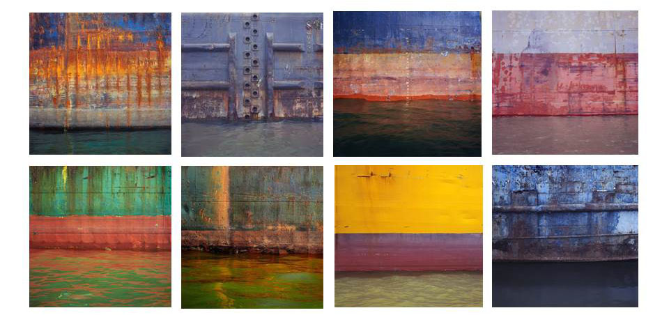
Frank Hallam Day is a photographer based in Washington who takes photos of ship hulls. His photos are have a common theme of vibrant colours interesting contrast in textures and perfect horizons. He started taking photos when he was 15, using a film camera and developing photos in a dark closet. He also has an interest in painting and we can see this style in his photos due to the bold colours and painted effect they give. The juxtaposition of the rough, rusted, paint pealed boats and the smooth water that reflects creates an interesting concept.
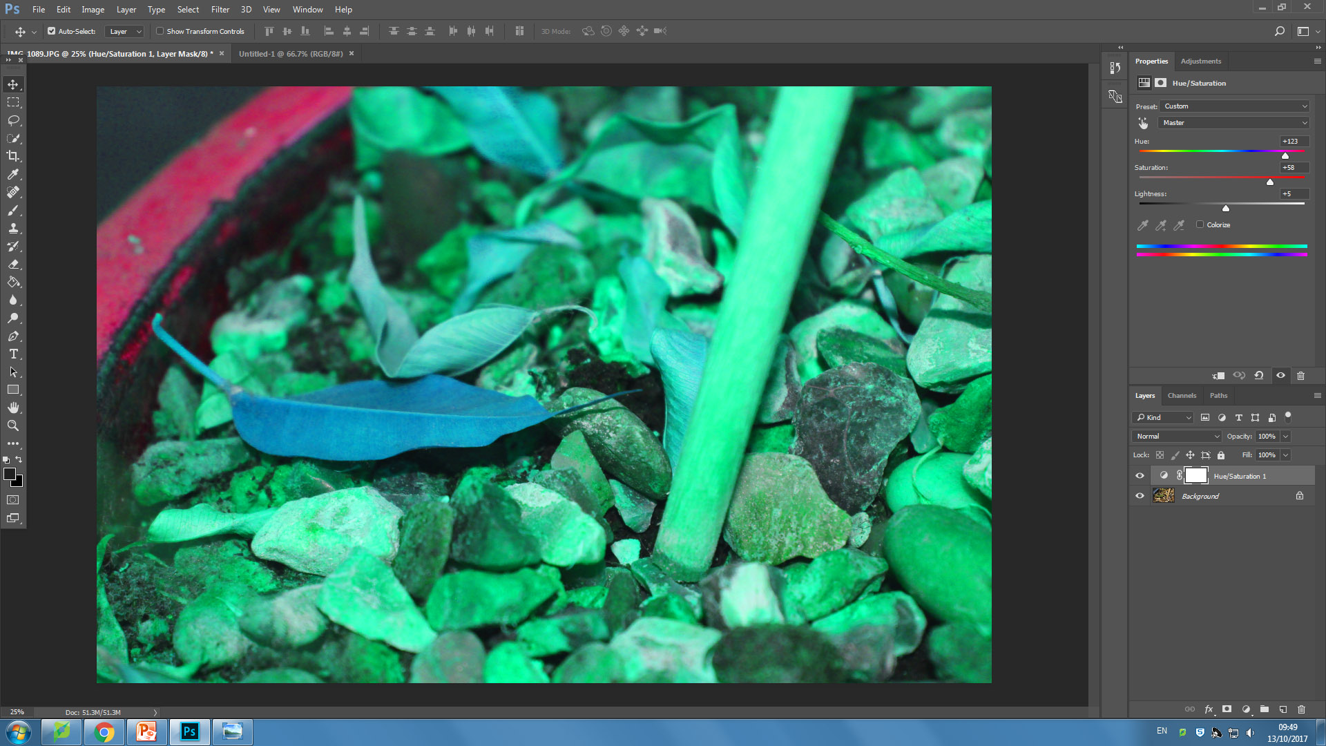
Colour, hue and saturation can change the appearance of a photograph greatly. The hue of an image is the colour or shade of it. The saturation controls how colourful or non-colourful an image is. These can be controlled in photoshop:
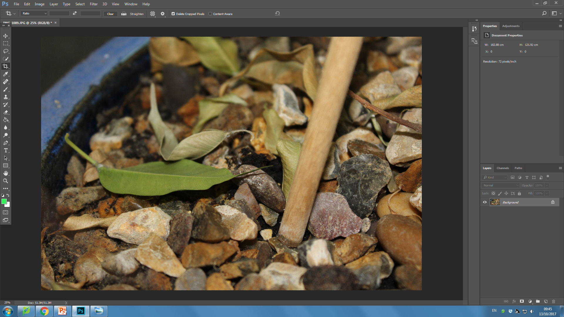
I took my original image and put it into a photoshop document. I then edited it by going to Layer then Hue/Saturation. This brought up a selection of sliders as seen in the top right of the bottom image. These sliders control lightness, hue and saturation. I made the hue a bright, abnormal colour to express how much it affects an image. I also put up the saturation to add extra colour to the image.
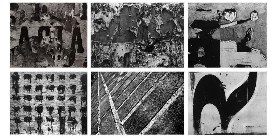
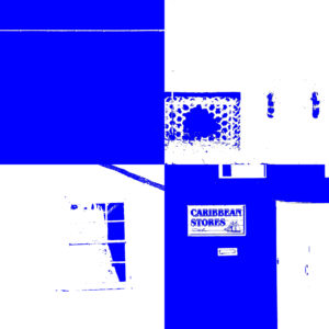
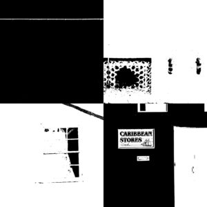
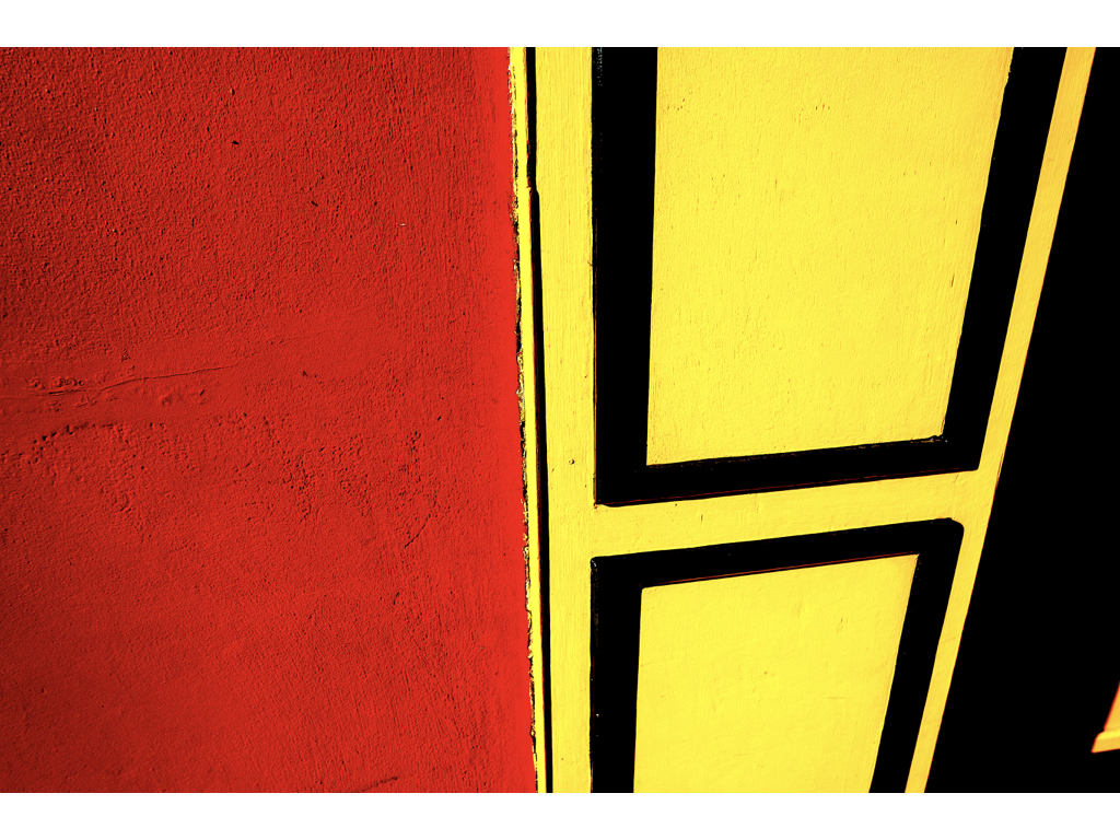
Keld Helmer Petersen - A danish Photographer who focused on shapes and kept his photographs very minimal. Some of his work uses very high contrasts. This moves the focus to the shapes and structures in each photo and strips away all the tones and shadows that a camera would usually capture.I used this technique on the images below by using Photoshop. I used 'threshold' and changed the levels of black and white that you could see in the image. I then inverted the image to see the opposite of the images. I also added colour instead of black for a similar effect however it looks more like to pop art:
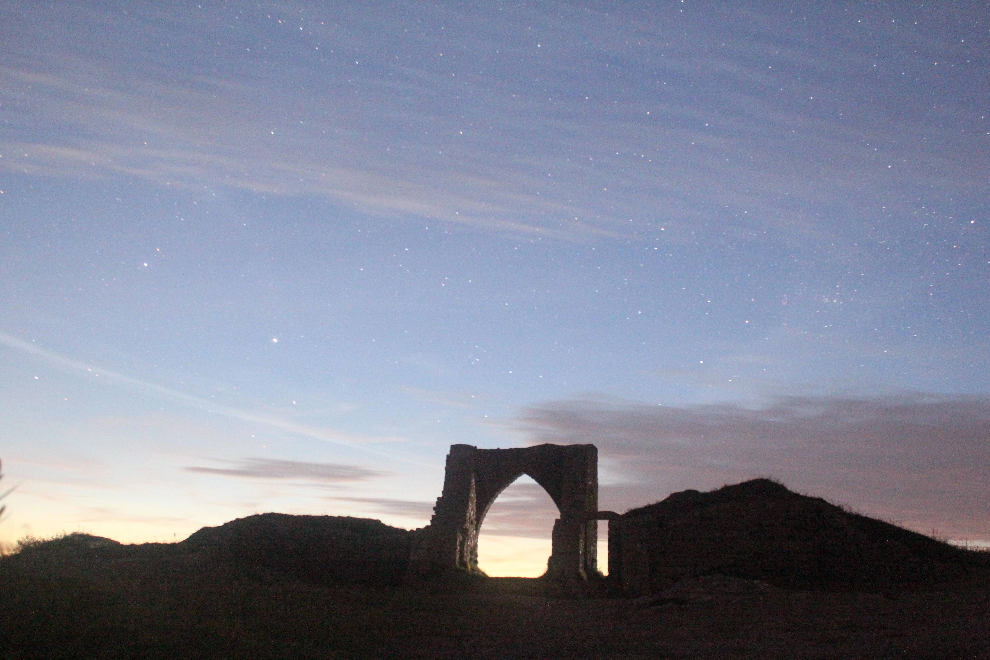
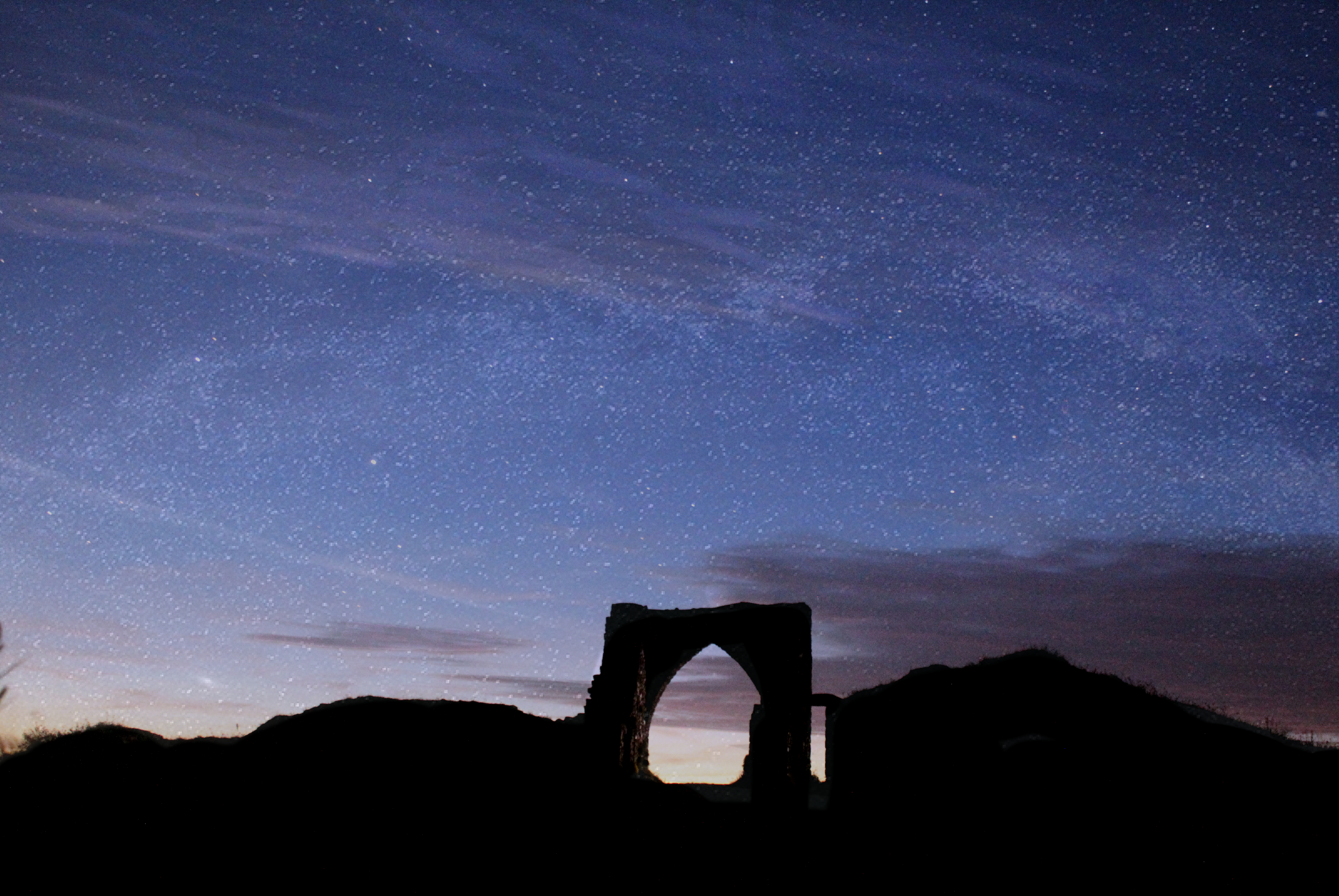
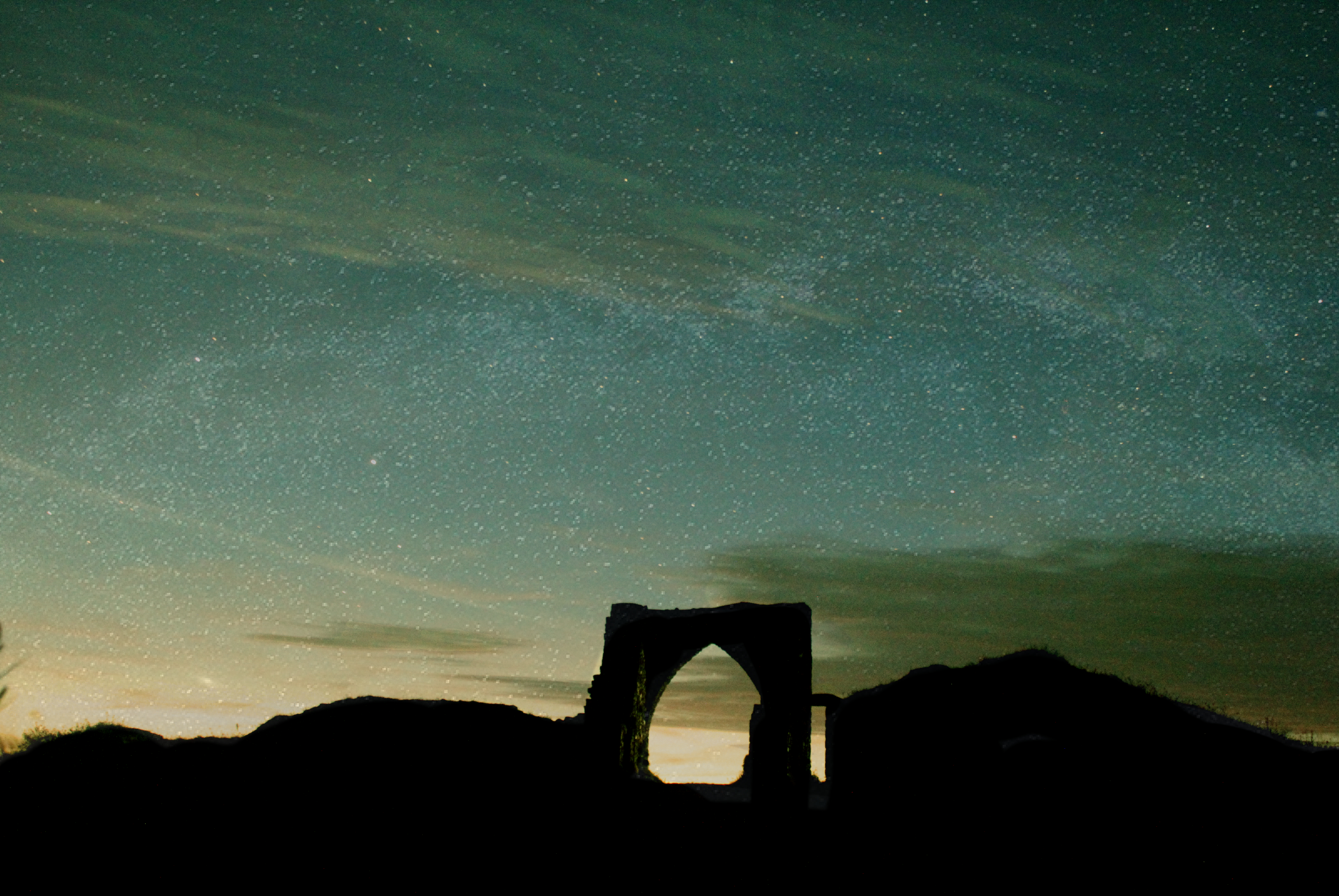
This image of Gronez castle was taking at nighttime, when it was completely dark. The aim was to capture the beauty of nighttime when inflicted with clear skies allowing visibility to see the millions of stars which surround us. Also to capture the colours which are seen through the skies at night time which often can be quite extraordinary. This photo below was taken with a 30 second long shutter speed and an ISO of 6400. I used these settings to allow as much light sensitivity possible into the lens.
This is the original photo
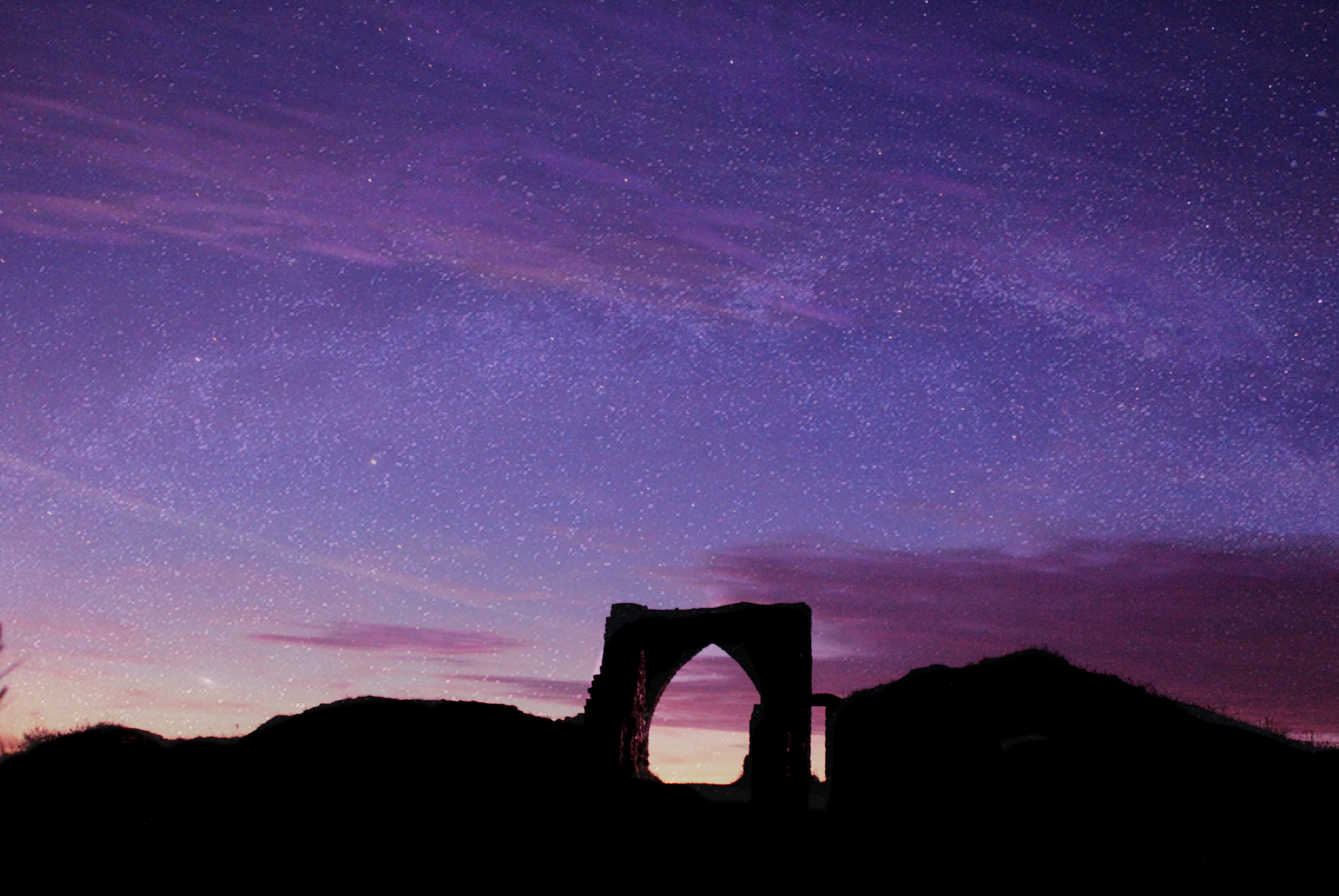
On Affinity photo, by adjusting the white balance and giving the photo a tint of different colours I was able to bring the night sky to life with vibrant and interesting colours. Much of the night time photography I have come across appears to have these unrealistic colours added which I believe is extremely interesting and is very beneficial in creating a photo in which people will take their time to look at. By adding the colour i was able to turn an ordinary picture not something which is eye catching and engages the audience more.


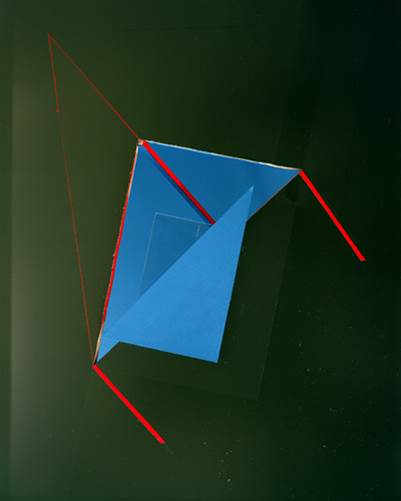
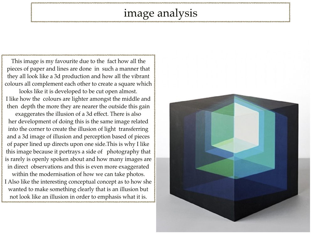
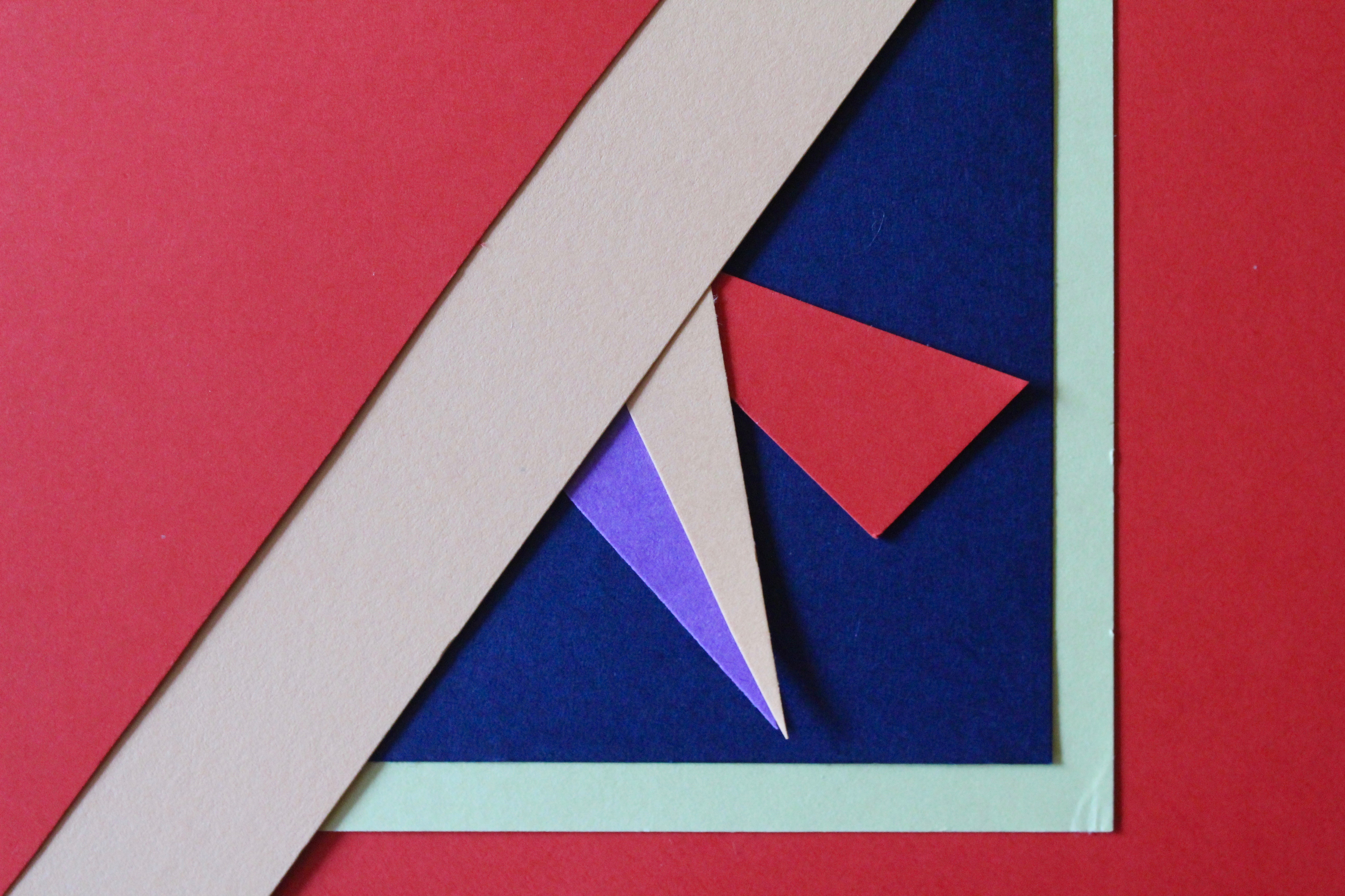
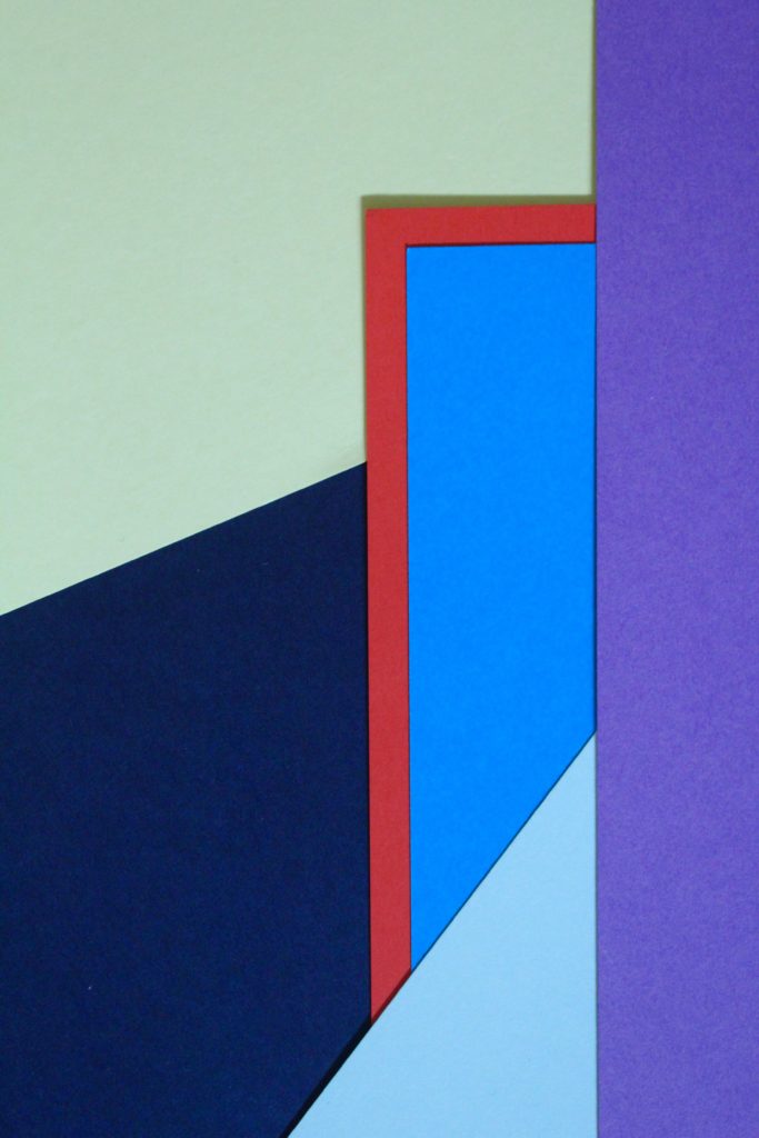
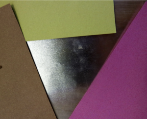
Tamara Lorenz uses geometrical shapes with solid colours to photograph. She cuts and folds the paper to achieve the shape that she wants. This photograph mainly consists of triangular shapes to give the impression of a 3D shape when in reality its only pieces of card. The folds within the photograph creates darker tones and shadows. The green background starts lighter in the top left corner and ends much darker in the bottem right, showing that the light is coming from the left. The thin lines of red create more geometrical shapes in the photo and outlines the other shapes. contrasting with the colours. At first glance, it is unclear whether the photograph itself is the artwork, or just a photograph of an exhibition, this directs attention to the tradition of photographic reproduction of artworks and its impact on the development of art and the art history since the nineteenth century.