Homework 4 – Textures

Frank Hallam Day

  • Frank Hallam Day is a fine art photographer in Washington.  He has taught photography at the Smithsonian Institution in other local programs.
  • His work is in numerous museum and private collections in the United States and abroad, including the State Museum of Berlin, the Baltimore Museum of Art, the Portland Art Museum, the San Diego Museum of Photographic Arts and the Corcoran Gallery of Art.
  • His artistic interests revolve around the themes of culture and history, and humanity’s footprint on the natural world.  Recent projects include the erasure of personal and cultural memory in East Berlin, and on the impact of globalization on African identity.
  • He was a winner of the prestigious Leica Oskar Barnack Prize in 2012 and the Bader Prize in 2006, and was a finalist both for the Sondheim Prize in 2007, the Sony Prize in 2010, the Voies Off Prize at Arles in 2010, and has received several grants from the District of Columbia Commission on the Arts and Humanities.  He was Artist in Residence at Acadia National Park in 2007, and was U.S. Cultural Envoy to Ethiopia in 2008. He has juried and curated numerous photography shows and competitions in the Washington area.  He also writes on photography for Photo Review.

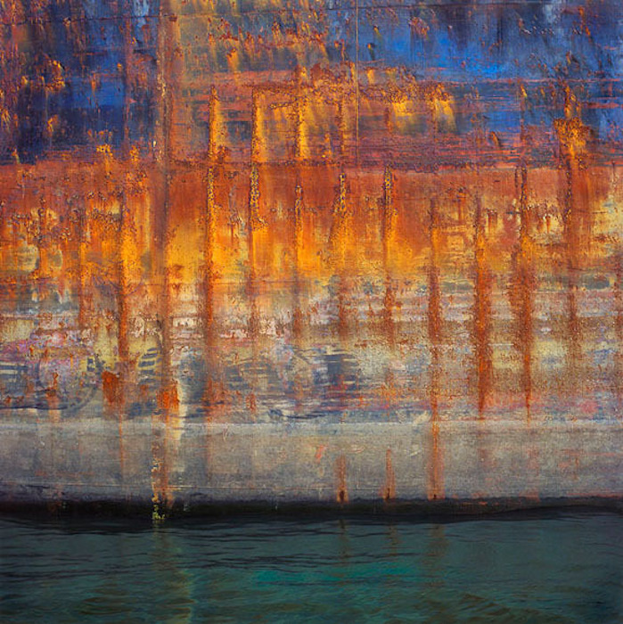
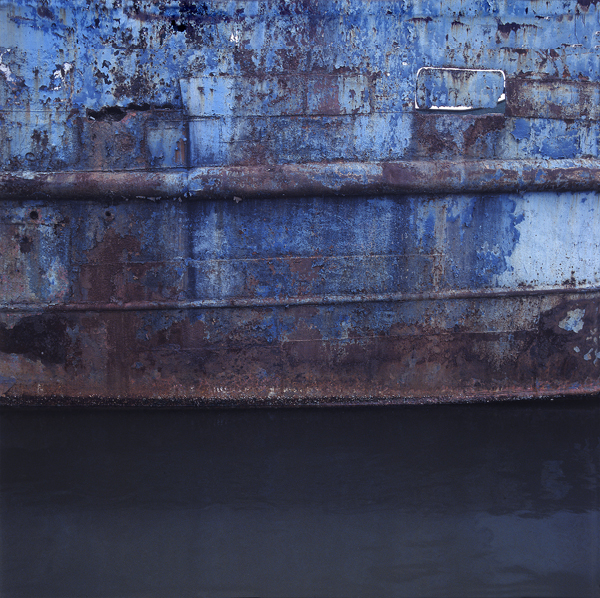
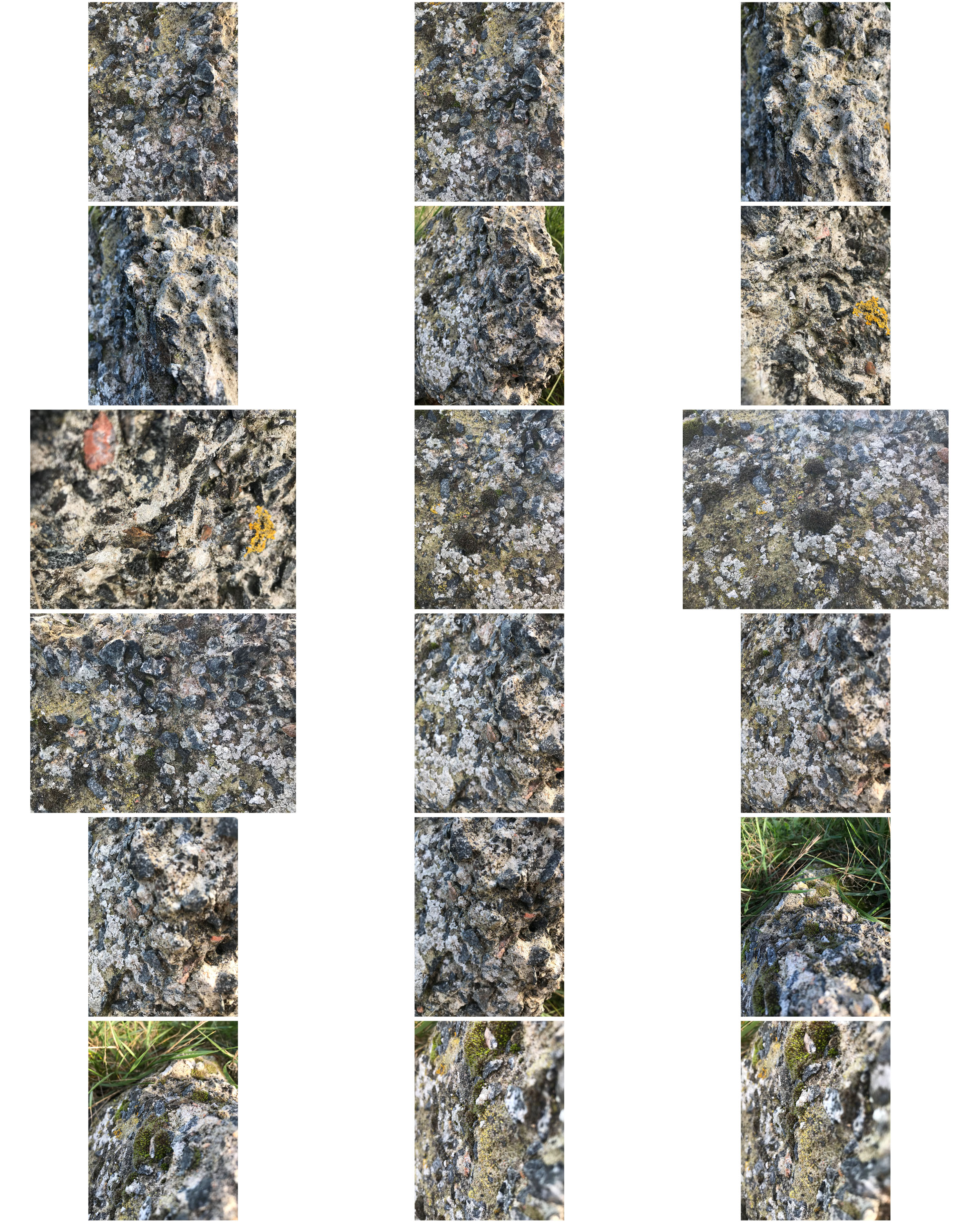
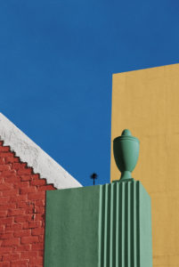
I was inspired by Frank’s use of vibrant colours on roughly textured backgrounds as it shows of the detail in their surface.

Aaron Siskind

  • Aaron Siskind was an American photographer born December 4th, 1903
  • He is considered to be a massive part of the abstract expressionist movement.
  • He began his foray into photography when he received a camera for a wedding gift and began taking pictures on his honeymoon. He quickly realized the artistic potential this offered. He worked in both New York City and Chicago.
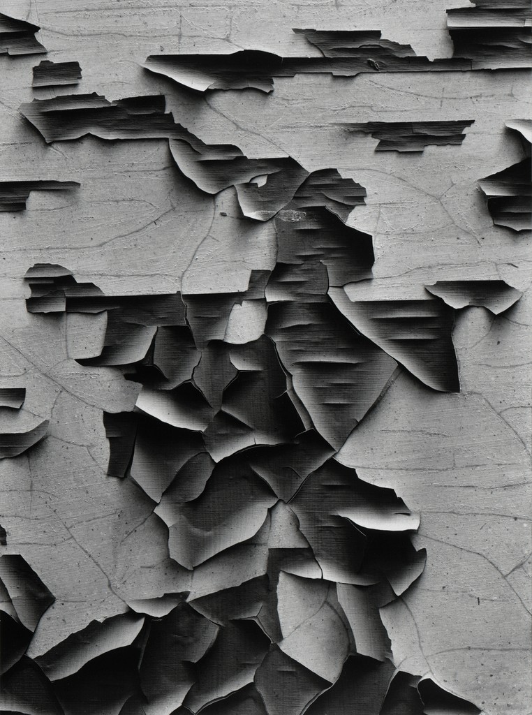
  • Siskind’s work focuses on the details of nature and architecture. He presents them as flat surfaces to create a new image out of them, which, he claimed, stands independent of the original subject. His work has been described as crossing the line between photography and painting.
  • He died on  February 8th, 1991.

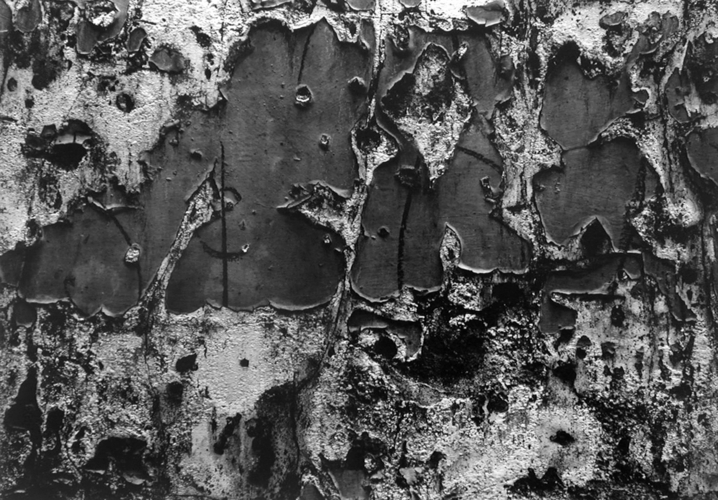
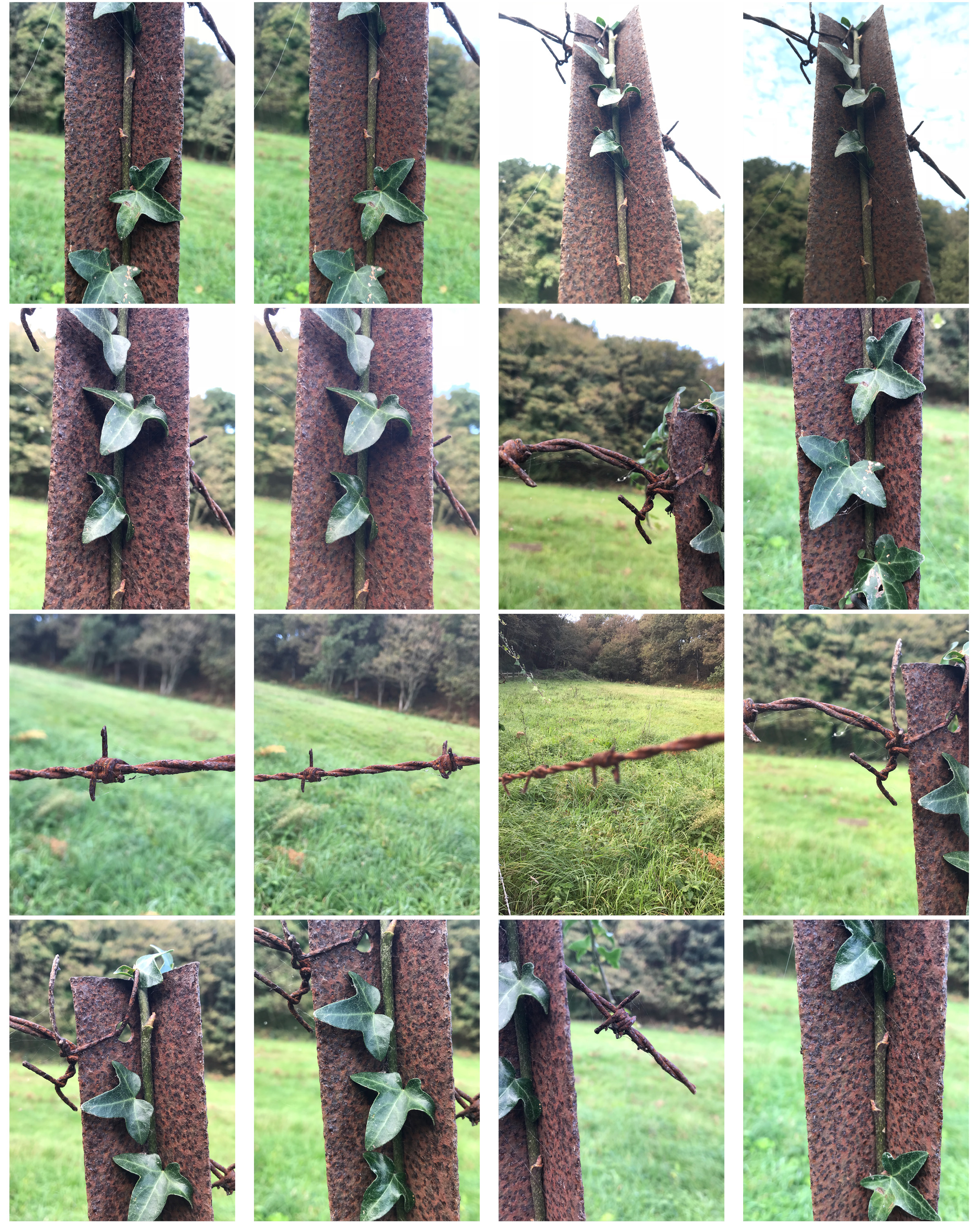
I felt inspired by Aaron’s work to use dark contrasted colours over different textures to present the different tones in their surfaces.

Image Analysis

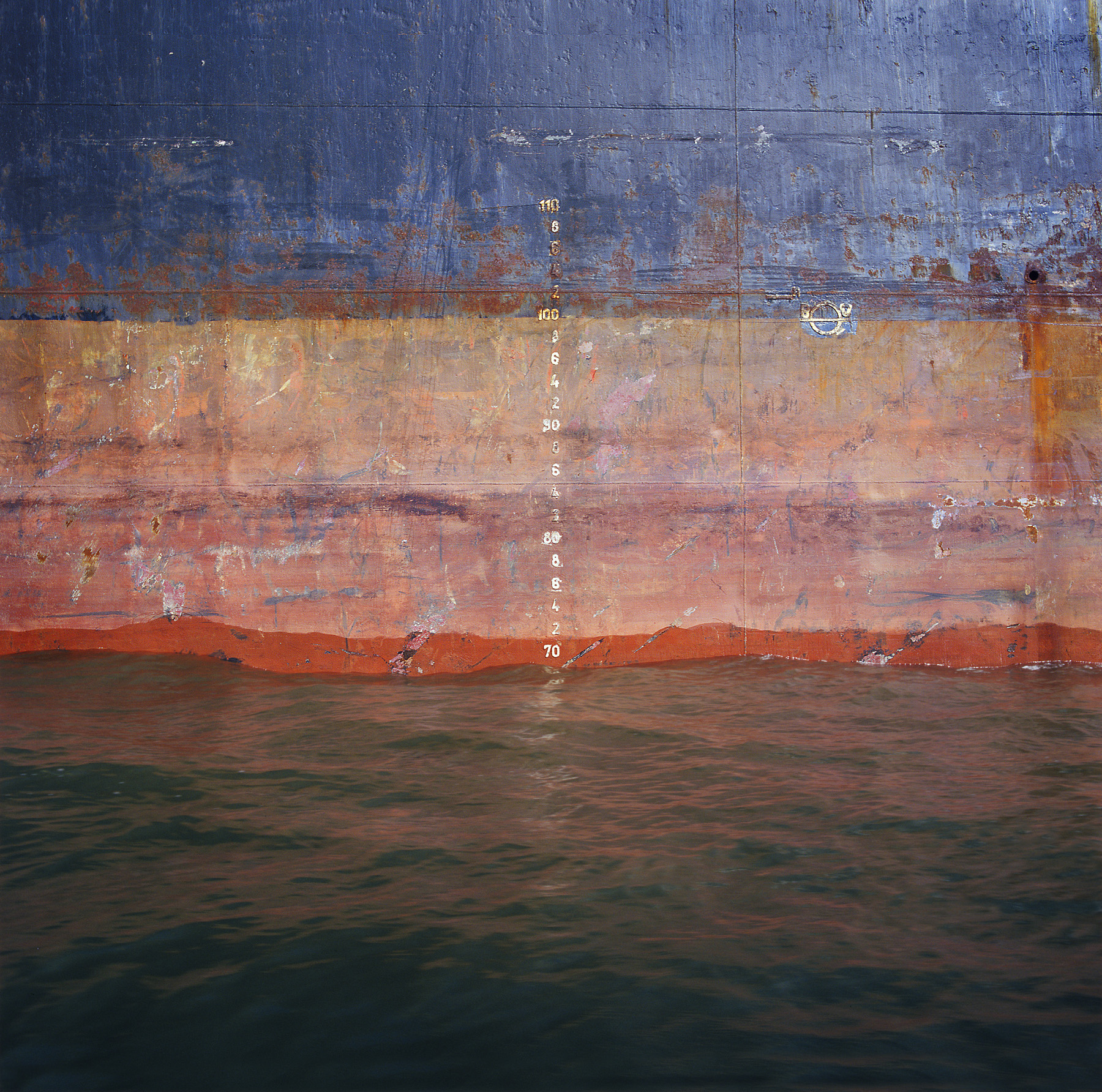
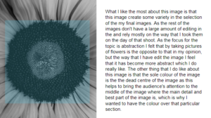
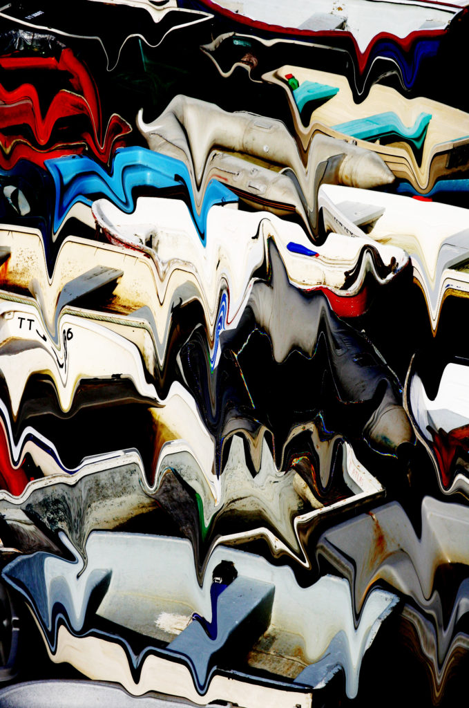
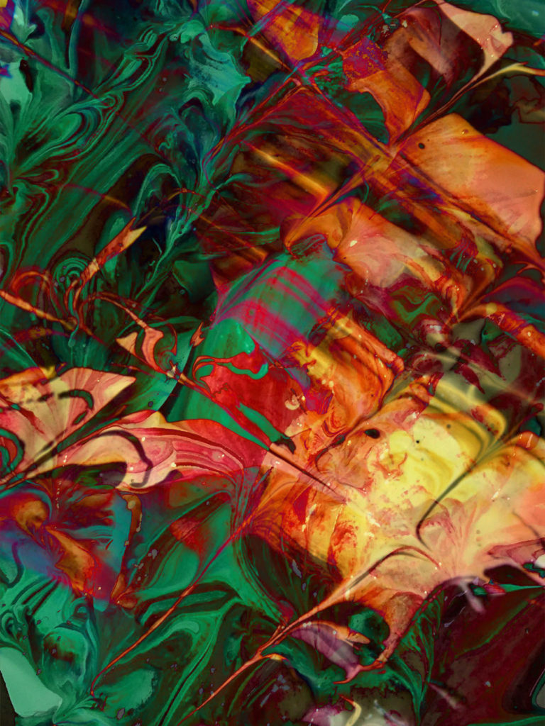
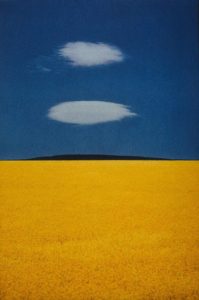
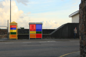
Frank Hallam Day uses a variety of natural textures such as the sea waves and the rust on an industrial ship. His image is composed into equal thirds with each section a different colour, allowing for the different textures to stand out from each other. Assuming he used a fast shutter speed, the sea waves provide a rich clarity in detail. The Ship Hulls series shows Frank’s interest in shipwrecks and travelling as he went across Lagos, Nigeria taking a photo everyday. Frank presents vibrant colours through this image, in reflections and the ship surface.
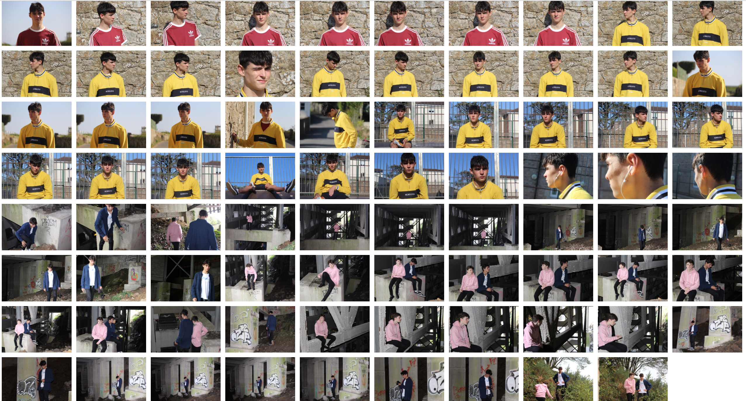
My Work


Edits

Processed with VSCO with b5 preset
Processed with VSCO with b1 preset

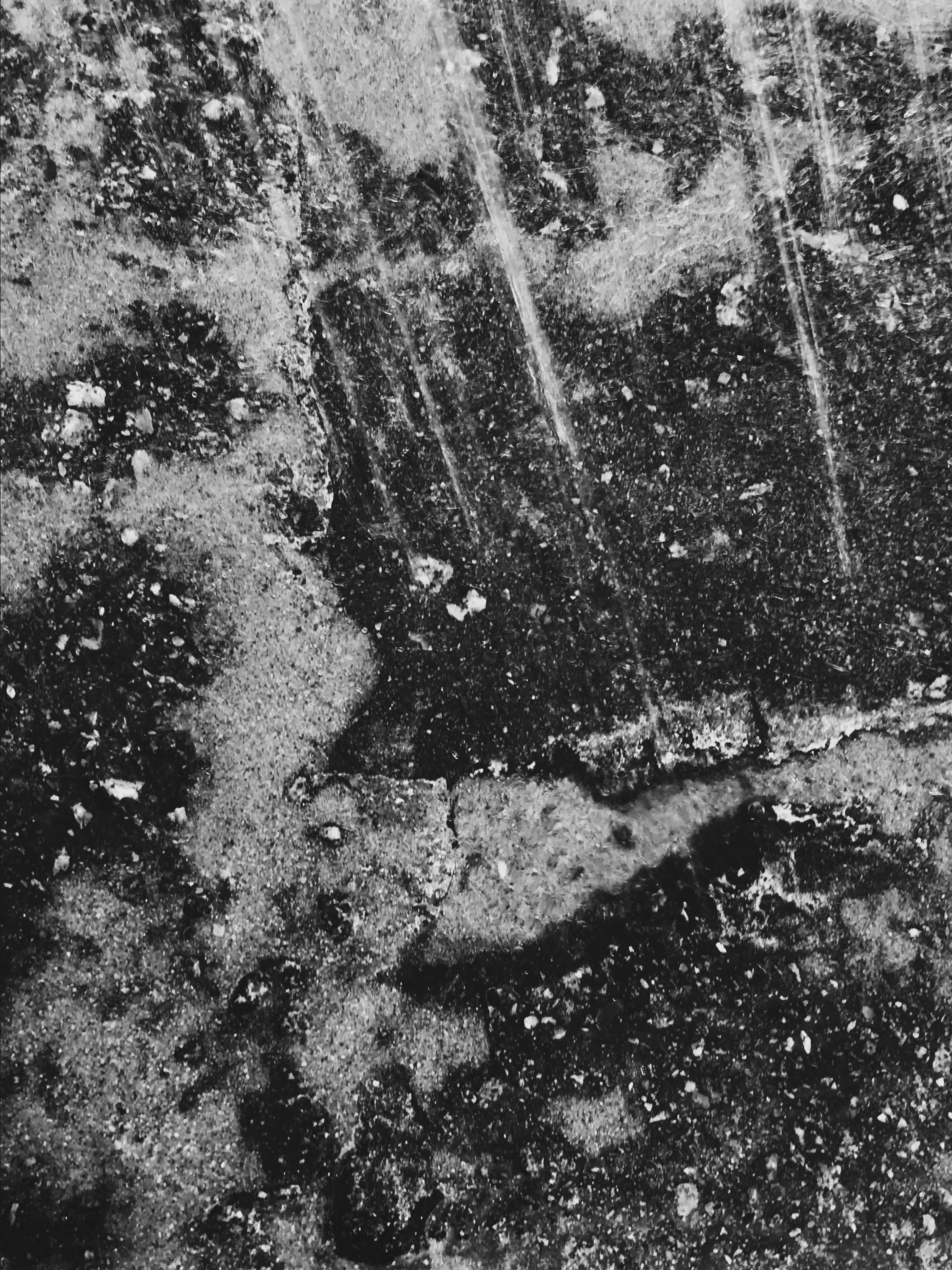
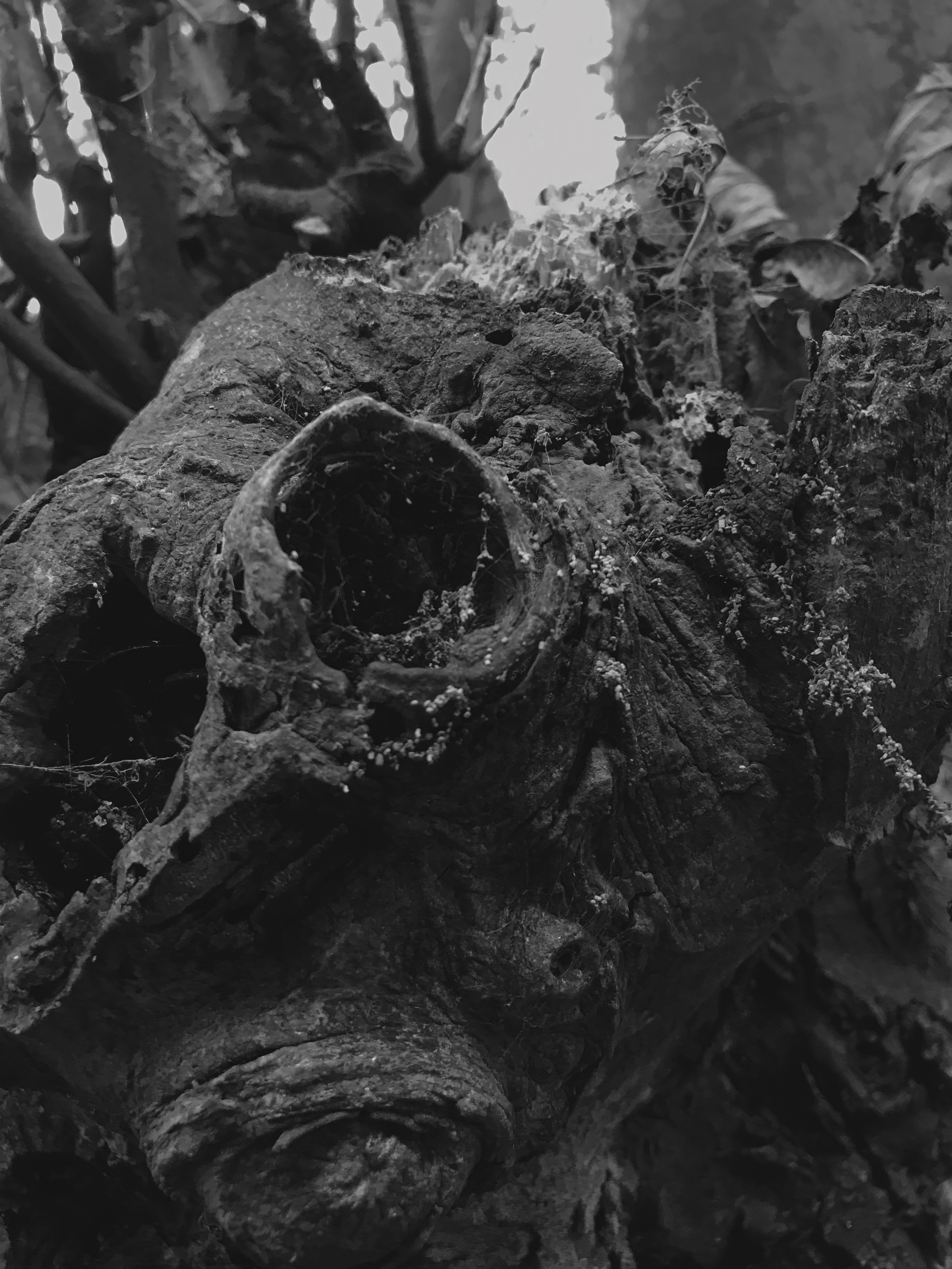
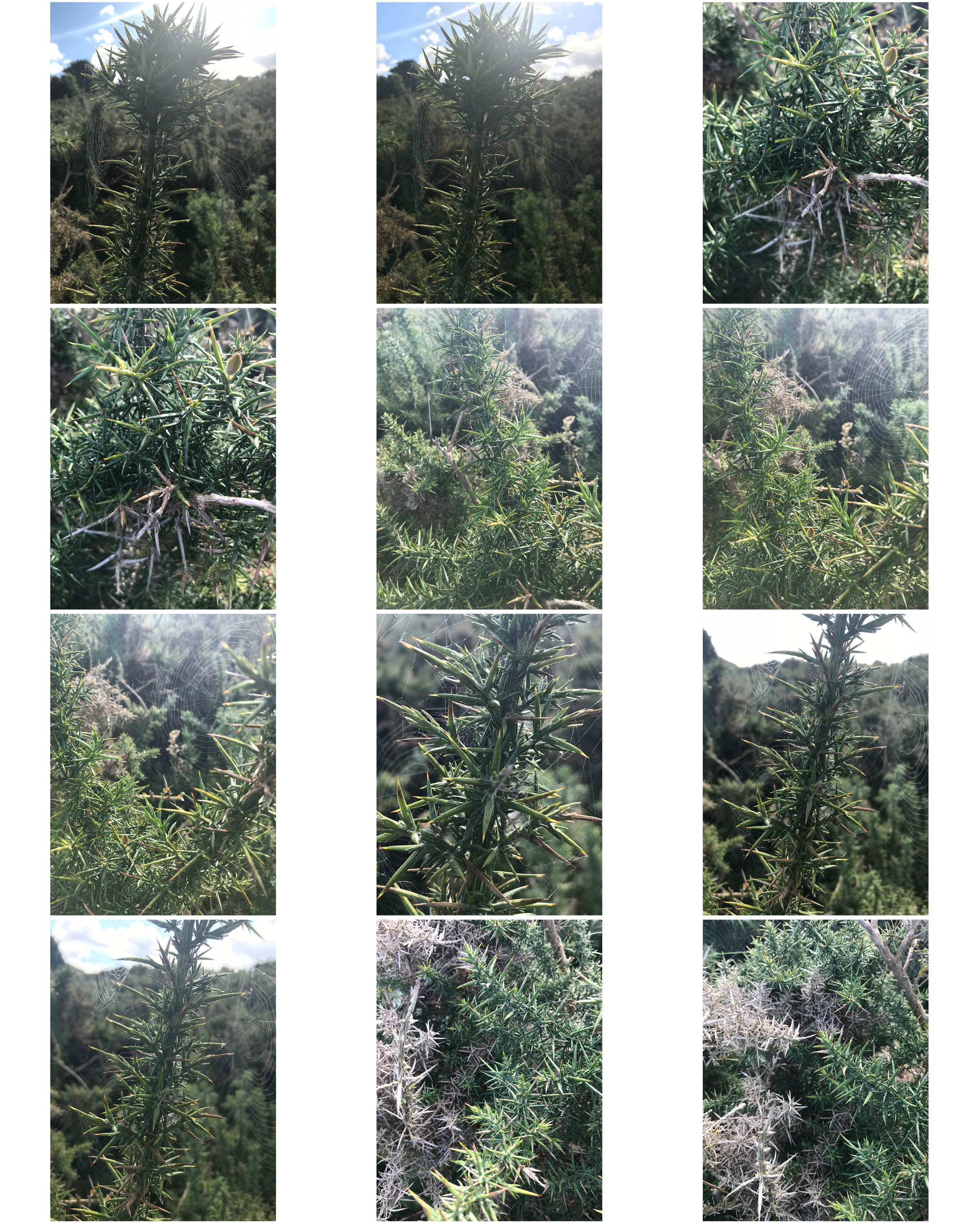
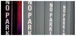
I edited the above images in black and white like Aaron Siskind’s work. I liked the balance of dark to light tones and felt it might be included in the Ansel Adams Zone System.

Processed with VSCO with c1 preset

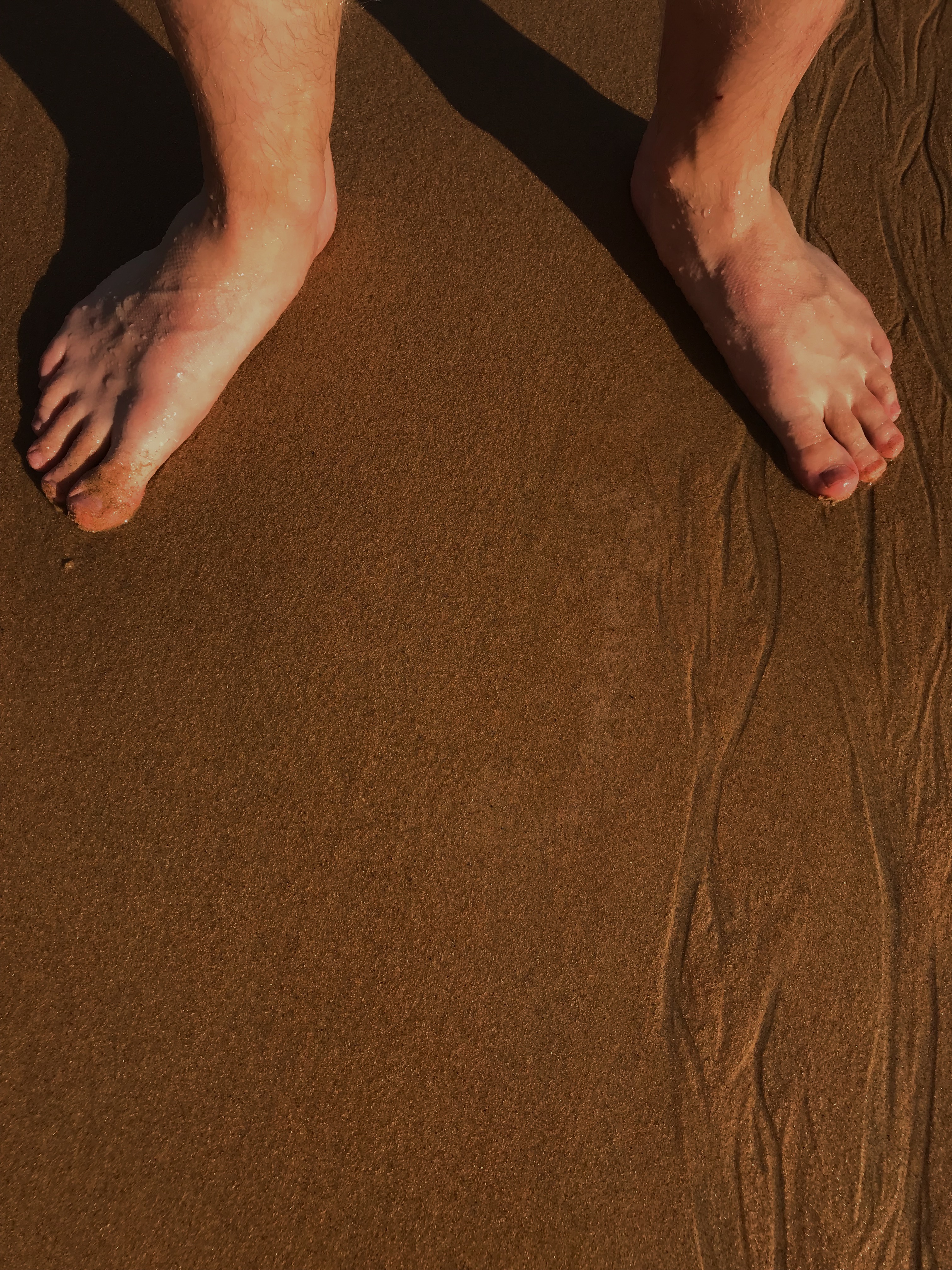
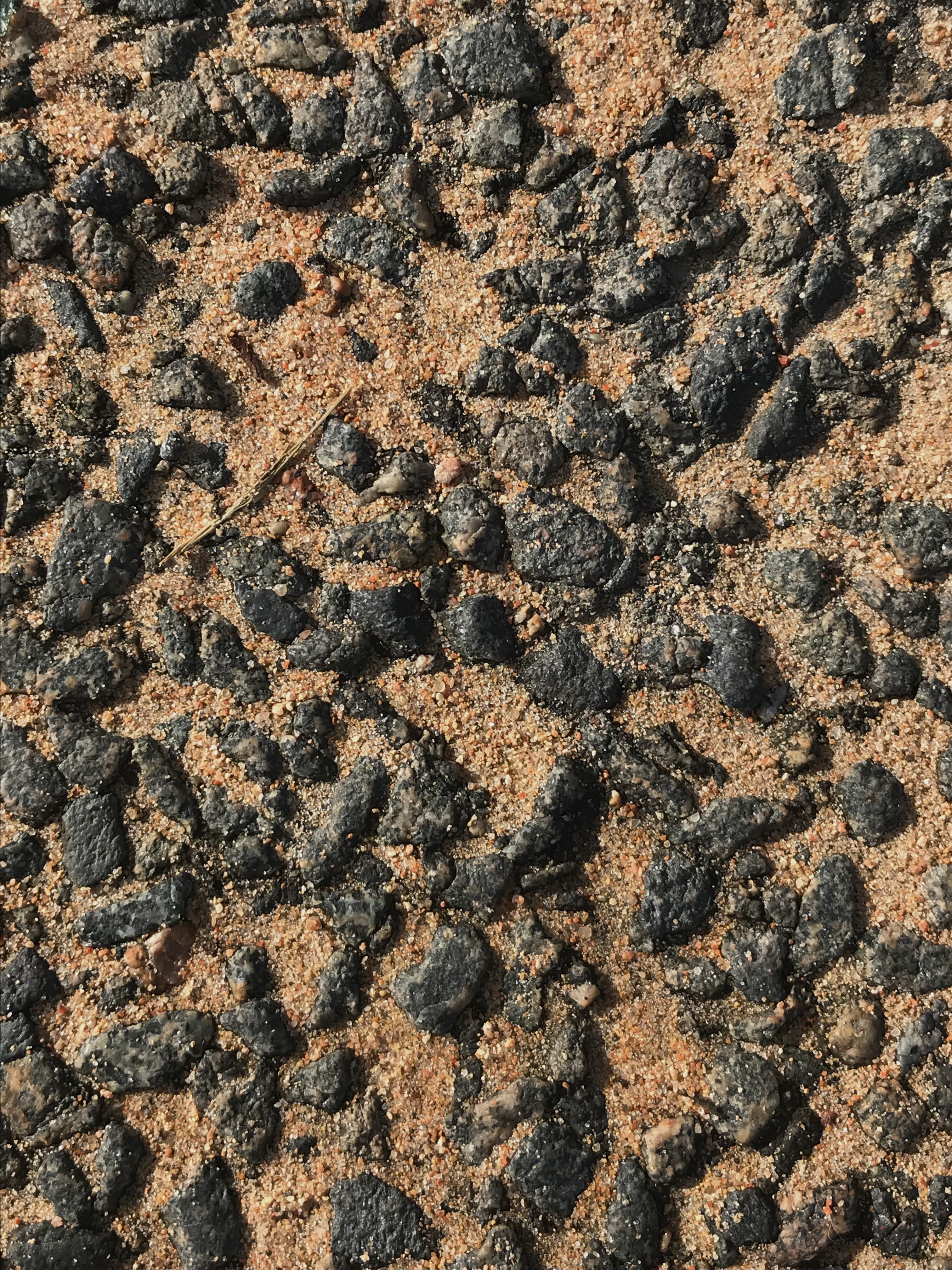
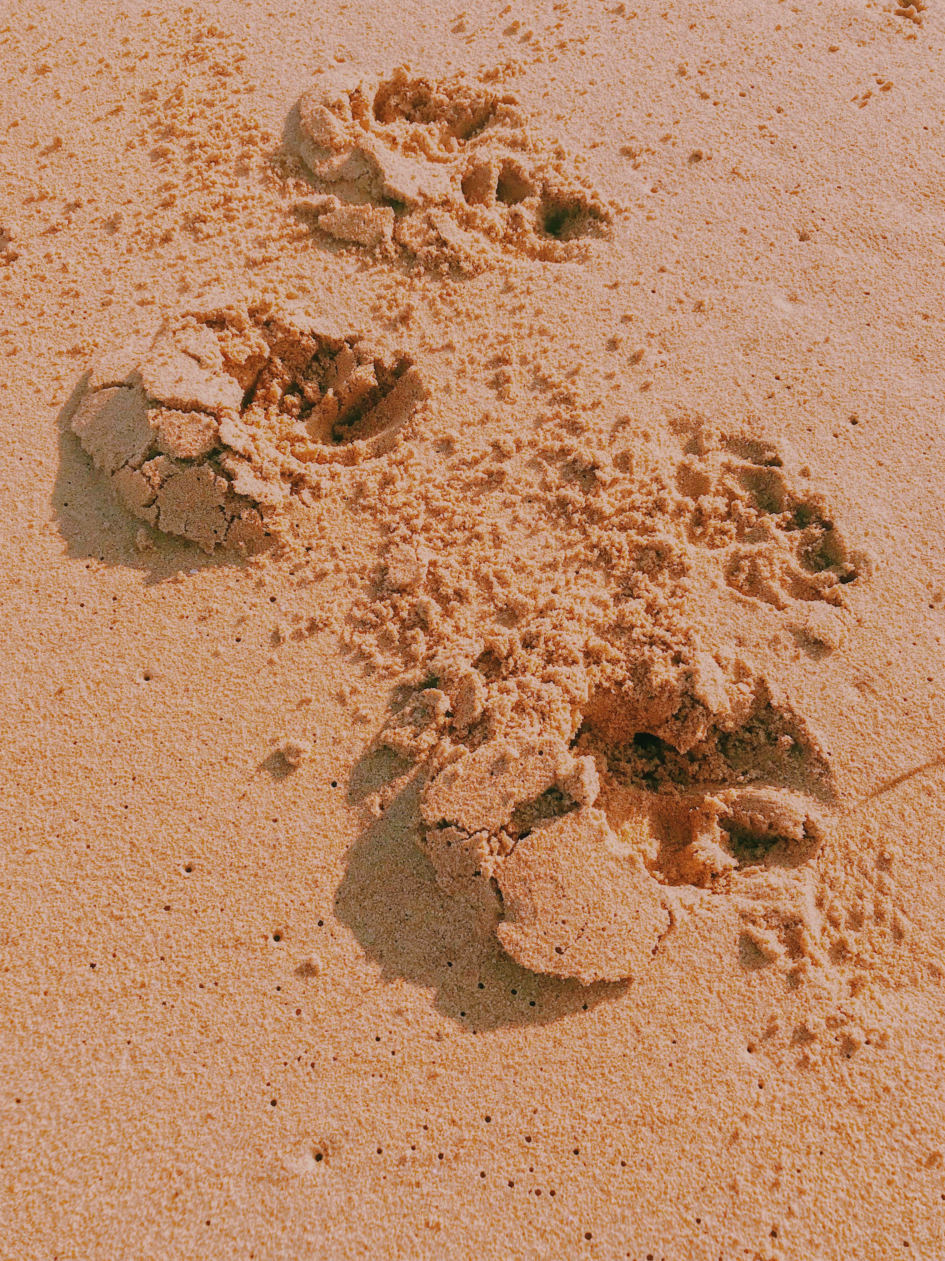
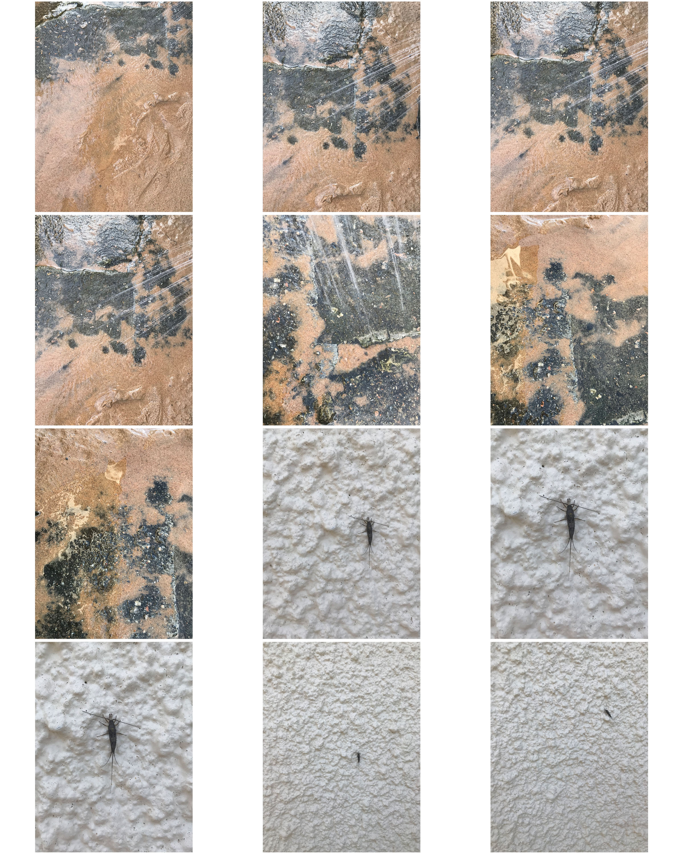
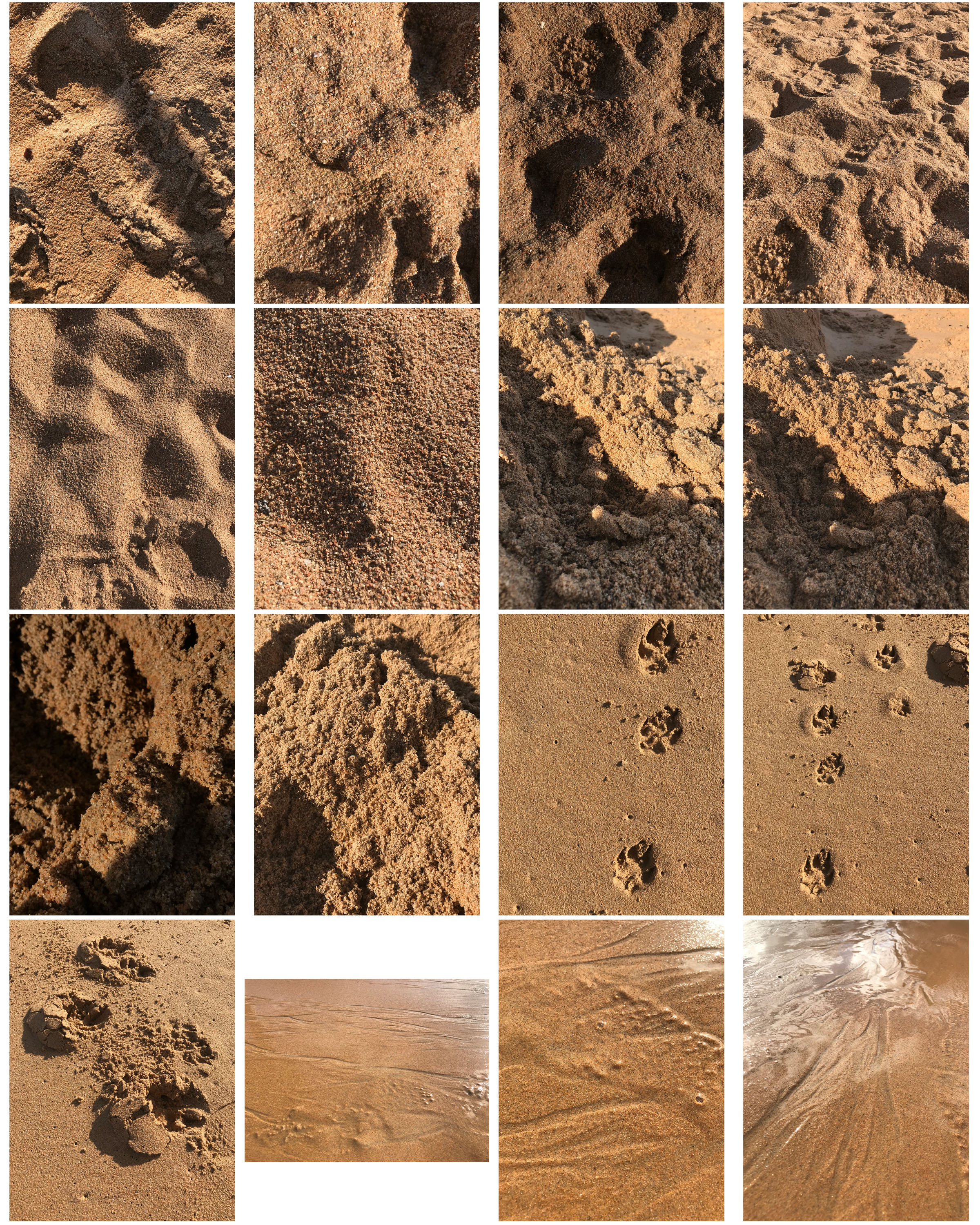
I liked the textures of the sand especially when it had been messed up by footprints or gravel. These images worked better in colour to show the different tones of the sand in comparison to other things such as the feet in one image or the gravel rocks in another.

Processed with VSCO with hb2 preset

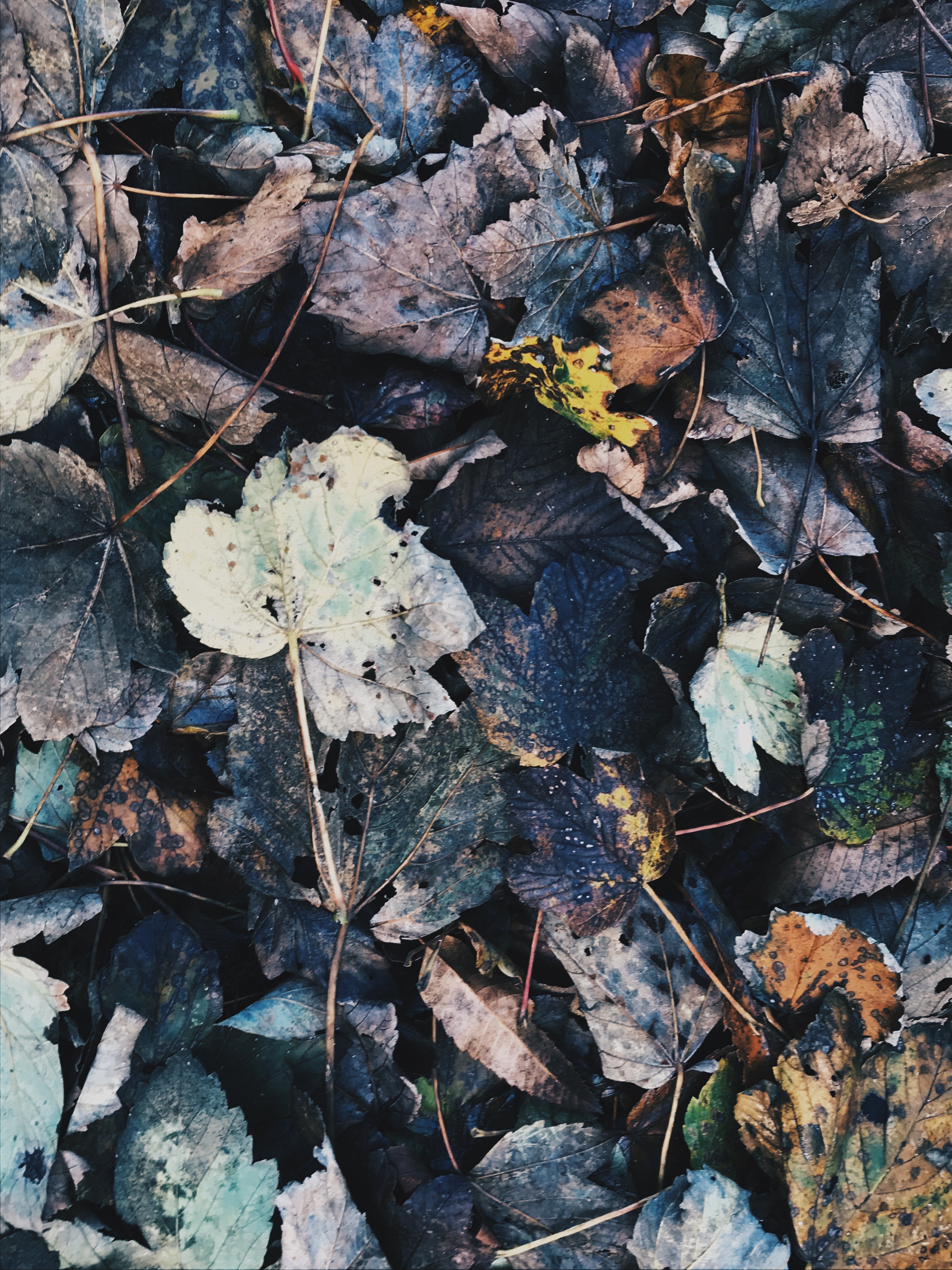
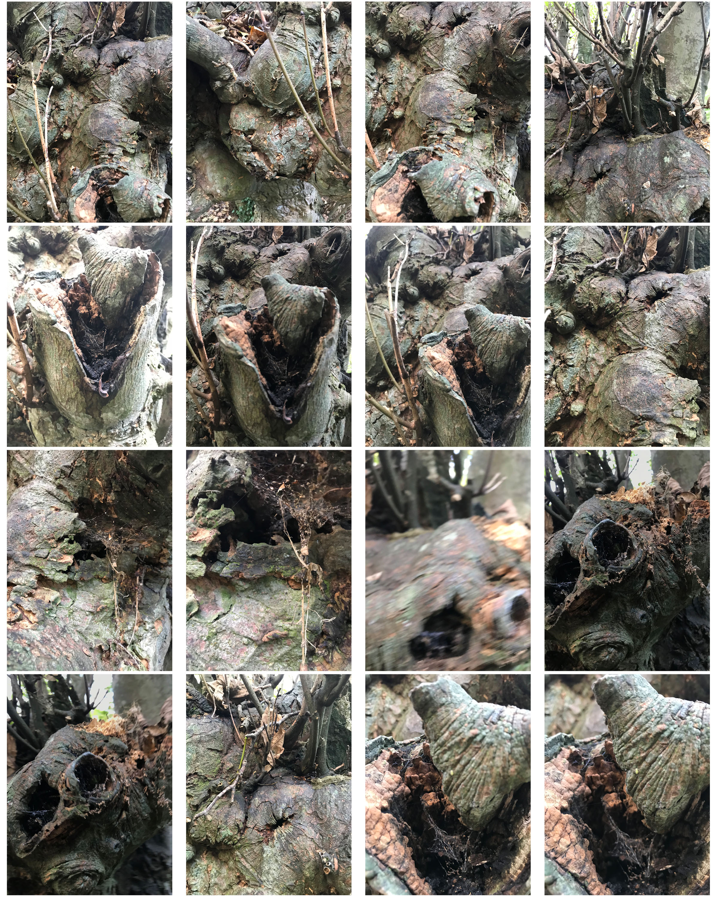
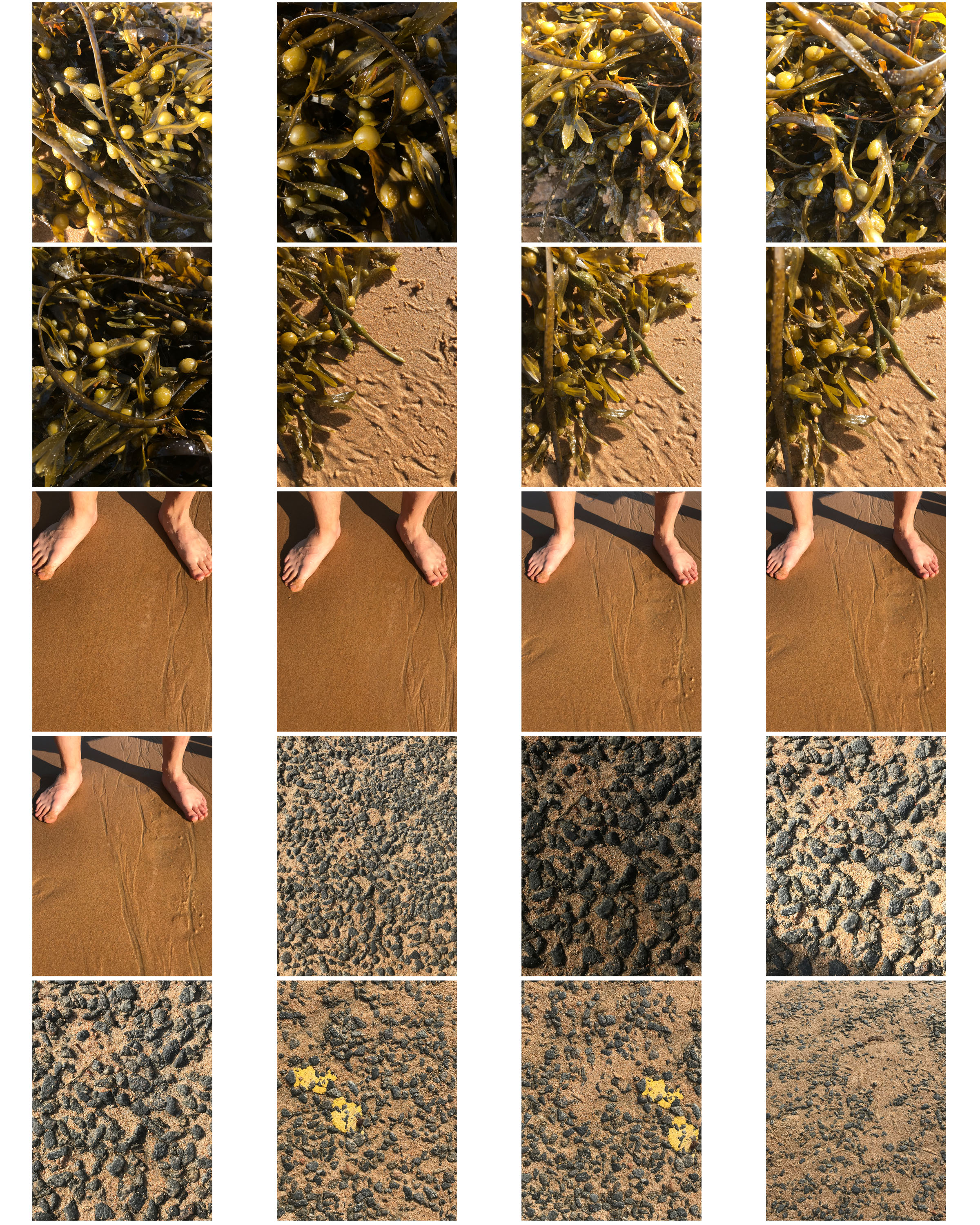
I experimented with different filters on the ‘VSCO’ app to bring out different tones in the subjects of an image. For example, in the above image, I liked the mixture of dark browns and blacks to brighter oranges and greens.

Processed with VSCO with oak3 preset

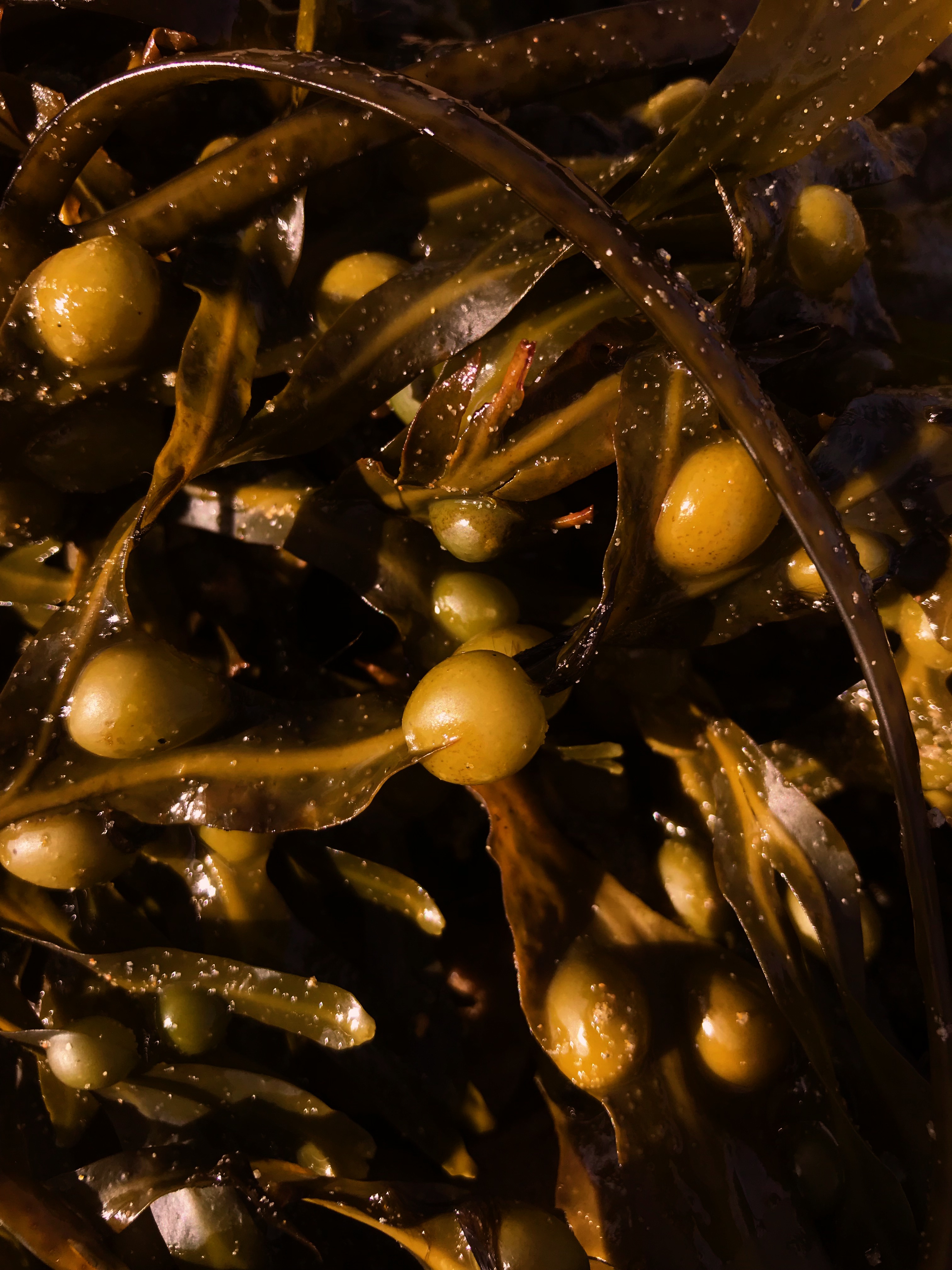
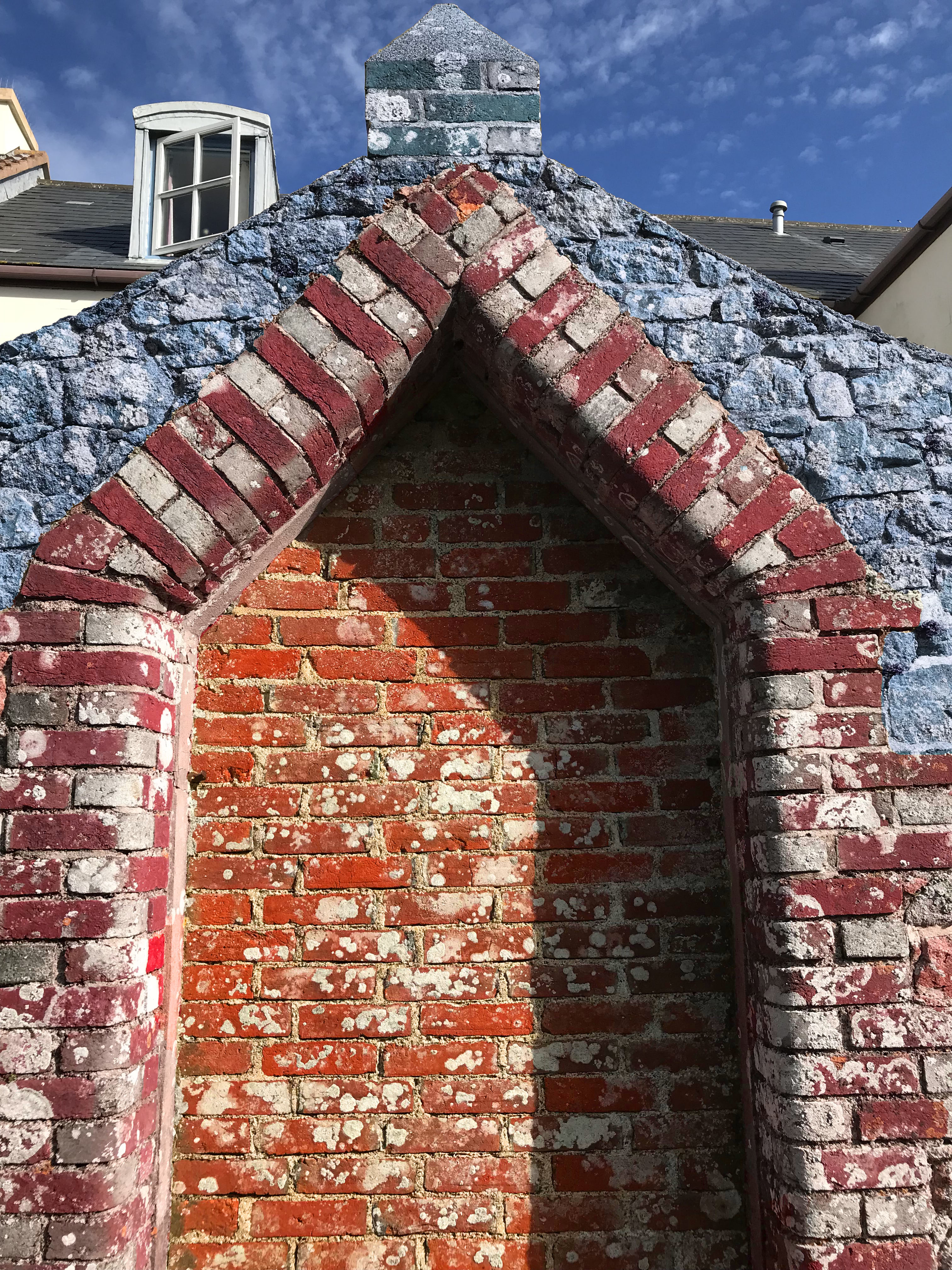
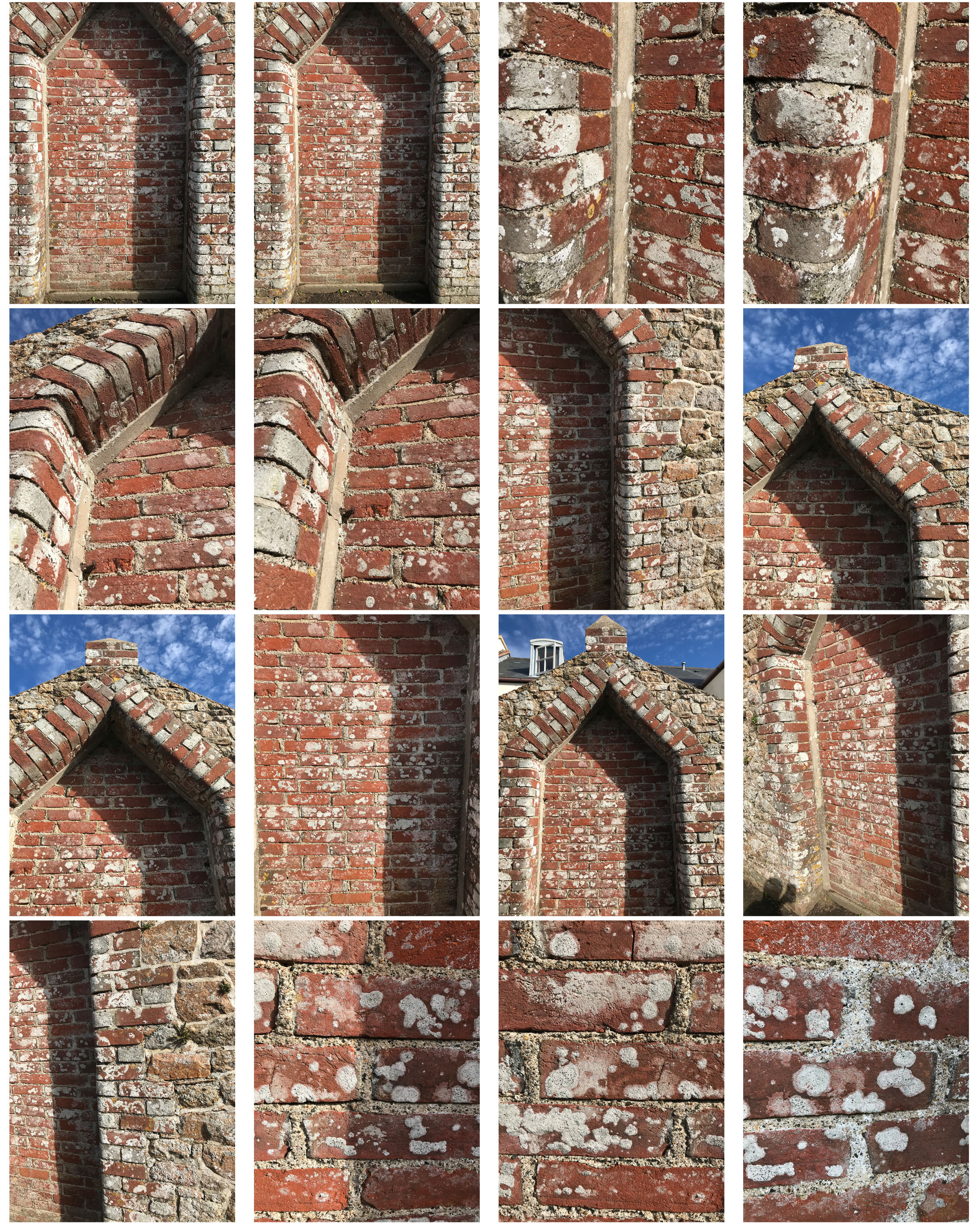
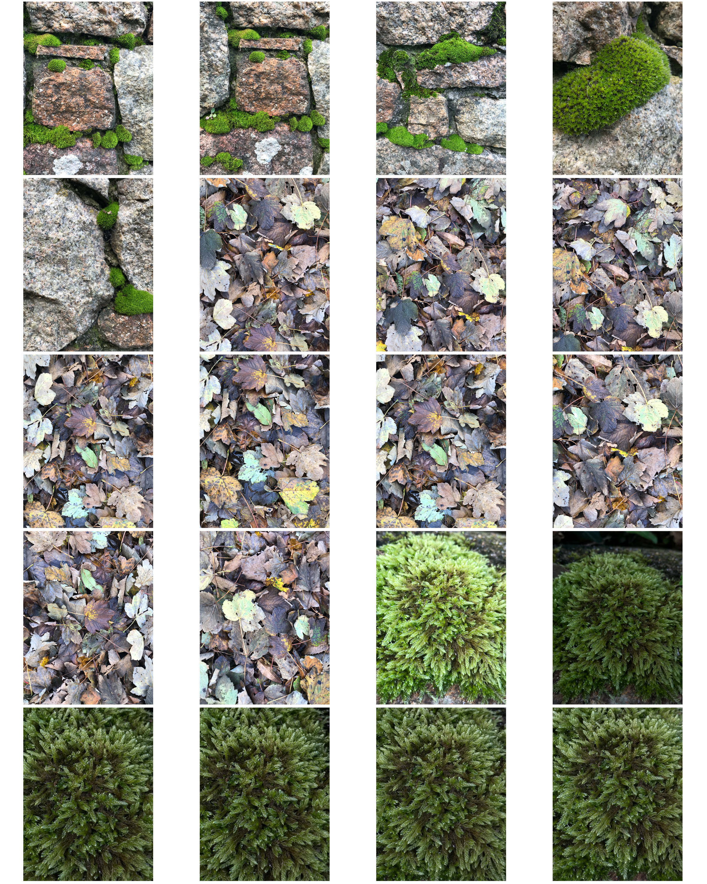
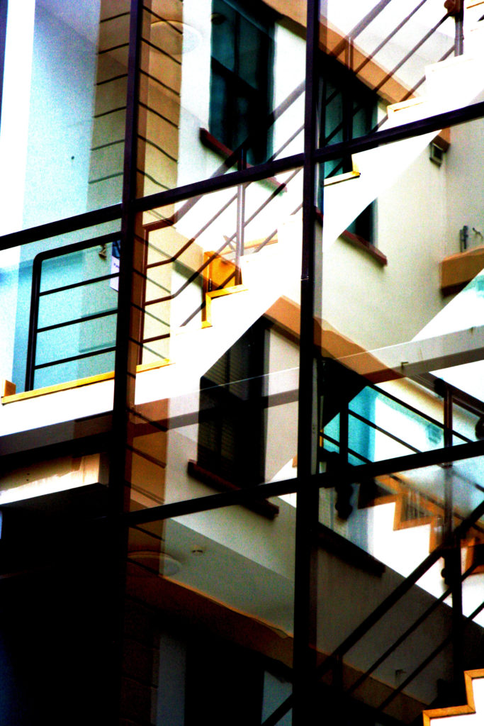
I quick selected each part of this wall and changed the hue colours to contrasting warm and cool tones that made it similar to Frank Hallam Day’s work.

Processed with VSCO with c1 preset

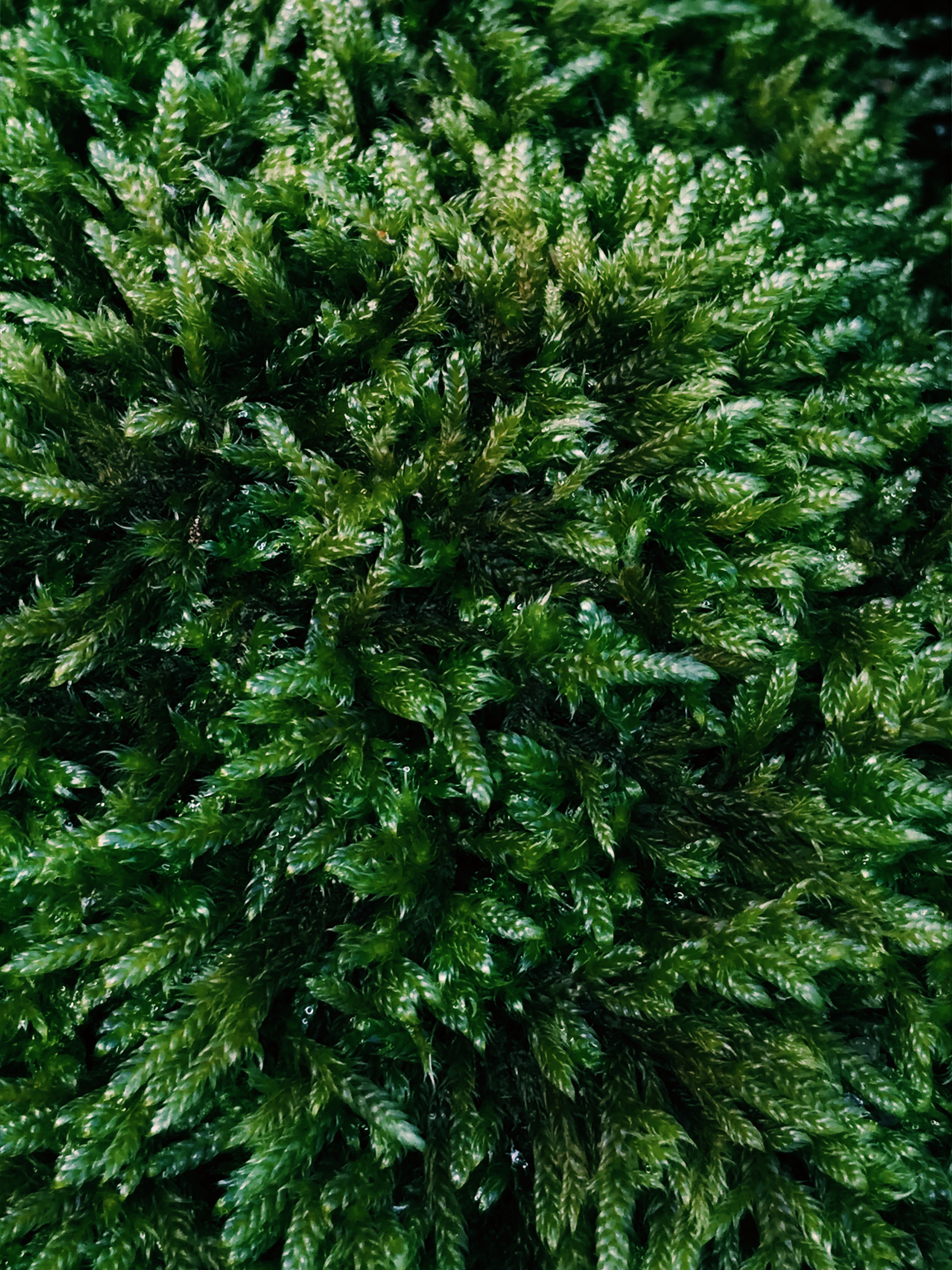
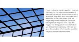
In this image, there is a subtle blur yet vibrant colours draw the viewers eyes in. The natural light from above as well as the darker shadows help give the moss more texture by adding shine. I took this photo as a close up which makes it feel like a mini jungle of moss.


Abstract Final Piece

My Final Piece

For my final piece I have chosen to go with a composition of 9 images (3 groups of 3.) This is because I believe that rules of 3 look very aesthetically pleasing to a viewer.

I believe that the images strongly portray a sense of abstraction through the use of color, minimalism, PhotoShop, composition and structure.

Original Images

Here are the 9 images that I have chosen to use as my final piece…

m e l t i n g b o a t s
r e d s t e e l
1 3 2 6
m i x e d
s t a i r f l e c t i o n
60 40
w i s e 2 5
c o d e
n o p a r k

All of these images have been edited using PhotoShop, some more than others. I would have considered all of the images to have been abstract before editing them however I believe that the PhotoShop editing that I have done has increased how abstract the images are.

Originals & Edits

Here are the original images against the edited images that I have produced…

Edits (LEFT) Originals (RIGHT)

Grouping

For my final composition of photographs I have decided to group them into 3 groups of 3 (9 all together.) This is because I believe that visual threes work very well visually therefore 3 groups consisting of 3 images would hopefully work very well.

I wanted the organisation between portrait and landscape images to be symmetrical therefore I composed the portrait images in a cross (X) and the landscape images on each ends of the across sections (+). I believe that this gave a very visually pleasing result.

Here is my original basic composition of images (3×3)…

Further Improvements (inspiration)

I was happy with how this appeared, but I wanted my final piece to be slightly more interesting to the eye.

One of my favorite abstract artists, Keith Haring‘s bold, minimalist and colorful work is what inspired me to group of the 3 groups of images using colorful polygons. The 3 groups that I sectioned my images off into were: Visually Melting, Visually Minimalist and Visual Text.

Here is some of the work of Keith Haring to give an idea of how it is reflected in my final piece…

Here is what my piece looked like after adding the colored sections…

However I was still not 100% satisfied with the full aesthetic of the piece. I wanted to add titles/names to the 3 groups of images. I wanted to do this without the writing distracting the viewer from the images themselves, so I decided to go with a basic ‘typewriter’ style font called ‘Rod Regular’.

So all together with all final improvements and edits here is my final piece on the work of abstraction…

FINAL PIECE


Final Selections

I chose these six photos for my final selections from my colour harmonies and contrasts shoot because I thought they showed a range of styles, patterns and colours. I took these photos in the style of two famous abstract photographers however for my final image I would like to edit them using skills I have acquired during this project. 
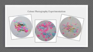
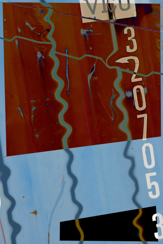
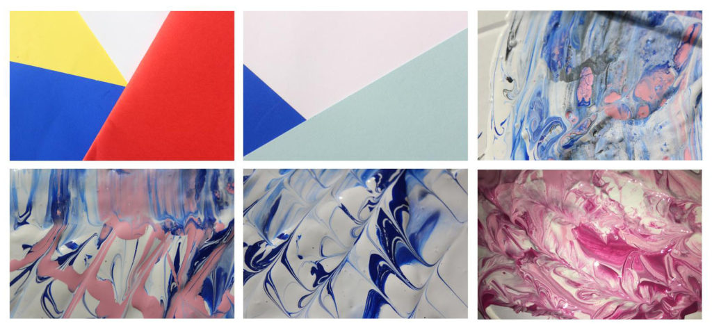
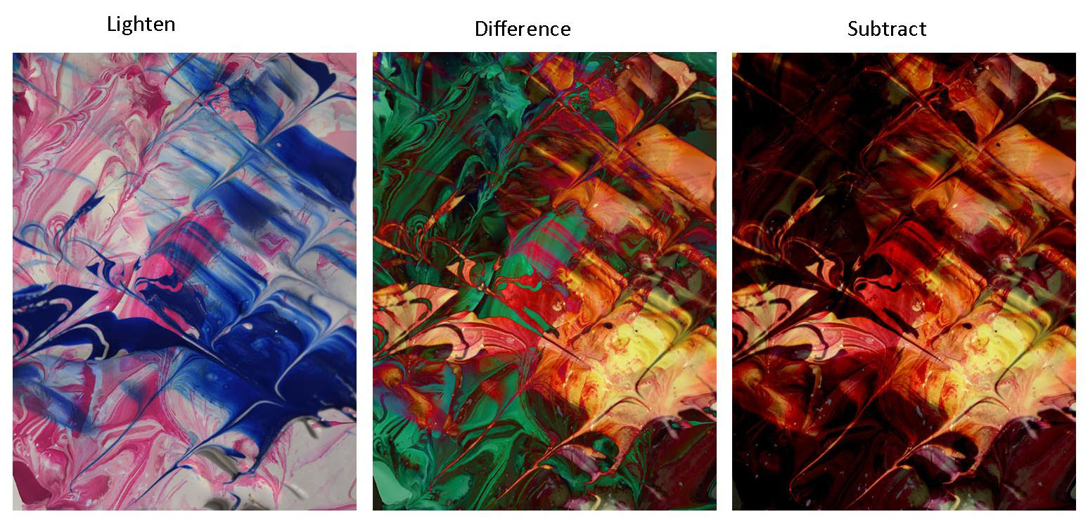
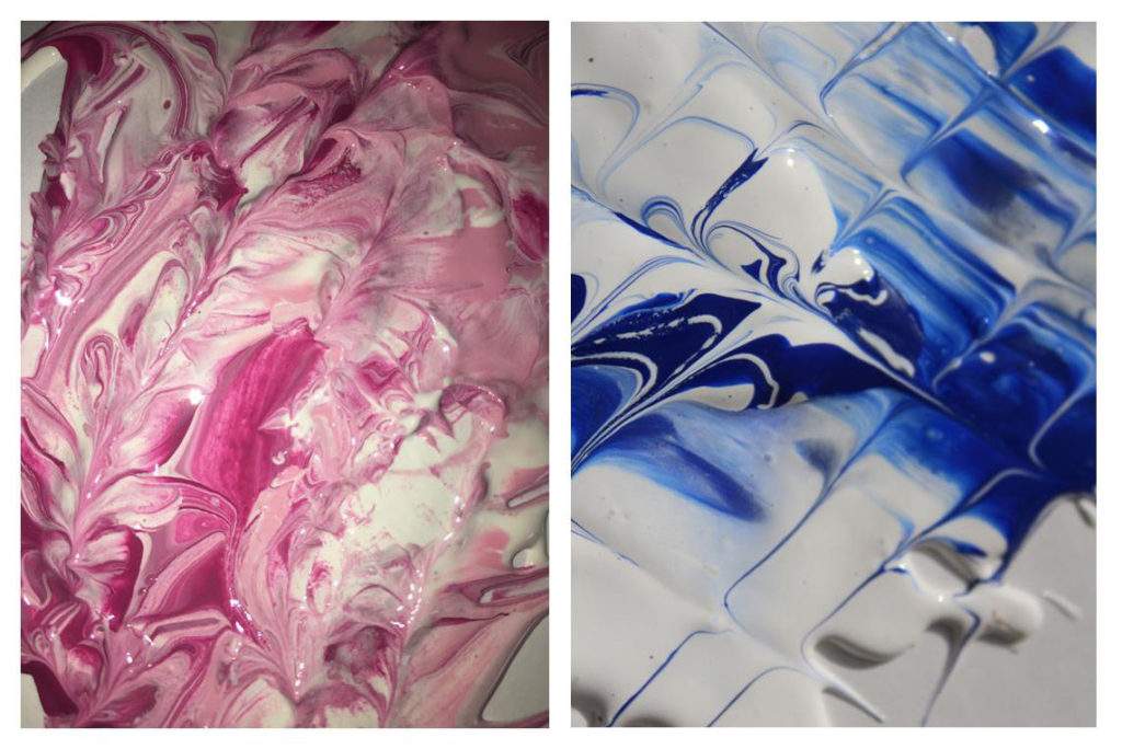
Using these two images from my last shoot I re sized and rotated them so they were  the same dimensions. I then  added the blue photo as a separate layer over the pink one and experimented with blend tool. 

For the first edit i used the blend setting lighten, this removed all the white areas from the blue image so that the pink showed through. This photo did fit the abstract theme however the colours made the photo a bit disjointed and you could still see the original image. For my final image I wanted something more traditionally abstract that showed a mixture of all the techniques I have learned through this project such as shape and pattern, colour and texture. The second image for me showed this the best.

Alternative Final Piece …

Editing My Images For Final Piece

Edit 1 

I belive this edit is good and has a strong relationship with my inspirations work. There is a strong contrast emerging between the persons skin colour and clothing with the background. The composition is effective as the main subject is dead in the centre making the viewer view that straight away, and the background is plain therefore it is beneficial to have the main subject in the middle. I believe this edit portrays the idea of hidden identity which I intended to do however I am not pleased with the image as a whole due to the background. I believe if I change the background to have a street or wall it would be more effective in revealing a story and creating a more surreal feeling/look.

This is the final edit for photo 1. I believe that changing the background from plain to this sinister looking carpark roof image has completely changed how people may  interpret the image. The background has connotations of crime and badness as it is taken at night, which is when most crimes happen and the light on the left appears to hide part of the image relating to a person hiding their identity when causing a crime. However the over exposed light on the left can reflect goodness, contrasting with the darker side on the right relating to badness. This may reflect the person in the centre who has to decide his path to take, the good path or bad path. Due to the fact I have edited the person in such way to distort any facial expression it leaves the viewer to decide what the person’s identity is like and how the background may or may not relate to it.

Edit 2

Using the same method as the edit above I was able to achieve another successful surreal image. Firstly I chose to use the colour orange as it fits in with the motion blurs which were created when I originally took the photo. These motion blurs were created by taking a photo with a long shutter speed, around 2 seconds, and panning the camera to the side. I was able to get my model in focus by holding the camera still for the first second facing him and then panning for the other second. In my opinion these motion blurs create a sense of movement which fits in well with my edit as the slime is moving as suggested by the falling droplets.

Edit 3

I believe this is my strongest edit. Not only is the digital manipulation at a high standard but the meaning and feelings portrayed are also very strong. Again, to some extent I have incorporated the running theme of blank identity however slightly altered this image to produce some sort of facial expression. In my opinion the facial expression, mainly within the eyes and how they appear to be bruised, reflects upon the theme of child abuse again crime. I believe the underexposed background gives the image a sinister and almost haunting feeling. The dark background is strongly contrasted with the color of slime upon the models face which focuses the attention on the person.

Edit 4 

I like this photo due to the emotion and story it creates and tells us. I believe this photo has a sense of imprisonment as it appears the people are stuck in this enclosed area. The background within this photo is de-saturated to some extent which I think helps to add to the dark and depressing atmosphere. This photo uses the technique of leading lines within the structural features leading us away from the models deeper into the picture to view the rusty and old man made structures. The vibrant colors of the models create a strong contrast with the background relating to the opposition of light vs dark or good/bad.

Presenting My Work

After having reflected my images I have come to the decision that I will use only two of the original 4 images I intended on using. The edits I have selected to use are shown below. I have selected only these images as I think they are my strongest edits in representing abstract photography and telling a story. Also they pair well together as they are of similar colors and tones. These images link to abstract photography in the way it is a piece of art that does not attempt to represent external reality, but rather seeks to achieve its surreal effect by using shapes, colours, and textures. I think that the image with the motion blur lines relates directly to the photographer Ernst haas which was on of the photographers I researched as part of this abstract project. Ernst haas often includes motion blurs within his photographs to indicate a sense of movement and chaos which is what i have incorporated within my final piece. The motion blur lines not only work well with the dripping effect on the persons face but they add to the abstract effect in the way that it is not a usual and commonly seen thing.


franco fontana

Franco Fontana is best known for his abstract colour landscapes.
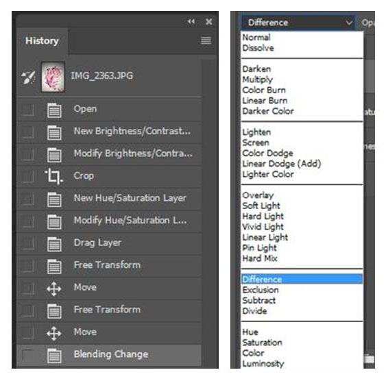
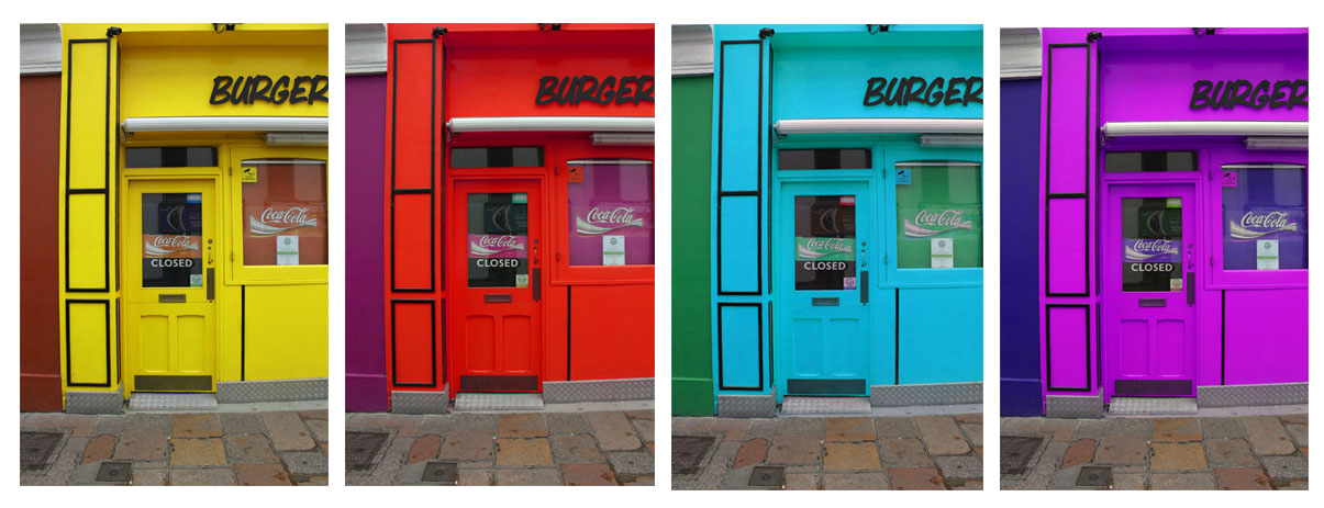
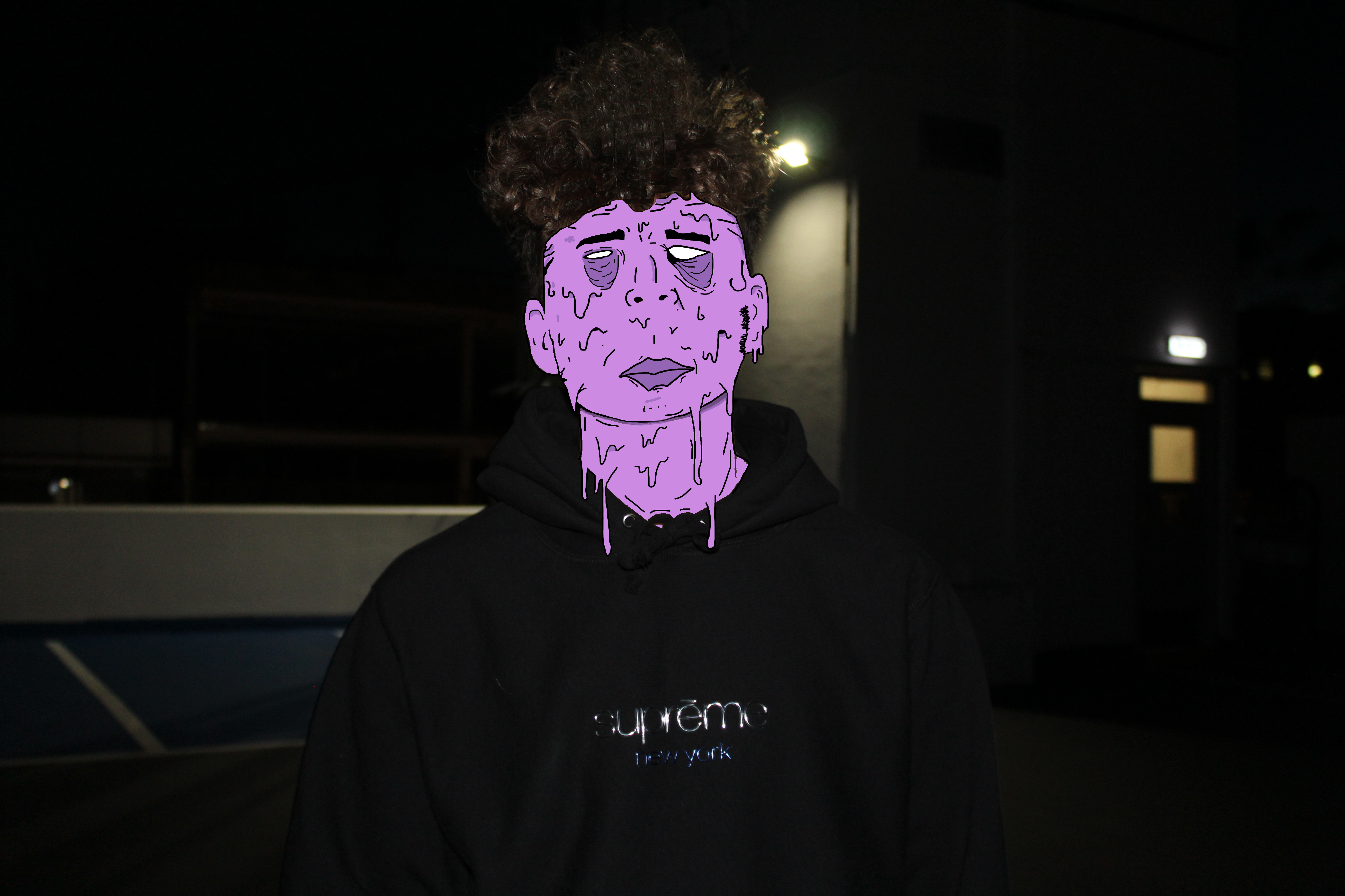
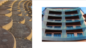
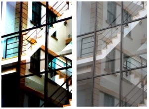
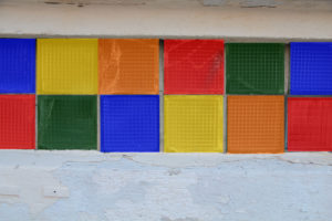
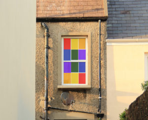
His work focuses on the enhanced colours that contrast and compliment each other. Visually, his photographs are aesthetically pleasing and minimal, yet the mise-en-scene in some photographs have a unnatural and toxic feel because of the intense colours.


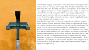
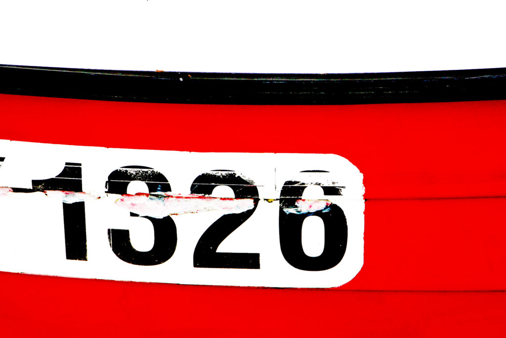
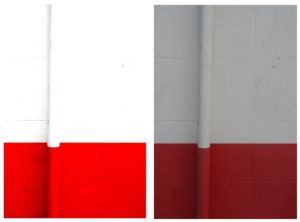
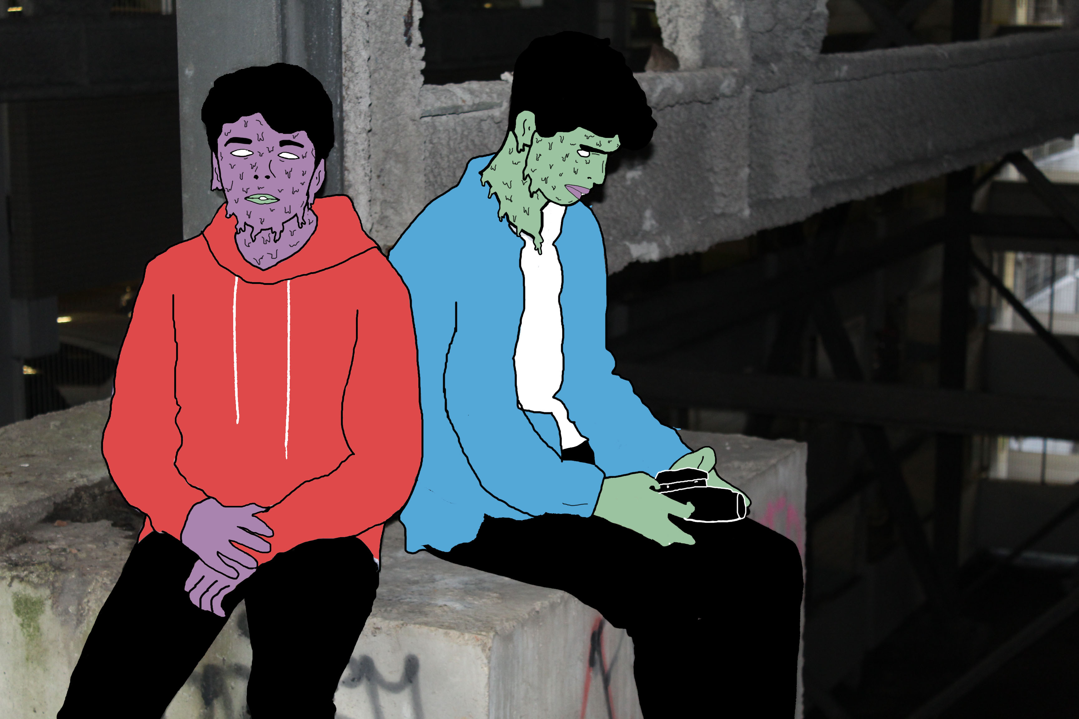
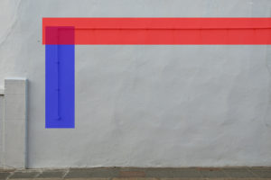
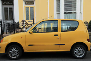
This image stood out to me because of the repetitive use of red is almost like the scene was composed to fit together for the photograph. However the image was probably edited after it was taken to create a perfect scene of red. 

colour response

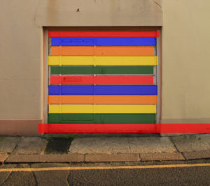
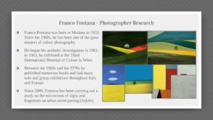
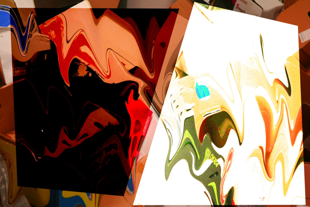
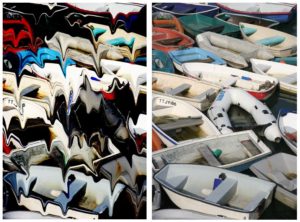
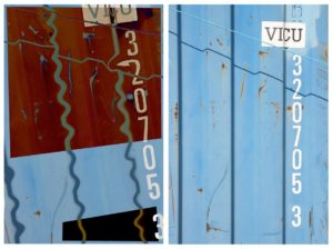
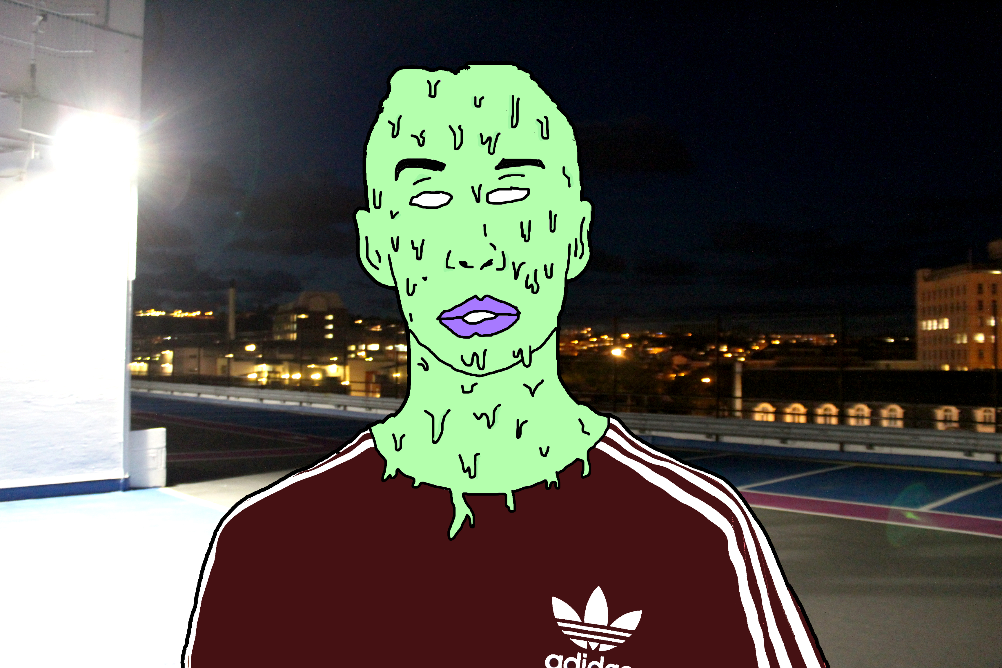
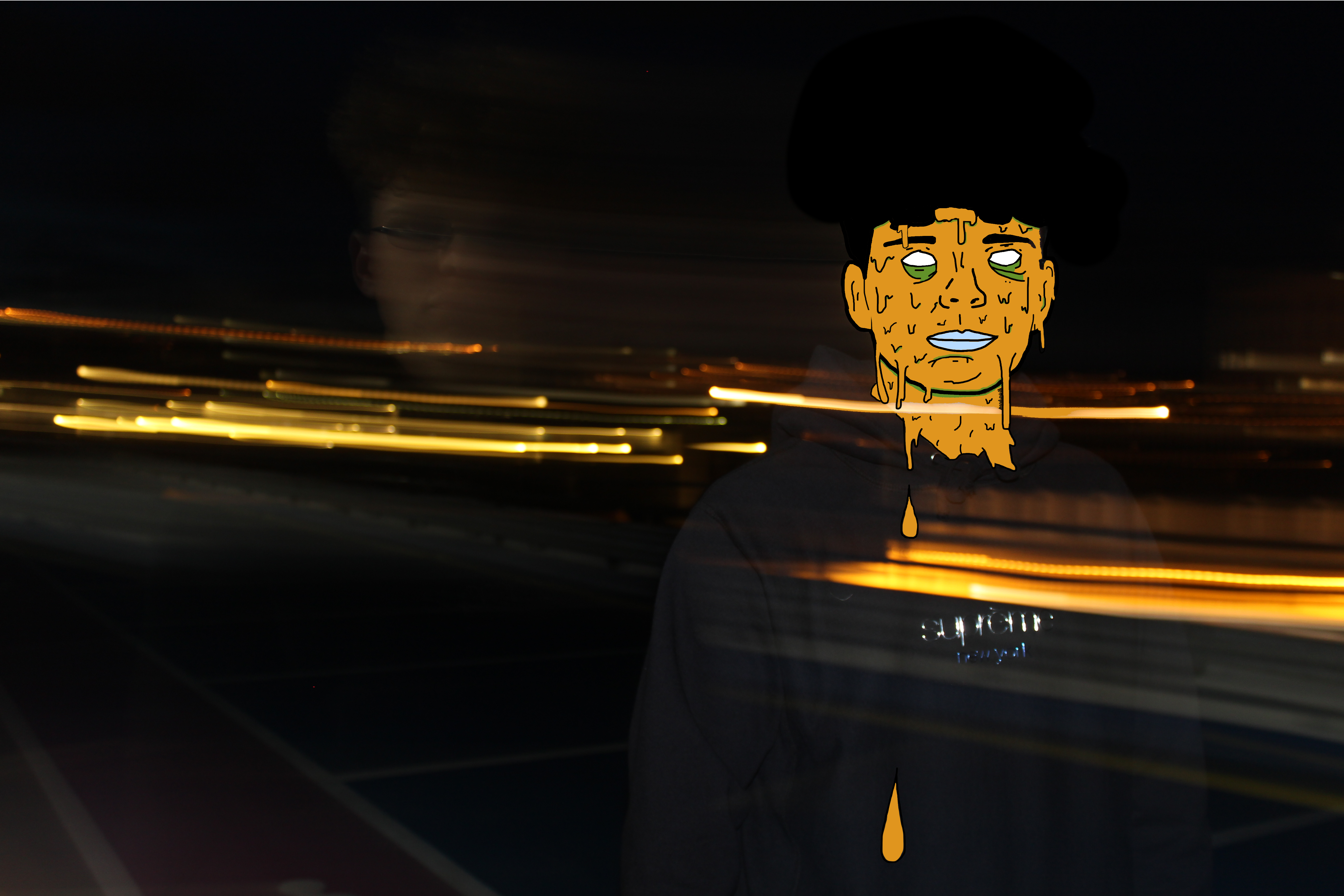
I used Photoshop to edit all these image to give eah of them unordinary colours that make the photographs stand out more. I kept the same colours in each photograph because I think the photos as a collection present a better response for Fontana. I used these photos because I wanted to bring ordinary photos onto another level.

The Research and Selected Photos for Final Piece

My Research and Chosen Images For My Final piece 

The Research 

After having researched Pinterest I came across a selection Images under the hashtag ‘desolateputoface’ which really was intriguing in my opinion. I liked how the images portrayed a surreal and unrealistic approach yet still contained an understanding of what the image is. These Images present us with unreal representations of a persons face and they link to the idea of hidden identity. Below are a couple examples of the photos created by the anomonys photographer/graphic designer.

Image result for desolate puto face

Image result for desolate puto face

Analysing This Work

The thing which first inspired me to take a closer and more detailed look into this style of work was the vibrant colours used to create the surrealistic figure. Not only does this image look interesting and creative but it give’s an impression of hidden identity. It appears that the editor/photographer has purposely covered the person in slime to portray a sense of equality and that we are all humans no matter your skin colour, race or religion and therefore meaning we should be treated equally. A lot of the images appear to be males in the streets which may be referring to gang members and in this case the dripping slime relates to the fact that they are ruining and destroying their lives by doing bad. The part of the images that are not slime are fairly basic and unedited, contrasting with the slime.

Choosing my Images

At this point, I didn’t believe that many of my images from the several shoots i have collated were suitable for this theme/genre of photography. I decided it would be best to do a photoshoot to ensure that i could get the best possible images that could relate to this style of work and best portray a sense of surrealism and abstraction. The intention for this shoot was to capture portrait shots with an abstract background to further relate to the theme of the project. Thus in mind, i intend to take photos behind pier road carpark where there is some great structural features which hold the carpark together. Also I will collate images on streets to link to my inspirations images.

Photoshoot 

I believe this photoshoot was highly effective in achieving the aims I set out to do. Thus being getting some quality portraiture shots which could be further adapted to replicate a similar yet personalised image to my inspiration. I believe the natural lighting in the daylight photos was very helpful in allowing me capture the detail in my models face and the background too. The flash which was used in the nighttime and darker locations was effective in creating a focus on the model/models as the flash highlighted the foreground, being the model, and not the background.

Selecting My Images

In the process of selecting my images, I had to carefully go through this last photoshoot and start narrowing down my images to the best 50 then 25, 10 and then finally to arrive at the ones I intended on using. I wanted to select the images that showed a good understanding of using the camera for example using ISO and shutter speed and those that of course had the best lighting composition and were most appropriate to reflect a sense of abstraction whether it be in the editing process or the photo how it is.

Selected Images


Just another Hautlieu Creative site