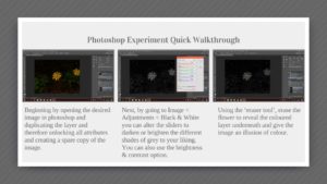
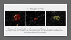
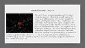
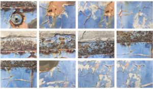
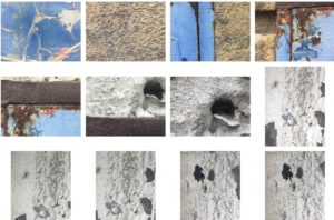
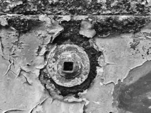
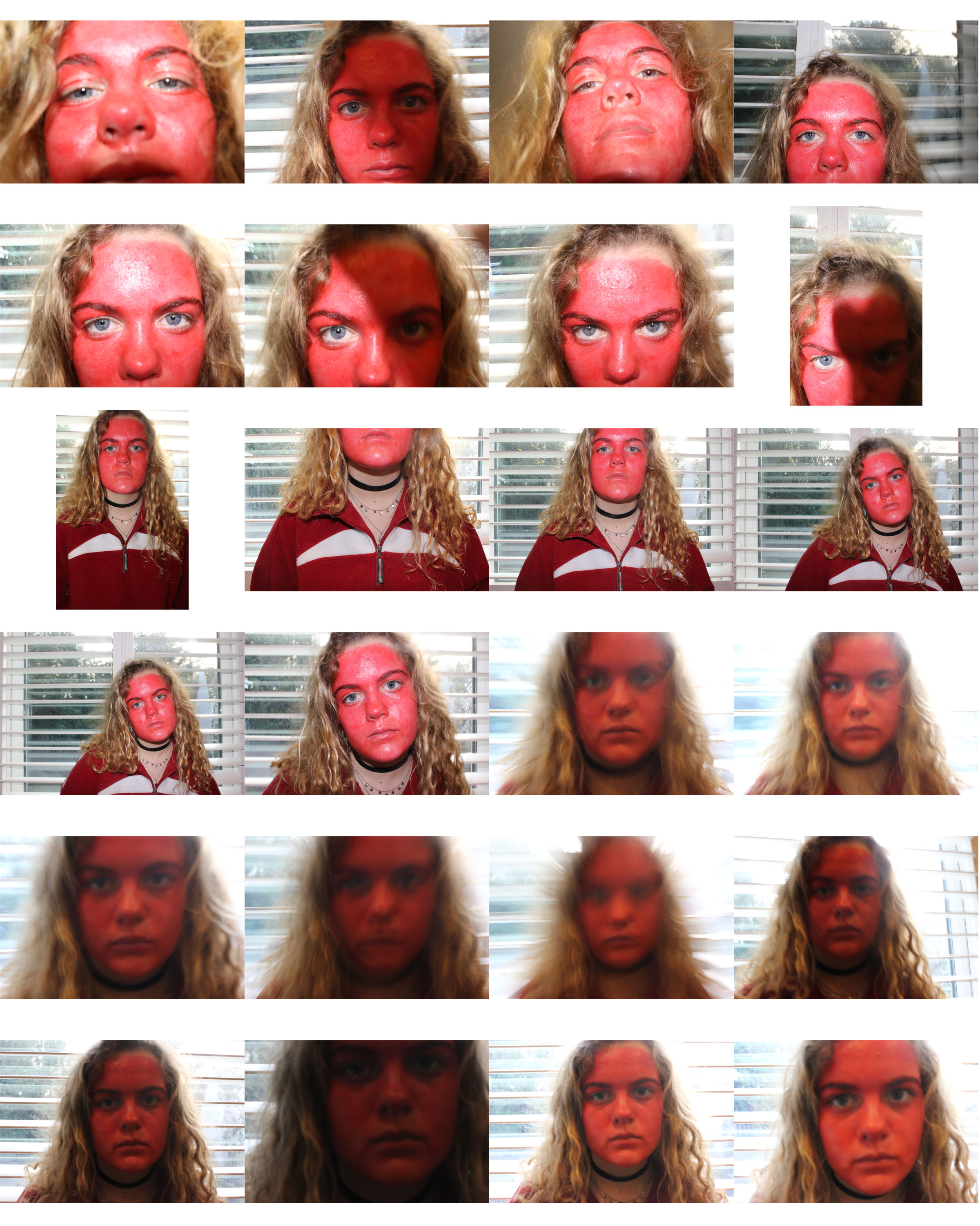
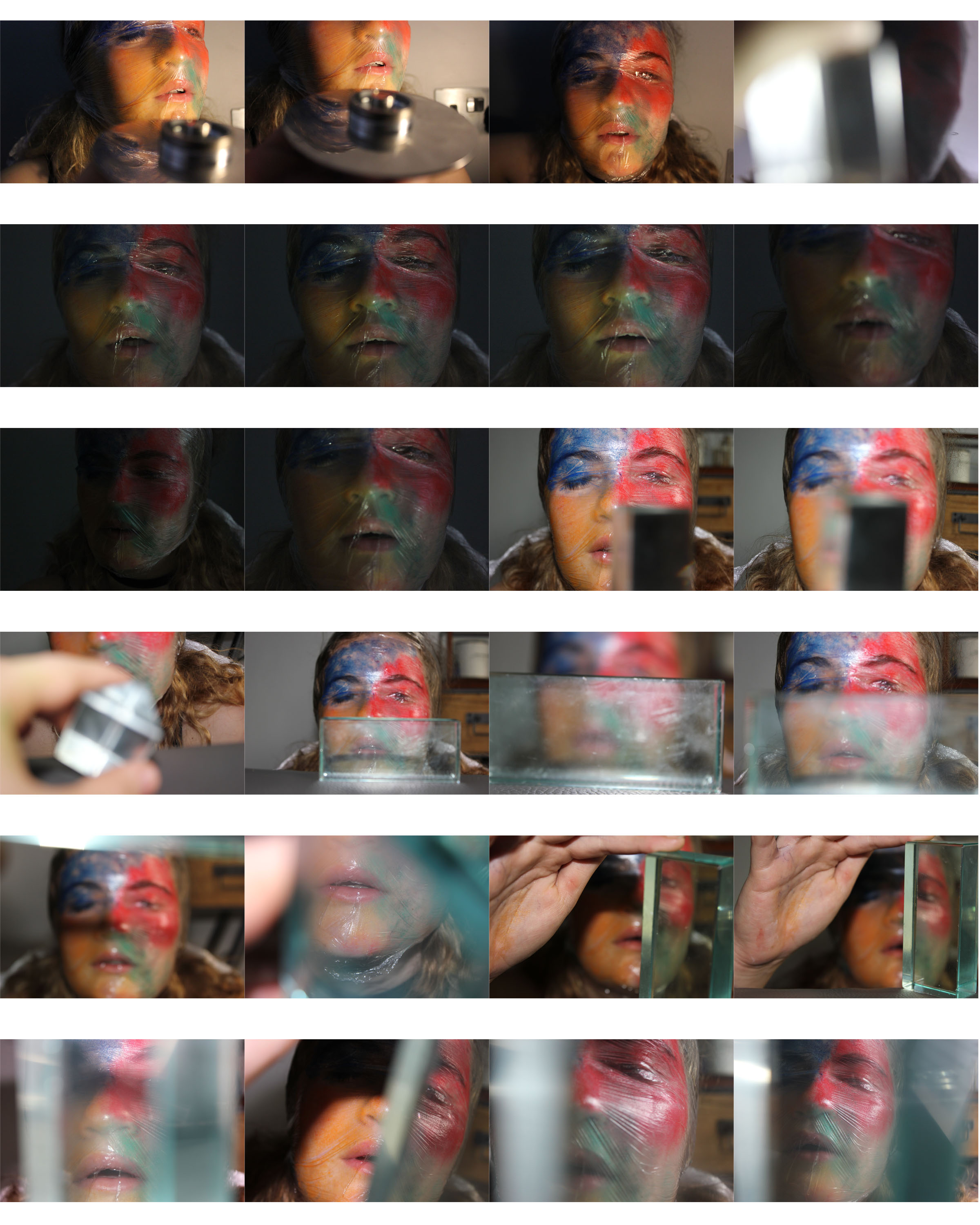
Planning
Task – Take 150-250 formal portrait photos that show an understanding of environmental portraits.
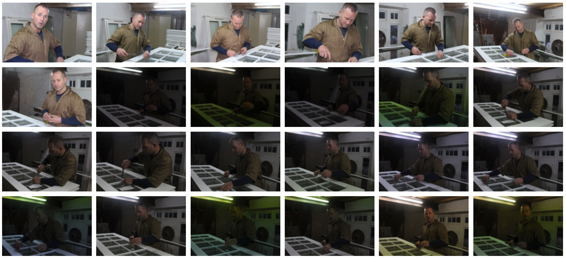
Location – My dad’s workshop, music room
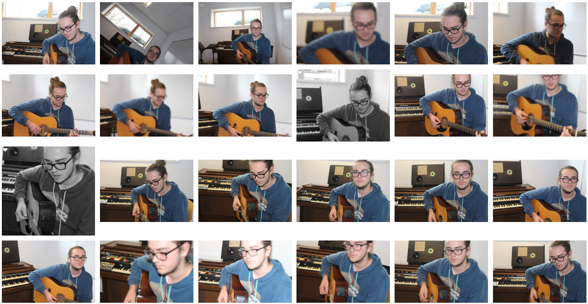
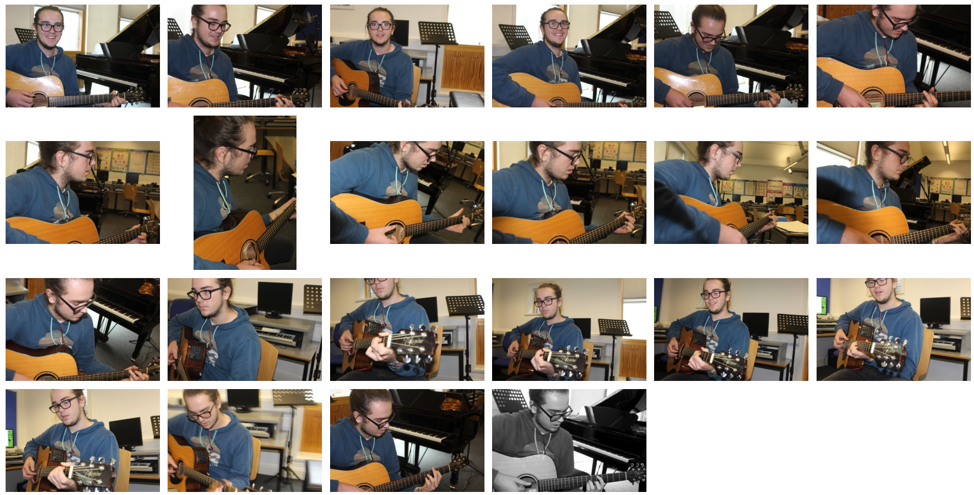
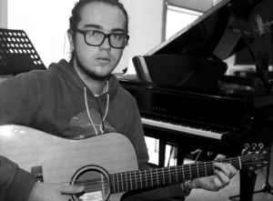
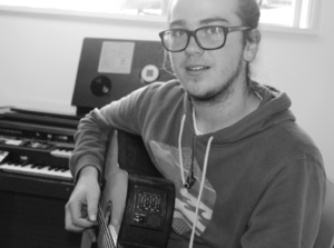
Subjects – My dad at work, Alfie playing guitar.
Camera settings – For images in workshop: shutter speed 1/100-1/200, ISO 800-1600, white balance – shade preset, flash used. For images of Alfie: shutter speed – 1/60, ISO 400, white balance – shade present.
Concept – To capture formal portraits in the style of August Sander and Arnold Newman.
August Sanders


August Sanders (1876-1964) was a German portrait and documentary photographer. He was once described as ‘the most important German portrait photographer of the early twentieth century’.
Sanders’ work includes landscape, nature, architecture and street photography but he is mostly known for his portrait work. He tried to take pictures of the workers in Germany in their natural workplace to show the cross-section of society during the Weimar republic. He released a book series from this called ‘People of the 20th Century’.
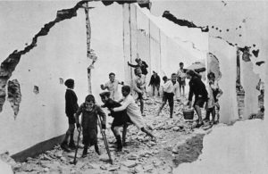
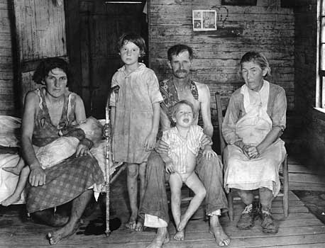
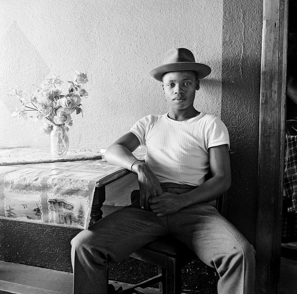
August Sanders Favourite Photo:
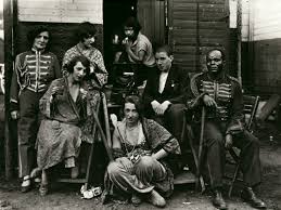
In this photograph it appears that natural daylight has been used to capture the environmental portrait, which is suitable as the photo should be in the subjects natural environment. The subjects appear to have been positioned close together as if they’re cramped into the photo – this could reflect their living conditions and style. There is not a massive tonal range throughout the photo; there is vary dark but rarely is there a bright white. The subjects have been positioned so that they contrast with the dark background (excluding the black man on the right) this makes the image more dramatic. It appears that a deep field of depth has been used along with a quick shutter speed as the image is not blurred and everything appears static. A medium ISO appears to be used as the image has a slight bit of noise in it. There is a grey overtone to this image.
Due to it being an old photo there is an old-fashioned texture to the photo which makes it seem more rustic and mysterious. The photograph appears 3D in places as the subjects have been positioned at different levels and distances. There are no patterns in this photograph which matches the lifestyle of the people in the environment – they play it by ear and they take each day as it comes.
The photograph is taken from his photographic series, ‘People of the Twentieth Century’. The series aimed to portray the differences in life styles among the German people. This particular image shows circus workers in their natural environment, as you can see it is quite messy and nothing is organised, just like the photo. It helps to show what life was like for these circus workers.
Sanders was known to not be judgmental and was never shy when taking photographs of people. What he wanted to show was how people live their lives in extremely different ways but they’re also happy doing so. Sanders tried to exploit the cross-section during the Weimar republic and opened Germany’s eyes to each others differences.
Arnold Newman


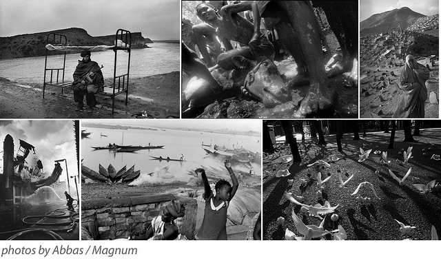
Arnold Newman, born 1918 is acknowledged as the pioneer of the environmental portrait, he is also known for his still life and abstract photography. His images show people in their natural workplaces in the style of formal environmental portraits. He released many books such throughout his life and is an important contributor of portraits to publications such as life and vanity fair.
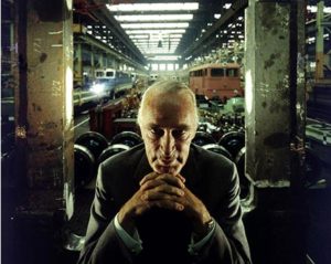
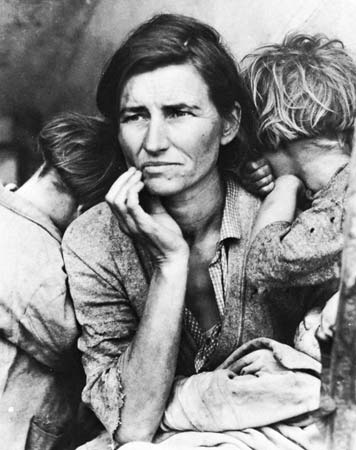
Arnold Newman Favourite Photo:
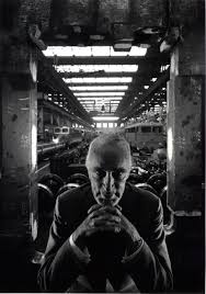
In this image it appears that natural lighting was used as the image is dark at the front where it is hidden from daylight and brighter at the back where it is exposed to daylight. The subject has been positioned in the centre of the image to create an intense and sinister image. There is also a wide tonal range in this image, ranging from the darkness of the foreground to the brightness of the background. It is also a very contrasting image which makes the photograph appear even more sinister and mysterious. It appears that a deep depth of field was used along with a quick shutter speed as everything in the image is static and in focus. A low ISO also appears to have been used as it is a clear but dark image.
It is quite a 3D image as the subject is clearly very close to the camera with the trains running along with the roof in the background making the image appear to stretch backwards. There is lots of symmetry in the image as at a glance it appears that it is almost perfectly symmetrical with the line of symmetry being vertically straight down the image.
The image shows armaments manufacturer Alfred Krupp who supposedly used slave labour to make weapons for the Nazis. In 1963 Krupp contacted Newman for a portrait photograph. After this, Krupp found out that Newman was a Jew he refused to let him take the photograph. Newman then asked Krupp to look at his works before settling on a final decision and he changed his mind and allowed him to take the photographs. Newman then went to one of Krupp’s factories and tried to make Krupp appear as evil as possible in the photographs that he took. Krupp was obviously not happy with the photographs at all.
I think that by making Krupp appear evil in this image, it was his way of getting a small bit of revenge on him for his evil doings and showing the world how evil Krupp really is. This small piece of revenge wasn’t done just for Newman, he did it for all the enemies of the Nazi’s and all of the people that have suffered from them. It did not do much but the notion and small victory was there.
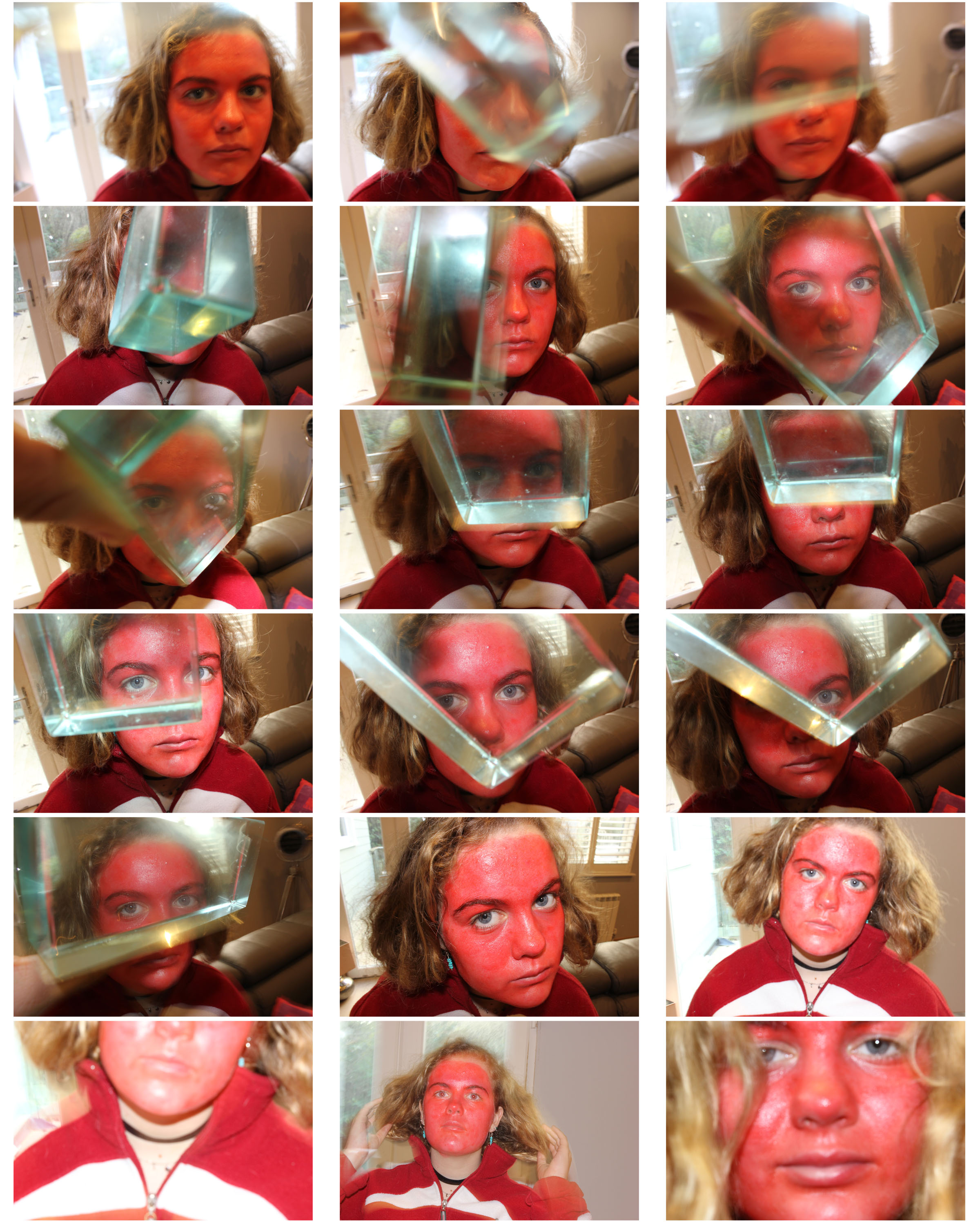
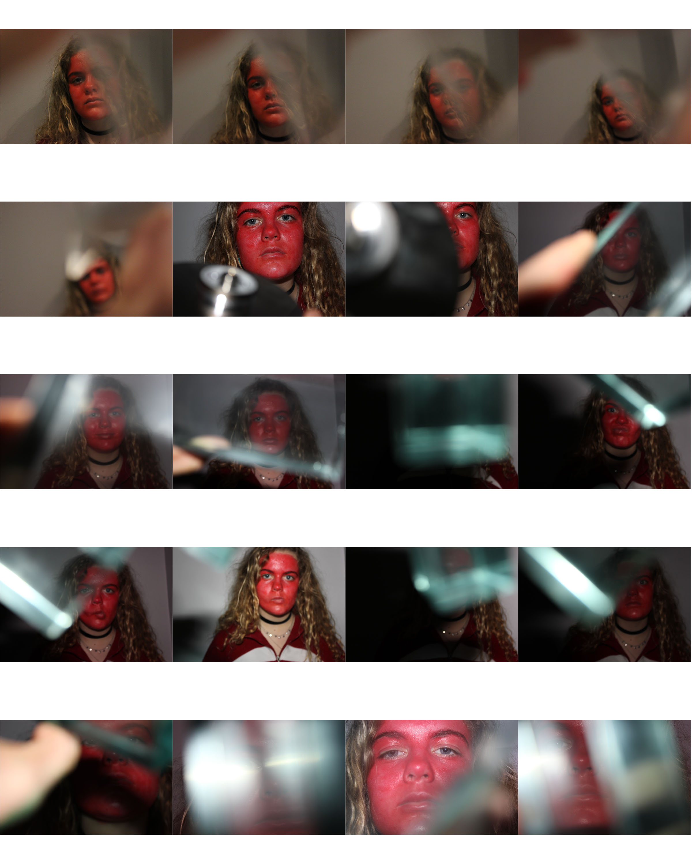
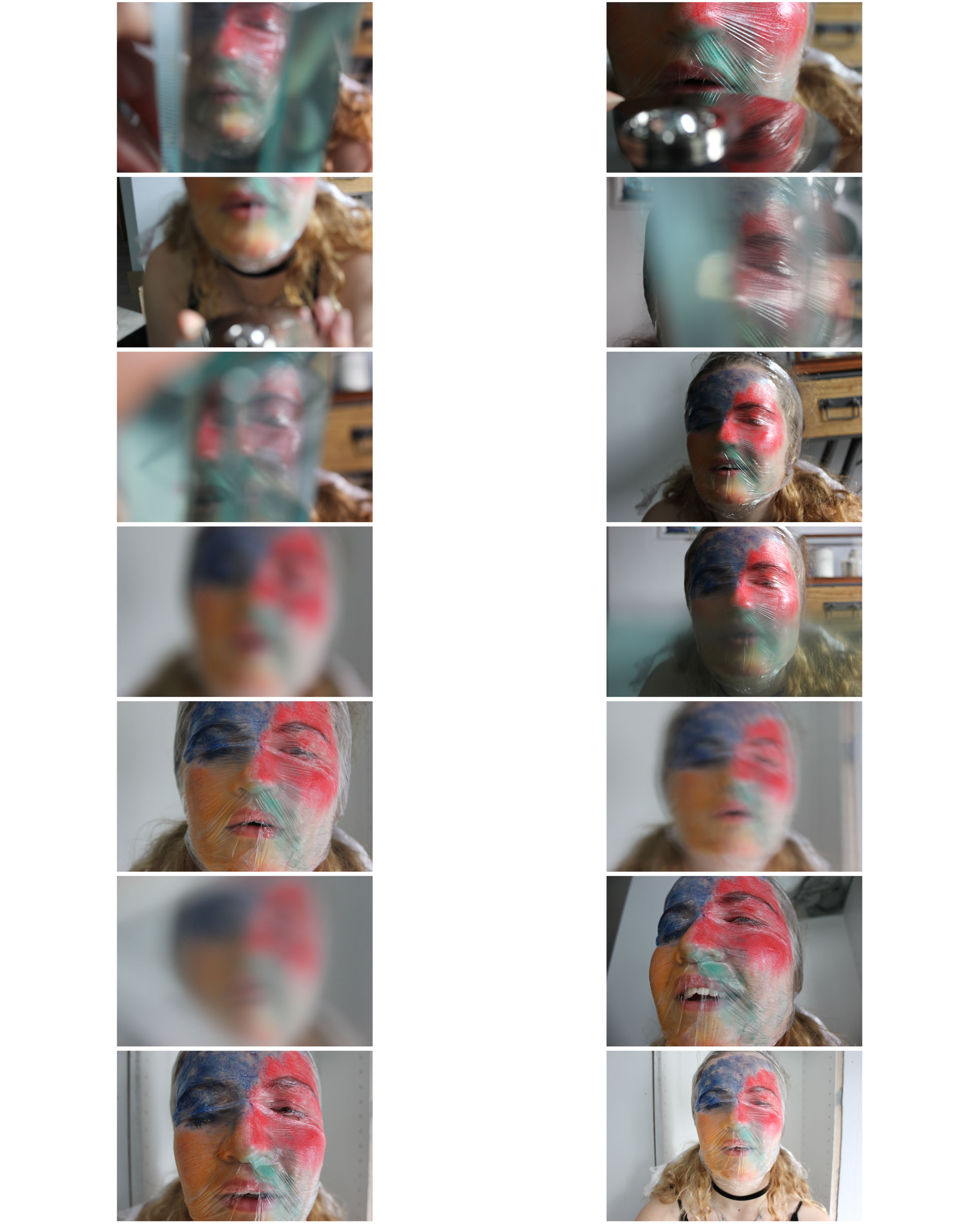
My Response


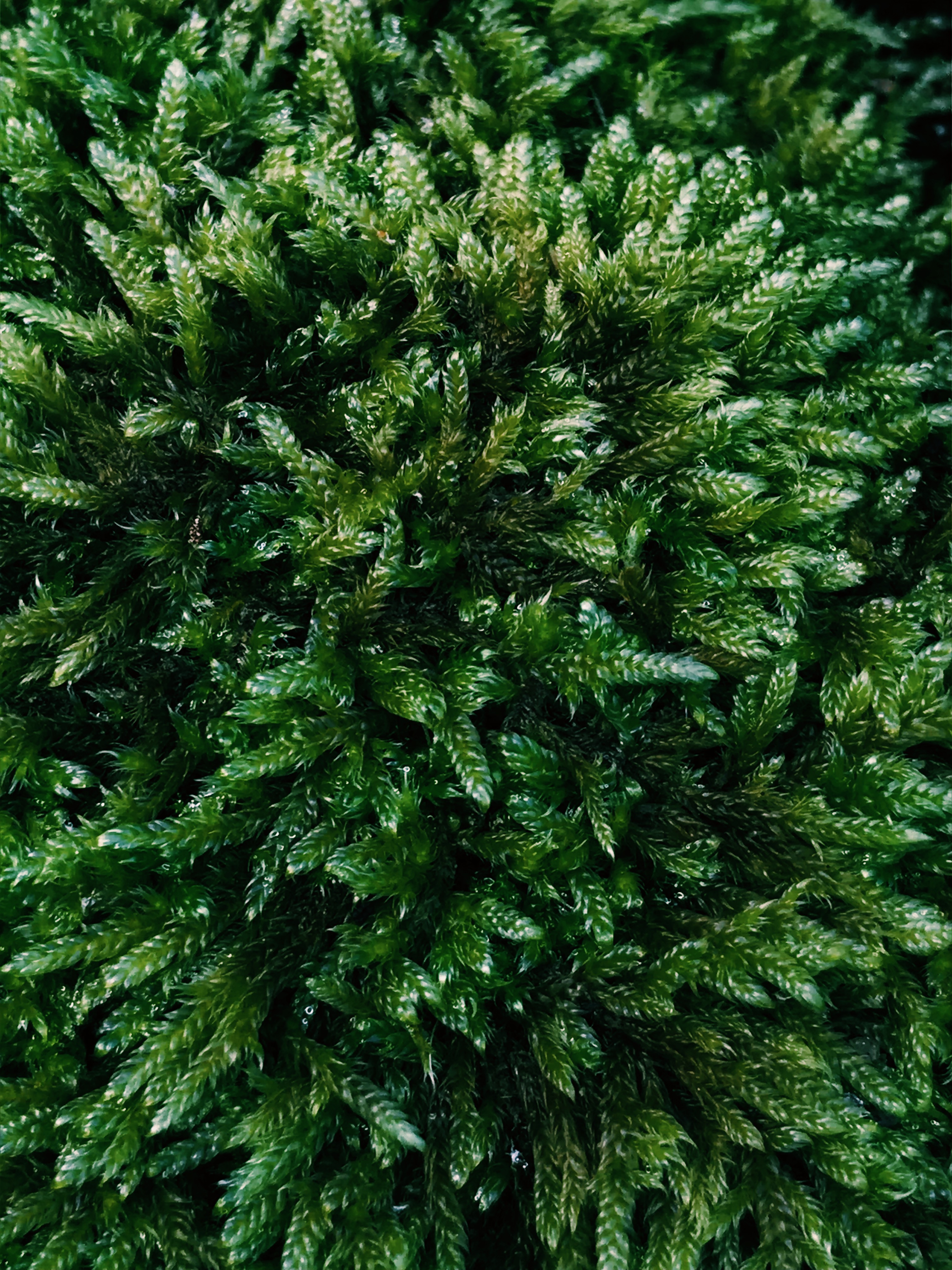
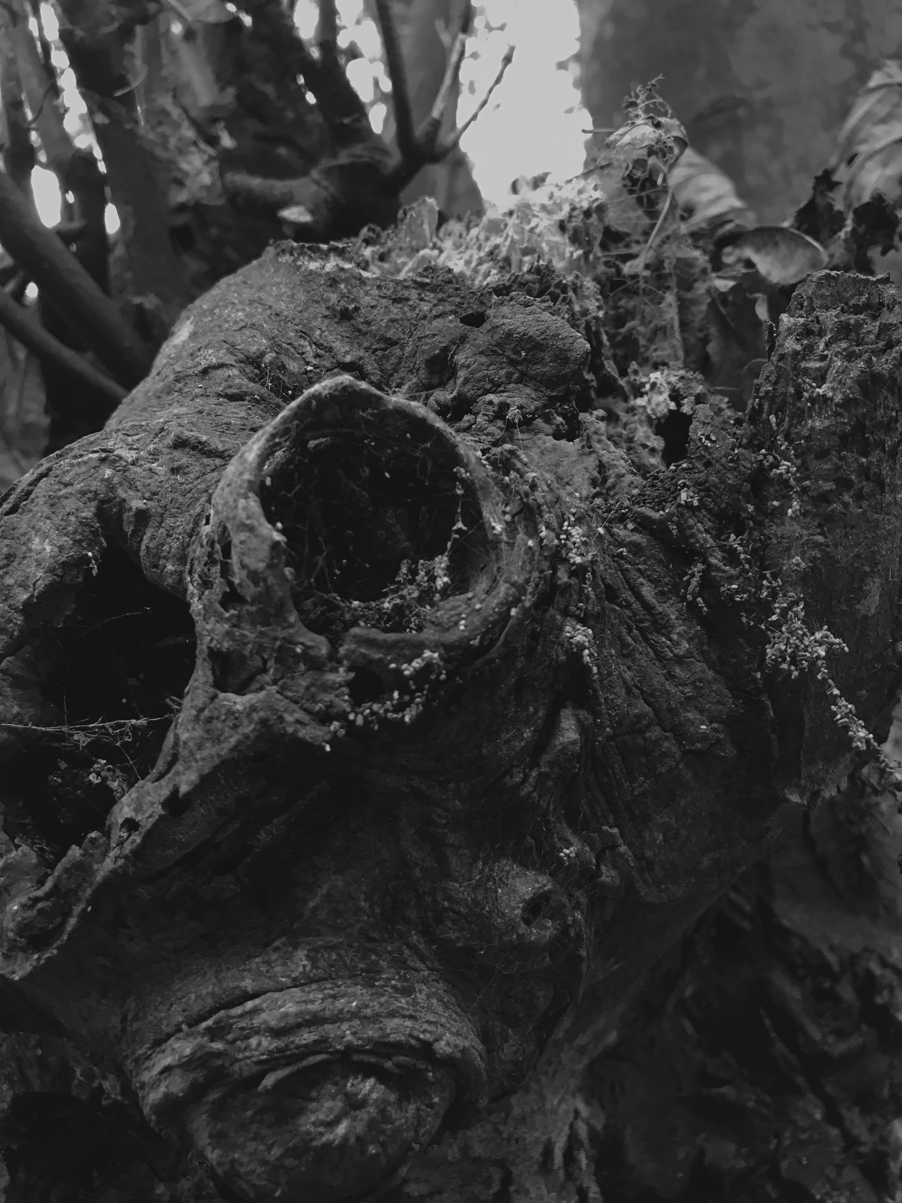
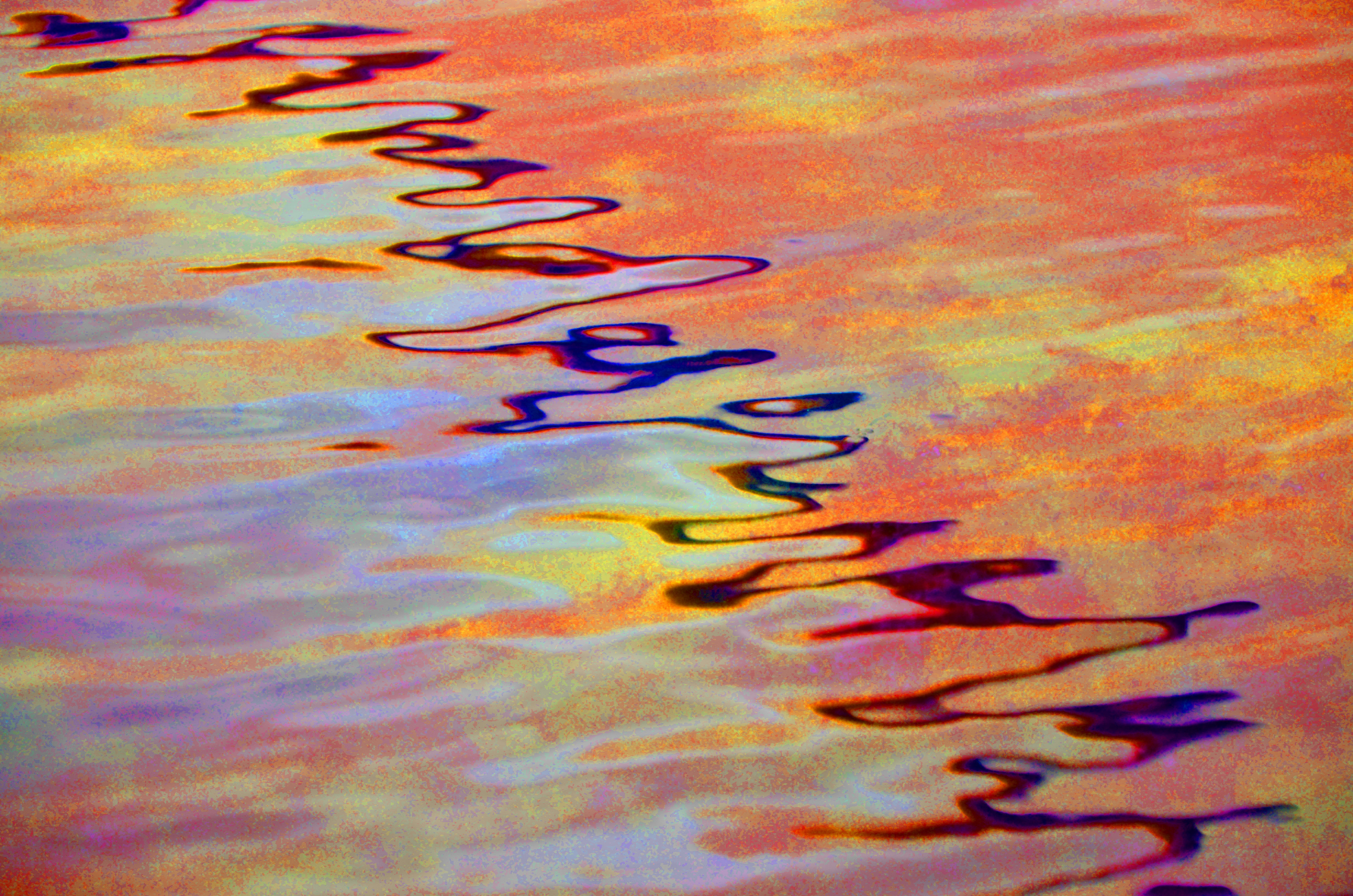
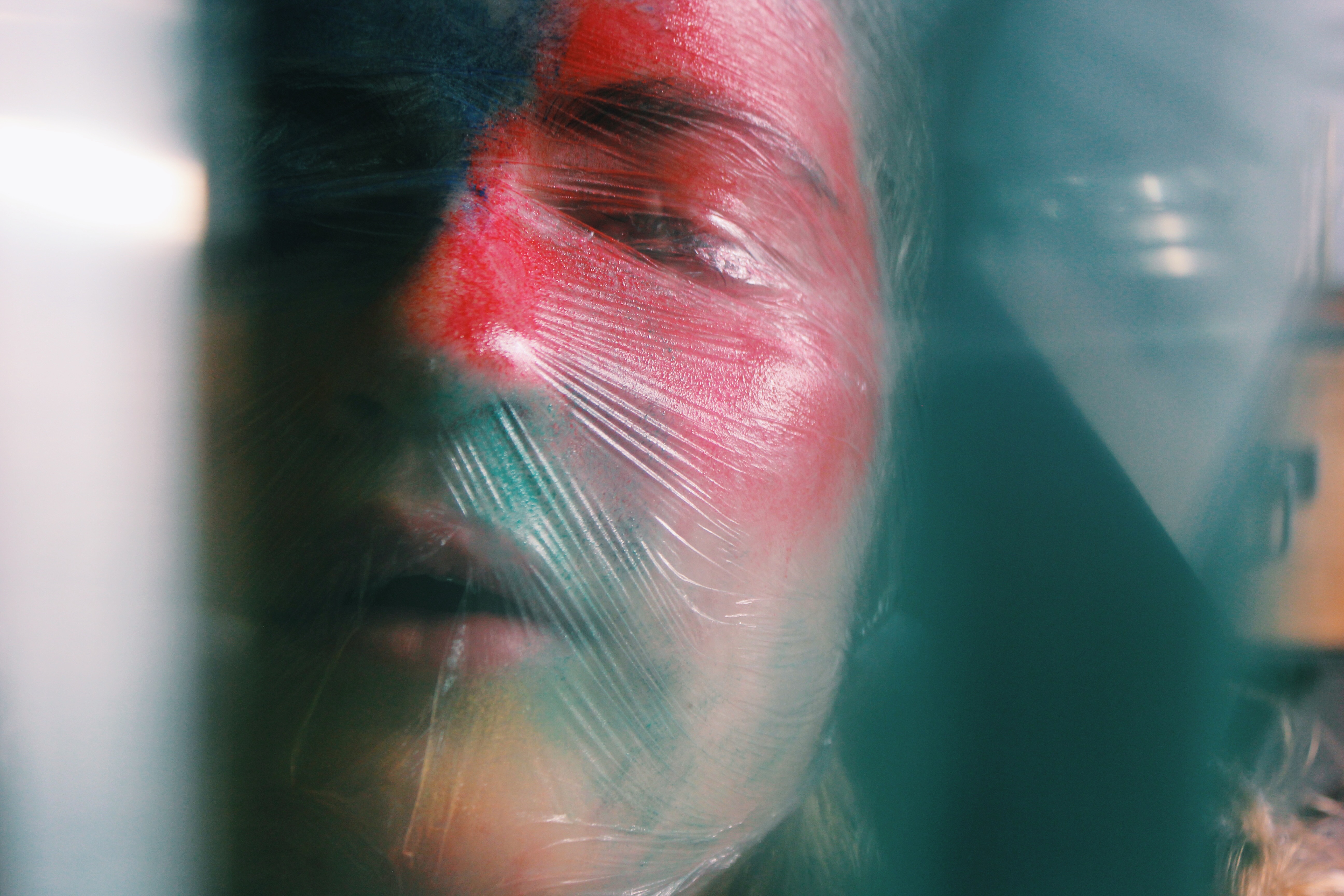
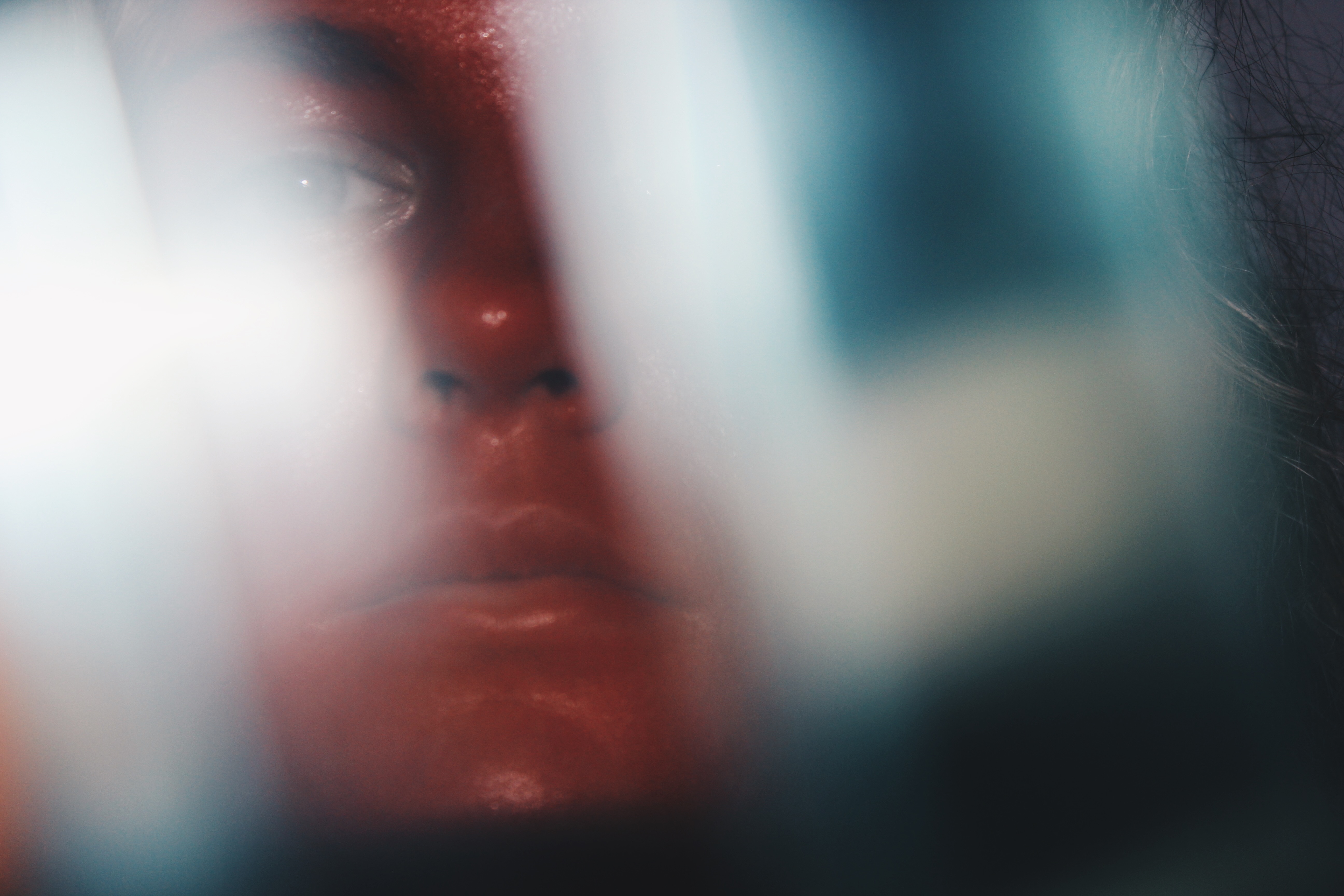
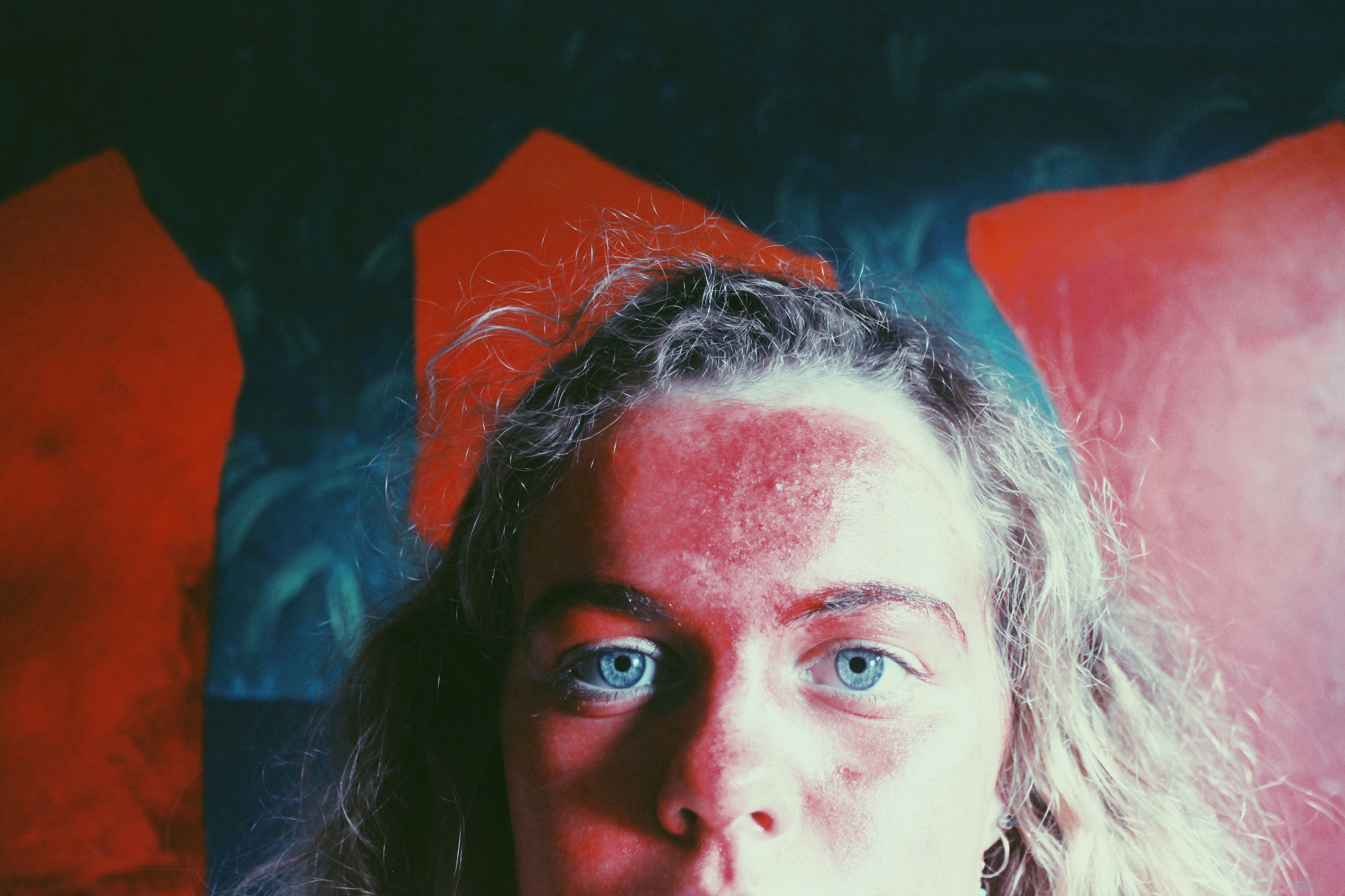
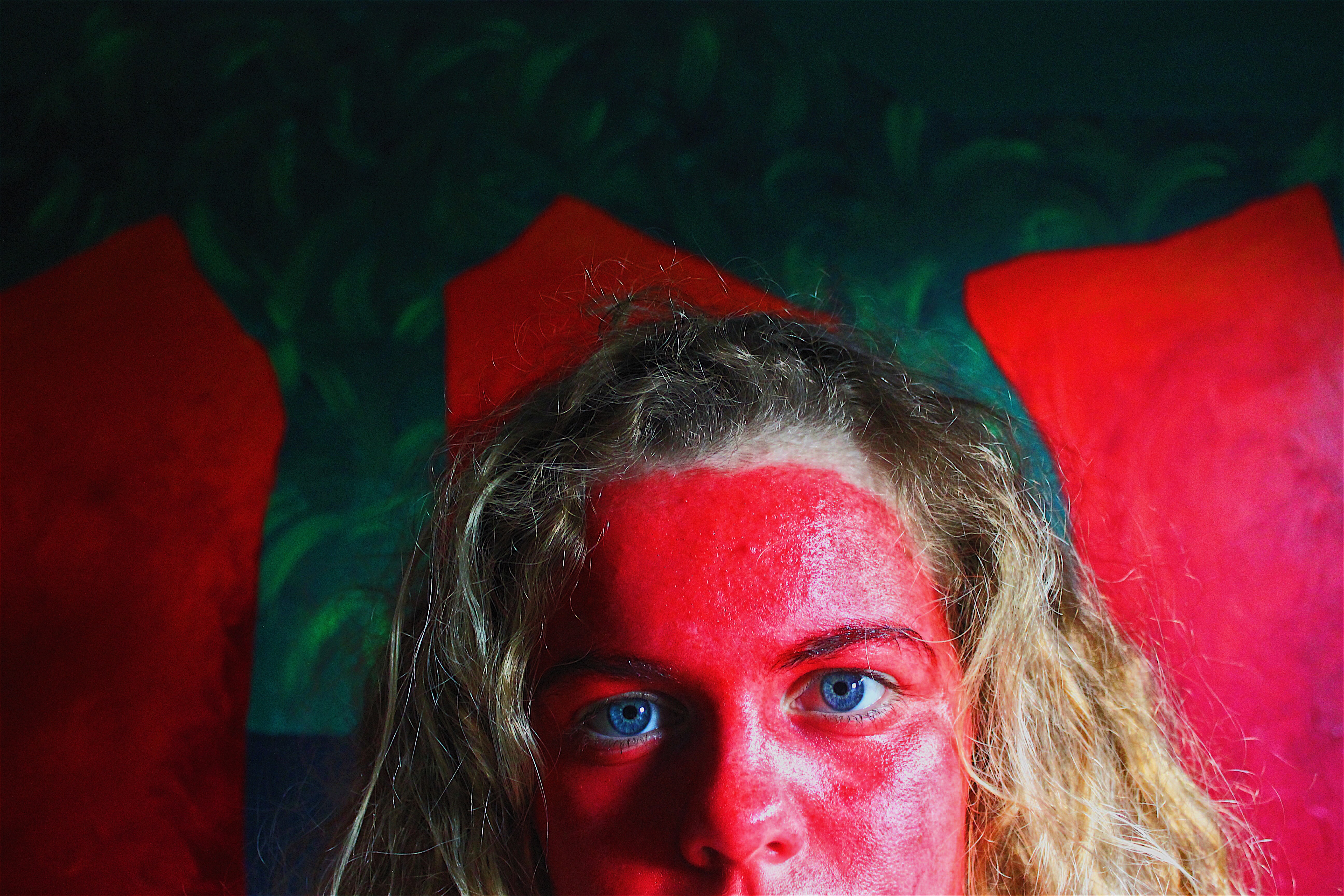
My Edited Images


My Favourite Images

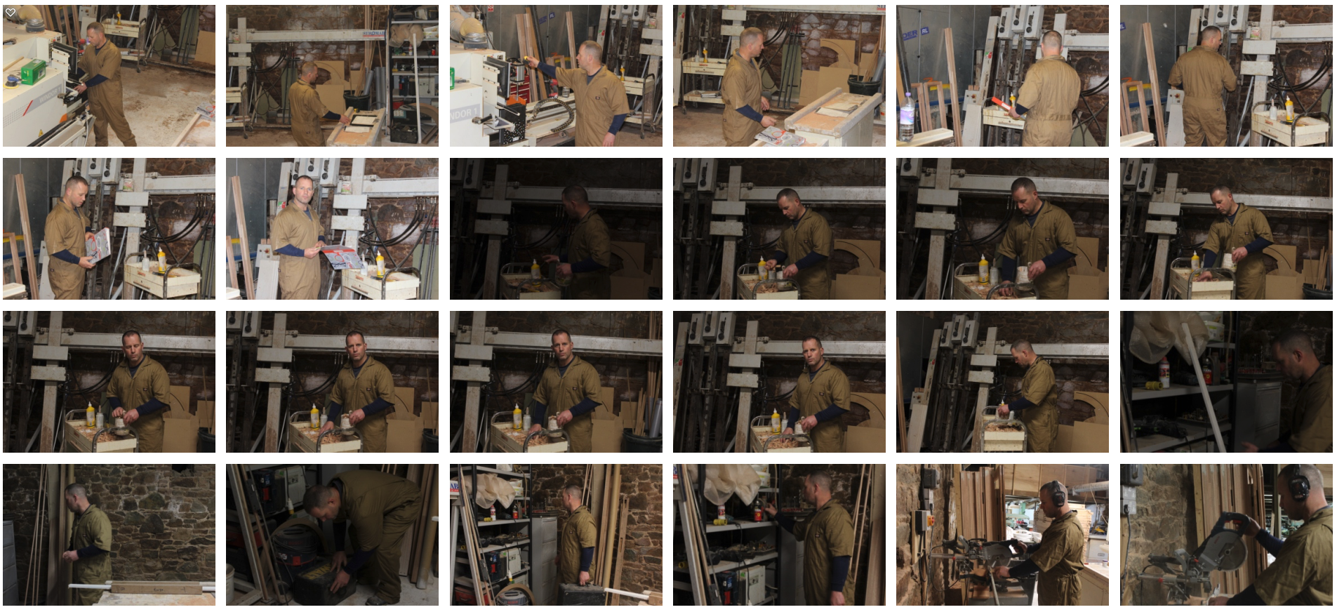
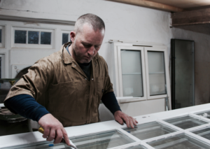
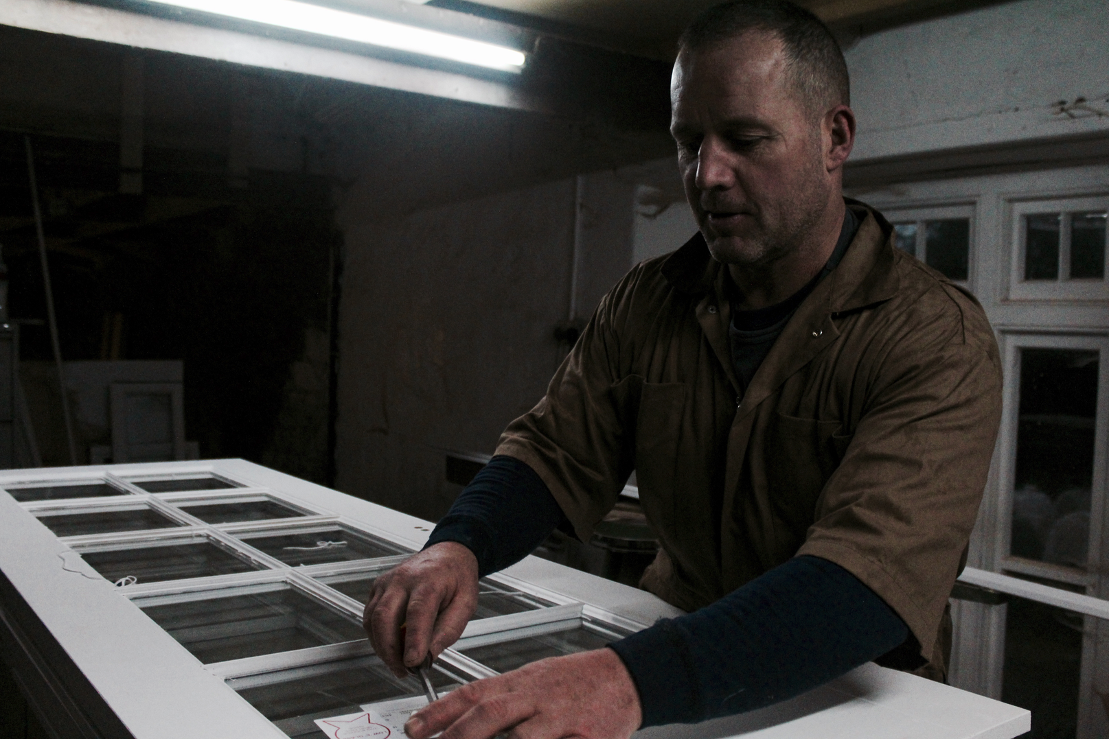
In the above image, a flash was used to deal with the dark atmosphere of the workshop that I was working with. The flash allowed the industrial items in the background to be brought into the image. A medium/shallow depth of field was used for this image so that the focus would be on the model whilst the background was still present but less prominent. A shutter speed of 1/200 was used to create a sharp image whilst the model was moving around as he worked. An ISO of 800 was used to make sure the image was bright enough with the minimal amount of noise.
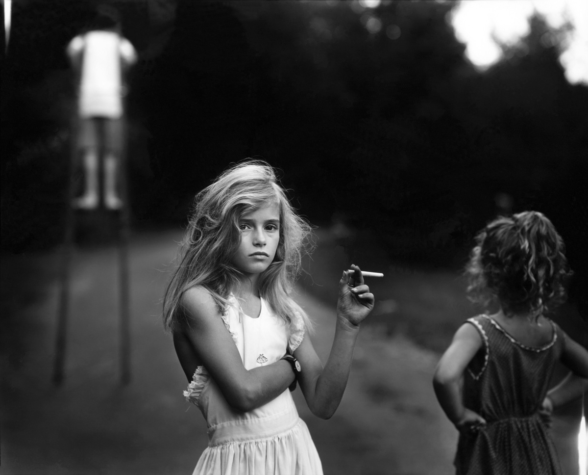
I chose a black and white colour style for this image as it helped to introduce more contrast into the image and separate the model from the background more, I took inspiration for this from Sally Mann’s work. There is a wide tonal range in this image – going from the black of the background to the white of the machine in the foreground. The image has a slight 3D effect as the model is clearly in the front with the machines further behind him. There are no patterns or symmetry in this photograph as in the building industry, the focus is on getting work done quickly and efficiently, not spending time making the workshop look pretty. I have positioned the model along a vertical line of the rule of thirds to make the image appear more appealing, this helps to bring more attention to the model and what he is wearing.
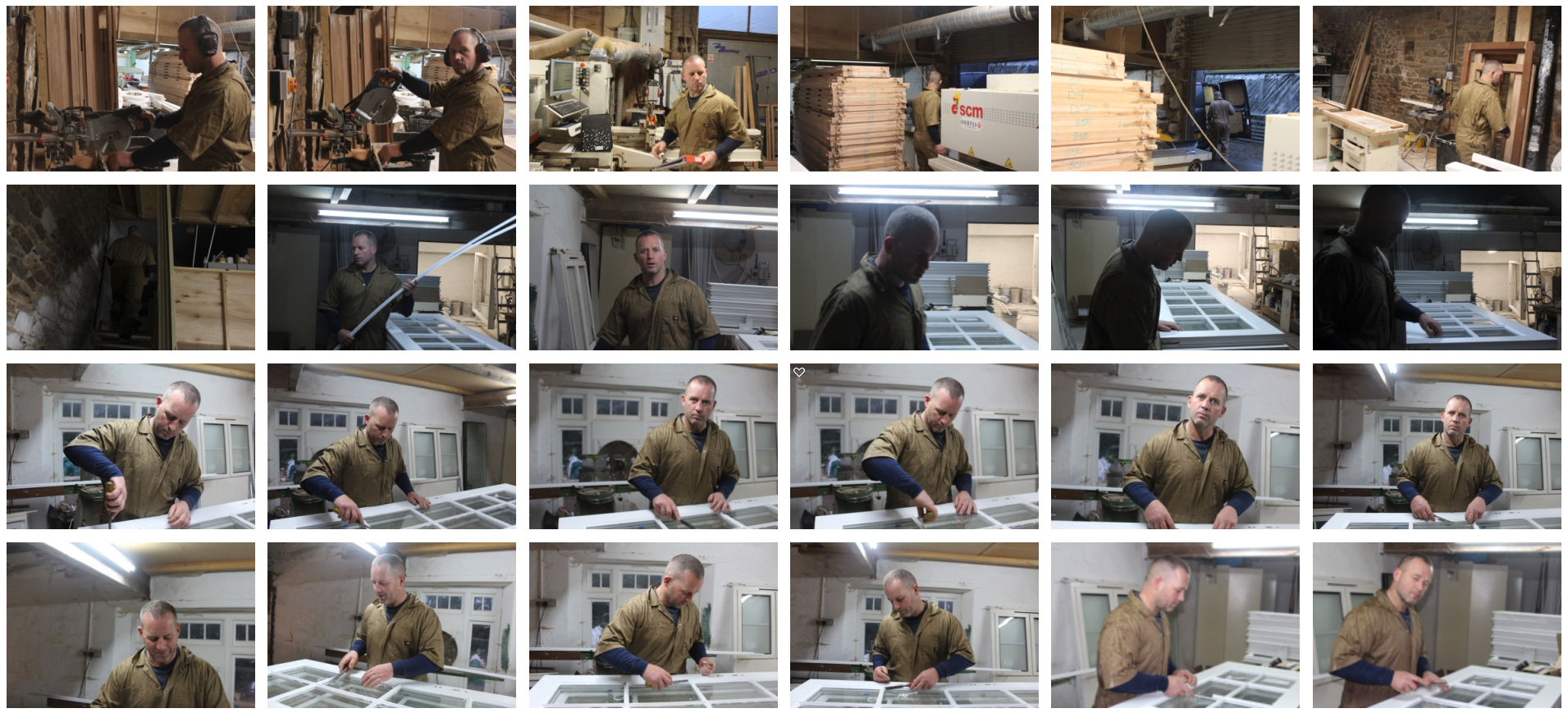
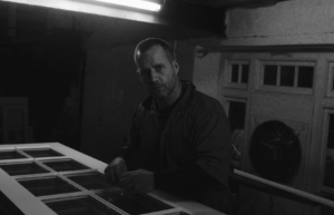
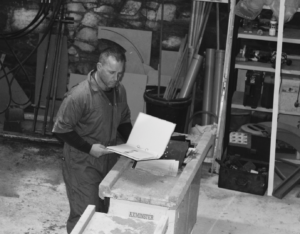
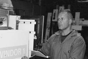
In this image, I used the dim lighting from the workshop to create an authentic, natural look of my dad in his workshop and to add contrast. A shallow/medium depth of field was used to create a blurred effect towards the background of the image and to keep focus of the model. A shutter speed of 1/200 was used to capture the photo whilst the model was still moving around. An ISO of 1600 was used as the setting was very dark, this allowed me to capture this under-exposed style photograph.
There isn’t a lot of colour in this image because of the settings I used, this helps to create a dark and industrial look in the photograph. There is a wide range of tones throughout the image from the white light and door to the background and the shadows. There is an almost dirty texture to this image as it it dark and you can see the dust/dirt of the wall in the background. It is quite a 3D image as the models hands come forwards towards the camera with his body set further behind. There is repetition in the window frame that he is working on that expands towards the background of the image. I set up the image so that my dad was along the vertical line of the rule of thirds to create a more appealing image.
The two photographs above were set up and taken in my Dad’s workshop, where he works each day and runs his business as a carpenter. He spends lots of time here each day so it is his typical workplace and environment. I simply asked him to do what he does and to look at the camera every so often. To me, my dad and his workshop was the perfect set up for the images as the dark lighting and unusual setting allowed me to create interesting images such as the one shown above
When the task was set to take environmental portraits, my dads work was the first thing that I thought of as it gave me a chance to take advantage of the dark and industrial environment that is my dads workshop. These images show my dads day-to-day life and show authentic hard work instead of someone just modelling for a photo.