
Robert Frank was a Swiss American documentary/Street photographer, who documented the life in 1950’s America. His most famous work would be his 1958 book tilted ‘The American’ which consitsed of 83 photos. He began in photography as using it as way to escape the horror of World War ll and express his emotions. In 1047 he moved to America, however he did not settle there he went traveling in South America and Europe he then came back to the USA in 1950. Although he was excited for what he was going to experience in the USA this excitement quickly tuned into disappointment as he found the American lifestyle as a fast paced and overemphasis on money. He found the country to be bleak, lonely and disappointing which he expressed in he documentary photography of the country.
The image shown above is a famous image from his series ‘The Americans’ which is entitled ‘Trolley’ the image can be broken down in to different sections.
Technical
The image has lot of visual technical features that makes the image, one of them being the use of rue of thirds. as the image is clearly dived up into three sections it helps to that the onlooker can take more time into looking into the detail and texture of the image. The use of symmetry can also be classed in the rule of third as it helps to make the image more effective as the use of repetition is very pleasing to the eye. Another technique that is used in the image whether it was intentional r not it has been used in the image is the use of Anansel Adams Zone system, the darkest tones are in the space within the trolley are the lightest part is in the bars on the outside,
Contextual
This image highlights the struggle ans segregation in at the time. In the image the people on the trolley are very clearly separated into sections; White men, White woman, White children. Black man and finally Black woman. The image shows the struggle that black people would be facing having to give up there seats for others, being forced to sit at the back and having to be sectioned because there was something ‘wrong’ with them. So this image has a lot of contextual meaning to it.
Visual
The one of the visual feature of the image is the use of black and with and within that the high levels of contrast and highlights as it makes the image more dramatic. One of the natural feature tat has formed in the image is the frame like types of windows as it helps to break the image up into different sections.
Conceptual
One of the conceptual features is the meaning of the bars. Which can also be seen as prison bars which could have a symbolic meaning that the people are trapped in society beliefs in what they are/worth based on there appearance, which helps to bring a structure of the segregation in the society at the time.


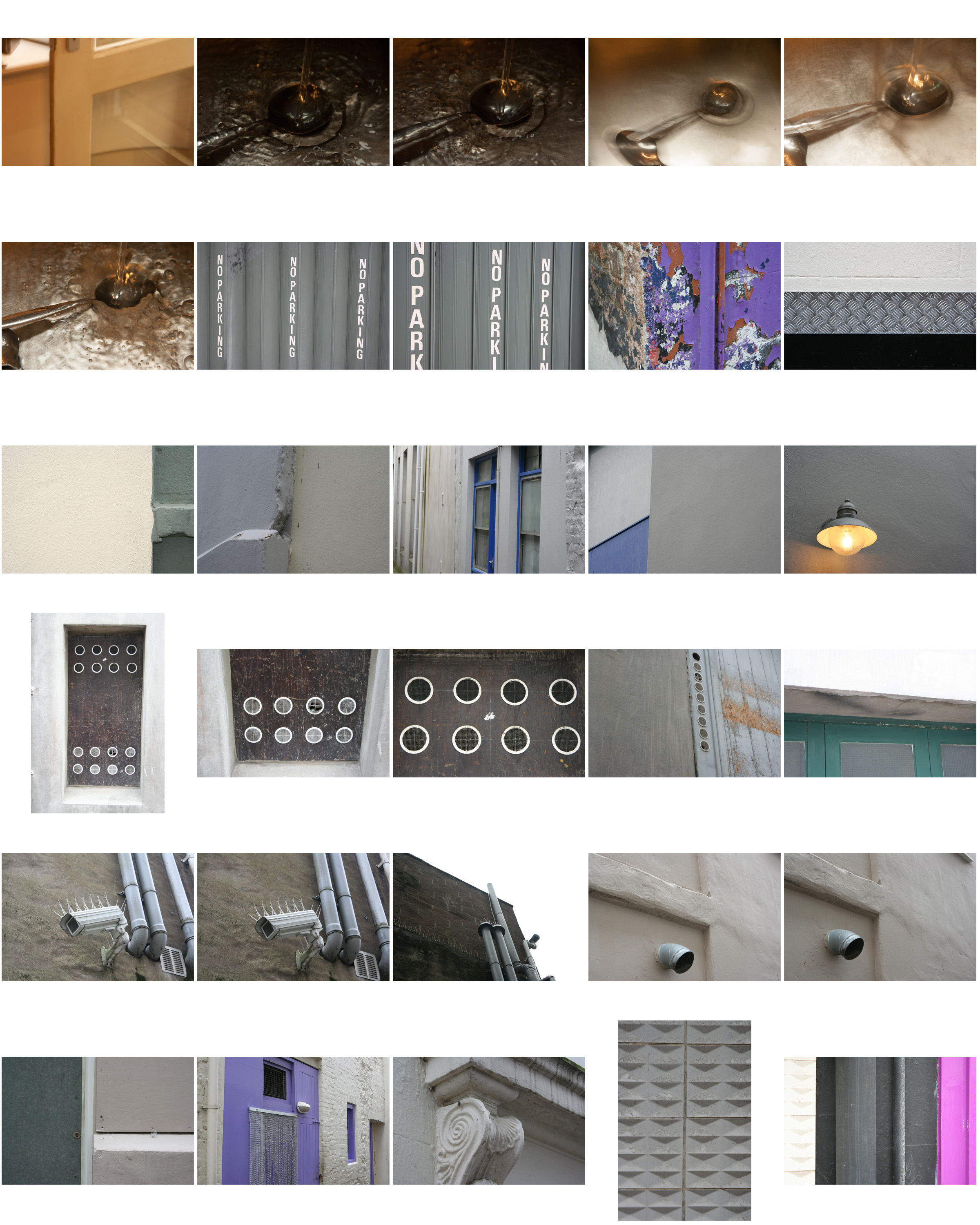
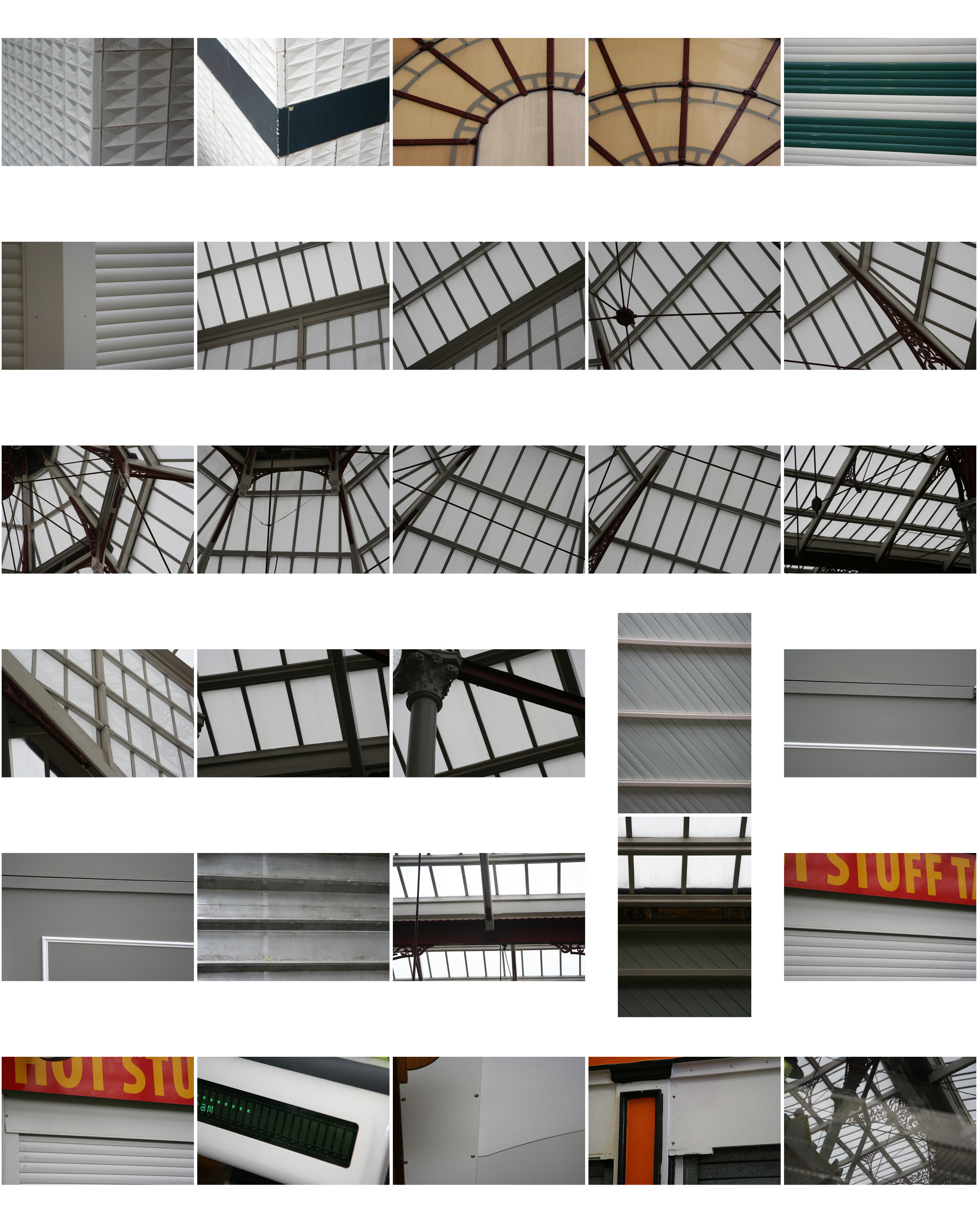
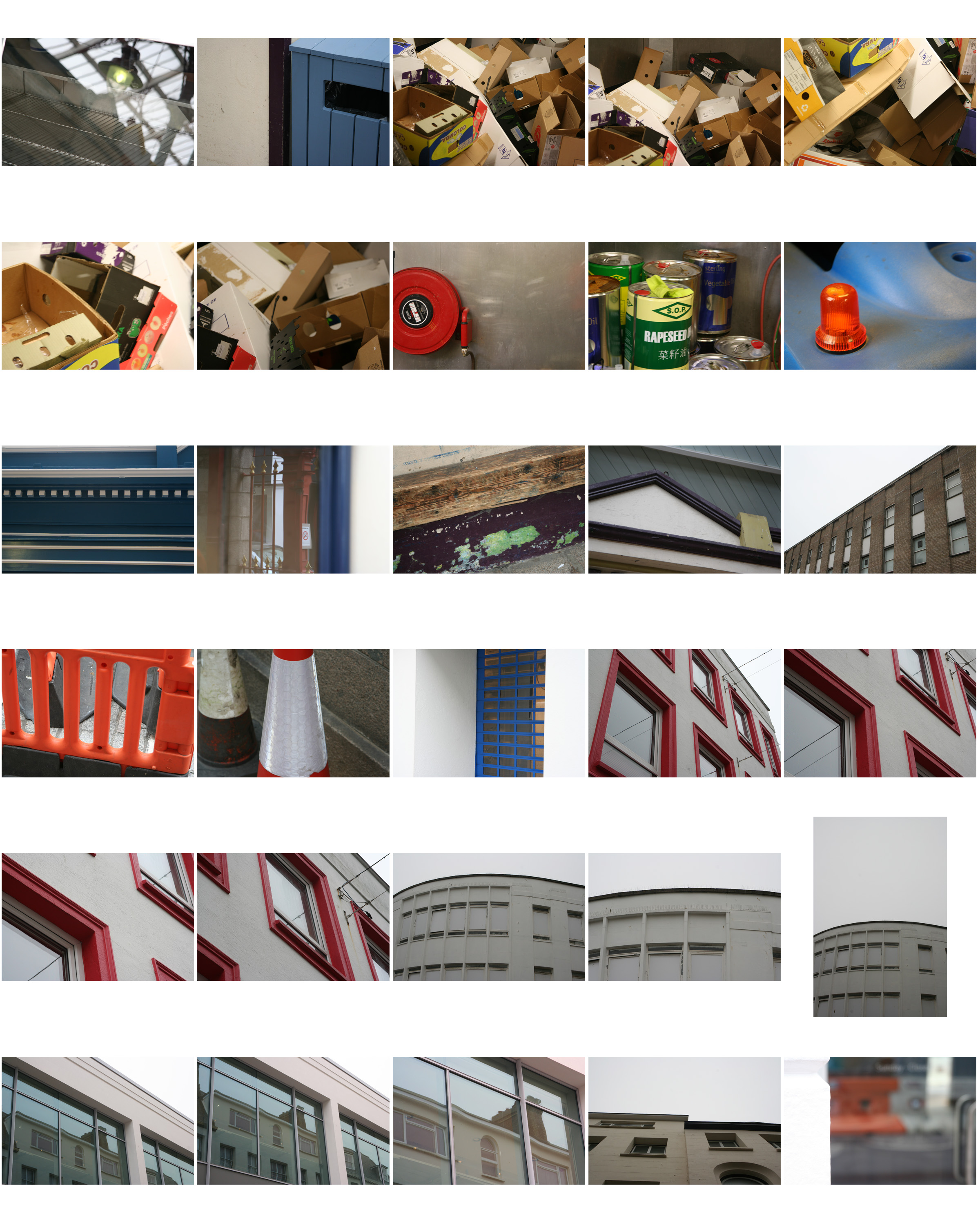
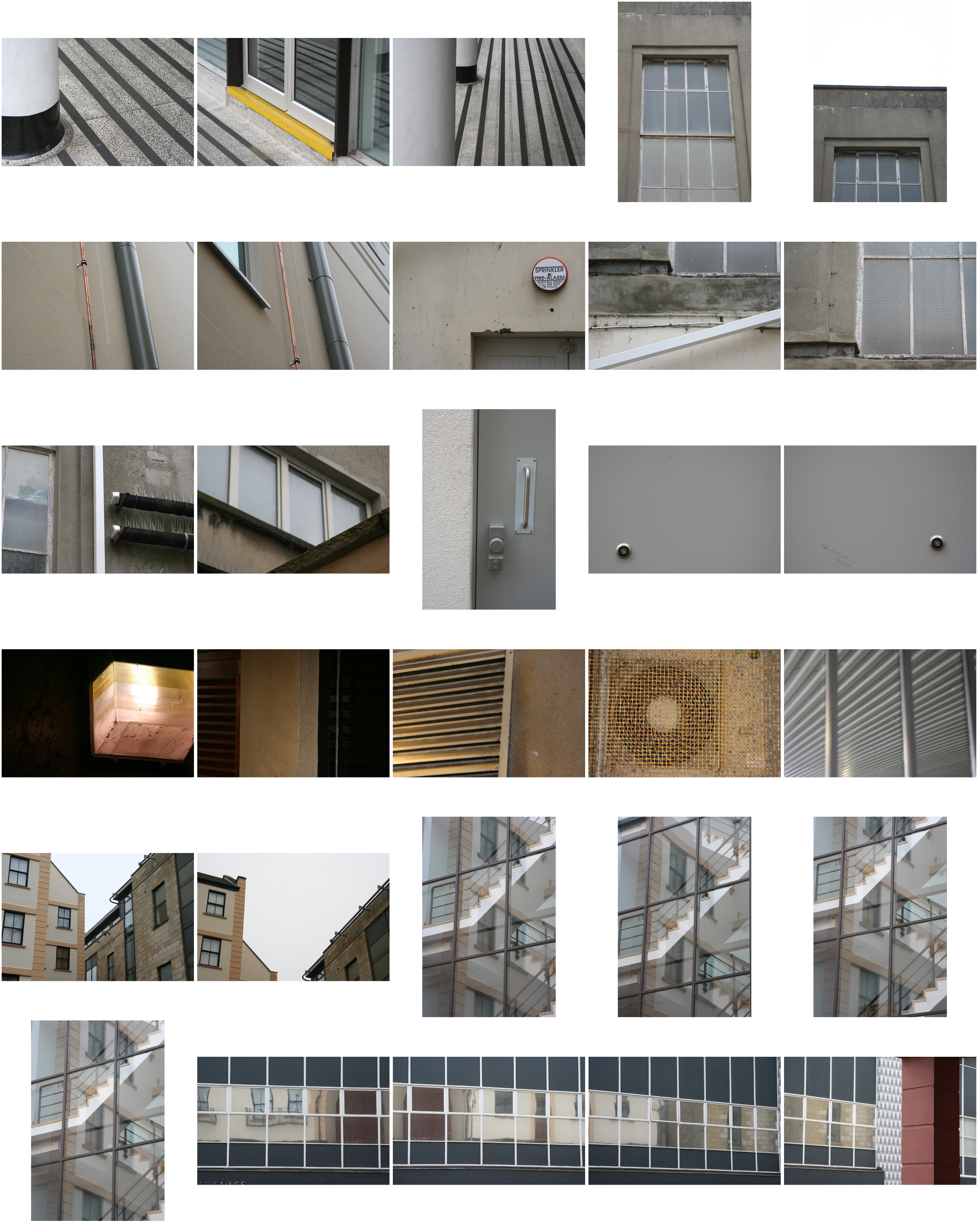
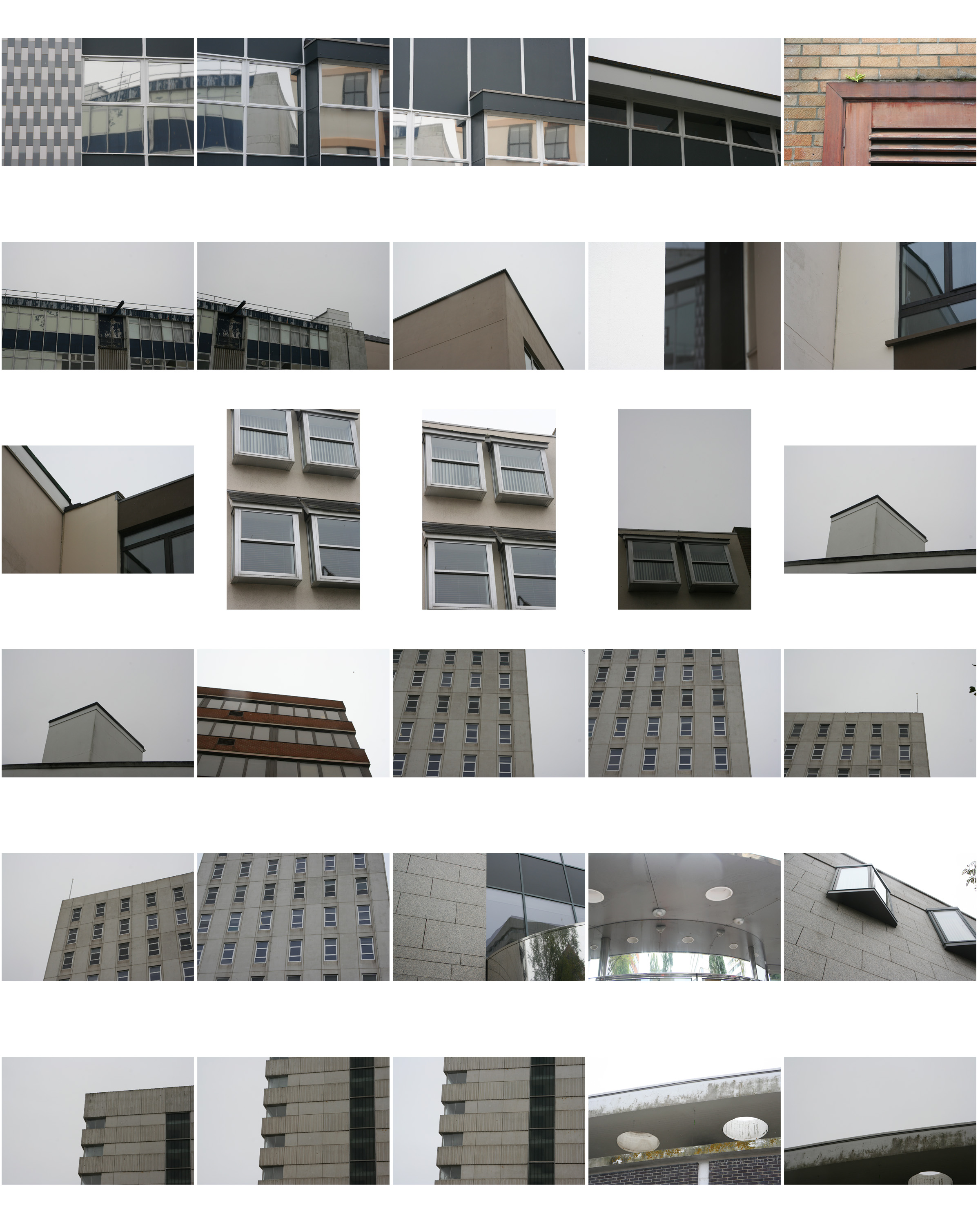
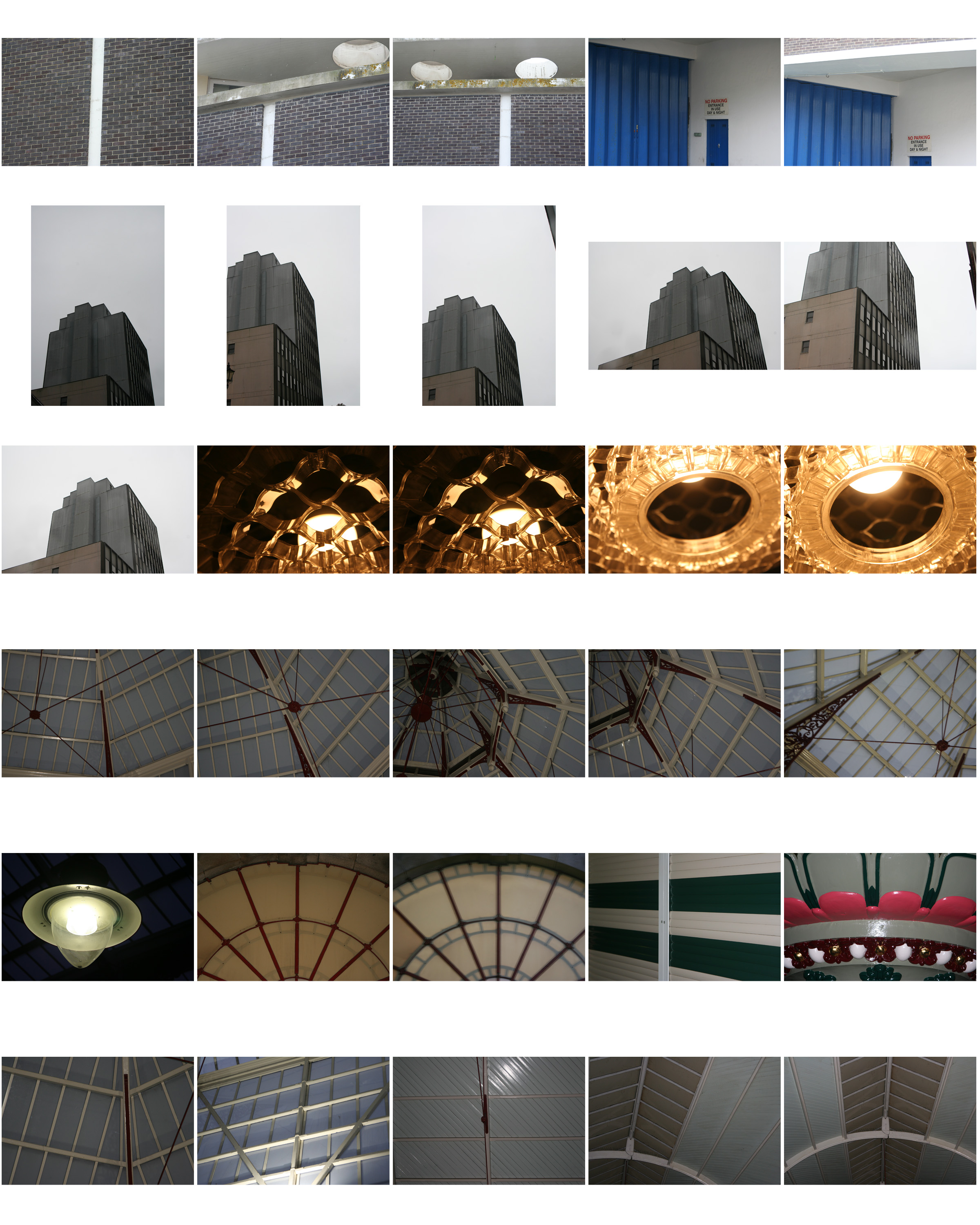
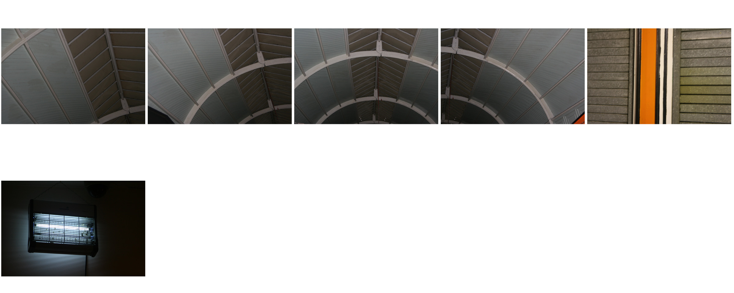
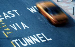
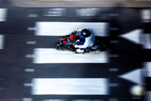

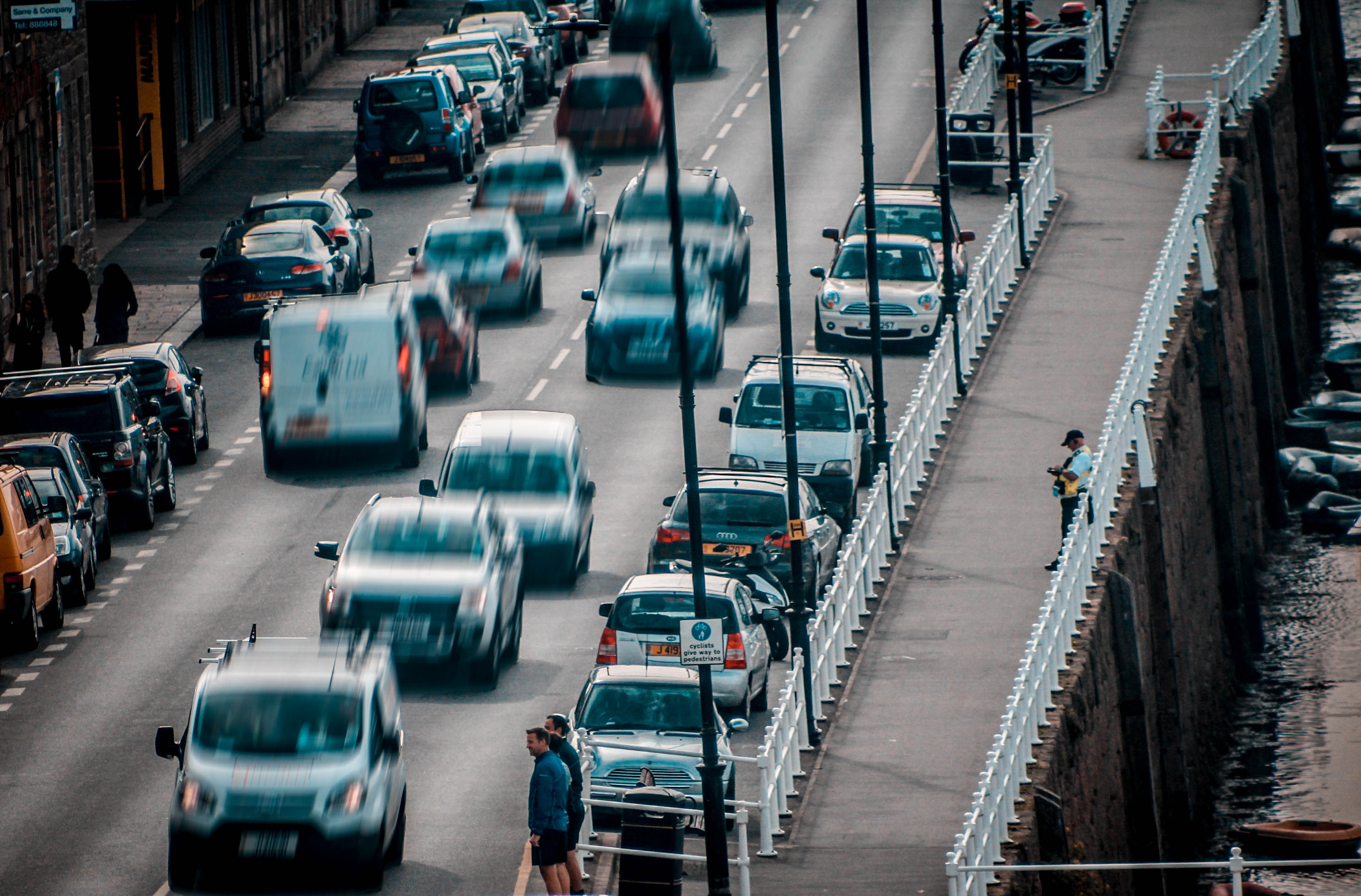
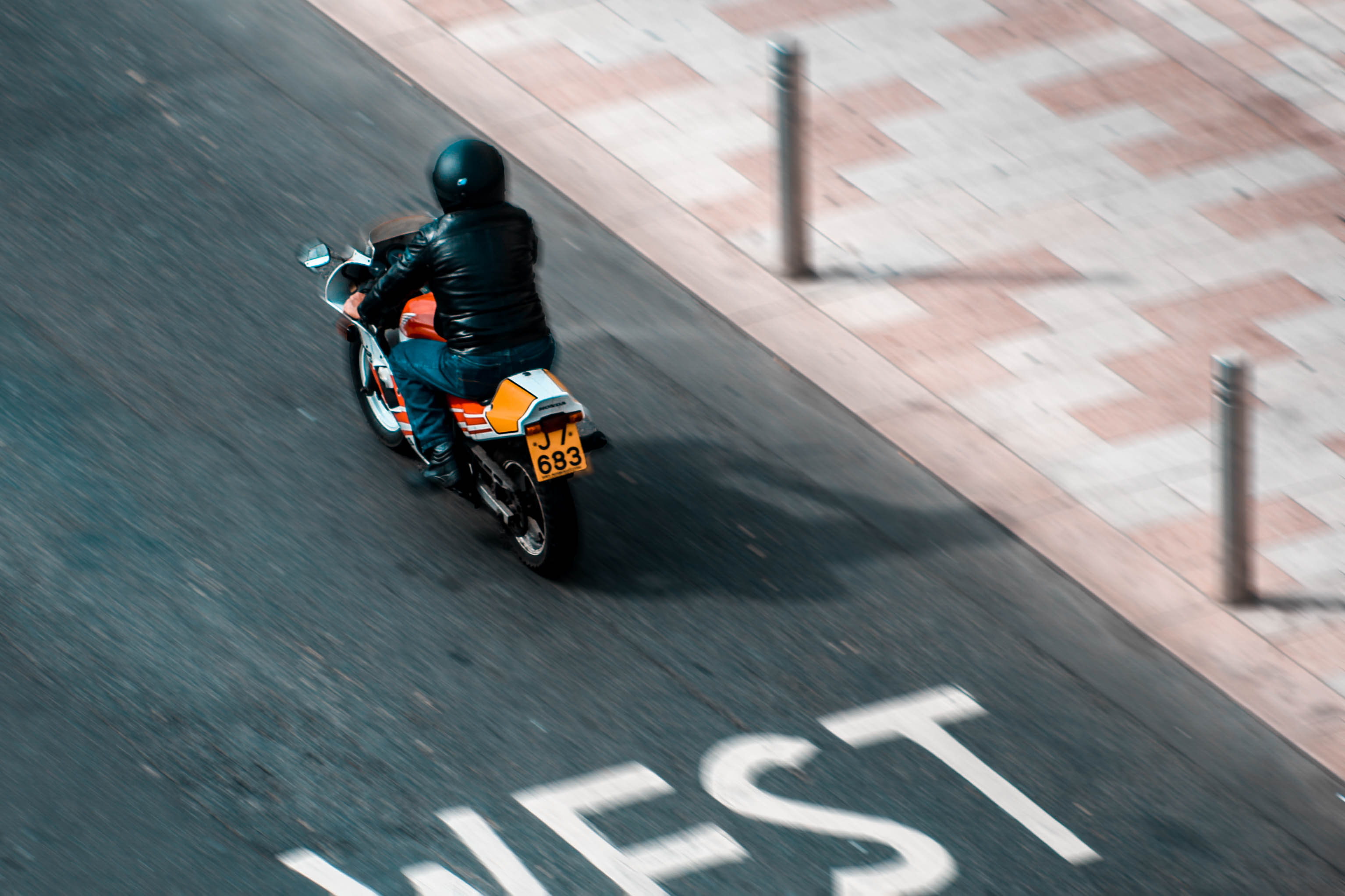
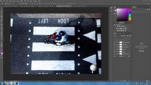
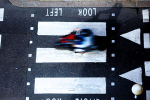


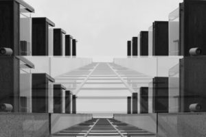

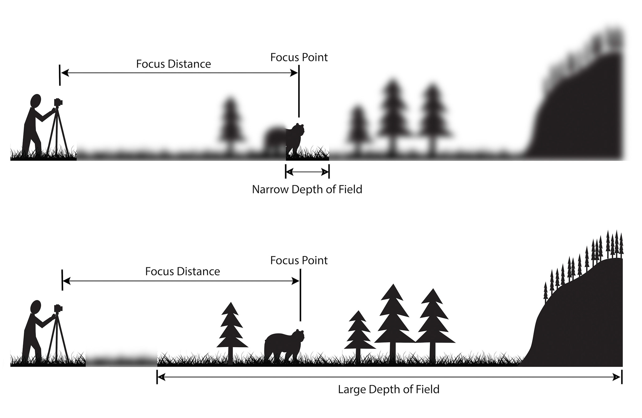
 After reading up about the ways in which I could use my point system on my camera, I went out with a few friends to incorporate this into my photos, these were my results:

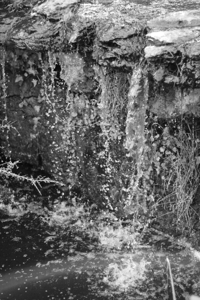


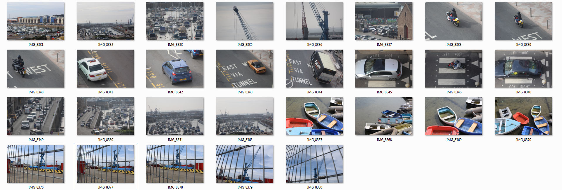
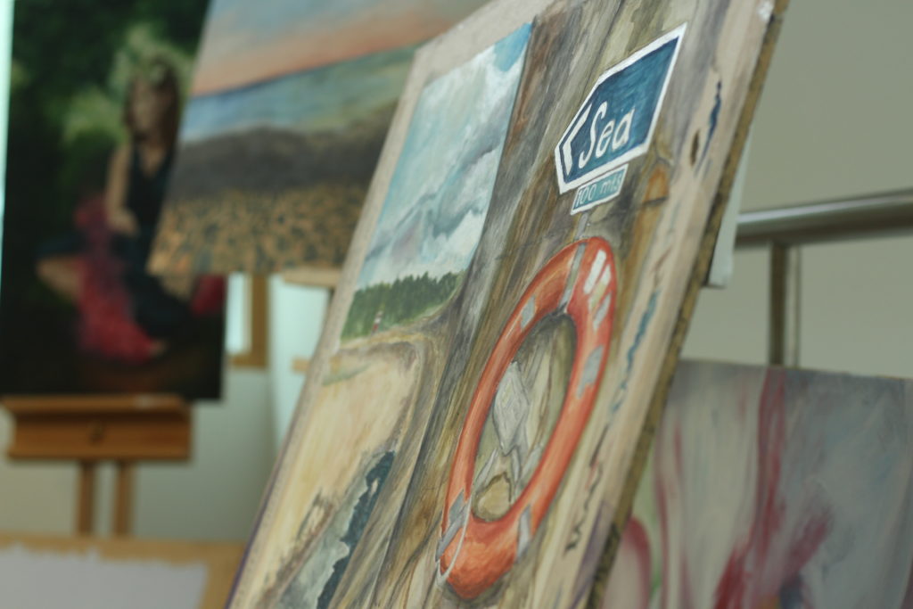
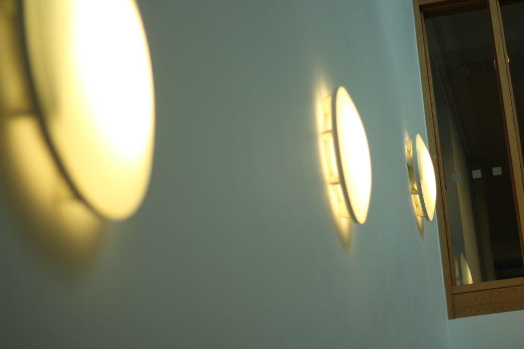
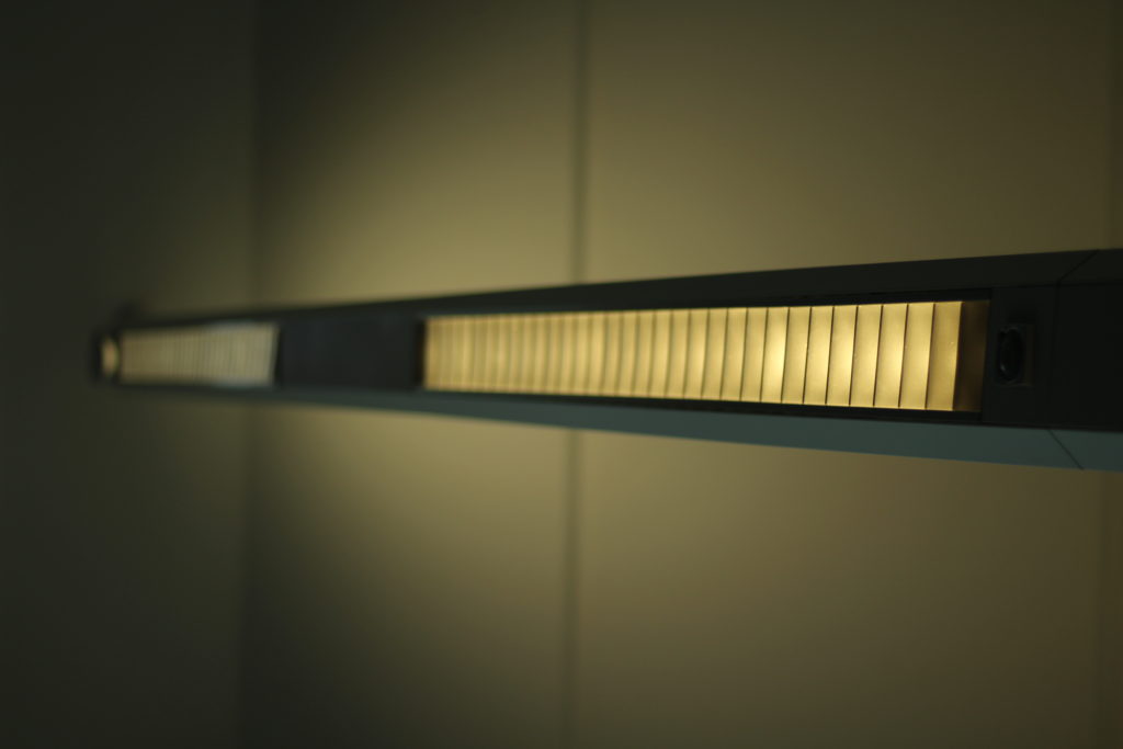
 I decided to have a go with the method in a few of my photos, and so walked around school experimenting with it, these were my results:
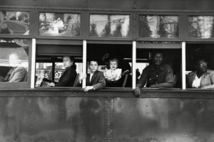 Robert Frank - Swiss-American photographer and documentary filmmaker:'Trolley, New Orleans', 1955.
Visual
In this photograph a selection of people sit, and are naturally framed by the white bars of the trolley - this could be viewed as a series of separate portraits. The rule of thirds brings the focus to the middle third of the photograph. The windows of the bus are directly on the center lines which naturally draws the attention to the people in the bus. This photograph clearly demonstrates the divide/segregation between the social classes.
Technical
The photograph was most likely to have been a very quick snapshot with little thinking time about the image. With these assumptions the photograph would have been shot with a fast shutter speed due to the clarity of what would have been a fast moving object.
There is a high contrast in tonal range which creates a deep image with many layers - the darker foreground and the lighter background behind the bus. The reflections in the top windows suggest that the light was shining towards/on the object which is why there is a lot of tones and depth.
Conceptual
I believe Robert Frank selected this photograph because of how much it represented the social hierarchy at the time. The photograph clearly documents the segregation between races - white people at the front of the bus and black people at the back. The white bars that frame each portrait of the individuals also symbolizes this. The white bars in the photograph are very bold and stand out a lot, due to the high tonal range and contrast of the dark bus. The white makes a bold statement of the authority and power white people had over black people and reinforces segregation between the two races.