What is threshold?

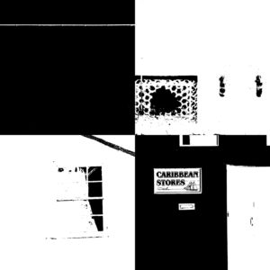
The Threshold tool transforms the current layer or the selection of images, into pictures consisting of only pure black and white. In this, the color of pixel represents something, for example white pixels represent the pixels of the image whose value is in the threshold range, and black pixels represent pixels with value out of the threshold range.

I was inspired by the photographer Keld Helmer-Petersen, whose work was mainly based around this aspect as seen by some of his pictures below. I noticed that his images mainly consisted of every day objects, with a clear definition between light and dark, to which he would convert these using the threshold (As seen below).


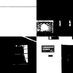
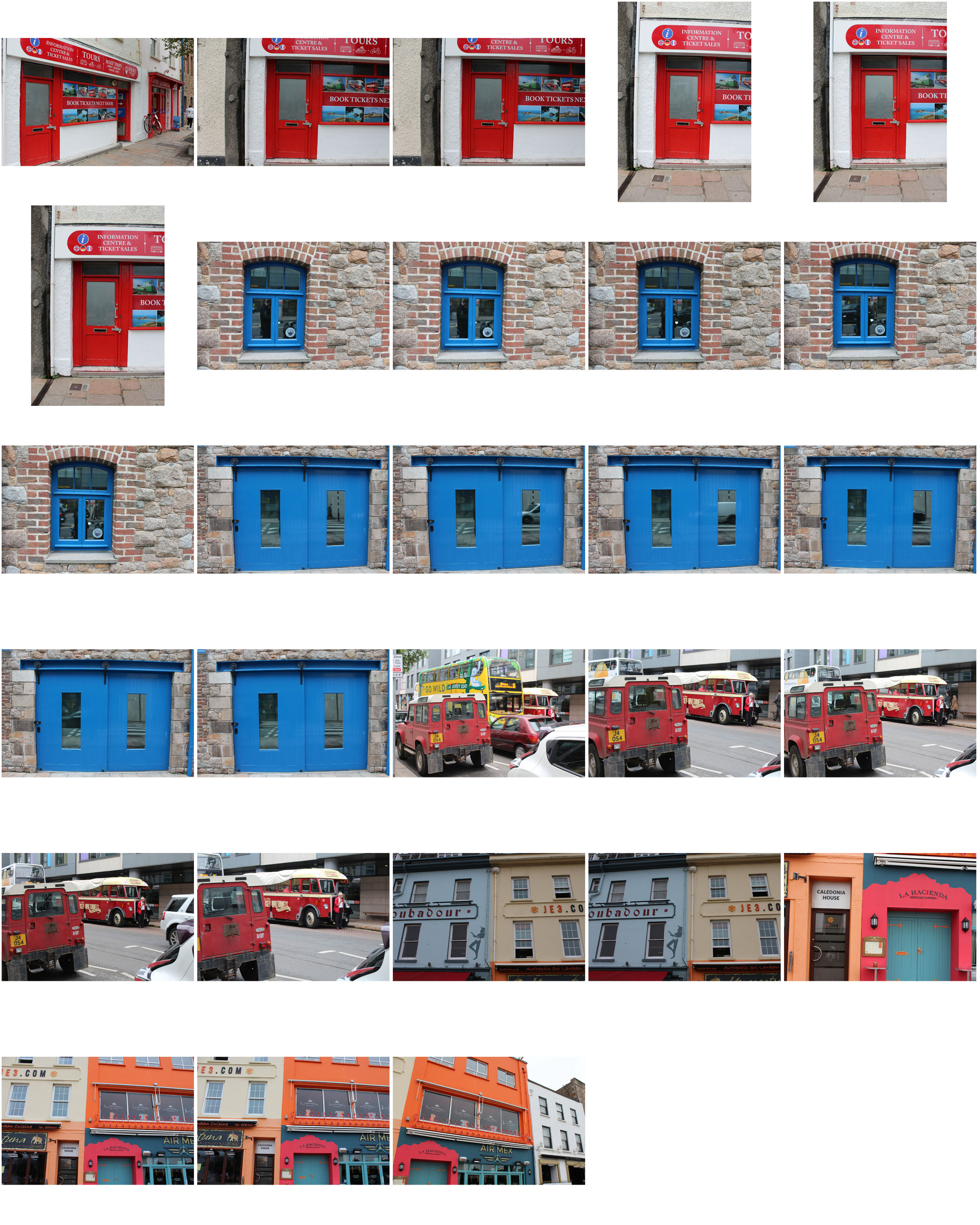
This style of photography inspired me to create my own small contact sheet, in which I would incorporate this threshold idea into some of my picture taken previously, using the software Photoshop. This would really make certain aspects of the image that I desired to stand out from the rest, by reverting the image to a black and white only state. However with certain images, I decided to invert the colors as I believed it made the image more aesthetically pleasing to the eye, and in some circumstances made the object I wanted to pop out.

This is the outcome of my experiment:

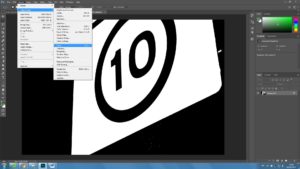
The method in which I created these images on Photoshop are below:

1. Locate the Image tab above, and click the adjustments section, which will reveal the Threshold section.


2. For some pictures I then had the idea to invert my image colors, allowing for a completely different picture to be formed.
Category Archives: Uncategorized
Filters
high contrast keld helmer petersen
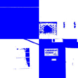
Keld Helmer Petersen - A danish Photographer who focused on shapes and kept his photographs very minimal. Some of his work uses very high contrasts. This moves the focus to the shapes and structures in each photo and strips away all the tones and shadows that a camera would usually capture.I used this technique on the images below by using Photoshop. I used 'threshold' and changed the levels of black and white that you could see in the image. I then inverted the image to see the opposite of the images. I also added colour instead of black for a similar effect however it looks more like to pop art:
Photoshop Skills – Editing Colour into photos
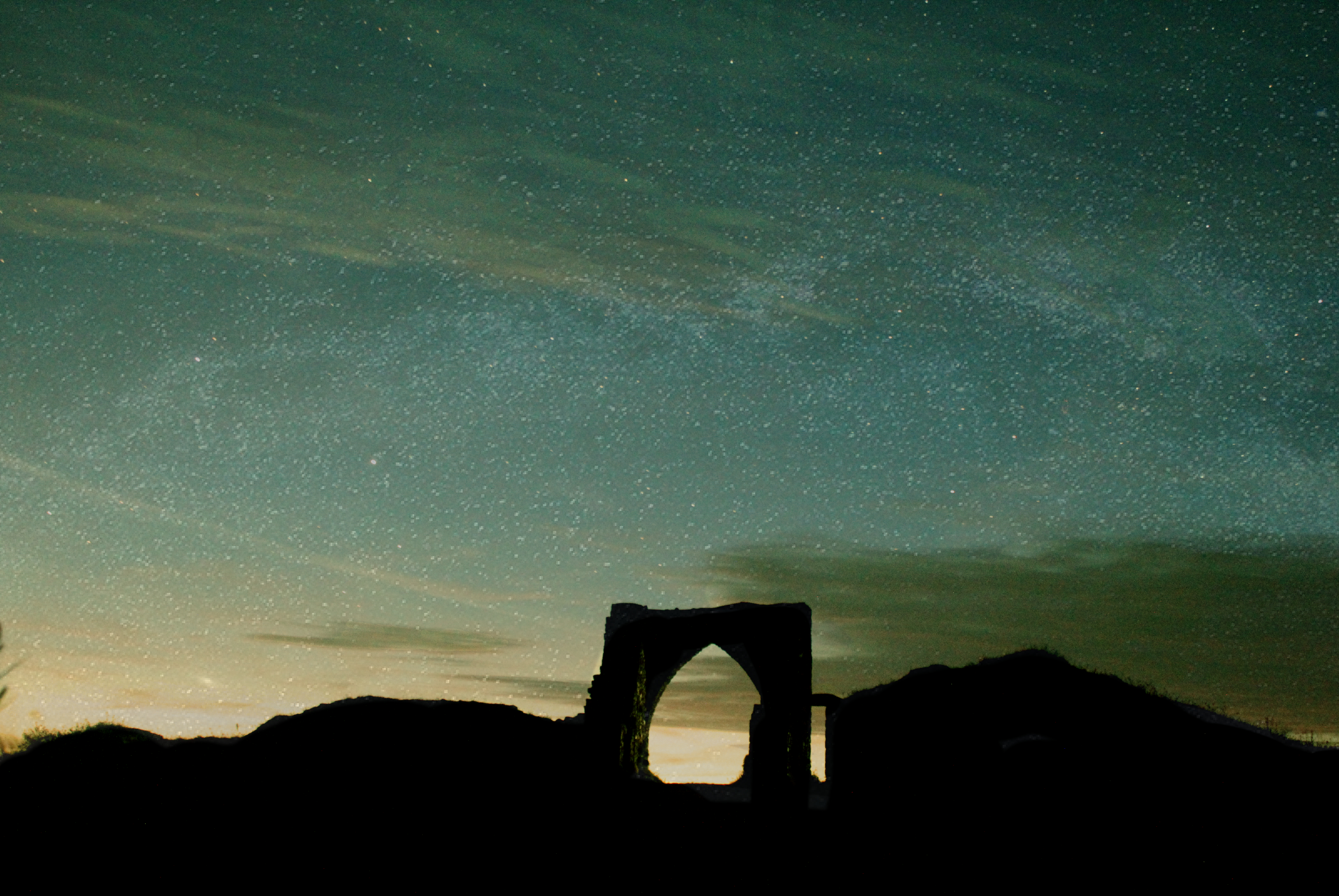
This image of Gronez castle was taking at nighttime, when it was completely dark. The aim was to capture the beauty of nighttime when inflicted with clear skies allowing visibility to see the millions of stars which surround us. Also to capture the colours which are seen through the skies at night time which often can be quite extraordinary. This photo below was taken with a 30 second long shutter speed and an ISO of 6400. I used these settings to allow as much light sensitivity possible into the lens.
This is the original photo
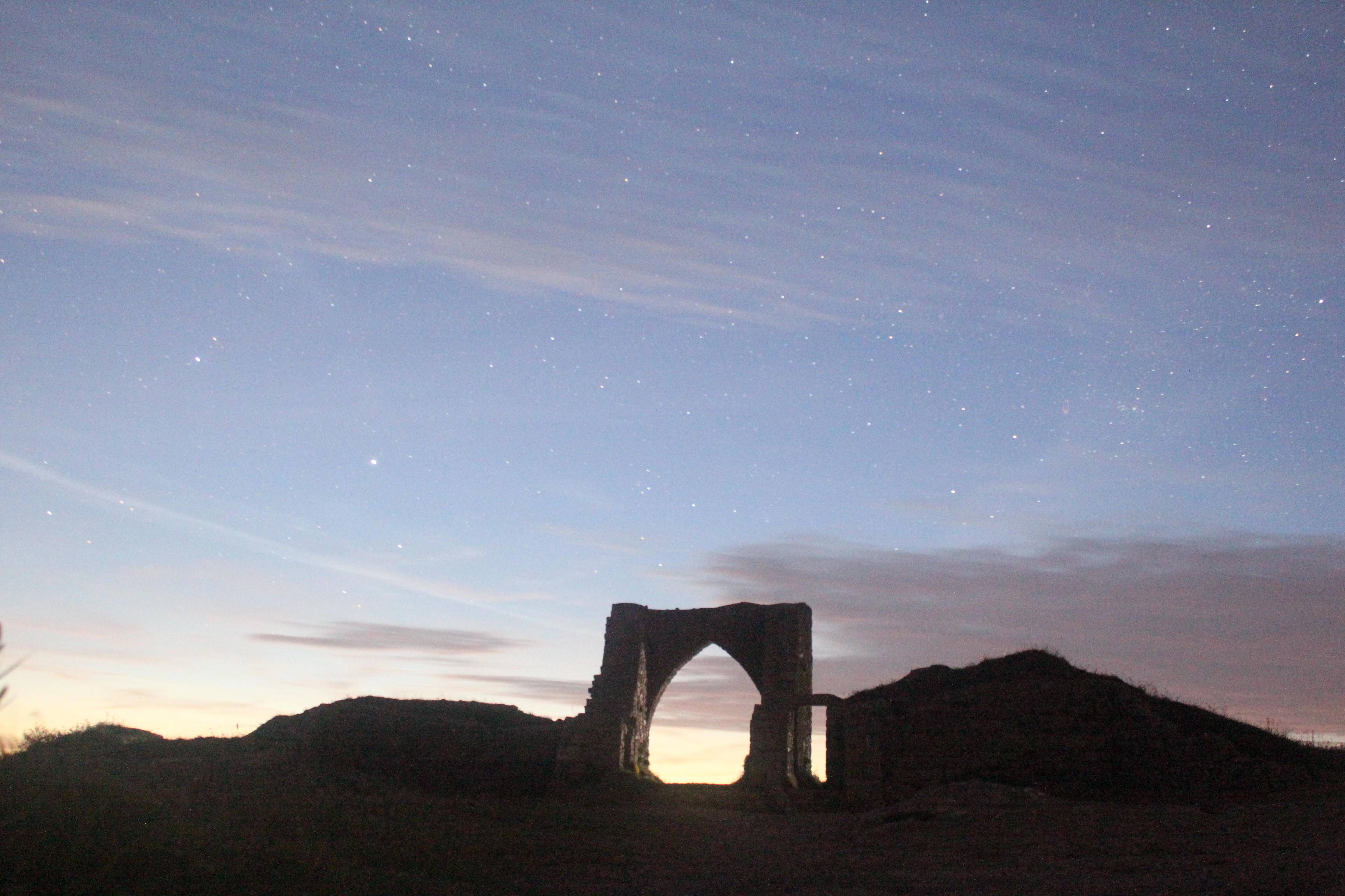
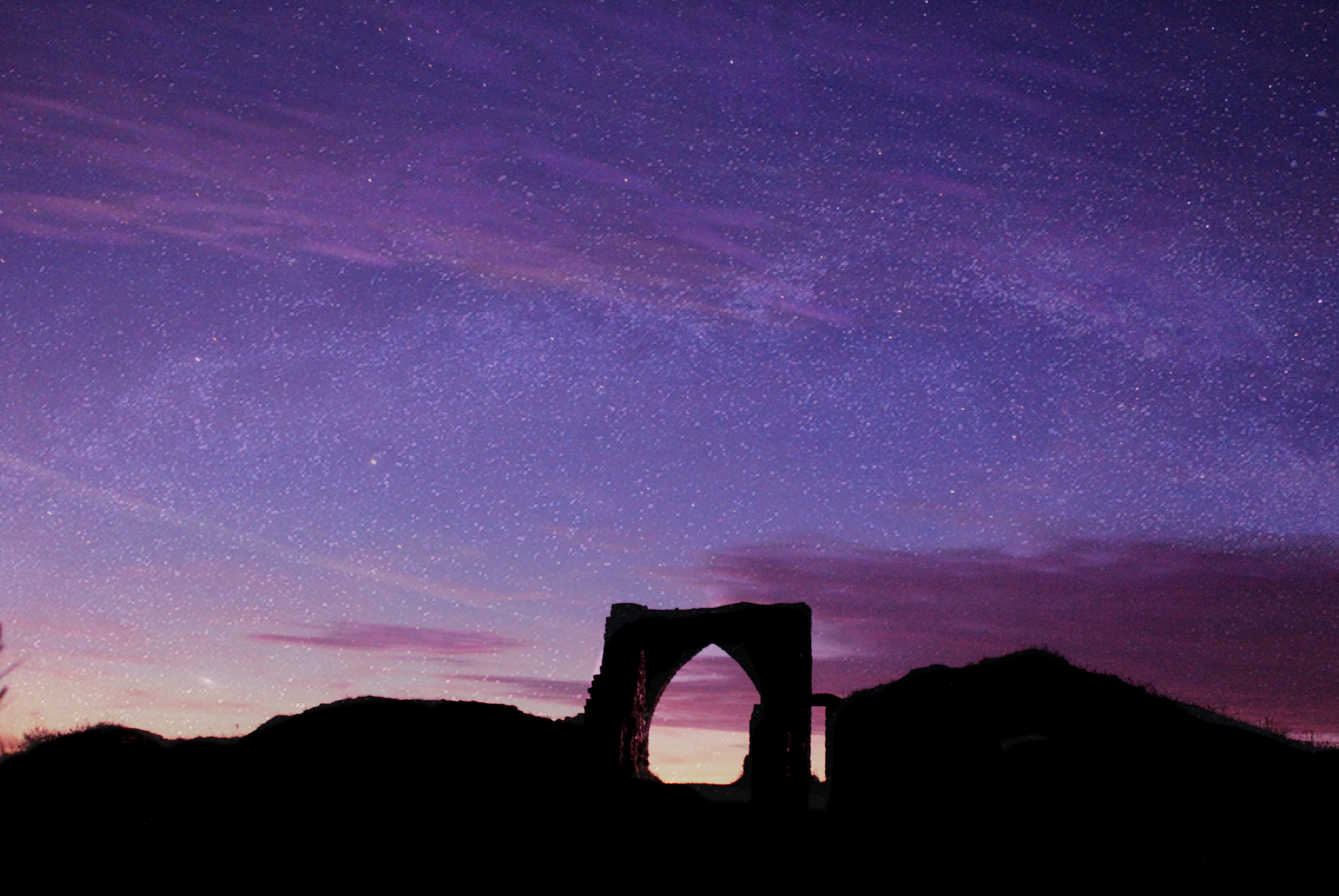
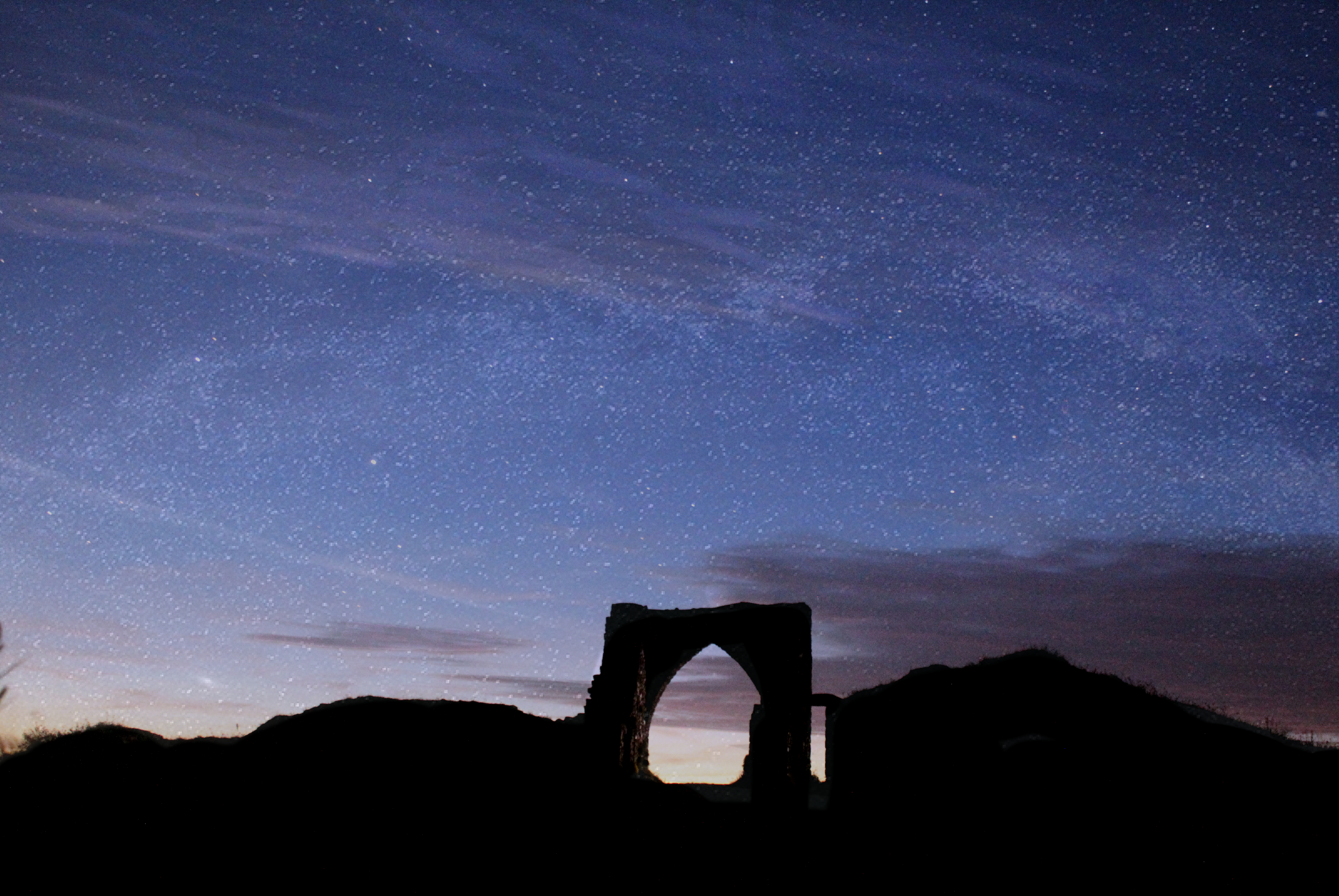
On Affinity photo, by adjusting the white balance and giving the photo a tint of different colours I was able to bring the night sky to life with vibrant and interesting colours. Much of the night time photography I have come across appears to have these unrealistic colours added which I believe is extremely interesting and is very beneficial in creating a photo in which people will take their time to look at. By adding the colour i was able to turn an ordinary picture not something which is eye catching and engages the audience more.
Minimalism Photography
What is Minimalism photography?
Minimalism is a style used by many 20th Century artists, using a minimum amount of components such as colour, shape, line and texture. Within the art world it is considered an very subjective concept, leaving interpretation and meaning up to the viewers perception of the work.
Examples of minimalism photography

Julian Schulze
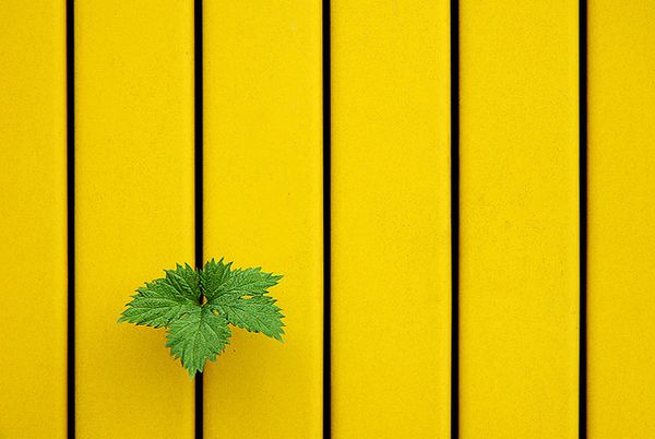
Schulze describes himself as “focused on geometric abstraction and minimalist compositions.” His images varey from simple shots of everyday scenes made up of just one or two things to photos where you have to look twice and that will leave you wondering which way is up. Each shot is composed, using light, shadow, and colour to create a 2D picture out of a 3D scene.
Examples of Julian’s work
![]()
![]()
Analysing Julian’s work
![]()
This image is of multiple coloured buildings. The three separate buildings create a sense of depth as it creates layers to the image. However, the bold colours from each building and the way the photo is present on an angle confuses the view as it really makes the viewer think as to which way the buildings are meant to be and which one is at the front. This image effectively exemplifies colour within Julian’s minimalistic work. For example, his use of colour and tone is particularly successful, the orange, red and white all compliment eachother while contrasting with the grey on the windows, this makes me think that Schulze wants the audience to perceive these subjects as three different components of the image.
Contact sheet
My interpretations
Bokeh
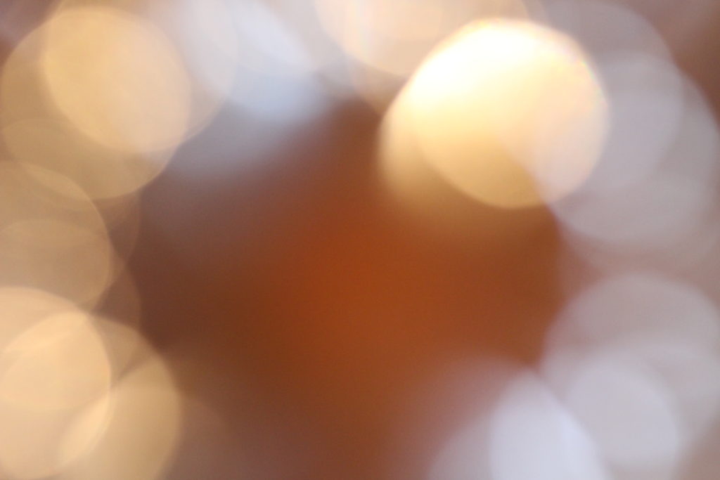
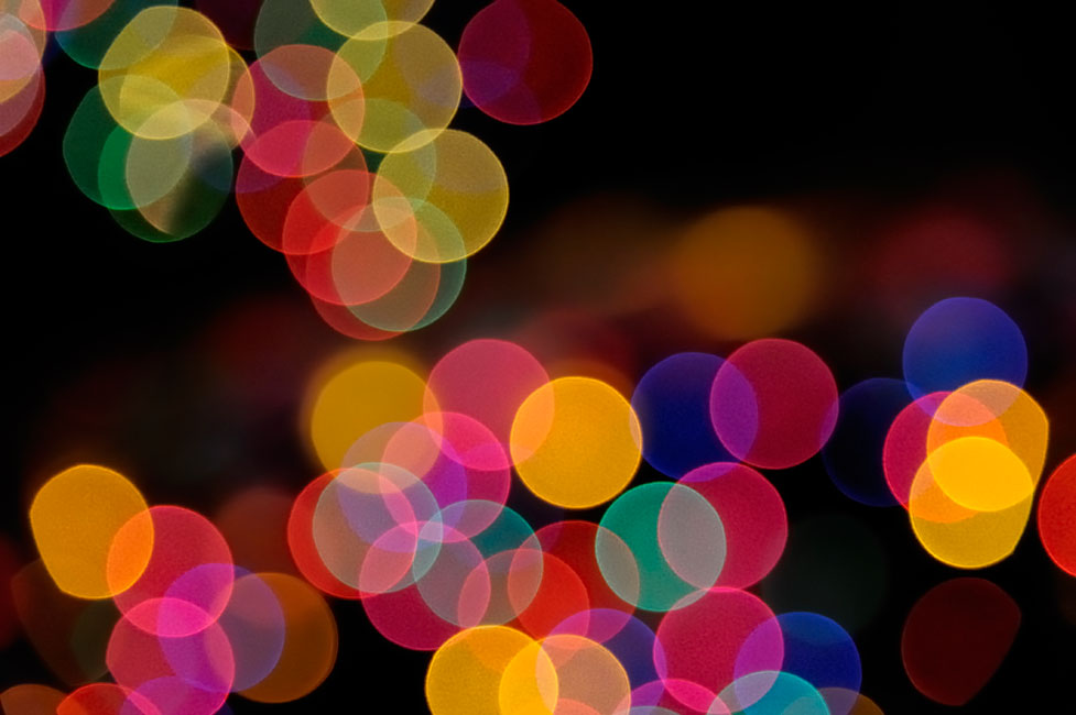
What is Bokeh? Bokeh, also known as “Boke” is one of the most popular subjects in photography ever. The reason why this technique is so popular, is because Bokeh makes photographs visually appealing, forcing us to focus our attention on a particular area of the image. The word comes from Japanese language, which literally translates as “blur” which is exactly what it is.Basically, bokeh is the quality of out-of-focus or “blurry” parts of the image rendered by a camera lens, – it is NOT the blur itself or the amount of blur in the foreground or the background of a subject. The blur that you are so used to seeing in photography, that separates a subject from the background, is the result of shallow “depth of field”, and is generally simply called “background blur”. The quality and feel of the background/foreground blur and reflected points of light, however, is what photographers call Bokeh.
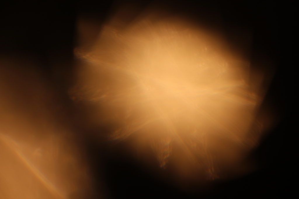
To achieve this effect, you must select a large aperture about f/2.8, 1.8 and 1.4, then get up close to the subject, and focus on what you wish to be 'sharp' whilst making the subject far from the background you want blurred out. I really liked the way many photographers used the use of making lights into almost circular spheres, and decided to have a go at trying out the effect, by putting a clean glass over my lens to take the pictures it created the desired outcome, these were my results:
Texture Homework Task
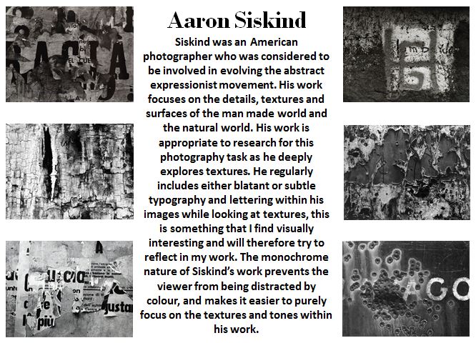
Photographer Research 1
Photographer Research 2
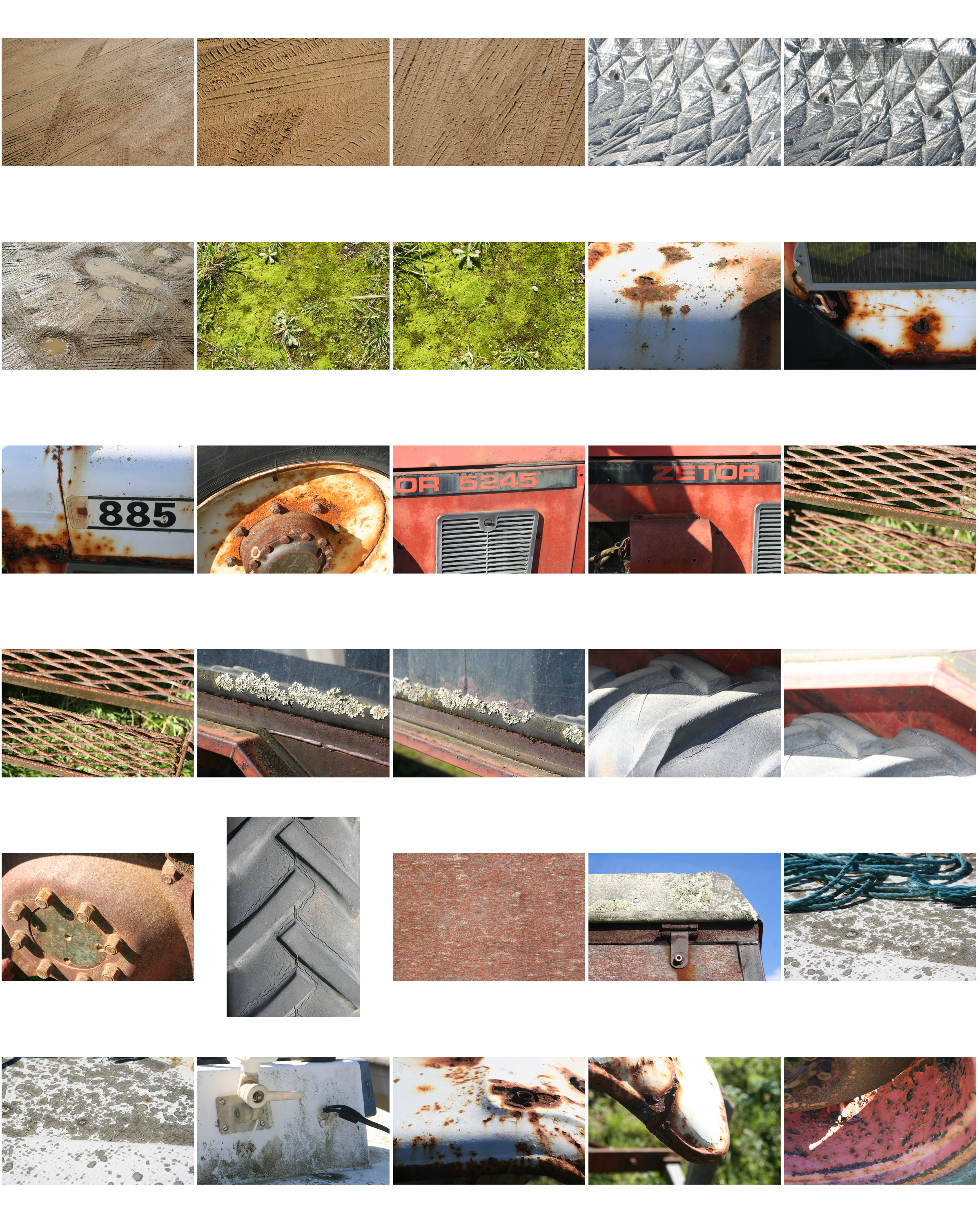
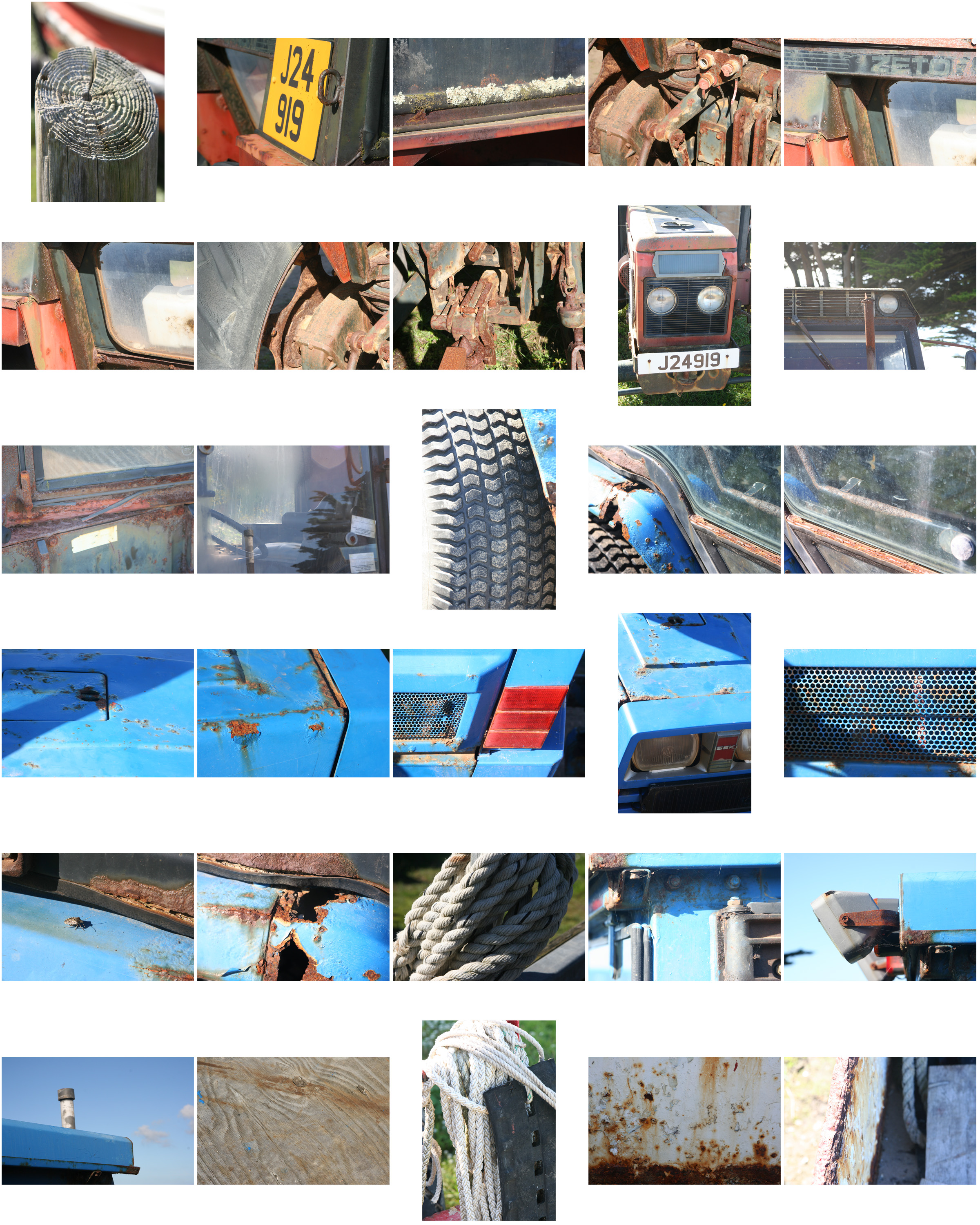
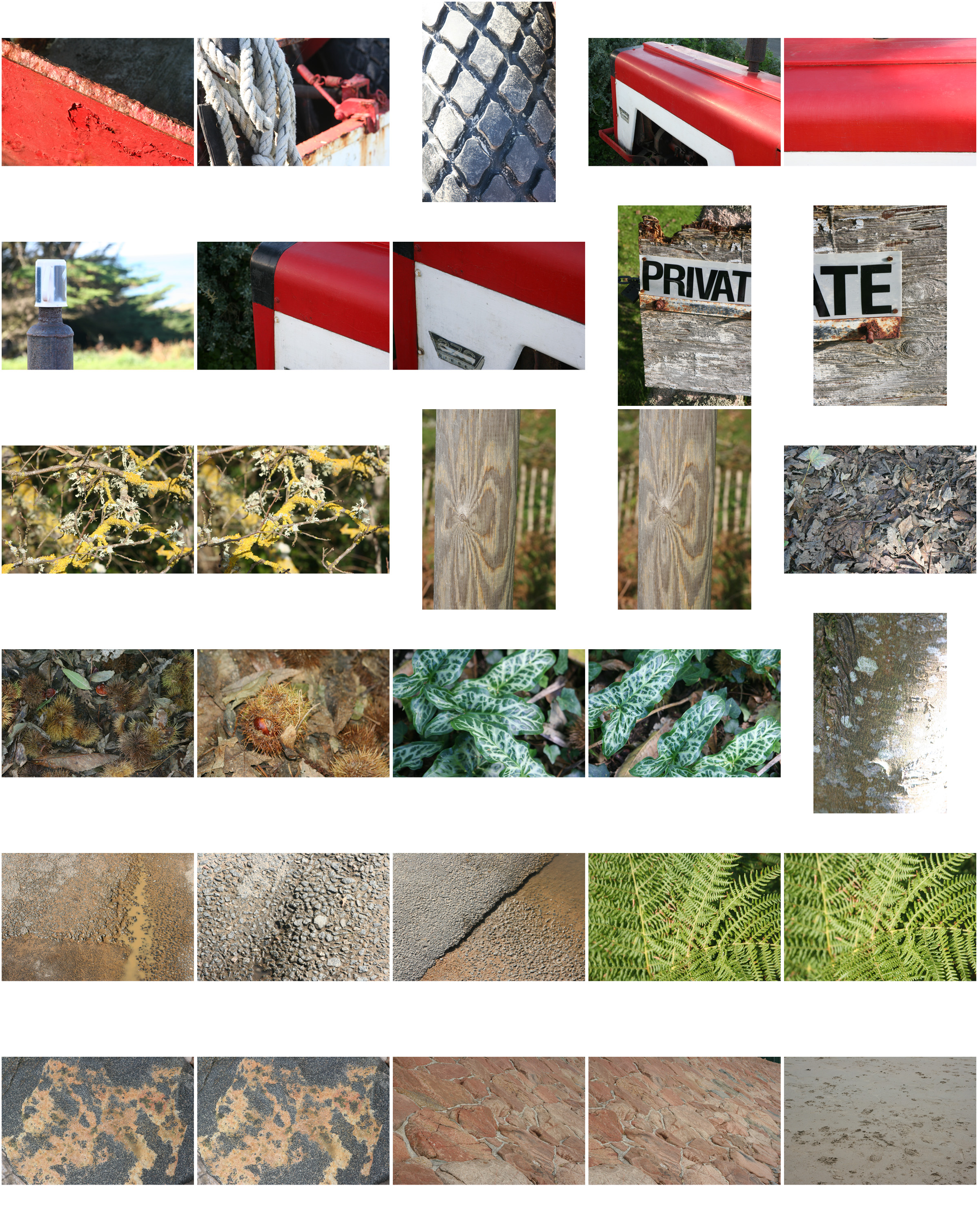
Texture Photo Shoot (My Response)
Bokeh
Bokeh is the visual quality of the out-of-focus areas of a photographic image, especially as rendered by a particular lens.
Bokeh can be done by switching the lens to manual-focus and purposely making the light source out of focus. A shallow depth of field and a wide aperture tends to be used.
Rule Of Thirds
What is the rule of thirds? The rule of thirds is basically breaking an image down into thirds (both horizontally and vertically), so that you have 9 parts. As follows.As you’re taking an image, you would have done this through your viewfinder or in the LCD display, that you use to frame your shot. With this grid in mind the ‘rule of thirds’ now identifies four important parts of the image that you should consider, placing points of interest in as you frame your image. Not only this, but it also gives you four ‘lines’, that are also useful positions for elements in your photo.
The theory is, that if you place points of interest in the intersections or along the lines, your photo becomes more balanced and will enable a viewer of the image to interact with it more naturally. Studies have shown that when viewing images, people’s eyes usually go to one of the intersection points most naturally, rather than the center of the shot – using the rule of thirds works with this natural way of viewing an image, rather than working against it.

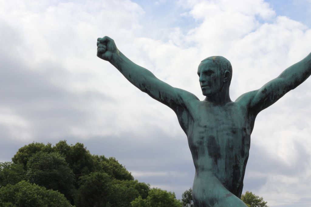
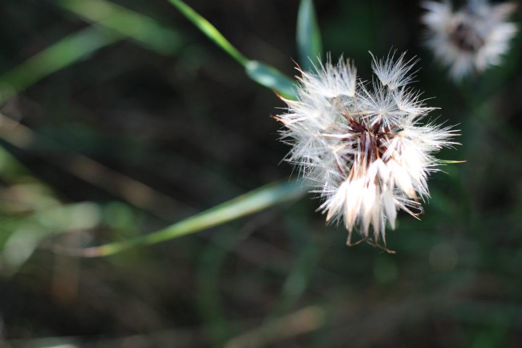
In addition to the above picture of the bee, where the bee’s eye becomes the point of focus. The next time I went out I decided to try this within my photos, to really get the viewers attention to the object of my choice, these were my results:
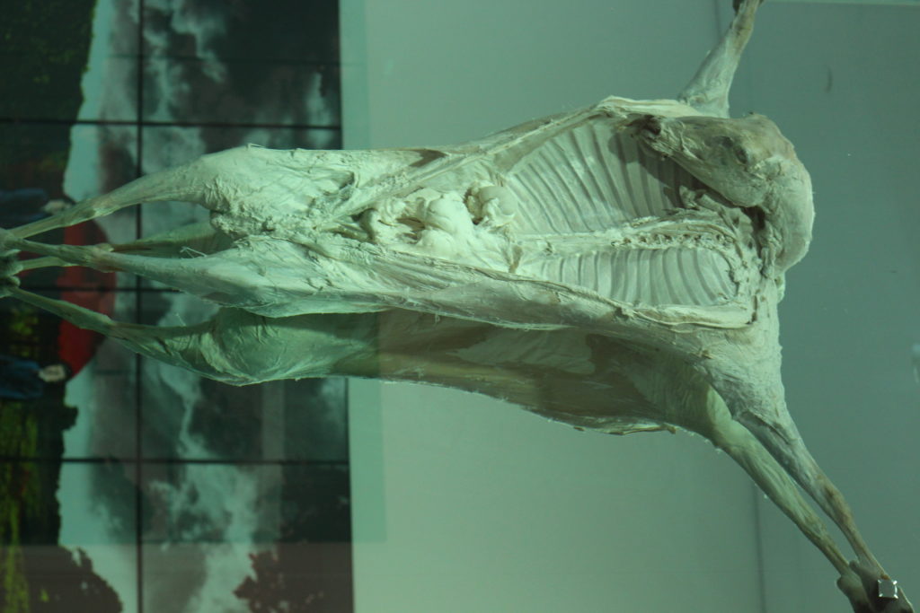
For the people, I decided to use the head of my friend and statue as the area I wanted the reader to instantly look too, where as the flower the seeds as the focus, and the rib-cage in the carcass.
Minimalism
Minimalism is a style employed by many 20th Century artists, using a minimum amount of components such as colour, shape, line and texture. Within the art world it is considered an extremely subjective concept, leaving interpretation and meaning up to the viewers perception of the work.


Colour Overlays
Colour Overlays
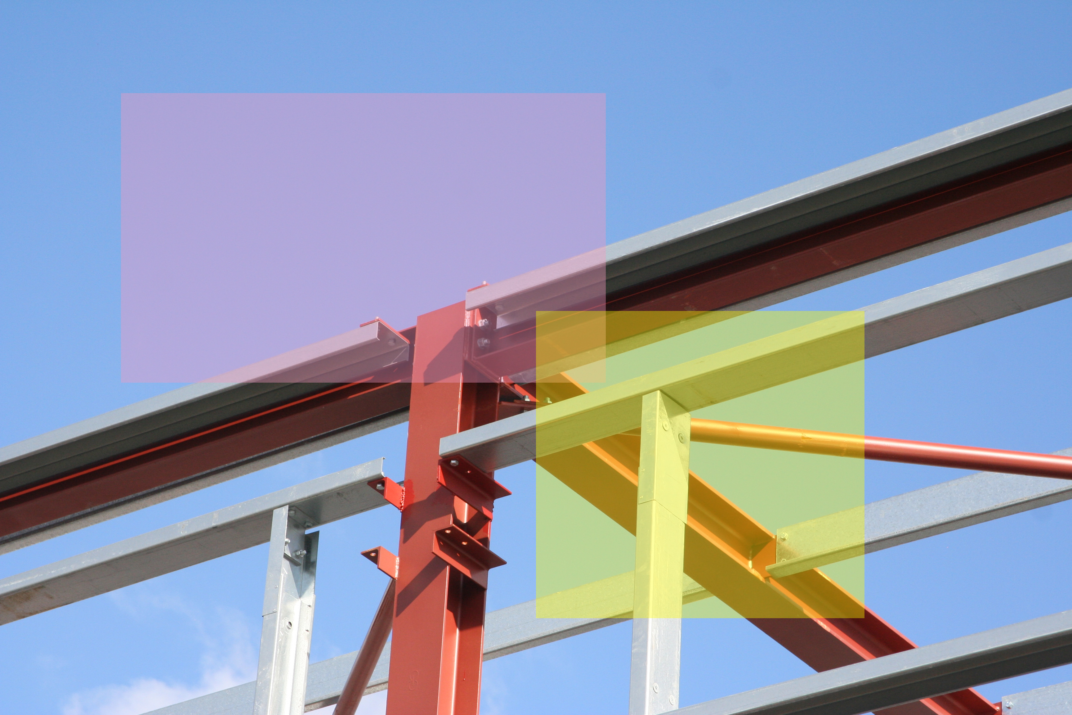
Colour overlays are a block of colour with an opacity lower that 100% that are placed over an image in order to bring the viewers eye to a specific section of the image.
Here are my colour overlay experimentations that were done on Photoshop using the shape tool and then adjusting the opacity of the coloured shapes.
