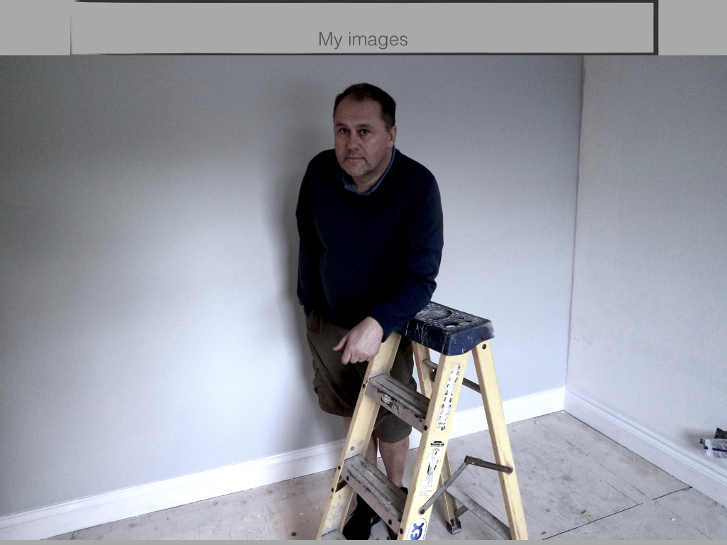
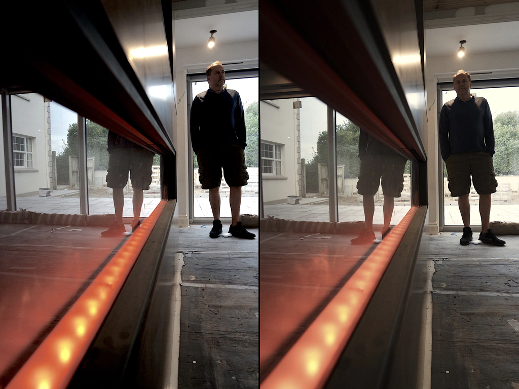
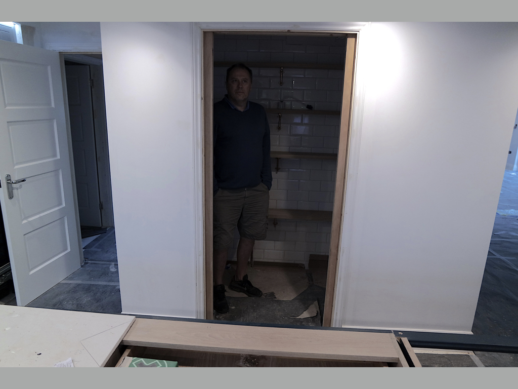
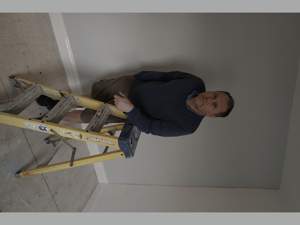
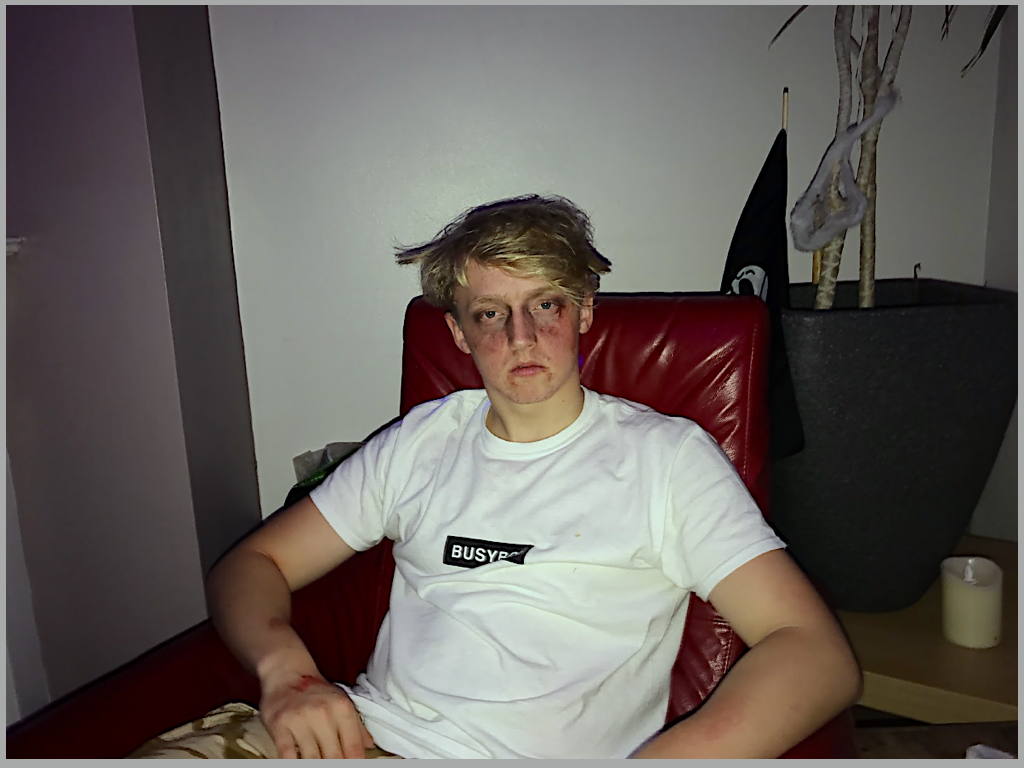
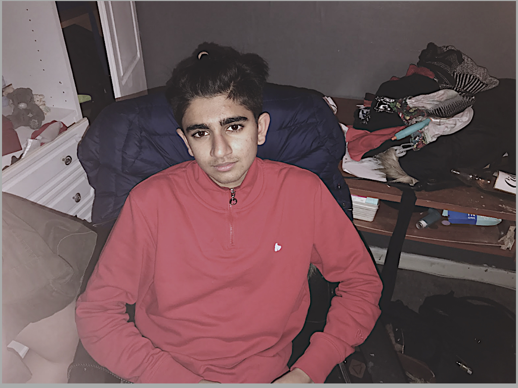
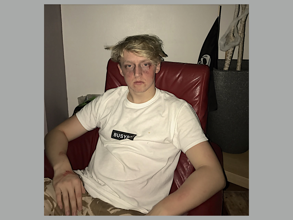
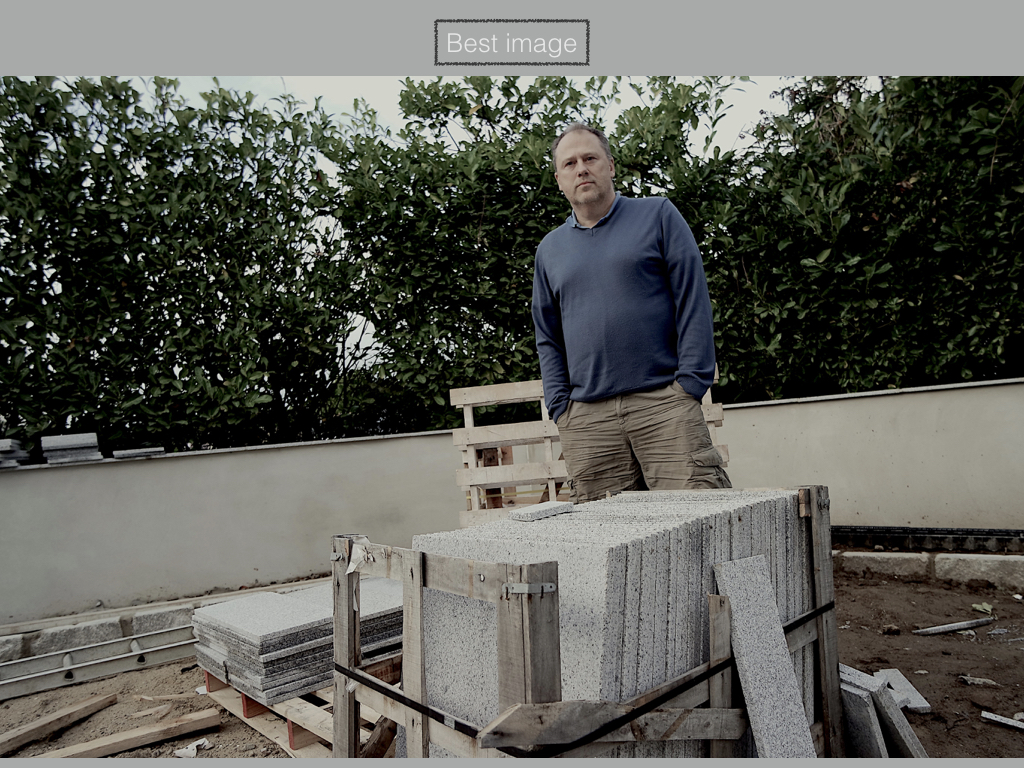
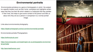
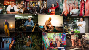
In this shoot I focused on environmental portraits. I wanted to capture the calmness of a person's facial expression, in order to make an impact within the picture itself. When taking the shoot I tried to make sure that the subjects facial expression was expressionless, so that it could make the viewer interpret more about the person's personality themselves. I used a variety of subjects to really explore the different expression of different people, and which ones would impact the most from them all.
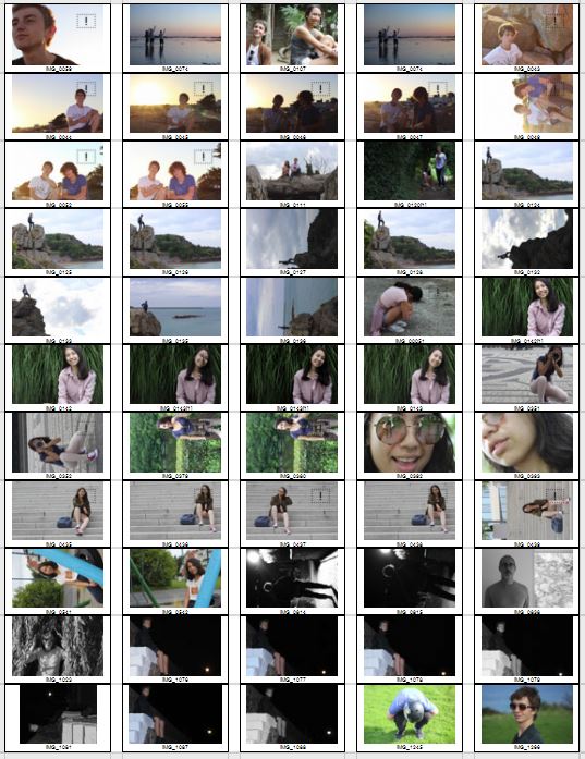
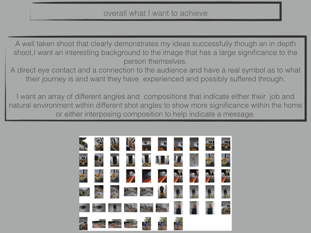
 Once I had completed the shoot, I decided to try to limit the images down into my top ten photographs, from there it would allow me to decide which picture I found the most effective from the overall shoot. I chose the image that I thought had the biggest impact of all, so took into account the rule of thirds, symmetry and lighting. These were my results:
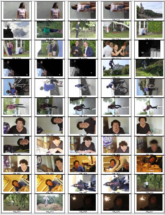
Once again I then decided to limit my top ten photographs into a top five. From these it would make it easier for me to figure out what I thought was the best image out of the entire shoot, by using software like Adobe Lightroom to edit my pictures and make each one stand out against the rest. These were my final results:
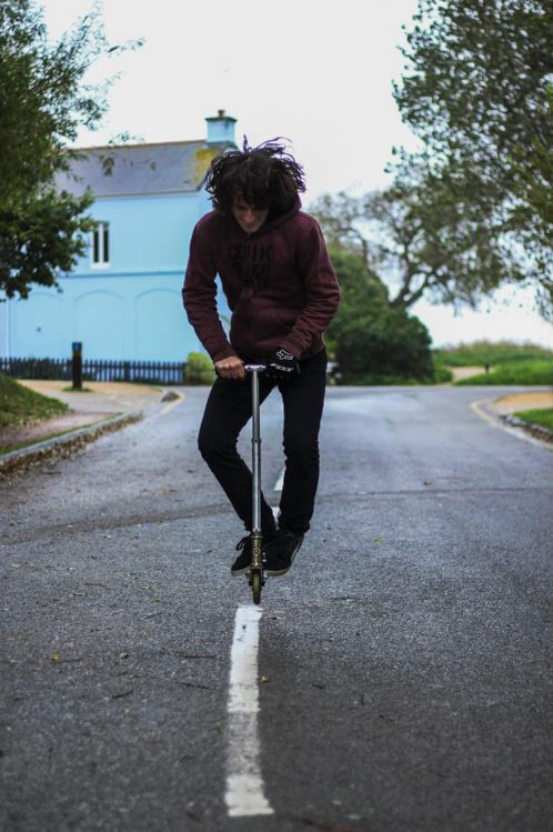
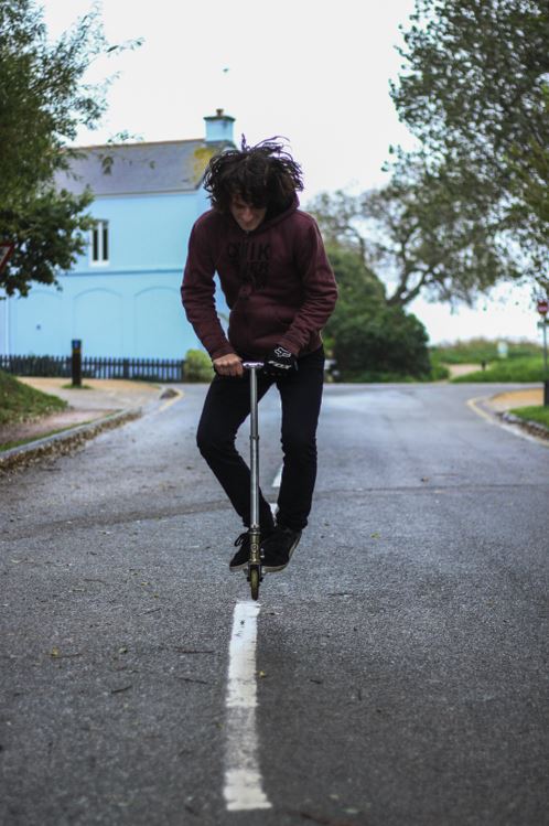
I chose this image because I loved how the subject was exactly on the middle line of the road. From this it created a look of symmetry within the picture, and with the trees and paths in the backdrop with the same composition, it to me made the picture aesthetically pleasing. What I also liked about the image was how the blue house in the background, in a way neutralized the image, and to me made it easy to look upon.
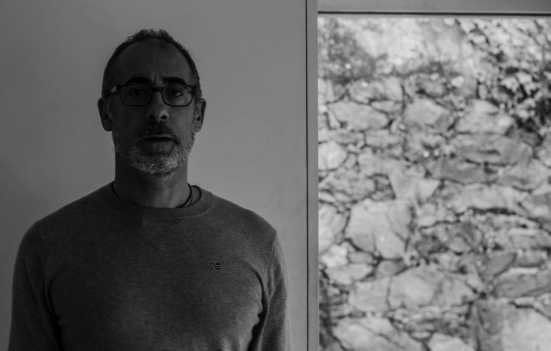
 I chose this picture because I liked the expressionless face of the subject against a white plain backdrop. This to me created effect within, as the backdrop broke up to a messy brick wall on the right hand side, allows for more focus on the subject rather than what is around them, due to how the contrast on their face stands out from the exposed wall.
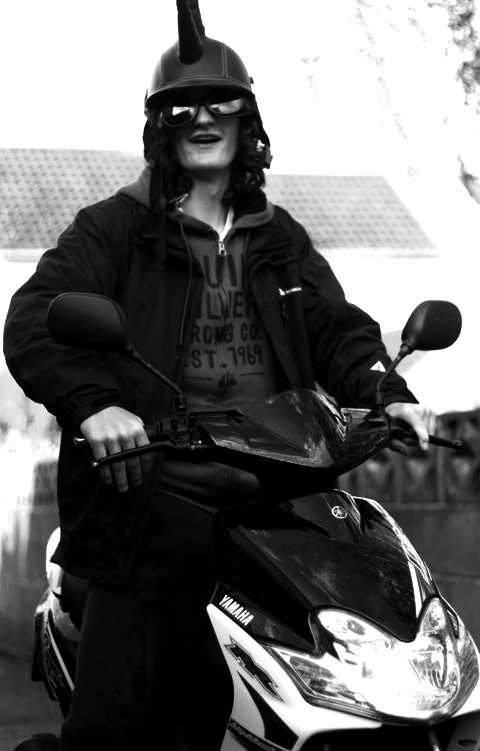
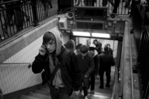
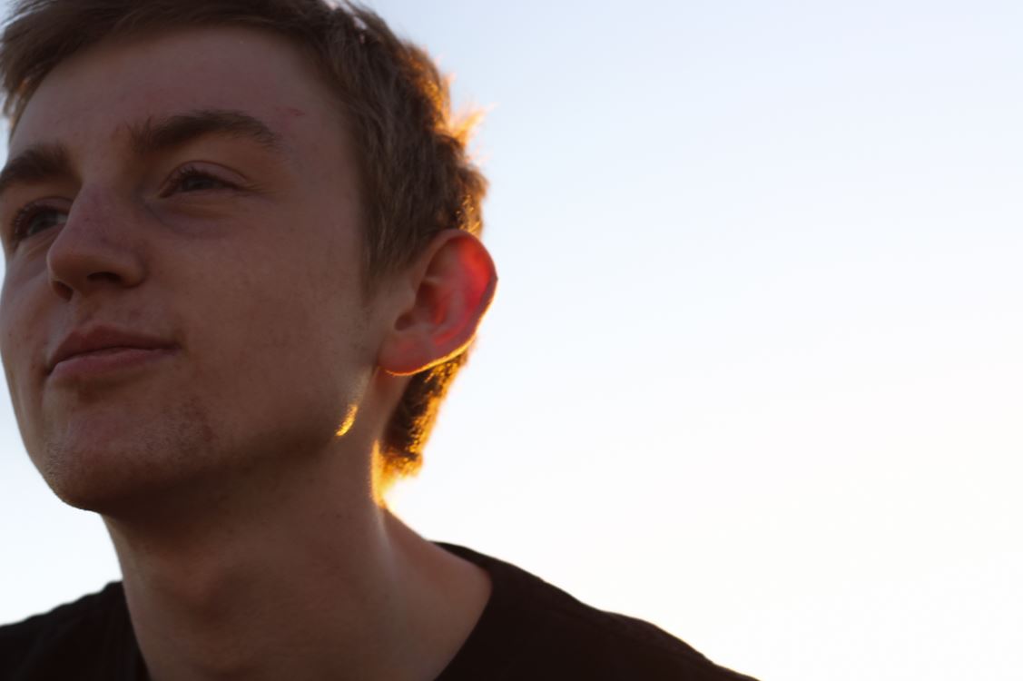
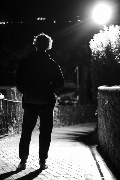
 The reason I chose this image was because I loved the contrast between the overly exposed background and the darkness of the subjects clothes. This creates a dramatic effect, whilst highlighting the points I wished for the viewer to look upon, like the head up. I found that the character being centered slightly to the middle of the picture made it an overall aesthetically pleasing piece.
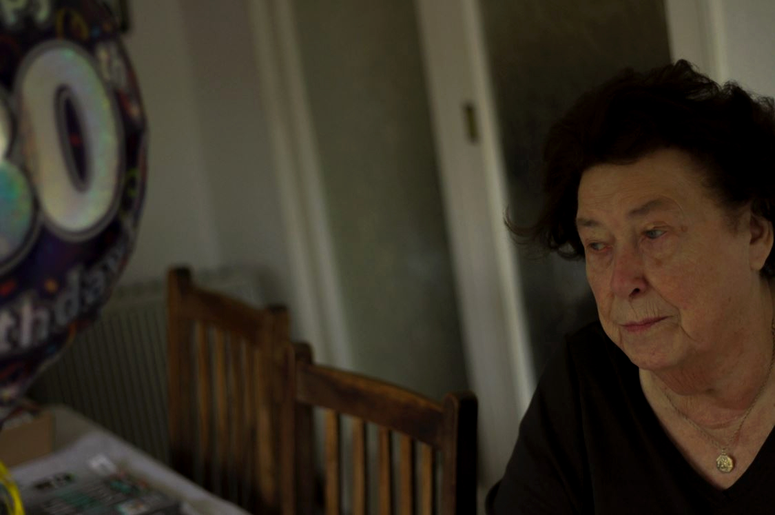
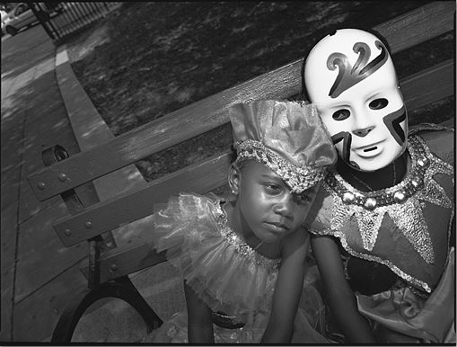
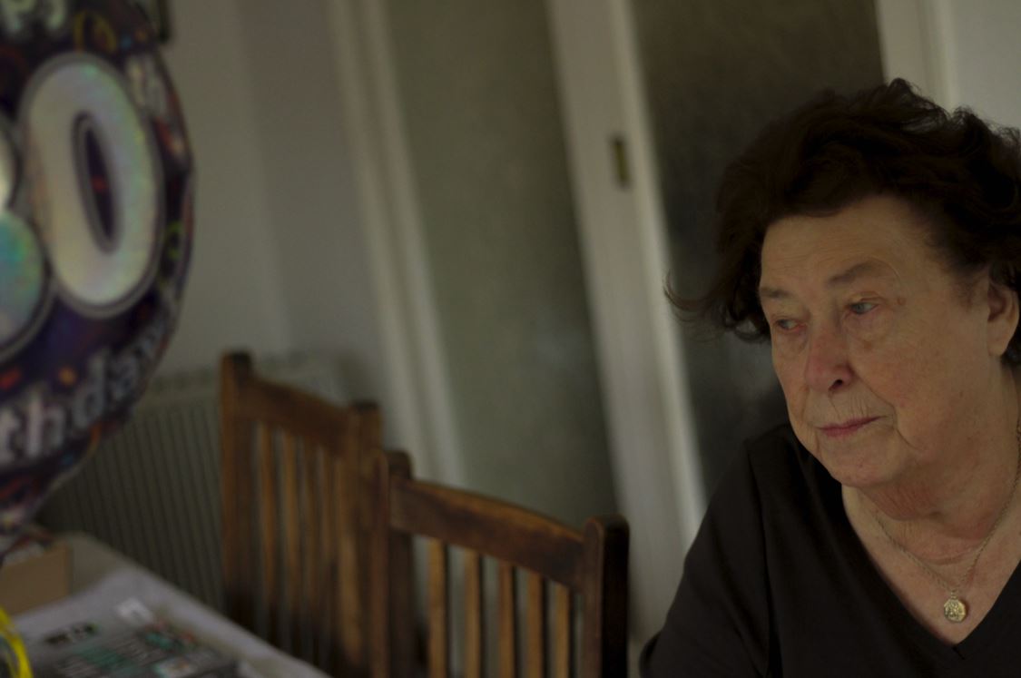
 Finally I chose this image because I found that it captured the calmness and thoughtfulness, of the subjects face at a significant time in their life. This makes the image aesthetically pleasing because of how there is symmetry between the subjects face, and that of the birthday balloon, which cancel each other out making the picture very balanced.
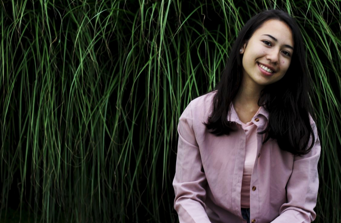
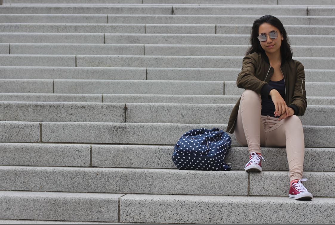
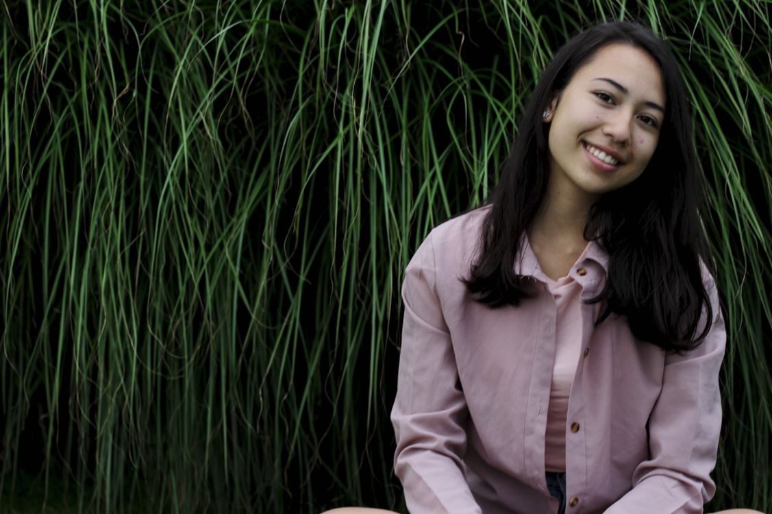
 The reason I chose this image was because I really liked the contrast between the darkness of the backdrop of a bush, and the brightly colored outfit of the subject. This instantly draws the viewer's eye to the subject due to the clear definition between her clothes and the bush, whilst making it visually pleasing to the eye as the pattern of the bush behind is broken up.
 FINAL IMAGE
 I chose this image as my final photograph, because I loved the look of thought upon the subjects face, and found that it told a lot about their past and personality. I found that the balloon and the subject's face being on either side of the image, in a way cancelled each other out, making the overall piece aesthetically pleasing to the eye. The fact that the subject was not centered in the middle of the screen, and made more way to the backdrop behind her, allowed the viewer a bit more of an insight into the life of the subject as a whole. Finally what I thought made the image most effective was that the birthday balloon allows a bit of an view into what the subject may be thinking about in their previous years, and everything they have seen, creating a perspective which is joyful, yet saddens the viewer.






 Once I had completed the shoot, I decided to try to limit the images down into my top ten photographs, from there it would allow me to decide which picture I found the most effective from the overall shoot. I chose the image that I thought had the biggest impact of all, so took into account the rule of thirds, symmetry and lighting. These were my results:
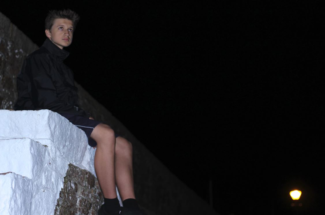
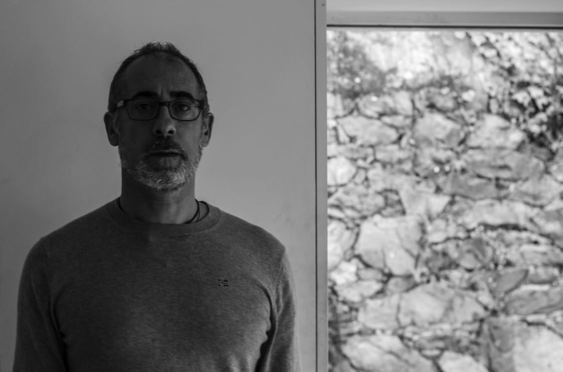
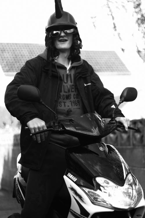
 I chose this picture because I liked the expressionless face of the subject against a white plain backdrop. This to me created effect within, as the backdrop broke up to a messy brick wall on the right hand side, allows for more focus on the subject rather than what is around them, due to how the contrast on their face stands out from the exposed wall.
 The reason I chose this image was because I loved the contrast between the overly exposed background and the darkness of the subjects clothes. This creates a dramatic effect, whilst highlighting the points I wished for the viewer to look upon, like the head up. I found that the character being centered slightly to the middle of the picture made it an overall aesthetically pleasing piece.
 Finally I chose this image because I found that it captured the calmness and thoughtfulness, of the subjects face at a significant time in their life. This makes the image aesthetically pleasing because of how there is symmetry between the subjects face, and that of the birthday balloon, which cancel each other out making the picture very balanced.
 The reason I chose this image was because I really liked the contrast between the darkness of the backdrop of a bush, and the brightly colored outfit of the subject. This instantly draws the viewer's eye to the subject due to the clear definition between her clothes and the bush, whilst making it visually pleasing to the eye as the pattern of the bush behind is broken up.
 FINAL IMAGE
