Category Archives: Uncategorized

Filters

Author:
Category:

Final Essay – Personal Study

How is the work of Tanya Deman and Darren Almoud questioning the politics of environmental issues and the way in which we treat the earth?

Introduction

The area which I have chosen to study is the sublime and the political debate about how natural land is used and the destruction that urbanization is causing to it. This has been a reality since the industrial revolution where humans are clearly contributing to the destruction of the planet. This subject matter is important to me as I believe it is vital to protect the earth and not ruin/destroy the last remaining natural habitat. Our ancestors were much better at looking after our environment which we need to be influenced from. Photographers that explore the sublime environment are often giving the viewer an insight to a landscape that is rare and evoke an experience that is uncommon. My personal study deals with political, social and cultural issues that have impacted people all across the world. Essentially, my area of study is a non-verbal communication about raising awareness of the beauty of our earth and to prevent people from destroying it. Psychologists believe that this non-verbal communication can reveal much more than words which I believe can help spread my passion for the natural environment and preserving it too. The representation of the land has been explored by many artists including the photographers Darren Almound and Tanja Deman that I have previously taken inspiration from and will be analysing in this essay. Both of these photographers explore the land to portray their views on how society treats and uses it. Within my essay I will be discussing how the two photographers have taken a different approach through their works. I have chosen to analyse the work of these two photographers due to their somewhat similar messages yet very different approaches in telling the story. Darren Almound focuses on capturing beautiful imagery of the natural landscape with a subtle conflict of pain and beauty that creates the sublime environment. Tanja Deman uses manipulation and photo montage techniques to focus on humanities destruction to the world that is eliminating any recollection of a beautiful natural environment.

For Darren Almound I will specifically be looking into his ‘full moon’ project where he leaves you wondering what words like landscape and nature can possibly mean in a world where environmental change is so rapid that both are fast disappearing into myth and memory. In ‘Fullmoon’, British artist Darren Almond catches landscapes around the globe, under the particular light of a full moon. With the shutter kept open for over a quarter of an hour, rivers, meadows and mountains are illuminated almost like daybreak, but the atmosphere is different: a mild glow emanates even from the shadows, star-lines cross the sky, and water blankets the earth like a misty froth. The enhanced moonlight fill the landscapes with a sense of the surreal or the sublime, and with haunting ideas of time, nature and beauty. Within my own work, I have taken inspiration from this project and created two photo shoots where I proceeded to keep the shutter open for between 15-30 seconds to create dream like images that can’t be seen by the naked eye. I think these images will play a major part in my project in telling the story about the conflict between pain and beauty within the environment. The harsh rocks conflict with the soft water to show this sense of pain and beauty and the rocks/cliffs act as a metaphor for the urban development occurring in other areas.

In relation to Tanja Deman I will explore a particular image of hers which links directly to the idea that Darren Almound’s full moon project portray about the ever changing land and destruction of the the natural landscape. The particular image that I will focus on has these ideas about the natural landscape fast disappearing into myth and memory which is exactly what Almound’s project focuses on. I have responded to Tanya’s work where she places urban infrastructure into nature by creating my own manipulation imagery using St Ouen’s beach and the skyline of London and New York to juxtapose.

In the late 18th Century the aesthetic theories of the sublime and picturesque emerged and inspired many landscape artists. Burke’s ideologies of the sublime were first established in the book:  A Philosophical Enquiry into the Origin of Our Ideas of the Sublime and Beautiful written in 1756 suggesting that the sublime and beautiful cannot be seen at the same time. Burke illustrated the sublime as a ‘character of a particular scene imbued it with a special quality of beauty, which was at the same time admirable and awe inspiring, but also capable of imparting a fission of fear’ (Mayer. L. (DATE) Masters of English – Landscapes. Pierre Terrail Edition, Paris Page 10). Whereas the picturesque was established by Uvedale Price, is when ‘the artist concentrated on those details which he knew would delight the viewer’ (Mayer. L. (DATE) Masters of English – Landscapes. Pierre Terrail Edition, Paris Page 10). There was a clear need to establish a distinction between the sublime, beautiful and picturesque when it came to art. The sublime and picturesque were a chance for landscape painters during the Romantic period to showcase their style of painting. The term ‘picturesque beauty’ was first used by William Gilpin for an item being neither beautiful or sublime. The pictorial qualities of picturesque landscapes are, ‘roughness, sudden variation, or broken tints’ (Rosenthal M. (DATE) Constable – The Painter and his Landscapes. Yale University Press, New Haven & London. Page 31).

Tanja Deman is a Croatian visual artist whose recent photo compositions have taken the relationship between the built environment and natural landscape to its extremes. The dreamy images depict familiar urban forms like skyscrapers and highways, dropped into natural landscapes such as mountain terrains. The more close-up shots of a theatre and stadium, seem to make a spectacle of nature’s wrath and Deman’s anger towards the mistreatment of the planet. The image which stood out to me the most was the one inside of the theatre. This is because it clearly remarks a series of messages about the destruction of our land and proposes the idea that one day the natural world will be part of history and we will have to go to the theater to view it. What most interested me about Deman’s work is how she points a surreal spotlight on the relationship between nature and humans. Her work acts as a voice to humans about the problems we are facing and the environmental problems we are creating. This is really intriguing to me as I have a strong interest in preserving our environment and keeping it untouched by humans and too want to communicate this political message through my photographs. I think that Deman’s work will be a strong reminder to the general public that we are now having undeniable impacts on the environment at the scale of the planet as a whole. This debate has sparked a new battle between geologists and environmental advocates over what to call the time period we live in. It would appear that Deman’s work agrees with the argument for “Anthropocene” a time period that is viewed as the period during which human activity has been the dominant influence on climate and the environment. The word combines the root “anthropo”, meaning “human” with the root “-cene”, the standard suffix for “epoch” in geologic time. Experts argue that the Holocene is outdated which began 11,700 years ago after the last major ice age and Deman’s work would shows her agreement with this and her belief in the Anthropocene time period.

Image result for tanja demanI think the image conveys a very powerful story about the relationship between urban landscapes and the nature. My interpretation of this manipulated image is that at the rate humans are developing our land with man made features, one day we will have no natural land to see. Therefore going to the theater is the only way that people can see the natural land due to the destruction of it.  Essentially her message is that the one day the natural land will be part of history and this is clearly dealing with the politics of environmental destruction. There are many other ways this can be interpreted for example, the message that nature needs to be appreciated mimicking the way in which people appreciate theater performances. However most interpretations will follow the intended message of the photographer about having respect for our natural world and bring a realization of the harsh man made urban development. There is a large tonal range within the image from the dark shadows in the foreground to the highlights in the background. The sections where people are seated, there is a use of dark shadows which I think  were purposely created to show a sense of danger that humanity is to nature. The forest area is bright with increased highlights to show the significance and importance of it. The framing and composition of this photograph is really appealing to the viewer. I like how the theater creates a frame for the main subject which is also positioned central to show the audience that it is the focus point. Also, the use of leading lines from the balcony and rows of chairs at the front help draw the viewer to the main subject. Overall all it is clear, through this image and many of her other pieces, that Deman is questioning the political issue of man vs nature and the impact that we are having on it. This is achieved through the use of a juxtaposition between the natural land assisted by urban landscapes dropped into them. These compositions depict a changing environment and creates an oddly disturbing message to us; who is destroying the natural land.

My second artist is an English based photographer, Darren Almond. One of Almound’s projects that stood out in particular was his full moon project taken in Patagonia and Cape Verde. Looking at this work presents us with picturesque images shot by the light of a full moon. To achieve the photos in his project he stood attentively by his camera waiting for clouds to clear, then used long exposures of between 12 and 30 minutes. The results are both natural and unearthly, recognizable and oddly alien. Quoted by Sean O’Hagan from The Gaurdian – “Volcanic rock emerges from a sea that looks like misty cloud seen from an aeroplane window. A river’s torrent is rendered smooth and sculptural, and the eucalyptus forest it runs through seems impressionistic and ghostly. Shadows lose their edges; they become soft and almost indistinct.” “With long exposures, you can never see what you are shooting,” Almond told The Gaurdian, “But you are giving the landscape longer to express itself.”

Image result for darren almond full moon

Almounds work in this project reminds me of the initial artists who painted with the aesthetic theory of the picturesque containing significant amount of detail. His outdoor landscapes show a connection with these ideas of the picturesque which has a deeper meaning, understood by reviewing the image to gather all the detail which is contained in a single photograph. Almond has the ability to connect with the audience’s emotions using his images to reflect environmental change with the motion in his pictures signifying the ever changing environment. Linking with the theory of the sublime Almonds images clearly have aspects of beauty and danger with the contrast between the elegant silky water and the harsh sharp rocks. It may also be seen that the motion of the sky and waves is a depiction of the force of nature that is dangerous. The vortex of sea and mist draws the audience to look at the image. It showcases the experience of awe and power which the natural elements behold evoking a feeling of fear within the audience.  My interpretation of his images is that the rocks act as a metaphor for the urban development that is occurring, a clear environmental issue within our world. The fear of the unknown is a key element within Darren Almounds work but at the same time there is true beauty within his work. His landscape work present environments devoid of human activity however we know that by looking in detail that there is a reference to the human activity in the world today. The de-saturated color scheme showcases the life which has deteriorated from presence of human interaction. A sense of the sublime aesthetics comes from the alien nature which these images represent, which do intrigue us but add a sense of fear due to the unrealistic environment which is being captured. As an audience we are free looking into Almounds landscape series, as there is large room and space in the frame. This creates an overwhelming or intimidating feel which introduce the fear factor involved in the sublime. Furthermore, the ideas of not knowing what is lurking beyond the sea or rock formation, presents us with the aesthetics of the sublime. Capturing these images in the style of the sublime clearly shows how the environment is unstable with the destruction that humans are causing to it. Despite the fact there is no presence of humans or the direct destruction they are causing to the landscape in Almounds project, through the inspiration of the picturesque and incorperation of the sublime, when the audience look in detail we can understand the messages about environmental change that he is displaying.

To conclude, over the course of this personal investigation, my own work has been inspired to capture elements of the aesthetic theories of the picturesque and the sublime. I have further taken inspiration from the photographers Darren Almound and Tanya Deman which has led to my exploration of the rural vs urban environments as well as the Utopian world too. My work on this project began looking at the beautiful natural environment inspired by the picturesque and sublime theories where i photographed coastal areas and their beauty. This was later influenced by Darren Almound which further triggered me into exploring the beauty of the natural environment whilst trying to incorporate subtle signifies of human presence whilst them not actually being there. This was seen through the photoshoot I did using long exposures to try and capture a sense of time and movement which is relevant to the change in time period from the Holocene  to the Anthropocene which links to both artists. This change in time period links to human activity causing the most significant change to the planet ever. This not only links to Almound’s full moon project in the way he portrays the picturesque but also links to Deman’s work where there is a clear presence of human activity. I mostly took inspiration from Deman’s work to create the fantasy landscape images that can be seen in my photobook. Inspired by her montage and manipulation techniques I wanted to create a utopia world from my perspective to show the viewer how I see the most ideal world. This later stemmed the urban photoshoot that played a major part in my project and book too. The idea of utopia was fascinating to me and I wanted to explore it from others perspective whilst still keeping to the ideas of natural vs man made. This brung me to photographing urban landscapes where artists graffiti their ideal world onto buildings. This not only explores the utopia from another perspective but also shows reference to humanities destruction to our planet and the urbanization that is present. Overall, it is clear to see that Almound and Deman have strong beliefs in the mistreatment of our earth and have demonstrated their perspectives of it differently yet both very effectively.

  • Bibliography: List all relevant sources used

https://books.google.je/books/about/A_Philosophical_Enquiry_Into_the_Origin.html?id=pdpDAAAAYAAJ&printsec=frontcover&source=kp_read_button&redir_esc=y#v=onepage&q&f=false

https://archive.org/details/gri_essayonthepi00c2pr

https://www.smithsonianmag.com/science-nature/what-is-the-anthropocene-and-are-we-in-it-164801414/

http://www.anthropocene.info/

https://www.theguardian.com/artanddesign/2014/jan/21/darren-almond-moonlight-landscape-photography

https://www.architecturaldigest.com/story/darren-almond-fullmoon-article

Final essay Draft

How do images of P.H.Polk and Khadija Saye, show change of representation of black identity?

‘I have a dream that my four little children will one day live in a nation where they will not be judged by the colour of their skin, but by the content of their character’. –  Martin Luther King, Jr. March On Washington, 8th August 1963

In this essay, I will be looking at the way that the depiction of black people has progressed over the last 150 years. I will be comparing and contrasting with the 19th century when photographic records began to emerge with modern day technologies, such as social media platforms. YouTube, Instagram and Twitter, where an individual is in control of their own representation. With old technologies, such as newspapers and TV one person or group of people were in control of the messages that would be broadcast to the public, as discussed by David Gauntlett. However, since the growth of the internet, there are multiple platforms in which a person is able to express their voice. So audiences have a much wider range of direct sources of information in which they can use for their opinions on topics, groups, or people. The 18th to 19th century was the height of colonialism, at this point in history slavery was being used all over the world. Slaves were being transported largely from Africa, this continued until 1835 when Britain abolished its slavery throughout the whole of its empire by the Slavery Abolition Act of 1833. The U.S abolished Slavery in 1865 with the 13th Amendment, but segregation in America was not ended until 1963. In modern day society, all nationalities legally have equal rights, but there is still some social inequalities. Such as workers who come over from countries such as Poland and Romania, they face prejudice from many white English groups, due to them living and raising families in the UK, this tension had only been made worse by events such as Brexit. I will be looking at the works of P. H Polk, who photographed acute portraits of African Americans post civil war that first gave black people an equal photographic representation. I will compare him to Khadija Saye, her self portraits express her multicultural background. I have chosen to analyses these artists due to their links to my personal project on ‘Political Landscapes’, in which I am looking back at my life growing up as a mixed-race child in a mainly white society in the island of Jersey and having little connection to black culture. These artists look at the expression of the black identity through photography, when the images are compared it is clear how the view of black identity has changed.

The first documentation of Black People in Photography

Image result for J T ZEALY
J.T.ZEALY, Jack,1850s. Daguerreotype Peabody Museum of Art, Archaeology and Ethnology, Harvard University, Cambridge Massachusetts

As western society progressed much quicker than other countries in the world, due to colonization and economic progression, they developed many new technologies faster as they had a larger amount of resources to draw on. Louis Agassiz 1807 -1873, was the founder of comparative zoology at the University of Harvard who had an avid interest of photographic data. Due to his photographic documentation interest, he authorized the portrait commission on the front, back and side views of slaves from a North Carolina plantation in 1850. These were one, if not the first images of black people for scientific purposes. He wanted to provide visual evidence for his theory that the races were created separately at different times in the world. Whites being developed first then other nationalities, because at this time many people believed that humans were created from God.  An idea that slavery supporters felt would have scientifically justified their use of slavery and saw no problem with racial inequality. Fifteen daguerreotypes of the slave who was name ‘Jack’ where taken by J.T.Zealy. In the image below Jack is romantically lit, emphasizing facial features that make him appear noble, pensive and unassuming. This romantic side lighting has been used to intensify his facial features and prove Agassiz’s theory. Although these images were meant to be compared and contrasted with other physical body types to prove his theory, no other images of compatible exposed white men and woman went along with these daguerreotypes. The main purpose of Zaley’s image were to convince viewers that racial inequality was acceptable because blacks, had been created later and therefore are less intelligent. His way of thinking has been influential in the term. Theorist Edward Said theory of Orientalism describes their reasoning behind their actions. ‘Westerners had no evidence apart from their upbringing and experiences in life in to which they made the judgments on other races. So they showed it in a limited way as it was too different from the culture that they had experienced'{6}. Agassiz was validated that what he was doing was right as it was accepted by his peers who had the same viewpoint on the world. In their eyes, the western imperialist invasion and colonization was justified as they were saving themselves as they were the superior race. This photographs contributed ideas to the Eugenic Movement’s viewpoint of white racial superiority, these ideas were later adopted and promoted by the Nazis who actually invaded and occupied Jersey in 1940.

Pictorial and Straight Photography 

Image result for STRAIGHT PHOTOGRAPHY

The straight photography movement began in 1905 as a reaction against the Pictorialism movement, the dominant style of photography at this time. Pictorialism, aesthetic emphasized beauty of subject matter, tonality, and composition rather than the documentation of reality. The images tended to look similar to romanticism in paintings which tended to be very fantasy and dreamlike. To create this effect pictorial photographers would often smear Vaseline around the lens of the camera to make the image distorted. Straight photography became the trademark style of many Western photographers the most famous being Ansel Adams. Straight photography emphasizes and engages with the camera’s own technical capability to produce images sharp in focus and rich in detail. Straight photographs have not been manipulated, either in the taking of the image or by darkroom or digital processes, but sharply depict the scene or subject as the camera sees it. The movement became associated with masculinity due to the sharpness of the images to contrast the femininity of the Pictorialist movement. My work on political landscape has links to both the Straight photography, and Pictorialist movements movement as all of the images that I have produced have been in a documentary approach, by looking back on the life that I have lived in Jersey. When shooting the images I have used s straight photograph approach. But on the shoot when I went around Jersey and visited places from my childhood I have manipulated the images to be blurry and fuzzy to show a disconnection to me as a teenager, so my editing process has been greatly inspired by the Pictorialist movement.

H. Polk

H. Polk was an African American photographer born in 1989 in Bessemer, Alabama, he first became involved with photography after he met C.M.Battley, who was the head of Tuskegee’s Photography Department, who later became his mentor. He was speaking of the potential of the photographic movement and was encouraging students to come and see if they had any interest in the subject. After this meeting, Polk went up to Chicago to further his study of photography with his blessing. He then returned to his home town and opened his own studio and then took over as the head of Tuskegee photography department. In which he documented many critical moments in the civil rights movements on the campus. In much of his early work, he photographed his subjects on a Kodak box camera with a Graphex lens, in which he has been praised by credits for his technical mastery of the medium but not having the best equipment. His book Through These Eyes: The Photographs of P.H. Polk is a collection of over 100 hundred photographs that depict southern life in all of its different forms, the images range from the African American scientist George Washington Carver to images of the farmers working the land the cotton fields in Macon County. These collection of images are essential in my eyes, in showing the differences of how African/ Americans saw one other, to how white Americans saw them. One of his most influential series, ‘Old Characters’, in which he documented ex-slaves from Macon County. One of the reasons that I decided to pick P.H.Polk as one of my photographers to references is because of that way that he documented African Americans. In his images, they are presented with class, dignity, and humanity. When compared to the first documentation of African Americans, in which they are shown as specimens of nature, and photographed as freaks of nature who need to be studied. Polk’s images show a great comparison of how the civil rights movement started the change of attitude towards blacks in America culture.

Image result for P H POLK macon county

This image was taken in 1932 and is entitled ‘The Boss’. The image looks as if it was taken in a studio using artificial lighting that looks to be coming from the left-hand side of the frame. The woman in the frame who looks to be from the working class from the look of what she is wearing has been positioned in a powerful stance with her hands on her hips. It looks as if the camera was taken from a lower angle as the woman in the frame is looking down into the frame, which is in turn giving her the power. She is looking directly down the lens to the viewer which, draws the onlooker into the image makes the images more personal.

Khadija Saye

Khadija Saye born in London in 1992 was a British – Gambian artist and photographer, who tragically lost her life in the Grenfell tower Disaster in 2017. At age 16 she won a full scholarship to the prestigious Rugby school where her passion of photography first began to grow, she then went on to take a BA in Photography at UCA Farnham, where she first began to experiment with her Gambian identity in relation to photography. In early 2017 Saye, completed nine tintype photographers from she project she entitled ‘Dwelling: in this space, we breathe’ these self-portraits where on Gambian spiritual practices.  This project was set to be exhibited at the Venice Biennale, which is a prestigious international art exhibition held every two years in Italy. Her works were meant to be included in a project entitled ‘ Diaspora Pavilion’, in which a group of contemporary artist from racially diverse backgrounds presented work on the theme of migration and displacement. Each image was a self -portrait, in which Saye performs a different, time-honoured, Gambian spiritual ritual. For the project she drew on her own self-interest and explored the emotions, feeling and consequences of her journey and heritage.

Image result for Khadija Saye

These images were created to look a certain way, inspired by the Victorian era of tintype photography, in which the image is created by using a wet metal plate and collodion solution. Tintype photography is affected by the environment that they are developed in such as the consistency of the light and the temperature. I personally think that she decided to present her work in this format because there are very few portraits of black woman in the 19th century when this type of technology was being used. It gives the images a sense of incongruous to them which then makes the viewer think about the historic documentation of black people throughout photography. When I look at the image the first thing that I connect it with is images of slaves from the 19th century when black people were being photographed as a part of their plantations owners property. Making the images became impactful for Saye, ‘whilst exploring the notions of spirituality and rituals, the process of image-making became a ritual in itself ’.{4}.In the images, Saye in wearing a traditional Gambian headwrap, and is holding an incense burner which is an item considered to be sacred in The Gambia. The image looks as if it was taken in a studio, it is unclear if Saye took this image using a shutter release so she would have been pressing the shutter, as her hand is out of the frame, or whether there was somebody on set with her. Saye’s eyeliner looks as if she is looking up to the burning incense, this may be a symbolic sign because the incense is used is spiritual practices, that maybe she is trying to seek approval from a higher power. The fact that she is facing away from the camera in his image, maybe representing the fact that she like many other black woman face prejudice, and are seen as the stereotypes set around they are seen to be connected to.

Conclusion

There are more similarities than differences between P.H.Polks and Khadija Saye work, but both of them show black self-expression, in its purest form. The person in front of the camera is in charge of the message that is being expressed. Which is greatly important as for a lot of history, the way that the black identity was depicted in images and history was the way that white people saw ‘the other.’  The main difference between the two artists work is that Says, has taken more of a tabuex approach to her project ‘ Dwelling: in this space we breathe’. As she is recreating parts of The Gambia spiritual practices, rather than taking a documentary approach to these traditions. Whereas P.H.Polks images, are more formal and were trying to communicate to the audience at that black people are equal, what this project did at the time was show them as individuals with humanity behind them, as at this time there was still a massive racial divide in America. These two photographers have greatly influenced the way that I have looked at myself, in the Political Landscape project. In the project, I haven’t taken any images of myself in the present day, but studying these photographers it has made me see how these images could be interpreted in a different way. Because I grew up in a white society, I forgot to look at myself and see that I was different from most of the people that I was surrounded by. Which did help my experience growing up in some way as I was oblivious to the differences that society saw, but the society that I grew up did see me as different. Which I mainly think was due to the fact that I had a very happy childhood, and I felt accepted in the environment that I was in so I had no need to have a sense of longing for anything else. One of the ways that I expressed this in my project was through the editing of the archival images that I used.

In this project I have distorted the pictures of me and my father together he was the only black person that I had around me when growing up to look up to. I wanted to get across that the image of black/mixed race families in the media is often distorted, and makes out that the child of the relationship will not be as happy as a child of a nuclear white family. One of the things that I really liked about Kahijas images was use of The Gambia headscarf that she can be seen to be wearing in her images, by wearing this it shows a connection to her country and to her heritage. One of the ways that I did this is my project was thought the techniques of ‘Rephotography’. In which I found images of myself as a child and then went back to these locations now and line up the images with what the area looks like now, by doing this I felt as if really drew the connection of Jersey becoming apart of my identity and how the island has shaped me into becoming the person that I am today, into the project in a visual way. To conclude, Saye and Polk have shown a dramatic change in the way that black people and the black identity have changed by taking control of the messages that are being communicated to the audience .

Bibliography

1.Wikipedia ( December 2018), P.H.Polk, https://en.wikipedia.org/wiki/P.H.Polk

2.Wikipedia ( November 2018 ), Khadija Saye, https://en.wikipedia.org/wiki/Khadija_Saye

3.Wikipedia ( February 2018 ), Straight Photography https://en.wikipedia.org/wiki/Straight_photography

4.Christies (27 September 2018), ‘Heat warming and haunting – two works of Khadija Saye’ https://www.christies.com/features/Heartwarming-and-haunting-works-by-Khadija-Saye-9410-1.aspx

5.Mary. W. M (2002), Photography: A Cultural History. Laurence King Publishing

6. MACAT.(4 April 2018), Edward Said – An Introduction to Orientalism.https://www.youtube.com/watch?v=1aNwMpV6bVs

Photo-Book Layout

Photo book Layout 1

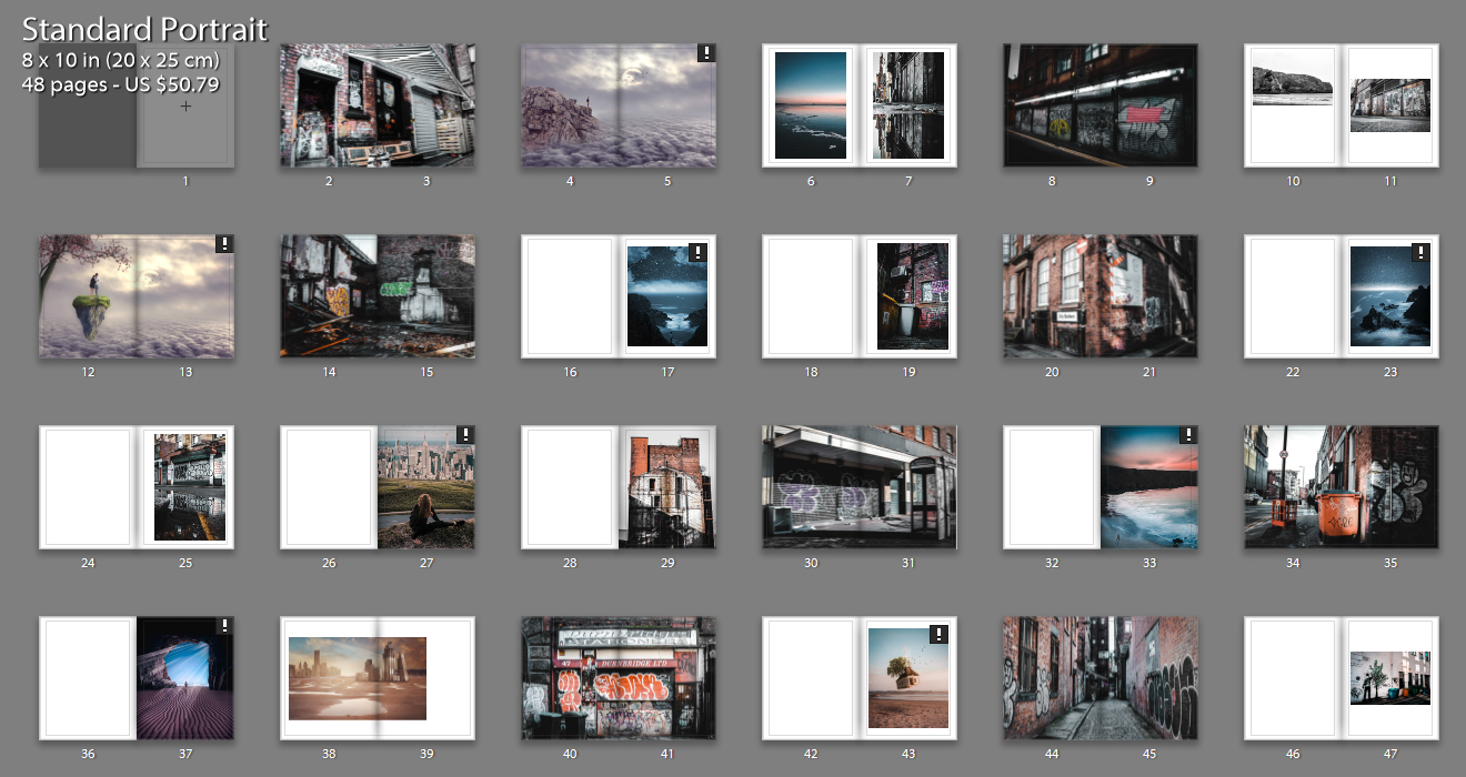
This is my first photobook layout that I have come up with incorporating all styles of photographs to give variety and keep the viewer interested. The above image shows all pages included with the differing layout styles on each page i have gone with. I have included a range of layouts from double page spreads to single images with a boarder. The majority of my images are full bleed to allow the viewer to view the whole image in as much detail as possible and really connect with the visual story. Throughout the book there is contrasting imagery from aesthetically pleasing coastal landscape shots to images depicting the grotty back streets in Manchester. I have tried to pair up some images that have similar shapes and colors to create more intriguing and interactive pages for the viewer.

Photo-book Layout 2

With the thought that i had too many differing concepts in my last book layout I condensed it down to having only the urban landscapes and dream like images. I think that this has helped for the viewer to understand the narrative and story that I am conveying about environmental change and the destruction of the natural environment. The clear juxtaposition between the dark contrasted urban landscapes and the bright dreamy images shows my anger towards the urban development all across the world. I like how throughout this photo book, there is reference to a Utopian world from two perspectives. The urban images shows a Utopian world from the graffiti artists perspective because they are creating beautiful art that they think is making the world better. Also, the dream like images are a clear Utopian world from my perspective showing the audience my view on what the world should be like. However there are also elements of the sublime incorporated within this layout. For example, the graffiti could be viewed as vandalism or gangs marking their territory as appose to an art form. Also my art/manipulation photos may be seen to incorporate elements of fear as the natural land is a scary place with the force and natural disasters it can create.

Photo-book Layout 3

For this layout I wanted to revert back to my first layout and try to incorporate all of the images that i started off with. To still go with the idea of narrowing down the selection of the main images I have used a montage method to combine the urban landscapes and dream like images. I have tried to match up the colors of the urban landscapes and dream like images to achieve the best results. I think it has worked out well for certain images however has also lead to be a bit distracting and confusing too.

Urban Shoot

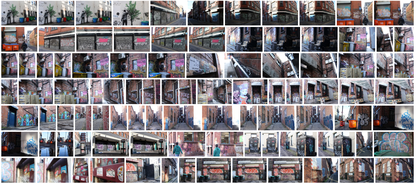
The exploration of the city as a rough and dingy place can enhance the audience to interact with the natural environment which is my overall intentions within this project. I will try to incorporate the sense of fear that is present in the area and the beauty this has too, to portray the sublime. For this shoot, I intend to visit the northern quarter in Manchester, a rather run down urban area. The somewhat scary yet interesting derelict streets will help to show an exaggerated feared perception that can be experienced by a person there.

My overall intentions for this shoot is to take photos with the intention of manipulating them in post production to enhance the distress and the psychological effects that the urban area can connect with. This photo shoot connects with the sublime in the way that the cityscape is a beautiful place where people often will go for walks and to soak up the atmosphere however it has this element of fear connected to it too. This element of fear is evident in cities through the high crime, gangs and scary alleys that are present. Linking to the ideas of the picturesque, my images will need the viewer to look more in detail at the fear I am portraying through the cities. This fear being the environmental problems they are having and the impact they have on our natural land.

Contact Sheet

Edits

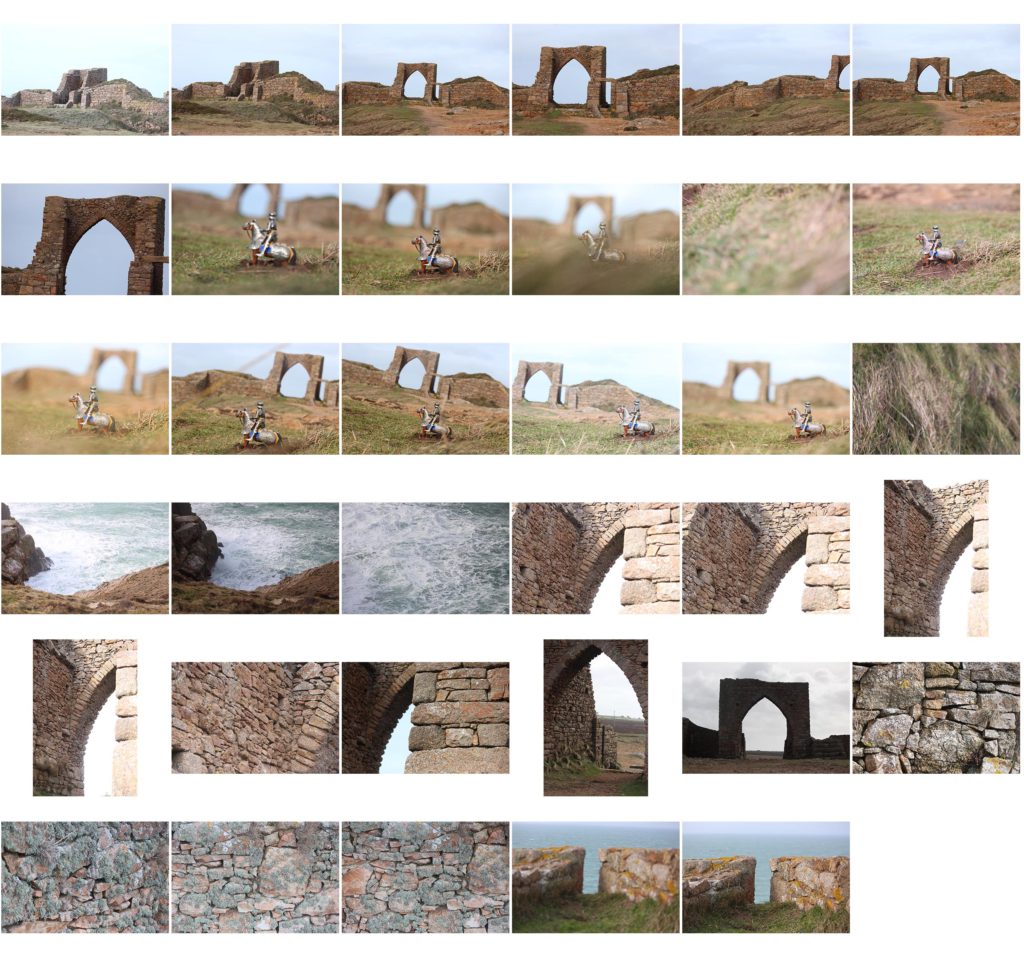
Fifth Photoshoot

Photoshoot plan: I wanted to re do one of my previous shoots with better lighting to allow me to capture the castles feature more clearly and in higher quality. I also want to incorporate toys from the original poem in the photographs and merge memories of time spent at this castle and playing with the toys at their house.

Due to the high winds whilst on this photoshoot I struggled to balance most of the toys in the foreground of the image. I ended up having to dig the back of the horse legs into the ground to secure it whilst I took the photo. The idea with the depth of focus was to make the toy look larger than life and the castle to be slightly romanticised by the blurring and size in comparison to the toy.

The shapes of the arch in the castle mimic those on the toy castle I used to play with, i wanted to capture this in some of the photos and possibly use it beside archival images in my final book to show the parallel.

P.H.Polk

H. Polk was an African American photographer born in 1989 in Bessemer, Alabama, he first became involved with photographed after he heard C.M.Battley, who was the head of Tuskegee’s Photography Department, who later became his mentor. Image result for p h polkHe was speaking that the potential of the field and was encouraging students to come and see if they had any interest in the subject. After this meeting Polk went up to Chicago to further his study photography with his blessing. Hw then return to his home town and open his own studio and then took over as the head of Tuskegee photography department. In which he documented many critical moments in the civil rights movements on the campus. In much of his early worked he was photoghing his subjects on a  Kodak box camera with a Graphex lens, in which he has been praised by credits for his technical mastery of the medium but not having the best equipment . His book Through These Eyes: The Photographs of P.H. Polk is a collection of over 100 hundred photographs that depict southern life in all of its different forms, the images range from African/ American George Washington Carver , to images of the farmers working the lads the the cotton field of Macon County, these collection of images are essential in my eyes, in showing the differences of how African/ Americans saw one other, to how white Americans saw them.  He photographed a range of African/ American subjects such as George Washington to poor working class citizens. One of his most influential series, ‘Old Characters’, in which he documented ex-slaves from Macon County.


One of the reasons that I decided to pick P.H.Plok as one of my photographs to references is because of that way that he documented African Americans. In his images they are presented with class, dignity, and humanity. When compared to the first documentation of African Americans, in which they are shown as specitls of nature, and photographed as freaks of nature who need to be studied, shows a great compassion in how the civil rights movement many fret changes in America. This image was taken in 1932 it is entitled ‘The Boss’ In the image looks as if it was taken in a studio using artificial lighting that looks to be coming from the left hand side of the frame.The woman in the frame who looks to be from the working class from the look of what she is wearing, has been positioned powerful stance with her hands on her hips. It looks as if the camera was taken from a lower angle as the woman in the frame is looking down into the frame, which is in turn giving her the power. She is looking directly down the lens to the viewer which, draws the onlooker into the image makes the images more personal.Image result for p h polk


Understanding Photobooks

Suite Vénitienne

1. Research a photo-book (select one you have looked at previously in your project) and describe what story/ narrative the book is telling – its subject-matter, genre, style, approach etc.

Story and Narrative – pdf edition and book : The book is a collaboration by Sophie Calle and Jean Baudrillard, though I will mainly focus on Calle’s work and photographs since Baudrillard includes only text in his section of the book. There is another edition of this book, one that solely focuses on Calle’s perspective and story, this is the one I have in hand.,The book follows a very chronological and linear storyline, it is almost written like a diary; Calle clearly documents her day to day observations and doings as she searches for Henri B. The genre is strictly documentary, the approach is rather informal and it remains that way throughout the book as the images are not stages but instead spontaneous. The main subject of her photographs is Henri B, though she follows and photographs a passing flower delivery boy during her search and some alleyways she spent time in. Other than that, the subject and theme is solely focused on Henri B. The book explores her journey and story from the start to finish, starting with the day she first met Henri and ending bitterly with a inevitable confrontation and her decision to stop following the man.

  • Book in hand: how does it feel? Smell, sniff the paper.

it’s light, small and portable. It smells a lot more like a literal story book than a traditional photobook.

  • Paper and ink: use of different paper/ textures/ colour or B&W or both.

The images are prominently black and white, the text is also black wirth certain points highlighted in the same blue as the cover. The paper is texture like a story book, very think and cream in colour. The texture of the photographs is a bit rough to the touch though it looks matte.

  • Format, size and orientation: portraiture/ landscape/ square/ A5, A4, A3 / number of pages.

There are 48 pages, the book is A5 and in portrait orientation.

  • Binding, soft/hard cover. image wrap/dust jacket. saddle stitch/swiss binding/ Japanese stab-binding/ leporello cover: linen/ card. graphic/ printed image. embossed/ debossed. letterpress/ silkscreen/hot-stamping.

 Hard cover with an image wrap. Simple swiss binding.

  • Title: literal or poetic / relevant or intriguing.

“Suite Venitienne” – translates directly to Venetian Suite, which is because this book is set in Venice, Italy. It is set there due to the origin of the story; Sophie Calle had followed a man in the streets one day but lost sight of him, incidentally, she met him at a party that night and overheard he was travelling to Venice. She had decided she would follow him there.

  • Narrative: what is the story/ subject-matter. How is it told?

Documentary approach, the story is told like a journey or diary that documents what Calle does each day during her search for Henri B. The subject matter is predominantly Henri B. though she does include multiples shots of streets and other people who she either followed in the meantime or were connected to Henri B. It can also be said that Calle becomes the subject. I became interested in her decisions and framing of Henri B. ad well as immersed in her detailed and straightforward descriptions of her subject. Calle tells us that she is in disguise — wearing a blonde wig. She carries a camera with a double reflective lens. In the charged moments when Calle reveals her proximity to Henri B. the act of following becomes a performance and the quality of the relationship between follower and followed reveals itself to be one of a high tension.

  • Structure and architecture: how design/ repeating motifs/ or specific features develops a concept or construct a narrative.

The design is linear and written entries create a very sharp and clear narrative. Calle describes her feelings, observations and doings to the audience; in a sense, it’s a little unsettling and would make the viewer uncomfortable but it also does not leave them wondering what is happening in each image and the context/relevance to Henri B.

  • Design and layout: image size on pages/ single page, double-spread/ images/ grid, fold- outs/ inserts.

The book design consists of a lot of empty space intervals mixed with very filled pages, her entries and writing tends to take up a whole page; even when the writing is very sparse. This is contrasted with an image usually directly linked to the writing, even with that, the images take up the whole page. There’s multiple full bleeds and images that go onto a double spread. Though, there are also  double spreads that contain just text.

  • Images and text: are they linked? Introduction/ essay/ statement by artists or others.  Use of captions (if any.)

The text and images are intertwined and have a distinct relationship. Without the text the images would be very disorientating and confusing – the text allows the audience to understand the images much better. Personally I think the text is really is where the artist shines. The writing is brilliant. It’s poignant and moving, it is also clever while hinting at its author’s various vulnerabilities. It frames the photographs and makes them a lot more interesting than they actually are in that sense.