Category Archives: Uncategorized

Filters

Author:
Category:

Nick Frank experimentation

Photo shoot Plan

Genre /  Artist – Landscape, Formalism/ Minimalism

Concept –  Man Made

Location – Towns, Cities

Props – Tripod

Shot type – Landscape

Lighting – Natural

Settings – Landscape

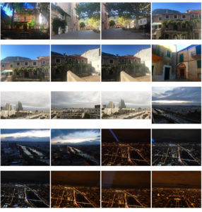
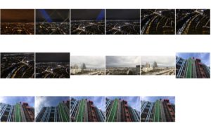
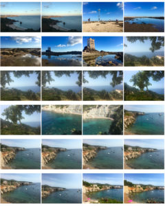
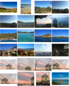
Contact sheets

My Favorite images

Edited Images

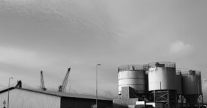
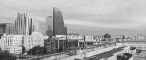
Further experimentation – Black and white


Evaluation – favorite final image

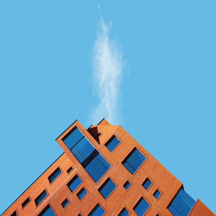
This was my favourite image out of the originals and also the edited images. I think this image is very aesthetically pleasing as the strong contrast between the multiple colours on the building and the dark blue sky really brings forth the building and allows the colours to stand out massively. Furthermore, I believe that this image is very strong in the way it imposes the conceptual ideas of man taking over and nature. This can be seen in the image as this building is almost looking over the tree thats tucked away in the bottom corner. This is a clear representation of the power of man and our mad made structures and how it can overcome nature is such a way that it has just been put to the side so humans can make their vast man made structures.


Nick Frank

Who is Nick Frank?

Nick is a German urban landscape photography who has studios located in Munich and has also worked with some of the largest companies in the world such as; Apple, Adobe and Canon. Furthermore, Nick has also been awarded with numbers of awards throughout his carrier.

Nick was responsible for the visual presentation of advertising campaigns over many years in advertising agencies, he then he changed to express his ideas in his own pictures.

His photographs can be found in numerous announcements today. For example; news magazines like Spiegel,  Wired or New York Times and highly regarded newspapers like SZ. His requests from global cities like Vienna, Paris and so on are showing his strength in his images.

Examples of Nick’s work

Image result for nick frankImage result for nick frankImage result for nick frank

Photo analysis

Calpe_06.jpg

This coloured landscape photograph is of a pink building called the La Muralla Roja. This photography has clearly only been taken with natural lighting as you can see the multiple shadows that have been created from the abstract building. There is a strong contrast in this image between the pink building and the pale blue sky. The use of this strong contrast really allows the building to project its abstract shapes. Furthermore, the green tree creates a sense of juxtaposition as it also creates a strong contrast between the man made structure and the natural structure within this image. This is because there is very little natural structures compared to the large amount of man made structures. The multiple shapes within this building creates a sense of depth as it create an almost maze feeling to the image as you could imagine getting lost among all the sharp and abstract shapes. Overall, the way Nick has captured this abstract image allows the viewers to visualise it in such a way which results in this image being  very aesthetically pleasing to look at.

Final Presentation Ideas

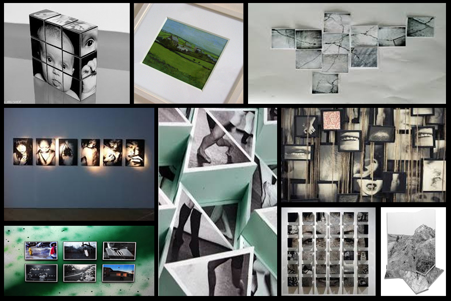
When presenting my imagery I wanted to experiment ways of which I could visually present my images differently to the standard style. A way in which I could do this was through Photoshop where I could manipulate images into the style of presentation I desired. Before I got to this stage however I thought it was necessary to come up with a mood board on my ideas regarding the presentation of the final pieces, this was my result:After looking over these images I decided I should trial run a few of them by manipulating the photos within Photoshop to get the effect needed. I Ideas I settled on were 3D presentation of the landscape and objects due to how through this method it allowed me to choose the focus of interest I wished the view to focus on, whilst creating a more realistic and abstract result. The second idea was the simple image between two black sheet with a white border, I chose this one because I loved the simplicity of the outcome as I thought it emphasized and complimented the entire piece.
I firstly focused on the 3D design with this being my desired effect:To create this I stitched images of building I had taken together, with me adding edges digitally it made the 3D effect I wanted, this was my outcome:
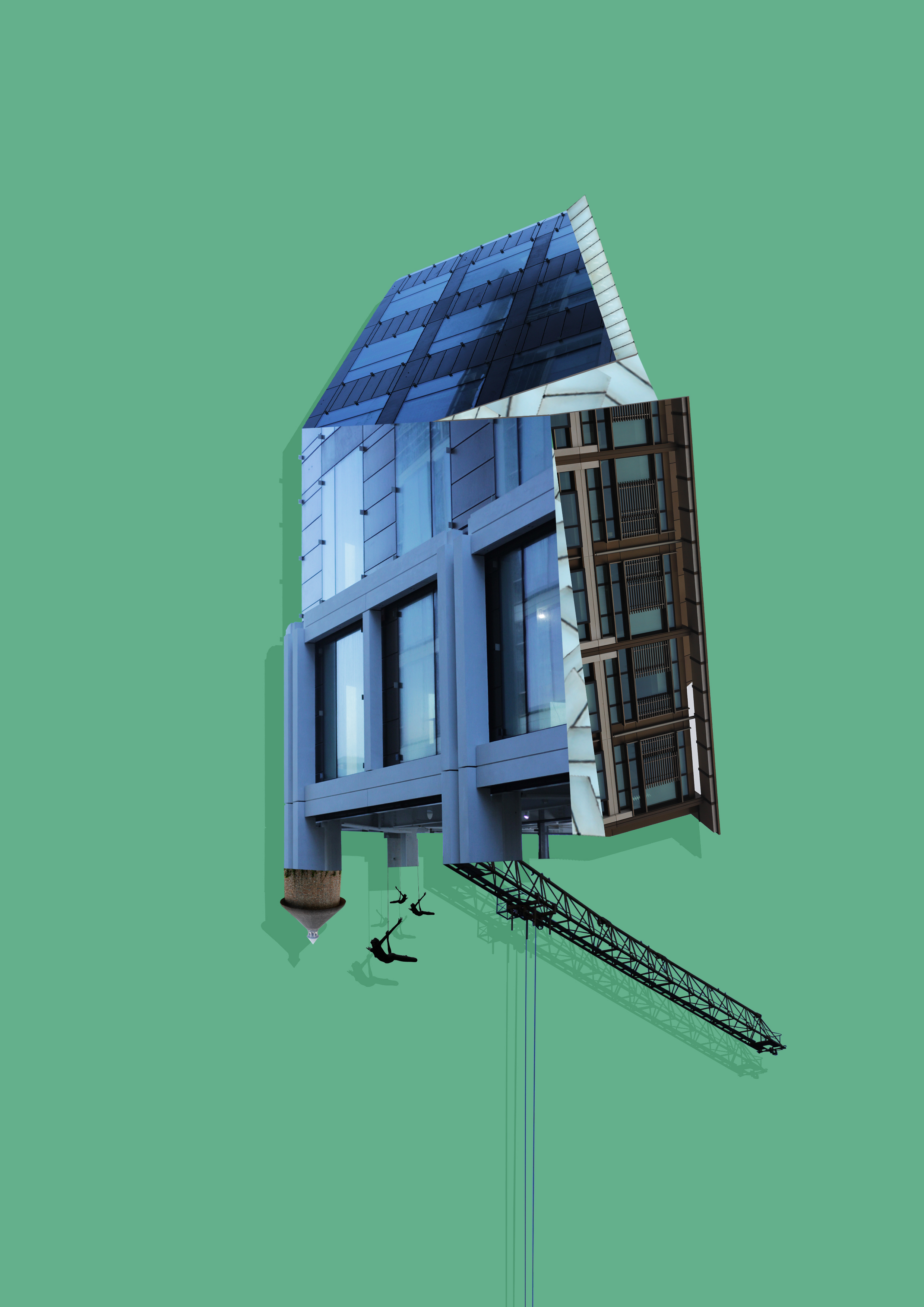
Whilst making this design I found that by adding a shadow to the piece created the effect as if it was mounted upon a wall, emphasizing the 3D aspects even more.
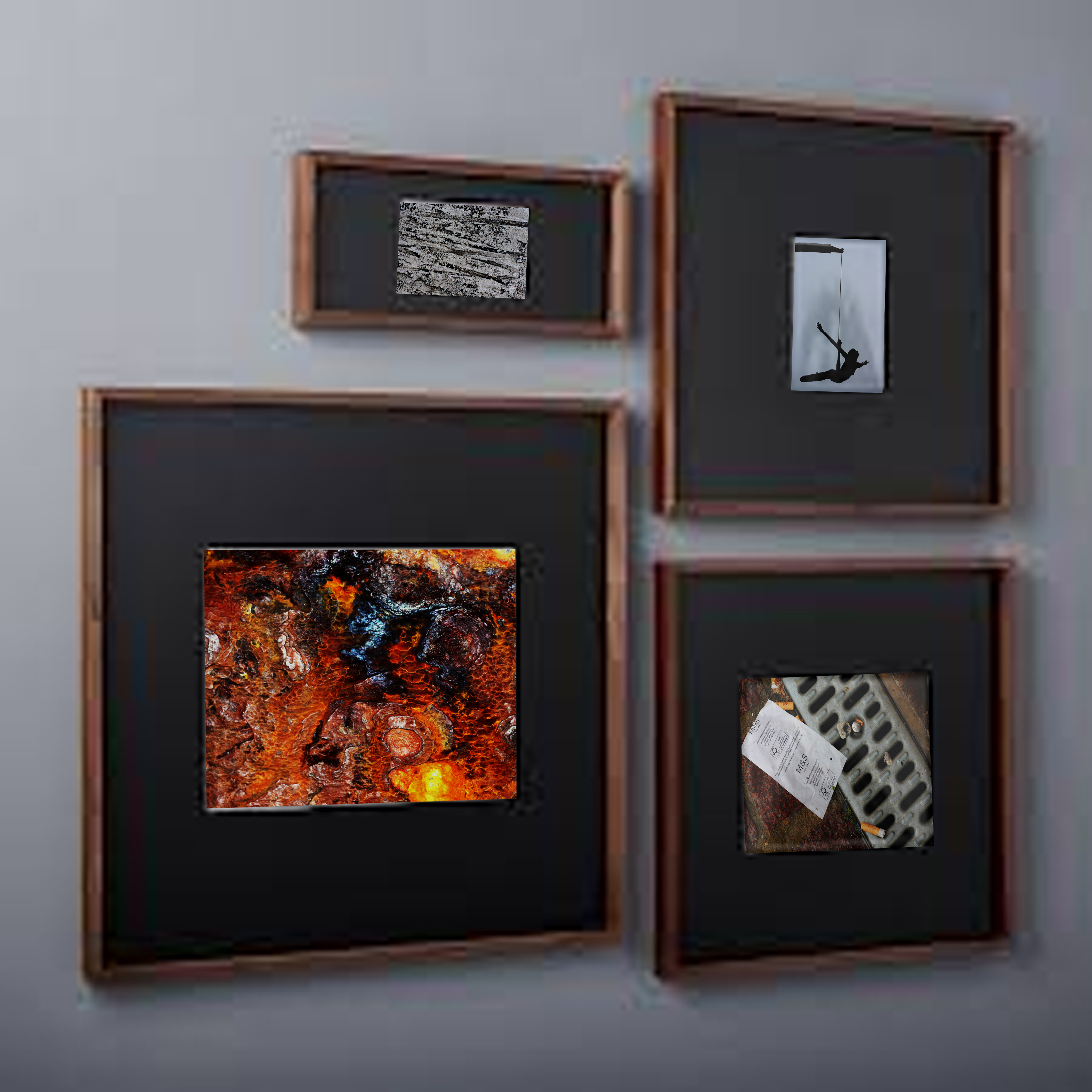
Once completed I moved onto the design of a plain black mounted image to present my images in. To do this I used simple shapes to create the imagery adding texture to them by using overlay, this was my result:

Image result for Diagram of framing a pictureWhen editing the images I found that when displayed together the pieces looked more aesthetically pleasing to the eye. This allowed me to come to the conclusion that I would display three of the images together to created this effect.
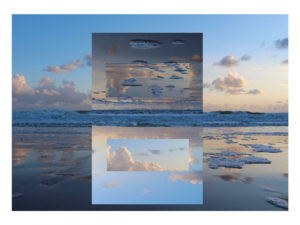
Final Images and Presentation Ideas

For this image I decided to print the image to the scale of A3 size, I want to sick this image onto a white foam board as I wanted to have decided to present this image by its self as I feel that this is the strongest image out of my final selection.
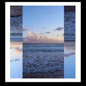
I have decided to present these image together on the same white foam board as the I feel that they do not fit with the other images but when they are put together complement each other very nicely, I have printed these to images to A4 size.

With this final image I decided to print it off at A4 size. I  plan to stick it onto a white foam board and then to stick this onto a black board to highlight the levels of contrast.
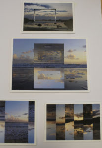
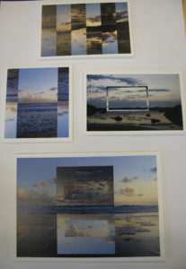
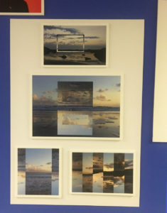
Experimentation Of Different Layouts 

Final Layout Choice

decided to change the layout of the image from being on separate pieces and card and foam, I decided to present all if the images on a white piece of card as it would be more effective as the images all fit into the same series. I placed the A3 image in the center of the card as I feel that this is the strongest image out of my final selection.  

Joan Fontcuberta

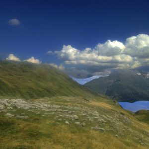
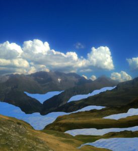
One of Spain's most prominent and innovative artists, Joan Fontcuberta is best known for exploring the interstices between art, science, and illusion. Where science reaches its limits in his works, the imagination frequently finds a creative space in which to flourish. In Landscapes without Memory, Fontcuberta has co-opted a piece of computer software originally designed for military or scientific use in rendering three-dimensional images of landscapes. The software enables the user to build photo-realistic models based on information scanned from two-dimensional sources—usually satellite surveys or cartographic data. The result gives the user the illusion of navigating in three dimensions which had previously been visualized only as a flat image.Fontcuberta feeds the software fragments of pictures by Turner, Cézanne, Dalí, Stieglitz, Weston, and others, forcing the program to interpret a variety of landscape masterworks as "real." The contours and tones of these painted and photographic landscapes are transformed into three-dimensional mountains, rivers, valleys, and clouds.

My edits using my own images

Case Study-merve ozaslan

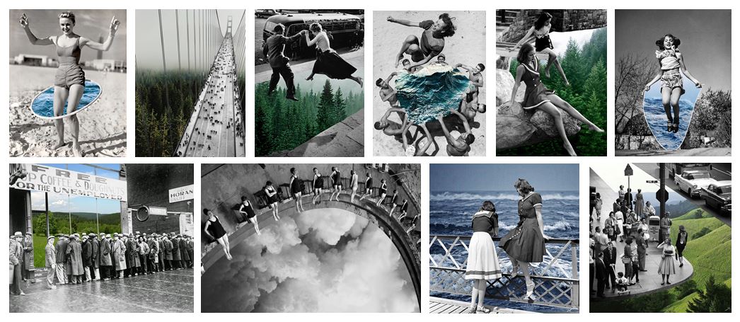
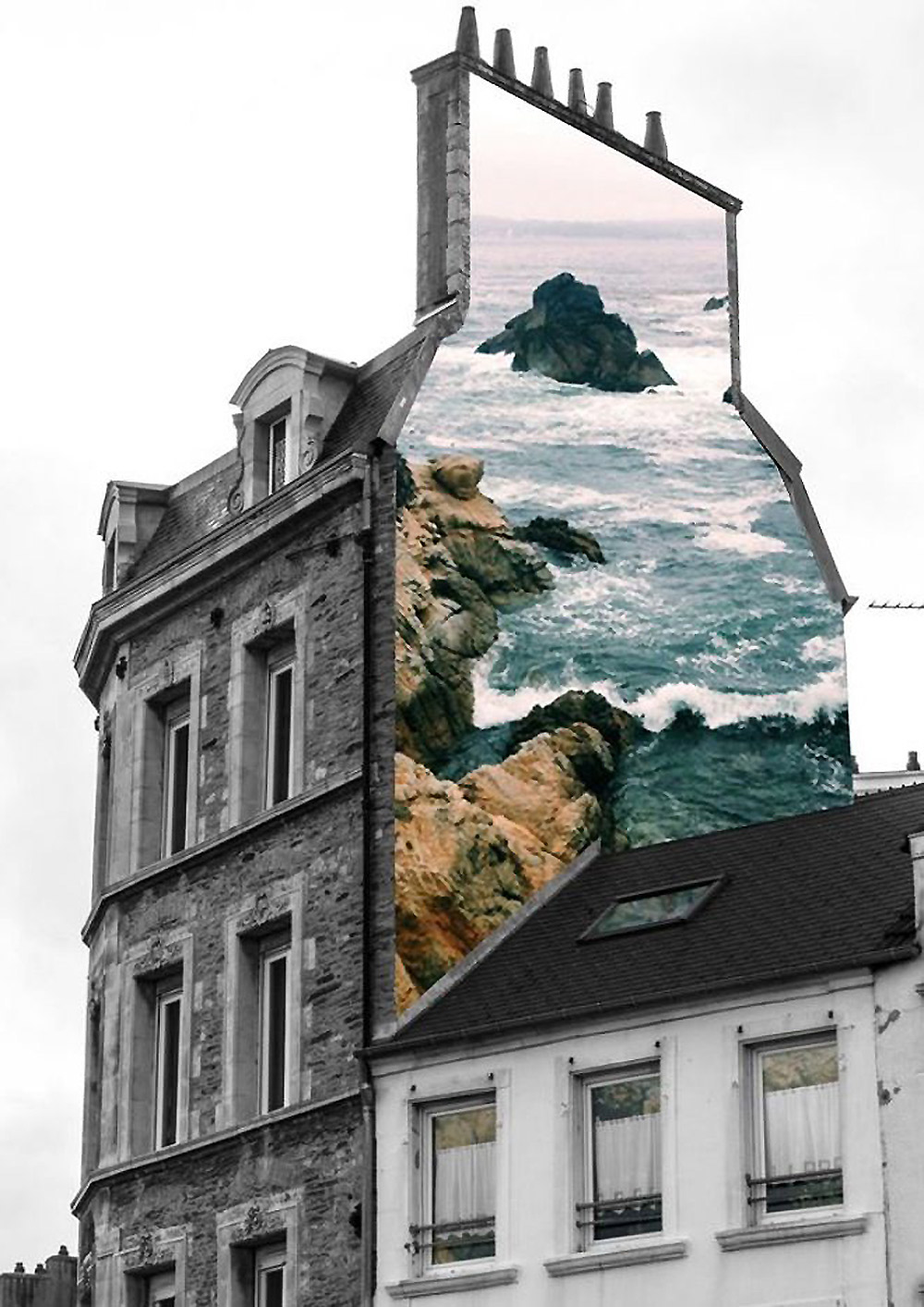
Merve Born in Istanbul, Turkey and graduated from Mimar Sinan Fine Arts University as an ceramic artist in 2010. She is a ceramics jewellery artist but is most popularly known for her series “natural act” which is a group of collages based on the questions of the relation between nature and the humanity. The main feature of this series is the unexpected use of selective colouring of black and white vintage photographs and new coloured photographs which creates a parallel meaning to the original storyline of the photograph. She spends a lot of time looking for  the perfect vintage photo to manipulate, when she finds one she instantly starts thinking of how it could be manipulated in her head.


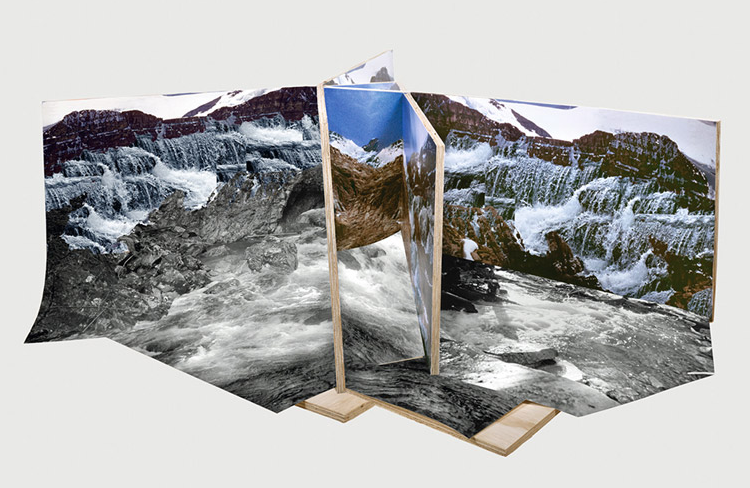
Technical: This image is made up from two photographs, one of a cliff edge with rough water at the bottom stretching out to sea. the second photo is of the edge of an old building. Both of the images were taken using natural lighting which was probably not with direct sun light due to the lack of harsh shadows. both of the photographs have a large depth of field because they are both landscapes. we know they were both taken with a fast shutter speed due to how sharp the images are, the waves would also be blurred if it was a longer shutter speed.

Visual:  The main image of the building is in black and white and has a high contrast, the sky in the background is white washed which helps the texture of the building stand out. There is no other distraction in the background which helps the building stand out and take more of our focus. The photo of the sea has been edited with a filter which gives it a blue tint and enhances the shadows giving the image more texture. The image of the sea has been cut out and placed perfectly over the edge of the building to look as if the picture is on the wall in real life. the photo has also been taken from a low angle making us feel we are looking up at the wall. although we know that the image has been manipulated it creates a sense of fantasy by combining two polar opposites.
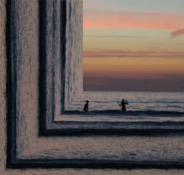
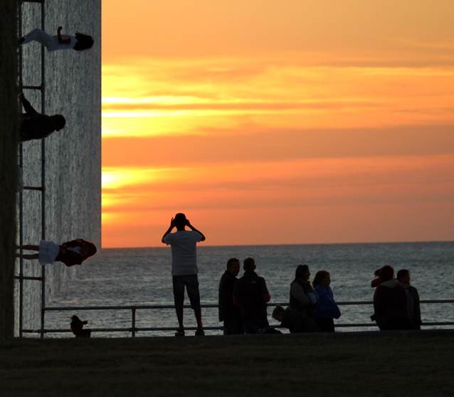
Conceptual: this image is made out of two completely separate photography, the black and white image is one the artist found and did not take herself. Like the rest of her work she combines old photos with knew ones, this old photo acts like a canvas for the new image. The coloured photo represents nature and contrasts with the urban black and white image to show a visual representation of how diverse landscapes and out surroundings can look.

Altered Landscapes

Witchoria

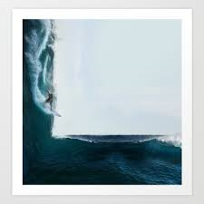
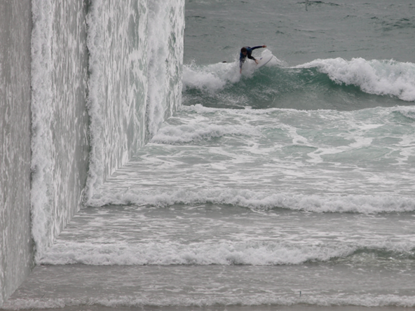
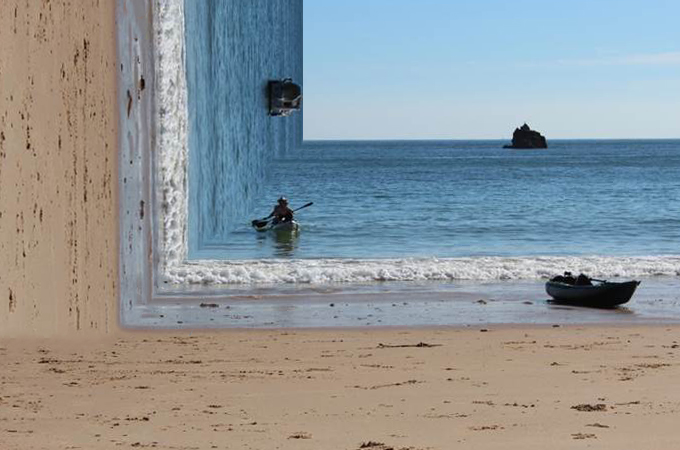
Victoria Siemer is a Brooklyn-based American graphic artist who focuses mainly on photo manipulation using Photoshop.

Her inspirations come from the idea of “emotional fragmentation or ‘fragmentation of the self.’“ Since she had no formal photography training, she paid close attention to others, including artist and former roommate Jeff Brown and street photographer Dave Krugman. It was only more recently that Siemer has begun to call herself an artist, rather than a designer.

Inspiration for this shoot


Photo shoot Plan

Concept Genre /  Artist Location Props Shot type Lighting Settings
Altered Landscapes Witchoria Beach Tripod Landscape Natural Manual focus,f/2.8-f/4, 1/60 shutter speed ISO-100

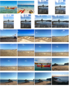
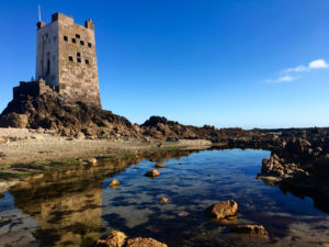
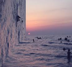
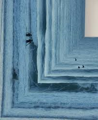
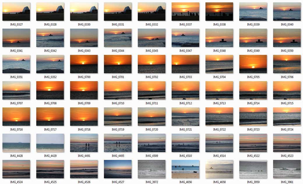
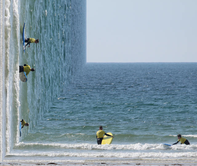
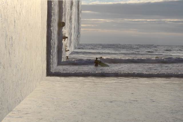
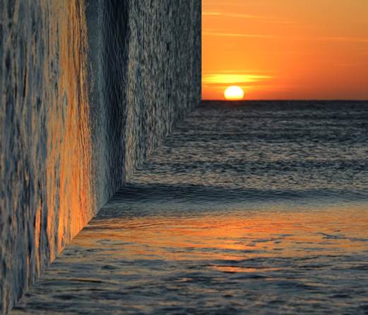
For this photo shoot I am going to focus on Witchoria’s photos which she creates a 90 degree angle of half the picture on the side to create an illusion.  Her photos are all at the beach for this style therefore this photo shoot will consist of mainly beach pictures.  For this photo shoot I will use a tripod due to the fact that the sea is constantly moving and I want to try to reduce as much motion blur as possible to create a realistic looking photo to help with the illusion which will be created when editing.