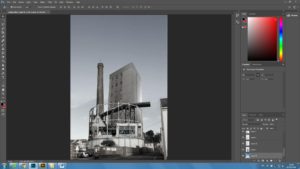
To start my edits I chose the foundations for my pieces. I chose industrial bases because I wanted start them with interesting objects that would frame the rest of the made up monuments. Also to keep a contrast between elements of churches and shops.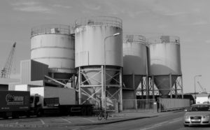
first I had to cut away pieces of the original image so i could place other images inside, and one by one I cut up objects and buildings from my photos and placed them in the tower.
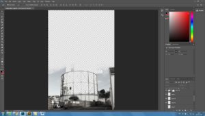

The final edit I had was to add more sky to make it a continuous photo. Using the brush tool to blend another picture of sky I came to my concluded image.
Category Archives: Uncategorized
Filters
Final Outcomes/Presentation
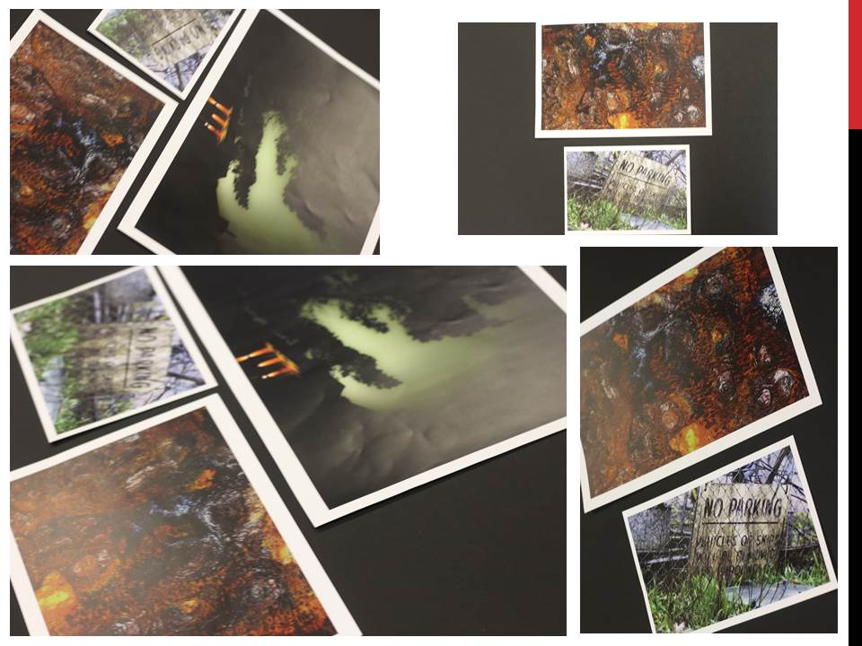
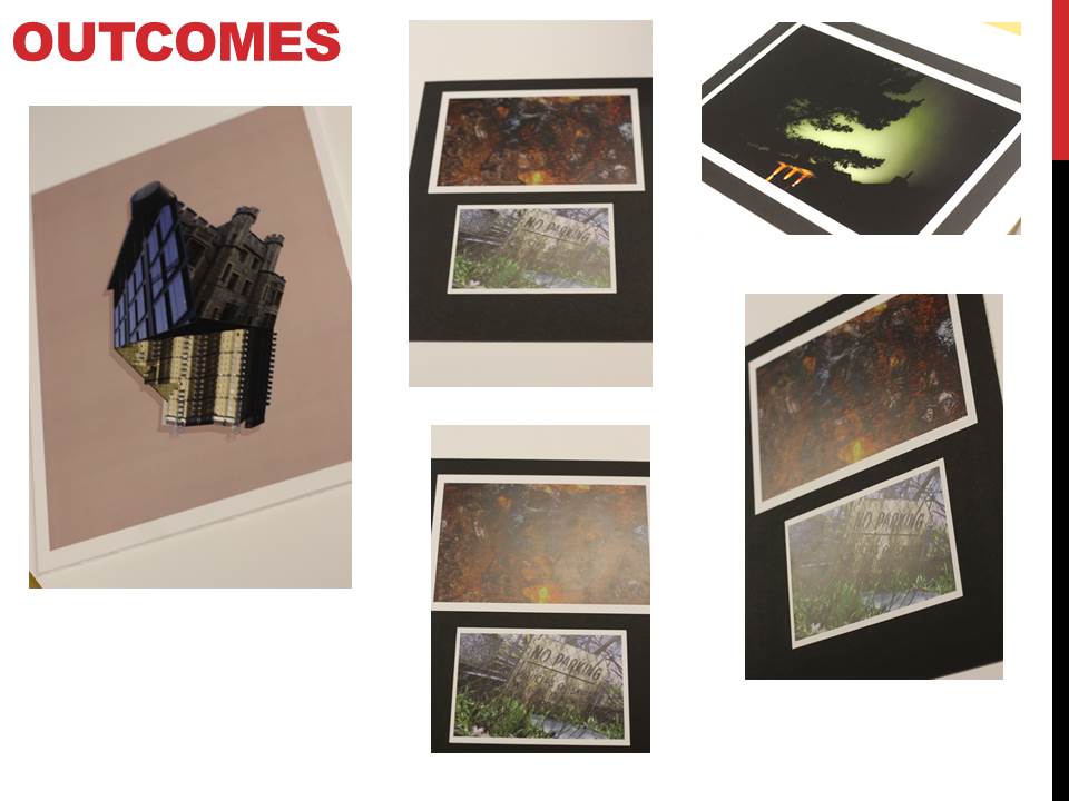
For my final outcomes I gathered my favorite images from each shoot together to analyse and compare them. At the same time I had sent some of these images to be printed so that I could present them in a few different ways rather than just the image online. From this it would allow me to explore the use of composition and presentation of each image, creating a more aesthetically pleasing result as a result. These were my top 5 images I had selected throughout the course topic of ‘Landscapes’:





Evaluation , Critique and Analysis and Final Response
Image Analysis

This light in this image is the natural lighting coming from the sun, I took this image during golden hour which has given the sky lots of different colours. I took this image using a shutter speed 1/250 as I wanted the crashing waves to be sharp and in focus. An ISO of 200 and an aperture of f/22, these settings made the image have lot of light.There isn’t a large amount of texture in this image as I have edited out rocks that would have given texture as I wanted the image to have a crisp look to it. The colours in this image are very brought and vibrant due to the way that I have edited them to look like this, I wanted the piece to have a very bright and light feel to it, to add emphasis on colours in the sky being created by the sunset. There isn’t a large tonal range in this image as the image is bright.I took his image down at St Brelades Bay at low tide during ‘Golden Hour’ .This is my favourite image from the shoot, what I like the most about this image id the colour palette and the reflected section of the image lines up with the rest of the image.My concept behind this image and the shoot as a whole was to take a different perspective when looking at landscape images and to make them more interesting and appealing.
Final Presentation Of Images

My final piece is a combination of 4 images from the Alternate Landscapes project. I stuck the images onto a white foam board and then stuck them onto a large white piece of card, By having the images backed onto white foam and then white card it helps to bring out the colour in the images and highlights the brightness in them. One way that I feel that I could have improved the overall presentation of this image, as if I had thought ahead about how I wanted the images to look as I would have printed out one more image from my selection at A4 size, I would have placed it at the top to balance out the position of the images.I think that these four images are the most effective as they all have a clear linking theme between them.
Overall I feel that this project went very well and is the best project that I have done so far. I really liked exploring different techniques in relation to geometric and the way the two come together. Using Tyhe Reading as my inspiration for this project I feel that I have created images that have the same theme but are also successful in their own way. What I want to improve for next time would take a wider range of images at different locations and different times during the day as this effects the lighting and the overall look of the images.Overall I feel that these images work well together to show the themes of Geometric Landscapes although some of the images could have been further edited the simplicity of some of them still creates the same overall effect.
beomsik won
Bemosik Won - Born in South Korea, studied photography and metals & jewelry design in Seoul and then moved to London where he completed a degree in fine art media. He has already been featured in many exhibitions including Hollywood, Seoul, London and Paris.Technical - Won's pieces are assembled from dozens of cut-up black and white photographs in a process of deconstruction and reconstruction which ultimately creates new monuments from the buildings of London in his own digital sculptures made through the art of photography. The pieces may take hours to construct with digitally combining all the pieces in his puzzles in comparison to one quick snapshot taken in a spontaneous moment, with each part of his pieces cut up and placed to look like they actually exist in the world. Visual - His work is constantly inspired through the city of London, with many of his pieces featuring famous monuments and buildings taken from our everyday landscape - the car park and escalators weaved into this image holds a sense of reality in a surreal landscape. His pieces defy laws of statics making them more surreal and monumental/sculptural. From architectural photographs and collages he creates urban mirages set in familiar landscapes which is perhaps is the only thing that connects the audience to the monuments. Conceptual - His made-up monuments are glorified with the combined everyday constructions and artistically generated sculptures that tower above their landscapes which creates an idea of powerful inhuman forces. His work questions the understanding of contemporary photography and human perception. Photoshoot - I planned to exlpore around La collette and any other industrial or constructional places in town [the gas tower] and churches as they have many towers and turrets with intricate designs. This was to collect enough images of buildings to finally create a digital sculpture based on Beomsik Won's work.
AS Photography Externally Set Asignment
EXAM START’S HERE
THIS IS THE START OF MY EXTERNALLY SET ASSIGNMENT AS
TOM WEBSTER
COURSE DIVIDER
CORSEWORK CHANGE TO EXTERNALLY SET ASSIGNMENT
Evaluation, critique and analysis of my final response

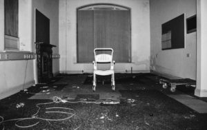
This piece of work is a true representation of the past. It represents a discovery of forgotten things which brings a realization that this place was someones past; the history of lives we never even knew. There is great use of leading lines and depth of field within these photograph which help to direct the viewer around the piece as a whole. The carefully positioned pictures create a strong contrast and juxtaposition to the photos themselves which are completely wrecked and derelict. This use of contrast may be a reference to the atmosphere which once was present to how it appears to be now. This links to the way the hospital used to be run, probably smooth and regulated well, compared to the myths associated with it and how it looks now. Personally, I believe that viewers should appreciate the subjects of this work but keep them in mind as examples of humanity’s wastefulness and the impact society has on nature. I think that to make this piece of work better, I could have explored a variety of derelict sites as appose to only one. I could have also thought about the presentation more to create something more visually pleasing such as a 3D sculpture, incorporating my photos within it.
Presentation Ideas
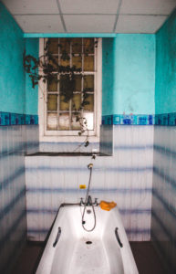
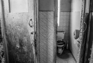
For the presentation of my images I have printed my selected images out onto three different sizes based on how important each image was in telling the story and messages I intended.
A3

A4


A5


For presentation, I intend to create a story board that gives the audience an insight into the St Saviors Mental Asylum. This will consist of using two foam boards, taped together, and arranging the images into an order that will attract viewers and direct them around the board to the different pictures. The pictures which gives the biggest impact will be in the middle as the main focus of my final piece. I will experiment with different compositions and placing of my photos to ensure i get the best possible arrangement for effect.
The following images show the process I took to get to my final arrangement. In order, it shows how I experimented with the positioning of my photographs to get to my final piece.
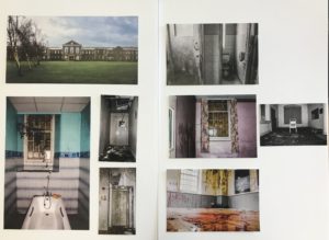


I think this composition works the best because it is visually pleasing, allowing the viewer to focus on the middle two pictures, the most important ones, and then be directed around them to get an insight of what the derelict building entails.
Selection Process For Final Images
Initial Images compared to Final Images
The overall effect of the initial images was completely incorrect for the story and messages I intended to portray. The photos did not ‘pop’ at all and the lighting created some very dull and faded images that were not eye catching. Through the editing process I manipulated all aspects of the photo, focusing on lighting and colors specifically. A main feature in creating these eerie feeling images, was the clarity. With a high clarity I was able to bring out very fine textures within the walls and other subject matter within the photo to give an overall feeling of destruction. I used the brush tool for almost every photo which allowed me to changed lighting and colors within small parts of my photos. Another editing technique i used in creating these images was changing specific colors through the hue, saturation and luminance. I believe the initial photos were not effective themselves and could have been improved by using a stronger light source within the building and possibly taking photos on a sunnier day which would have allowed for brighter photos inside the building and better lighting outside too.
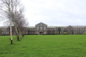


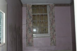

I believe for my final piece, these images are the effective and the best in portraying a sense of landscape, documentary photography of the derelict mental asylum. The variation of vibrant and black and white photographs will compliment each other when side by side in my final presentation. I believe this set of images creates a true representation of the mental institution at its current state and how it is wastefully sitting there, taking up space that could be used for nature. However it supports the untrue myths associated with how it was once full of psychopaths and was poorly run.
Through this set of images I want the audience to appreciate and acknowledge the wastefulness in which humanity evokes. Also i want them to serve as an eerie reminder that nothing lasts forever.


