Category Archives: Uncategorized

Filters

Author:
Category:

My Views, feelings and vision for the future of St Helier

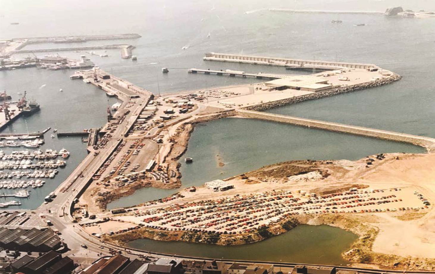
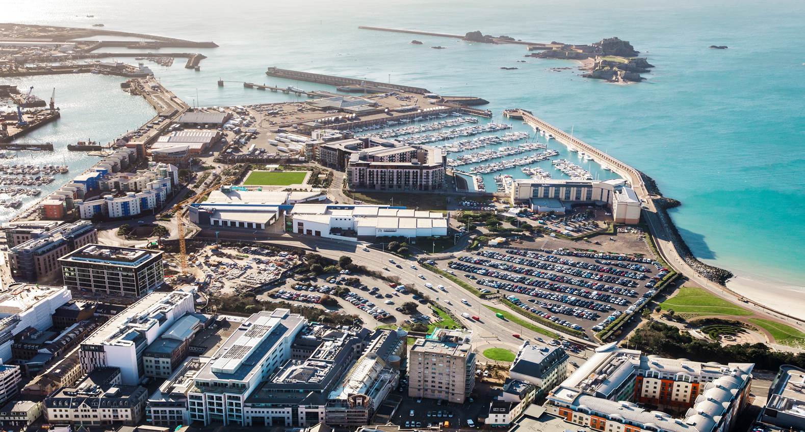
I strongly believe that St Helier is moving forwards with intent to make money with such ongoing projects like the international finance center. Although this is likely to benefit Jersey, these money making investments are orientated towards the finance sector and living complexes which does not positively impact Jersey as a community. Also, the tourism industry is clearly ignored buy the development teams of St Helier with many attractions collapsing and little investment in new leisure facilities.

A clear example of this is how Fort Regent was once considered a hot spot for tourists to the island as well as a great place for locals to spend the day. It provided weather proof activities for all ages but since the 90’s the attraction has been underfunded resulting in the closure of some of its main attractions such as the swimming pool and cable carts. The fact that the fort has continued to go downhill despite the plans to redevelop the whole of St Helier shows that the States of Jersey have lost interest in the islands tourism industry and providing attractions to meet the demands of locals.

Related image

In my opinion the future of St Helier should be surrounding a modernization approach with the belief that new types of buildings will increase the high demanding market for finance. Modern buildings such as high-rises are needed in order to move St Helier from being a town into a city which in my opinion would benefit Jersey as it will gives a chaotic atmosphere to which can and could not be found anywhere else. However this does not mean the demolishing of historical buildings but it will enhance their presence with the contrast between the past and present which shows the movement and development within Jersey.
 

Final Piece Evaluation


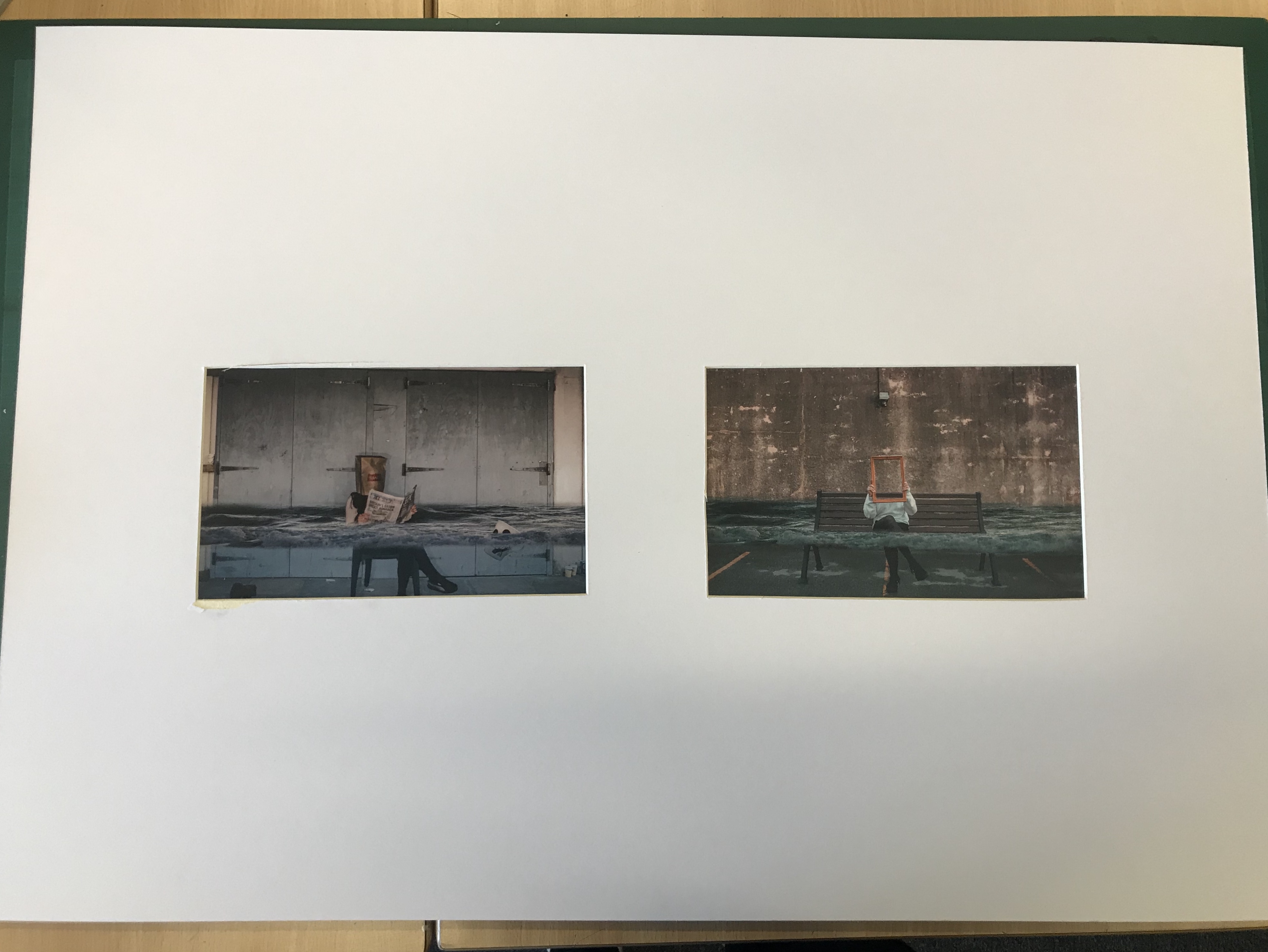
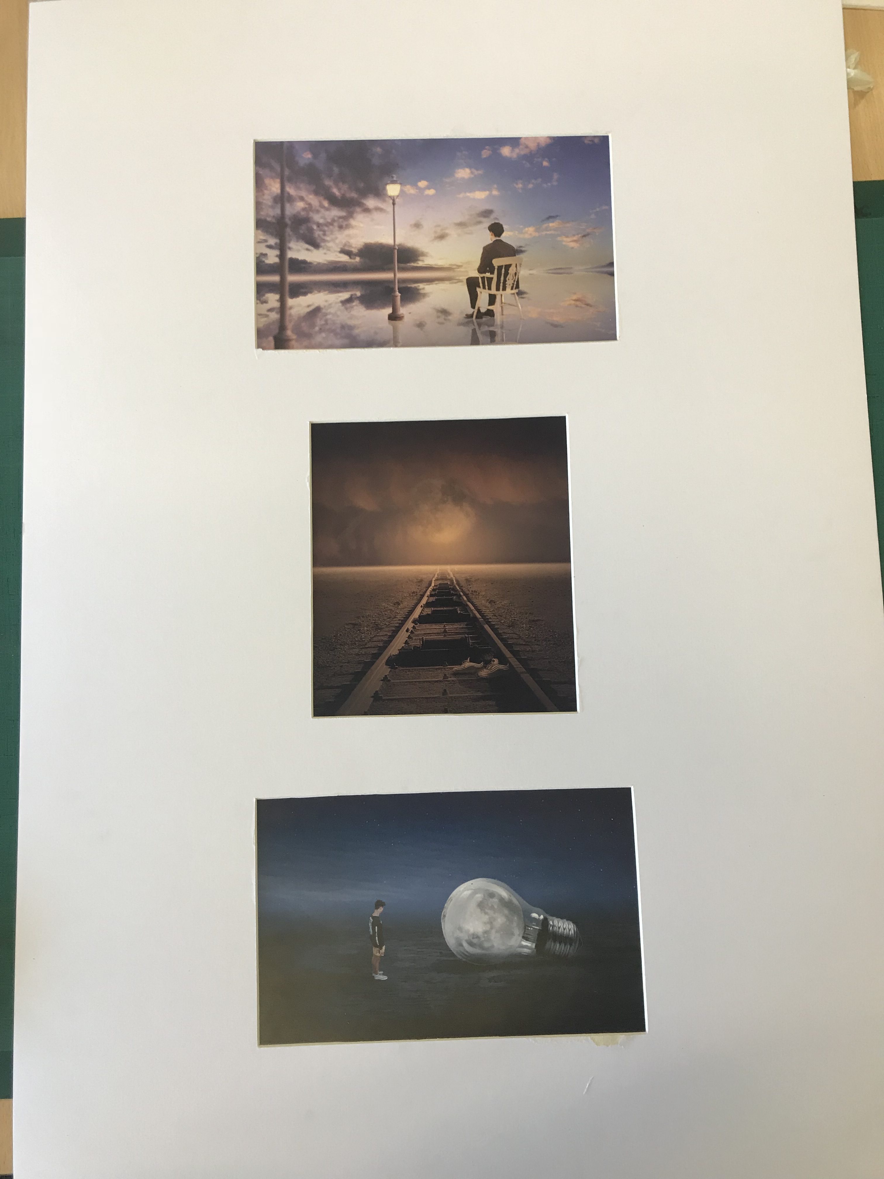
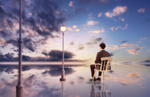
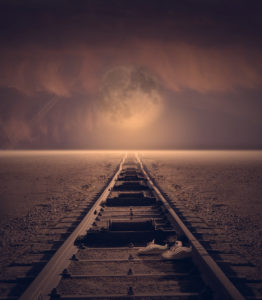
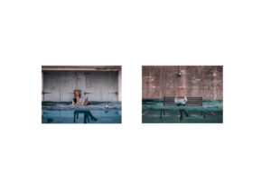
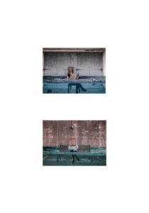
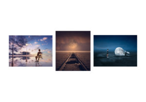
My final piece shows a collection of visual research about humanity’s impact on earth and digital manipulation photography which I have done in order to reach my final piece. I was trying to capture a sense of how our earth is changing by highlighting disasters such as rising sea levels and light pollution. This links to one of my artist studies, Thomas Barbey. He try’s to capture images which show two negatives within society and some which give an indication of our earth being ruined. He mainly uses black and white, which is the same as another artist reference i used, Tommy Ingberg. In contrast, my images display this idea of our earth being ruined with bright colors to attract the viewer. Similar to Tommy Ingbergs photos my final piece relates to how the people in my image could be feeling. For example, the concept of the top final piece is that our sea levels are rising and the person within the image is hiding from the camera suggesting she is ashamed to be part of society which has caused this.

The exploration of secrecy within my final piece is clearly shown by raising awareness of these environmental impacts that some people do not know about therefore they are secret to them. I used codes throughout my images to portray this sense of destruction for example the lampposts in the fantasy landscape image act as a code that we are unnecessarily building onto our land. Also, the idea of conventions has also been captured through my work. Modern day photography conventions are focused on editing and photo manipulation to create stories and make subjects more interesting. This convention is seen in much of the commercial photography that we consume daily, for example a magazine making a holiday destination look more beautiful than it actually is by enhancing the tropical colors.

A successful aspect to my final piece is that the edits are very strong and are shown of well with a simple presentation style. After having made this piece I have a better understanding of how digital manipulation images are created and how serial pictures can be achieved and used to create meaning. I think that if I were to do this piece again I could have explored with my presentation style more to perhaps create something 3D which would captivate the viewer better.

Final Piece Planning

My final idea to present my work is to simply create window mounts and stick my photos down. I think that due to the great deal of editing that has gone into these photos, there is no need for a creative presentation of the photos as the photos are very creative already. I considered mounting my images onto foam board however I think that it wouldn’t have such great impact on allowing my images to stand out.

Resources Needed

                                                                 Size A1 card                                                                                                                             My prints                                                                                                                                   Cutter                                                                                                                                           Masking Tape                                                                                                                           Pencil                                                                                                                                           Ruler

My Chosen Edits for Printing


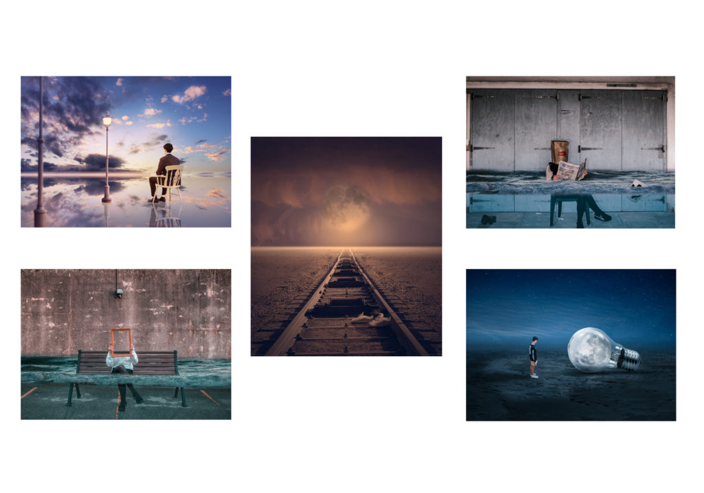
All these edits which I have chosen, strongly contrast with one another as the dominant colors are all different. I think that this will be effective when presented as a final piece because it will allow each individual photo to stand out. Also, I have tried to ensure each image can tell a slightly different story whilst still focused on the topic of environmental impacts caused by humans.

The two images with water involved pair with each other very nicely and would work much more effectively apart from the other images. Initially, I intended on mixing all of the images together into one final piece but after arranging them together, I noticed that there is too much going on and therefore distracting for the viewer. Also, pairing up the two images with flooding involved will allow the viewers to be drawn to the issue of global warming more effectively and make them think about it more.

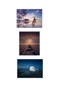
The images bellow shows my experimentation of my original final piece idea and clearly shows how crowded it looks. After having done this mock up I decided against putting all my images together and thought that It would be best to put to the water ones together and the other three together too.

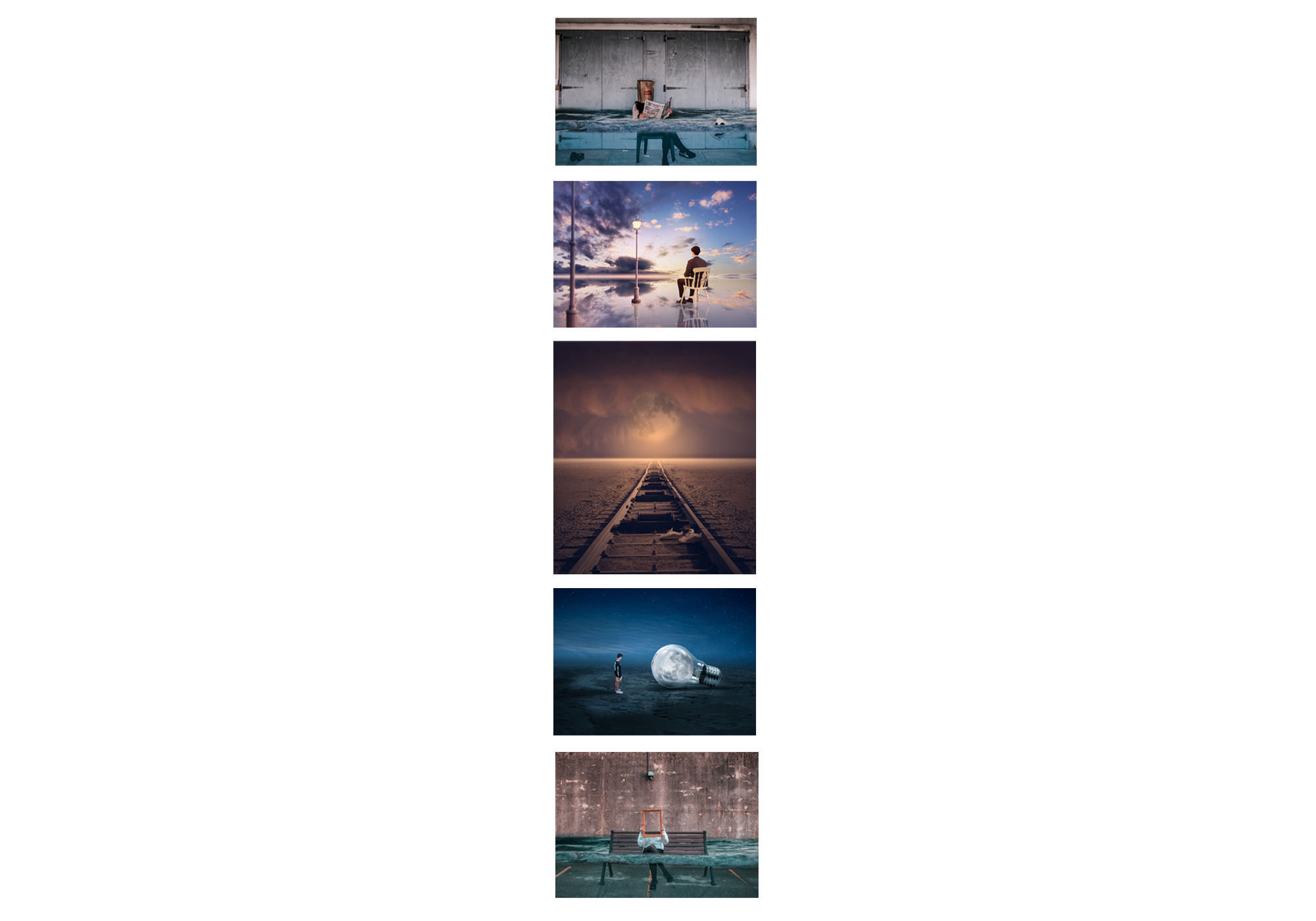
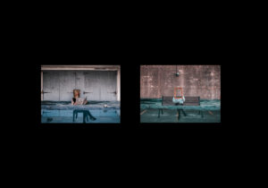
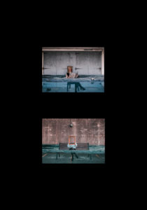
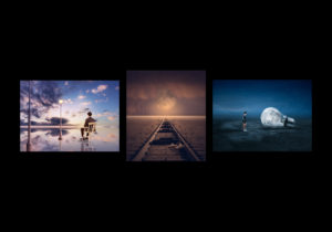
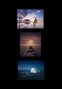
The images below show my experimentation with how my final idea will actually look. I mixed around the photos and backed them onto black and white to come to my final decision.

Piece 1

Final Decision For Piece 1

Piece 2


Final Decision For Piece 2


EVALUATION , CRITIQUE AND ANALYSIS AND FINAL RESPONSE

My final piece is combination of three images. I changed the overall layout from what I had thought to do originally, I stuck my images onto white foam board and then onto black cards with the two portraits on the outside and the landscape in the middle. I printed the images at size A4, but looking back I would have printed them at A3 so you could see a greater amount of detail, I have placed the images next and on the same level to as because I think that they are all of the same quality and standard and the focus should be split between all three of the images.  I think that the two portrait images have a closer link to each other, this is because they where taken during the same shoot.

Overall I feel that this project has been successful, but  as a whole i think it is not my best work. I think if I was going to go back and do the project again I would ensure to take more photo-shoots, at a range of different locations, focusing a on different colours, as the running theme through the final images is a rage of different blues. I would also ensure the take photos at different times during  the day to see how the light effects the overall look of the colours. But have had liked finding out about a range of different styles in photography and different photographers who look at colour, abstraction and minalsim. William Eggleston for his framing of everyday life photos,  Grant Hamilition for the inspiration for the use of colour, and Hiroshi Sugimoto for his abstraction work. Overall I feel that these images incorporate a wide ranges of styles, abstract,minimalism, and colour photography. My work is clearly taken elements by the three photographers, that i have studied by are not replicas of their work, I feel that i have touched upon each one of the stimulus  words, ‘Conventions’, as it it look at things we see everday in a differen way, breaking away from the norm.’ Secrets’ as unless you stop and  take you time to look for similar images like this you would past by them in everyday life. And finally ‘Codes’ is seen through the repetition of the colour theme through this project.