Category Archives: Uncategorized
Filters
9. Second Photoshoot
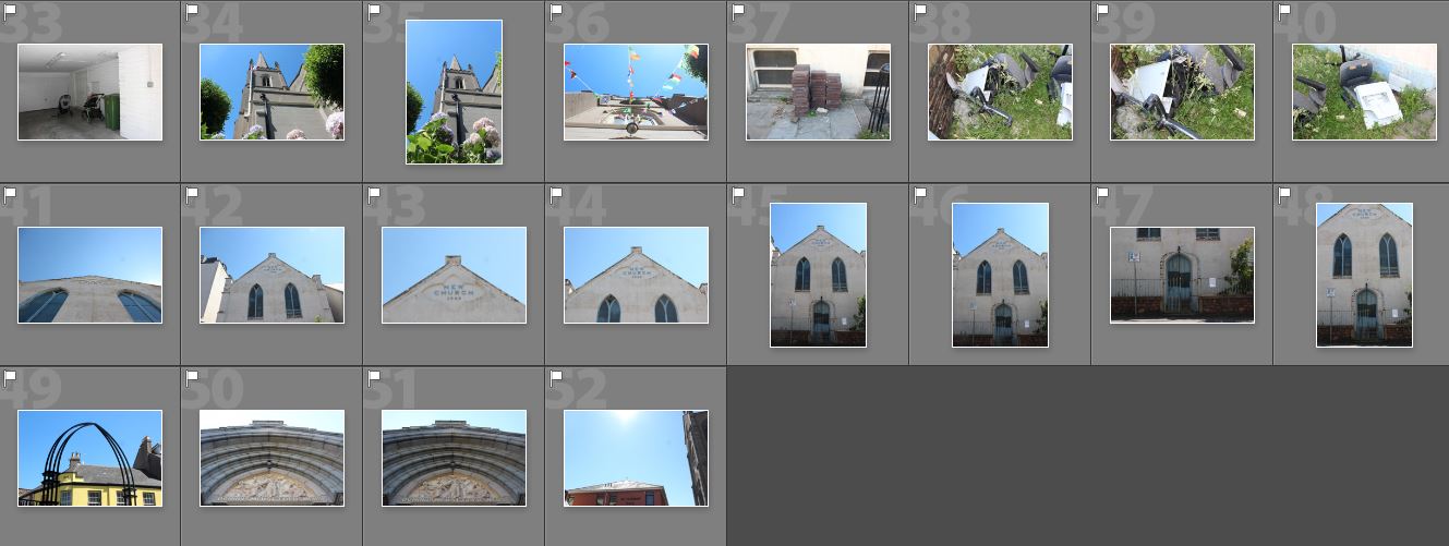
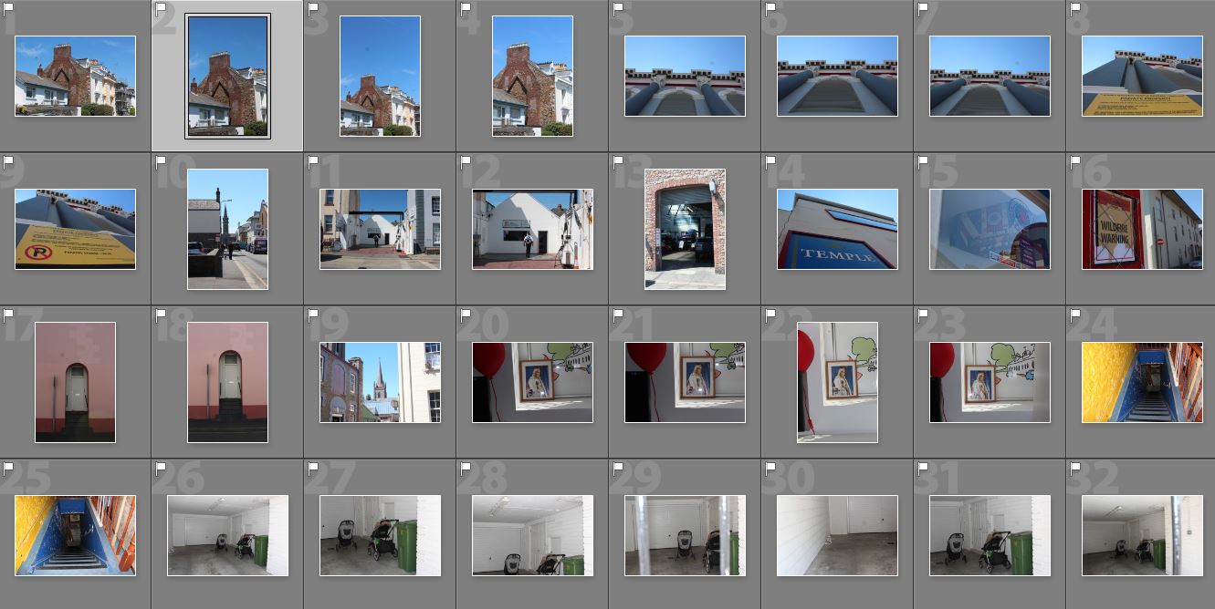
For my second photoshoot I wanted to re visit the same area and go to places I may have missed the first time around.
Experimental Editing
This blog post shows some of the experimental Photoshop edits which I have done on some of my favourite photographs from my first shoot…
This first image is a combination of a photograph from the Societe Jersaise photo-archive and some of the images from my first photoshoot. The idea behind this piece was to show how the aesthetics of the modern town are considerably less visually pleasing that those of the old urban landscape, and when imposed upon the old photograph take away the charm from the photo.

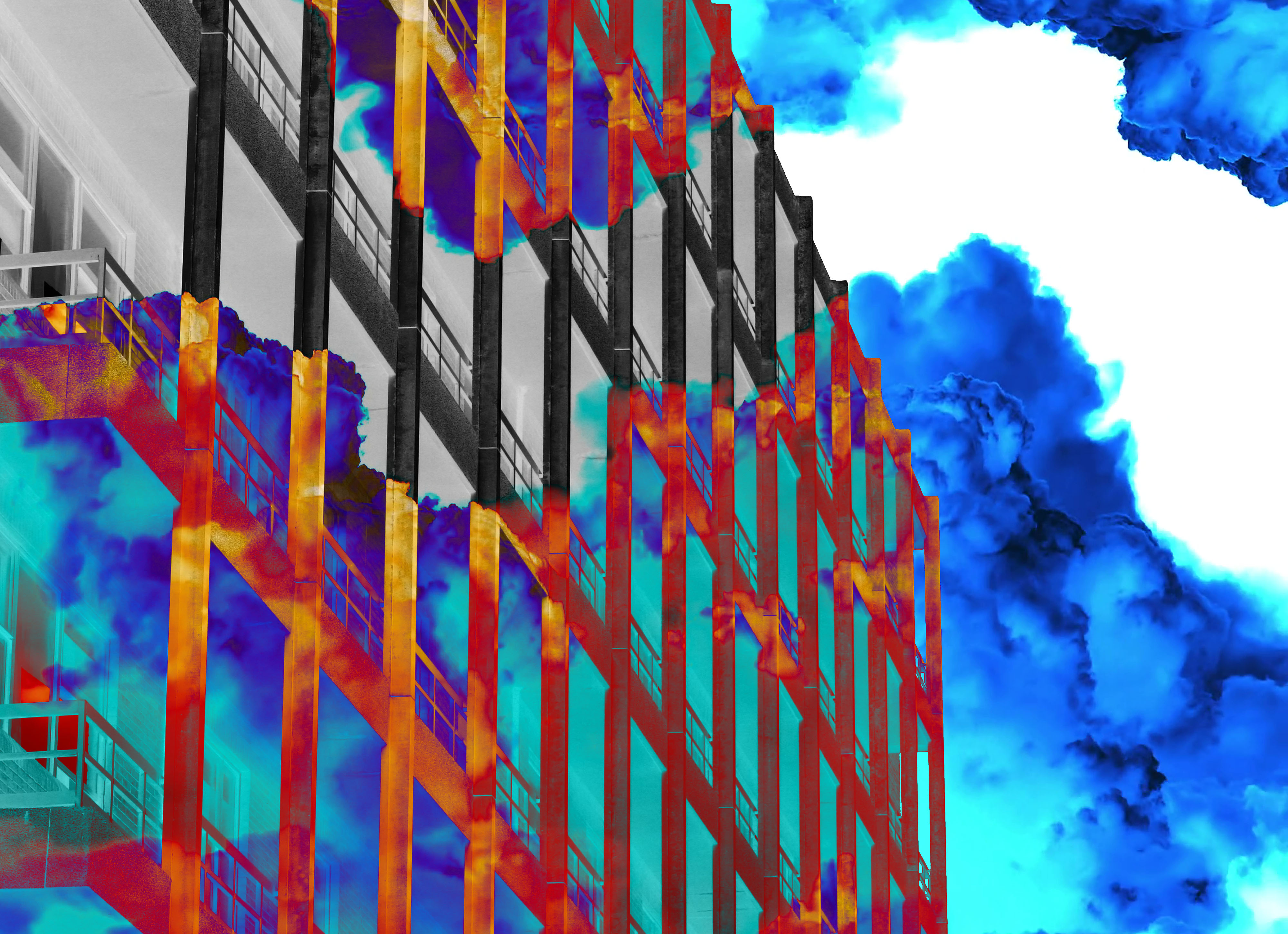
The idea for the second edit, which I produced on top of an image of the current hospital building, was looking at the indecisiveness involving the situation with the construction of the new hospital. The coloured mist represents the covering up of the important details in the situation and behind that the image/situation is in black and white, showing that once the details are exposed it can be dealt with in a much more basic manner.
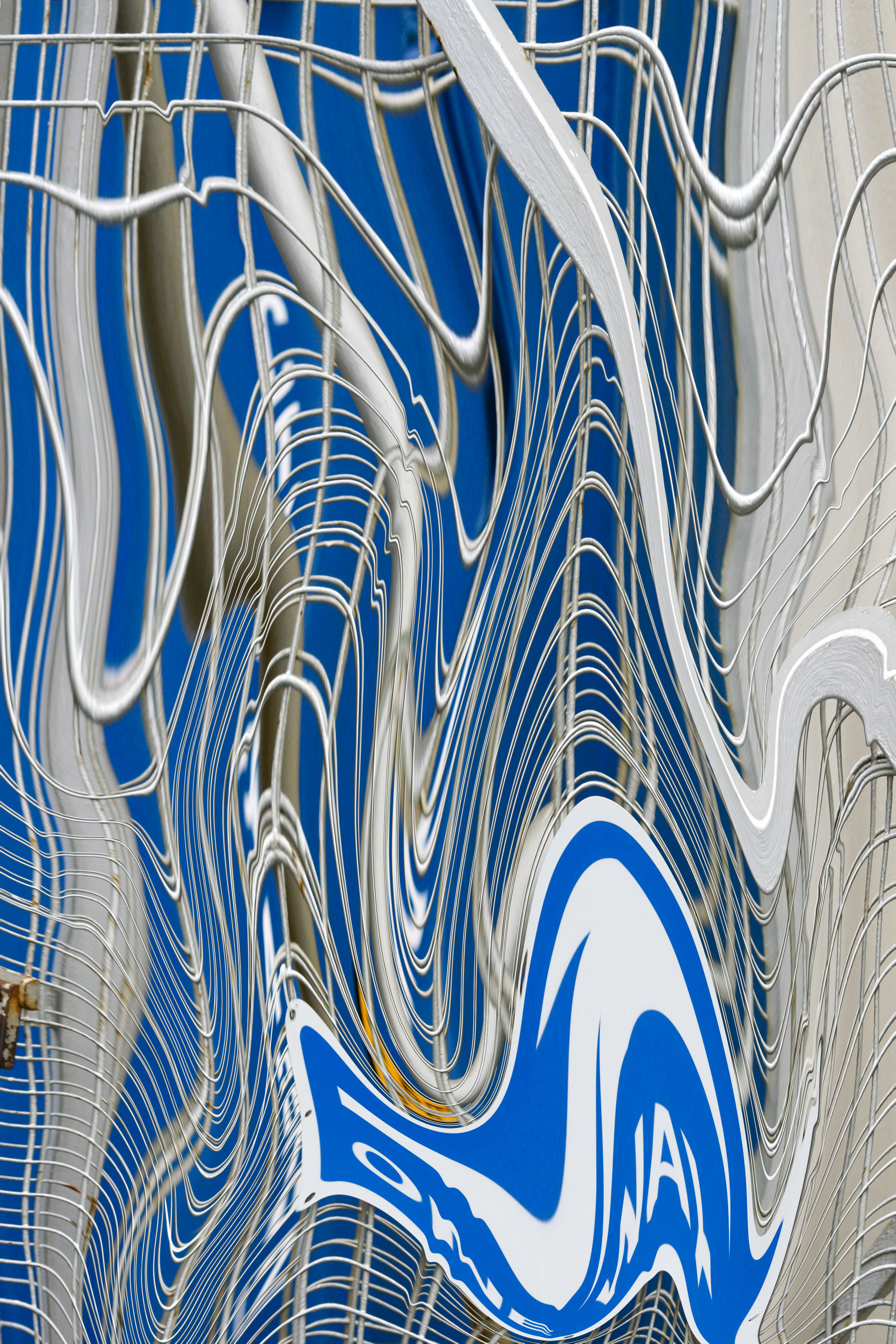
The next two following edits were experiments using the liquefy tool in Photoshop, I thought that the textures and text elements of these photos would work really well with this effect, as once the photo is liquefied these parts of the images will become distorted and stretched.

Single Page design experiment


Page design experiments
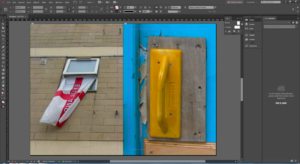
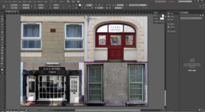
Final Design Layout – NEWSPAPER
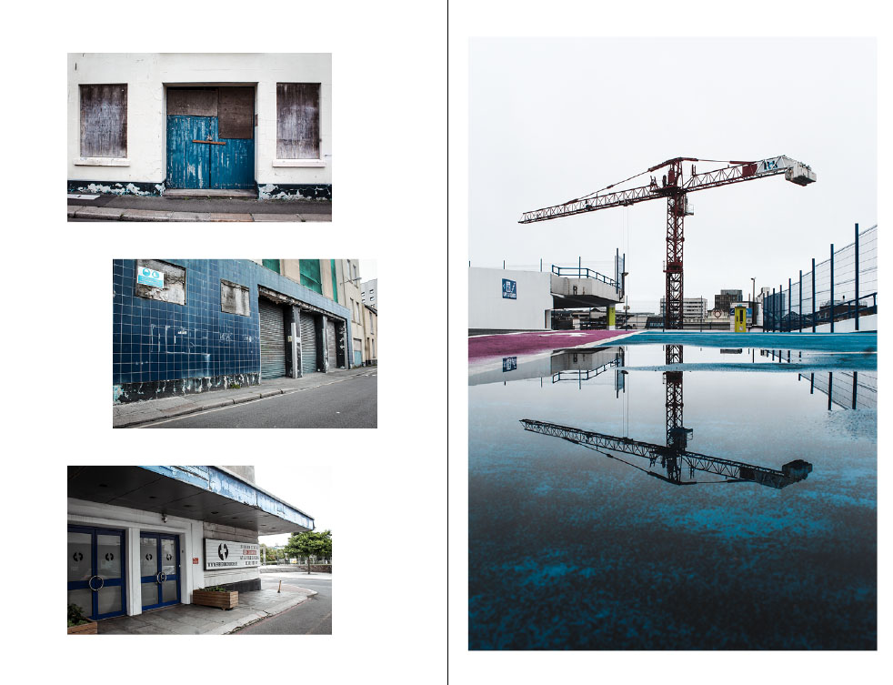
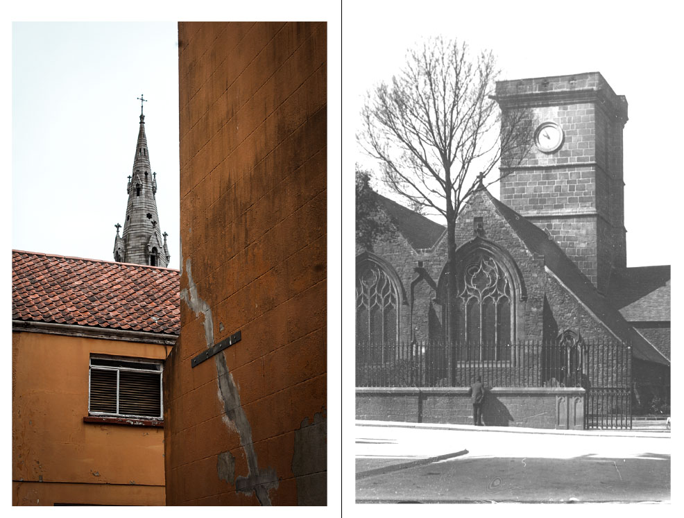
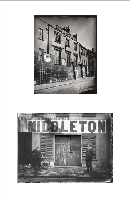
For my final design layout I have primarily focused on the dereliction side of St Helier which is often walked past by members of public without notice. I have incorporated some archival imagery which i believe has great impact through the messages and story they convey. I have merged some of my photography into the archival imagery which creates a strong message that our capital is in decline through the architecture that has been left to rot. The archive images are old images yet the buildings look modern and clean however the images that i have incorporated to the archive images are new however look old and abandoned. I think the composition of each page works well to aesthetically please the audience and i have used similar coloring for each page.
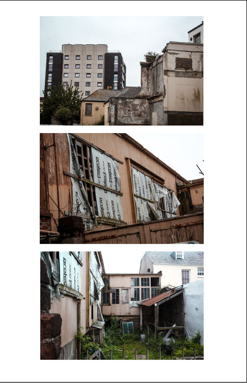
Experimenting with Montage
Within these edits I have merged some of my photography into the archival imagery. This creates a strong message that our capital is in decline through the architecture that has been left to become abandoned. The archive images are old images yet the buildings look modern and clean however the images that i have incorporated are new however look old and abandoned. This gives a strong contrast between how St Helier used to be compared to how it has become in the future/present.




Narrative and Sequence of Photos
Narrative structure is about story and plot: the content of a story and the form used to tell the story. Narrative structures within photography contain a set of photographs which tell a story or explore a theme through either similar photographs or ones that lead onto each other. Below are some experiments of the narrative structures that I have produced with my own photographs.

This narrative structure looks at the dereliction and destruction that is present within St Helier. My purpose for this sequence was to bring awareness to the amount of wasted space that there is within St Helier and portray it as a run down town.

This narrative structure follows on from the previous one and could work well along side it. It looks at the development present within St Helier and emphasizes the change that is occurring within St Helier. Viewers may see this as a positive thing as we are modernizing our town however others would see this as a negative thing as it could lead to the removal of historically important buildings.

Again, this narrative could follow from the previous one. It conveys the contemporary modernization which is present within St Helier and shows what the construction workers have accomplished.
Black And White Editing Experimentation
Black & White Experimentation
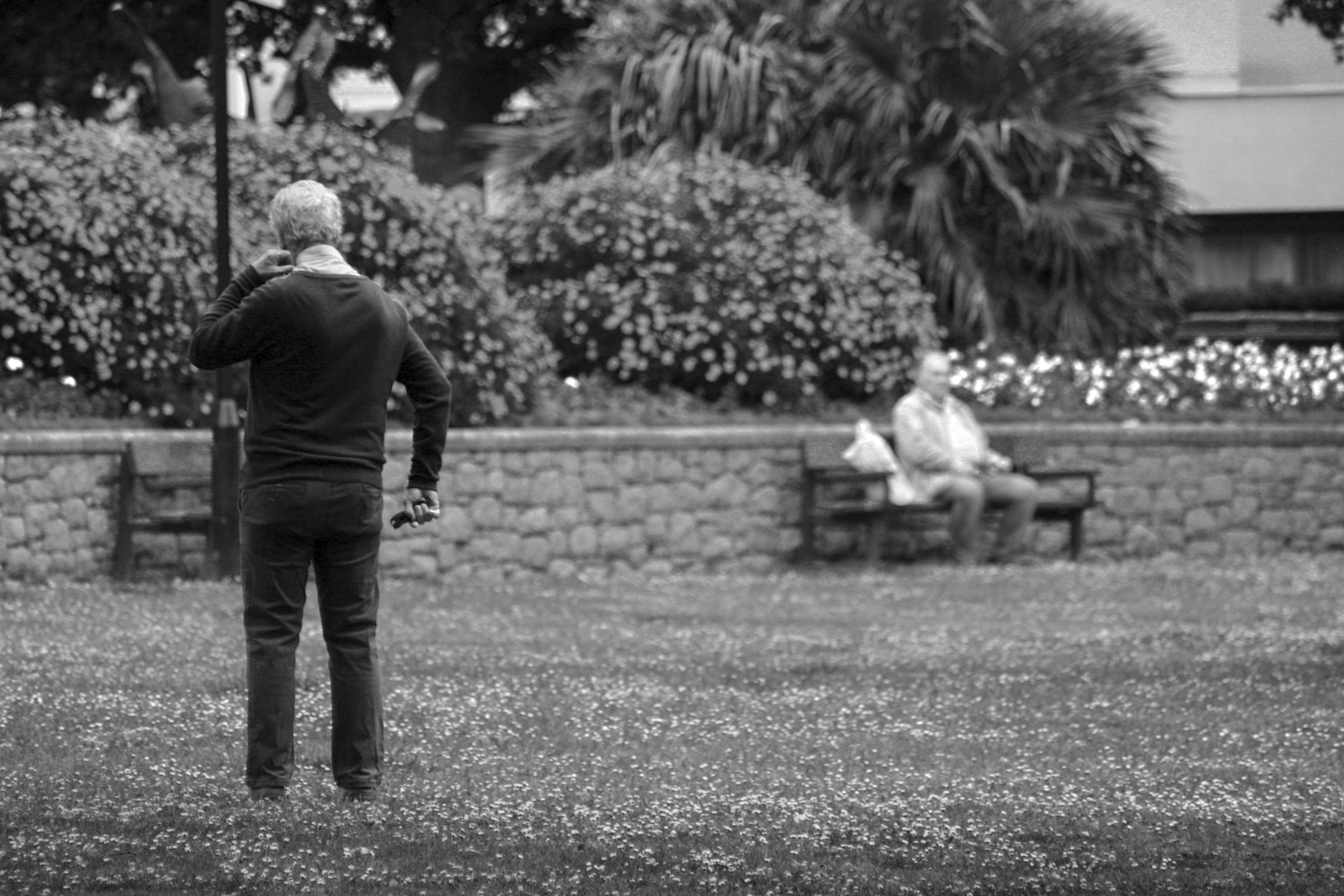
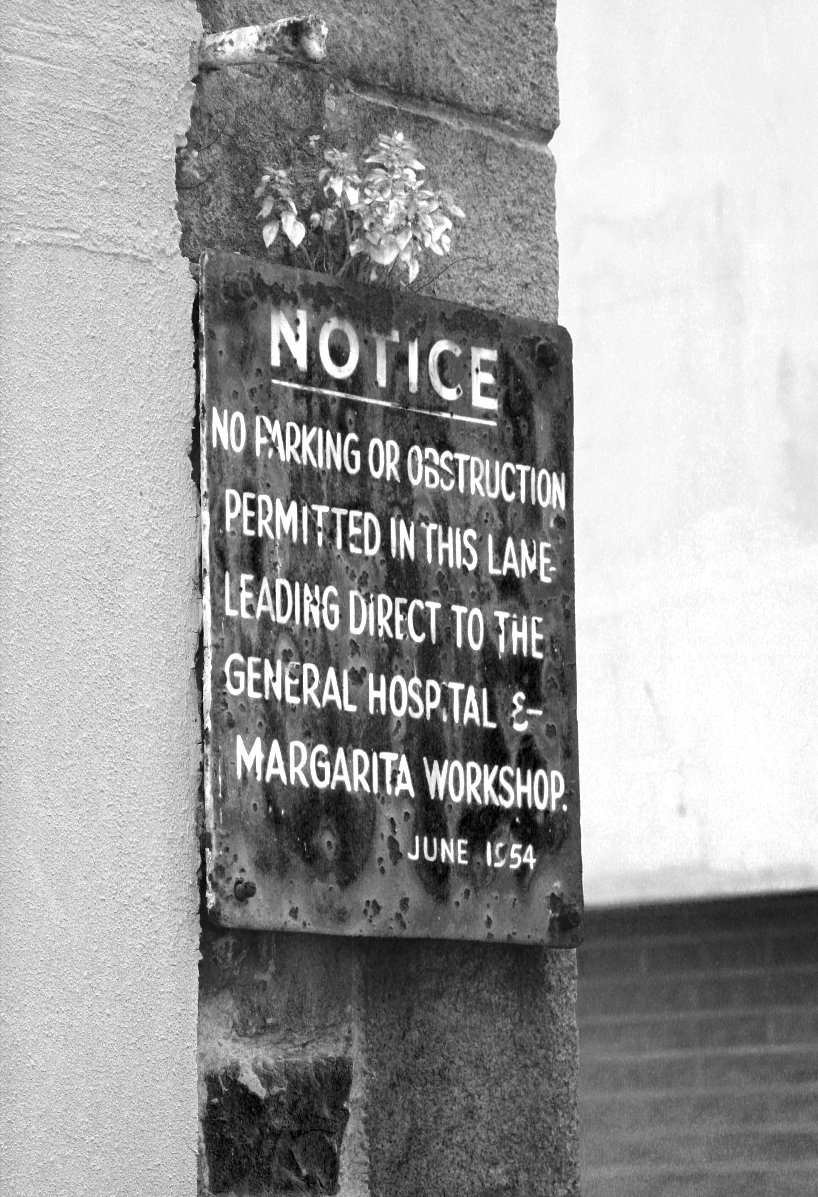
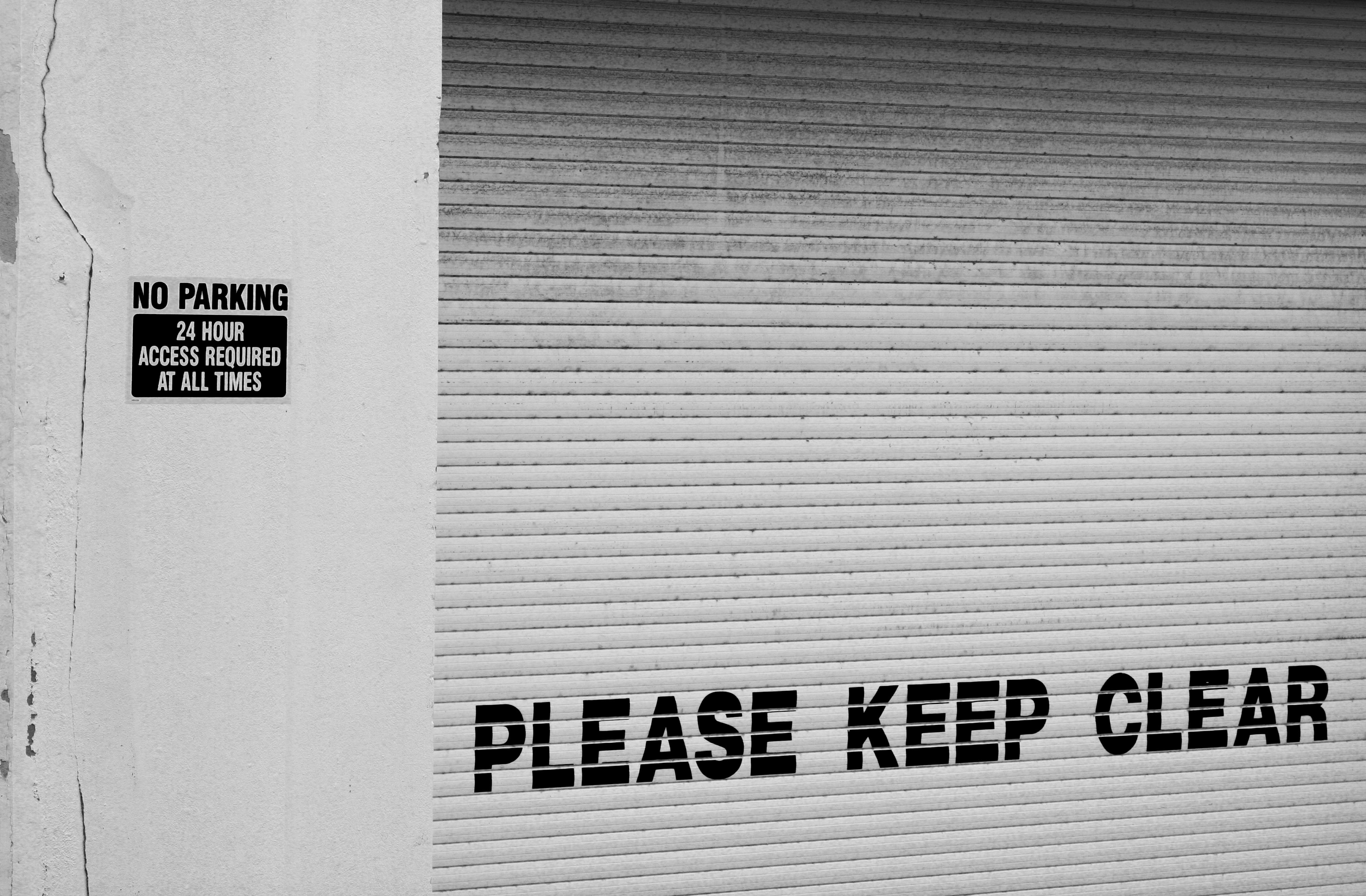
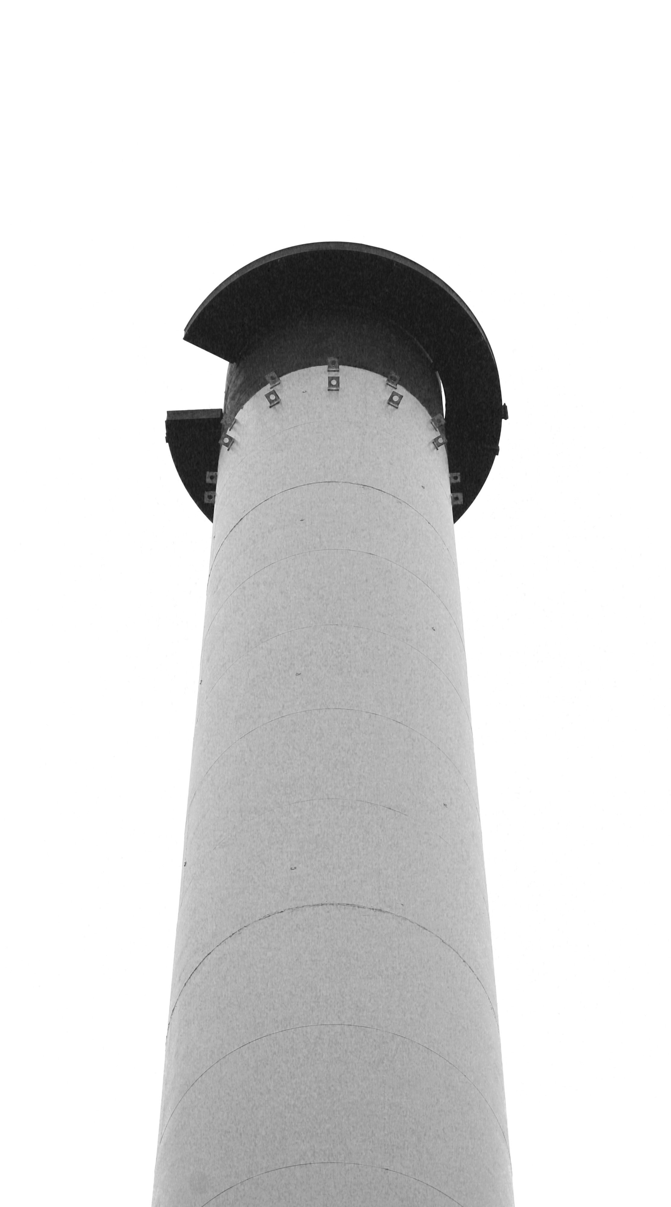
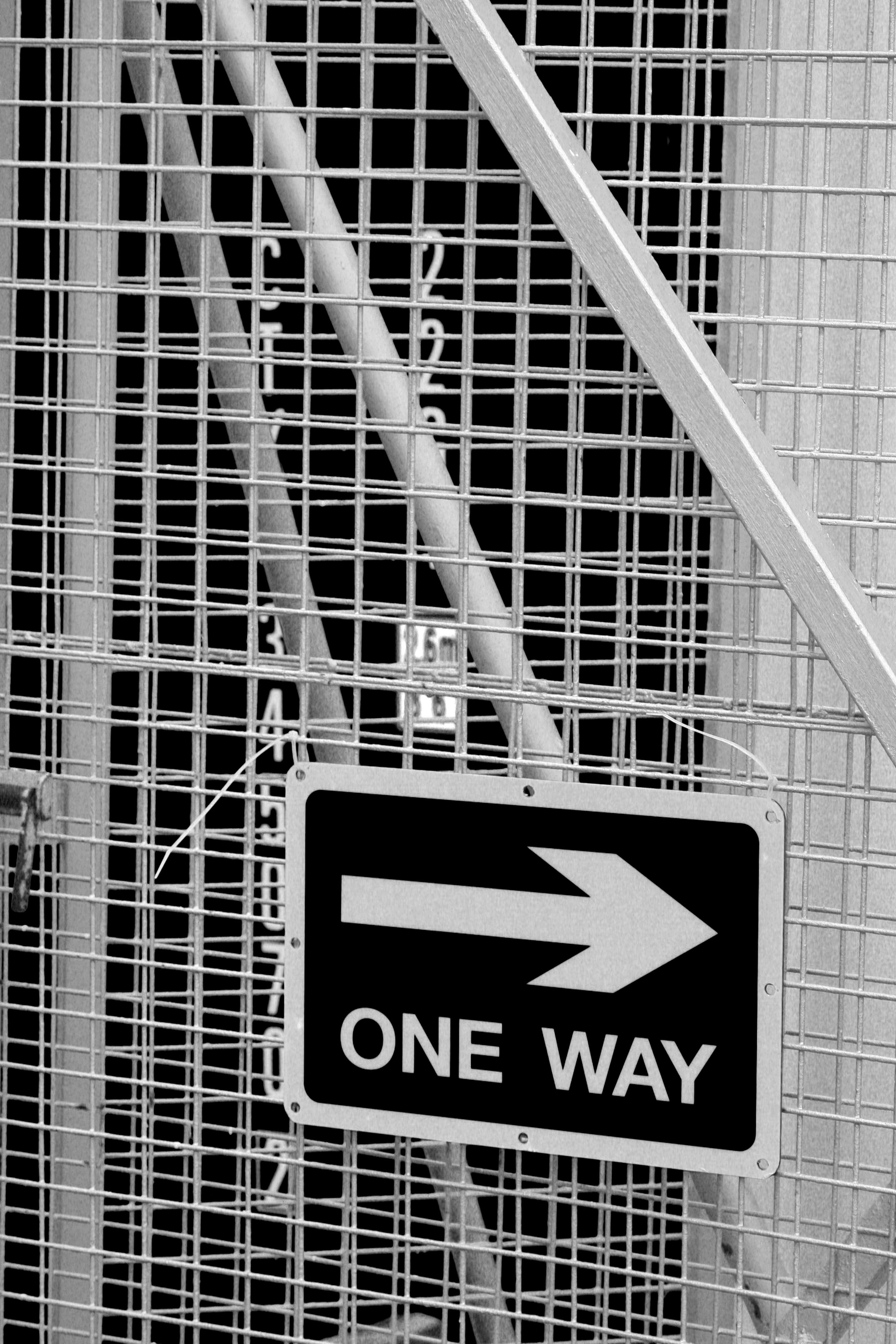
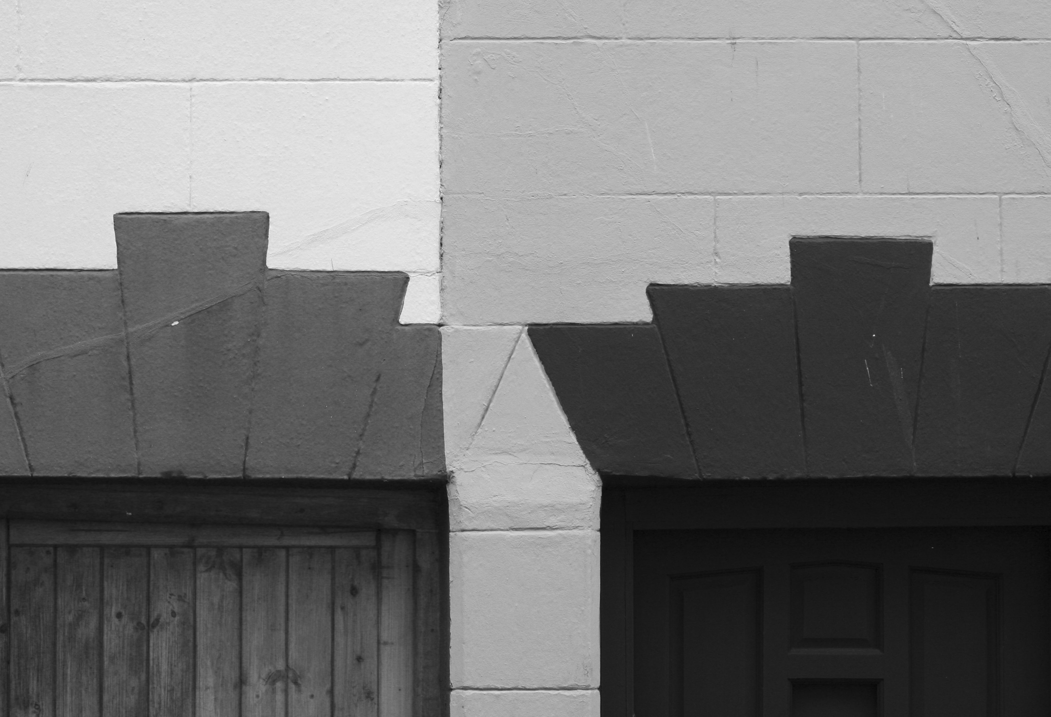
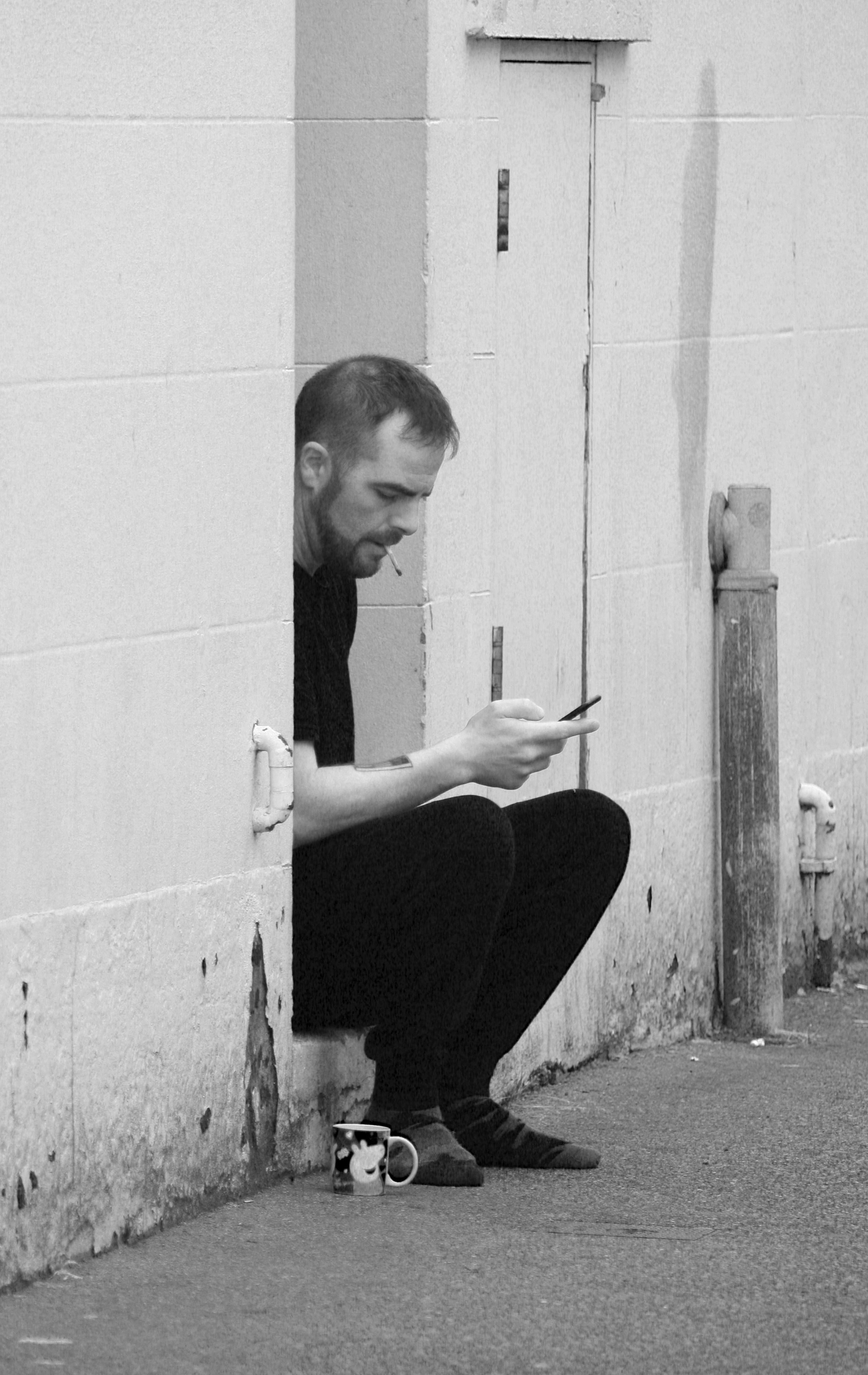
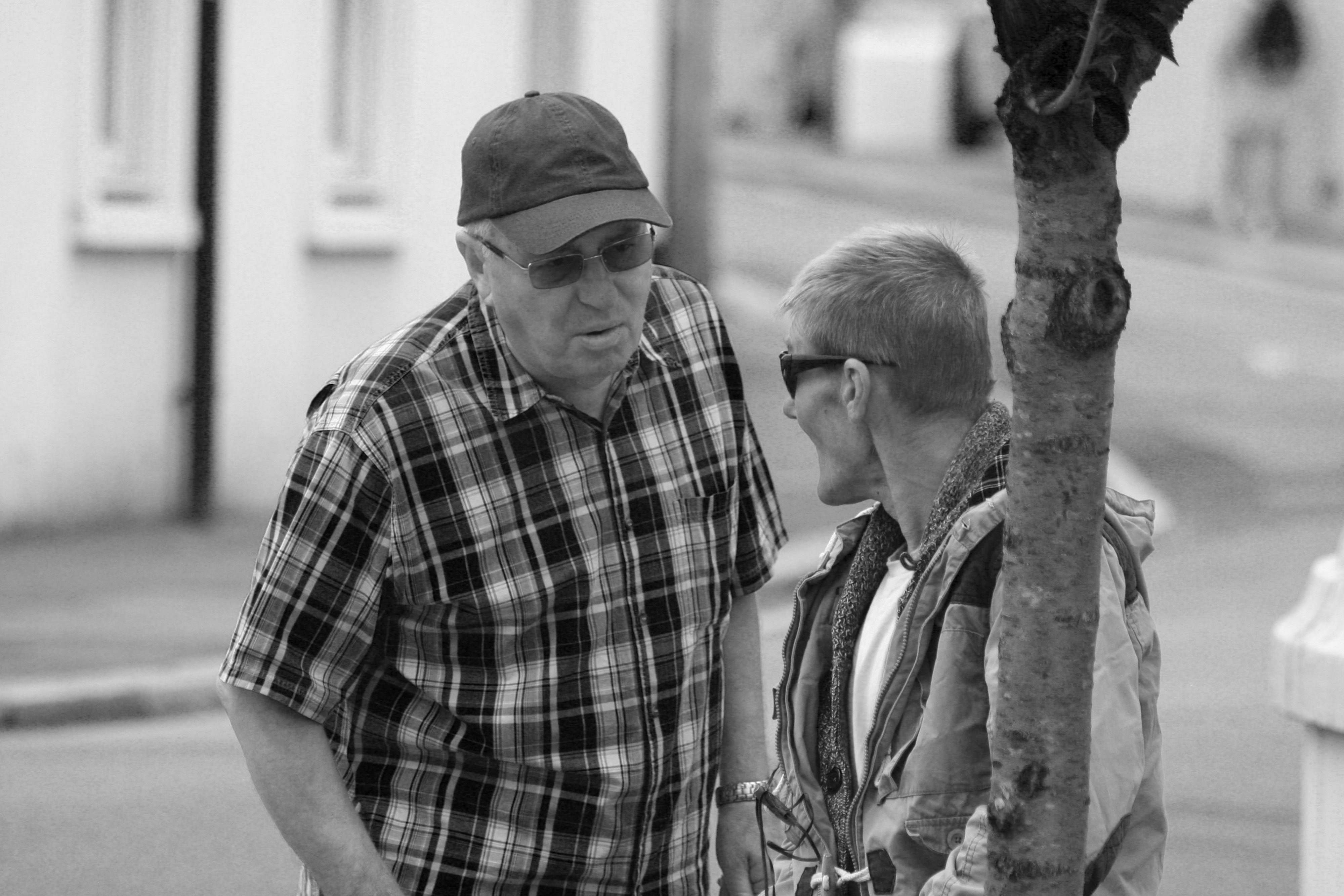
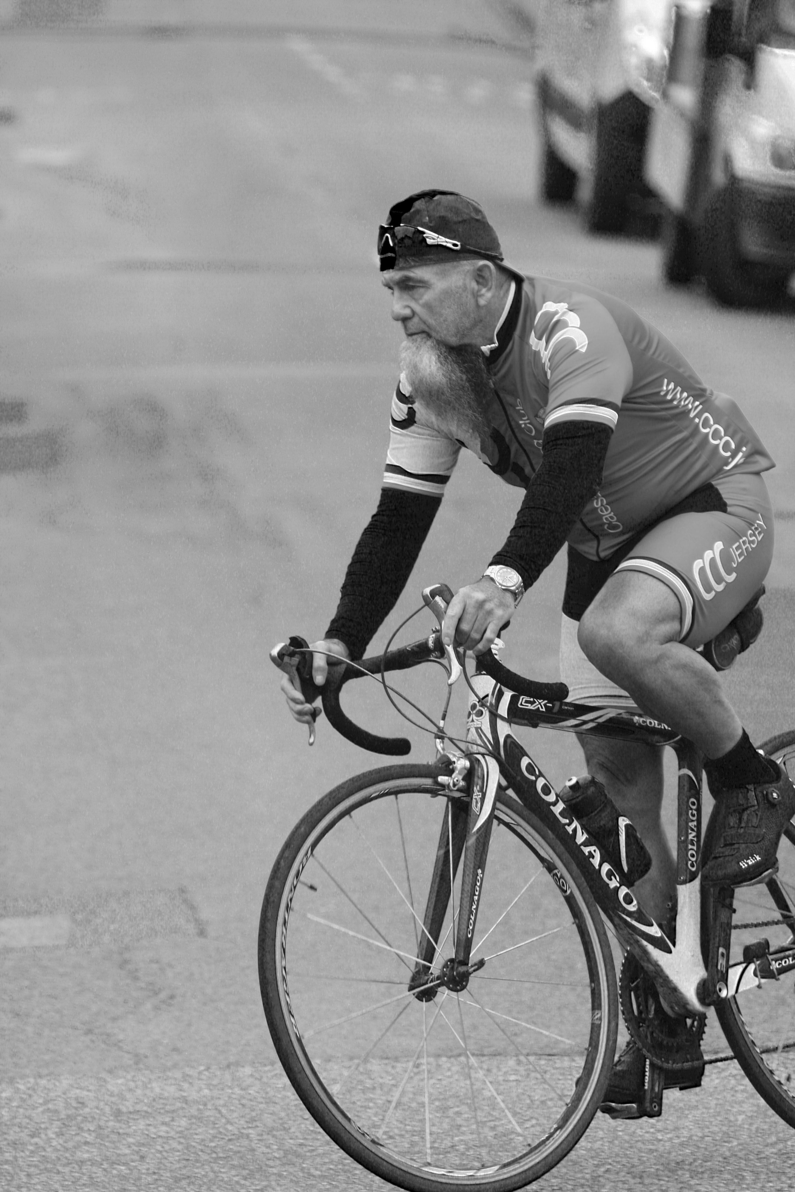
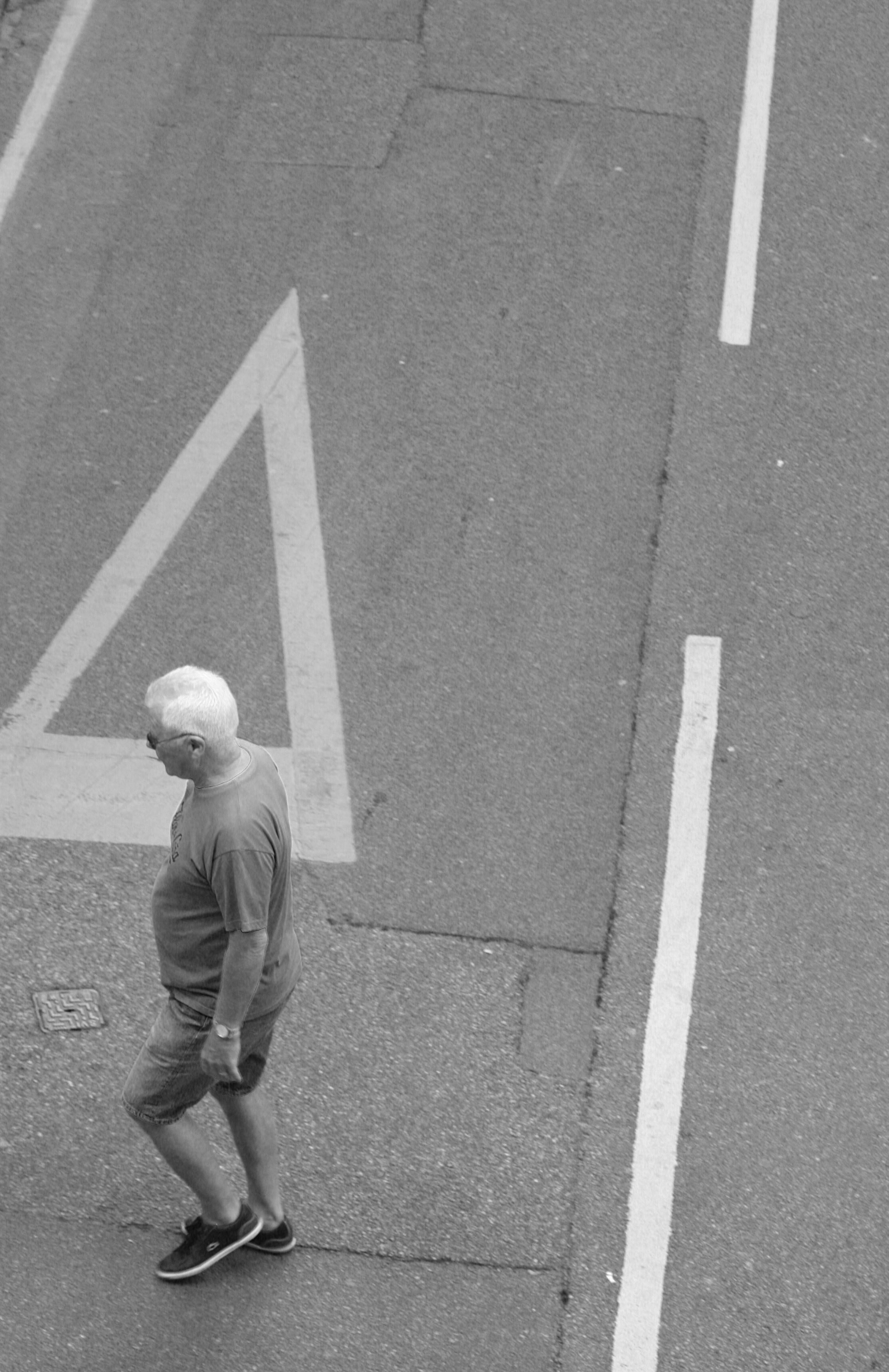
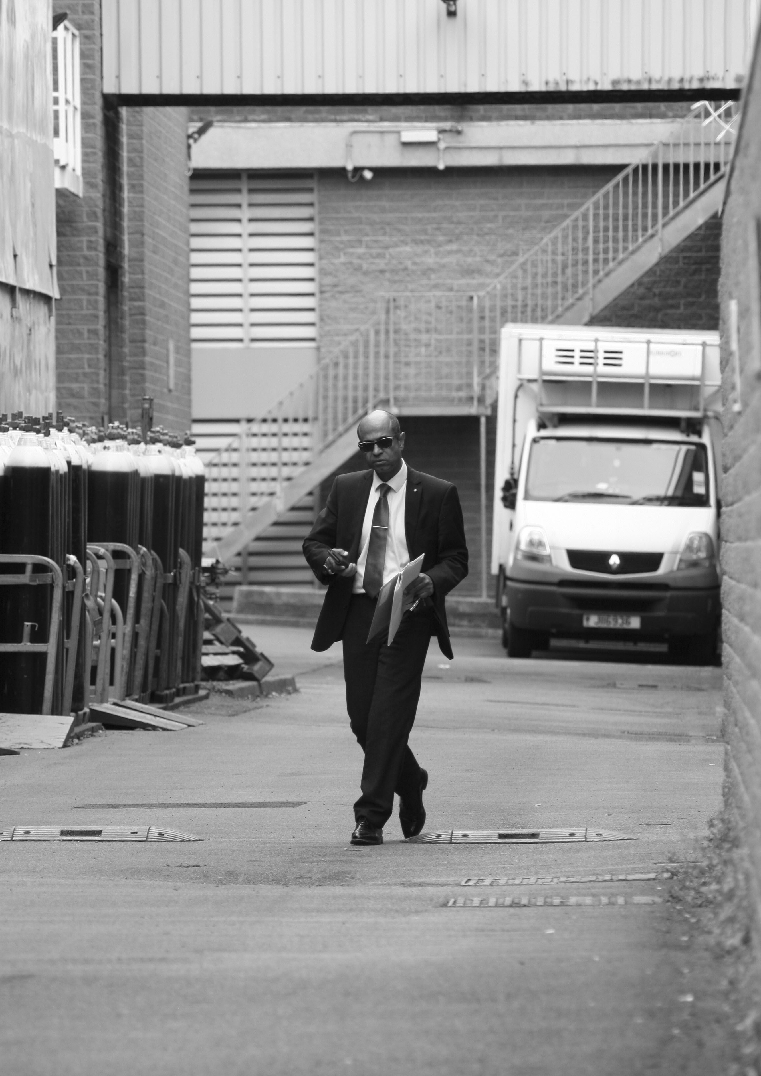
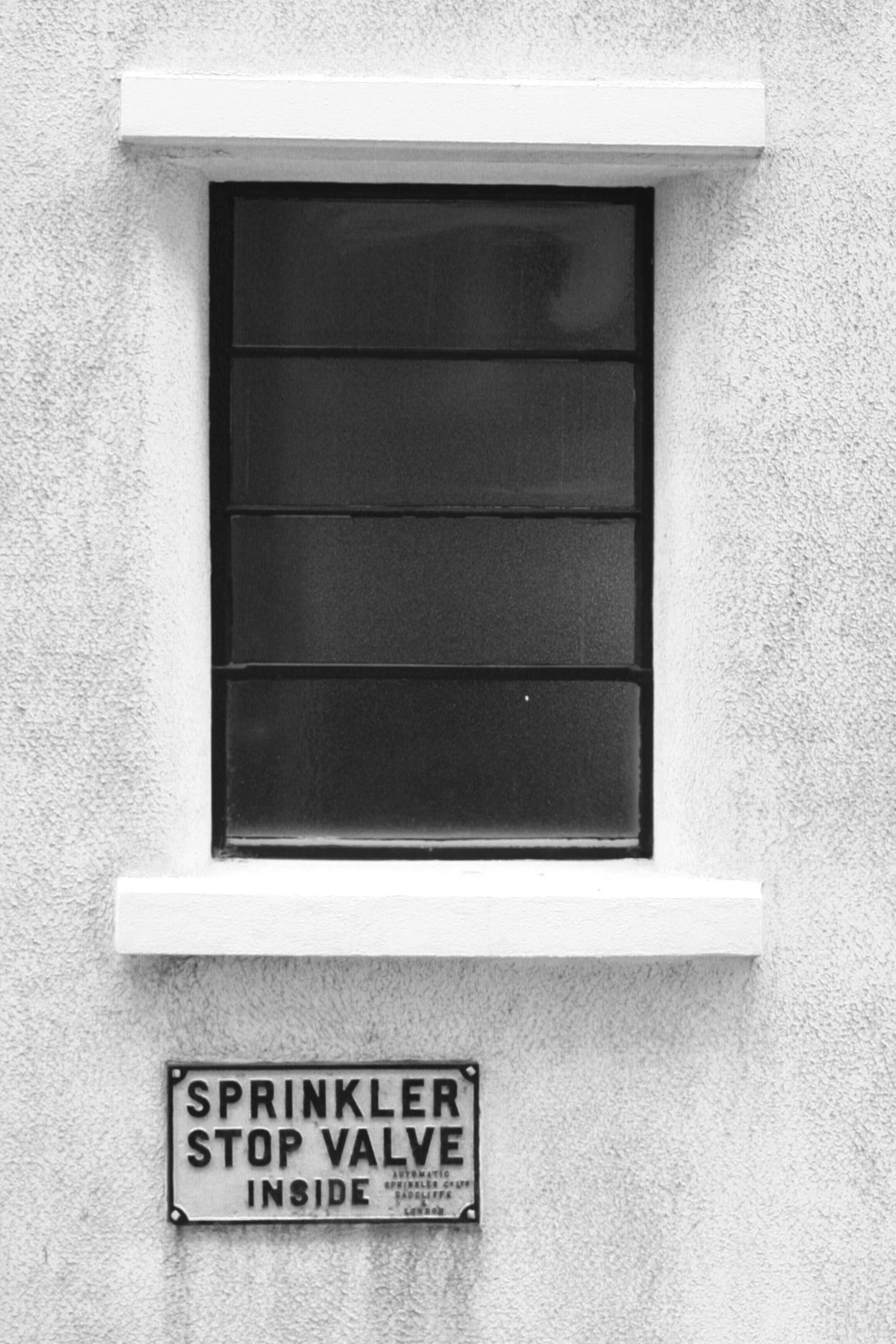
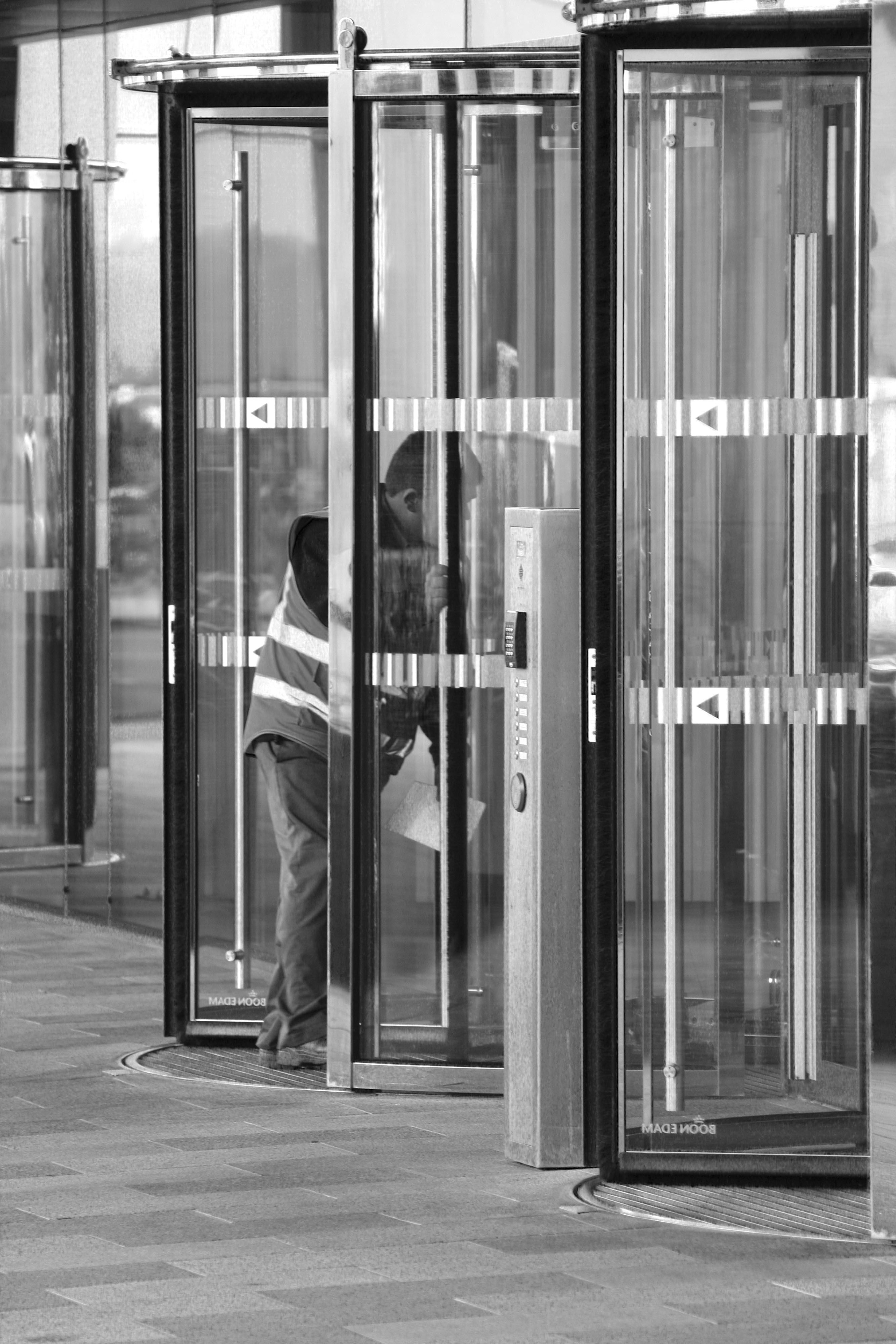
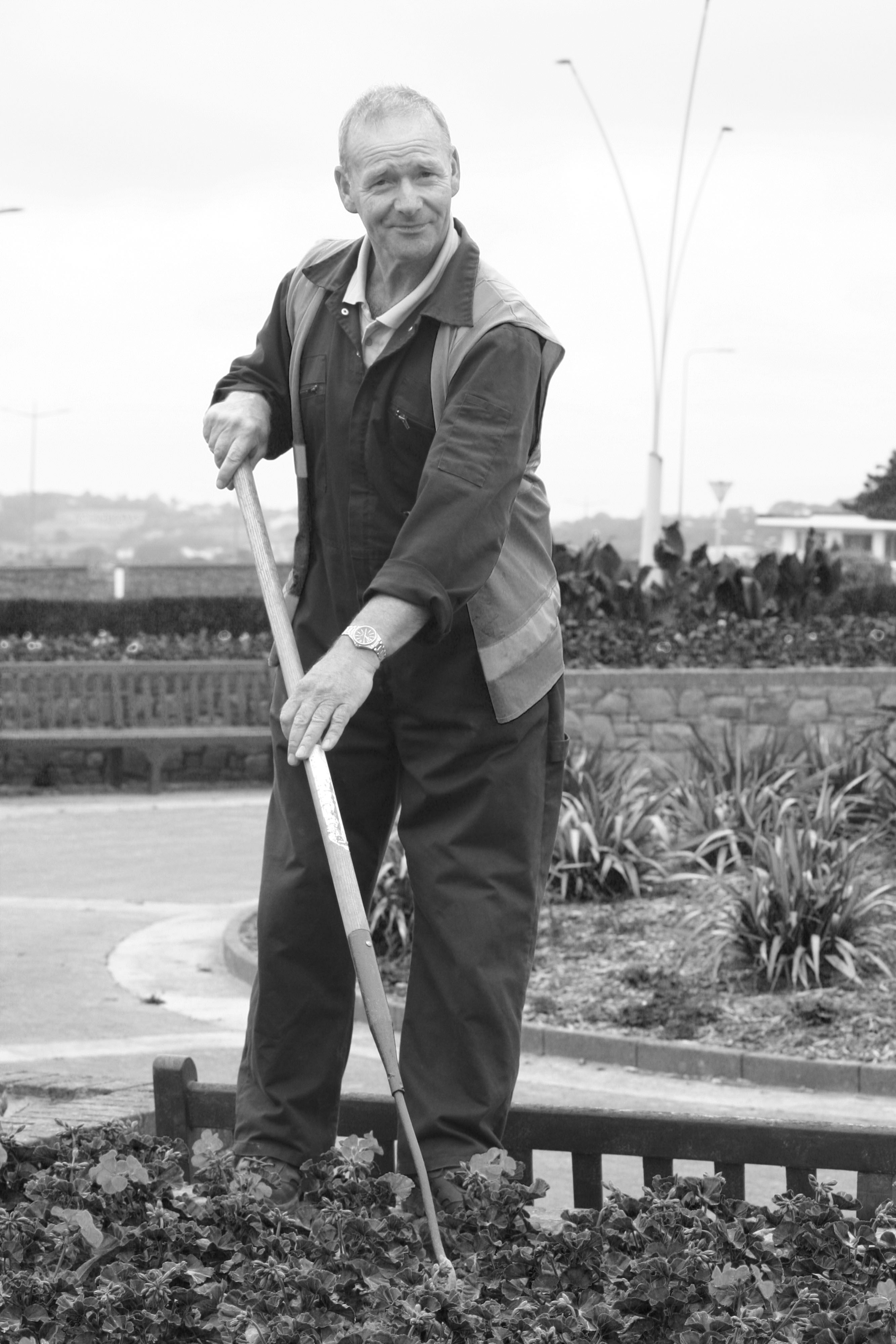
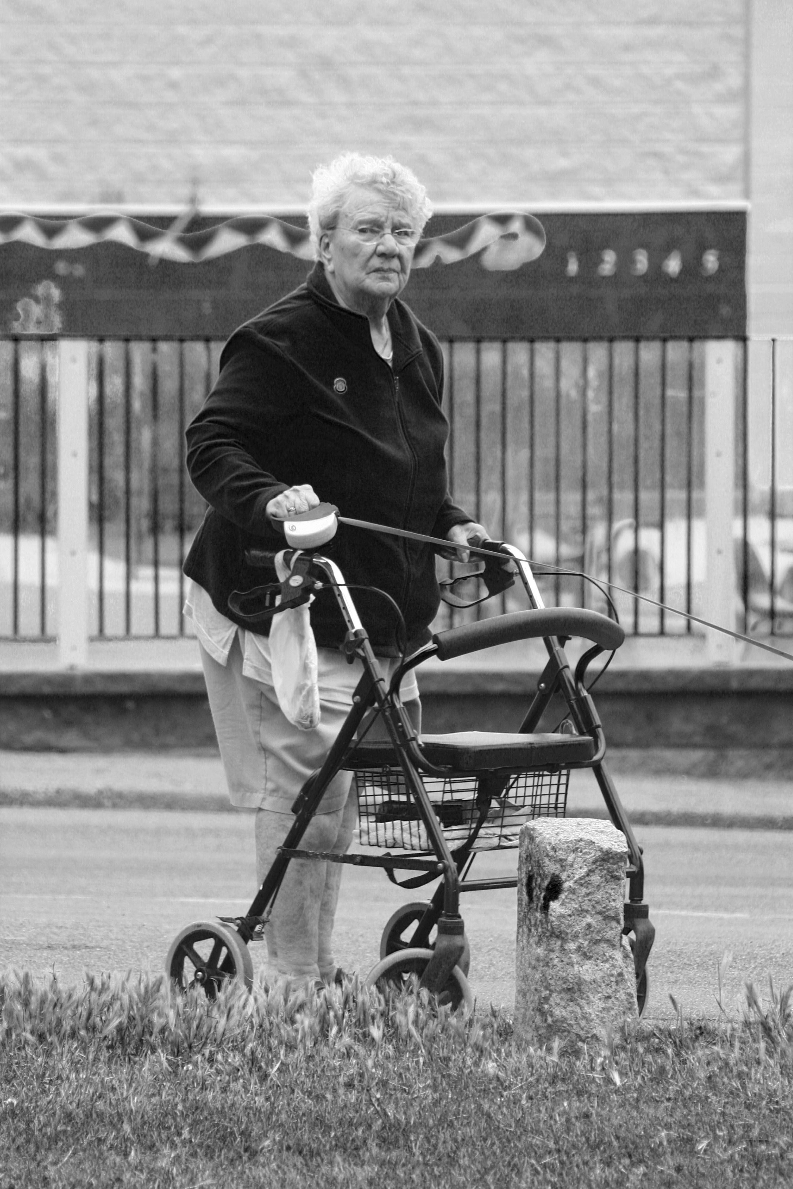
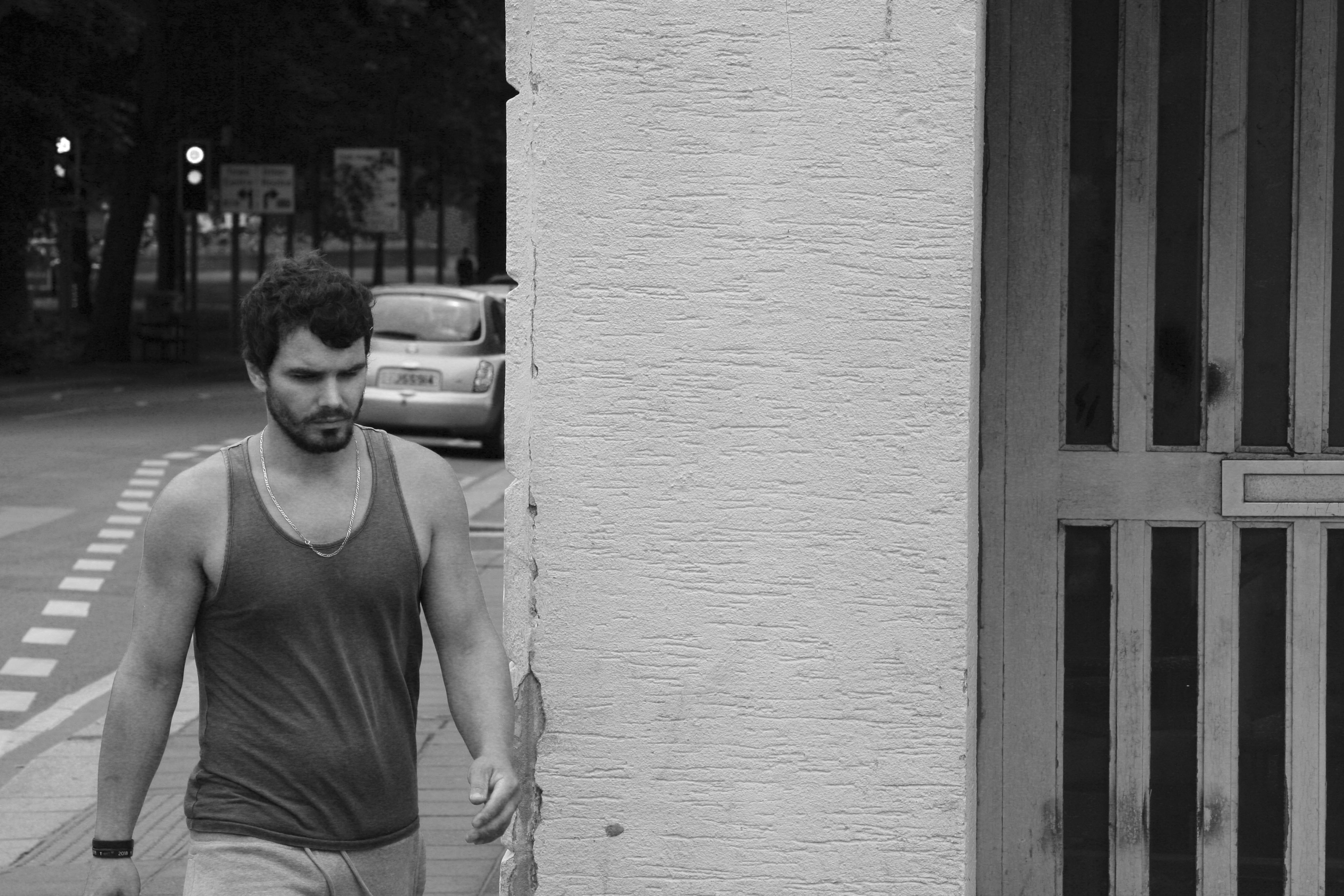
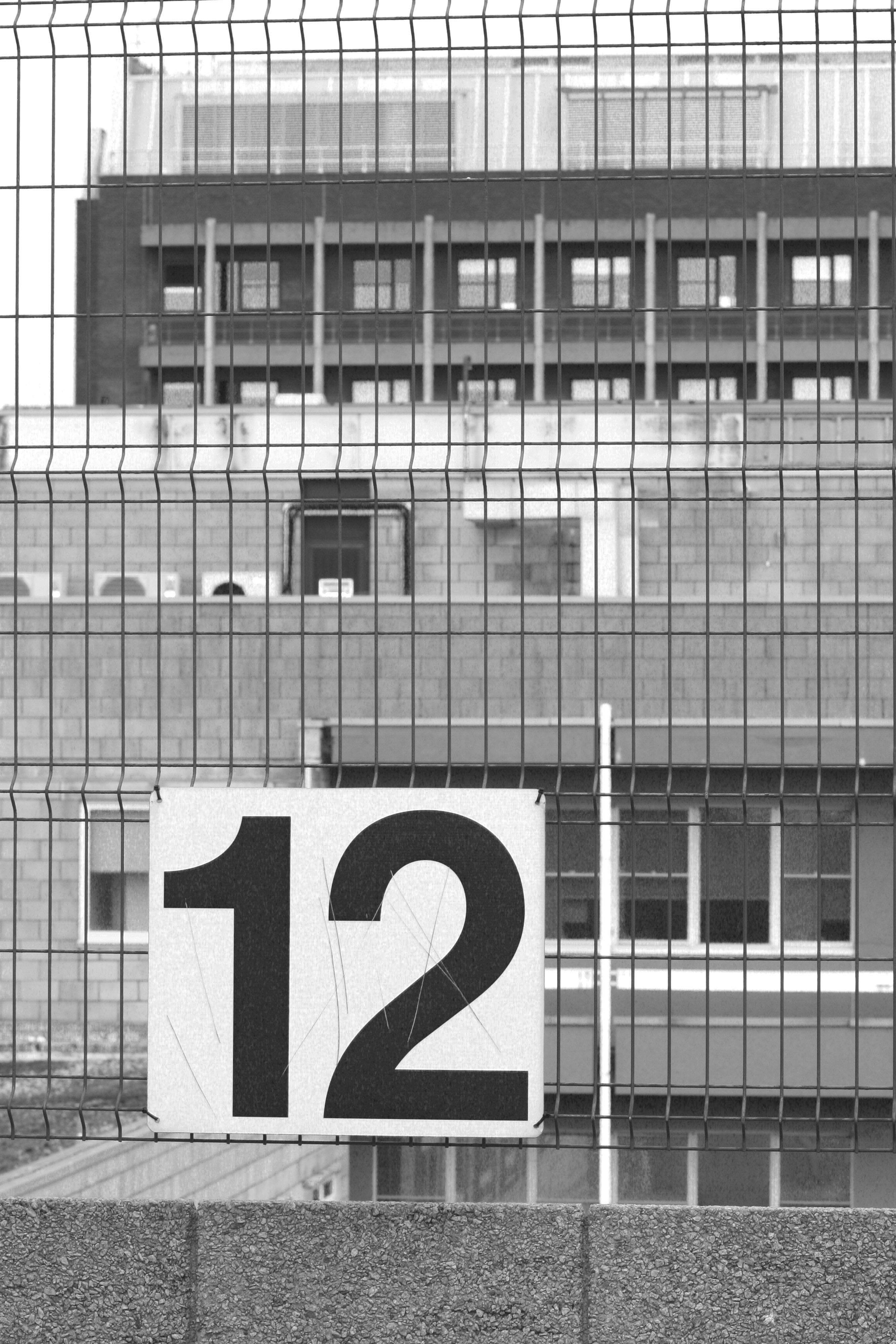
This post displays some of my favorite images from my first and second shoots that I have manipulated in black and white on Lightroom. I believe that the absence of colour in these edited images is successful as it gets rid of any visual distractions that may prevent the viewer from looking at the whole image and missing important elements of the photographs which add to their meaning and context.
From these outcomes I personally believe that images 1,3,5,11,16 and 17 are the most successful of these edits as I believe in monochrome the images are an improvement upon their originals.
Basic Cropping Task
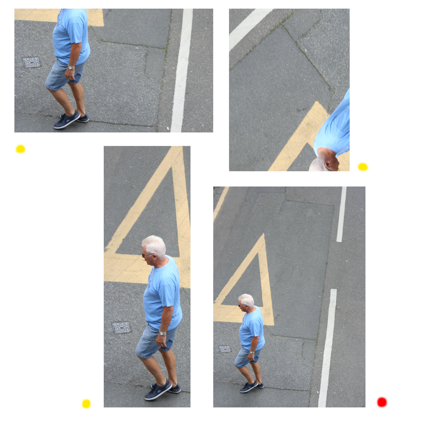
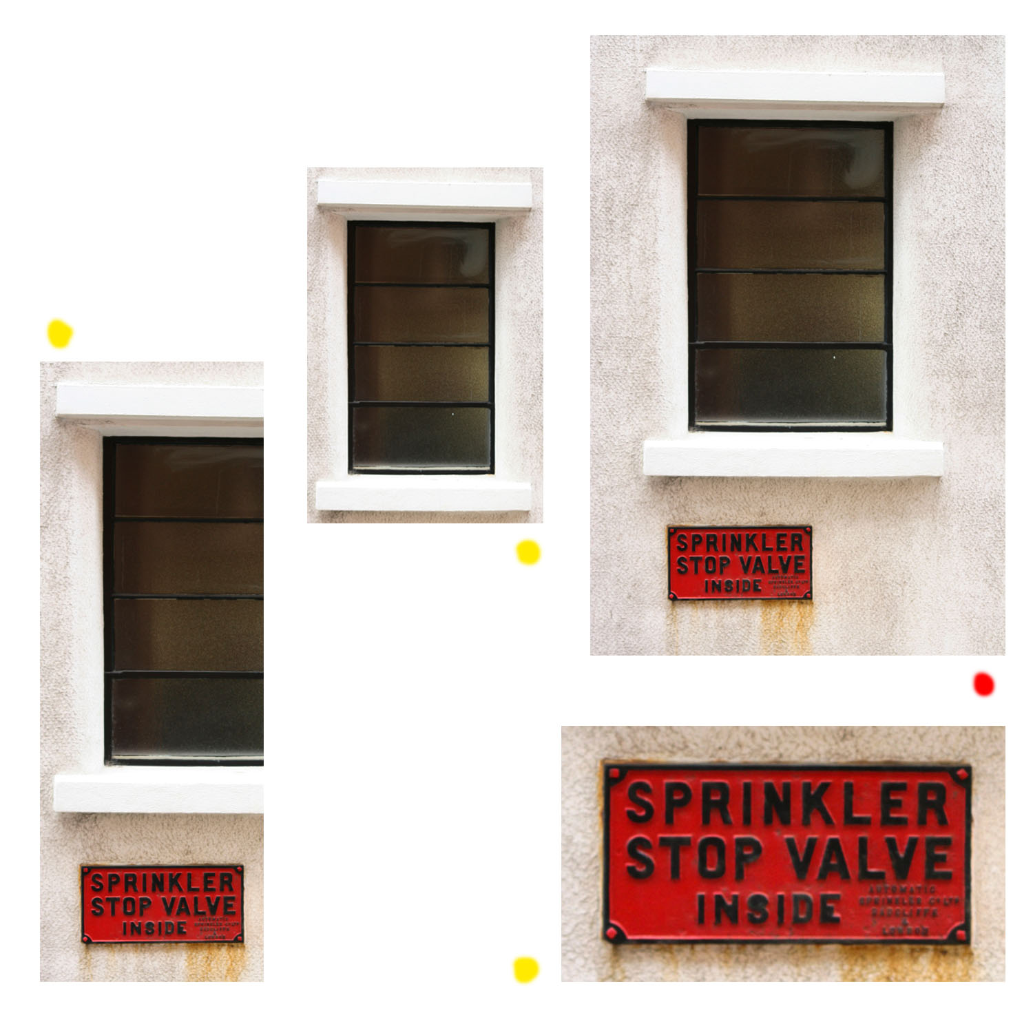
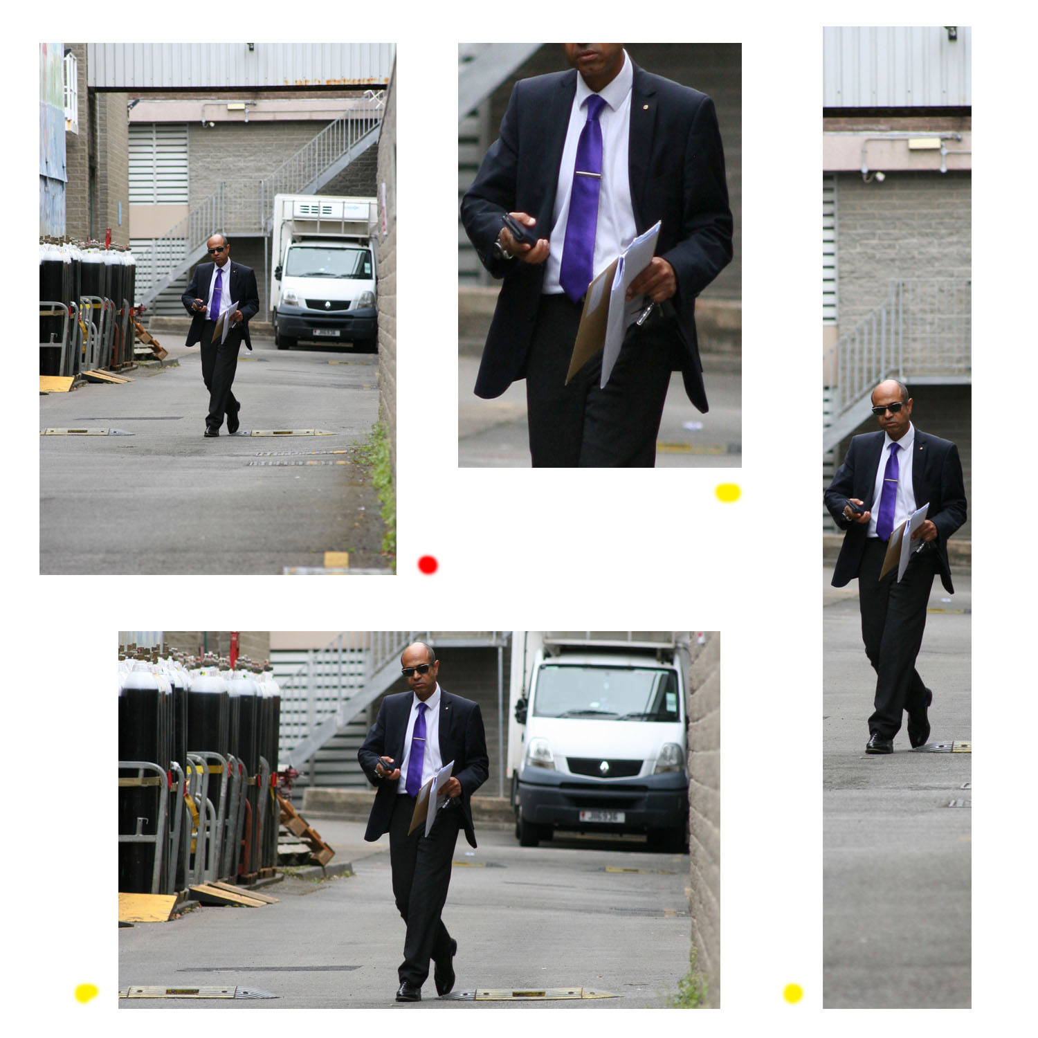
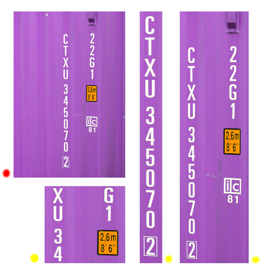
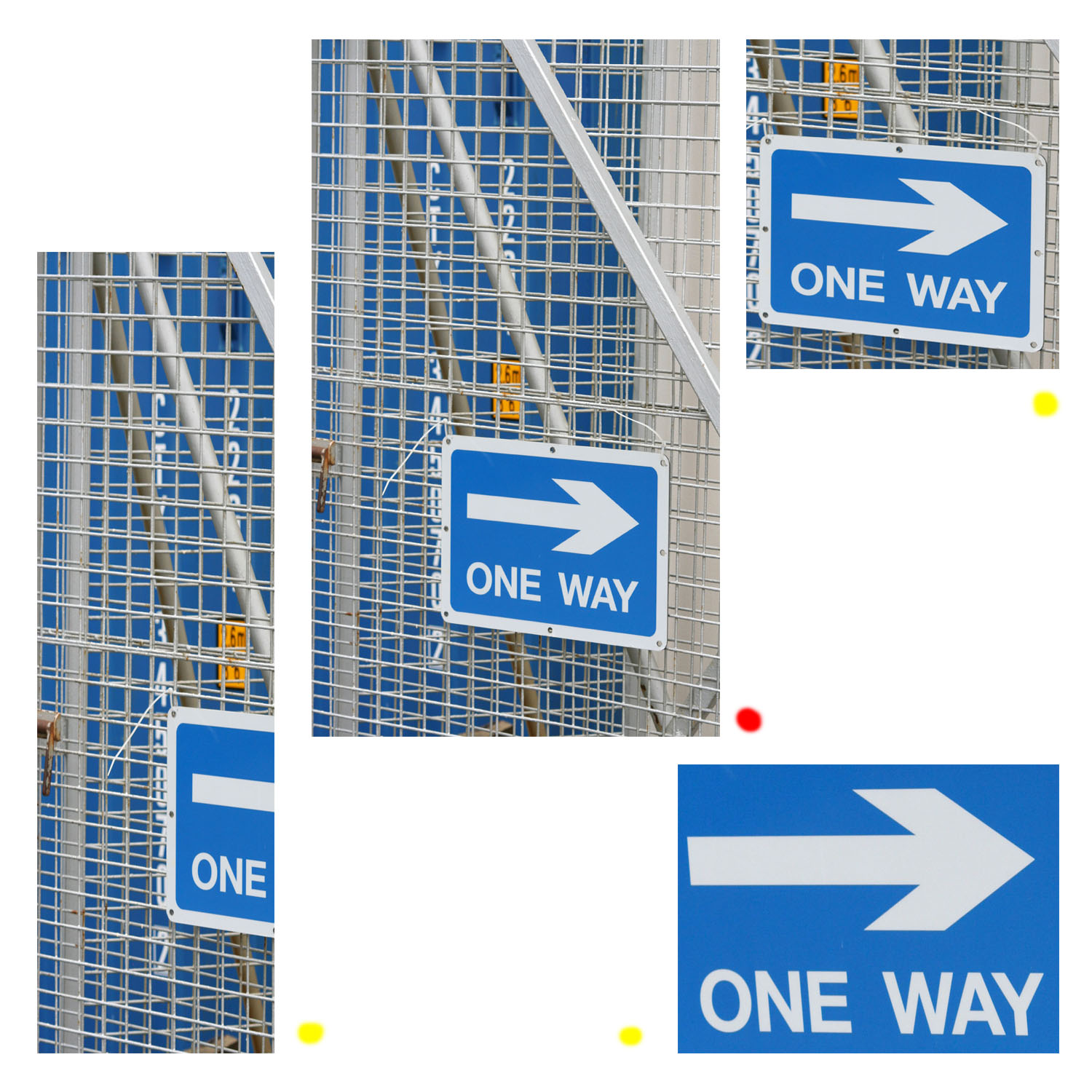
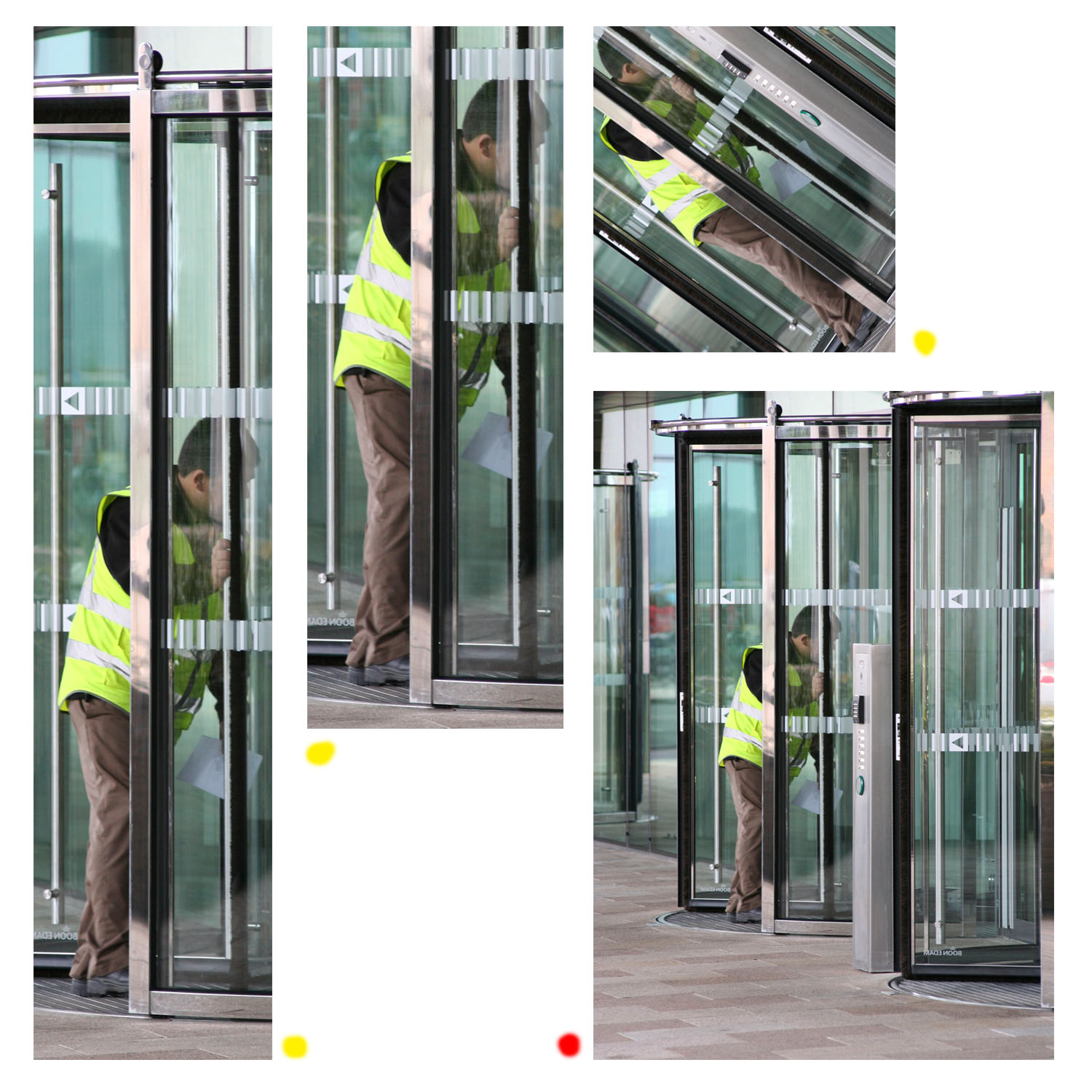
Red Marker = Original Photos Yellow Marker = Crops
