Category Archives: Uncategorized

Filters

Author:
Category:

Draft Zine Layout

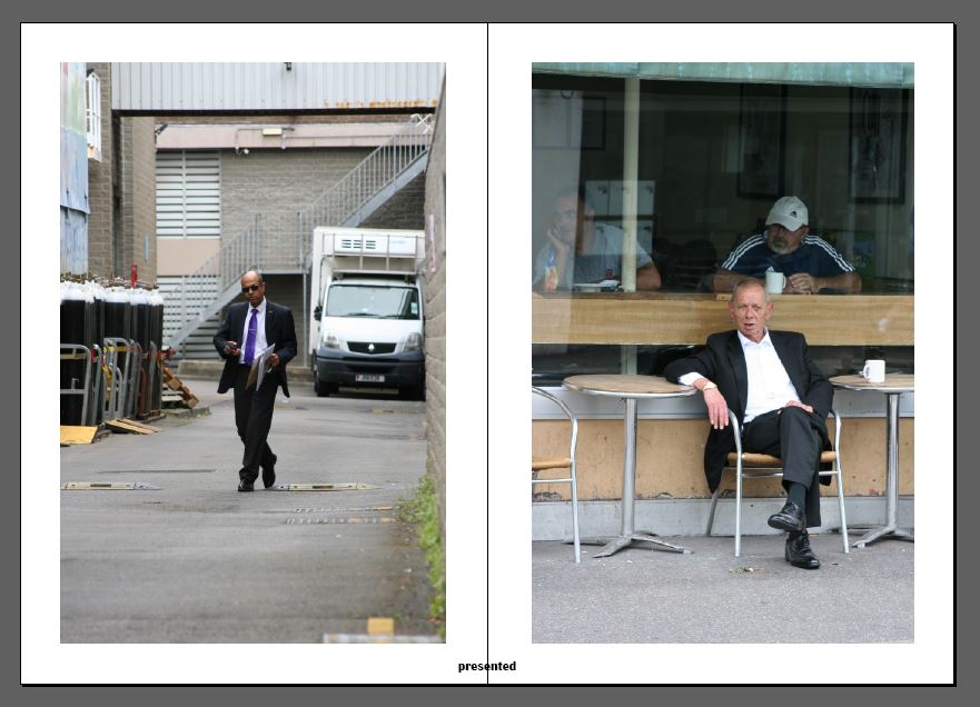
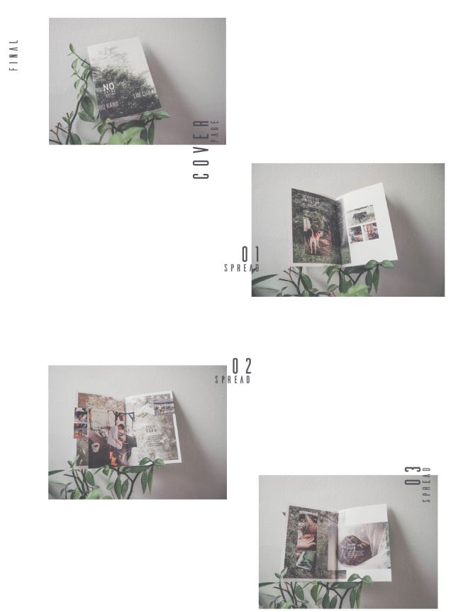
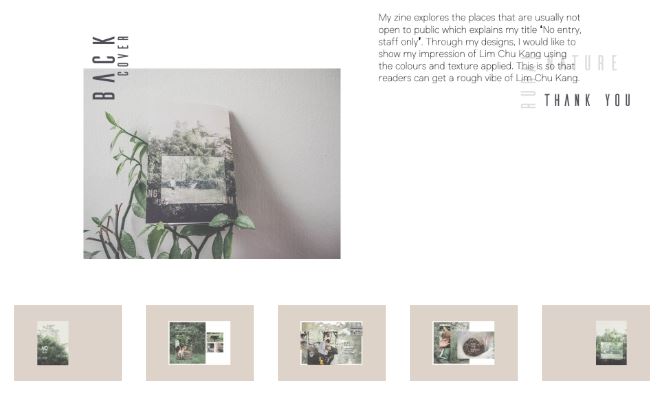
Here is my first draft layout of my zine design. I believe my choice and sequencing of photographs and my use of basic text is very effective and clean. I have tried to keep things as minimal as I can as i didn’t want to draw any attention away from the photographic content itself. However something that I am not too sure on at this point is the layout in terms of alternation and sizing of the images, I think if I was to experiment with alternative layouts using full bleed spreads and maybe overlapping images this could make for a more visually interesting sequence of images. So this is something which i will try when coming up with my final design for my zine. I may also experiment with the placement of the text used in the zine because at this point it is all very central rather than alternating or randomly placed etc.

FUTURE OF ST HELIER NEWSPAPER AND INSTALLATION

My Final Spread – Newspaper

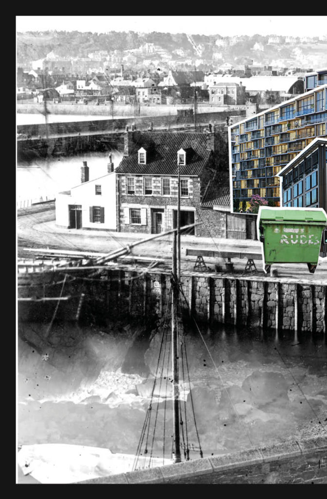
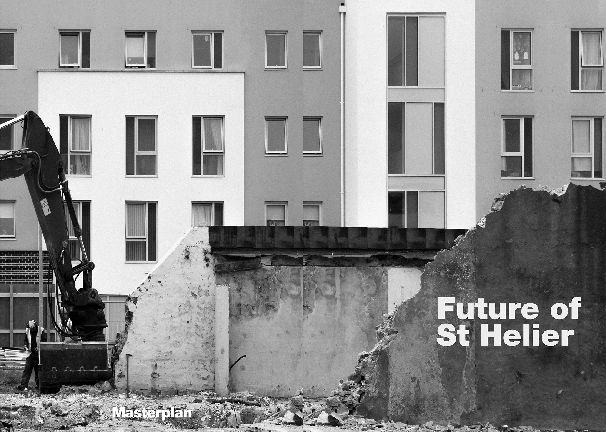
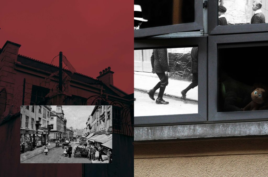
My final image that I put forward for this newspaper was this:

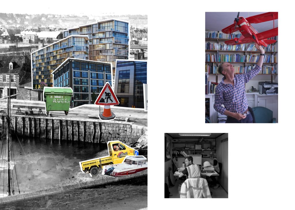
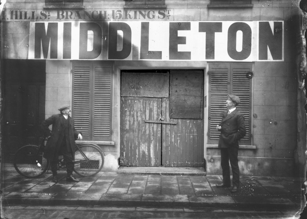
The image was too big to place as a whole on a single spread so I opted for a double spread design. It was a montage of multiple images I had taken over the course of this project, juxtaposed against an old photograph I obtained from the archive. The image is conveying how new building, and essentially a new version of St.Helier (new photographs) is being built on the foundations (old archival image) of the old St. Helier. The overall project was interesting; though, as someone who had only moved to jersey 3 years ago, I didn’t feel as much of a connection with the city and island and in that sense, my approach was very different and almost like one of an outsider. Portraying the capital in a way that people who have lived here all their lives may have not thought of.

Hoarding Installation

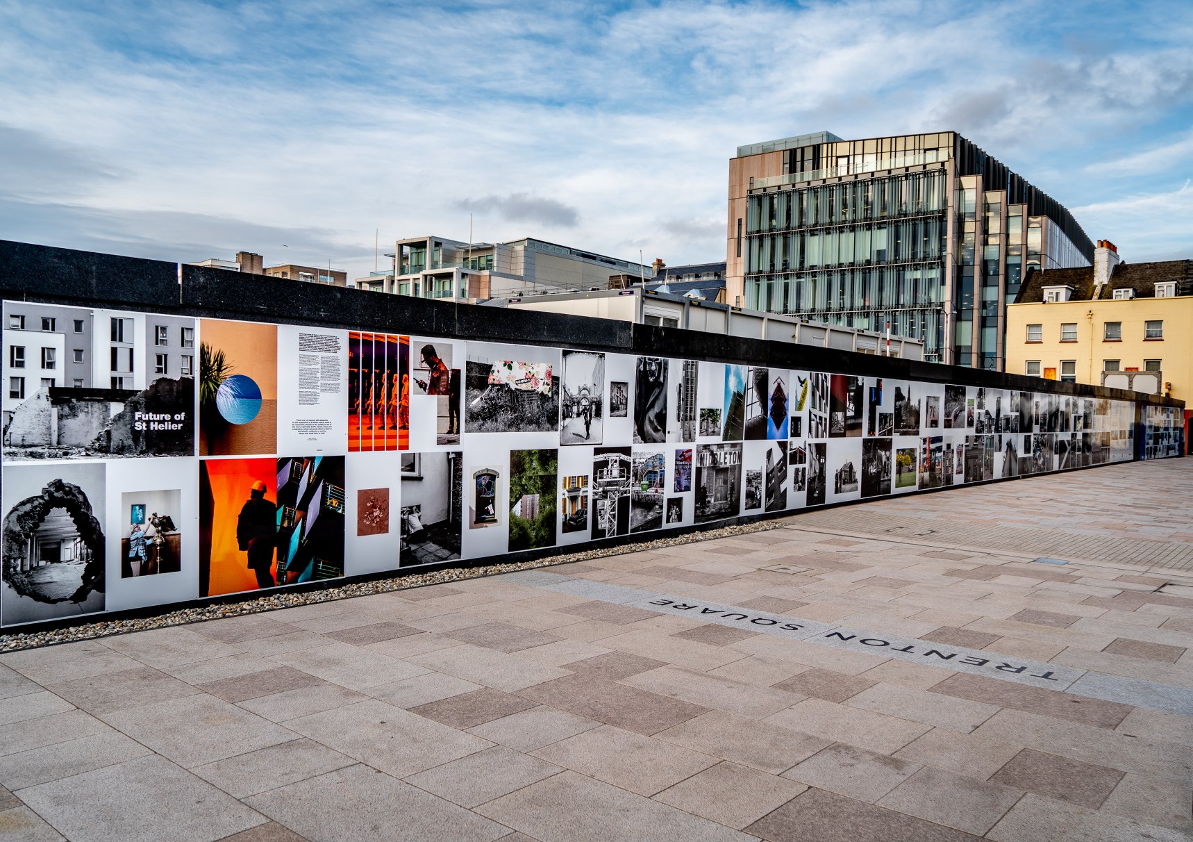
The unveiling of the Future of St Helier Hoarding at the International Finance Centre on the Esplanade in St Helier took place on Thursday 13 Dec 2018.

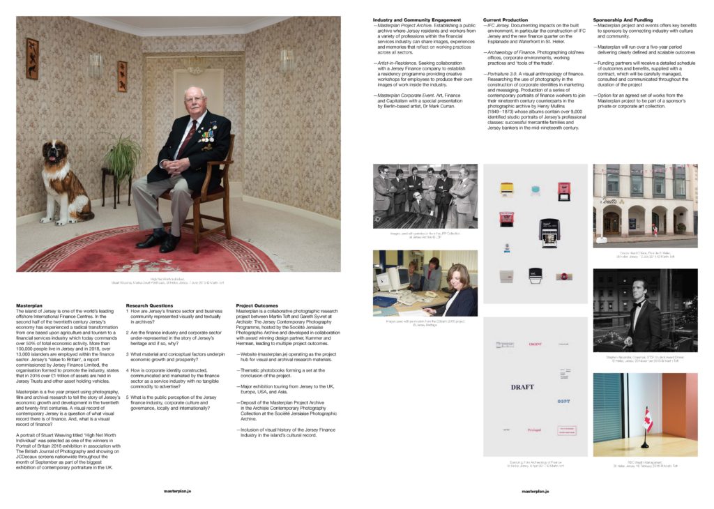
First published as a 52 page newspaper supplement in September by the Jersey Evening Post the work produced by A-Level Photography students at Hautlieu School have been transformed into a 34m outdoor installation as part of Masterplan Community Arts and Education Project

We were challenged with responding to specific areas, streets and neighbourhoods divided up along the urban vingtaines of St Helier and to explore through research, archives and photography the built-environment, urban living, diverse communities, town planning, land use and re-generation projects.

We thank all sponsors and collaborators for making this a successful contribution to the island’s cultural records and historic archivesJersey Development Company, Camerons Ltd, MJP ArchitectsArchisleLewis BushPhoto-Archive Societe-Jersiaise, Kevin Pilley,States of Jersey and Connétable of St Helier,Simon Crowcroft

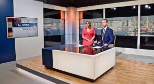
Earlier today we unveiled the Masterplan Future of St Helier hoarding display at the International Finance Centre. Lots of local media interest from Jersey Evening PostITV Channel TVand BBC Jerseywho broadcasted live on radio talking to photography students at Hautlieu School, Constable of St Helier, Simon Crowcroft and sponsors Jersey Development Company, Camerons Ltd, MJP Architects about the future of the island and its capital. An excellent example of how a community arts and education project can generate a debate that affects all those who either live, work or visit St Helier.

If you are interested in our views of young people tune into BBC Radio here (listen from 3:18:30 onwards or watch the six o’clock news tonight on ITV.

https://www.bbc.co.uk/sounds/play/p06rlpdw

If you missed the news last night at ITV Channel TV you can catch up here with Hautlieu students talking (15m.12s) about their images on display at the Masterplan Future of St Helier hoarding on the International Finance Centre.

See link here

The outdoor installation on the hoarding around the construction site is a great way to engage the public in art and debates concerning the future of the island’s capital but, what we need in Jersey is a new contemporary art space that will provide a new venue to showcase art produced in the island, but equally also bring international art to Jersey for the public enjoyment of its residents and visitors alike.

The recent Culture, Arts and Heritage Strategic Review, commissioned by the Government of Jersey makes 20 new recommendations that will revitalise the island’s cultural infrastructure and achieve a wide range of social and economic objectives from tourism, to health and well being to external relations, to planning and environmental developments – in the hope that in partnership with Government it will enrich and enhance Jersey’s quality of life.

Let’s hope those in power who can make real changes to St Helier’s build environment will include such a new art space in the revised Masterplan of the Waterfront. All we need is political will and re-prioritising public funding for the arts. States of Jersey

Future of St Helier Newspaper

The outcome of students work was first published on Tuesday 18 September 2018 as a 52 page newspaper supplement, Future of St Helier that was printed in 14,000 copies and inserted into a daily edition of the Jersey Evening Post and distributed island wide.


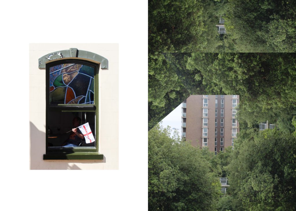
Here is a video browser of our Future of St Helier supplement printed and distributed in today’s edition of the Jersey Evening Post. Hautlieu photography students were challenged with responding to specific areas, streets and neighbourhoods divided up along the urban vingtaines of St Helier and to explore through research, archives and photography the built-environment, urban living, diverse communities, town planning, land use and re-generation projects. Each student designed a page spread which was then split in half producing a fragmented image reflecting on the nature of experience and diversity of St Helier.

Here is a video browser of our Future of St Helier supplement printed and distributed in today’s edition of the Jersey Evening Post. Hautlieu photography students were challenged with responding to specific areas, streets and neighbourhoods divided up along the urban vingtaines of St Helier and to explore through research, archives and photography the built-environment, urban living, diverse communities, town planning, land use and re-generation projects. Each student designed a page spread which was then split in half producing a fragmented image reflecting on the nature of experience and diversity of St Helier. Make sure to get your copy before the shops close!Thanks to everyone involved in the creative process Archisle Lewis Bush, Jamie Cole, Simon Crowcroft, Kevin Pilley – States of Jersey and our sponsors Jersey Development Company and Camerons Limited.

Posted by Martin Toft on Tuesday, 18 September 2018

Research On Creating A Zine

ZINE IDEAS / RESEARCH / INSPIRATION

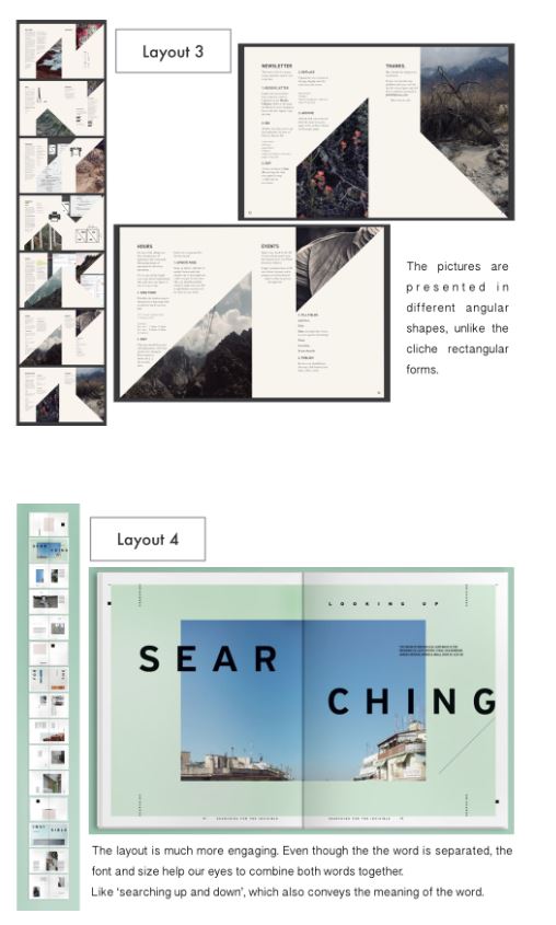
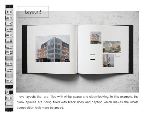
Here is the creative process of an existing zine called Ooi Qui Min which I was fond of, it shows a range of different presentation techniques and compositions which I think makes it a good zine to explore in order to get layout ideas for my own zine.

Here are some images of the creative process of the Ooi Qui Min zine…

 I believe that this zine is a very successful outcome as it covers various different compositions and layouts of images whilst remaining minimalistic. I also like the basic fonts used in the zine as they do not distract of draw attention away from the images themselves, this is something which I hope to do in my own zine.

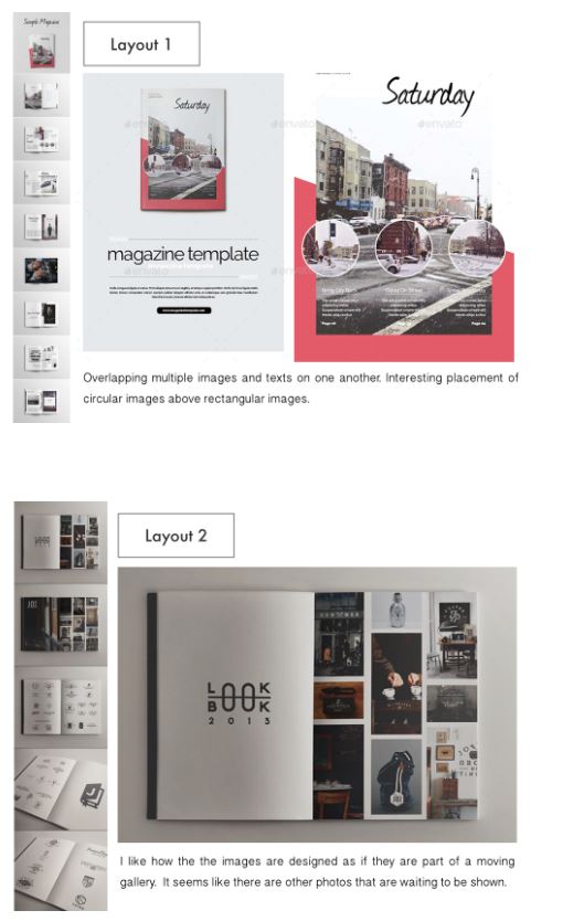
Here are some alternative simple layout ideas for a zine, which look at different compositions, use of text, framing, colour and sequencing. I believe that it is good to look at many different examples of what it is that you are creating, as it will give you as much creative inspiration as you may need.

Zine Research and Ideas

A zine is a small-circulation of self-published work of original or appropriated texts and images, usually reproduced via photocopier Zines are either the product of a single person, or of a very small group. Zines are used as an effective way of marketing and presenting ones work and often will stick to one small topic throughout all the pages. They incorporate a basic design layout with usually one image per double page spread and sometimes one image per page.  Among the various intentions for creation and publication, the idea behind zines are to develop one’s identity, share a niche-skill or art, or developing a story, as opposed to seeking profit.

When researching visual inspiration to develop an understanding of a theme, i decided I was most interested in the zines which featured architecture. I am interested in exploiting derelict architecture however i also think it could be interesting to contrast this with new buildings such as the new finance center as well as buildings within the development stages. Within my zine i intend to create a narrative which tells the audience how the area of St Helier has been developed and also left to suffer. I want to capture photos at night time and portray St Helier as a vibrant chaotic place by using techniques such as slow shutter speed.

Other than just displaying a sense of the different buildings around St Helier i intend on reflecting on the people that live within these communities and show how they use the area of St Helier. I think that a narrative could easily be created throughout my zine by starting off with some of the buildings located in St Helier and then moving on with the people that live here and how they use the areas.

MOOD BOARD

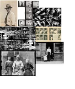
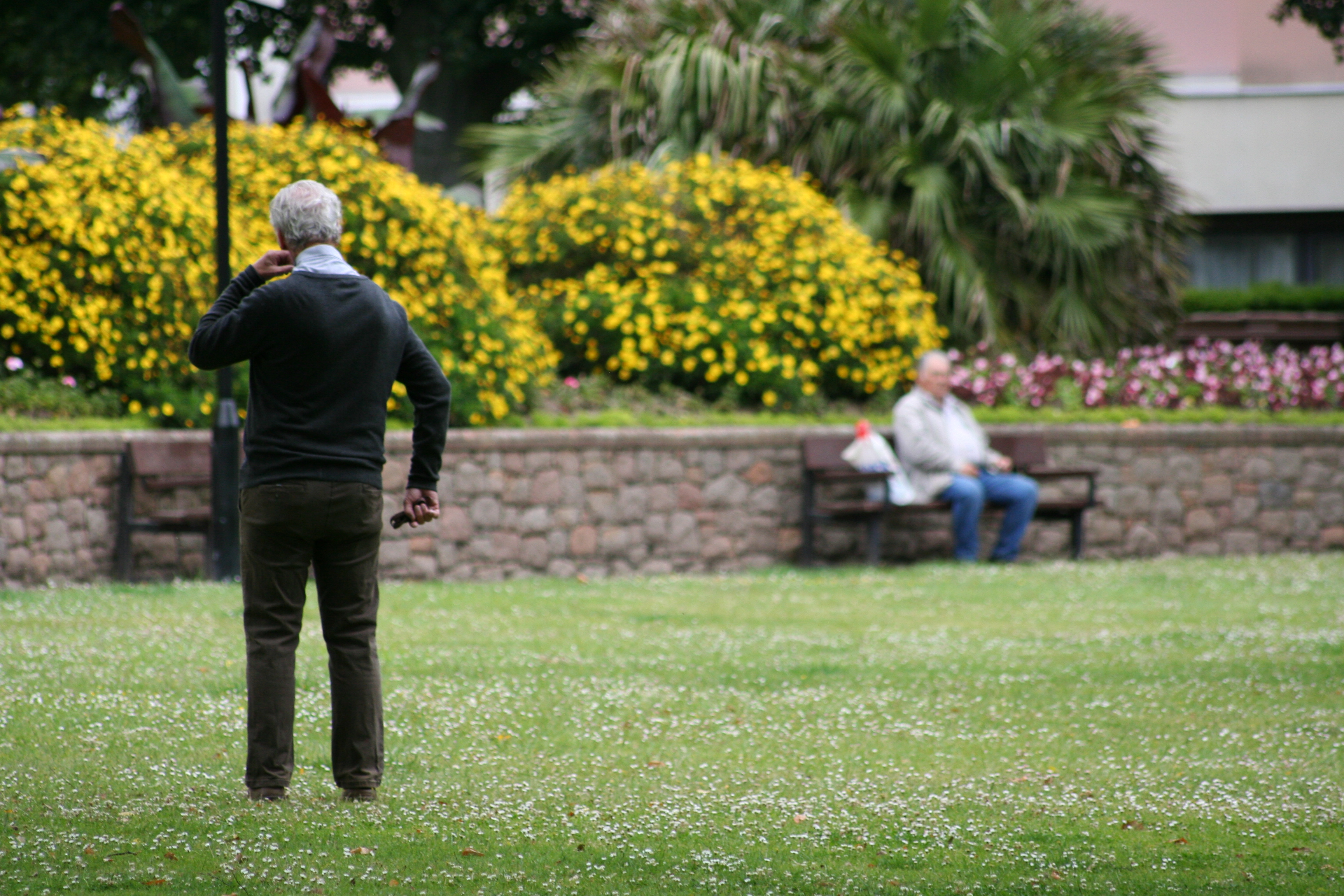
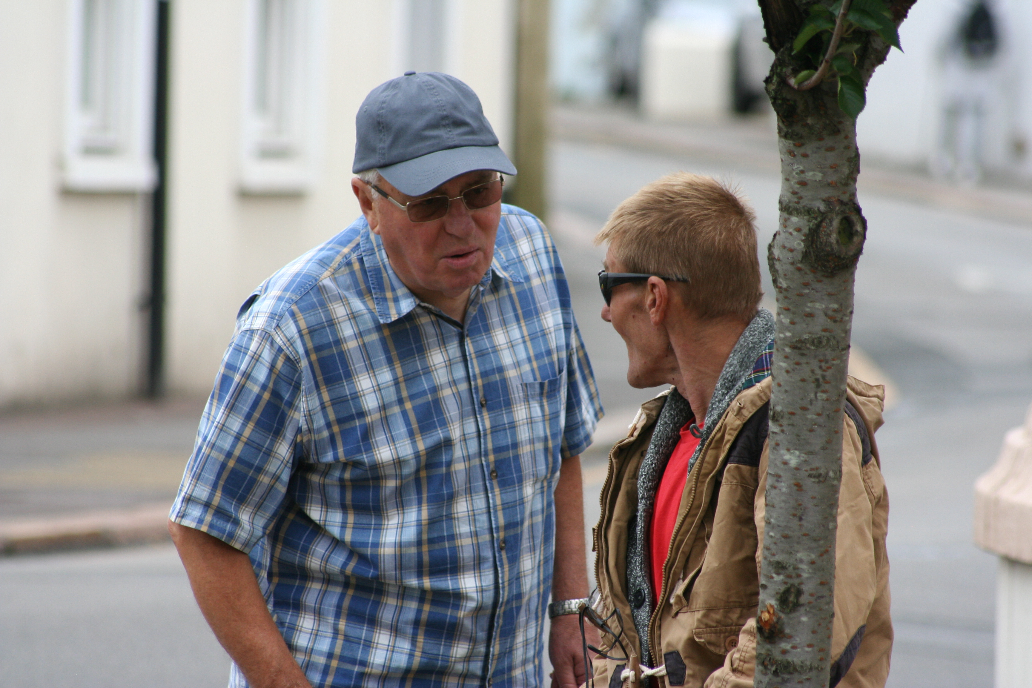
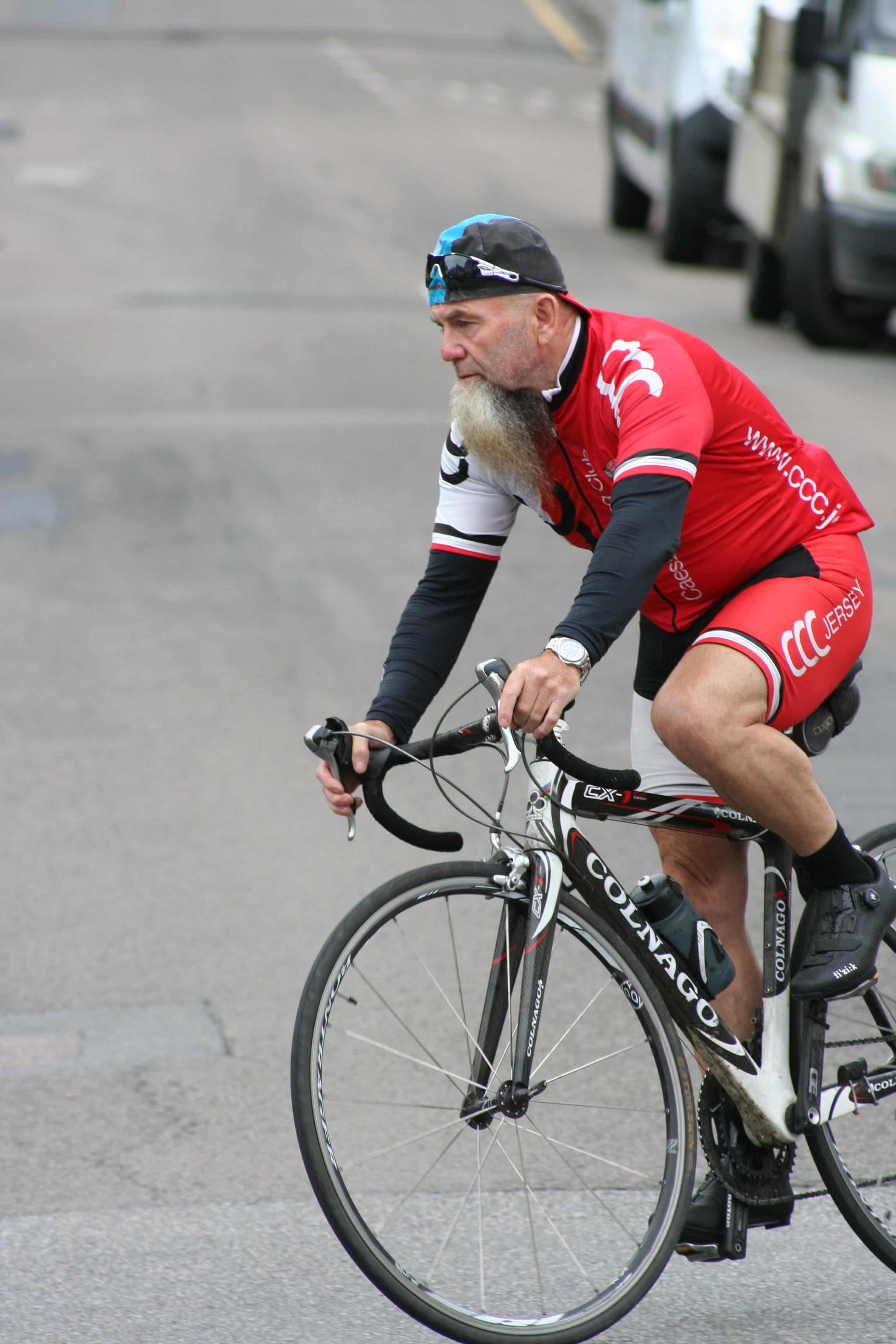
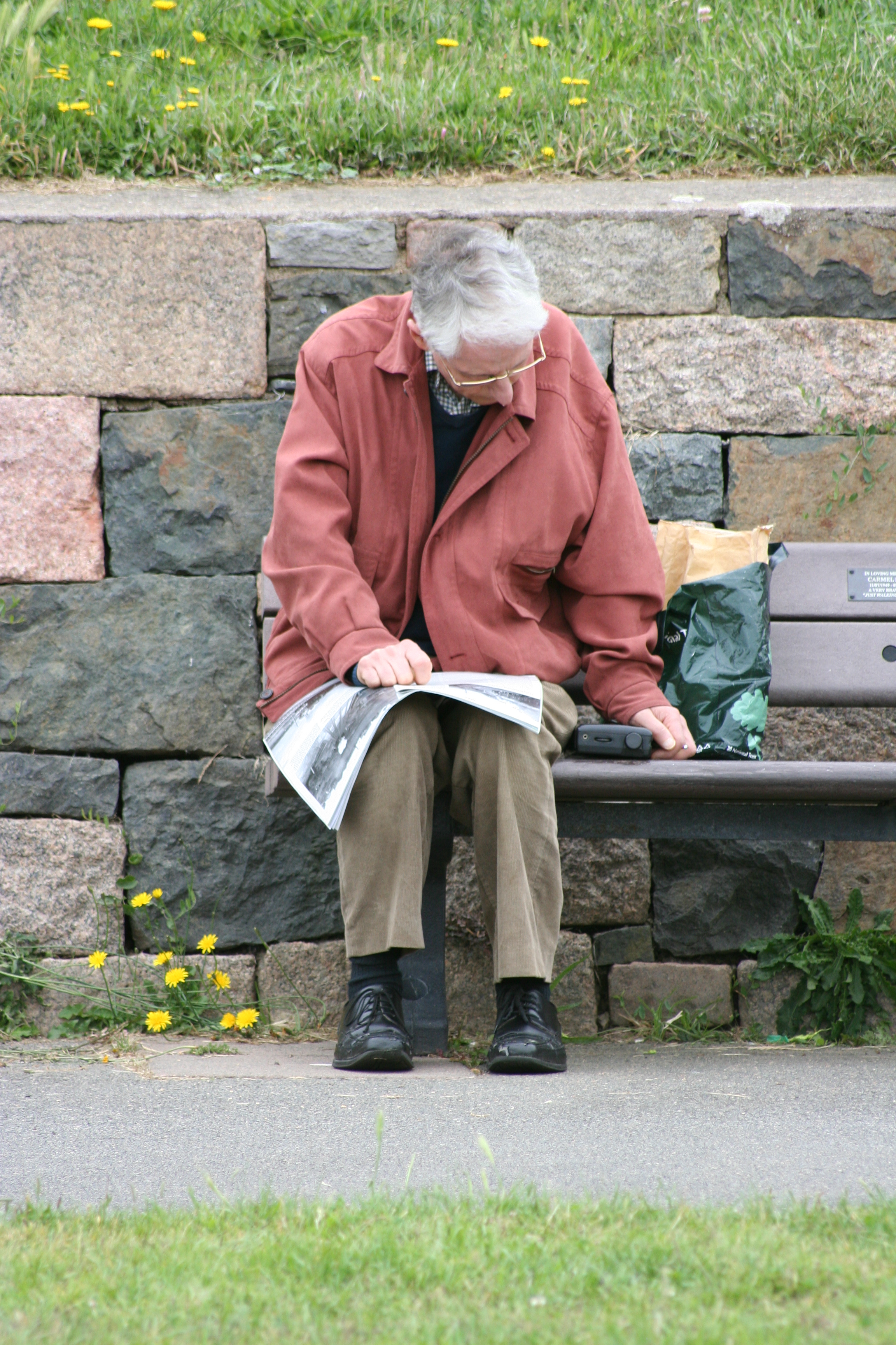
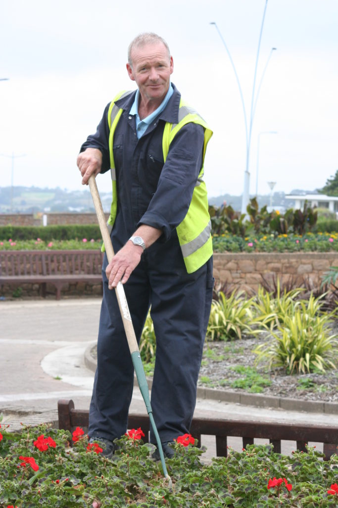
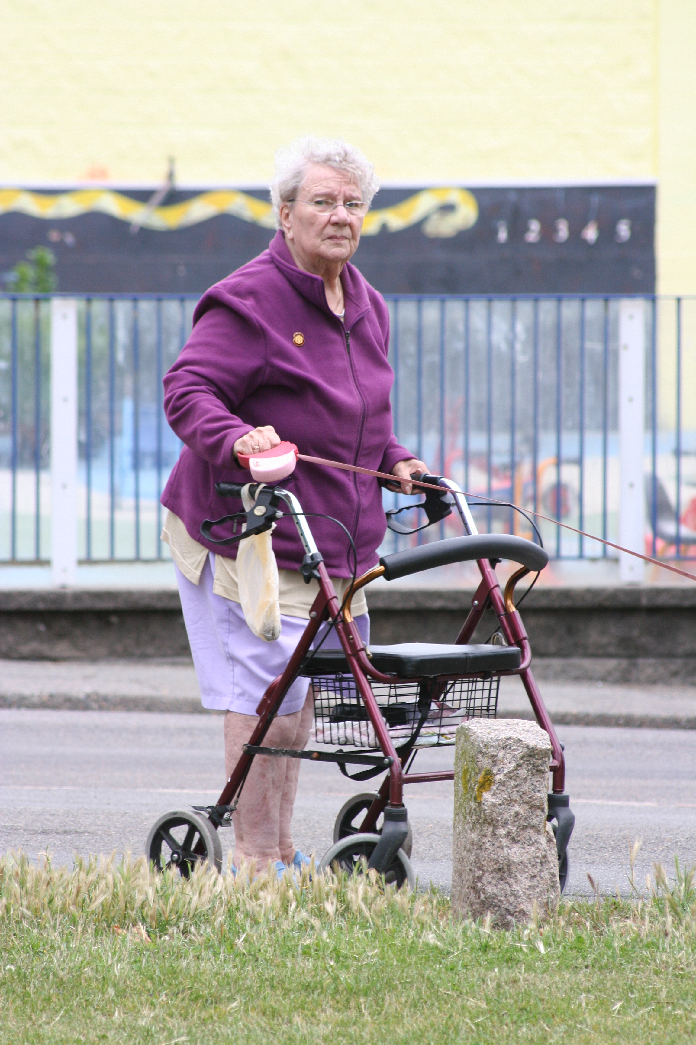
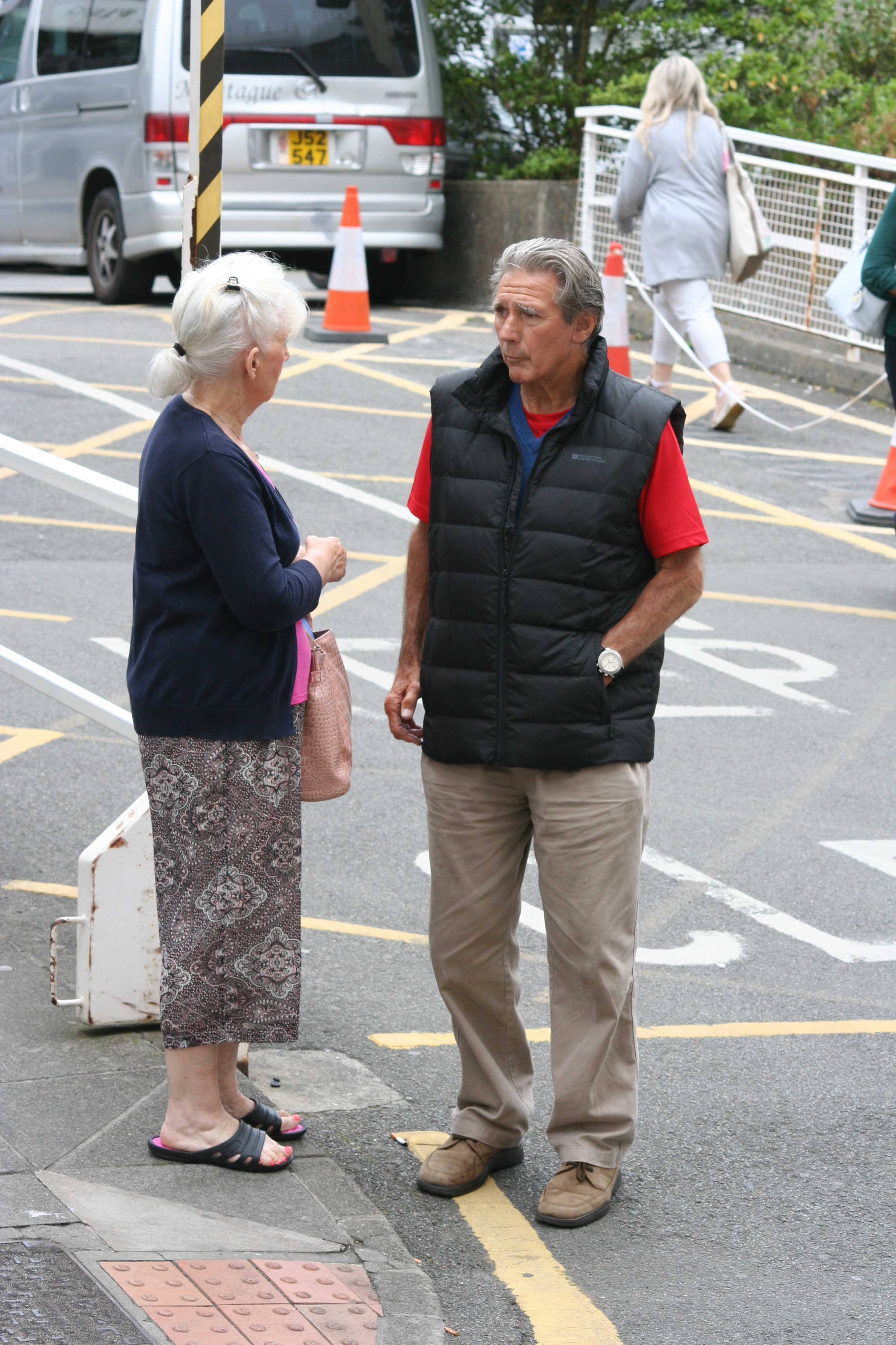
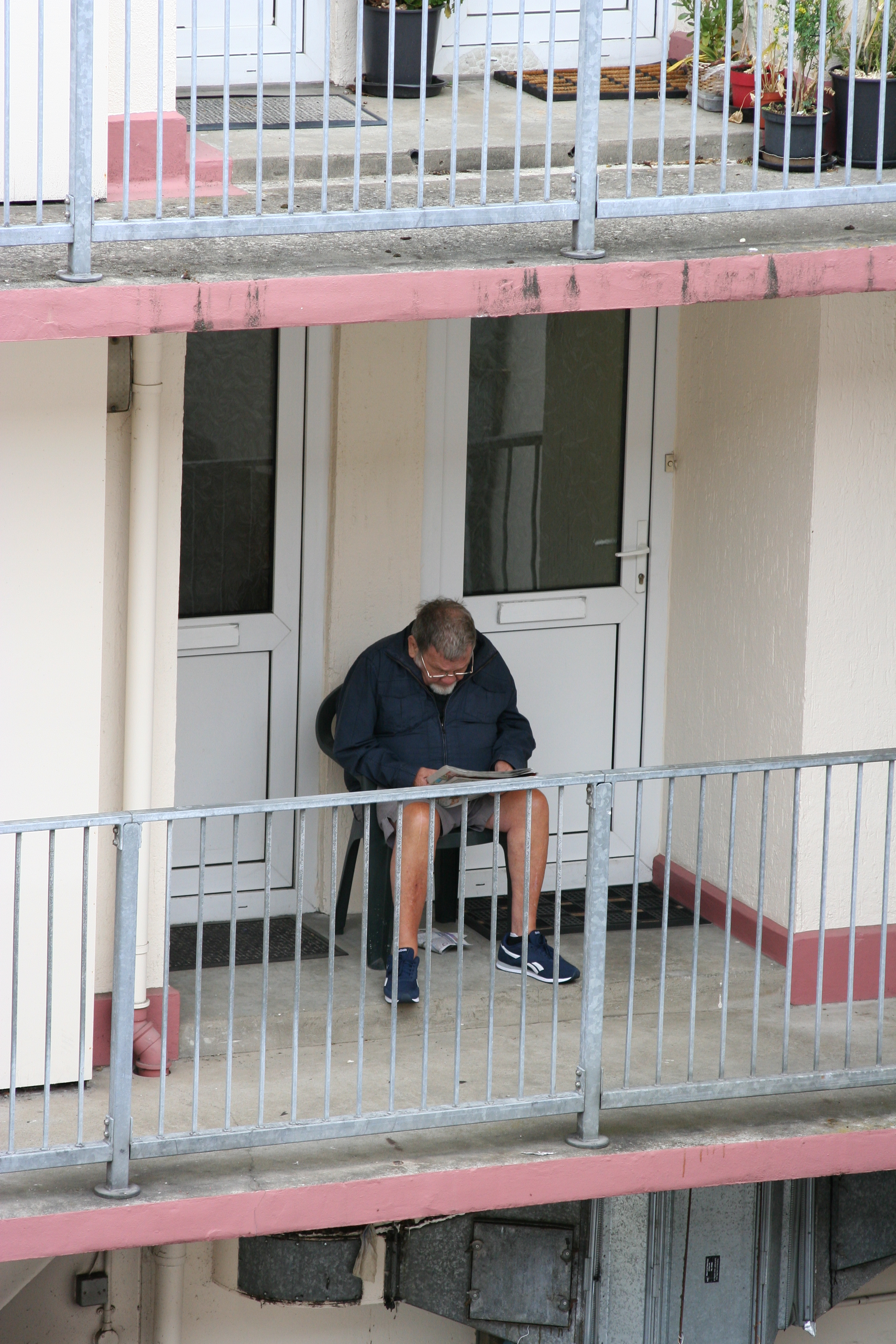
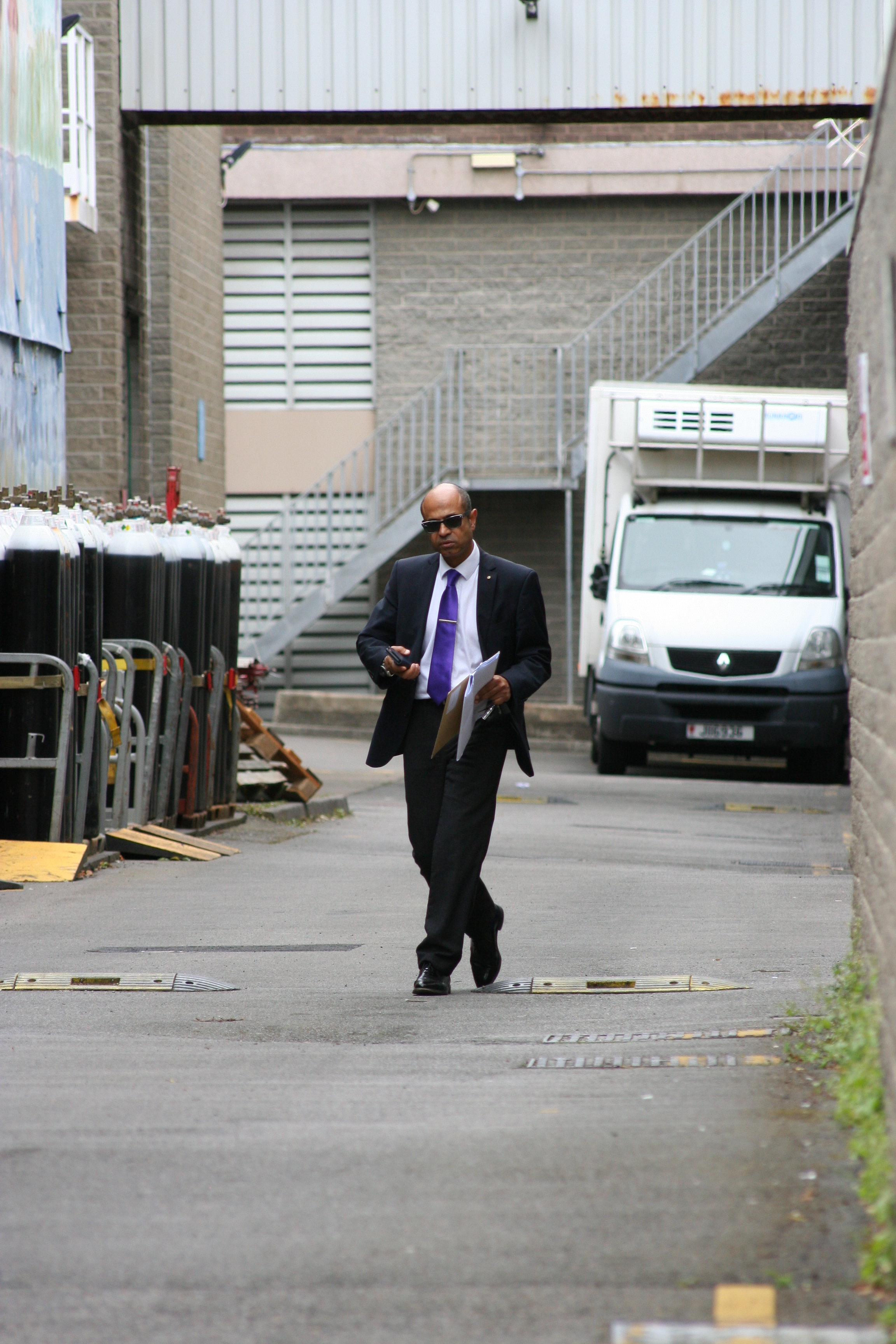
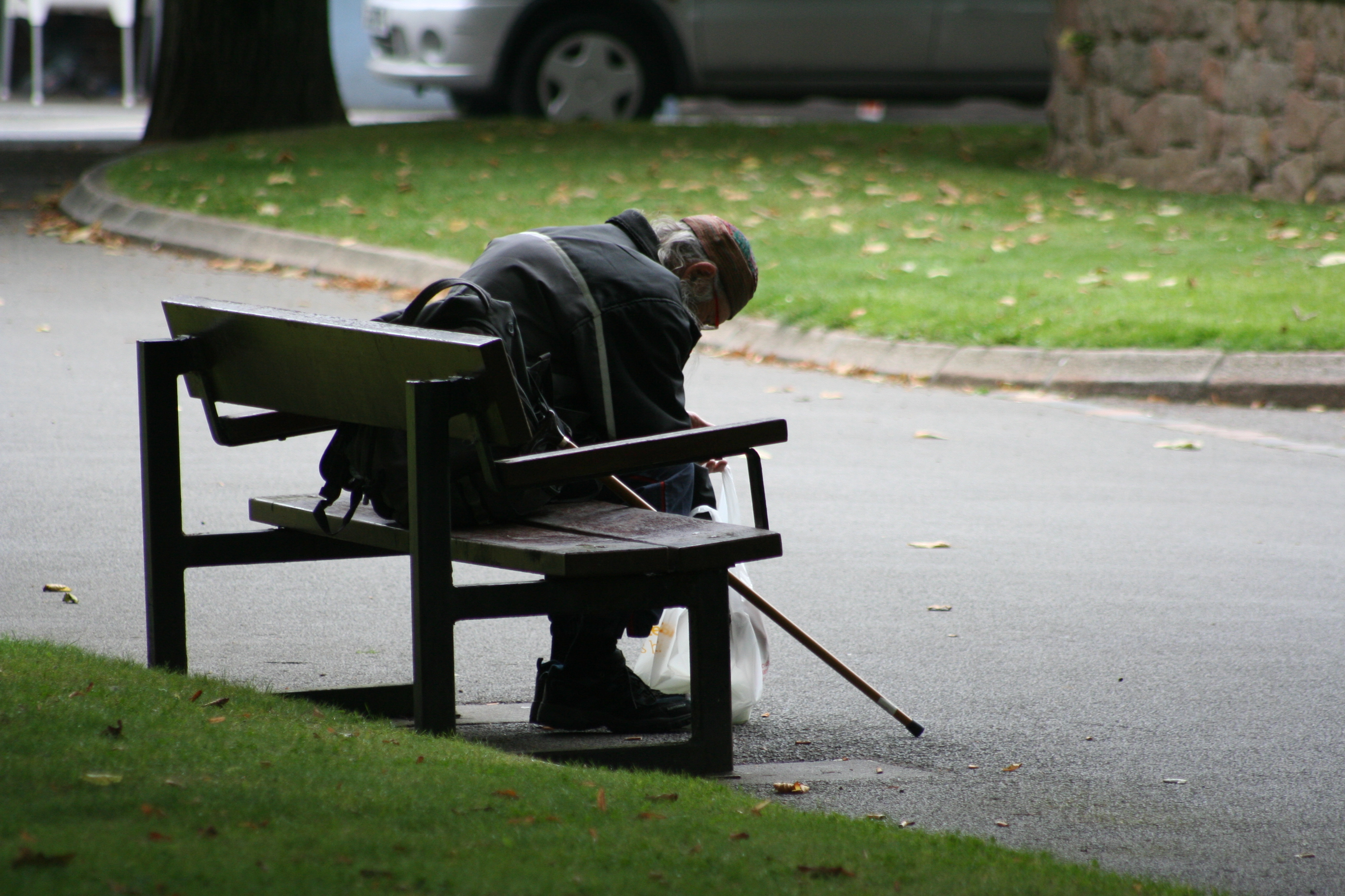
Each artist in this collection of images has provided me with inspiration for how I would like to capture the essence of St. Helier. I have selected images from the archive. I noticed a lack of portraits and the few I found were composed by Francis Foot, this has enabled the idea of capturing the people of town rather than architectural and landscape based pictures as I believe that what makes up St. Helier is the people and community. 
Another artist I would like to base this project on is Walker Evans and his collection of photos of American workers - 'Labour Anonymous' set out in the style of typology. He used the method of standing still with his camera set up by his waist shooting passersby framed by the negative space of a wall in his location. The collection of images are all candid and even when the subject realised their photo was being taken, their expressions were still honest and they almost give a bigger insight of who they are as individuals. Although all the pictures are set up the same and look alike, each person creates a different mood and emotion.
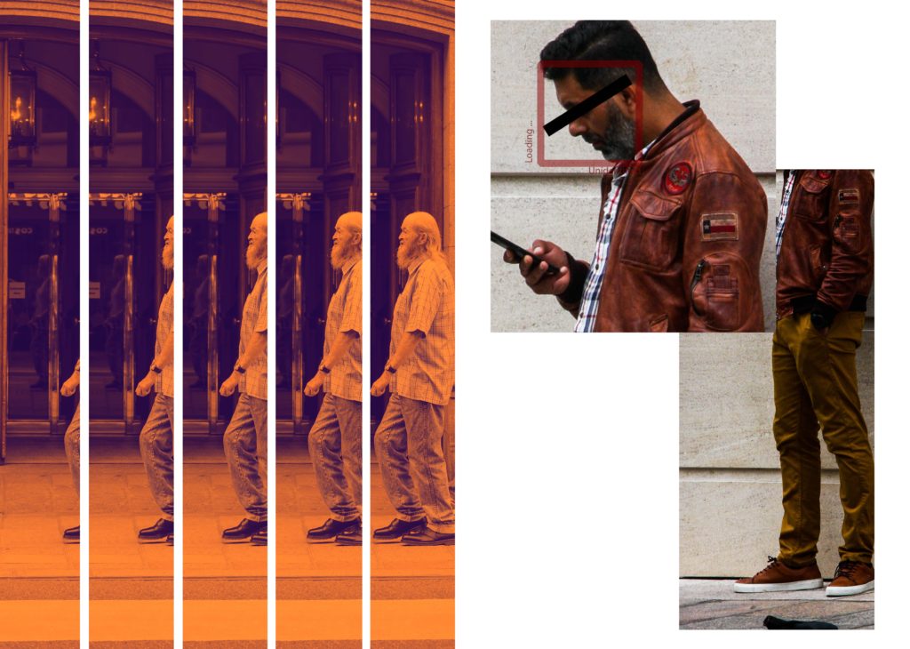
The last artist I drew inspiration from is Lewis Bush. The images I chose use a technique of cutting and pasting and repeating one image that creates an intense and overwhelming feeling. If I could apply this to portraits I would hopefully  like to emphasise the emotion and individuality of each person I capture on the street by repeating key parts of their portraits that add flavour and insight to who they are and what their motives are in that moment.


Physical Photo Manipulation / Collage

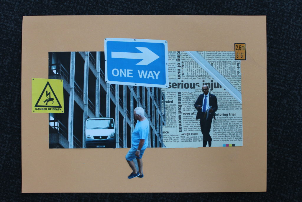
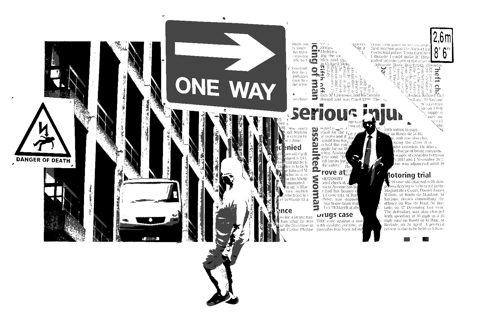
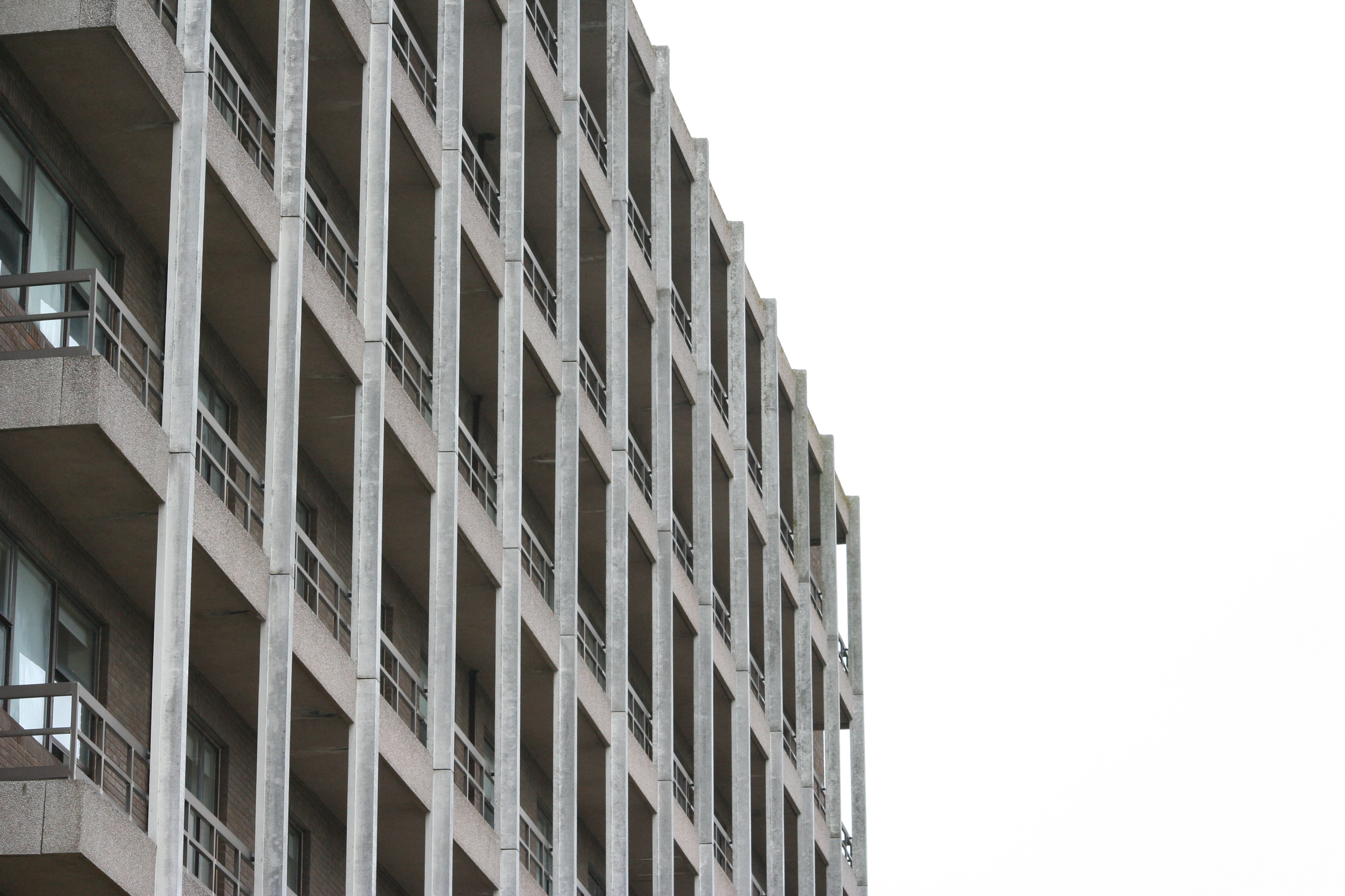
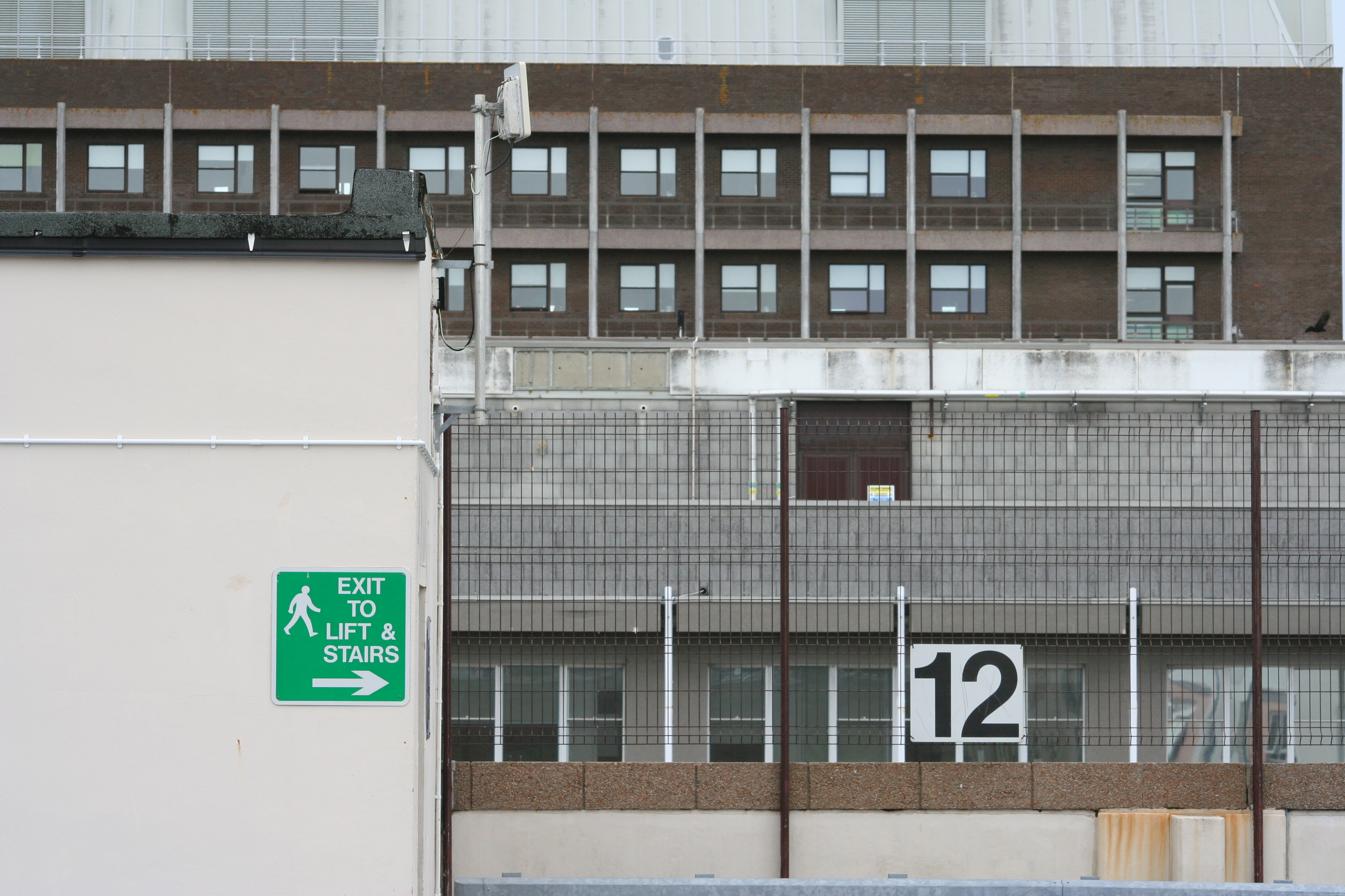
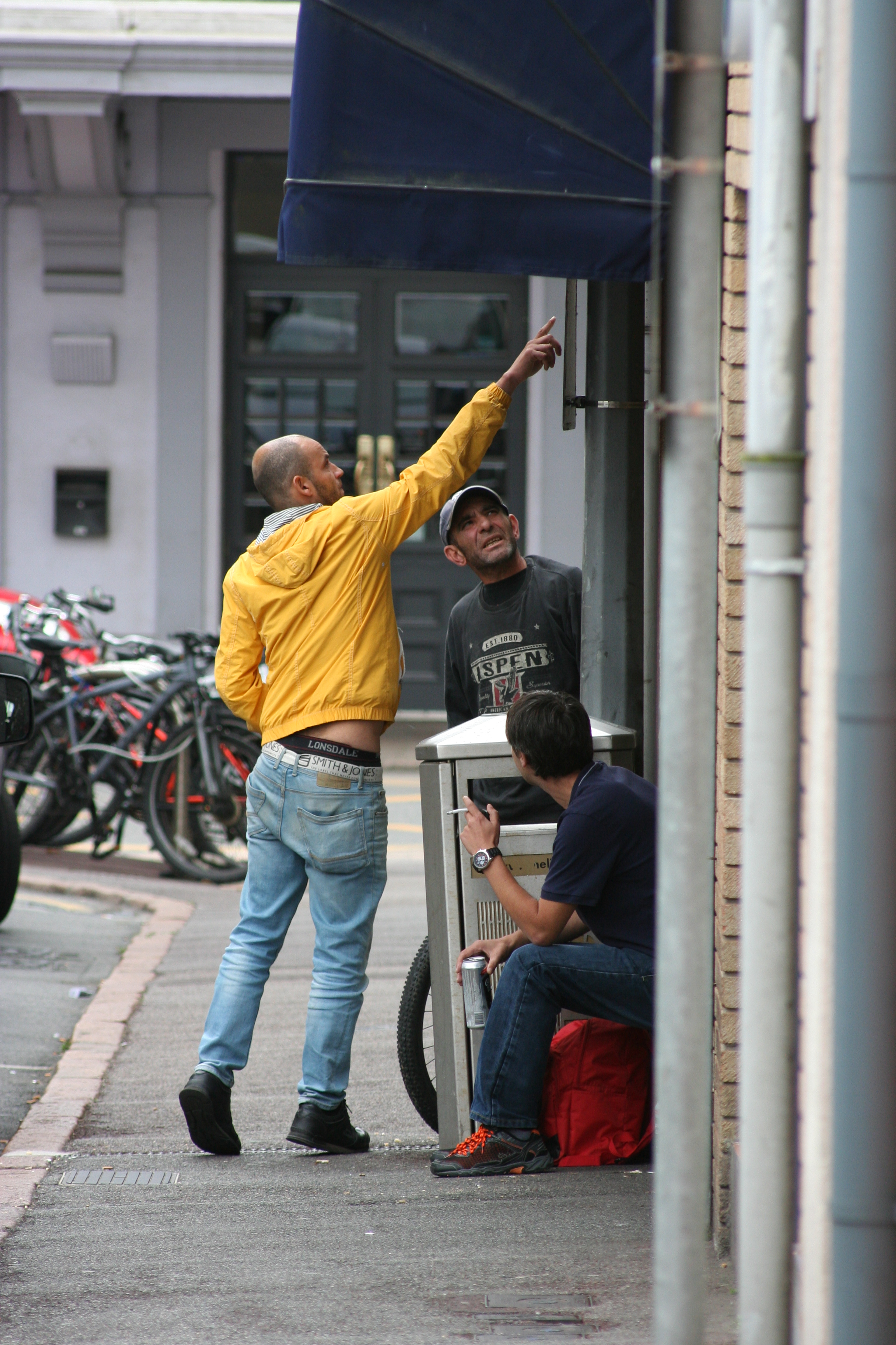
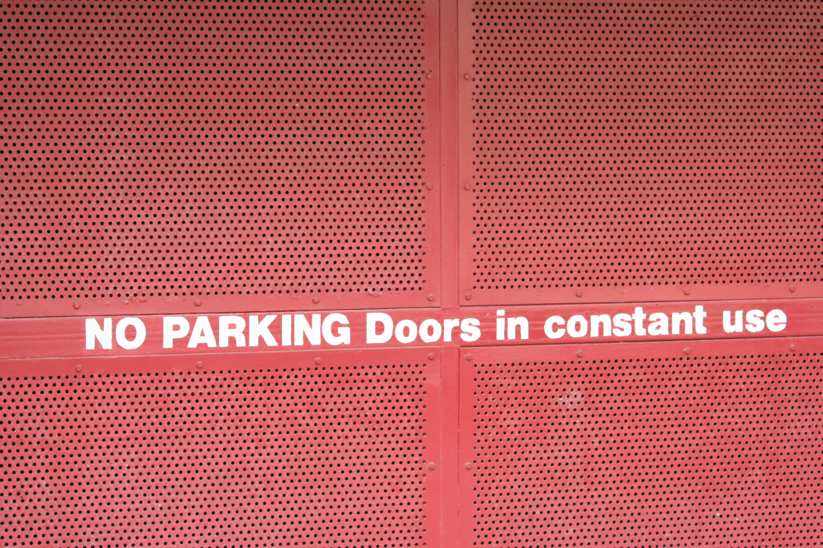
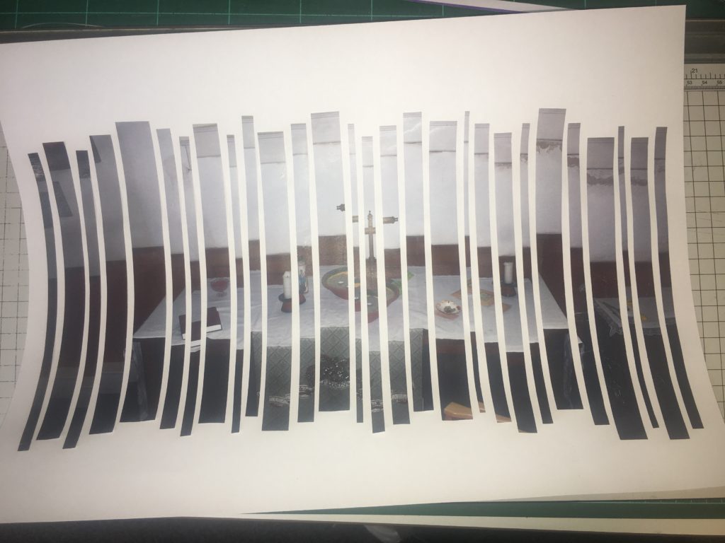
Using some of my photographs from my first and second shoot and a newspaper article about heath and safety issues such as injury, death, drugs and assault. The point of this collage was just to explore ideas about the concerns of the new hospital that is being planned for in the near future. The two street portraits of two diverse subjects in the collage are meant to signify the fact that people of any class, race, religion etc. will all be in need of health-care at some point in their lives. The photograph of the back of the current hospital is simply meant to show how dated and in need of renovation the current building is. The photographs of signs that have been included in the collage are all supposed to be a symbol of danger or warning which is commonly something that leads to injury and therefore peoples’ need for healthcare.
Here is a photograph of the physical collage before then being digitally manipulated…

I then went on to use Photoshop in order to make the collage digitally versatile. I did this by cropping down the original and then increasing the exposure of the image. I then made the image black and white and adjusted the monochrome tones until I was satisfied with how it looked.

Here is the outcome of this…


Critical Selection (Lightroom)

Critical Selection

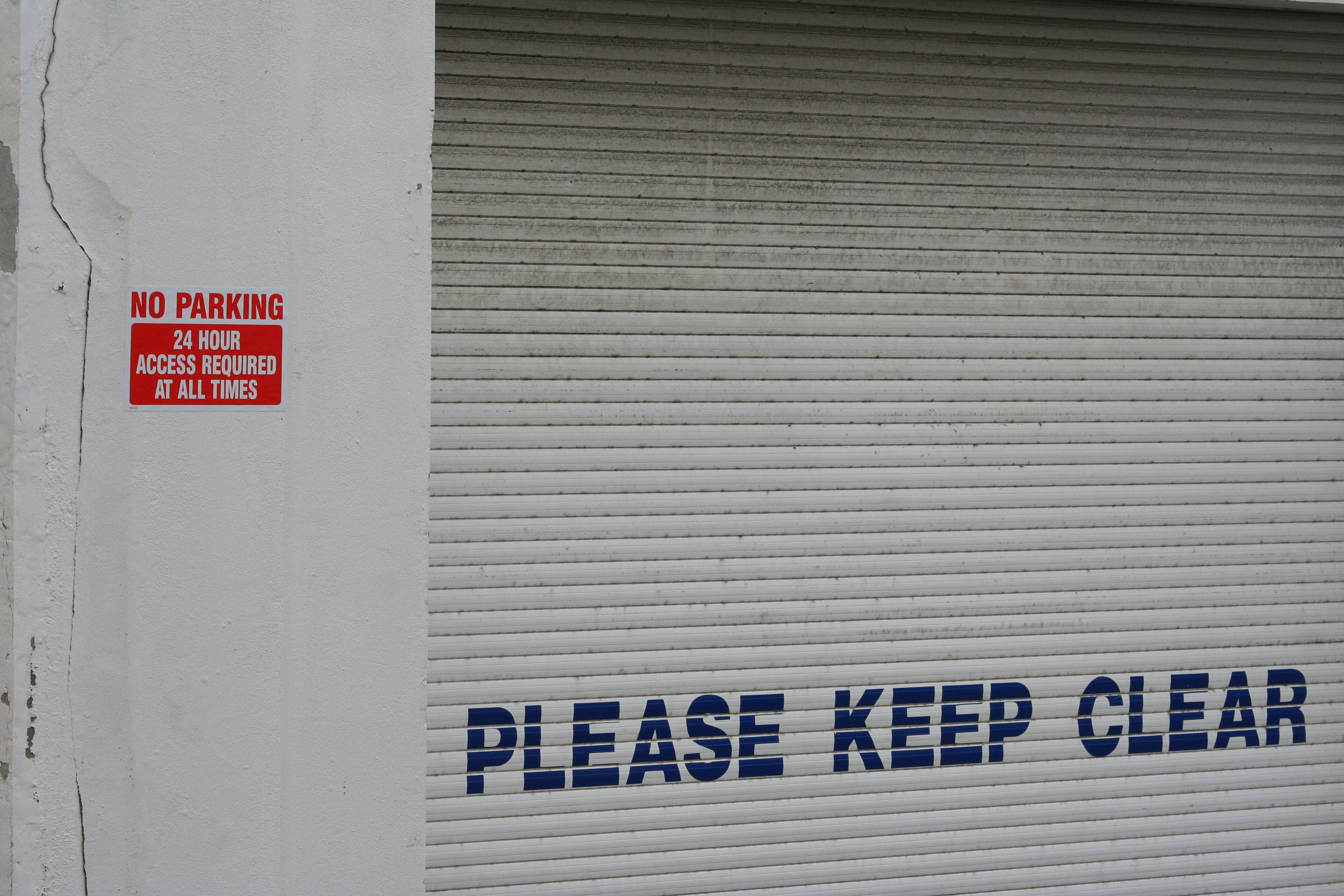
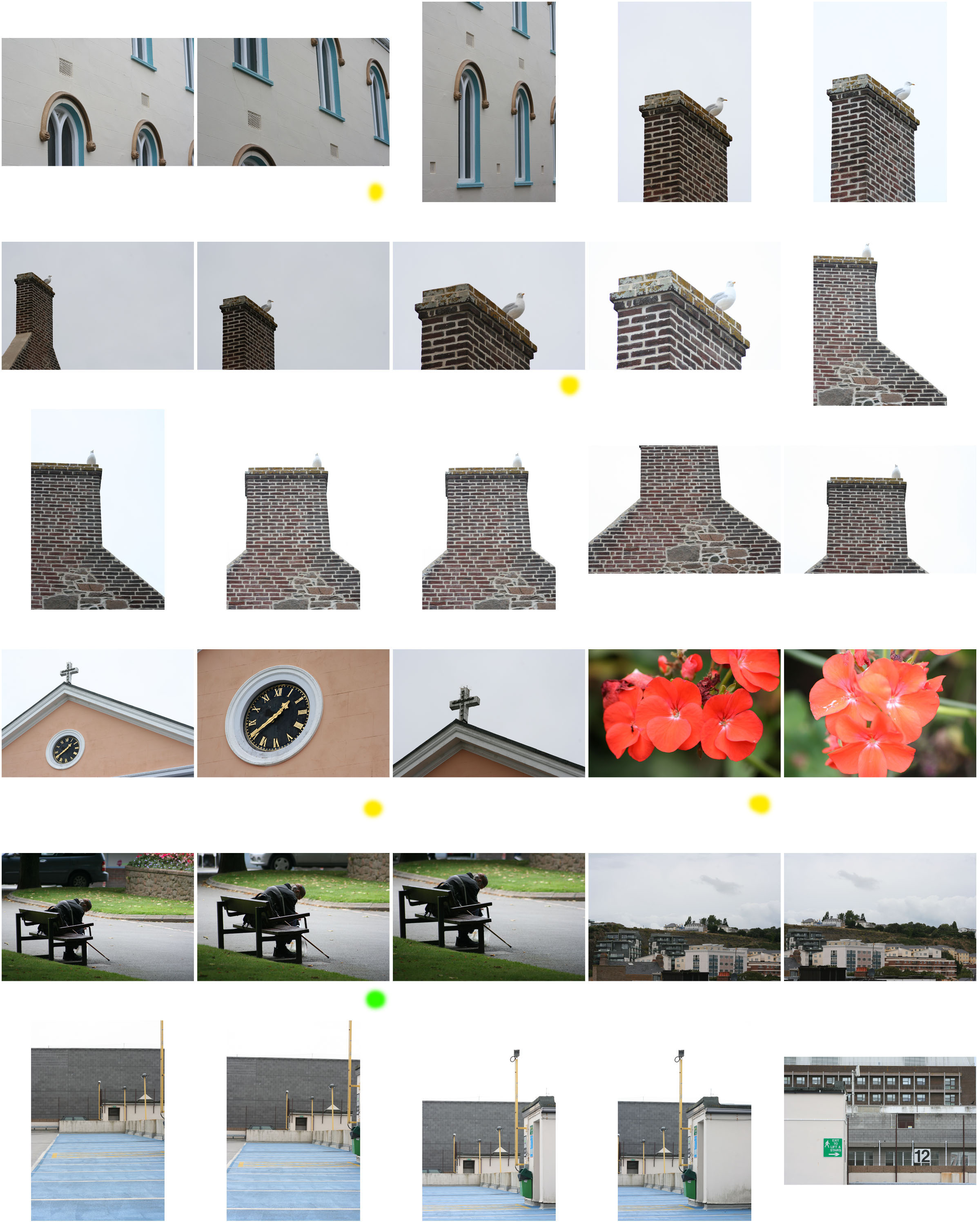
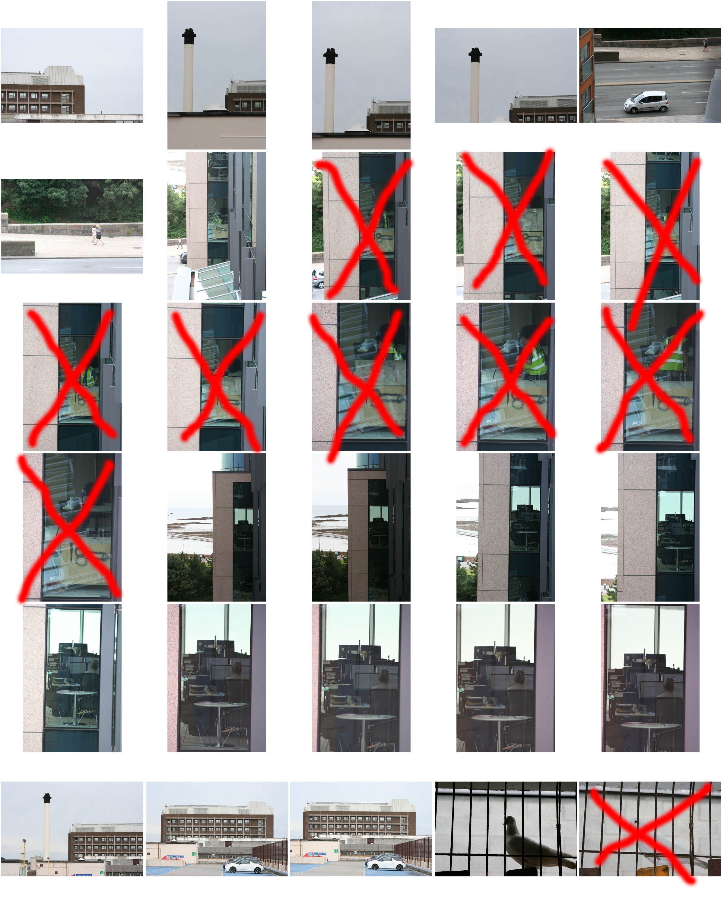
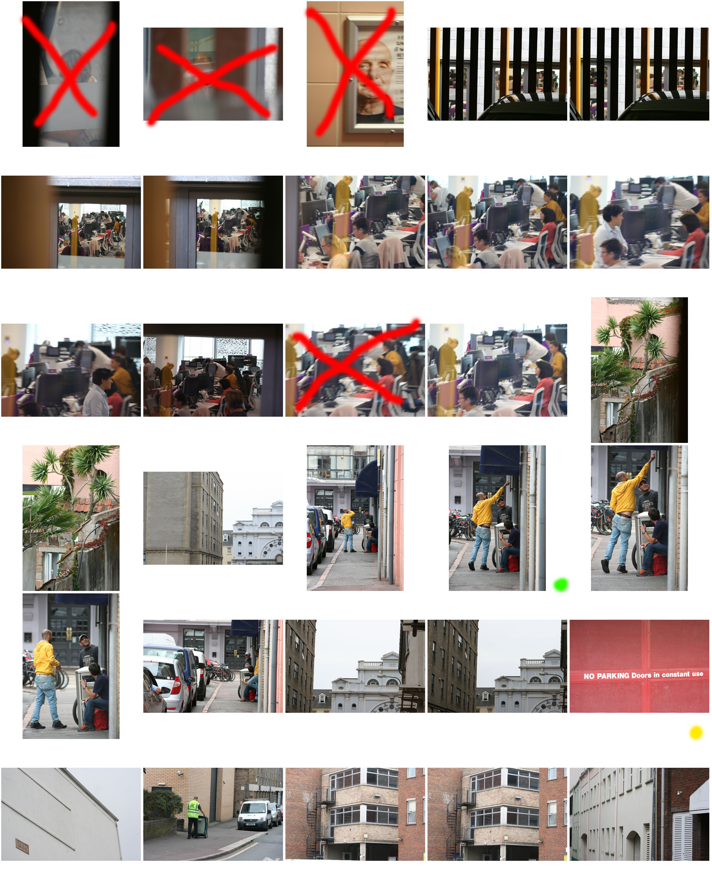
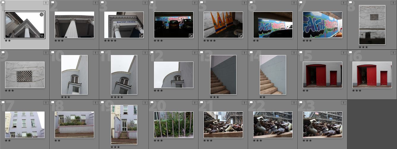
This blog post covers my critical selection of images which I have made using Adobe Light room from all 3 of my photo shoots which I  took in my allocated area of St Helier. These are the raw images before any editing and I have chosen them based on various aesthetic aspects such as the simplicity, colours, textures, and with the portraits based on the physical content of the images such as the expressions of the subjects of their surroundings. The images which I believe need to be slightly altered or manipulated I will caption with those needed changes, most of these slight alterations needing to be an increase in contrast, but i personally don’t believe that any of my favorite images which I have chosen need major changes to be made.

Shoot 1 Favorite images :

Could be slightly increased in contrast

Possible black and white, definitely increase contrast

Increase brightness and contrast to enhance the white

Black and white, possible increase in contrast

Enhance and darken blue tones

Experiment with saturation and hue of tones

Increase in contrast and slight decrease in brightness

Slight increase in contrast

Shoot 2 Favorite images :

Slight increase in contrast, maybe alter hue of red tones

Shoot 3 Favorite images :

Cropping, Increase contrast, possibly black and white

Cropping, slight increase in saturation

Slight decrease in brightness, maybe alter the hue