Category Archives: Uncategorized

Filters

Author:
Category:

First ideas for the future of st helier project

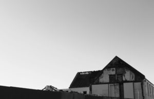
I got the inspiration for my project to have this idea of peeling back parts of images to reveal an old-style wallpaper. Was when we were on location on the building sites, in which we walked into a house that was midway through being knocked down in which all of the walls had been ripped out. As I walked through the house i came to a room which  i could only assume would have been a child bedroom, in which the only thing remaining was a small strip of an animation themed wallpaper, which gave me the idea to have this sort of torn out effect to reveal an old fashion wallpaper.

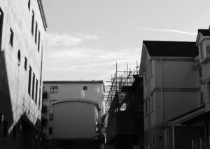
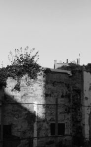
I first experiment with this idea, from using an image of a finance building down at the waterfront, I have the idea to use the wallpaper the would stereo-typically see in a grandparent house; As the connotation that many people have to their grandparents is that they are very warm, opening and loving, whereas in contrast to the finance industry in Jersey, which has been given the reputation of being very harsh, cold and negative. so I thought that by placing the two very opposite messages to get would create a nice juxtaposition.
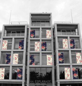
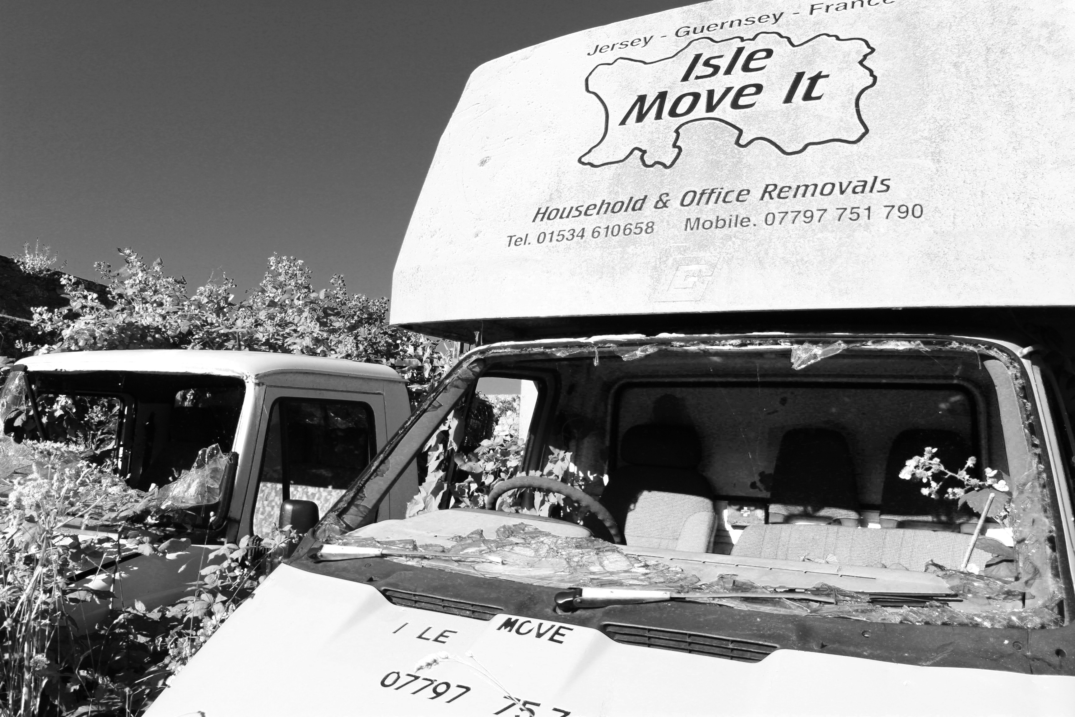
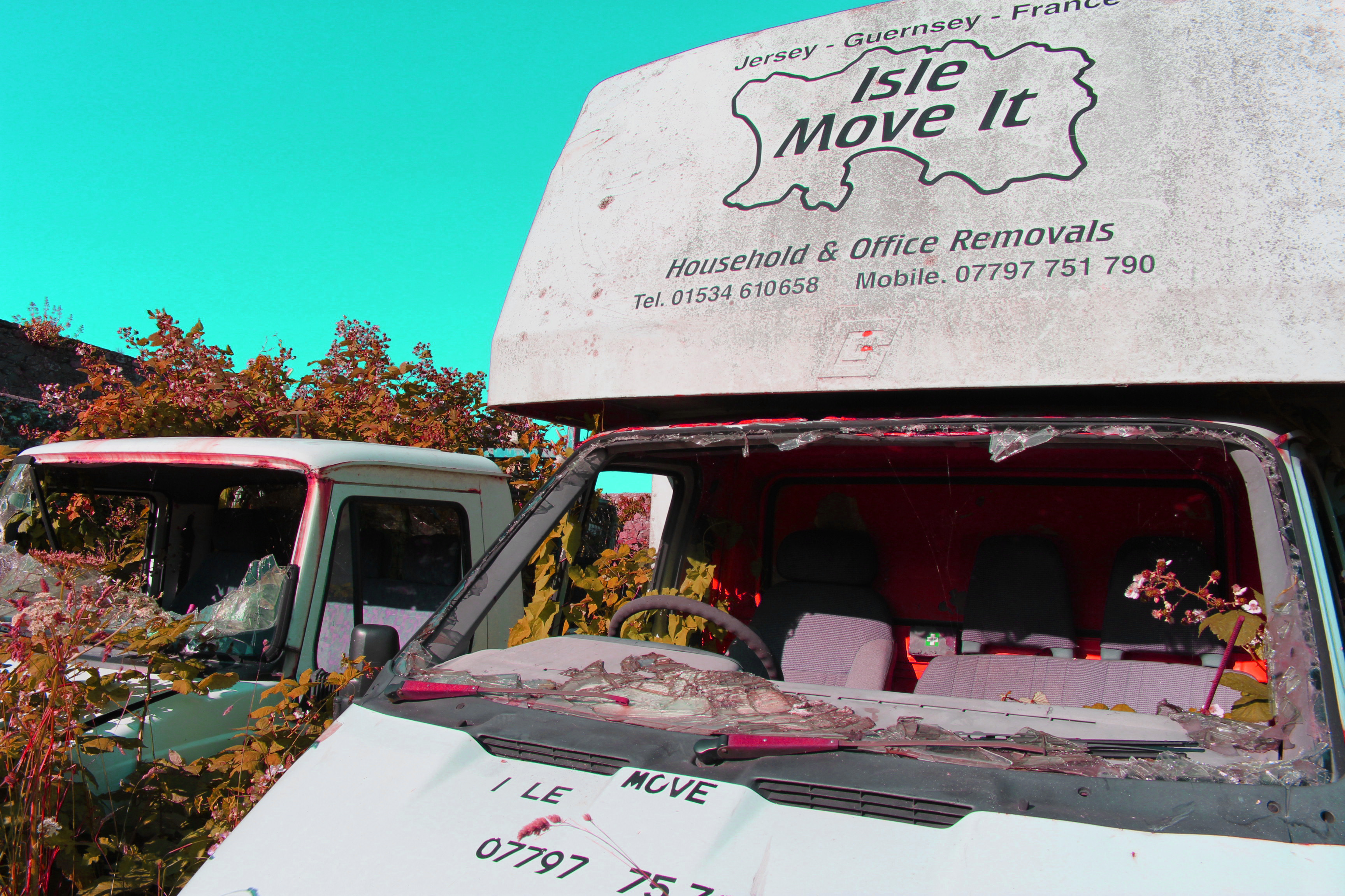
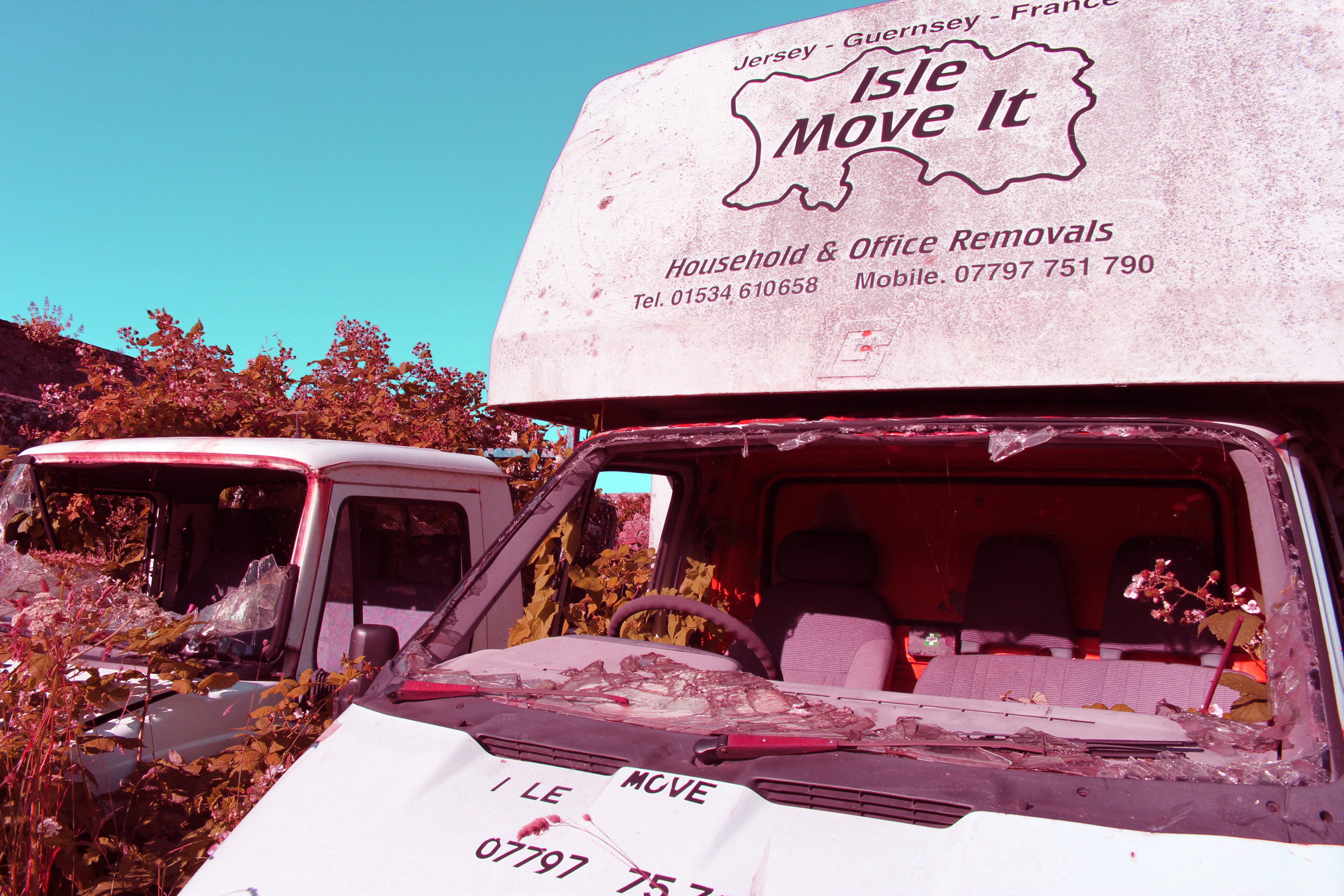
Experimenting with colour and black and white

By turning this image into black and white I think that it is the best outcome that i have created as it will create the greatest contrast with the wallpaper that I plan to edit in. So will help the design to stand out best, I think that I will do this for most of the images within this project.

I don’t plan to use this image again as I think that the colour of the sky is very unnatural and I dont like the way that it looks with the rest of the image

Out of the two colour designs that I have created I think it is the one that I plan to develop further. As I feel that the colour scheme within this image has more of a neutral colour palette which I think when combined with the wallpaper will look better.

The editing process

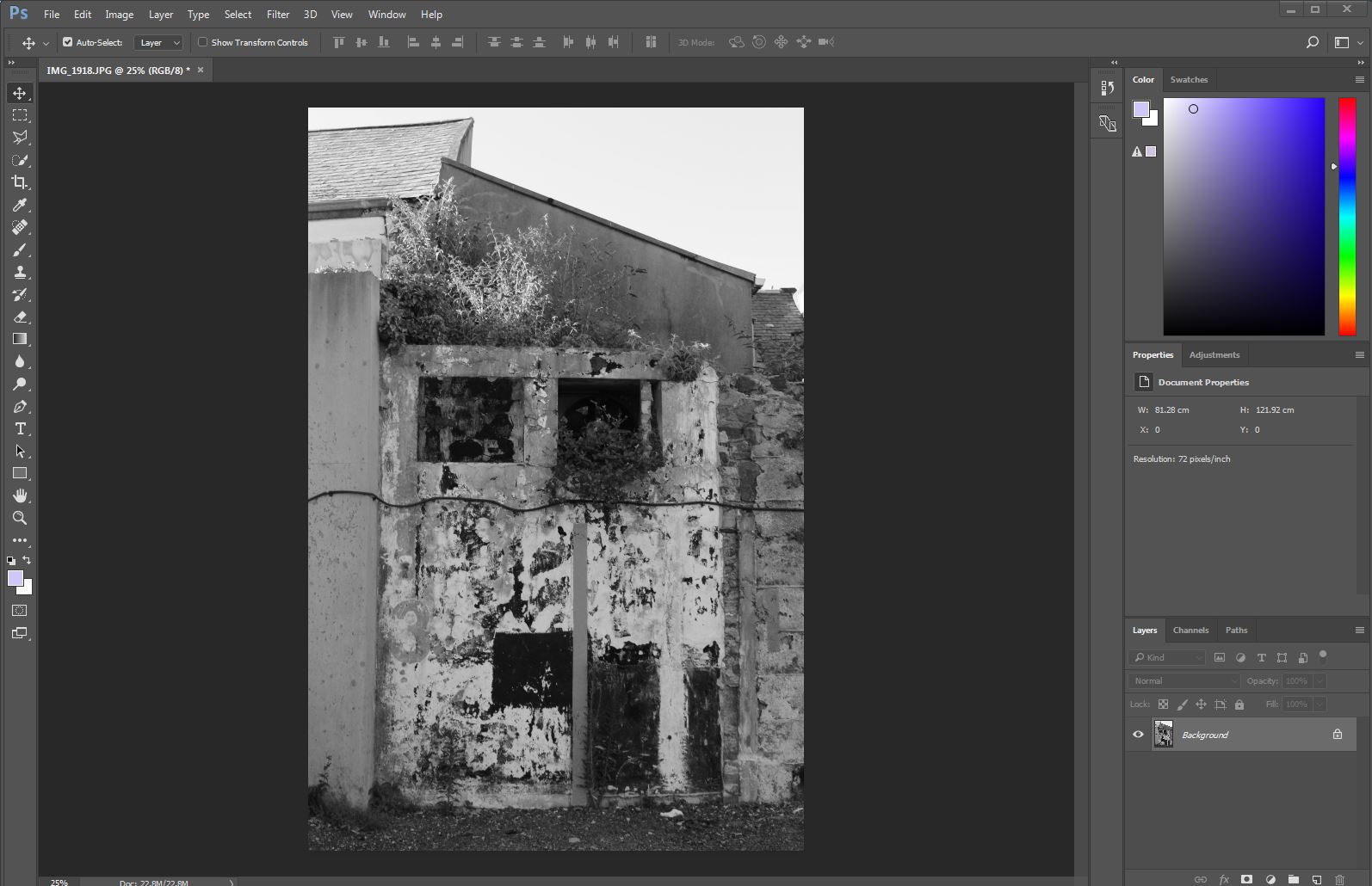
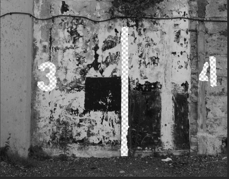
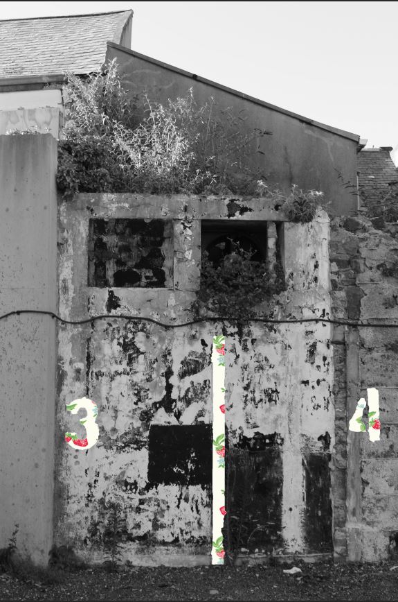
The first thing that I do when editing my photos is turn them into black and white this makes the contrast between the original phot and the wallpaper that I am going to edit in greter and heps the wallpaper to stand out more if the wallapper is a light colour and may not be seen at first.      I then select the quick selection tool and Choose the area where I want the wallpaper to come through. Then I cut out the area. 

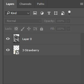
Then add a new layer and place in under the original image, this allows the original image to stay on top and the image which is going to be added in to be placed anywhere underneath  

This is what the final image will look like

Zine Research

A zine is a small circulation self-published work of original or appropriated texts and images, usually reproduced via photocopier. Zines are either the product of a single person, or of a very small group and are popularly photocopied into physical prints for circulation. Zines are self-published and are usually distributed in a very narrowed channels, this leads to the zines being more valuable and sentimental to the creators compared to larger artists with their official photo books.

Image result for zine books

Zine where first produced to express opinions of a range of different themes, but the first zine is often traced back to a 1930s effort by the Science Correspondence Club in Chicago. It was called The Comet, and it started a long-lasting trend of sci-fi related zines.

Cafe Royal Books 

https://www.caferoyalbooks.com/

Café Royal Books is a small independent publisher] of photography photobooks or zines, and sometimes drawing, solely run by Craig Atkinson and based in Southport, England.

Café Royal Books produces small-run publications predominantly documenting social, historical and architectural change, often in Britain, using both new work and photographs from archives.[9] It has been operating since 2005 and by mid 2014 had published about 200 books and zines. Originally he started the zinne’s as a way to disseminate drawings and photographs, in multiple, affordably, quickly, and internationally without relying on ‘the gallery’.Its publications are in public collections including Tate, National Art Library and many more.Image result for cafe royal books

Café Royal Projects are occasional projects that use gallery type spaces for a purpose other than an exhibition. In 2010 the Café Royal Temporary Library invited artists to submit books and editions. The gallery space was presented as a reading room for the public to use, with 800 titles.
ZINE

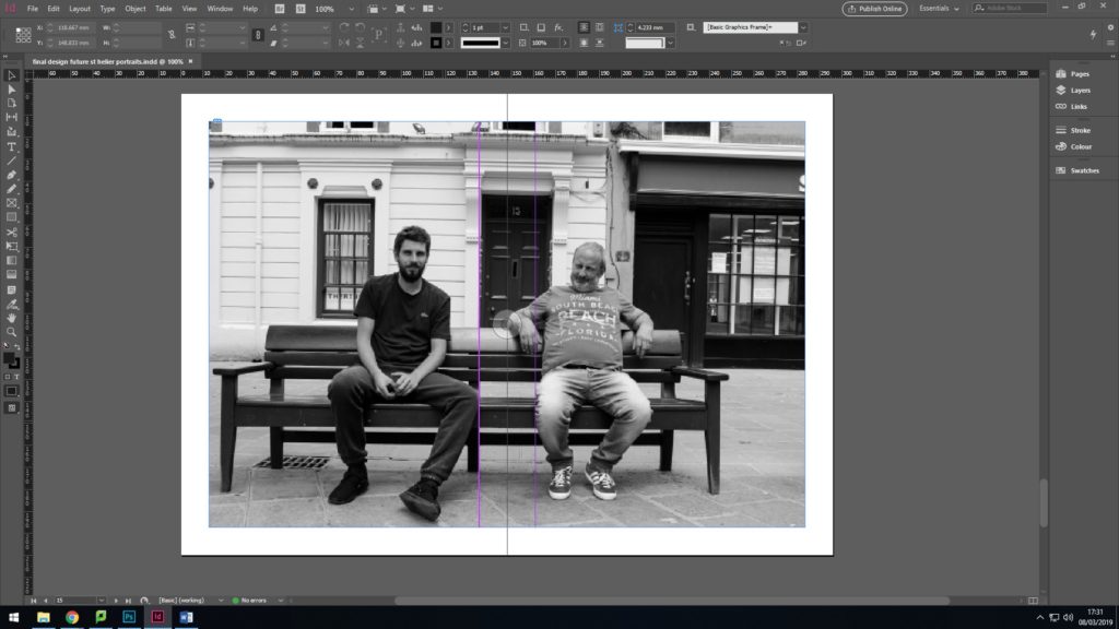
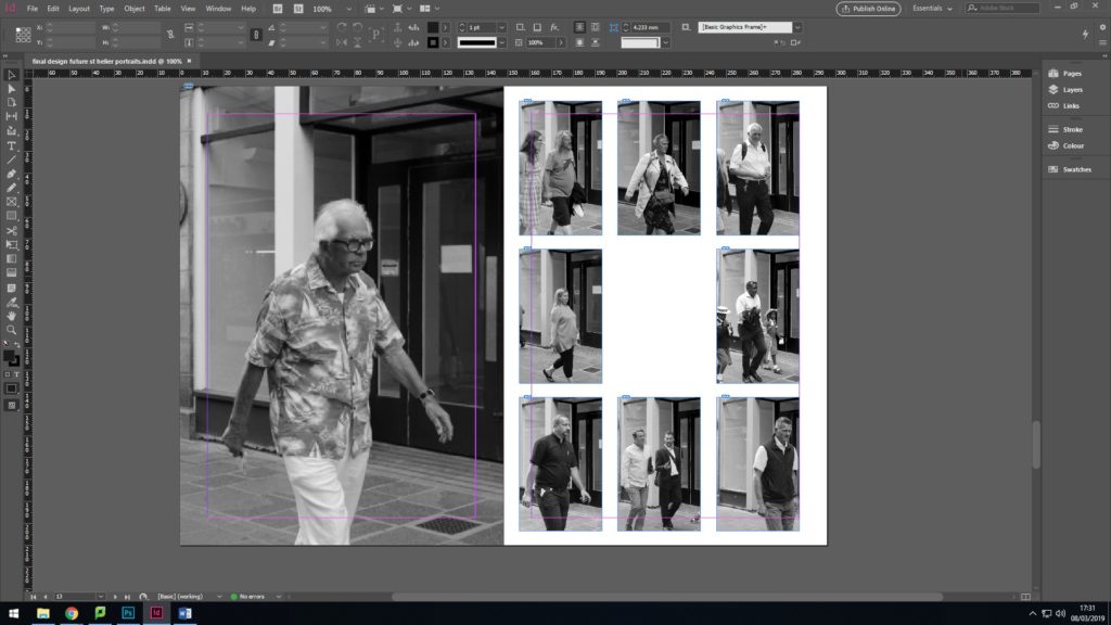
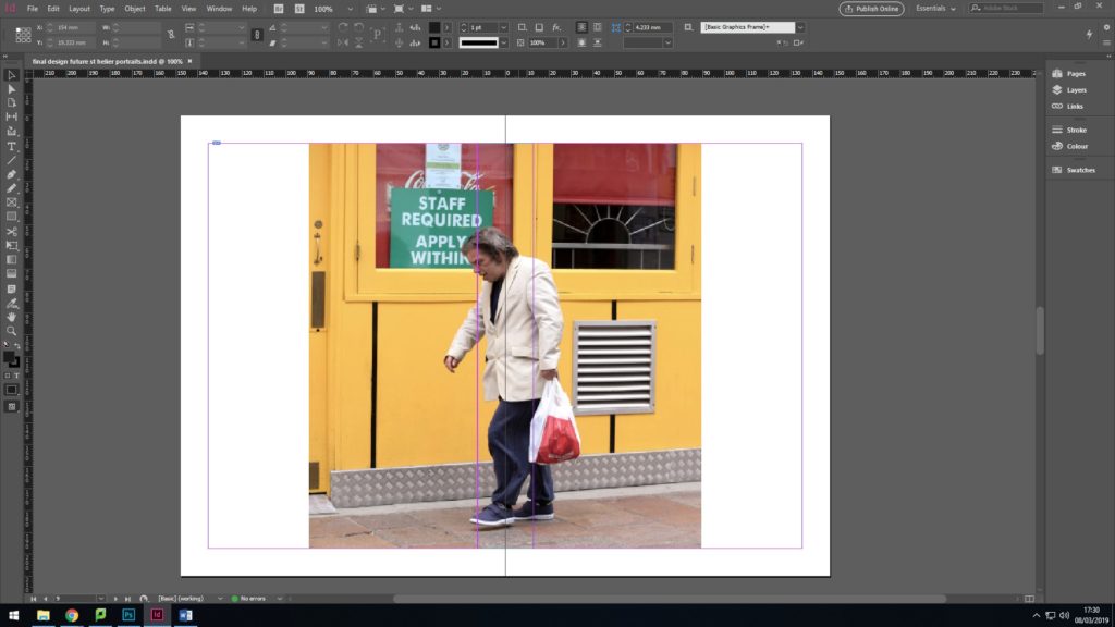
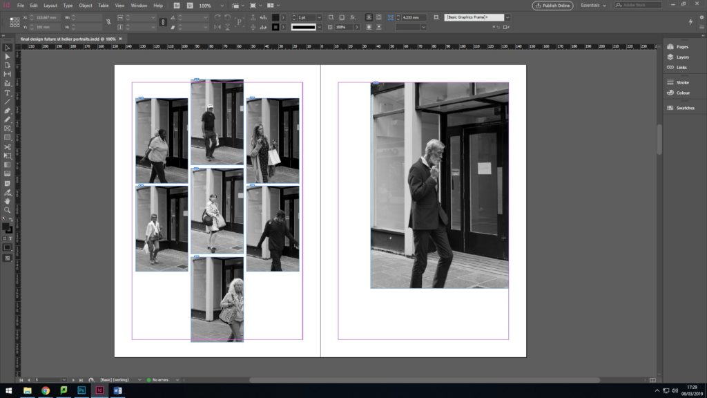
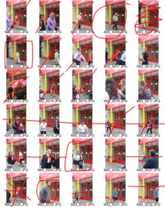
Below is my final Zine layout for the Future of St. Helier project. My first attempt of my zine had no structure, flow or theme and was a meesy outburst of colour that was too much to take in. Most of my didn’t link to any of my inspirations from the project so I had to re-think about artists that I had taken inspiration from. To relate to my initial ideas of photographing the people that make up St. Helier, I went back to artist Walker Evans and adopted his overall house style of editing. I then selected my strongest images from each of my photoshoots and edited them all black and white to correlate to Evans and also to simply display each photograph. I then explored layout and referenced contact sheets in some of the pages by arranging rows of images into the same format as contact sheets and shapes. I kept one photo in colour to; my strongest picture to break up the theme and let it stand out from the other pages.
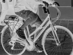
PHOTO SHOOT 3

I managed to capture a lot of material for my project and successfully managed to keep the same frame for each subject. It was hard to find an area in town that had a nice frame for people to walk into, while also being a busy spot that provided me with enough subjects to walk past my camera. I stood in the middle of the street and waiting for people to willingly walk past me. A lot of people clocked that I was taking pictures and walk past me with unspoken consent to take a picture. Surprisingly there were only a few people that avoided me.

EXPLORING EXTREME EDITING

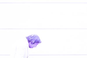
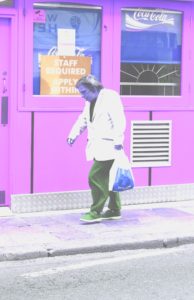
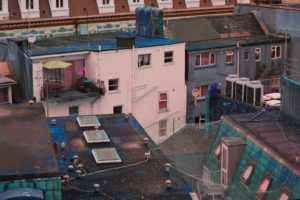
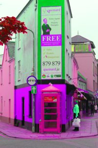
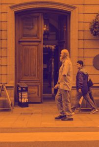
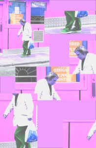
After my first shoot I have began to explore extreme editing in Lightroom and Photoshop to help establish a theme and way of enhancing images. I’ve edited each image to an extreme to understand how far I can manipulate an image, but also to understand how editing can cater to meaning behind an image and add personality. I’ve explored inverting images, changing the hue to enhance colours, over exposing images, layering bright colours over images and cropping. For example, I’ve cropped the head off the individual in the first image to shift the focal point in the image to the bike rather than the person riding it.

I think the overall mise-en-scene for this group of images creates an over-riding sickly effect that doesn’t justify my incentive or reason behind my images. However if each image is taken in individually, the editing entertains the underlying emotion and feeling for each individual in each image. These experiments have also helped me understand Photoshop and Lightroom more than previously.

These are few of my experiments;

Further editing:

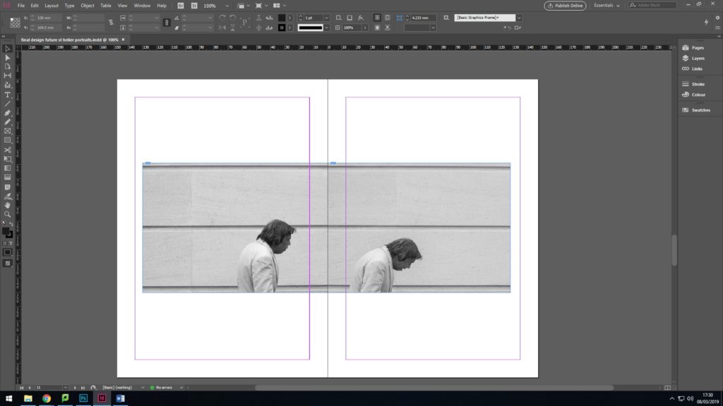
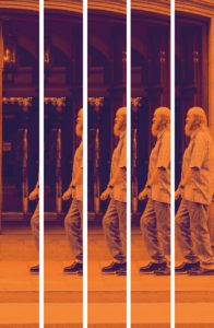
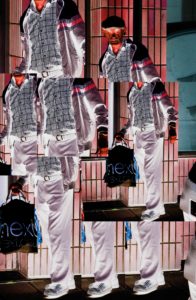
I further developed some of my images by cropping, layering and repeating parts of each image to create an overall insight into each individual. These images were inspired by Lewis Bush’s editing style in ‘Metropole’ where he used double exposure to create abstract images that almost replicated a kaleidoscope. Instead, for my images I have chosen and cropped certain aspects of each individual that give away more information of what they were doing, how they choose to personalise themselves, facial expressions, body language and their surroundings.

In the second image I decided to approach the editing style in a different way. I chose to crop the image into long and equal segments to mirror the height of the individual. I then moved and lined up the images together to create the simulation of a casual stroll. This was to replicate the impression I had when I decided to take this image.

Final Zine Layout

 This blog post covers my final layout for my zine…

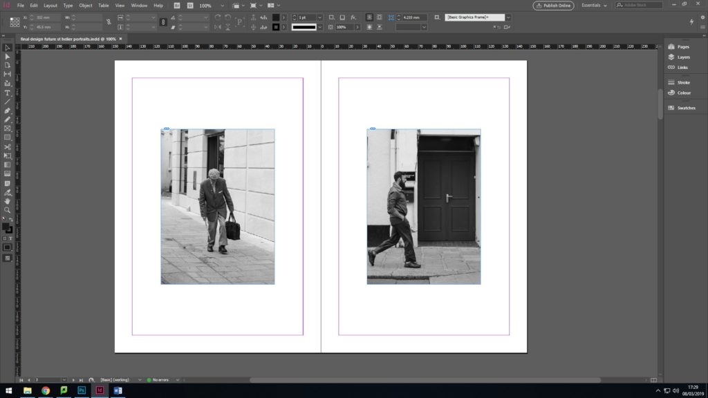
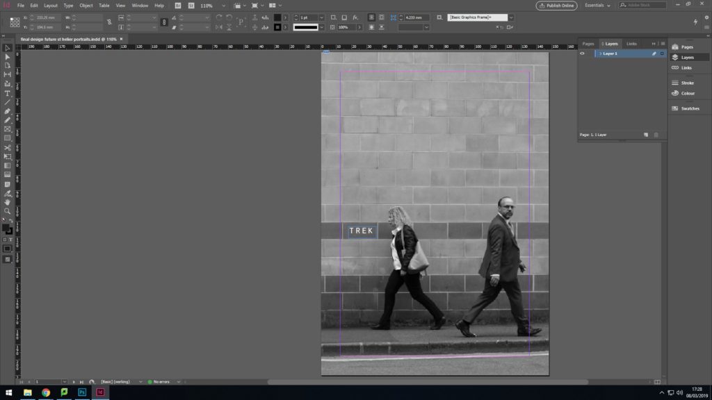
From my original drafts of my zine layout I have made some slight changes in terms of the things which I was not particularly satisfied with, and this is what I came up with. The layout follows a pattern in which every second double page has a link between two portraits, connected by a theme/word, followed by a double page portrait. The themes I have covered are those which I find suppressing and significantly apparent within the general public, noticeably in areas which are highly populated and civilized such as St Helier. I also made the text/words small and in a simple font as I did not want this to distract the viewer from the aesthetic value of the images themselves. The final images that i have used for my zine all have minimal manipulation and editing as I did not want to make the aesthetic of the zine overly complicated as it was more about just getting the point of the social issues across.

Final Newspaper Page

This image (below) which I have decided to use as my page spread in the student collaborative ‘Future of st Helier’ newspaper article is a combination of a photograph from the Societe Jersaise photo-archive and some of the images from my first photo shoot. The idea behind this piece was to show how the aesthetics of the modern town are considerably less visually pleasing that those of the old urban landscape, and when imposed upon the archive photograph take away the charm from the photo. I believe that this image would work well in the newspaper due to its rustic and dated aesthetic mixed with the modern corporate elements that are included within it. Also as a full page in a newspaper, I believe that the boarder around the edge will frame the image itself in an eye catching way, and will look very effective in a newspaper.

Without actually knowing exactly when the original photograph was take, the ‘God Save The King’ banner in the foreground of the image shows the age of the archive photograph, as the image would’ve had to be taken before 6 February 1952 as that was the latest date of a reigning male British monarch. The clothing of the office worker, the street signs, the modern building and modern lamppost that have been added into the original photograph are the give away signs that the image has been manipulated as I have tried to make this obvious when editing, but also having in mind that I want the first glance of a viewer to just think that it is just a dated photograph.

Here are the information references from the archive of the original photo taken by photographer Francis Foot.