
Category Archives: Uncategorized
Filters
Final Book – Online Version
Final print layouts
My final layout
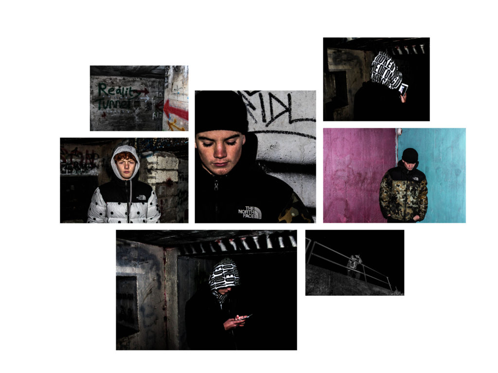
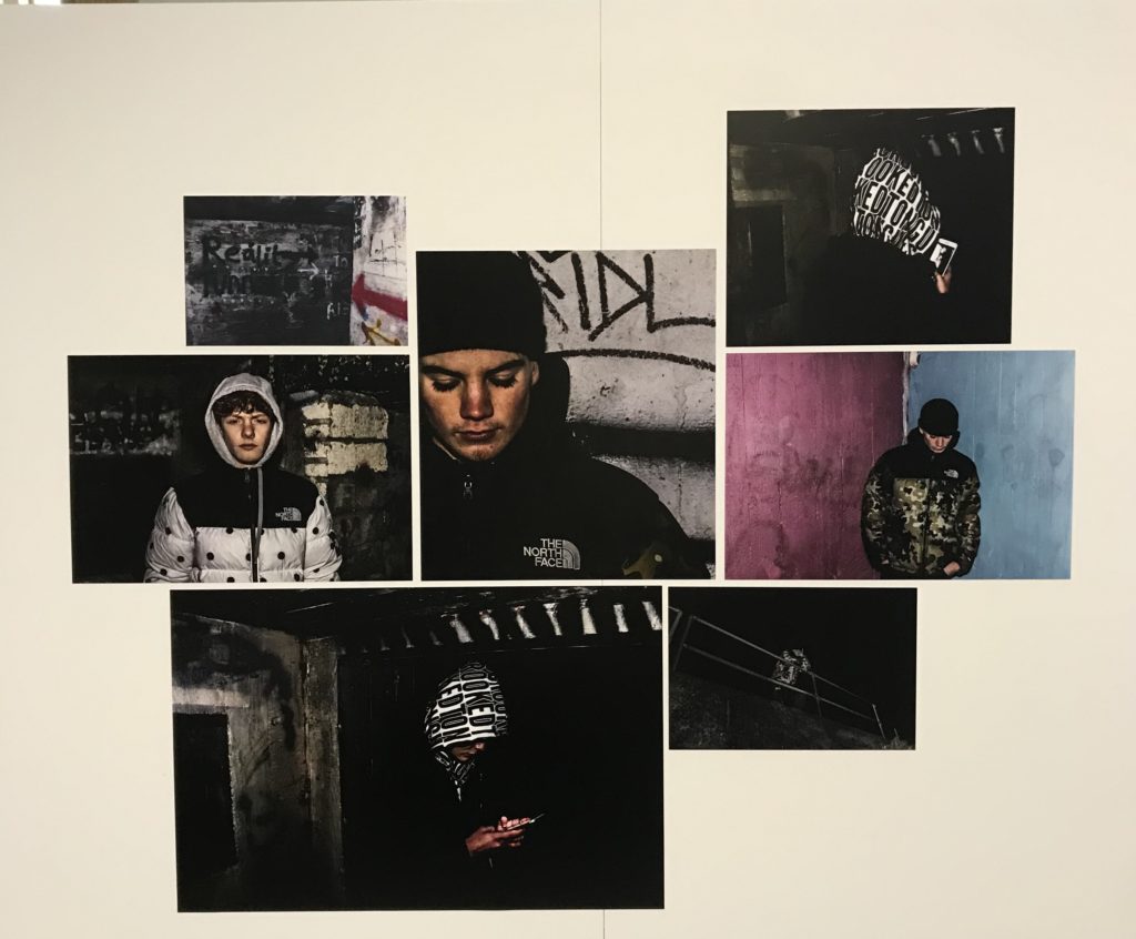
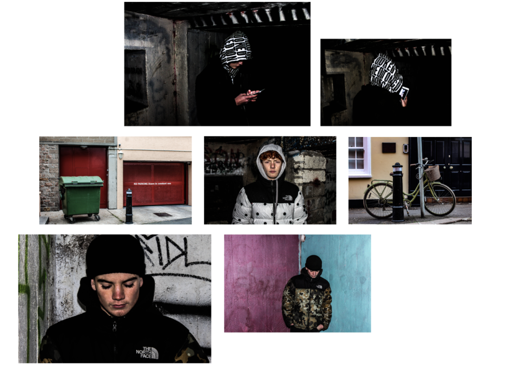
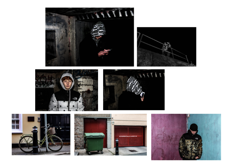
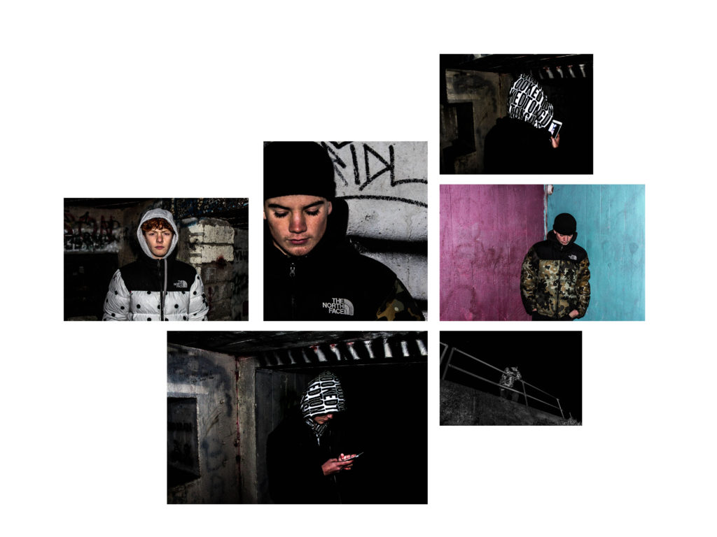
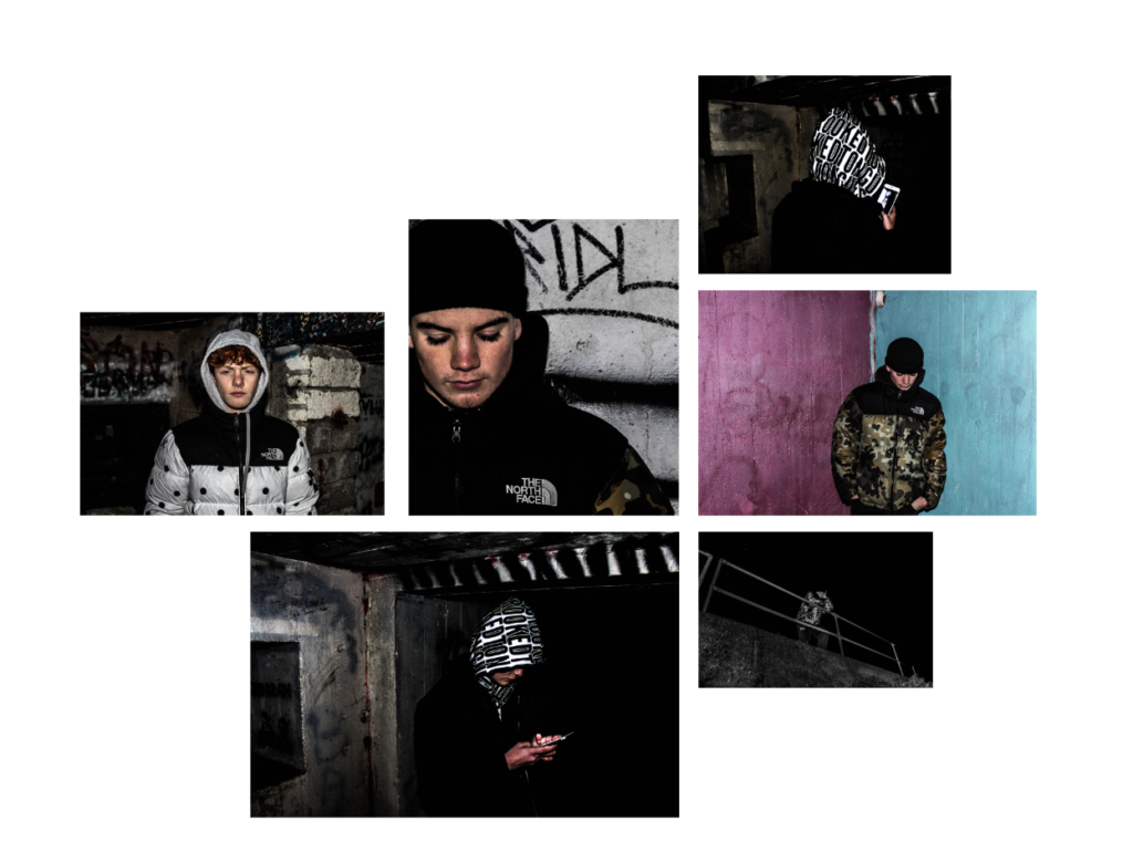
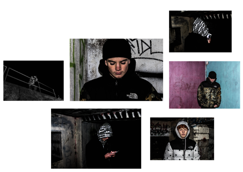
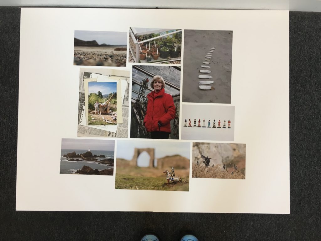
I have chosen the following images, as I have previously spoken about their quality that they hold and the amount of narrative which is found within the pieces. I wanted to create a final presentation that both showed element of landscape, portraiture, surrealism which all fits into my end title of my political landscape model was named ‘How do people react, control and effect the environment by creating man-made structures that cause a sense of isolation?’. I wanted to experiment within the orientation of my piece and more interesting ways which they could be positioned, as I think this would only further develop the narrative of my work altogether. Furthermore, I wanted to experiment with size also as I feel a variation of sizes allows for a more interesting layout. I tried to choose images which have a similar colour theme throughout.I wanted to included all my images but found it looked too crowded when all al the board which resulted in me removing two images. Due to some images having bold colours and also having dark images it created strong contrast and also variation. I do not feel a black background would be the best background have, as it might remove some of the tones, and create a background which you cannot properly see and won’t be as affective. I believe this project overall has really allowed for me to expand on the ways in which I am capable to take images and develop them further and create a true theme to my progression of work.
Final Prints
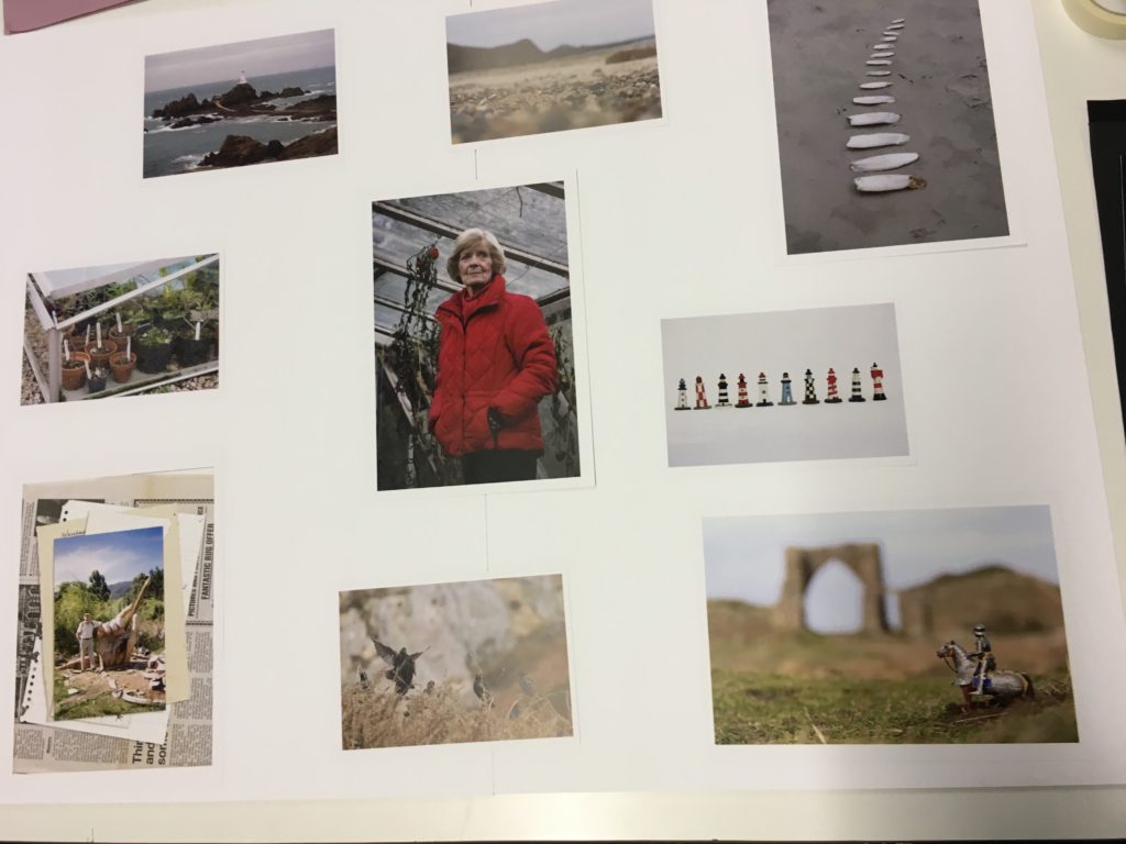
For my final presentation of the images I wanted to display them all on a white background in a collage format. I got my photos printed in a range of portrait and landscapes in size A4 and A5. I stuck two sheets of A2 foam board together to make a big canvas and background. I knew I wanted the key portrait of my Grandma in the centre because it is the boldest of all the images and draws your eyes in. I played around with different layout trying to spread them out evenly and make them all fit together without any big gaps.
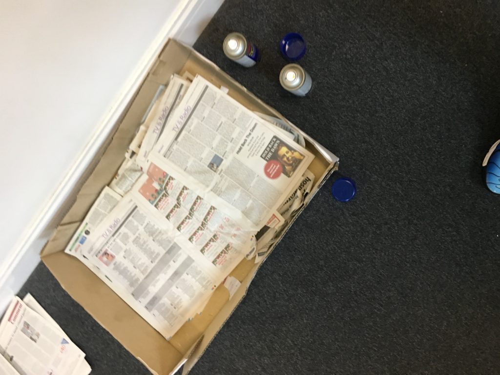
When I had decided on the placing of the images I spray mounted them and stuck them in place. First measuring the centre image and the aligning the rest up with it to make sure they were all straight. The image layout had a rough edge and were not all perfectly lined up, this was intentional to create a more natural look and to give it more interest.
Final Photobook
Here is the link to my final photobook ‘ loved ‘
POLITICAL LANDSCAPE ESSAY
EVALUATION
For Political Landscapes I struggled to reach a final idea for final pieces and a project. My initial ideas were leaning towards the meat industry and its effects on the landscape and the climate, but I had limited resources to produce photographs, so I started to explore other ideas. I then moved onto studying feminism and the role women have played in art throughout history as artists and subjects. This lead me to explore influential female artists that emerged around the beginning of new technology and consequently new art – video art. I then explored Yoko Ono and Marina Abramovic, radical female artists. However, their intentions weren’t always in favour for the feminist movement but more for the sake of art. I then started to look at more contemporary artists like Izumi Miyazaki and Iiu Susiraja. I realised that the use of art for political messages was more common today than it was in past, with almost every current female artists creating art for themselves as women and for other inspiring other females around the world. This lead me to think of the idea of creating art for individual females and making my concepts behind my photographs more personal rather than for a larger cause or movement. I think the simplicity of producing photos that reflect an individual is powerful, as the population on our planet rises and the need for individuality increases. -I think I succeeded in my intentions as my essay explains the context behind my book, and the book itself creates a visual display of two strangers, communicating to the audience who they are without the use if words and all through photos.
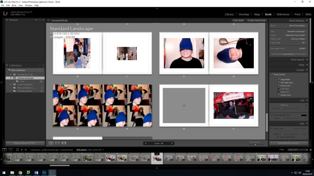
BOOK DESIGN


The initial layout of my book didn’t have a sense of a continuous theme throughout my design and layout. I wanted to imitate the content of my pictures through my design but the overall outlook of my design was too messy, untidy and had an overriding intense feeling. To improve the presentation of my book I used the templates instead of making my own to create a continuous flow. Below is my final design, improved from my initial design.


MY BOOK SPECIFICATION
My photo book will focus on the ongoing political movement of feminism and claiming back power through portraits and tableaux’s of domestic scenes that comment on traditional characteristics and stereotypes of the female using humor, with inspiration taken from working artists and photographers, Liu Susiraja, Juno Calypso and Izumi Miyazaki.

Izumi Miyazaki created ‘Me and Me’ photo book consisting of surreal self portraits that question reality and female stereotypes in art. Miyazaki is a Japanese artist, her work is considered in her homeland to be nontraditional for a female artist which helps to break down barriers for other female artists within and out of her homeland.
I like the format of Miyazaki’s ‘Me and Me’, the inspiration I take from her book is the individual formats on each page for each photograph. Every layout on each page caters for one image, keeping each image separate with individual frames that work best for the overall mise-en-scene and treating each portrait as a separate piece of art. This is simply done with each image on a blank background with different crops and frames, size and placement giving each image a different area of negative space.
 I want my book to feel as authentic as my subjects and to disregard any connotations of mainstream beauty magazines, adverts or icons in western society. Females are usually represented to be refined and perfect with a sense of materialistic features and symbols which I think take away from the authentic female. I don’t want to replicate this in my photo book, I think glossy paper connotes this negative outlook as it’s often used in magazines that are sold to a consumerist audience, making them buy into unrealistic lifestyles and beauty standards that are toxic to the mind. I want my book to have a fresh authentic feel, using matte paper is more raw and real, not fake.
From the moment someone looks at the cover of my book I don’t want any prejudice opinions of the content just by looking at a photo or colour. Colour and photographs hold a range of meanings that could lead to presumptions about the content of my book. The word Feminism already has so many negative connotations and I don’t want to add any more negative outlooks on my book.
Final Print Display
