What is tableau photography?

Tableau is the French phrase for 'living picture'. Before photography was a thing it was a popular past time to which people would recreate scenes from famous paintings at parties. These people would dress up and use props to make it as accurate as possible. As photography emerged artists such as Julia Margaret Cameron created fantasy scenes like Sir Launcelot and Queen Guinevere, which prompted a huge interest in the art form. However this form of photography fell out of fashion with the introduction to realism.

Some of Julia Cameron's work can be seen below:
As seen in her work, she wanted to focus on how the photos were meant to recreate paintings in an innovative and creative way not seen before.
The 7 deadly sins were a popular topic when doing tableau photography due to each one having an important connection. These were Lust, Gluttony, Greed, Sloth, Wrath, Envy and Pride. I could then link this back to how these all formed their own unique identity and change the individual for the good or worse.
Category Archives: Threshold Concepts
Filters
Studio Lighting Photo Shoot
Why do we use studio lighting? We use studio lighting because it gives us more freedom to control the conditions that the subject is in. For example we can adjust the angle, brightness and color of the lights so that we can have the settings we desire to have the picture taken in. What is 3 point lighting? Three point lighting is split into three different points: Key lights, fill lights and back lights. Key lights: Usually the main and strongest light, with the most influence in the shoot, and is placed on one side of the camera so that the other has some shadow. Fill lights: The secondary light that is placed on the other side of the camera from the key light, to fill in some of the shadows using softer lighting. Back lights: This is placed behind the subject to provide some lighting from the back, with its purpose to provide definition and some highlights in the picture, which helps separate the subject from the backdrop.In this shoot I used the artificial lighting provided by the spotlights, to create a dramatic, almost black background, whilst using a red film to cast a reddish shadow onto the subjects face. I tried to position the subject's face using the rule of thirds, so that the eye was drawn to the face almost immediately, whilst blending in some of the subject's clothes into the darkness to create a smooth visually pleasing image. This was my response:
Final pictures:
I chose this image because I loved how the subject emerged from the darkness through the slow faint gradient of the red. This I found created a more dramatic effect to the overall image taken.
What I liked about this image was how not all of the subjects profile was shown, as there is a clear contrast between the light and dark side of the face. This created a more abstract effect where the body seemingly is materializing from the darkness.
I found that the clear definition between certain points of the subjects face, such as the neck and forehead allowed from a most striking and dramatic look from the individual.
What I really liked about this image was the use of the main light only being used. By doing so it created a circular spotlight illuminating only the top half of the subject's body, whilst making an imposing and strong contrasted image.
The use of the shadow in this image allows for a strong contrast created by the singular spotlight, to which the slight gradient around the edges makes the overall image more sinister.
Photoshop Burn And Dodge Tools
What is the burn and dodge tool? The burn and dodge tool allow you to either darken or lighten an image of your choice. This can be used to create dramatic effect within an image, and so can use it to lighten dark areas or darken parts you want to stand out the most. This is used in portraiture due to how it can be used to make certain features stand out above the rest, such as making one side of the face darker. The image below shows the effects of dodge and burn to a grey surface:I wanted to apply this to an image of mine to see the effects that could be made. These were my steps: 1) Navigate to the selection bar on the left, and pick the burn tool.
2) Select a suitable size for the brush to match the face, and go over the parts of the face I want to darken once.
3) Go back to the bar on the left and select the dodge tool instead, from there I lightened the parts of the image I wanted to have a clear contrast from the darkness.
Final presentation
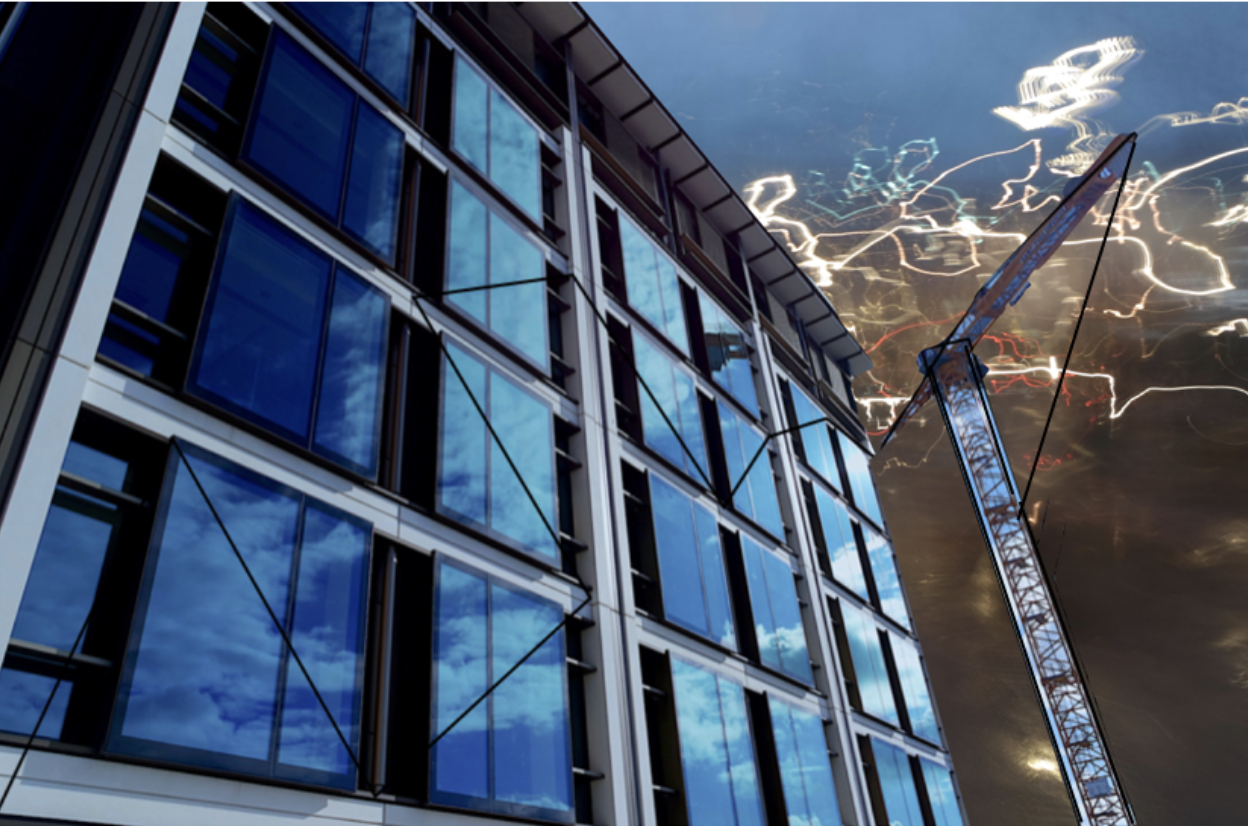

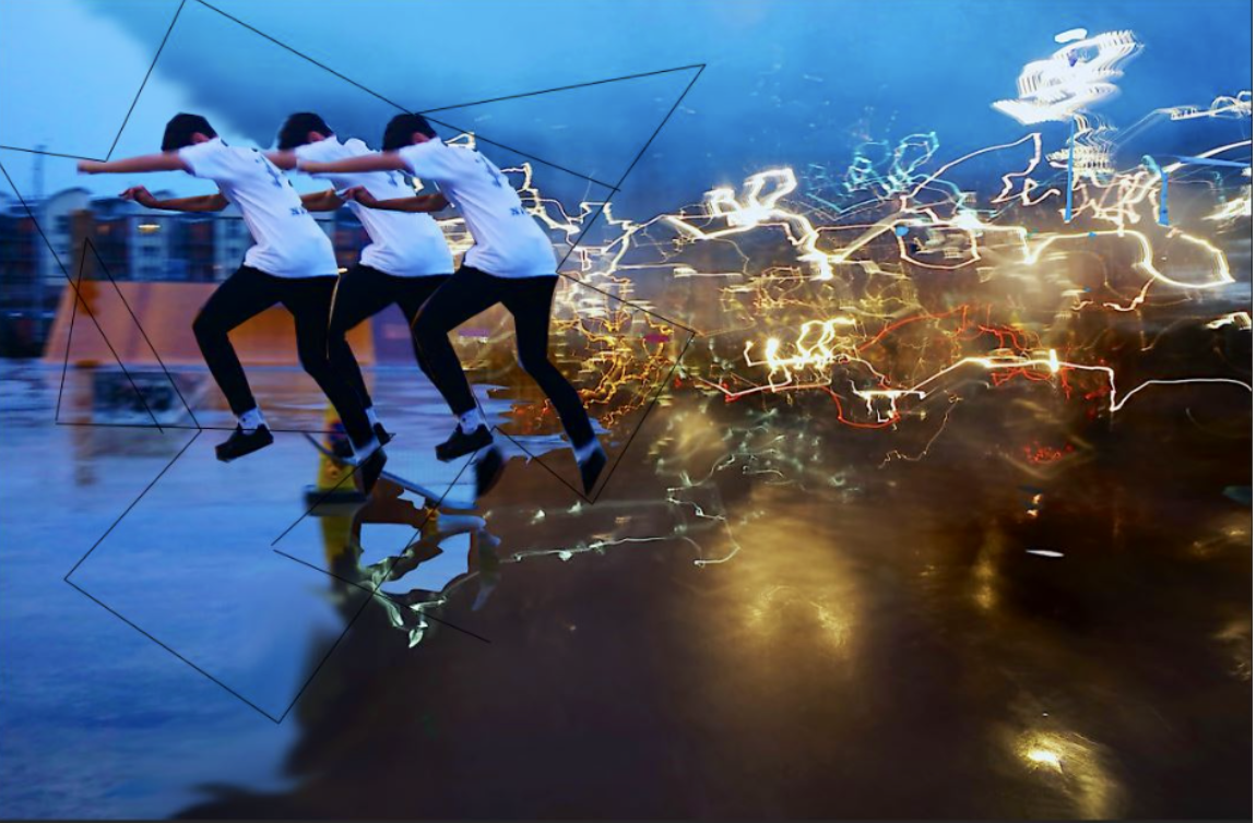


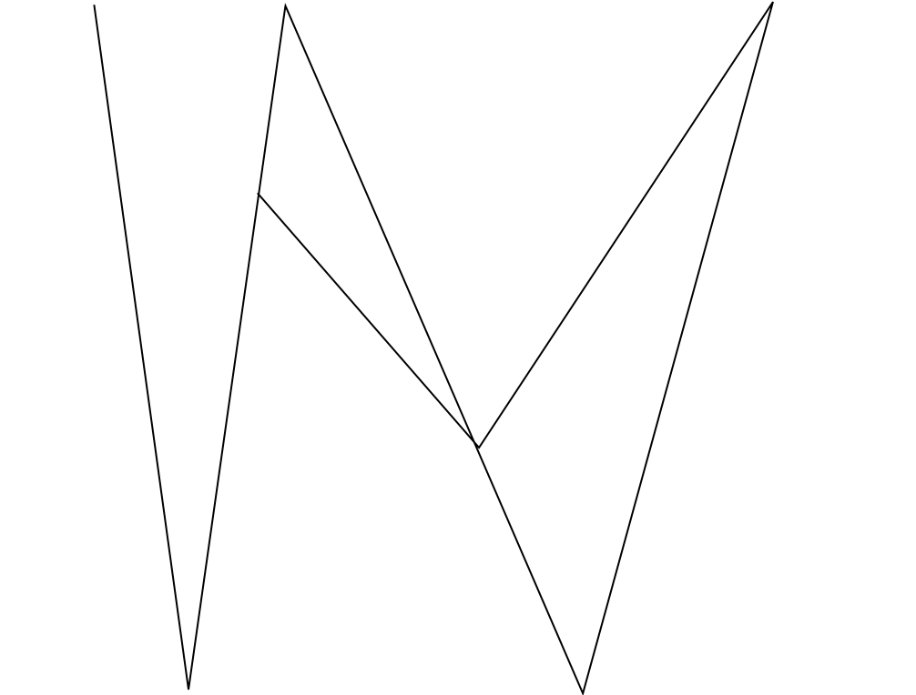
Final

Analysing Robert Frank
Trolley - New Orleans

Robert Frank is a Swiss-American  photographer and documentary filmmaker born in 1924, with his most noticeable work being the 1958 book called The Americans.
Trolley - New Orleans 1955

Named The Trolley, this became one of Robert Frank's most famous photos released from the book The Americans. The picture captures the fleeting moment that conveys the brutal social order of the postwar America. Frank was originally shooting a street parade when he saw a trolley passing, in which he quickly spun round and took a picture before the trolley disappeared from view.

Visual

The picture consists of a small amount of tonal range but a large contrast between black and white throughout. The picture is obviously taken at a slightly angled position, with a balanced symmetry across the entirety of it. This image has been cropped from the original taken with a huge contrast between the white poles and the people next to each one, instantly drawing your eye to them.

Technical

A natural light is used within the image as it was taken on a bright sunny day creating a warm tone to the overall piece, but has been slightly manipulated with evidence of the Ansel Adams zone system used throughout. The whole image seems to be in focus with no blur at all with a big depth of field, whilst telling us that Robert must have used a high shutter speed to capture the moving trolley so clearly without the traces of blur. From the reflection in the glass above the trolley windows, it is clear to say that it was taken head on allowing for the effect to occur.

Contextual

The picture perfectly captures the racial separation between the people at that time period within America in which classes were divided (In one window there is an old white woman, the next are two white children and the last are two black men), whilst also revealing and documenting the truth behind what the Americans saw as 'The American Dream' in which not everyone was equal with similar opportunities in life
High Contrast Images (Threshold)
What is threshold?

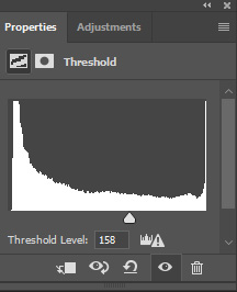
The Threshold tool transforms the current layer or the selection of images, into pictures consisting of only pure black and white. In this, the color of pixel represents something, for example white pixels represent the pixels of the image whose value is in the threshold range, and black pixels represent pixels with value out of the threshold range.

I was inspired by the photographer Keld Helmer-Petersen, whose work was mainly based around this aspect as seen by some of his pictures below. I noticed that his images mainly consisted of every day objects, with a clear definition between light and dark, to which he would convert these using the threshold (As seen below).


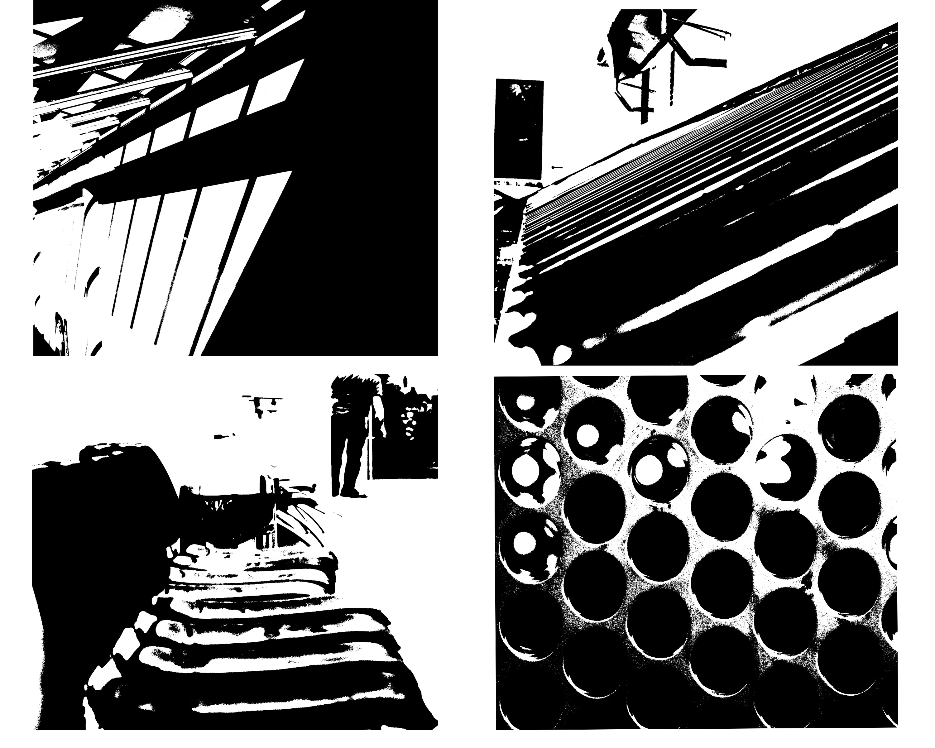
This style of photography inspired me to create my own small contact sheet, in which I would incorporate this threshold idea into some of my picture taken previously, using the software Photoshop. This would really make certain aspects of the image that I desired to stand out from the rest, by reverting the image to a black and white only state. However with certain images, I decided to invert the colors as I believed it made the image more aesthetically pleasing to the eye, and in some circumstances made the object I wanted to pop out.

This is the outcome of my experiment:

The method in which I created these images on Photoshop are below:

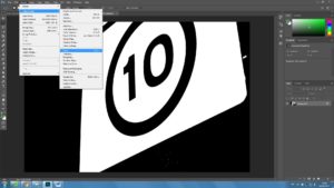
1. Locate the Image tab above, and click the adjustments section, which will reveal the Threshold section.


2. For some pictures I then had the idea to invert my image colors, allowing for a completely different picture to be formed.
Minimalism
what is minimalism?
Minimalism is a modern idea within the 20th century,it is about specific components such as color,shape,line and texture.It is highly subjective as artwork itself. leaving interpretation and meaning up to the viewers perception of the work.Some photographers use this in order to tell a story of a act of photojournalism but in a easily presented manner to the audience.
the best aspects are surrounding the openness and embracing the freedom of interpretation.There is no real direction to minimalism but photographers can still focus on issues or a specific subject matter. Some other photographers would argue it is about simplicity and the audience creating their own feel or interpretation of the image itself. Some techniques are consistently used to employ and enhance the impact of the work.There should be a consistent notion that is wanting to be captured.
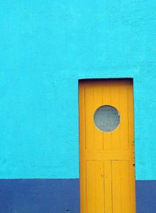
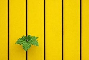
It can be seen within this piece in order to direct attention to a specific point of view,possibly because this kids the most detail or it is aimed to promote a certain aim of development within the image itself. The images are developed through a certain line within the mage,a certain single aspect of the image,or a texture.
My experiment within minimalism:
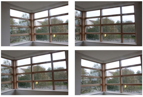
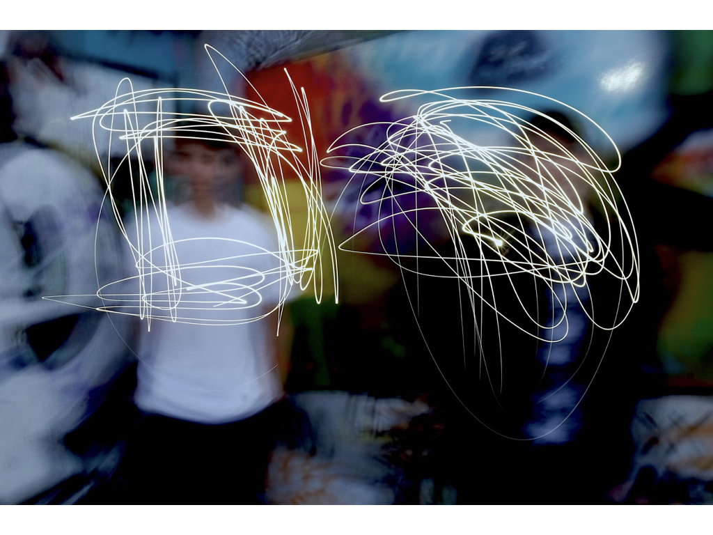
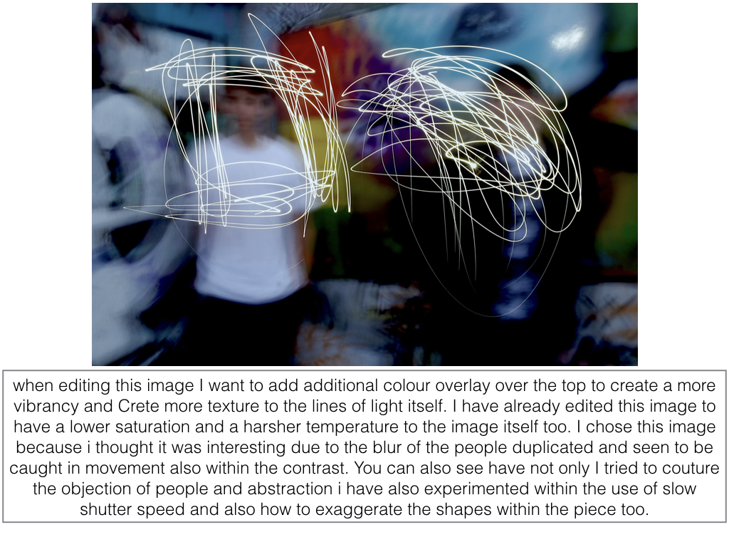
within these photos I simply wanted to capture the lines and highlights within the piece itself. I then decided to further edit these images to create more of a colour impact to the piece itself.
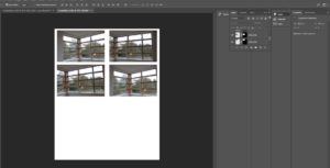
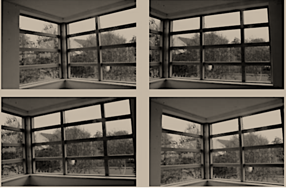
here you can see the final edited image that I have lowered the saturation for and also developed the thickness and how dark the lines are to give a greater focus on the minimalist dimensions of the piece itself.
editing with threshold: keld helmer petersen
within this image it is edited to show black light within high saturated edits,then also turned into squares for an even overall finish.I was inspired by the artists Keld Helmer Petersen who wanted to achieve an international collection of experimentation shapes inspired by ranger patsch. He also developed poetic realism within his work and modernism within photography.
He eventually adapted and developed the intellectual structuralism to art and photography,he liked to capture leafs and trees against grey light and patterns created within nature.He started to become more abstract within the enlarging of his images focusing on the microcosm of nature.
I chose these images due to their defined lines and shape within the pieces. I thought the compositions of the pieces where also quite interesting as there are many dimensions and angles to the piece themselves.
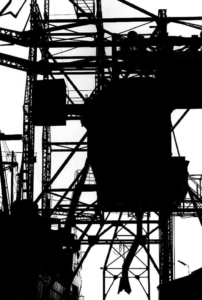
this is a clear example of his work and how he different from using more simplistic images to more complex lines but overall still achieved the same tonal range and detailed effect of the image.
Experimenting with Threshold
I have taken inspiration from Keld Helmer Peterson and edited my photos in photoshop, using the threshold effect to achieve a similar appearance.
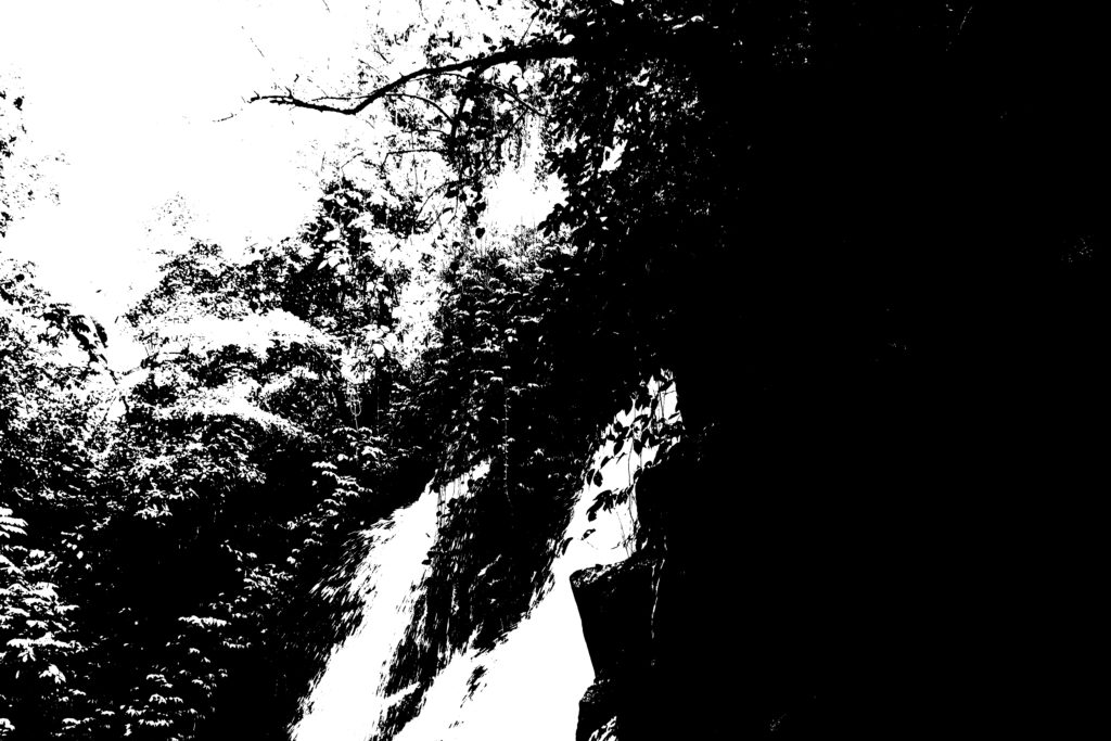
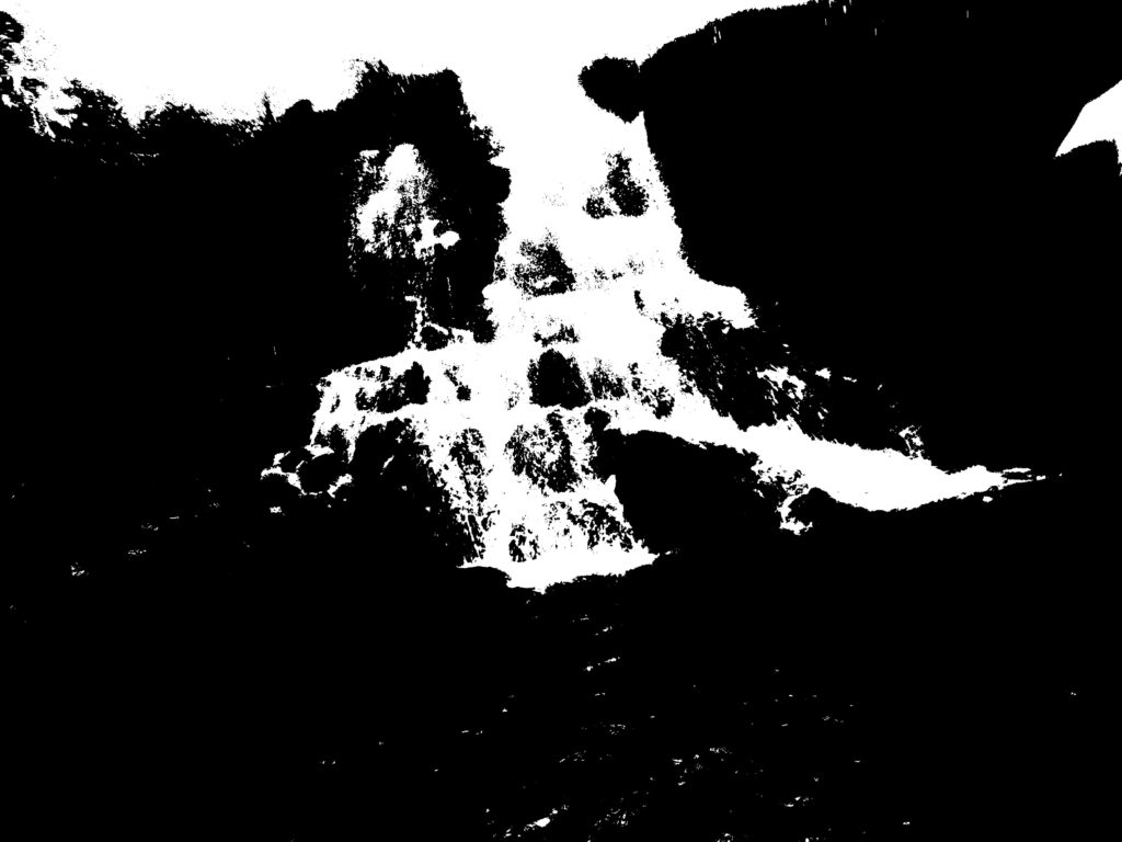
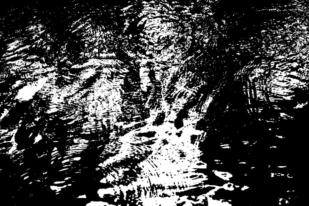
I cropped the photos and altered the threshold levels to get the effect I wanted. I put the edited photos in a square shape to show my work as whole.
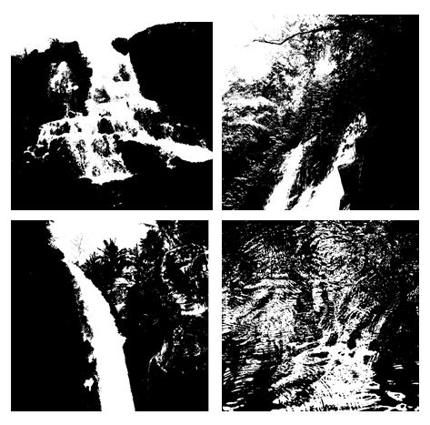
I think these photos work well in a grid format as the threshold effect shows the different textures of water. Having the images together emphasises the contrast from white to black and because the photos only have two colours it makes them more powerful.


