
'political' definition: Relating to the government or public affairs of a country.
origin: (from Greek: πολιτικά, (Politiká), meaning "affairs of the cities") is the process of making decisions that apply to members of a group.

'landscape' definition: All the visible features of an area of land, often considered in terms of their aesthetic appeal.
origin: Late 16th century (denoting a picture of scenery): from Middle Dutch lantscap, from land ‘land’ + scap (equivalent of -ship).

'Political landscapes' can be explored in many ways through photography, it could be argued that every photograph that we take has an underlying political statement even if there was no intention for it - a photograph can either conform to ideologies and standards of a culture/society or it could break them.
Your Photography Is Political

Effectively the product produced by the fusion of politics and landscape photography is documentary photography, which essentially highlights and tackles current issues, daily life, events or traditions that have been developed through political influences, then reinforced through the media and dominant ideologies in societies.

Landscape photography can present issues like global warming and the impact of human activity or capitalism in modern cities or societies and its effects on the lower classes, or natural landscapes and the impact of infrastructure and urban development; focusing on the sublime in nature or perhaps what has replaced the feeling of sublimity with the changing landscape; escapism.
As well as landscape photography conveying issues through the land and scenery of an area it can become something more abstract like the human body or inanimate objects. This can relate to social issues like equality within race, gender, disabilities, mental health and breaking stereotypes and breaking ideologies.
Category Archives: Threshold Concepts
Filters
Starter Activity: “Context is Everything” (Miss Hearn)
Learning Objective: To develop a deeper understanding of the way in which the context in which a photograph is created and seen effects its meaning.

Photographs are not fixed in meaning; context is everything.
Simply put, meaning is derived from context, whilst context is the information that surrounds something. We form our understanding of a photograph not just from what is in it, but what we know about it.
context
noun
1. the circumstances that form the setting for an event, statement, or idea, and in terms of which it can be fully understood.
2. the parts of something written or spoken that immediately precede and follow a word or passage and clarify its meaning.

meaning
noun
1. what is meant by a word, text, concept, or action
The contexts within which we encounter an image also offer areas for exploration. These might include:
- A photograph’s physical proximity to another and how this influences our perception of it e.g. side by side in a book, on a gallery wall etc.
- Whether we see the ‘original’ work as the artist/photographer intended – framed on a wall, in a specific location, via print, on screen, via digital projector etc.
- The information that surrounds, precedes, accompanies or follows the encounter. A simple (but highly influential) example here is if the photograph has a title or caption. But other diverse influences might seep in – the surrounding noise; your emotional state; recent reading; what you had for lunch?
Whatever your intentions for your own photographs, context doesn’t necessarily stop an image from having alternative meanings. Connections are free to be made and conclusions drawn regardless, and the deeper your awareness of various contexts – be it colour relationships, genres, the illusions of surface, photographic typologies, whatever – the more possibilities can emerge. Not everyone sees and interprets meanings in the same way.
Consider this influential photograph…
CLICK HERE TO VIEW
General Nguyen Ngoc Loan executing a Viet Cong prisoner in Saigon – Eddie Adams, 1968
What do you think is happening in the frame? Can you identify the meaning behind this photograph?
CONTEXT: Hear Eddie Adams’ account of the killing in Saigon http://100photos.time.com/photos/eddie-adams-saigon-execution
The photograph, above, is one of the most disturbing, iconic images to emerge during the Vietnam War and receive global press coverage. It quickly became a symbol of the war’s brutality. Long after he had pressed the shutter Eddie Adams lived with a sense of blood on his hands – but not that of the victim, but rather the gunman himself. Adams felt he ‘killed’ the gunman by creating an image in which he was forever cast as a villain. The man being shot (Nguyen Van Lem) was the captain of a Vietcong “revenge squad” responsible for executing dozens of unarmed civilians that day. The gunman, General Nguyen Ngoc Loan was, within the context of war – and (rightly or wrongly) The Geneva Convention – a man at work. There were no winners here.
Discuss in pairs…
“There are no meaningful images”
Do you agree with Joachim Schmid? Justify your response.
Suggested Activity (extension)
You may want to produce a photograph that has a significant gap between what is seen within the frame (the subject matter) and the context that lies beyond it (the explanation that reveals its true value).
Consider how interpretations of the image might be altered by providing further context such as: a title, a quote or song lyric, a short story, a formal explanation, revealing that it is part of a set or sequence.
The New Topographic Inspired Shoot
within this shoot on the topic of New Topographics, I will be focusing on the contrast between the urban landscape surrounded by forms of nature allowing imagery to give way to unromanticized views of stark industrial and urban areas to which these everyday scenes would not be given a second glance about. Photographers that have inspired this shoot for me consist of Robert Adams, Stephen Shore and Henry Wessel.
Some of their works can be seen below to provide a general idea to the overview of New Topographics:
 I decided however to plan the shoot before I went ahead and did it. This would allow me to have a general idea before hand of what I wanted, and needed to achieve to produce an effective overall image regarding the topic of New Topographics. These are my ideas:
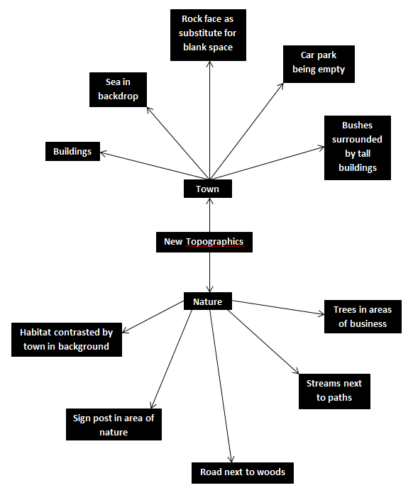 Once this was complete I decided it was time to move on to the shoot itself, and so decided to use the areas regarding the idea sheet of town, Grouville and St Brelades. These were my outcomes:
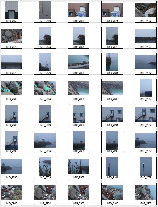

 Once the shoot was complete I narrowed the images down to only ten of my favourite pictures. By doing so it would make it easier for me to select the final image that I believe to be the most relevent and successful overall. These were my choices on the ten best images:


From this selection I whittled the ten images down into five, this would allow to select the best photo from the batch which I deemed most appropriate for the catagory ‘New Topographic’. These were my choices:
 I chose this image because of how I loved the clear contrast between nature and the taking over of it by man, seen by the run down sign surrounded by overgrown grass. I found this to be aesthetically pleasing created by the use of a depth of field, by doing so it blurs our the foreground and the background allowing only really the sign to be noticed properly which is where the eye is drawn. I found the slanted composition to be especially interesting by how it gives the impression of an overgrown and ruined world.
 I selected this image due to once again the use of the depth of field that blurs the backdrop, this along with the use of the composition allowed for maximum effect, giving the impression of a world that eventually succumbs to nature. I found that the way that the fence was composition allowed for a sense of distance to the photo, with the use of neutral space on the right being filled with industrial buildings bringing the viewer into perspective of the area it was taken in.
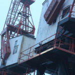
 What I loved about this image was the clear contrast and clear colors used to create an aesthetically pleasing outcome. This is done through contrasting colours blue and white which highlight features of the building, allow for such things as the door and bolts top pop out and draw the viewer’s attention. The composition I found also was aesthetically pleasing due to how the entire image is symmetrical which in consequence created a much cleaner and pleasing look.
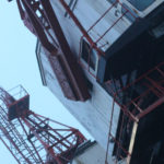
 Within this image I found that there was obvious difference between nature and man-made structures. This is once again done through the use of a depth of field to which allows for the appearance of us peering through nature to find the man-made structures that surround everything, whilst showing how where ever nature is human activity is not far behind. I found that the gloomy colours within the image emphasised the destruction caused to the landscape by these structures and how nature and civilisation lives side by side.
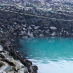
  Finally I chose this image as I loved the reflection of cranes created by the aftermath of rain fall. This was partially down to how I thought it highlighted a clear contrast between nature and society, with the looming structures left behind, whilst at the same time creating a deserted and desolate feel to the overall piece. I found that the composition of the piece complimented the photo as it filled most of the negative space made by bricks, with various beams fading out of the image.
Once completed I thought it was time to decide on a final image from the shoot that I thought emphasised the topic ‘New Topographic’ and was most effective in response to it. This was favourite image as an outcome to the shoot:
 What made me choose this photo as my final image was because how to me it summed up the clear contrast between human activity and nature. This was done by the composition of the grass creating the impression of it growing around the sign as if taking back the land seized by man, to which there is a clear difference in surrounding of the backdrop consisting of machinery and metallic structures that create contrast in not only surroundings but color. The use of depth of field creates a clear definition around the sign allowing for the eye to be drawn to it immediately with both the foreground and background complimenting it due to the drastic difference in colors and blur. To me this was the image that related the most to the topic of ‘New topographic’, which not only created a feel of the contrast between man and nature, but also of the deserted spaces that surround us in our everyday lives.
Psycho-Geography Shoot
For this shoot I will be focusing on the topic of psycho geography. For this shoot I think I will be mainly working around the areas of town such as Liberty Station and the International Finance Centers, to which through my photography I will need to explore how the place makes you feel and behave whilst exploring and navigating the urban environment around me to examine its architecture and spaces. Some of the photographers that I will be using to help guide me along to adapt to the style of psycho geography are the Boyle Family and Mishka Henner, the style of their work can be seen below:
 From here I thought it would be appropriate to come up with a few ideas in order to help me along the shoot and guide me in what I should be doing. Here are my ideas:

Once I had gathered my ideas I decided it was time to move onto the shoot. Using this mind map to produce the imagery desired I covered the area of town that I had concluded that I would explore in the previous post. These are my results made into contact sheets:


 Once all the pictures of the given area had been taken I decided that I should whittle the selection down to the top ten overall images. This would allow me to come to an easier conclusion on what I thought was the best image taken in the shoot. These were my selected images I thought had the best outcome from the shoot:


Once I had selected my favourite images from the shoot I decided to make it easier to select the final image by cutting the ten images into five. By doing this I could closely analyse the images in further detail and decide from there which is the best. These were my choices:
 I selected this image because I loved the texture created by the shades of rust on a pole. I found that this allowed heavy but effective contrast between the overall piece as all the colors complemented each other making an almost molten scene.
 In this image I found that I particularly liked the contrast between the silhouette of the statue and the dim-lit sky, with the composition of the pole and string balancing out the image as a whole creating a visually pleasing overall piece.
 Once again I loved the use of the colors created by the rust to make an almost volcanic landscape with shades of red overlapping each other. I found the composition of the piece eye-capturing as the more rusted black areas looked like a mountain range captured from a bird’s eye view.
 In this image I tried to capture the way certain streets were looked after within my given area. What I liked about this one was how it incorporated everyday objects as almost ruining and breaking up the pattern made by the pavement through the composition of the paper and cigarettes.
 Finally I chose this picture because I loved the symmetry created by the textures of the floor surrounding the lights making an aesthetically pleasing image. This use of composition I found was most effective from how it drew the eye to the areas wanted through a clear contrast.
Once analysing the images I had decided which image I thought was the most effective out of the batch. This was my outcome for the final image:
I chose this particular image because of how I adored the pattern created by the overlapping colors of the rust. This clear contrast of the blacks against the reds allowed for an almost landscape look effect upon the photo, making it look almost as though it was taken from a plane. The composition I really liked through how the black snaked its way across the image as if it was molten whilst the reds and yellows covered the areas around it.
Planning the Psycho-Geography Shoot
The aim of psycho-geography is to be familiar with a certain area, and to essentially explore it. To do this I will be focusing on a small urban area within town, to which I will try to become more familial with its surroundings in order to take the photos needed. This is the area I have chosen: To add to my research of the area to be explored, I decided that it would be appropriate to take street view shots in order to have a bit of an insight before hand of the area.
 Part of the main area I am exploring is the car park, however now has been transformed into the International Finance Centers, with much of it still under construction. Other areas include Liberty Wharf, which was once known as a former abattoir that was restored and converted for the use of a shopping centre.
Some artists that have inspired me in the shoot consist of Mishka Henner and The Boyle Family. Henner tended to focus on more satellite/birds eye view techniques of the landscape around the world to create vivid and mind-boggling imagery, to which in some cases he would distort them to create more abstract pictures. Some examples of their work can be seen below: As seen above Henner very much focuses on satellite imagery as his main source of art. One technique commonly seen in his work is shaped pixels, this can be done through selecting an area and finding the main color present in that space, to then convert it to just that singular color.
The Boyle Family however take a very different stance on psycho-geography, as seen below: They tend to focus on how the different textures of the floors can create the pattern to make aesthetically pleasing imagery. The images taken are of everyday generic objects that we take for granted and don’t see the patterns within them.
Marcus DeSieno Image Analyse
Who is Marcus DeSieno?
DeSieno us a lens-based artist interested in how the advancement of visual technology is changing continually and enhances our view of the world. DeSieno received his first MFA in Studio Art from the University of South Florida and is currently the Assistant Professor of Photography at Central Washington University.
His work has been displayed nationally and internationally at various places such as the Center for Fine Art Photography, Candela Gallery, Aperture Foundation etc. the work has also been used in a variety of publications such as National Geographic, Slate etc. Marcus DeSieno focuses on the idea of surveillance and macro lens photography as seen below: One image that I particularly liked and decided to analyse was ‘Archival Pigment Print From a Surveillance Camera Feed’ which won the Lens Culture Emerging Talent Award 2016.
 Technical: Marcus DeSieno’s piece consists of hacking into surveillance feeds to capture interesting imagery, the image itself seems to be taken on a gloomy day, capturing the silhouette of the mountain range in the distance whilst incorporating the Ansel Adams system throughout capturing a range of shades. The picture seems to have been deteriorated creating an old feeling to it whilst maintaining much of the crisp qualities of the original photo. A depth of field can be seen partially used through the use of the graininess and how the road snakes off into the distance removing detail from the image, but at the same time keeping out focus on the road.
Visual: The image consists of a huge range in tone, with a big difference in the contrast between black and white allowing for the photographer to make certain parts of it pop out and draw the viewer in. The snaking road positioned in the center of the image is the focal point of the picture as the light shades of it balances the rest the darkness, seen throughout the rest of the photograph.
Conceptual: His photography consists of the exploration of how surveillance is used in our everyday lives, with the idea that we are constantly watched. Marcus takes advantage of this and uses camera feeds that look upon landscapes to capture the beauty of nature using Archival Pigment Prints to capture the image.
Psycho-geography
What is psycho-geography?
The term psycho geography was made by the Marxist theorist Guy Debord in 1955. It was inspired by the French nineteenth century poet and writer names Charles Baudelaire’s concept of the flâneur, an urban wanderer. Through this new term it suggested a creative and playful way of exploring the urban environment in order to examine its architecture and space. He wanted to create a term that was new to the approach of architecture that was less functional and more exploratory. Some example of psycho-geography in photography consist of:

As seen above psycho-geography very much focuses around the aspect of architecture, through the recording and creation of visually pleasing imagery of what in most circumstances would look like ruins of debris. Most of the photos are very much based around the exploration of a urban inhabited area, to which what they tend to focus on makes the photos taken look almost desolate and uninhabitable for civilization.
The process of psycho-geography can be simple or complex depending on what you choose to focus on, but the main focus is how we are affected by being in certain places around us due to architecture, weather and who you’re with. Many are taken within a small area to focus on how much you know about the specific area you are in, this is known as practicing dérive, and is a fundamental principle in psycho-geography.
A leading photographic artist in the area consist of Marcus Desieno. Desieno creates almost de-humanised landscapes from hacking into surveillance camera networks, whilst at the same time avoiding privacy problems associated with urban and residential areas. Here are some example of his work: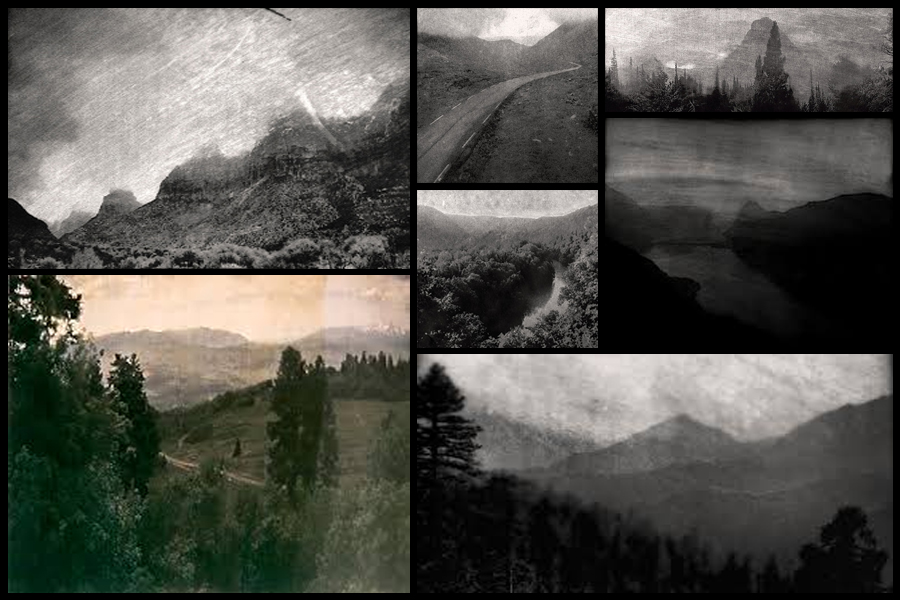
This form of photography can also be focused around the idea of the constantly being watch as everywhere we go there are cameras, and so can explore this idea by incorporating maybe satellite imagery into the form of photography using creative angles to make the most of the landscape.

Stephen Shore
Who is Stephen Shore?
Stephen Shore over the past five decades has conducted repeated interrogation of image making, this ranges from gelatin silver prints made as a teenager to his current forms of art on digital platforms. Stephen shore was born in America 1947, and is most famous for his capturing of mundane, unglamorous images. Shore has worked in many forms of photography, from cheap automatic cameras to large format cameras in the 1970s, where he pioneered the use of color before returning back to black and white in the 1990s and 2000s.
Shore’s first survey in New York was to include his entire career, as through the exhibition allowed a greater understanding of Shore’s work. His photography is very much defined by an interest in daily life, a taste for serial and often systematic approaches with a touch of sly humor. Some examples of his work consist of:

The image I found that stood out from the rest of the images taken was called ‘Ginger Shore’. I found this the most interesting picture due to the composition as seen below:

What I loved about the photo was the clear contrast between the subject in the image and the rest of the pool surrounding her, this was also emphasized through the use of the almost yellow pool side placed within the top left of the picture. This placement allows for the viewer to almost instantly focus on what the photographer wants you to notice, the woman. I found the fact that there was a vintage sense from the image made it particularly interesting, this it due to how everything used seemed ‘old fashioned’ such as the swimsuit ect, combined with the warm colors of the bank and water surrounding the subject that really made certain colors pop out.
The use of depth of field used on the swimming pool railings and the backdrop add effect, this is from how there is a sense of contemporary. We can see this is from how the picture seems to be taken just as the woman has stepped into the water, and stares of into the blurred, but obviously different setting seen in the distance.
Romanticism Photoshoot Response
In this shoot I will be focusing on photography surrounding Romanticism. To help me with my shoot I will use Fay Godwin as my influence from a photographer, I chose her because of how her photography uses much of the scenery seen in Jersey and so could use her techniques to provide guidance on what to take as seen below: Before taking the shoot I wanted to pull some ideas together on what to take, allowing for a guideline to my photos, this was my outcome:
 Once I had a general idea on what I could do for the shoot I finally moved onto the images themselves with these being the outcome:

From the photographs I decided on, I made a selection of ten images that I thought presented my best imagery from the overall shoot on the topic of romanticism. These were my choices:


 I chose these images because I thought they popped out from the rest of the shoot, and had a greater understanding of what romanticism in photography was about. I found that their vivid colours and use of depth of field made them particularly effective. From here I wanted to whittle my selection down to just five images to really provide a clearer insight into my final image for the shoot. This is my selection:
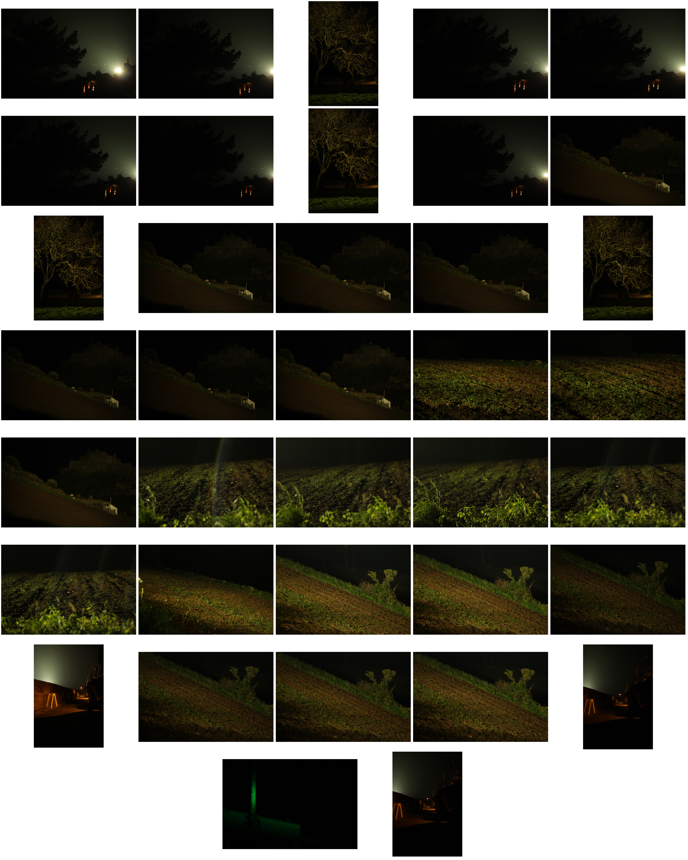
 I chose this image due to how I loved the effect created from the back light that was meant to illuminate Gorey Castle at night, that instead silhouetted the housing and trees around it, creating an aesthetically pleasing result as an outcome. And with the slight use of red and oranges from the housing I though it really balanced it out.
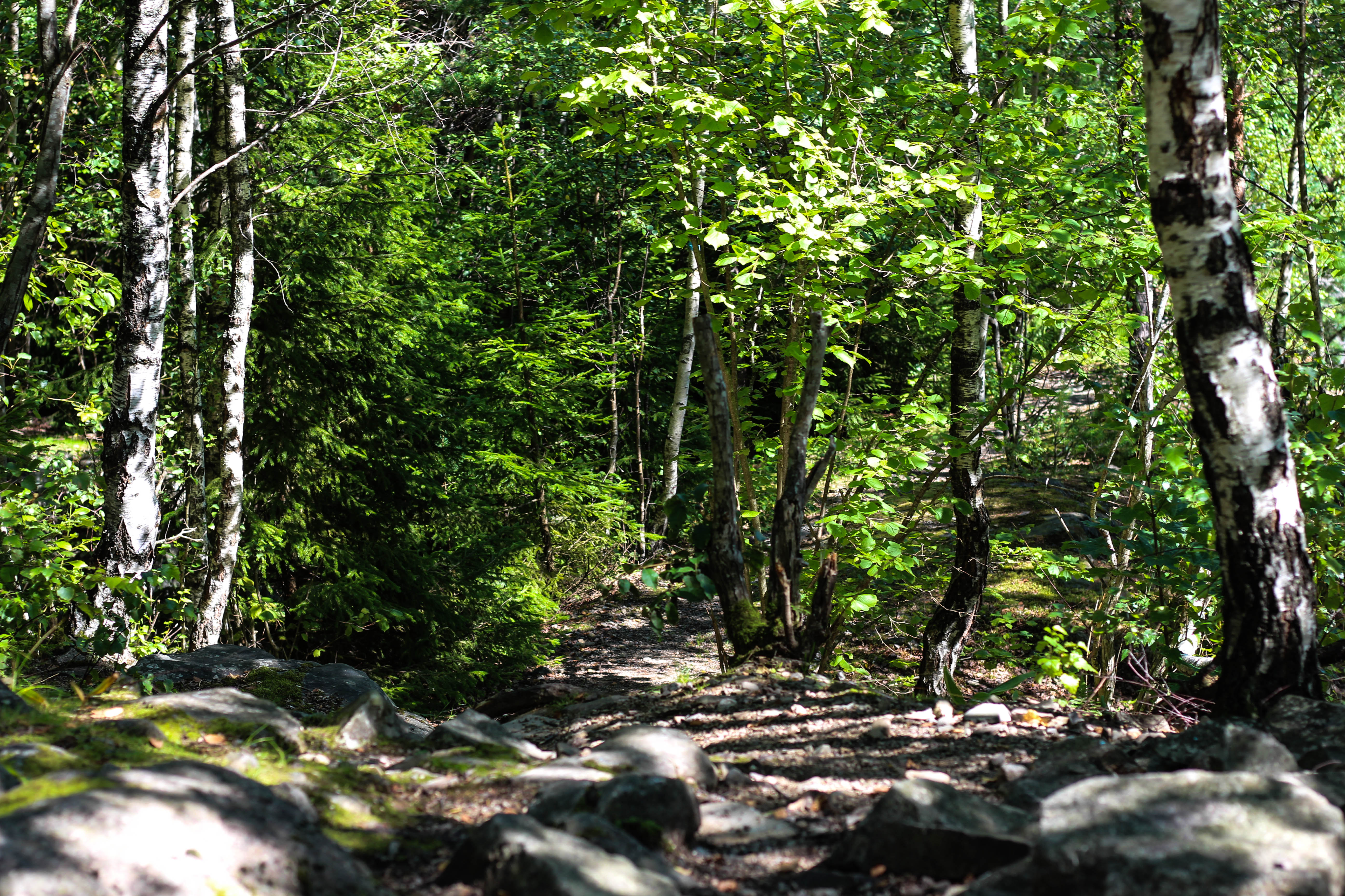 What I loved in this image was the use of the depth of field, this created a focus on a certain section of the woods which instantly drew the eye through the use of its vivid greens. Within the image I used Photoshop to enhance the greens within the image to make it more suited to the theme of Romanticism with the expected outcome as desired.
 I found that this images use of contrast between the light provided by the lamps created an aesthetically pleasing photo. This was because of how by making the oranges within the picture more vivid, it emphasised the shadows created by the surrounding boats, thus drawing the eye instantly to the soft glow of the lamp centred in the middle of the picture.
 The gradient created by the sky I thought particularly allowed for a romanticism theme. This was because of how the majority of the image was made up of the slow but constant changing of shades of blues into yellows, with only a small percentage made up by the landscape. I found that by darkening the ground it created a greater effect onto the sky due to an emphasis to the colours.
 What I loved about this image was the composition and the dark and grim colours. This is because of how the skeletons of the trees create a sinister but beautiful effect on the pathway through the middle of them, with unclear imagery of people in the far distance. I also liked the use of depth of field as well due to how the trees slowly faded and merged into one collective backdrop, whilst maintaining the desired look.
After analysing each of the five images, I decided to come to an overall decision on the final piece from the selection. This is my final choice for the best image out of the shoot:
 I chose this as my final image because of how I loved the contrast created by the floodlights to Gorey Castle. I found that through this it completely emphasised the silhouettes of both the tree and the house in a sinister but fascinating way. I also liked how the floodlight captured by the camera is seen as a circular gradient in which slowly fades into darkness, with the three red lights being there to balance out the image as a whole and not let the black overpower the piece.
Fay Godwin
Who was Fay Godwin?
Fay Godwin was renowned for her black and white landscape photographs of the British countryside and coast. She also produced a series of portraits of literary figures, with many of them being collaborated in her 1979 book ‘Remains of Elmet’.
Fay Godwin had no training when it came to photography, but rather became interested in it from photographs of her families snaps. From there she went on to produced portraits of well-known writers, photographing nearly every significant literacy figure in the 1970s and 1980s within England.
Later in the years her love of walking led to the inspiration to pursue landscape photography. She often photographed isolated, remote areas of the British landscape and producing many pastoral scenes as well as contrasting urban landscapes. Godwin became president of the Ramblers Association from 1987 to 1990, where she became well-known for her work as an environmentalist.
In 1987 Godwin was awarded a major Arts Council Bursary to enable her to continue her landscape work in distant parts of Scotland. Her work soon started to appear in many public and private collections, including the Victoria and Albert Museum, The British Council, the Scottish National Portrait Gallery and many more. Originally her work began a world tour by the British Council, but later became a Fellow of the National Museum of Photography and in 1990 received an Honorary Fellowship from the Royal Photographic Society.
Some of her work can be seen below:
 As seen above Godwin focuses on very much of what is normal in the landscape, however she tends to use the weather to create more dramatic images to what would usually be seen, such as the clouds to create contrast on the land.